Branded Presentation Deck Design - Figma and Canva Platforms

Jann Claude


I designed a branded presentation deck for a B2B company, focused on turning research, competitive analysis, and strategic recommendations into a clear and visually engaging presentation.
The goal was to make information-heavy slides feel easier to understand without losing the personality of the brand. I used strong typography, generous spacing, bold blue accents, monochrome imagery, and custom graphic elements to create a presentation that feels professional, modern, and consistent throughout.
Designed in Figma & Canva
The presentation was developed using Figma and Canva, with close attention to layout, hierarchy, typography, and brand consistency.
A mix of expressive serif typography and clean sans-serif type creates contrast between key messages and supporting information, while the cream and blue palette keeps the deck recognizable across different types of content.
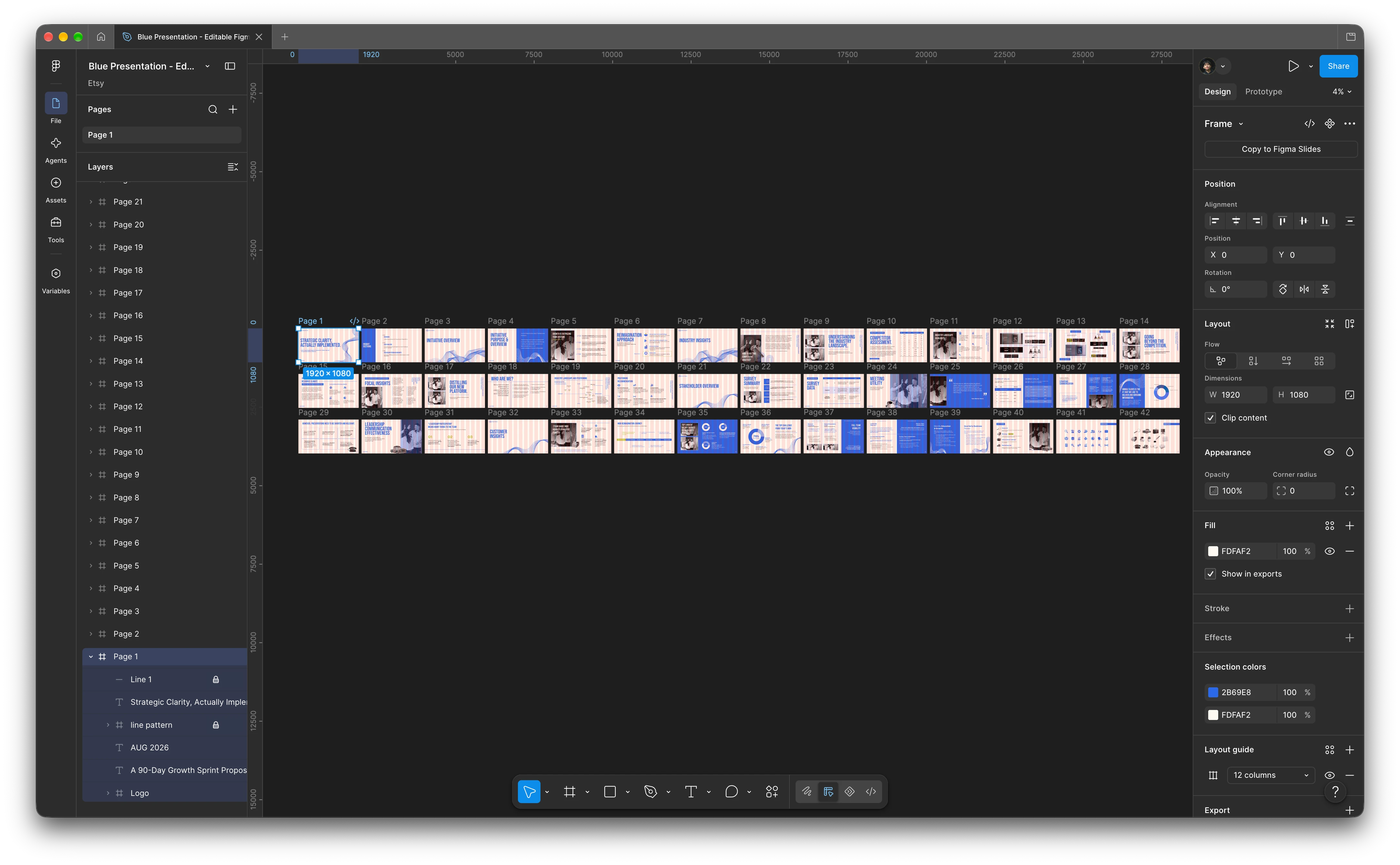
Figma Setup
Presenting complex information clearly
Because the deck contains research and strategic information, I created different layouts depending on how each type of content needed to be communicated.
Cover and section slides – bold typography and branded graphic elements establish a strong visual identity.
Research and analysis slides – structured layouts make longer-form information easier to scan and understand.
Industry insights – icons, imagery, and content blocks break complex findings into clear takeaways.
Positioning maps – data and competitor information are organized visually to make relationships easier to compare.
Strategic recommendations – recommendations are separated into clear sections with supporting icons and concise descriptions.
Quote and testimonial layouts – large typography and photography create visual breaks within more information-heavy sections.
This variety allows the presentation to communicate detailed strategic information while still feeling cohesive from slide to slide.
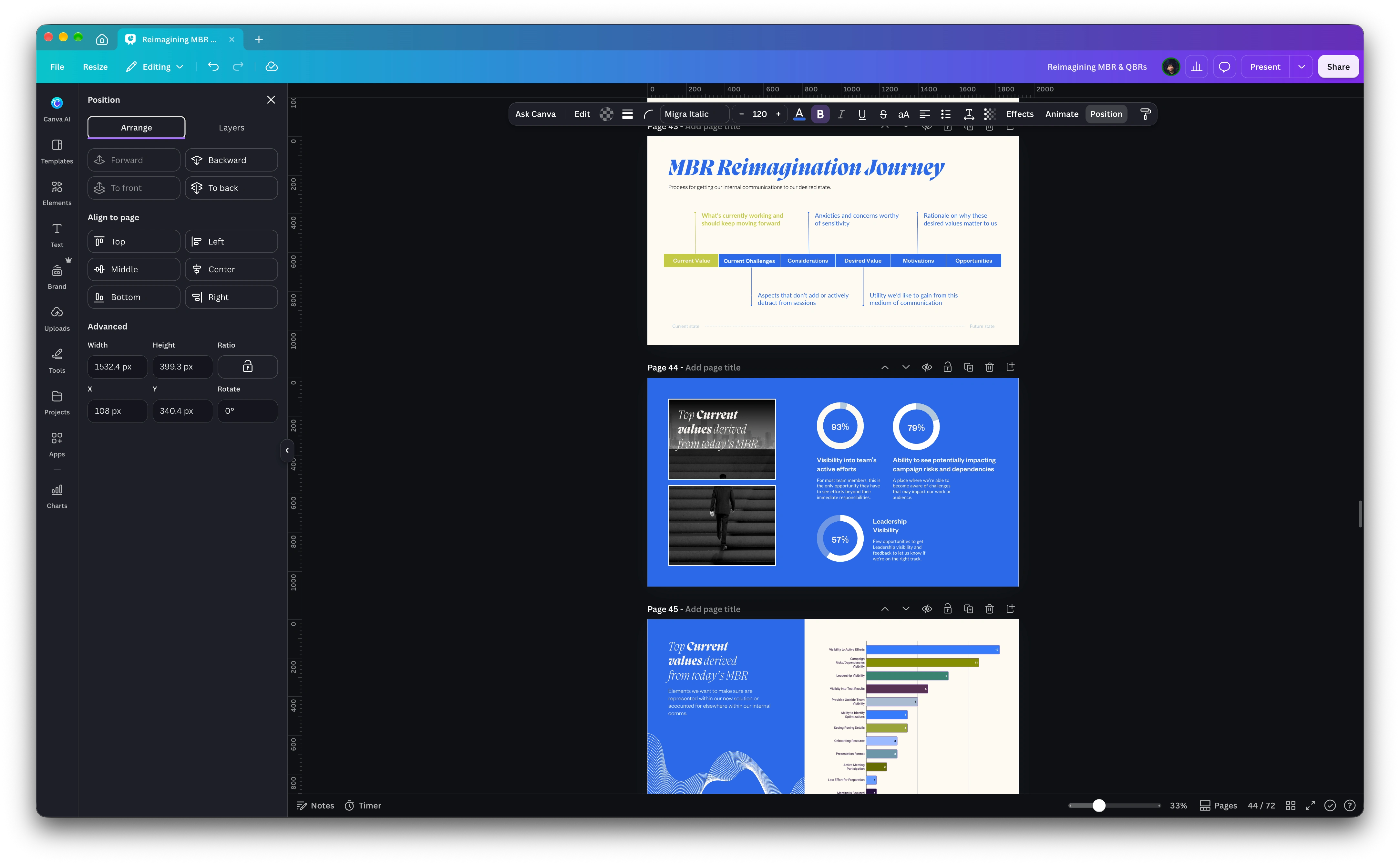
Canva Integration
Key features
Consistent visual identity across the full presentation
Strong typography and editorial-style layouts
Clear presentation of research and strategic information
Custom diagrams, positioning maps, icons, and graphic elements
Flexible layouts for text, imagery, recommendations, and data
Designed to balance visual impact with readability
Created in Figma and Canva
Skills & tools
Figma · Canva · Presentation Design · Editorial Layout · Branding · Data Visualization · Typography · Visual Communication
Like this project
Posted Oct 23, 2026
B2B presentation design in Figma and Canva, combining visual storytelling, typography, data visualization, and clear strategic layouts.