Sun Moon Studio
Yihsuan Lu

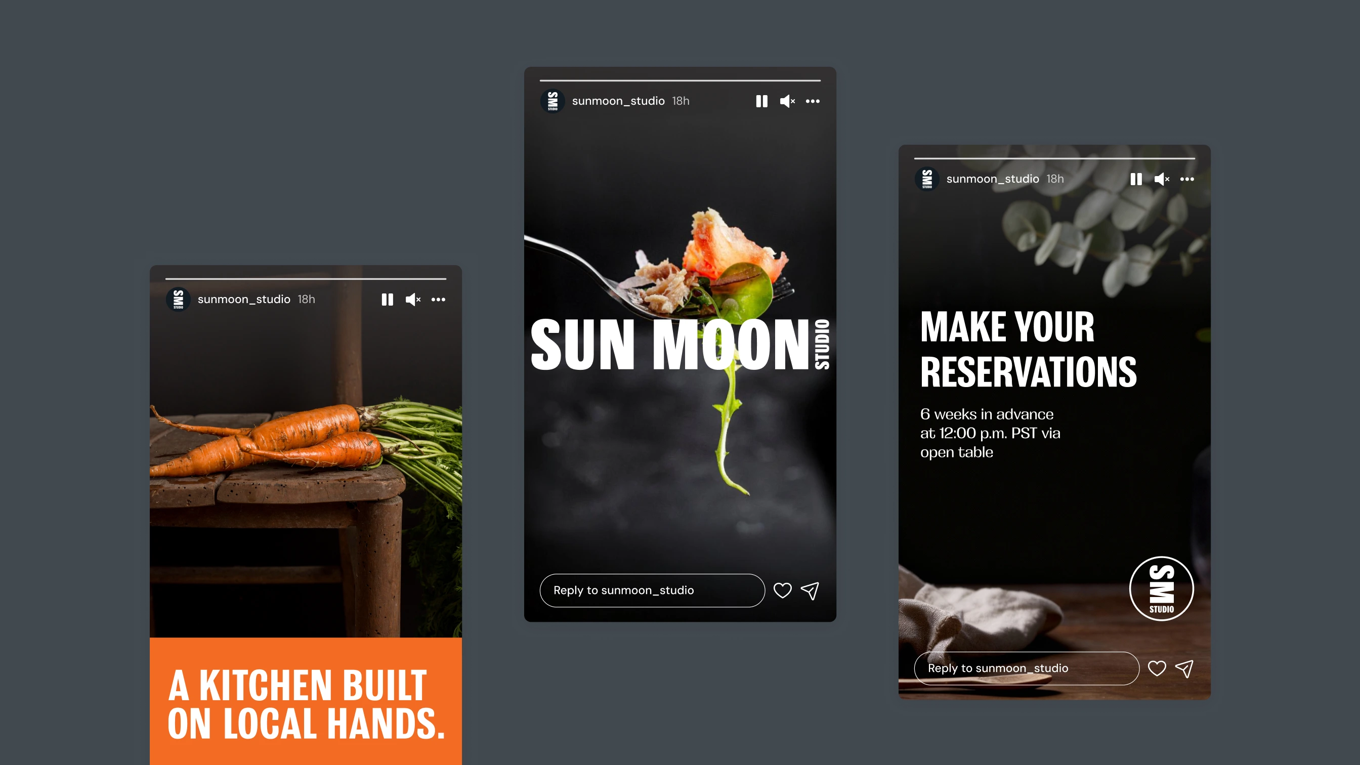
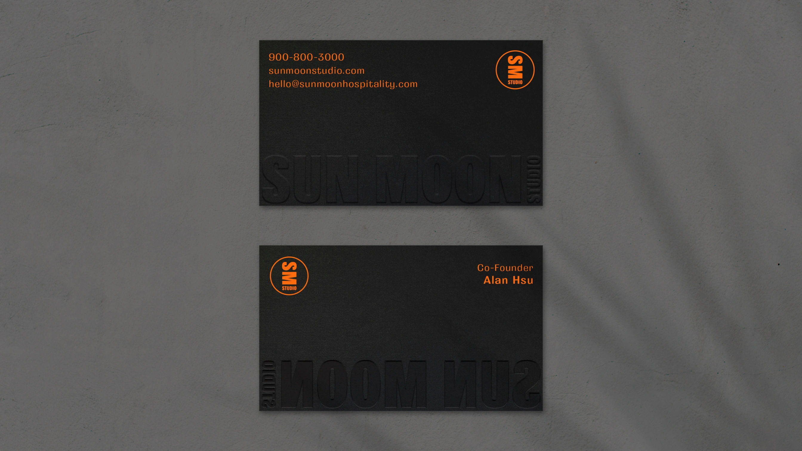
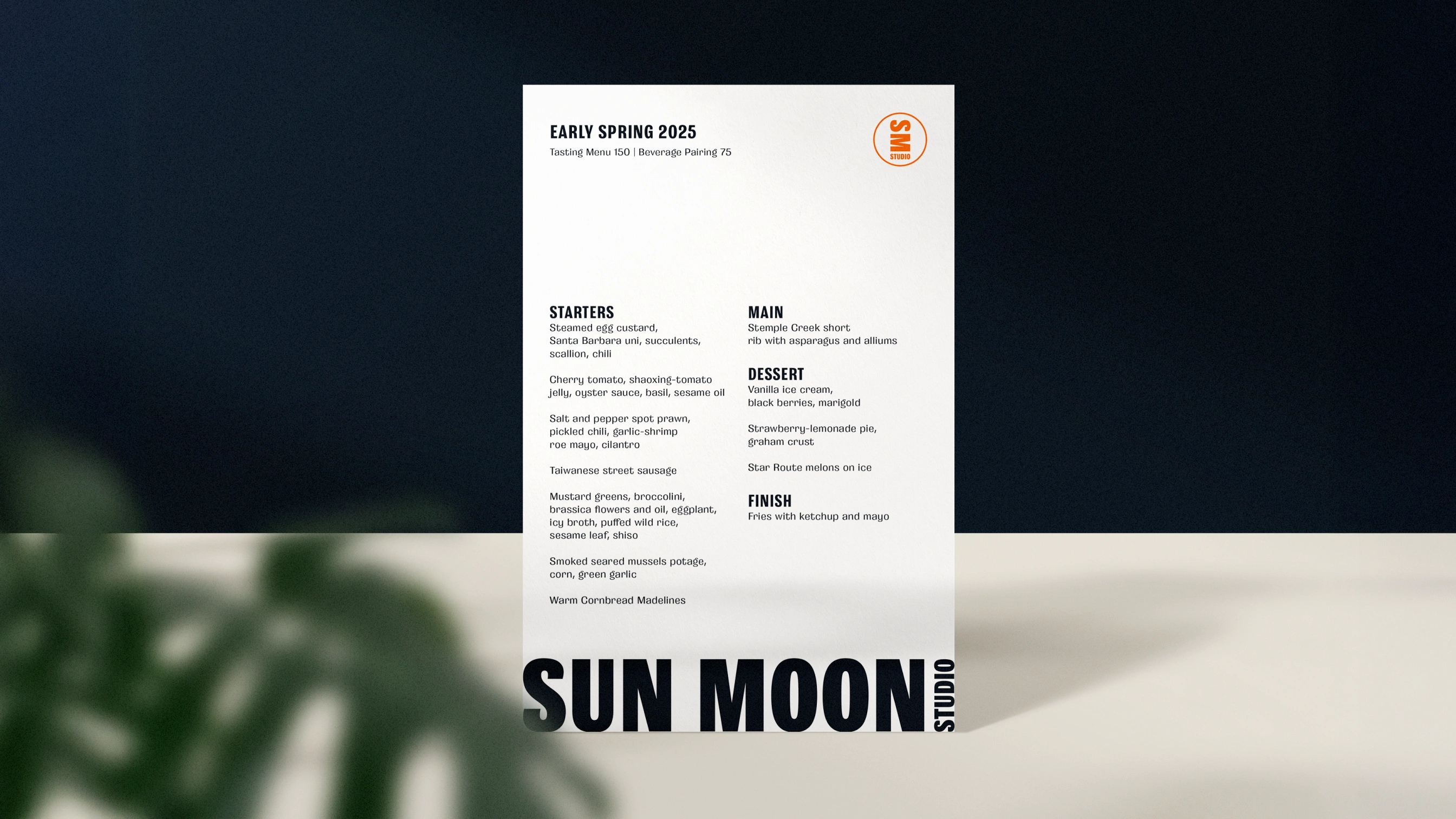
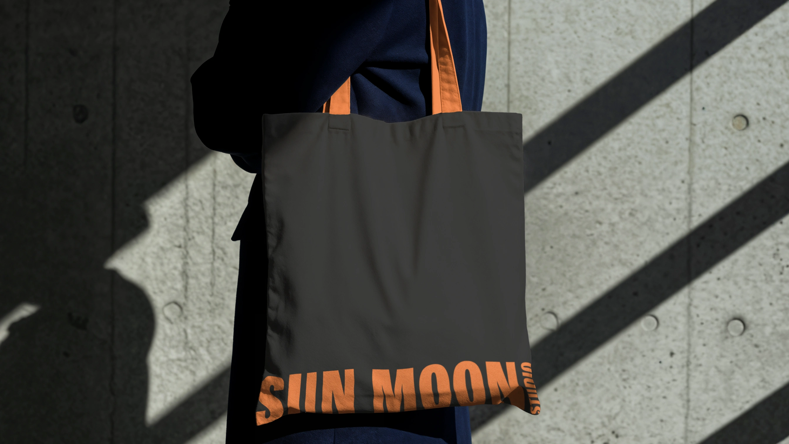
Brand identity for fine dining restaurant balancing refined restraint with approachable warmth. The mark pairs geometric letterforms with deliberate spacing and proportion, creating a wordmark that feels both contemporary and timeless.
Typography, color palette, and material choices emphasize subtlety and restraint, supporting the restaurant's position as an intimate destination without excessive formality. Developed through collaborative process with restaurant ownership.

Like this project
Posted Feb 18, 2026
Developed brand identity for a fine dining restaurant with a contemporary and timeless design.
Likes
0
Views
5