Camp Coalesce
Yihsuan Lu
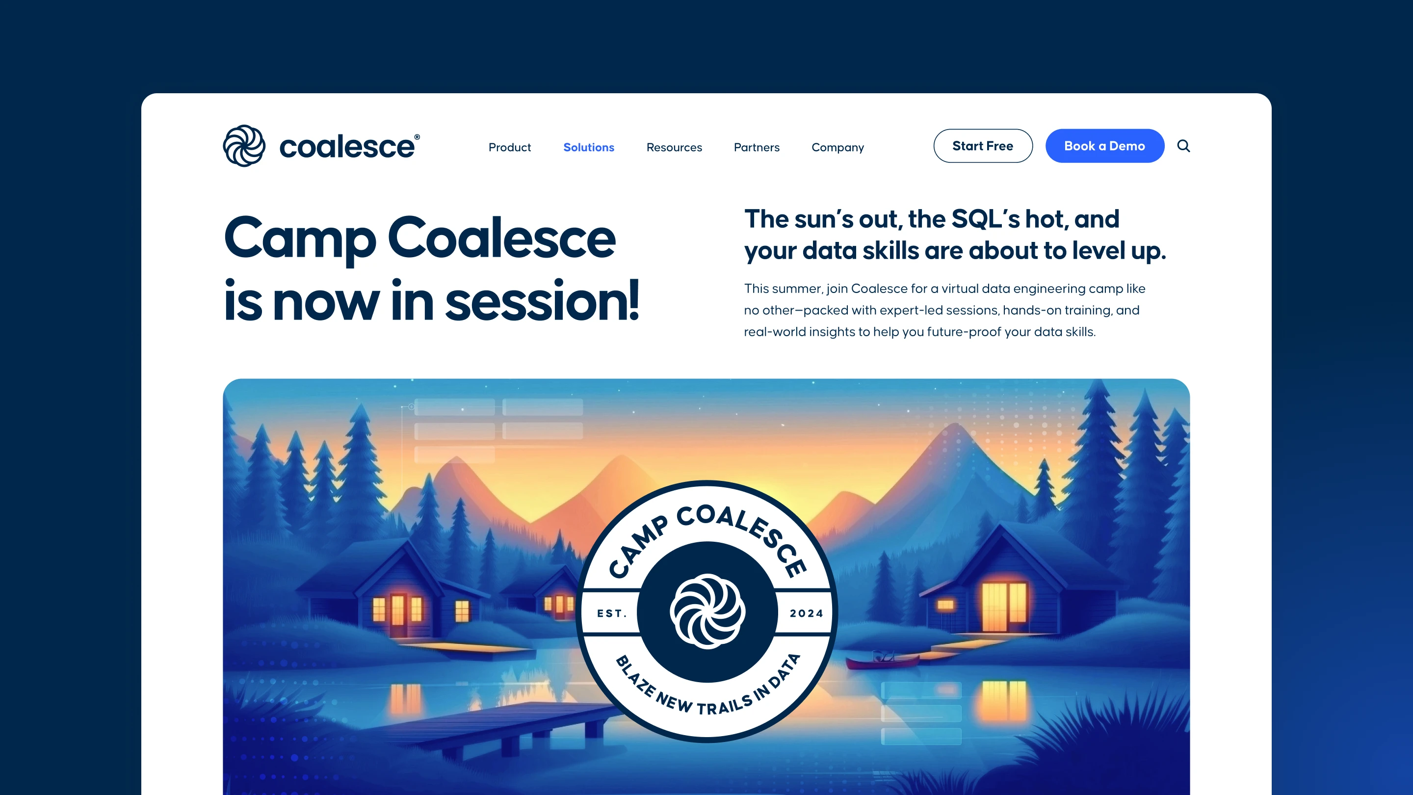
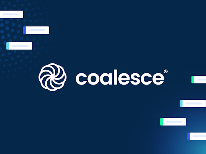
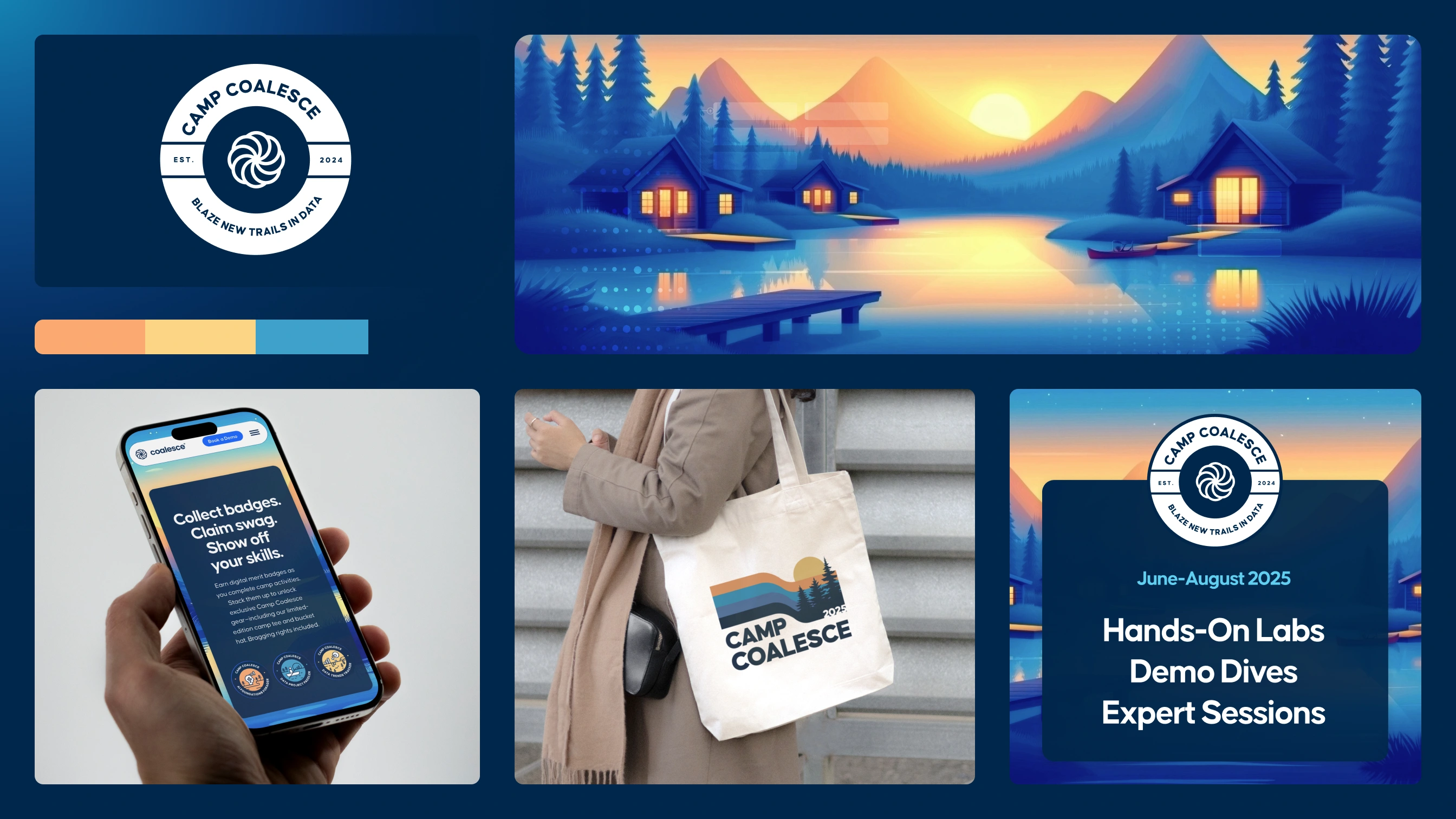
Event identity for Camp Coalesce, Coalesce's annual data transformation training program. The system combines AI-generated illustrations with hand-crafted elements, creating 300+ assets across digital and print channels while maintaining brand consistency with the parent Coalesce identity.
Client_ Coalesce | Agency_ BrightBase
Background
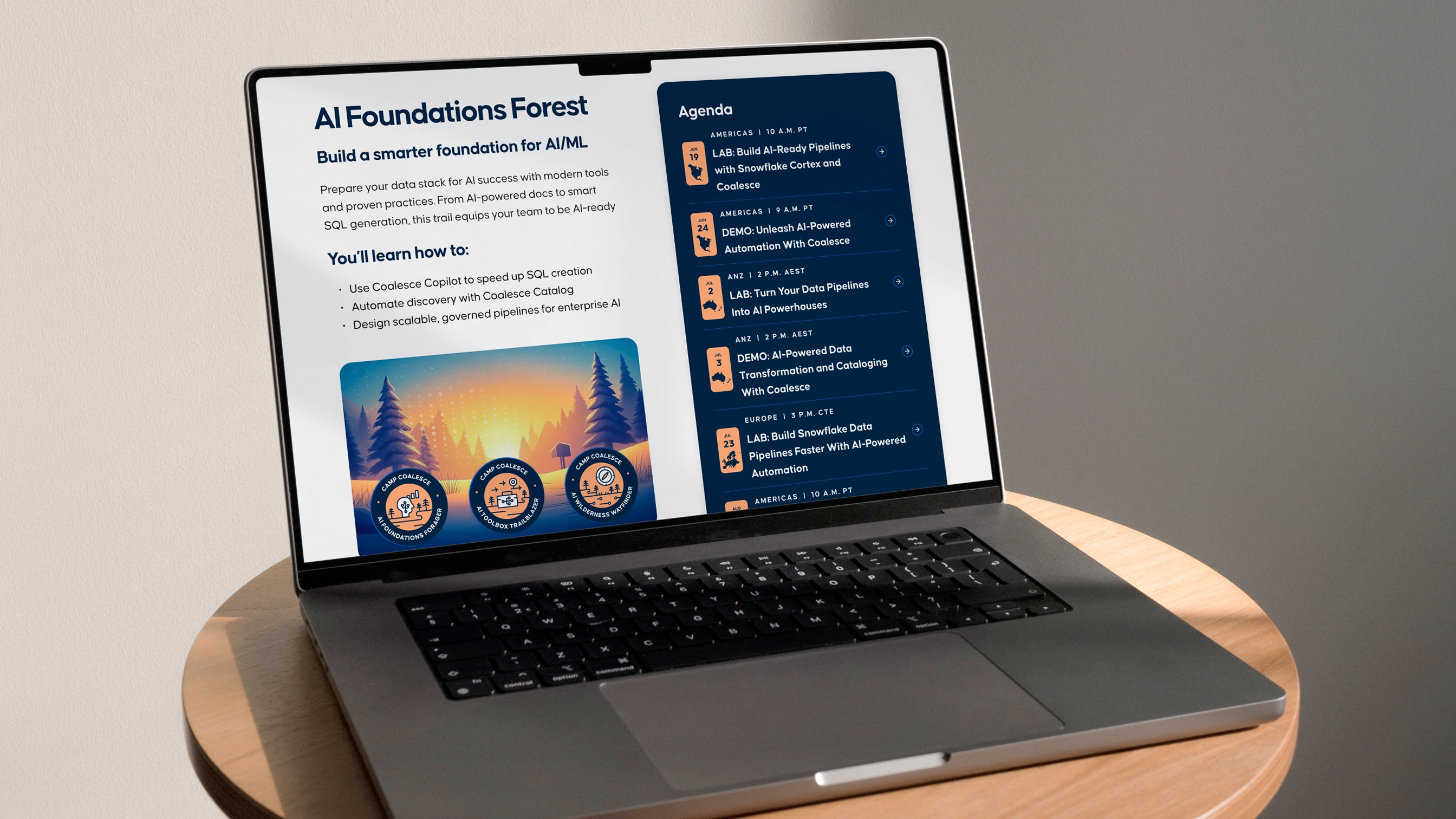
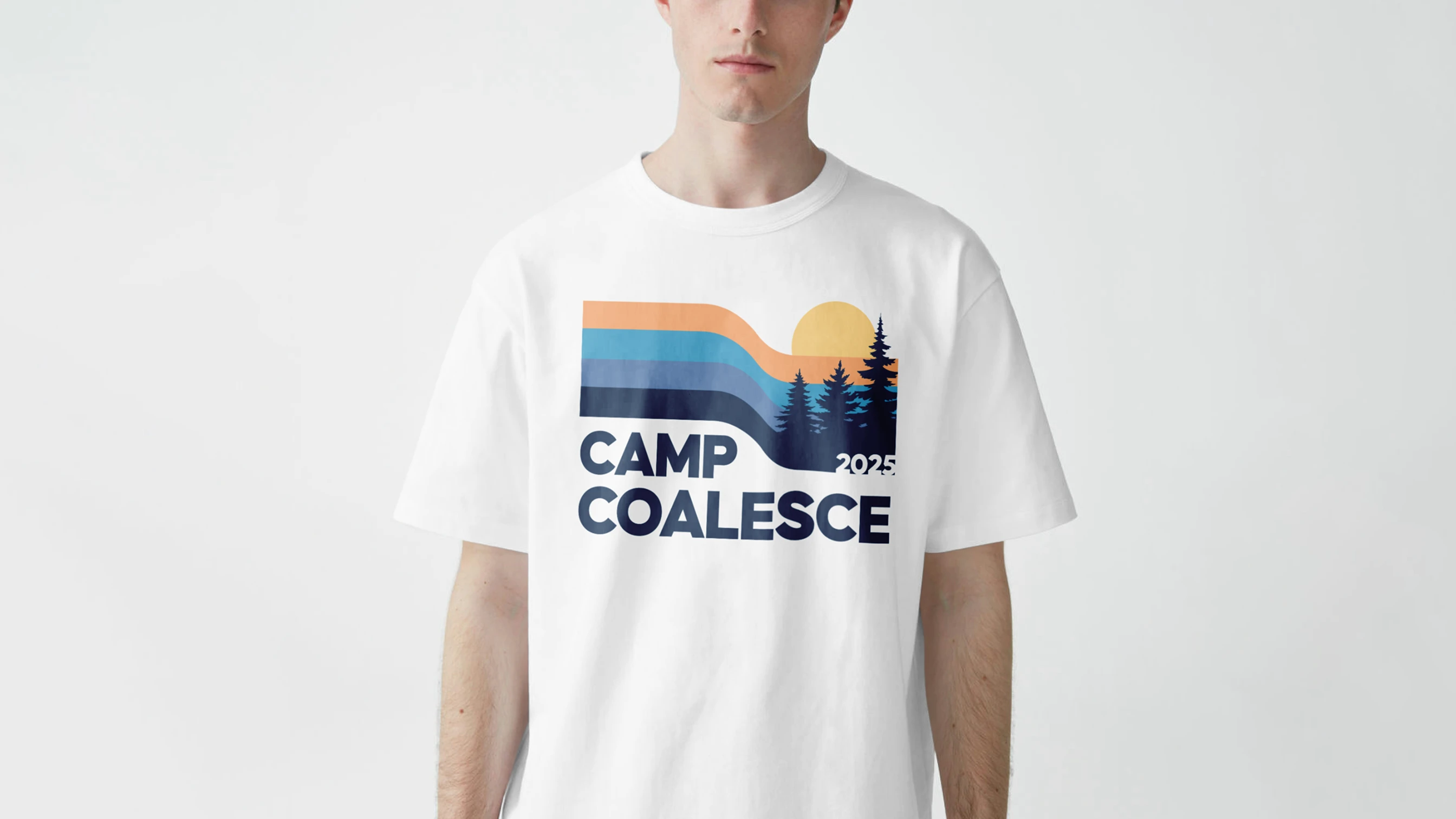
The visual language drew from nostalgic references—vintage park posters, scout badges, retro illustration styles, and camp counselor gear. These influences created a warm, familiar aesthetic appropriate for a modern B2B SaaS audience.
The core challenge was balance. Leaning too heavily into nostalgia risked feeling gimmicky; an overly restrained approach could dilute the spirit of camp. The solution needed to feel expressive and immersive while maintaining brand credibility.
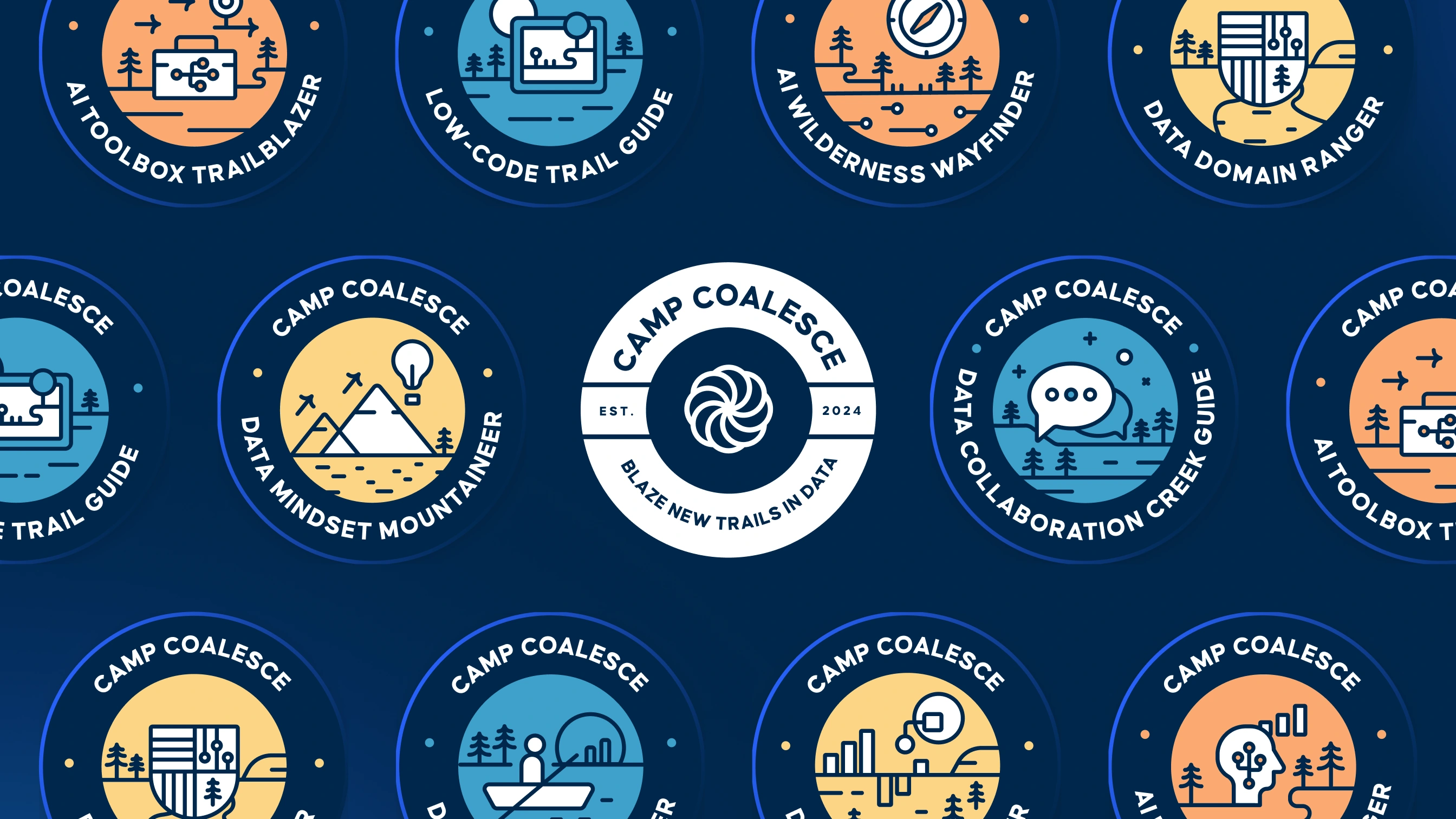
With human craftsmanship
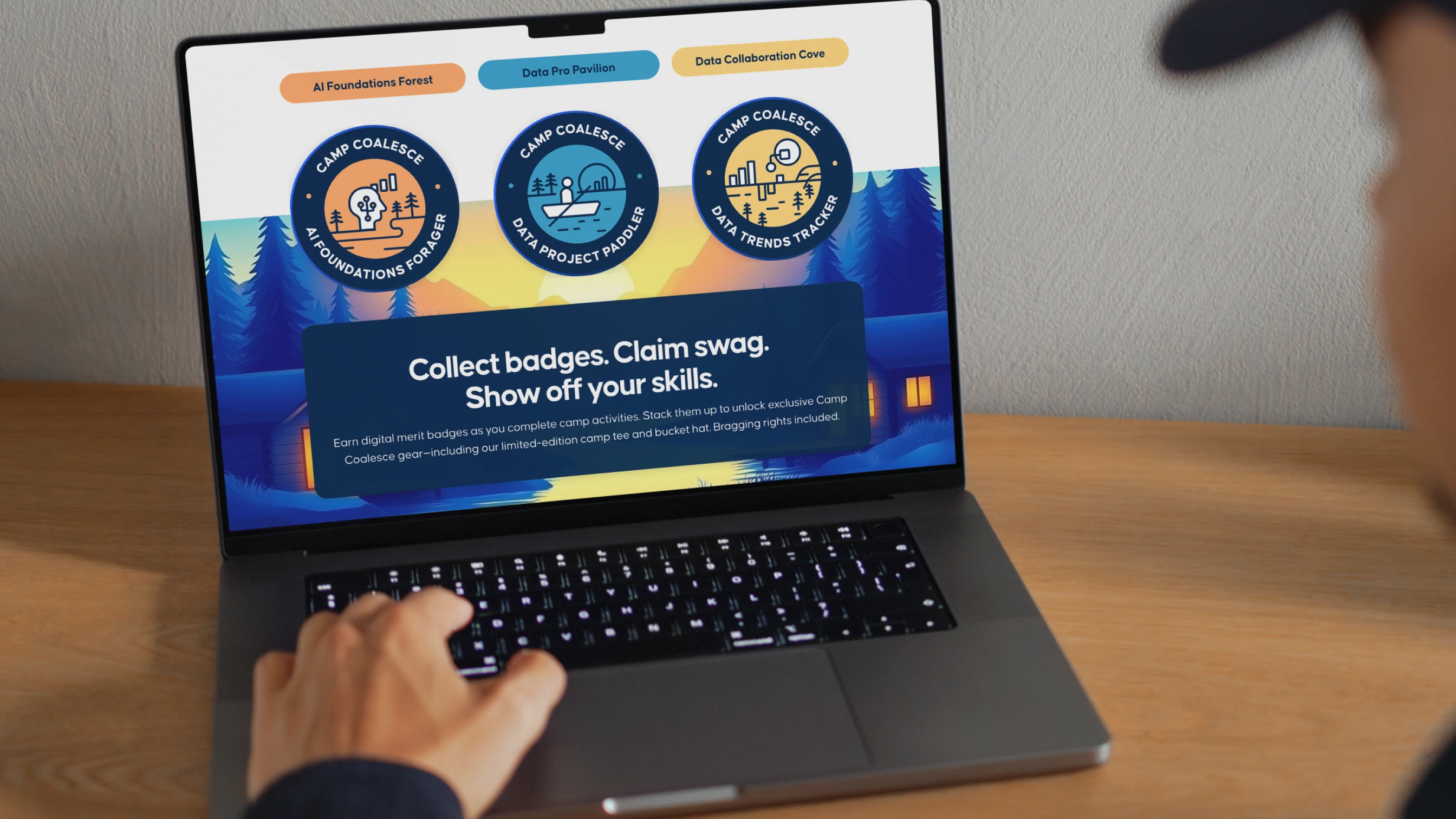
Hand-crafted badges and key illustrations served as visual anchors, establishing stylistic references for the broader system. These elements grounded the aesthetic with craft detail and intentionality, providing clear direction for generated assets.
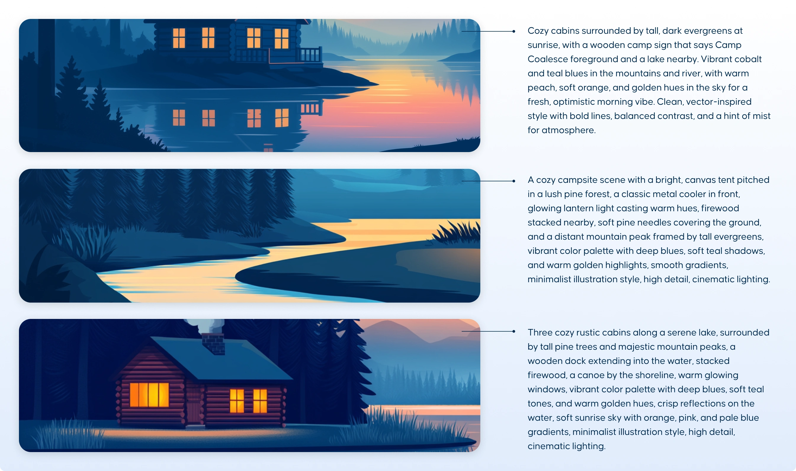
Design through AI
AI tools enabled rapid exploration and production across hundreds of variations following the established visual direction. Generated imagery was refined for consistency and brand alignment, with outputs adjusted to match the craft quality of hand-drawn anchor elements.
Result
The system delivered cohesive event branding across landing page, social content, and physical materials. Workflow combining hand-illustrated elements with generated imagery maintained visual consistency while enabling accelerated production timeline.
Like this project
Posted Feb 18, 2026
Created a visual identity for Coalesce's annual data training event using AI and hand-crafted designs.
Likes
0
Views
5
Clients
Coalesce