NURO Coffee Co. Branding & Packaging
Harsh Chelani
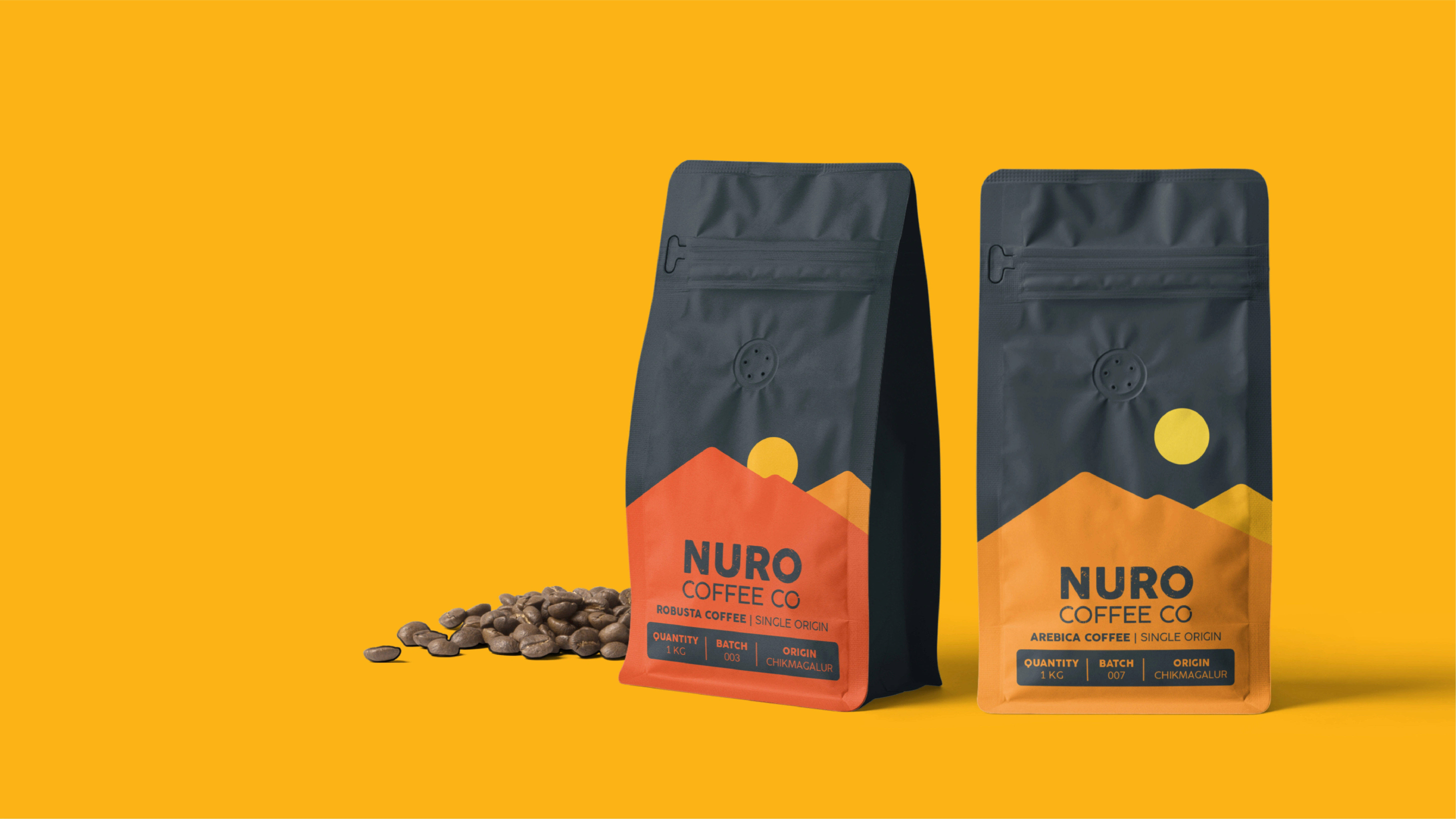
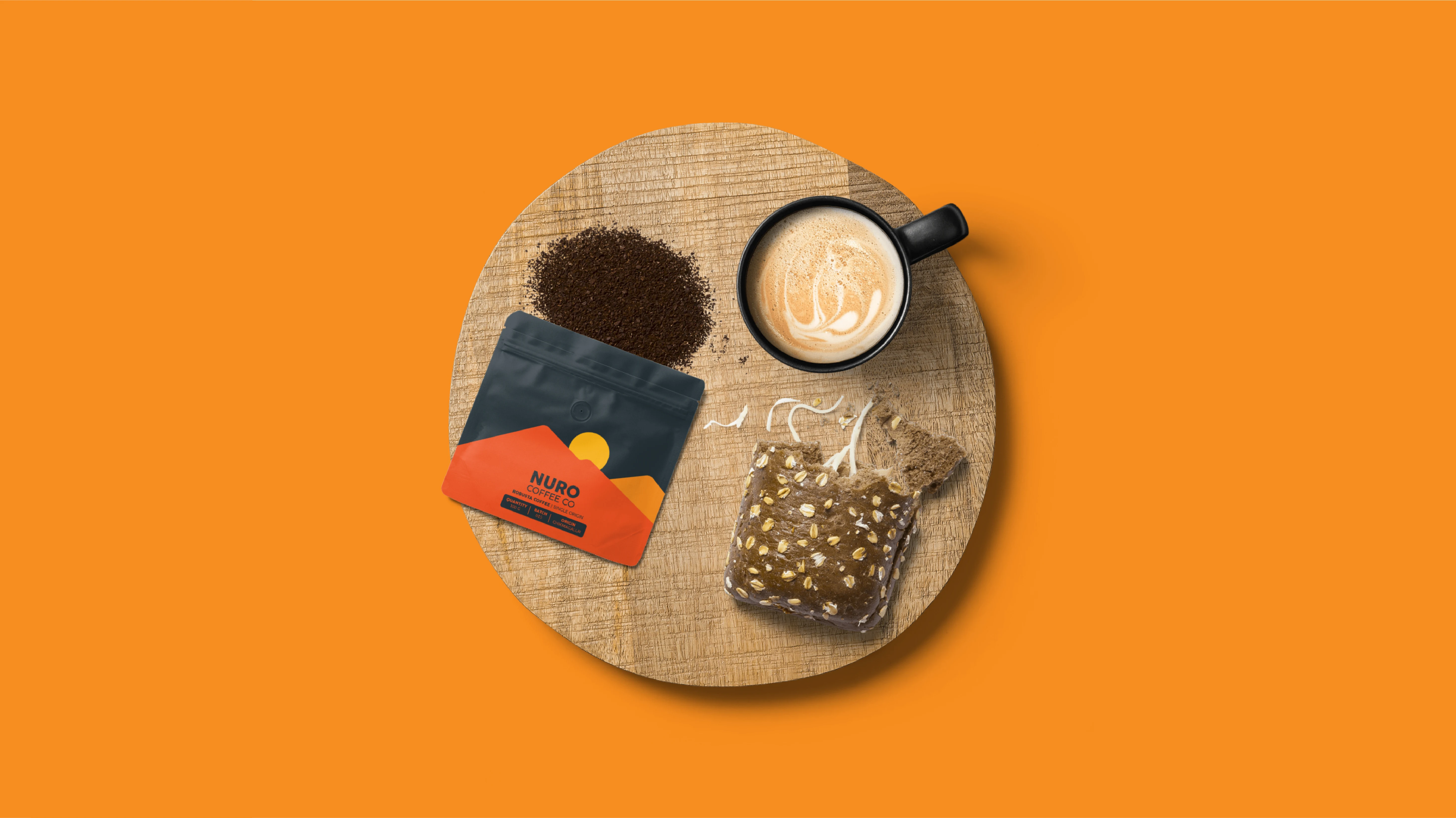
NURO sources premium, single-origin coffee from Chikmagalur and needed packaging that captured both its authenticity and everyday ritual appeal.
Challenge: The brand lacked visual distinction in a crowded D2C space and needed a packaging system to differentiate between coffee types while keeping storytelling intact.
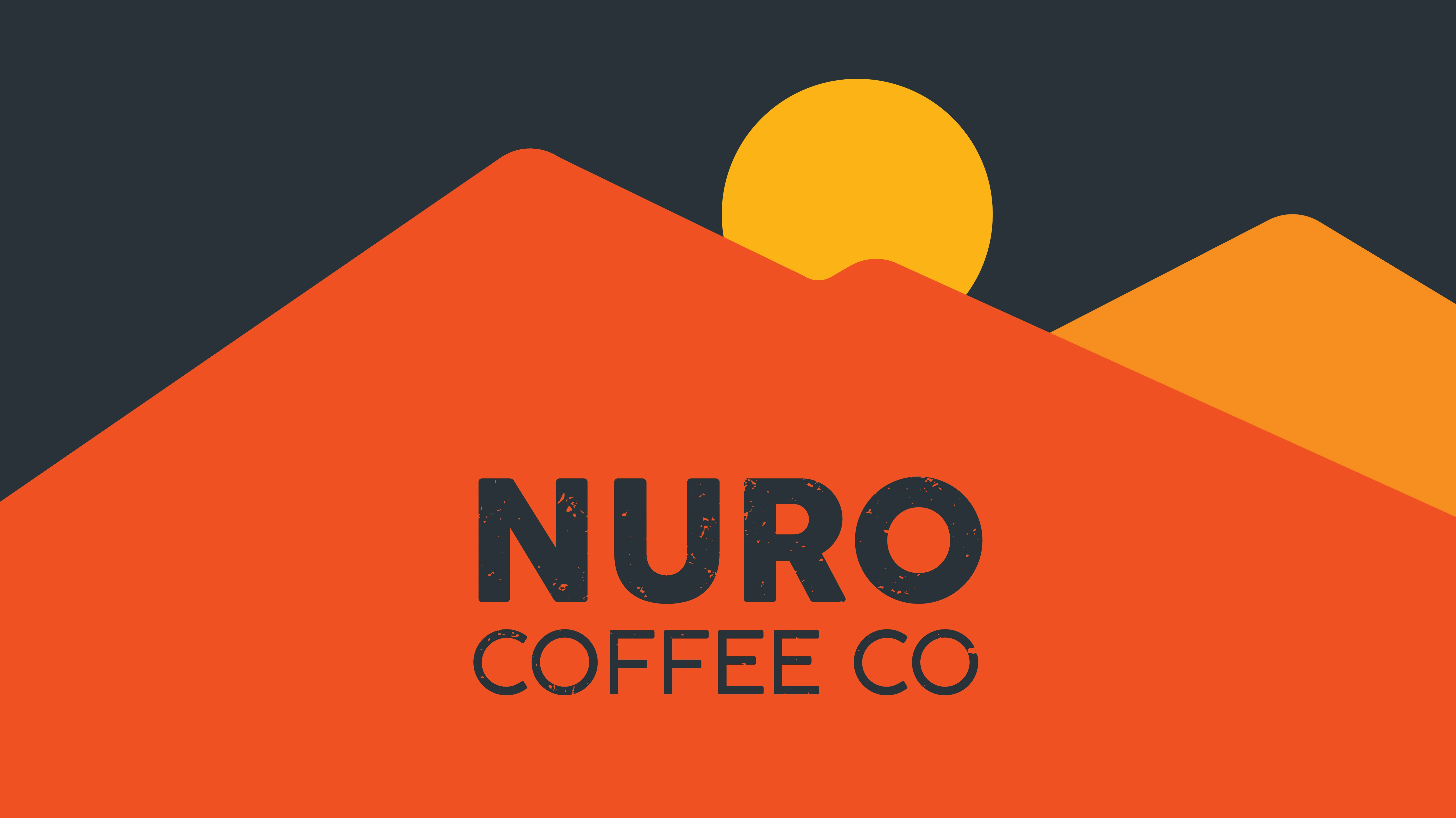
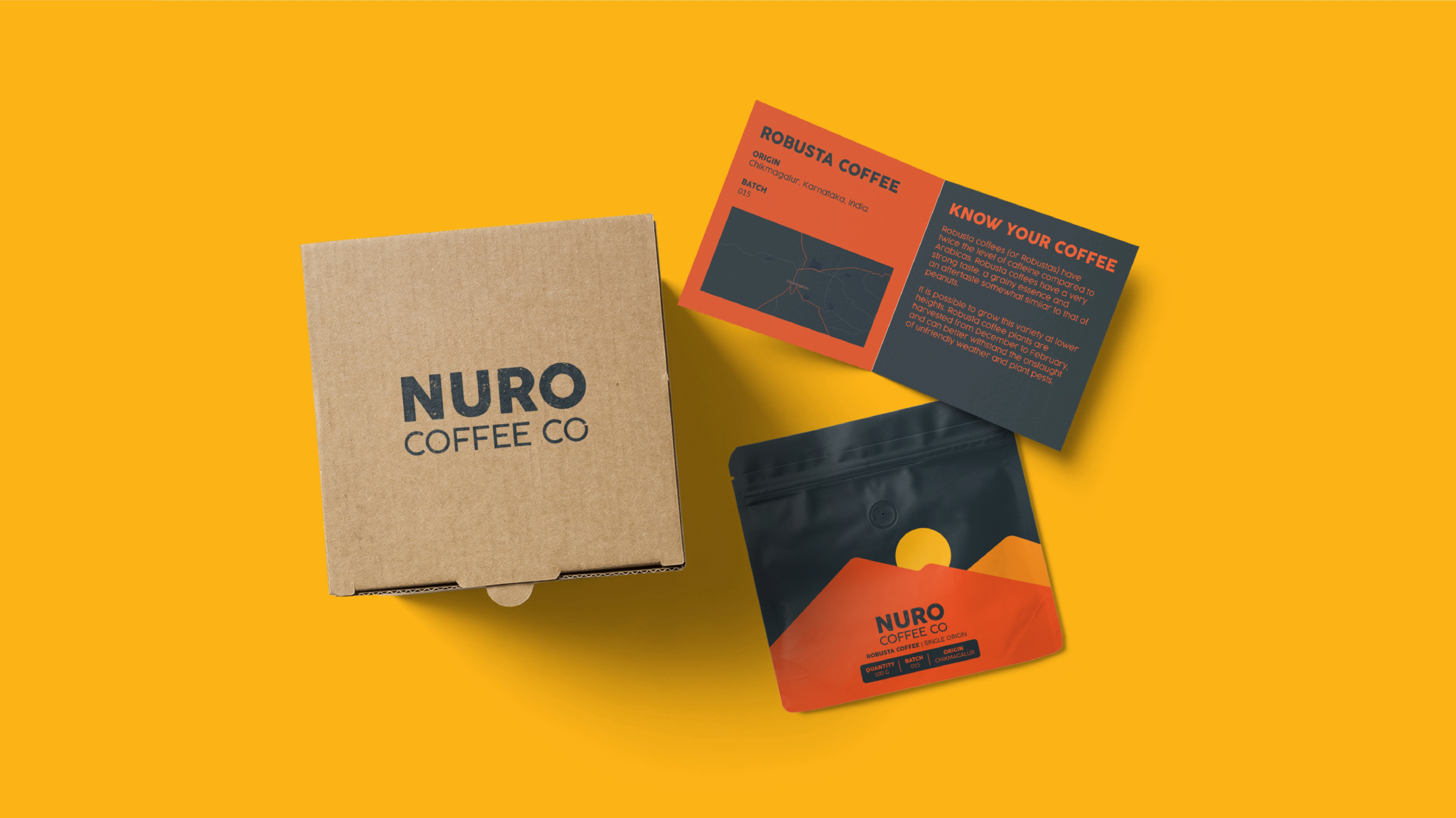
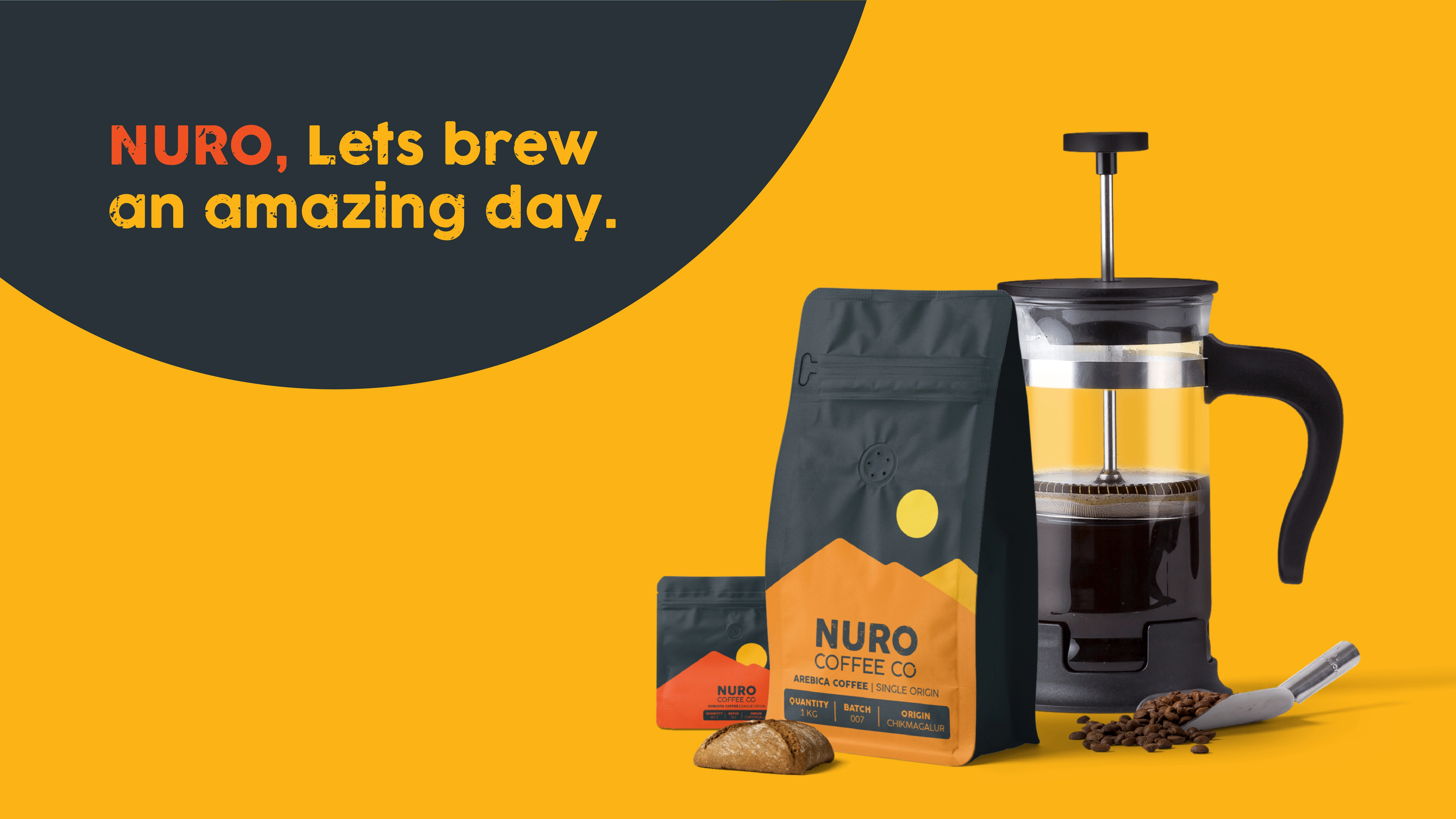
Solution: Inspired by sunrises and sunsets, the packaging uses a landscape graphic where the enviroment’s brightness reflects the coffee’s strength — lighter for Arabica, deeper for Robusta.
This minimal, story-driven approach brings visual warmth, clarity, and origin pride to every pack.

Like this project
Posted Jun 10, 2025
Branding and packaging for Nuro, using a sun-based system where environment indicates roast type. evening - darker roast, morning - lighter roast.