Redesigning CABSOL Accounting Platform for Clarity and Ease
Juliana Orji
Overview
CABSOL is an accounting software that helps manage key financial tasks like payments, receipts, budgeting, reports, and document storage. The platform handles large amounts of data and complex processes, but the goal is to make financial work easier and more organized for different types of users.
Scope of work
To deliver a comprehensive redesign of the existing software to improve user experience, visual design, and overall functionality, aligning the product with current user needs and business goals. This includes user research, UX/UI redesign with modern visuals and accessibility, feature optimization, collaboration with stakeholders, iterative design improvements, and thorough handoff with documentation to support development.
Role
I served as the Lead Product Designer on this project, overseeing a two-person design team comprising me and a design intern, whom I also mentored throughout the process.
The challenge
Product challenges
CABSOL’s initial focus on serving public sector institutions shifted to include private sector clients due to strategic considerations such as development costs, partnership opportunities, and the need for early adoption. While this broadened market approach supported business growth, it introduced significant complexity. The differing requirements of public and private sector organizations, ranging from reporting standards to deployment and configuration, have placed considerable strain on the product. In addition, the ongoing incorporation of client-specific feature requests without a formal change management process has led to architectural instability and design inconsistencies, making it increasingly difficult to maintain, update, and scale the application effectively.
Internal challenges
We held multiple sessions over an extended period to clarify the product vision and align on key decisions. One of the early challenges in designing the application was the difficulty in reaching a clear consensus on how the product should function. I collaborated closely with stakeholders across management, the product team, and accounting, but decision-making was often fragmented, leading to frequent iterations and shifts in direction.
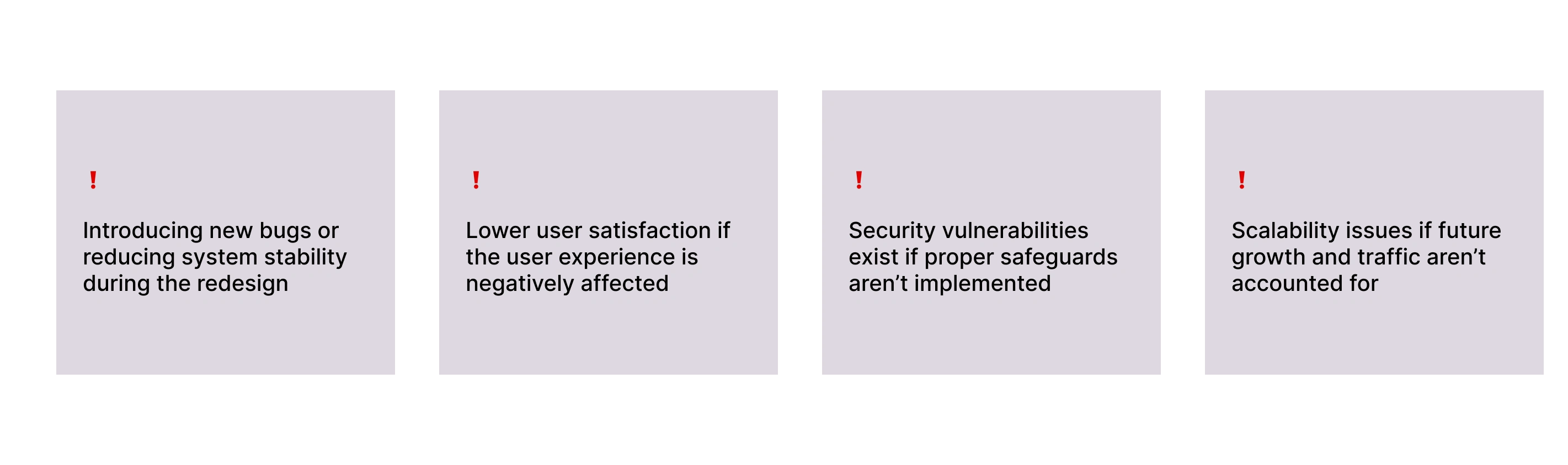
Risks
Design strategy
Phase Description Analysis of CABSOL Evaluation of the current system to identify weaknesses, inefficiencies, and areas for improvement. This insight will guide the revamp strategy. CABSOL Re-design Enhancing the existing system by refining the architecture, redesigning the UI, improving core features, optimizing performance, and addressing user feedback. Testing Rigorous quality assurance, including functional, regression, performance, security, and user acceptance testing, to validate the system’s reliability and readiness. Deployment Rolling out the revamped version of CABSOL for use, following successful testing and final review.
Product analysis
To begin the redesign of CABSOL, I conducted a thorough UX audit of the existing platform, systematically testing what aspects were effective and identifying areas that needed improvement. Since direct user interviews were not possible, I closely engaged with internal stakeholders to gather insights into the challenges they had encountered and the feedback they had received from users. I compiled these findings into a comprehensive research document to guide the redesign process. Additionally, I analyzed competitor products, such as Wave, which serves a similar function in foreign markets, to identify best practices and opportunities. Importantly, I studied the distinct design needs of both public and private sector users to ensure the new design would effectively serve the diverse requirements of both groups.
Find additional data on my UX findings and strategy here UX audit findings
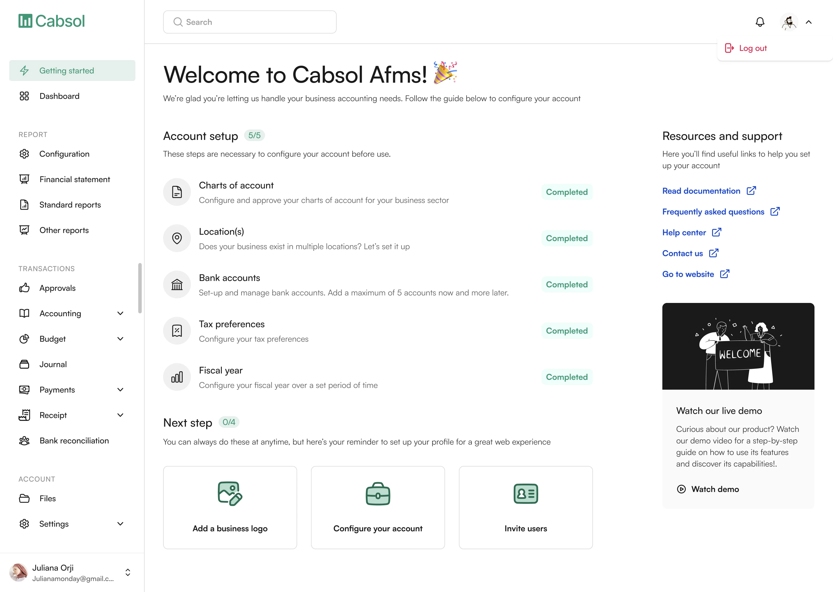
Re-designing the product
CABSOL was a large and complex product, managing vast amounts of financial data across various modules like charts of accounts, payments, receipts, bank reconciliation, budgeting, workflows, journals, reports, and a document center. One of the biggest challenges we faced was simplifying the information architecture and navigation to reduce the learning curve for users. The goal was to create an intuitive experience so that users, regardless of their technical expertise, could use the software effectively without extensive training.
The redesign process began with a comprehensive UX audit, mapping out the existing workflows and identifying pain points in navigation and usability. Since the product is heavily grounded in accounting principles, I worked closely with accounting experts on the team to validate key flows and ensure accuracy. Early in the process, we introduced a more detailed onboarding wizard to help users set up their accounts correctly from the start. This was a critical improvement over the previous version and laid the foundation for users to engage confidently with the product.
Initially, we planned to keep the app lean, focusing on a minimal viable product (MVP) with core features to accelerate time-to-market. However, as the project evolved, business needs shifted toward integrating the full suite of features from the original system. This was important both to enhance the product’s value proposition and because many features depended on each other functionally. Throughout the redesign, design reviews were an ongoing part of the process, with frequent iterations based on stakeholder and development feedback. Sometimes, this meant revisiting and redesigning flows that didn’t work as intended or pivoting to simpler versions that could be implemented faster. Given that design and development ran concurrently, this agile approach was essential to delivering a robust and user-friendly product within a tight timeline.
Some screens from the redesign
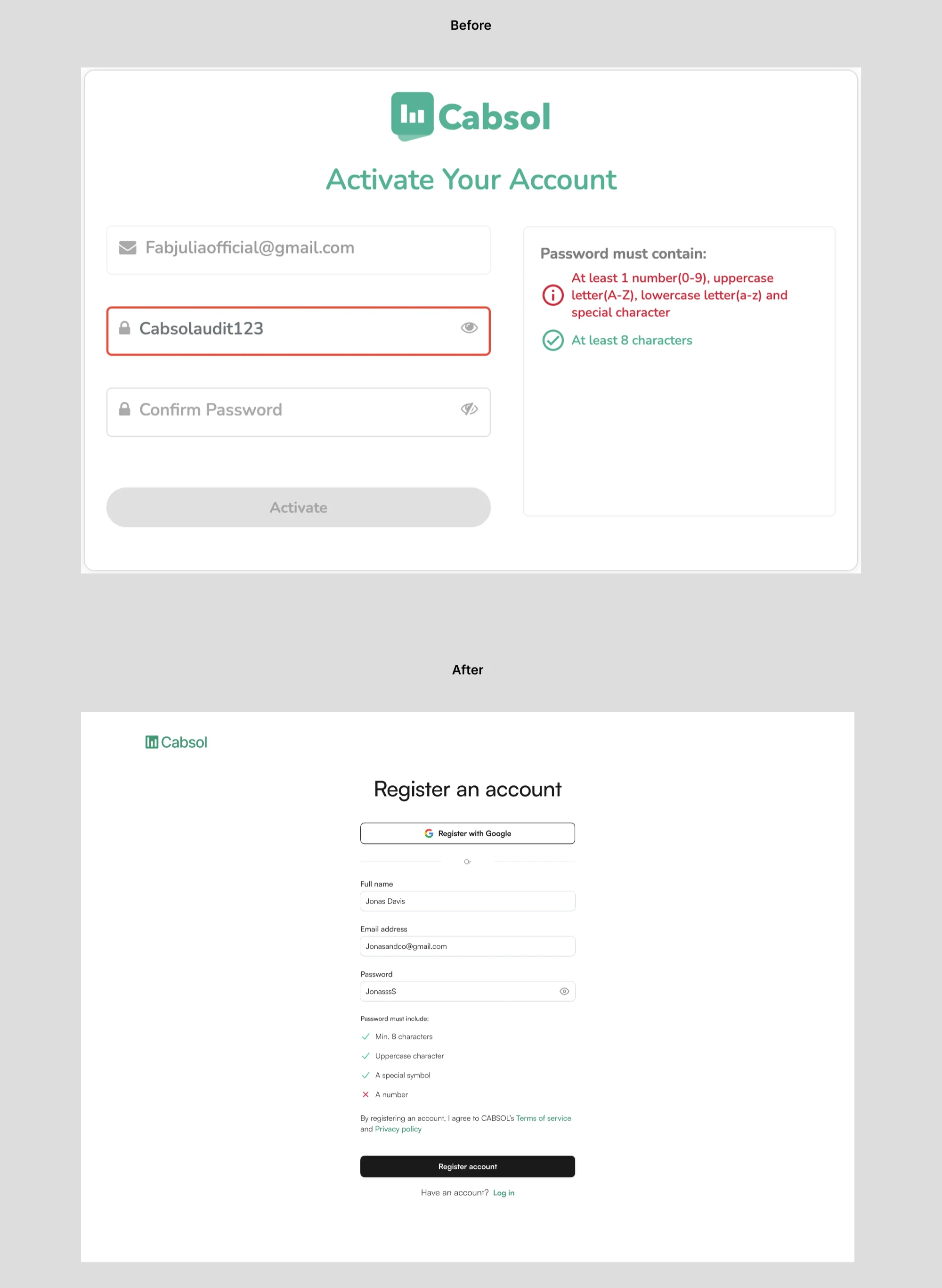
1. Creating an account
Before:
Password validation was combined into a single message, making it difficult for users to identify which specific criteria their password failed to meet.
After:
Password rules are now listed individually and provide real-time feedback as each condition is met. The registration screen also received a visual layout upgrade for better clarity and usability.
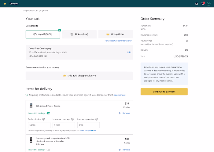
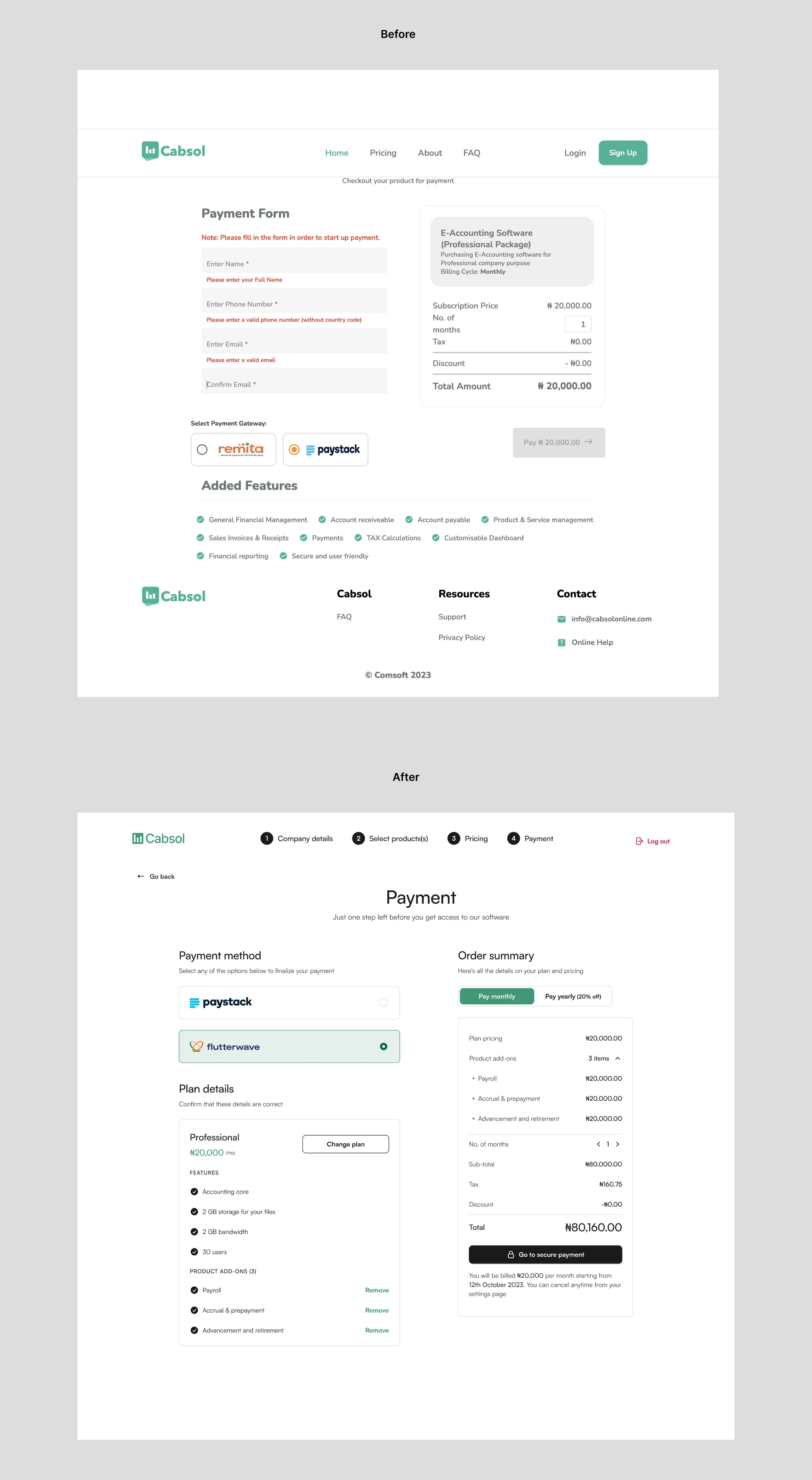
2. Improving the payment screen
Before:
In the earlier design (top image), the checkout experience feels ambiguous, rigid, and outdated, with a generic “Payment Form” layout that relies heavily on manual data entry and error-prone fields. The structure is flat, with key information like payment method selection and product features split awkwardly across the screen.
After
The improved design introduces a more modern, guided checkout experience with clear progression steps at the top. The interface is cleaner and more organized, separating payment method, plan details, and order summary into digestible sections. Visual hierarchy is used effectively, with contrast and spacing to reduce cognitive load. Users can now view and change their plan, see exactly what features are included, and remove add-ons if needed.
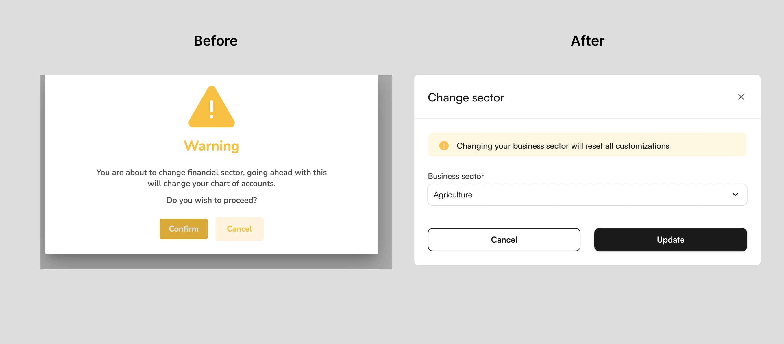
3. Designing better modals
Before:
The previous design relies on a bold warning label and icon to grab attention, but lacks contextual information about what exactly is being changed. The action feels abrupt, as it doesn't display the current or new sector, and places the burden on the user to interpret the risk before confirming.
After
In contrast, the improved design adopts a simpler, more conversational tone, clearly stating that changing the business sector will reset all customizations. It includes a dropdown showing the selected sector, giving users a stronger sense of control. The layout is cleaner, with a soft warning embedded within the form instead of a disruptive modal. Call-to-action buttons are more visually consistent and clearly labeled, making the overall flow feel smoother and more intuitive.
Due to internal confidentiality agreements and nondisclosure obligations, I am currently unable to share additional design screens or detailed visuals from the project. These restrictions are in place to protect sensitive company information and respect stakeholder privacy. However, I am happy to discuss the design process, challenges, and solutions in detail.
Testing and deployment
During the testing phase, we conducted thorough in-house evaluations to ensure the redesigned product met quality standards and aligned closely with the intended design. The product team rigorously tested multiple aspects, including functionality, ease of use, and task completion, to confirm users could navigate the system efficiently and accomplish key actions without friction. Additional focus was placed on validating that the design was well implemented, that workflows operated smoothly, and that the overall user experience was intuitive and consistent. This process also involved regression testing to verify that new changes did not introduce unexpected issues, as well as initial performance checks to ensure the system was stable under expected usage conditions.
Once the testing phase was completed and the product passed all internal quality benchmarks, the revamped version of CABSOL was deployed and went live.
Success metrics
These metrics provided a clear framework to measure the effectiveness of the redesign and the product’s readiness for market success:
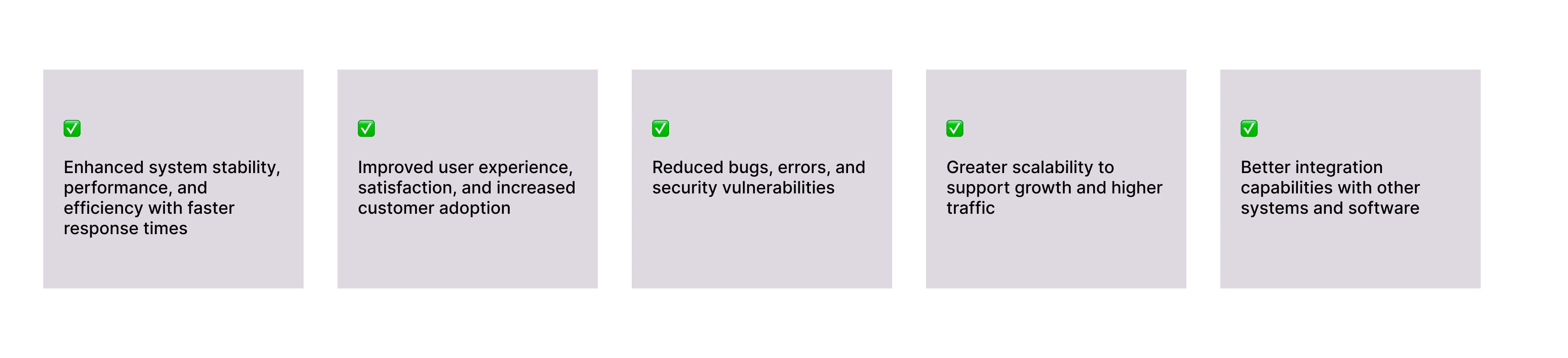
Although I do not have post-deployment data, the internal testing phase was designed to support these key metrics. Thorough testing helped reduce bugs and errors significantly and made sure the system could handle increased traffic without compromising performance. Security improvements and vulnerability reductions were also integral to our testing strategy, helping to safeguard sensitive financial data and build user trust.
What did I learn?
Balancing complex business requirements with user-centered simplicity is crucial.
Collaboration with accounting experts and stakeholders is key to validating workflows and ensuring accuracy.
Managing iterative design alongside ongoing development requires flexibility and quick adaptation to feedback.
Thoughtful information architecture is essential for improving usability.
Designing flexible solutions that serve diverse user groups effectively is important.
Next steps?
Conduct ongoing software assessment and monitoring to maintain performance, security, and usability standards
Identify and address issues early through regular evaluations
Provide comprehensive user training to support smooth adoption
Develop detailed documentation for effective system use
Collect user feedback post-launch to inform future updates
Plan iterative improvements based on evolving business needs
Like this project
Posted Jun 8, 2025
Redesigned CABSOL software to enhance UX, visual design, and functionality.
Likes
1
Views
1