Protecting Every Package: A UX Approach to Insurance and Claims
Juliana Orji
Protecting Every Package: A UX Approach to Insurance and Claims
Overview
In the logistics industry, things go wrong — packages get damaged, stolen, or even vanish in transit. Our goal was to reduce customer anxiety around these events by allowing users to insure their packages during checkout and make it easy to file a claim if things go south.
This feature was necessary for individuals and small-to-medium businesses.
Problem
Users had no protection if their package was lost, stolen, or damaged.
Complaints usually led to long back-and-forth emails and, more often than not, ended in frustration. There was no clear way to declare item value, pay for coverage, or file a structured claim.
This created trust issues, especially for high-value deliveries, and we needed to fix it.
Goal
Let users insure a package easily at checkout
Let users file a claim when something goes wrong
Make the claim process feel fair and straightforward
Approach
Adding insurance to a logistics platform wasn’t just about creating another form. It meant designing for moments of loss, frustration, and uncertainty — the rare but critical times when trust is tested.
As we explored the experience, a few key How-Might-We questions guided our thinking:
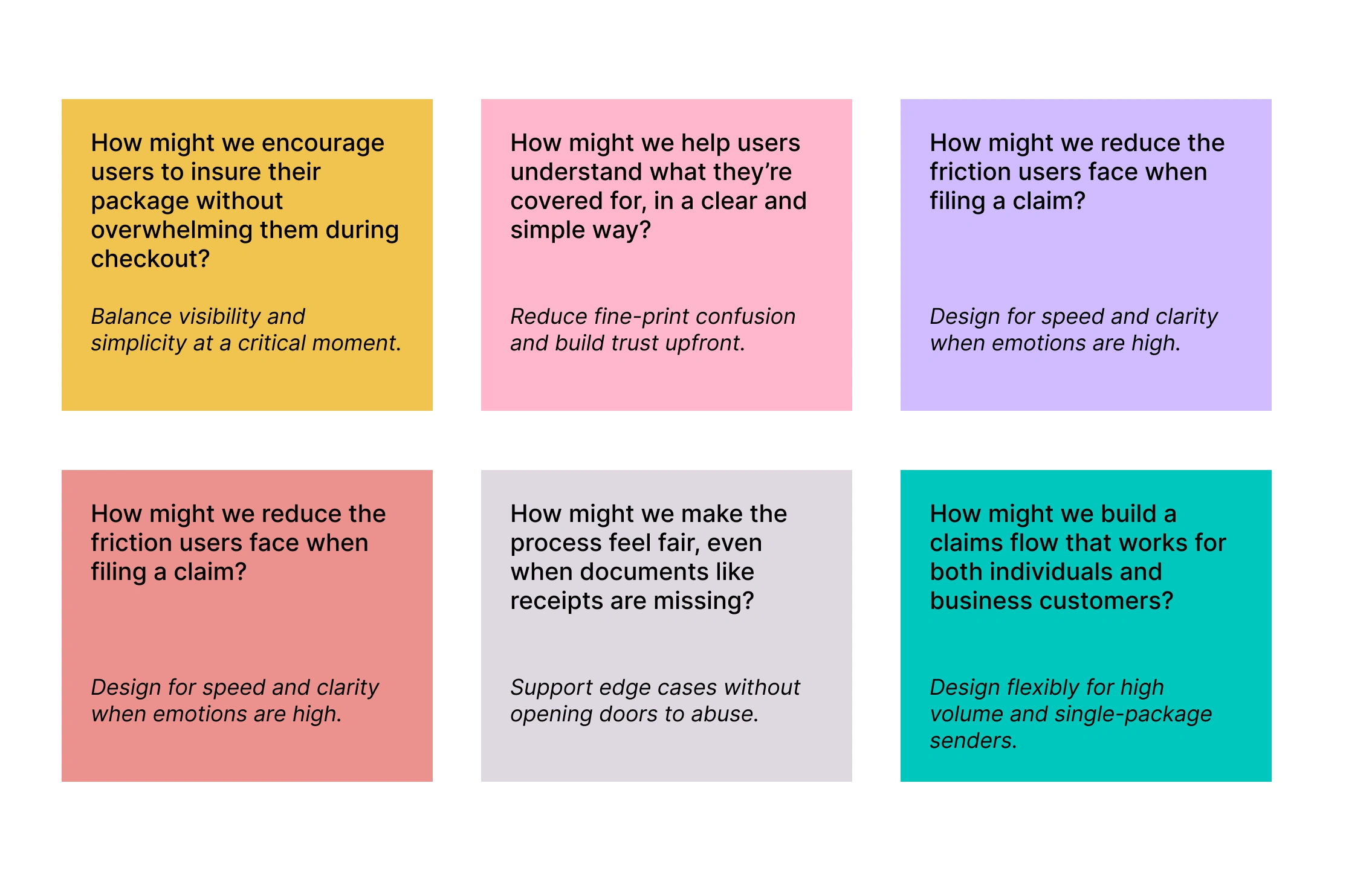
Understanding the Flow
We began by identifying two key moments in the user journey:
Before shipment, users can opt in for insurance.
After delivery (or failure), users can file a claim.
We mapped out the pain points in both flows and defined what “essential” means for each step. We aimed for a design that felt respectful of the user’s time, but still collected everything the insurance team needed.
User Flow Pain Points Map
Stage Pain Point Why It Matters Checkout Insurance option feels like an extra fee or is easily missed Users may skip coverage due to poor visibility or unclear value Confusion around what’s covered Users hesitate or abandon checkout if they don’t understand what insurance does Post-Delivery (Problem Detected) No clear starting point for filing a claim Users feel lost or frustrated when something goes wrong Filing a Claim Mandatory receipt requirement excludes gifted/personal items Honest users can’t complete the form and feel blocked Unclear which category (e.g., stolen, lost, delayed) to pick Leads to incorrect claims or rejections Users unsure what happens after submission Creates anxiety — “Did they receive it?” “Will I get refunded?” Claim Review Process Manual support escalation for edge cases Increases workload for support teams and slows resolution for all users Reimbursement Bank account detail entry feels risky or lacks confirmation Users worry about input errors or financial security
Design Decisions
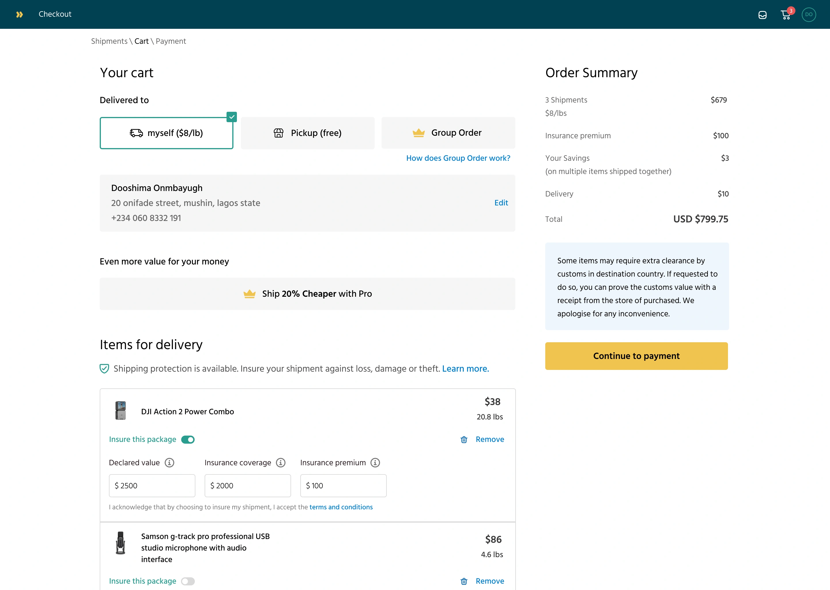
1. Insurance at Checkout
We added an optional insurance module on the checkout screen.
Users enter the declared value of the item(s). The system then shows a small fee based on that value (e.g., 1.5% of item value). The total cost updates in real-time.
This decision was influenced by:
Feedback that users wanted to know the cost upfront
The need to balance transparency with simplicity
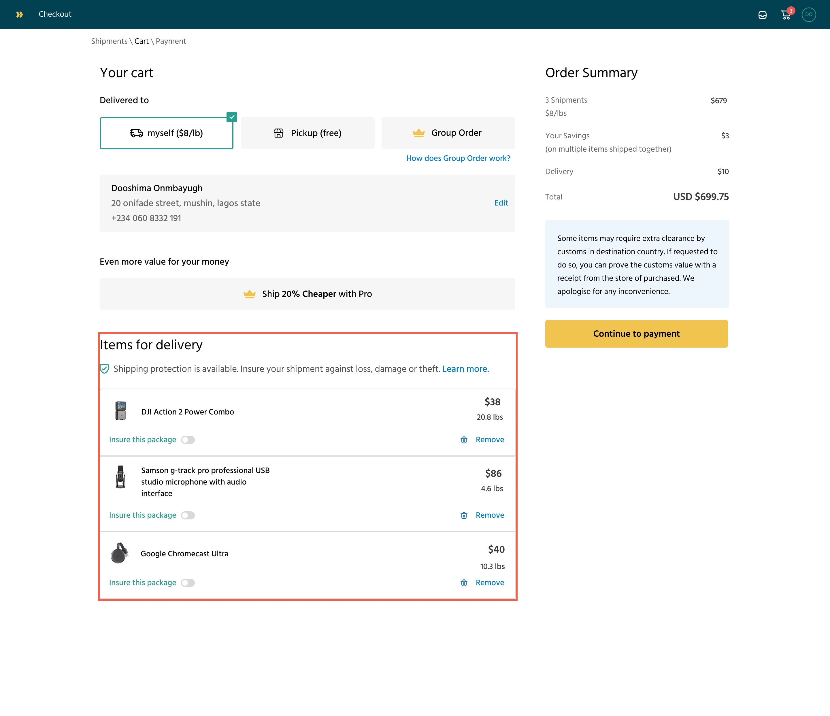
Customers could see the option to insure specific packages. They just have to toggle on the items to be insured
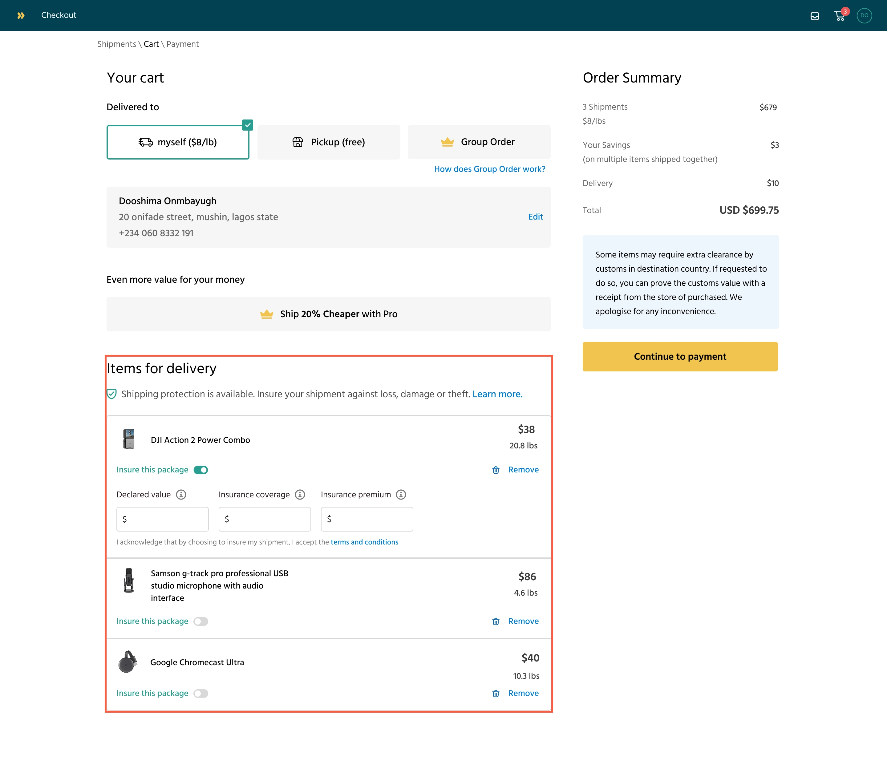
Once the insurance toggle is on for an item, it prompts the customer to declare the item's value
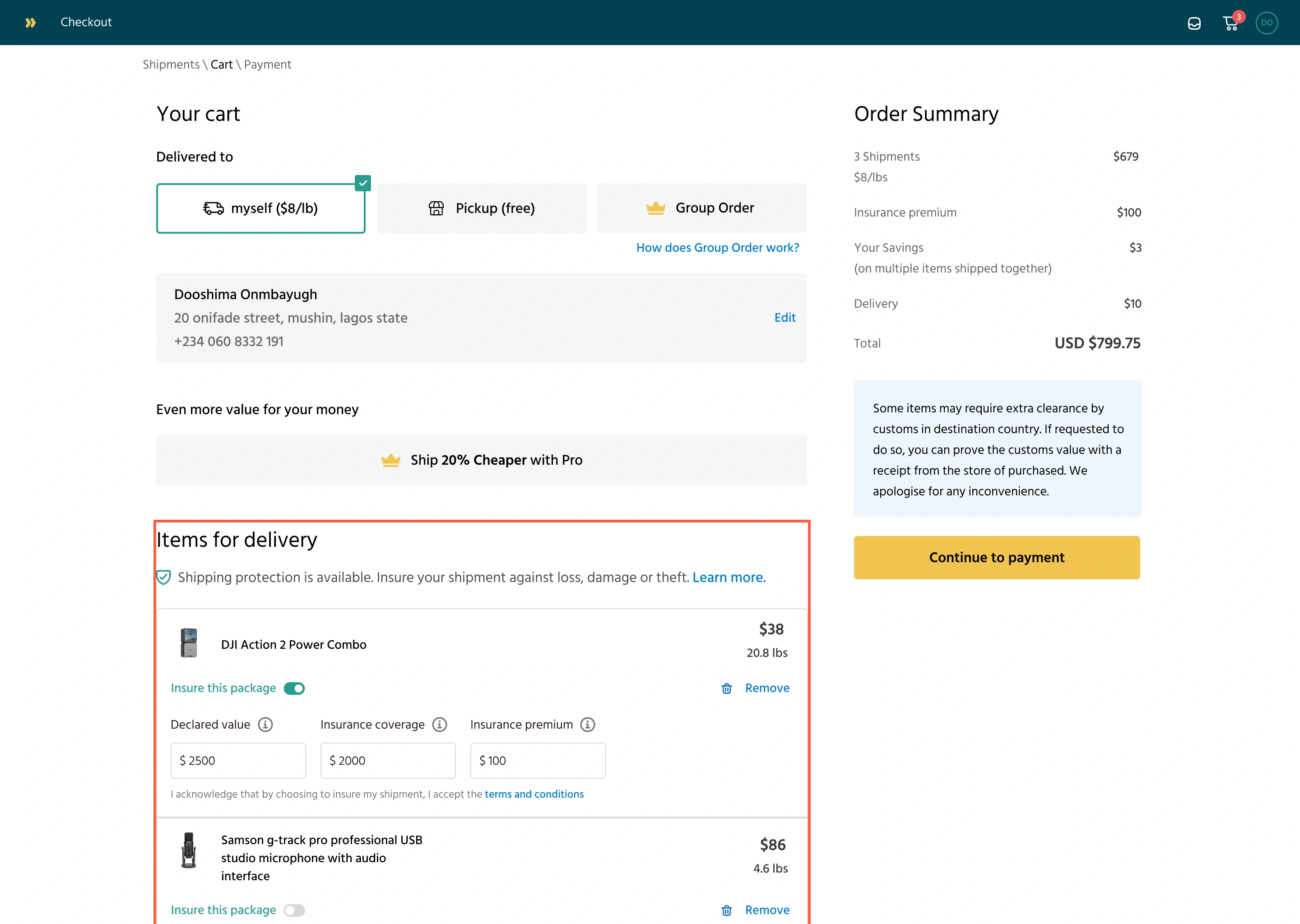
Once the customer declares the item value, the insurance coverage is calculated, as well as the insurance premium. The insurance premium is added to the checkout bill.
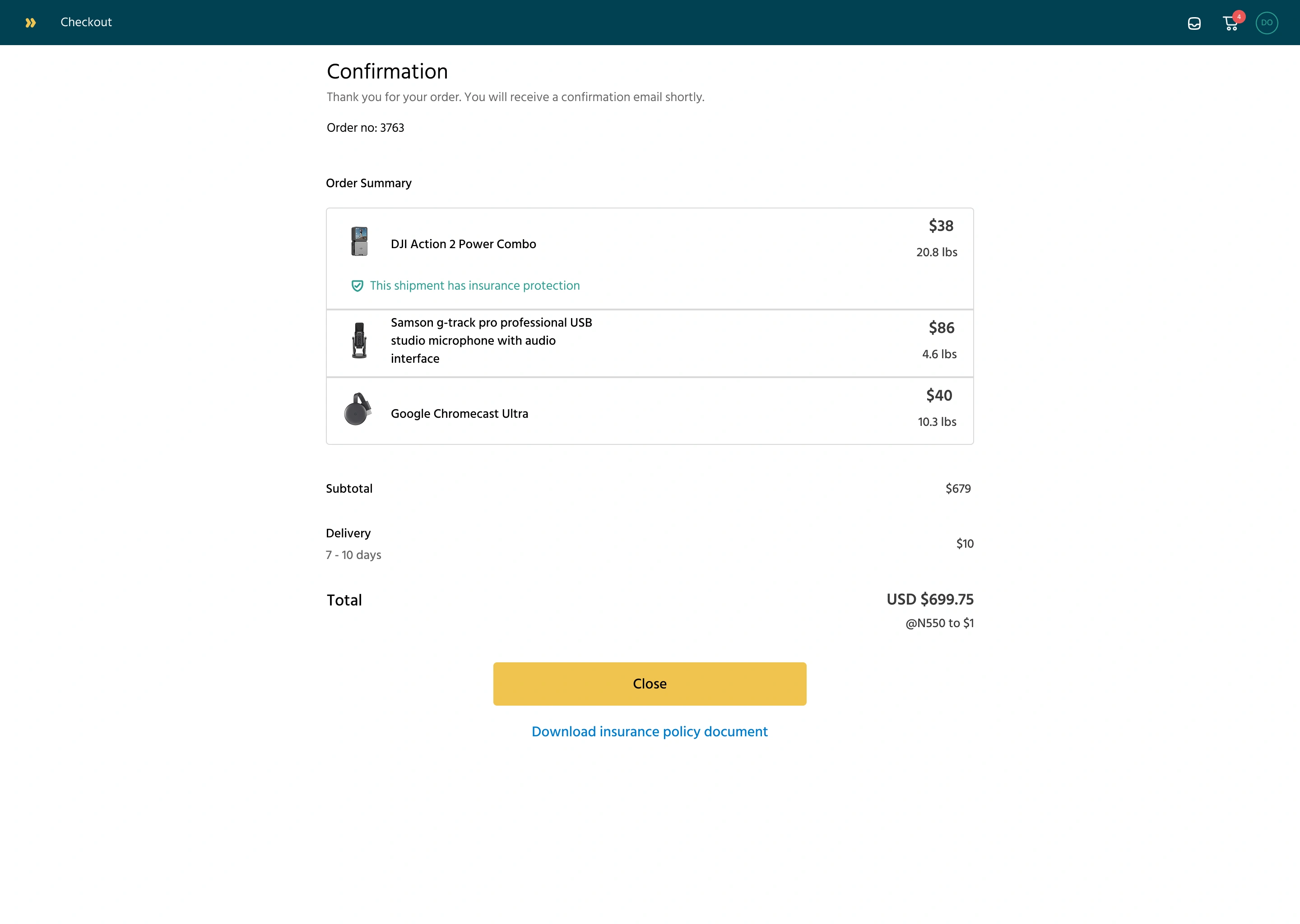
The user checks out, and the order summary shows which shipment was insured. There’s also a further option to learn more about the insurance policy
2. Filing a Claim
The claim form had to be easy but thorough. It includes:
Claim Category: lost, damaged, stolen
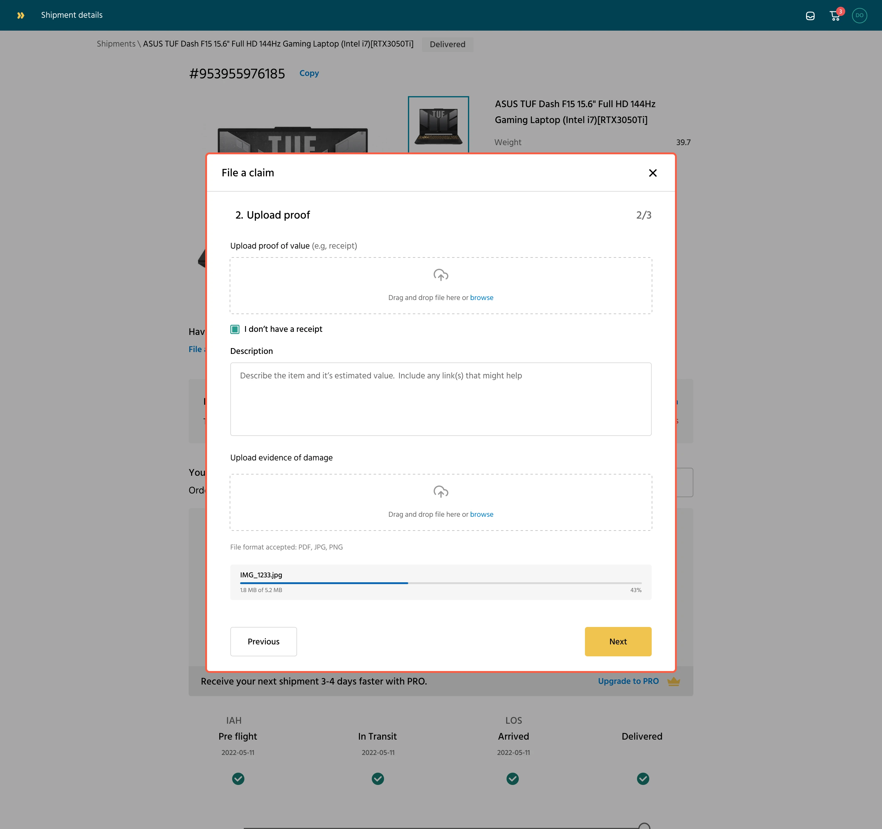
Proof of Value: receipt, invoice, etc. (image or PDF)
Proof of Damage: photos, reports (image or PDF)
Refund Bank Account Details
Optional comments for extra context
We used clear labels, visual upload indicators, and progress feedback (like “3 of 4 steps complete”) to help users stay informed as they filled it out.
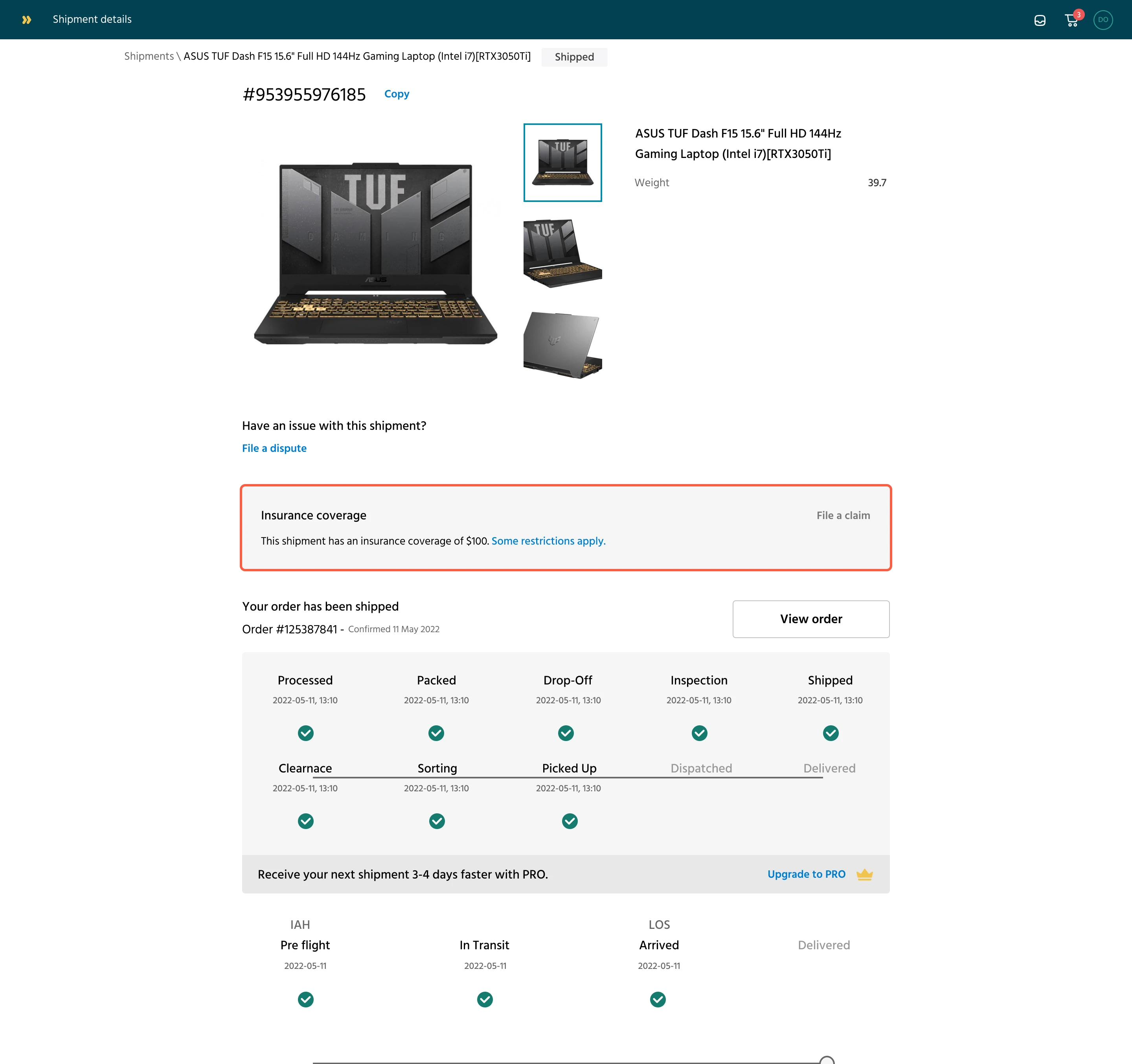
On the order details page, customers can see their shipment status. They can also see their insurance coverage on an item.
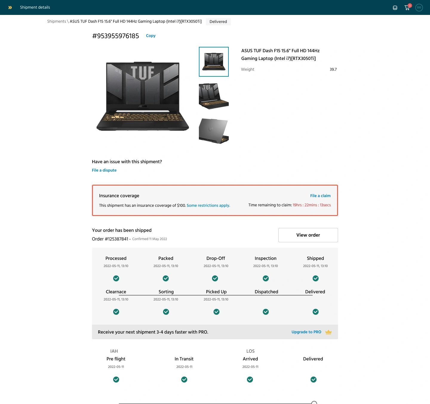
Once an item’s status is delivered, customers can choose to file a claim within 72 hours.
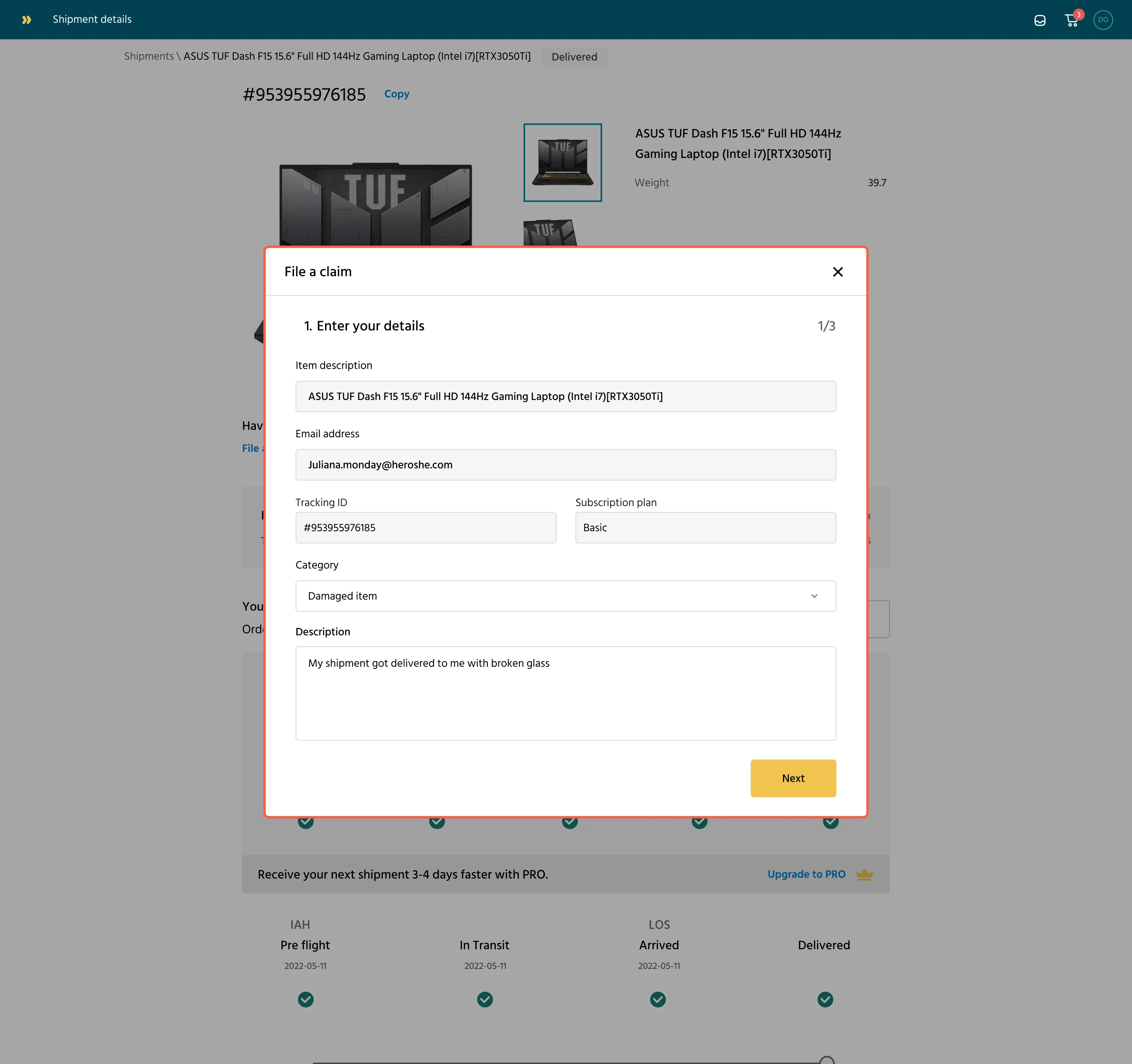
To file a claim, a customer selects a category and a description of the issue. e.g, damaged item.
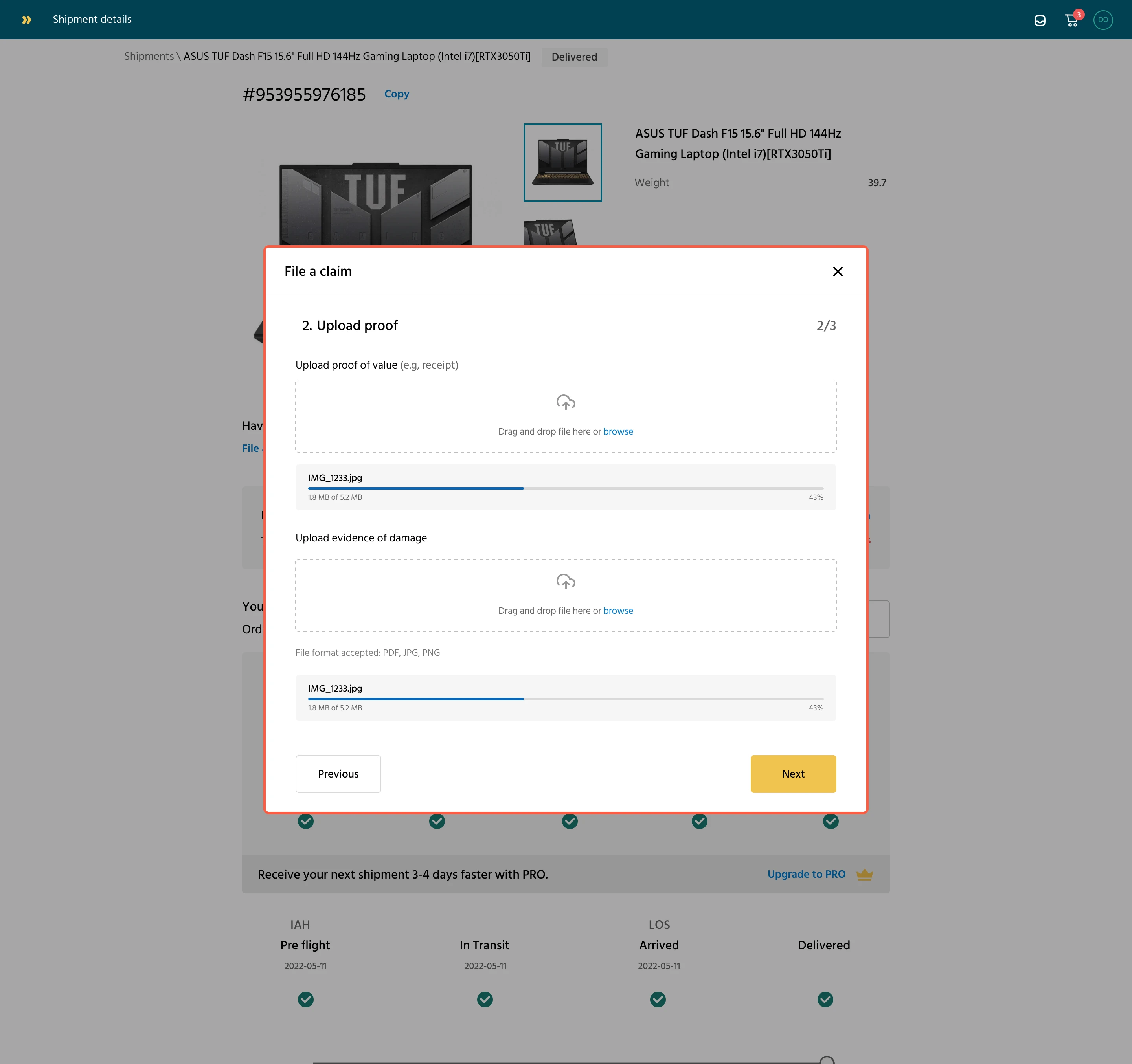
The next step is to upload a receipt that shows proof of value and another image as evidence of the damage to the item.
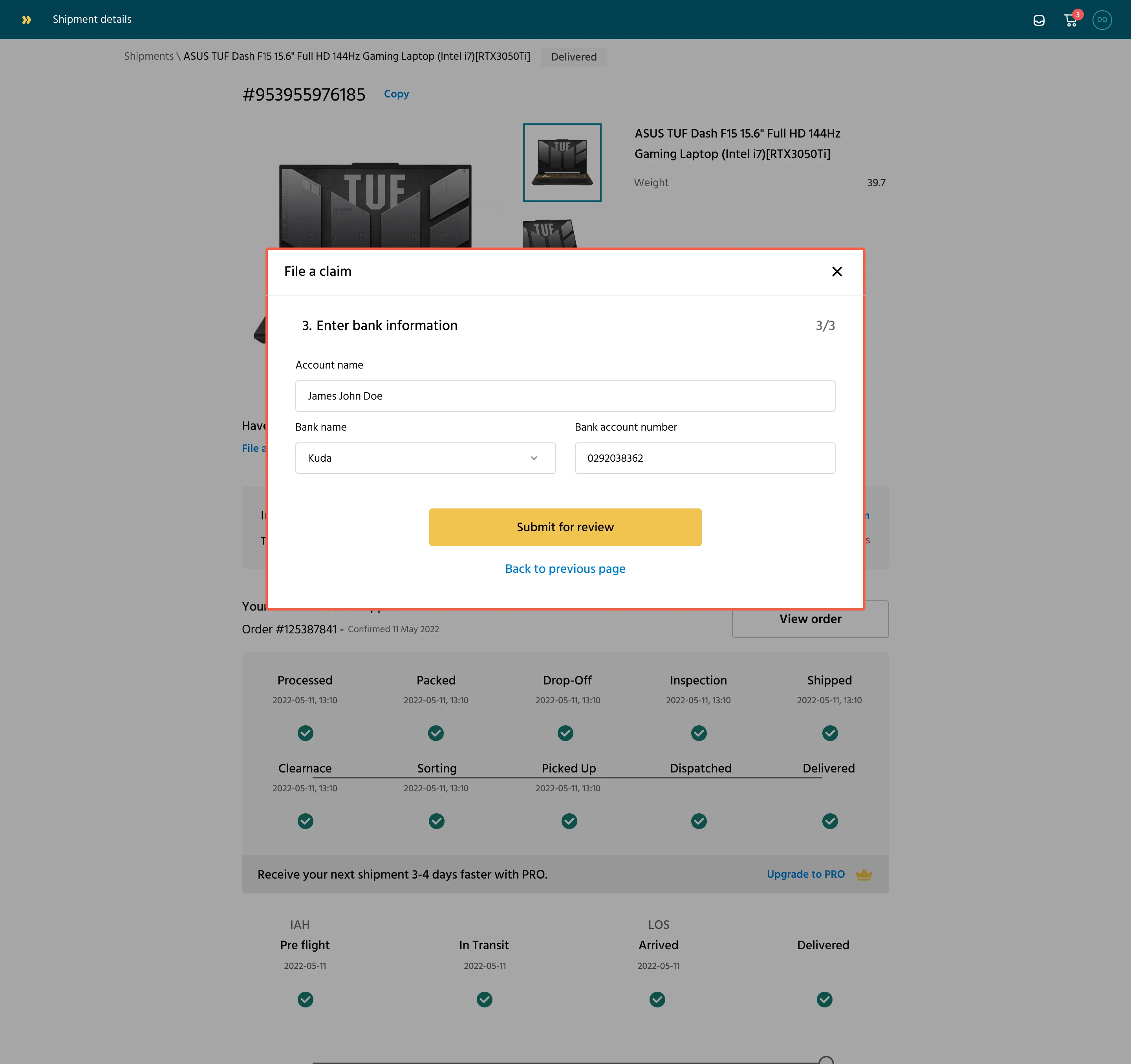
The last step is the customer entering their account details for a potential reimbursement if their claims are approved
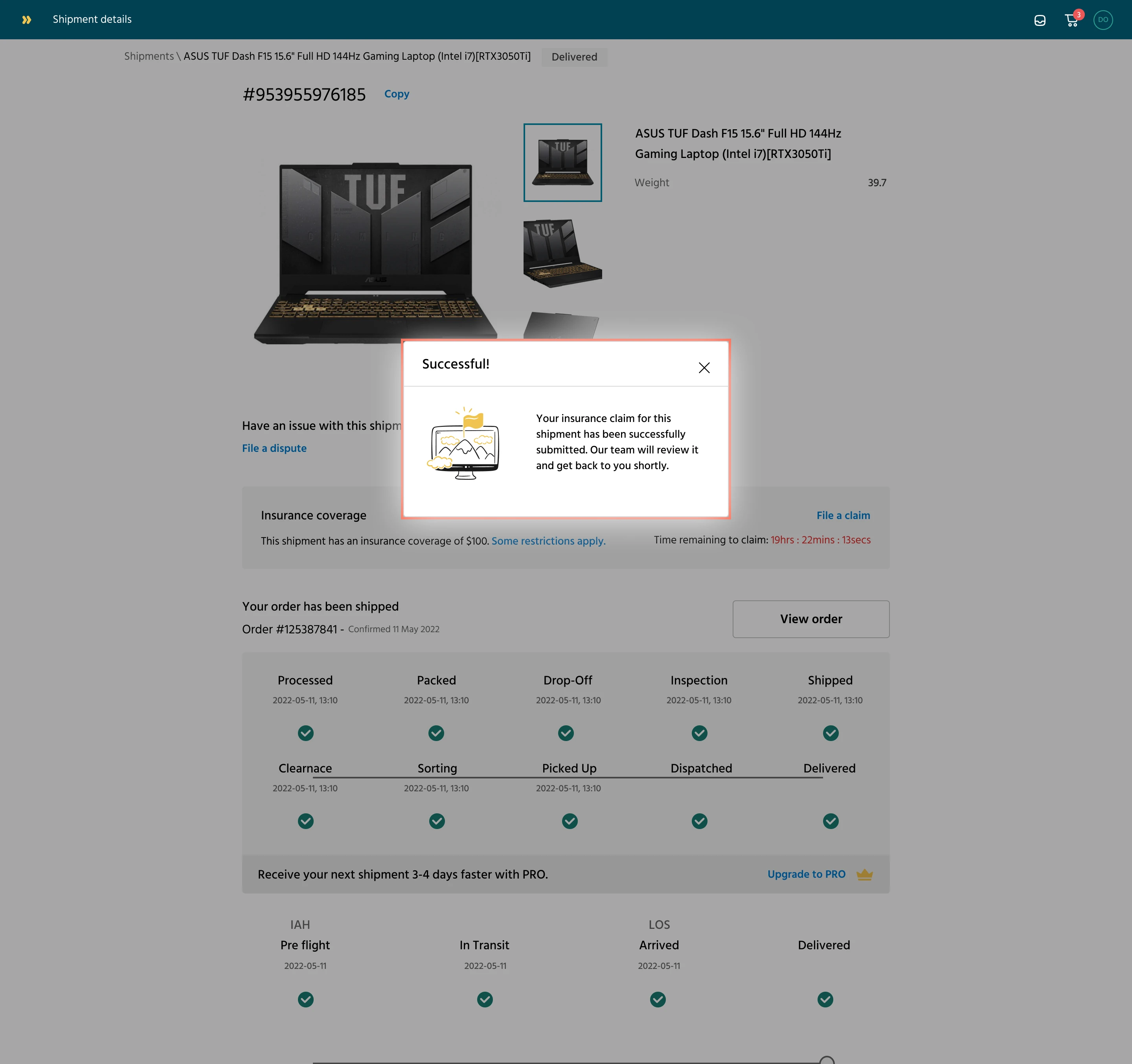
After completing the form, a success modal appears, notifying the user that the claim will be reviewed shortly.

Insurance claim processing state
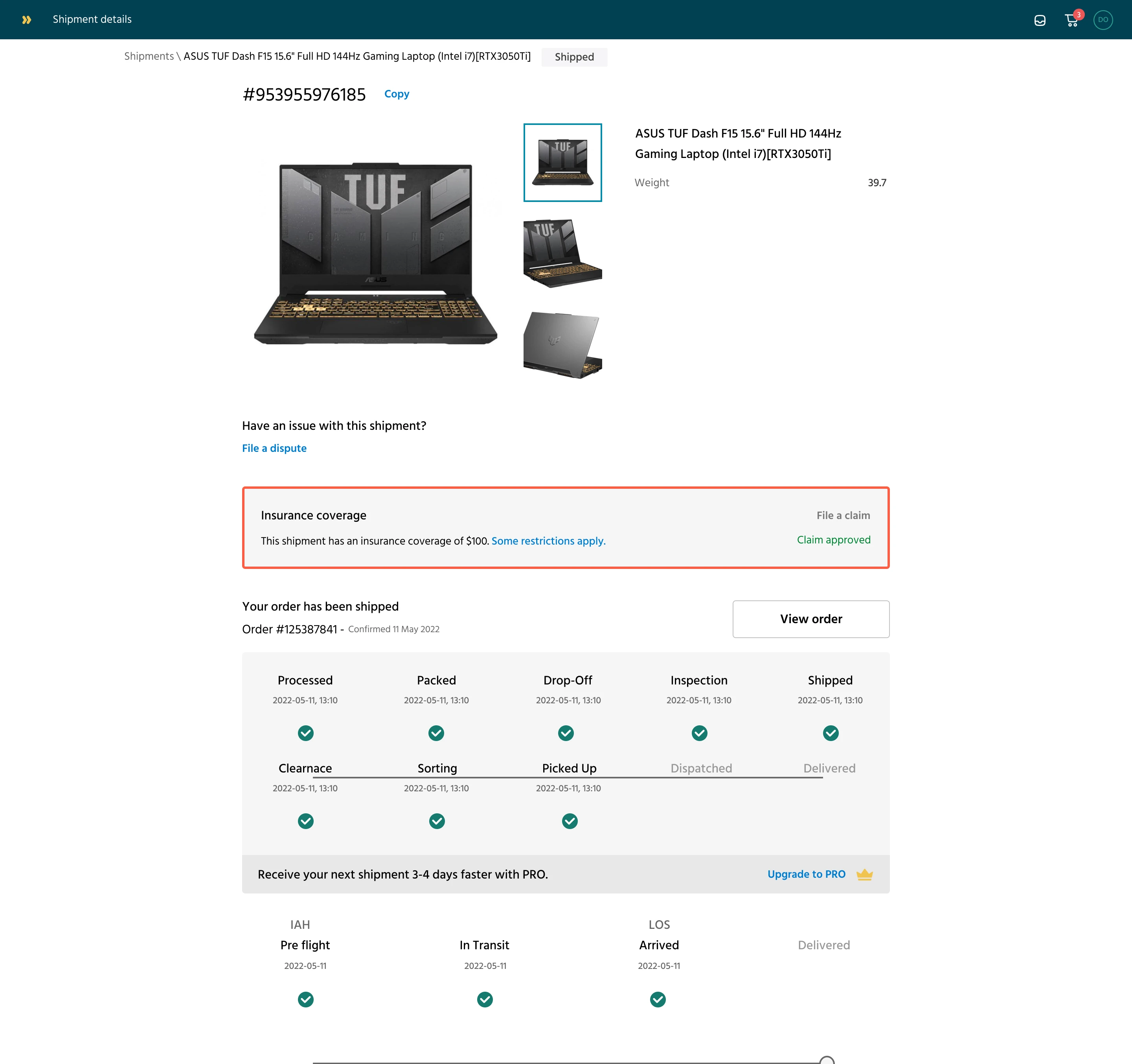
Insurance claim approved
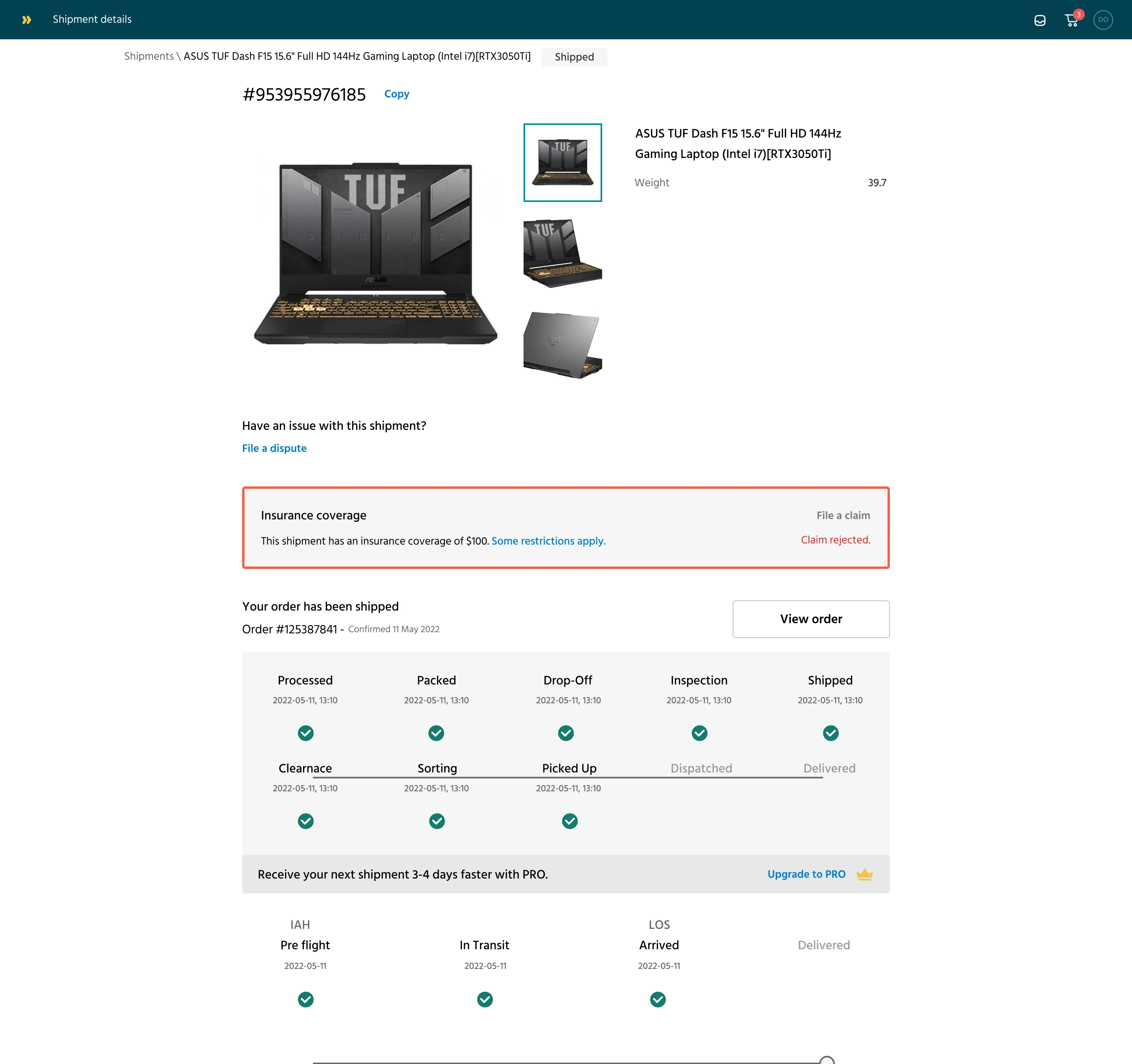
Insurance claim rejected. Usually, we communicate the details via email with no further action here
Designing for edge case considerations
One of the edge case considerations included
- No proof of purchase (e.g., gifted item)
The problem:
Some users were sending gifted or personal items — like a used laptop, or clothes — and didn’t have a receipt or invoice.
Our original design required a receipt for all claims. This meant some valid claims were being abandoned or rejected simply because there was no "proof of value."
We introduced flexible options like "I don't have a receipt" with a prompt for a written explanation.
What we did:
We introduced an alternative option: “I don’t have a receipt.”
This triggered a text box where users could write a description of the item and its estimated value.
We also allowed uploads of screenshots of marketplace listings, email confirmations, or personal valuations, giving the insurance team more flexibility.
Why It Mattered:
It made the claims system more inclusive and realistic. Many real-world shipments don't come with receipts, but still carry value. Supporting these cases helped us serve everyday users, not just businesses.
What did I learn from designing this feature?
Designing around risk is different. Insurance adds layers of seriousness and compliance. The experience needed to feel safe, not casual, even though the goal was simplicity.
Edge cases are real cases. Scenarios like “no receipt,” “gifted item,” or “partial damage” came up often. Accounting for them early avoided future rework.
Cross-team alignment is key. Claims involve support, finance, and legal. Having everyone weigh in during design reviews helped balance user needs with backend requirements.
Trust is a design outcome. Clear, fair processes (especially for claims) made users more confident in using the platform for high-value deliveries.
A small feature can shift perception. The simple act of offering insurance made the entire logistics product feel more “premium” and reliable.
Designing for the bad days matters. Most logistics flows focus on success. Designing for failure (like when a package gets lost) builds deeper user loyalty.
Like this project
Posted Jun 8, 2025
Our goal was to reduce customer anxiety by allowing users to insure their packages during checkout and make it easy to file a claim if things go south.
Likes
0
Views
1