Built with Jitter
Brand Identity Development for Axioma

Afifudin Zuhri


Challenge
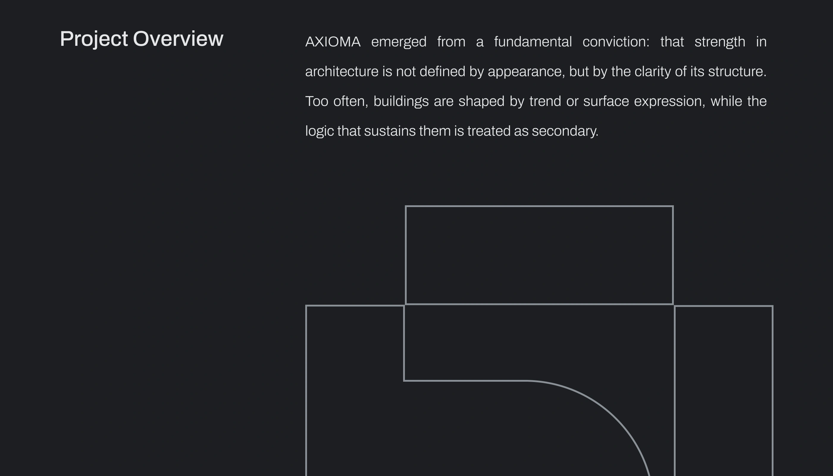
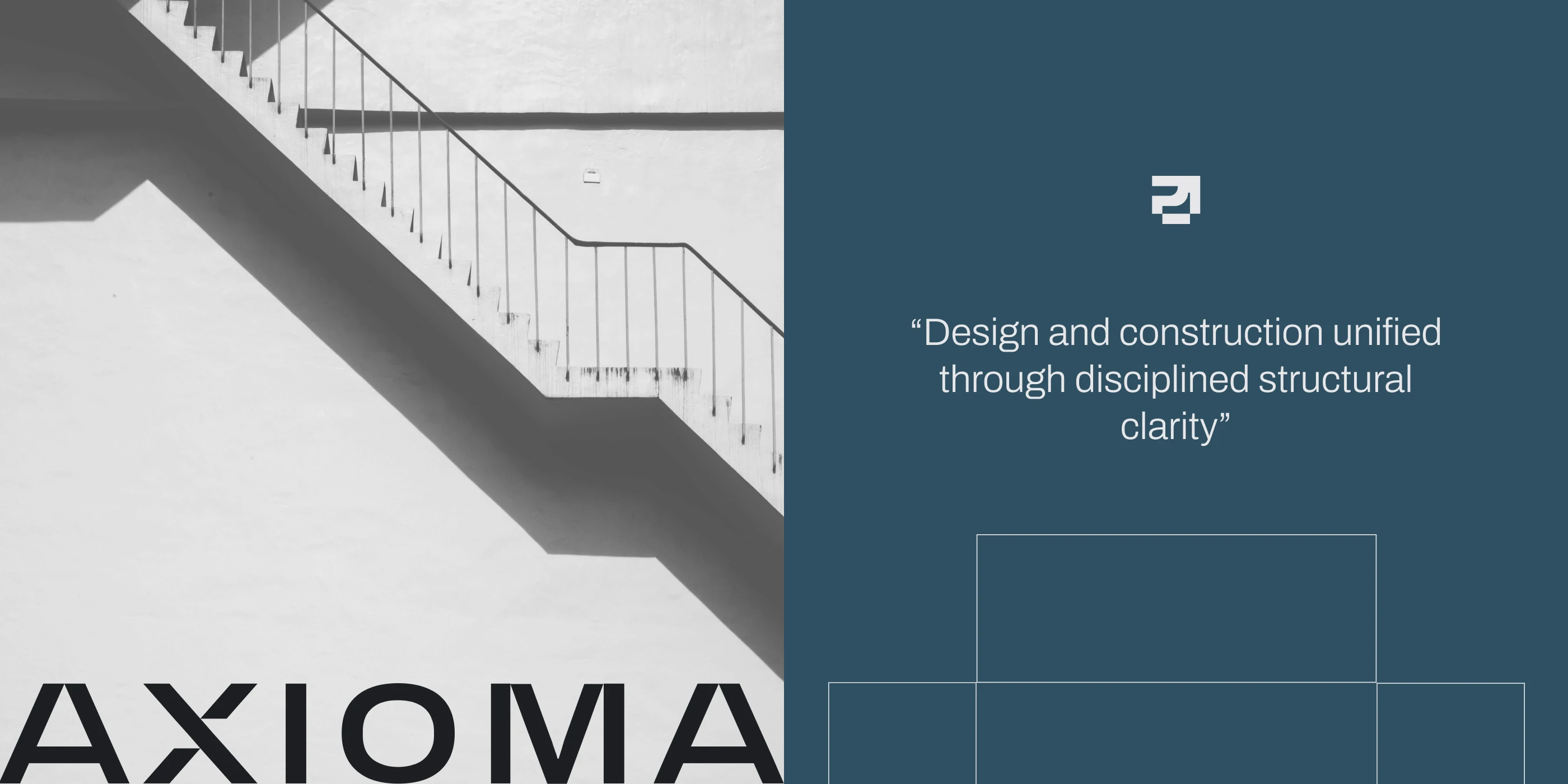
Many architecture and construction firms operate as separate disciplines resulting in fragmented processes, misaligned decisions, and compromised execution. Design often prioritizes visual expression, while structural logic and build feasibility are addressed later in the process. AXIOMA needed a brand identity that clearly communicates integration, precision, and structural clarity — without appearing generic or decorative.
Solution
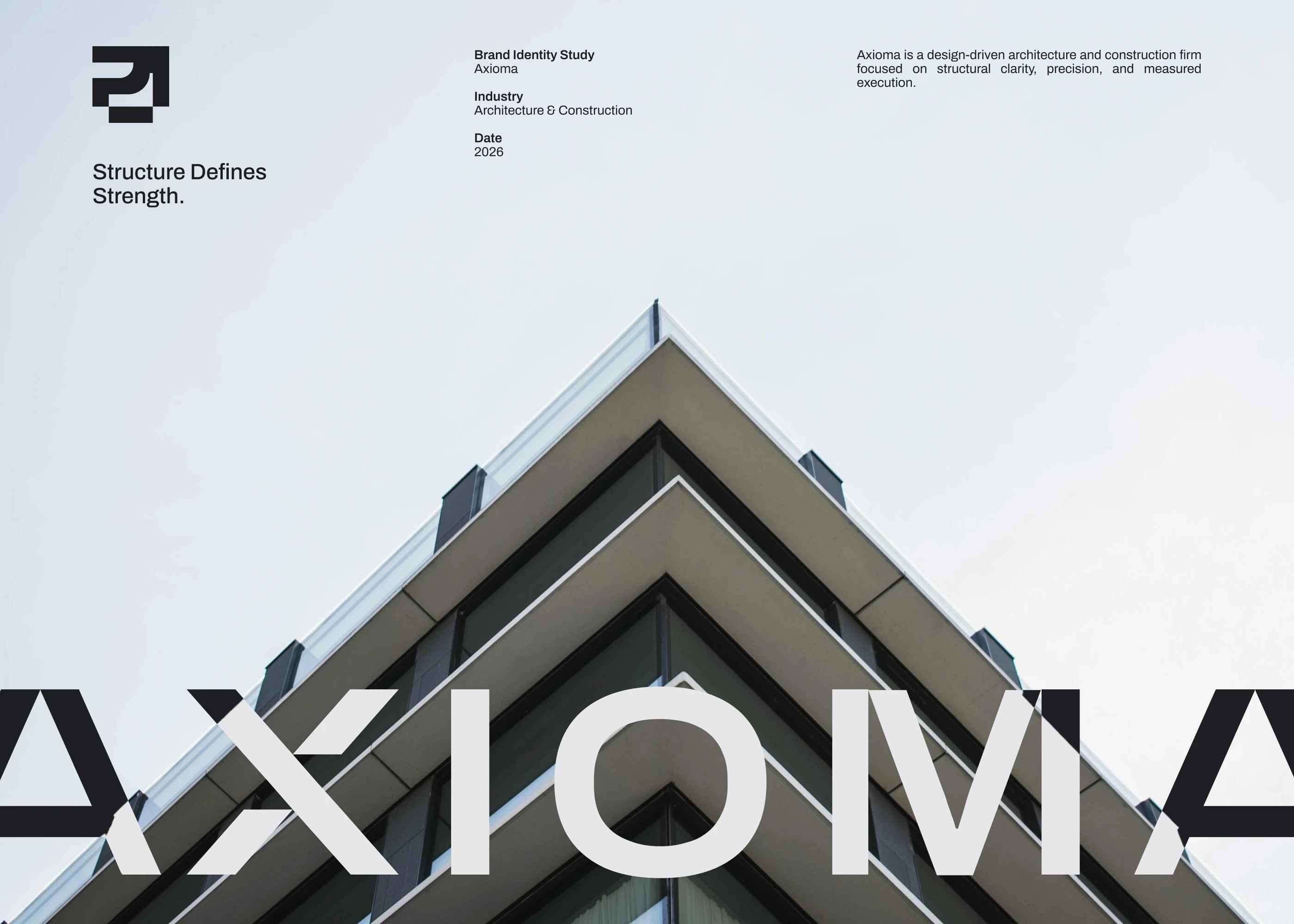
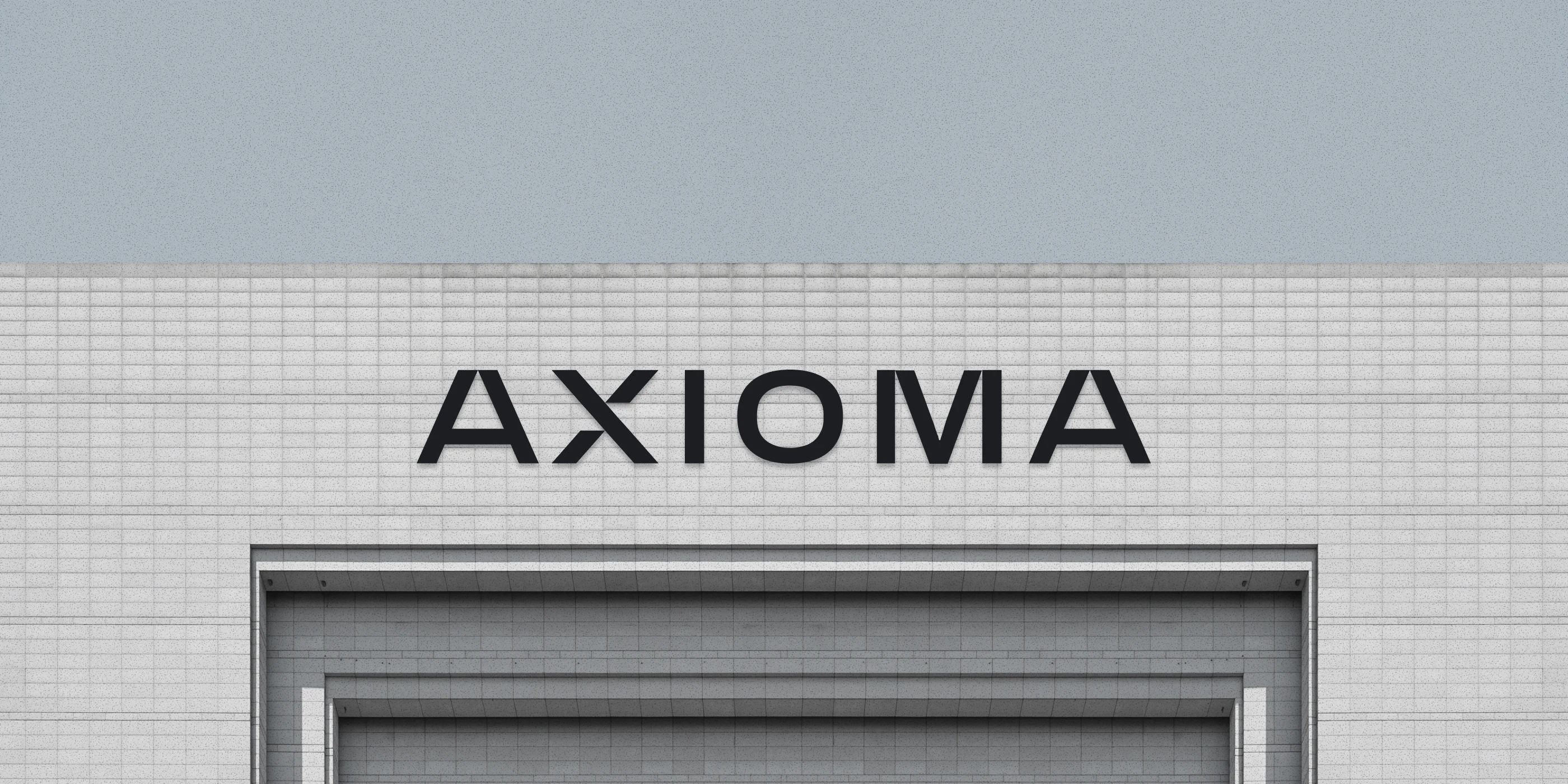
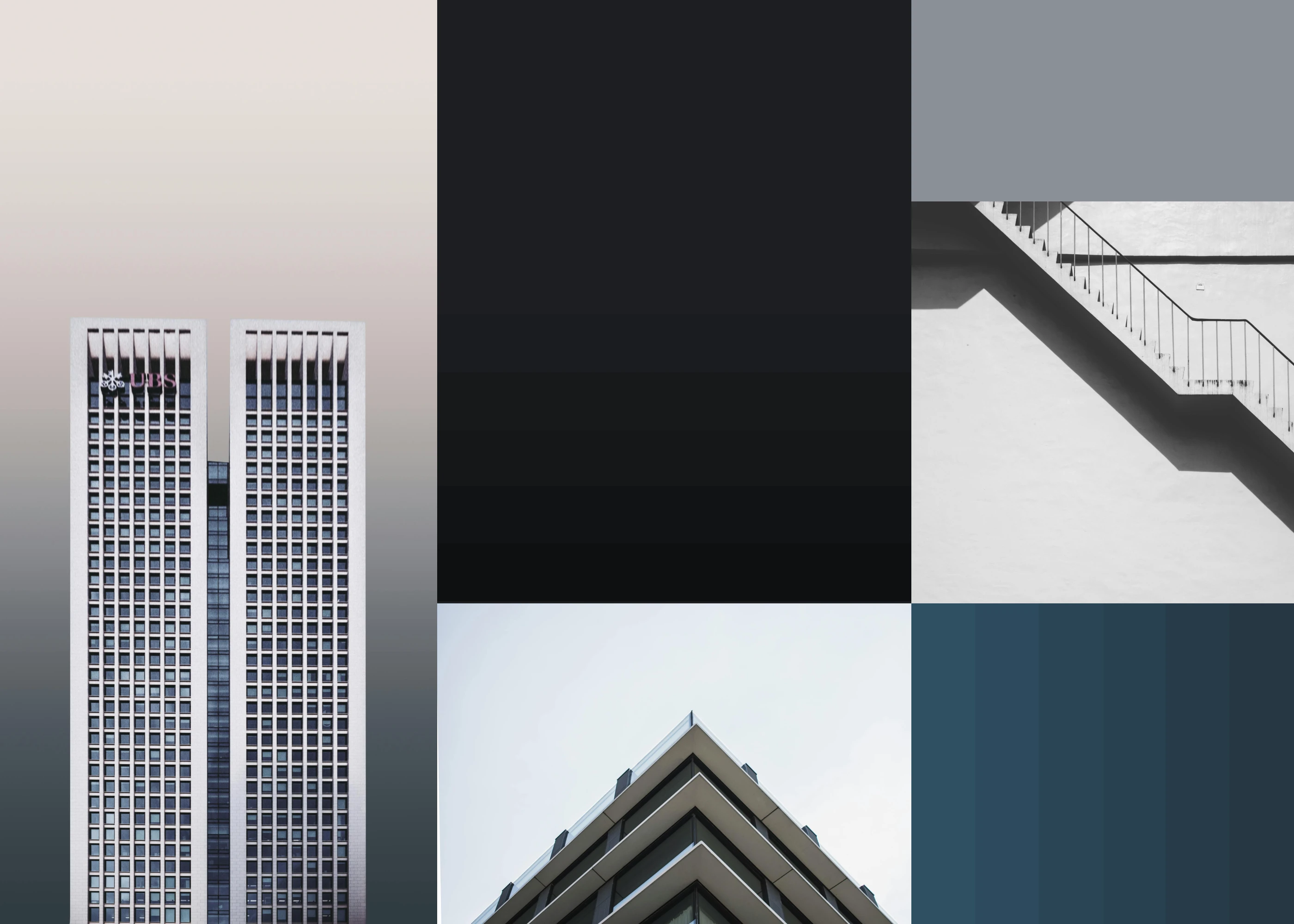
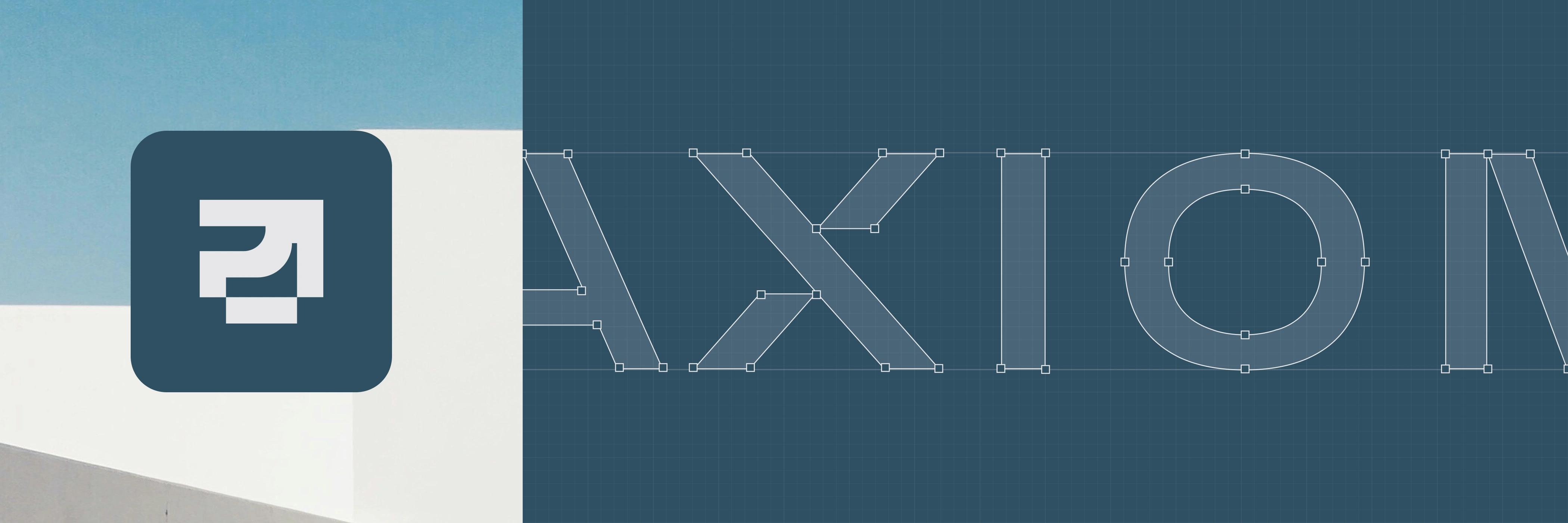
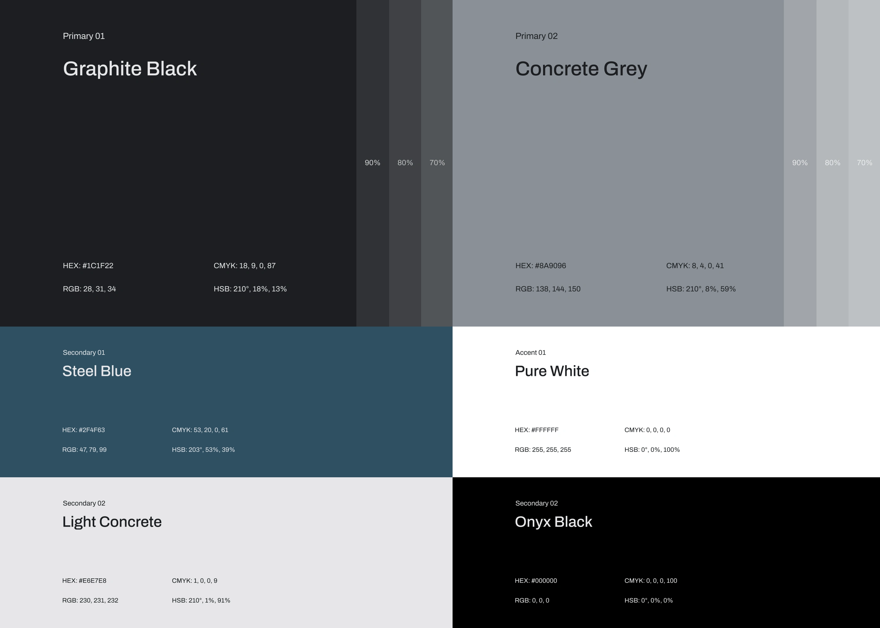
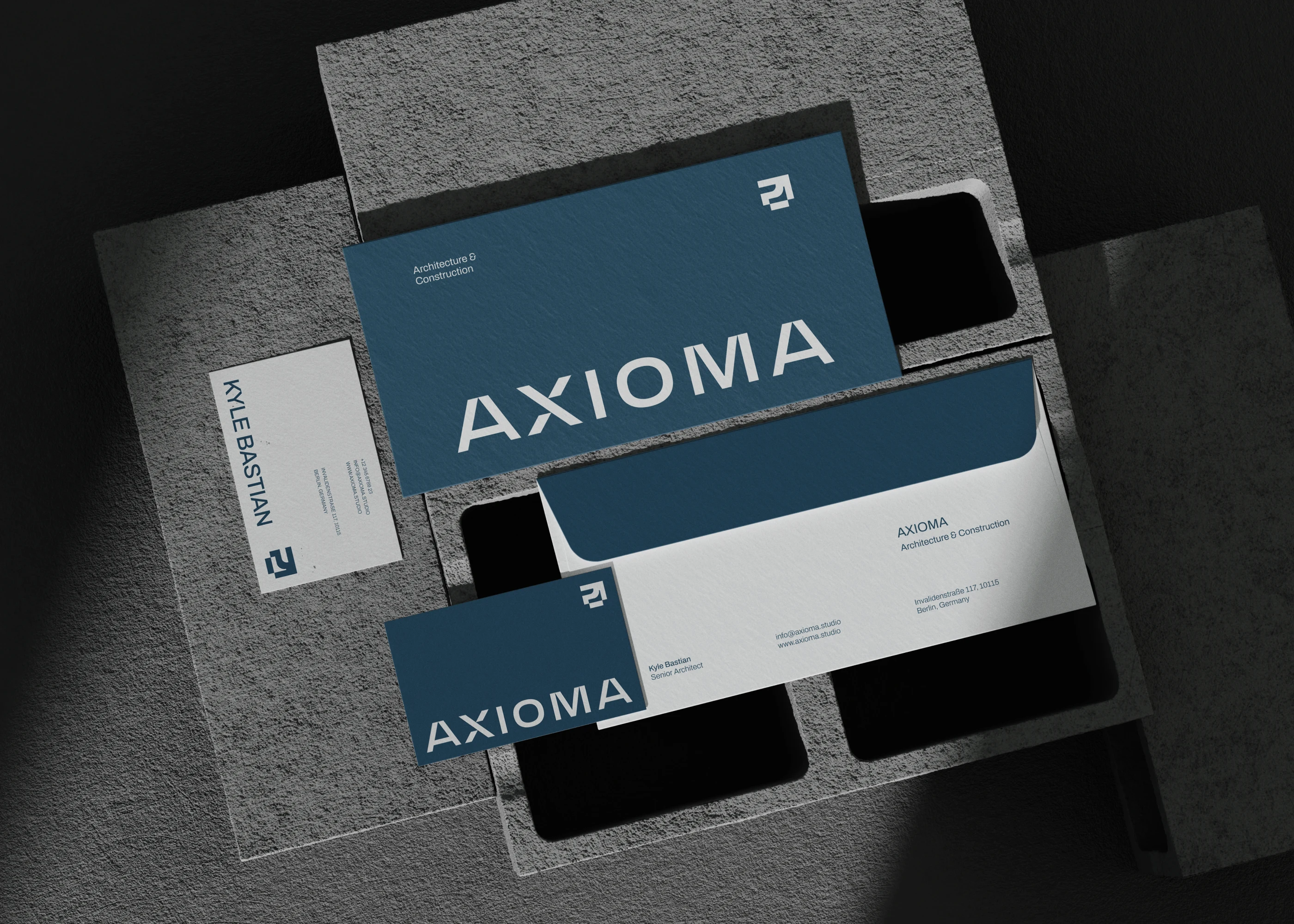
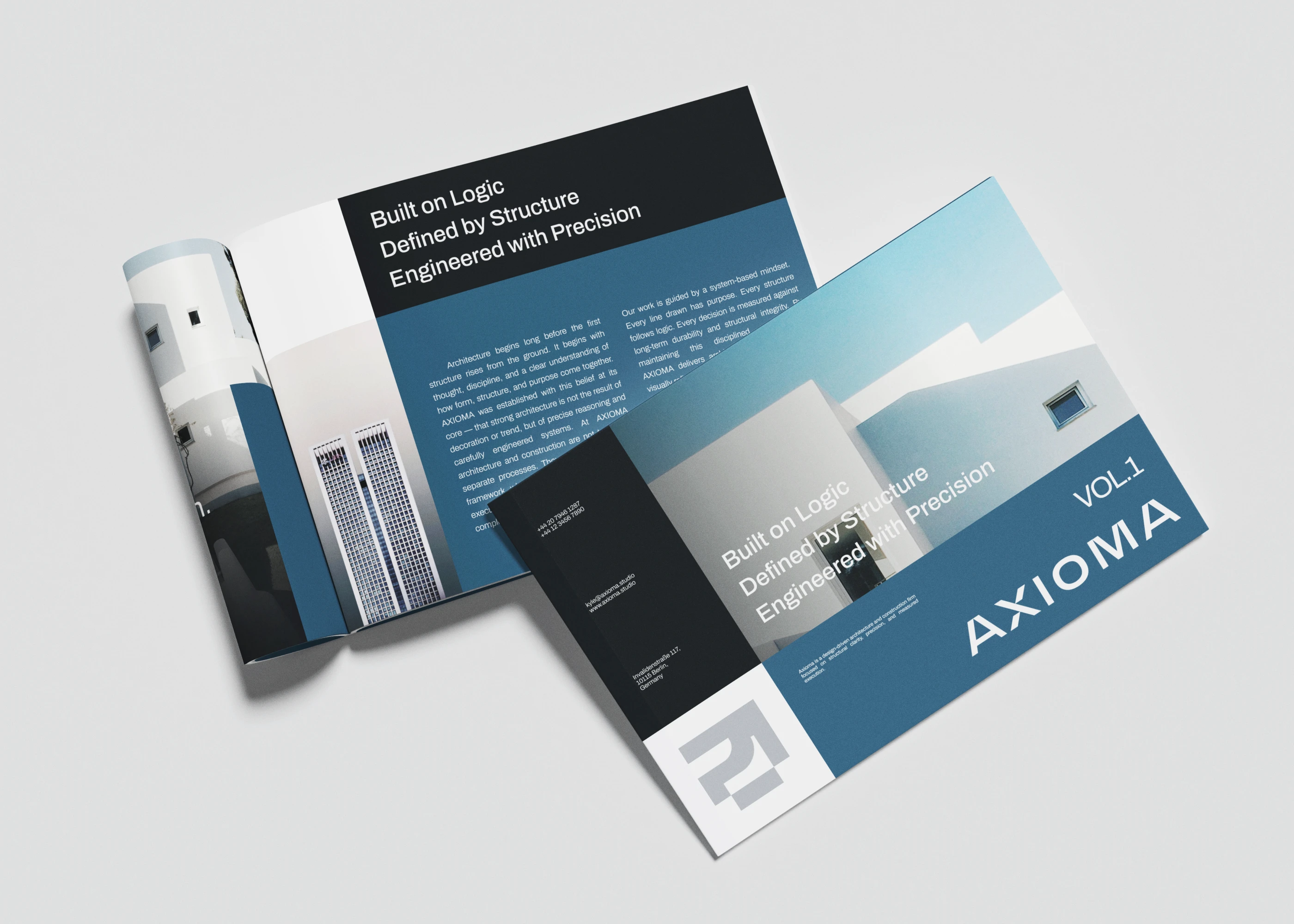
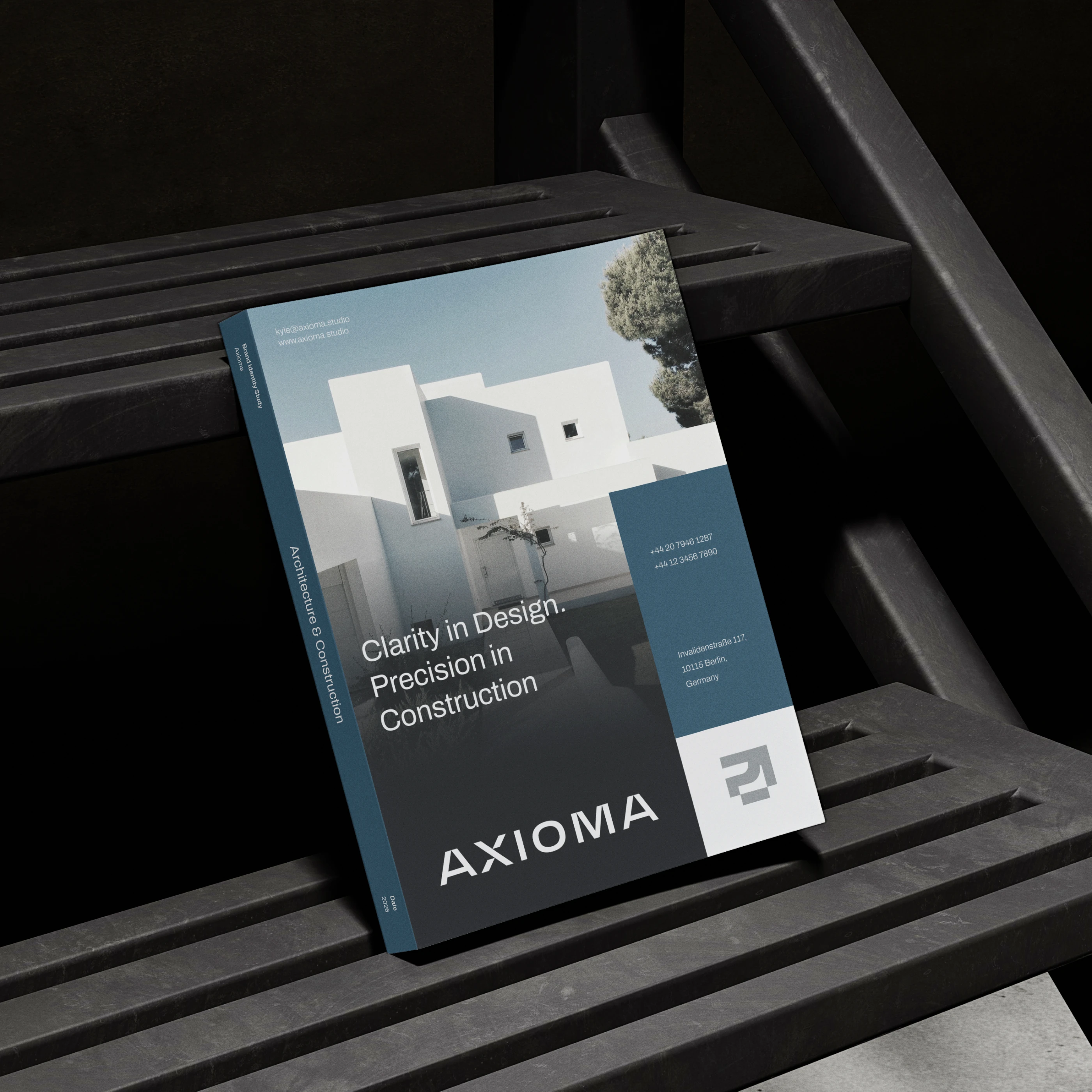
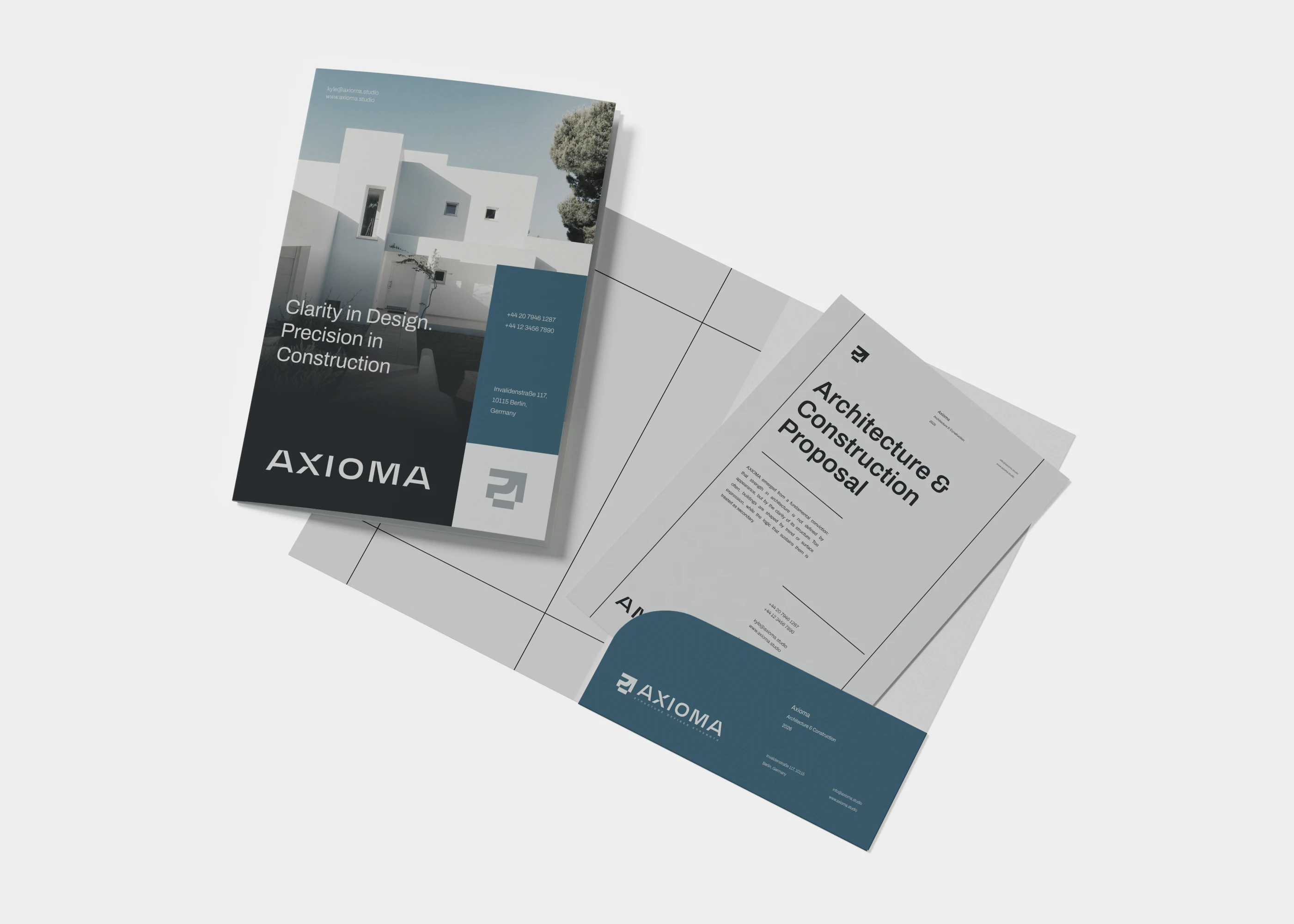
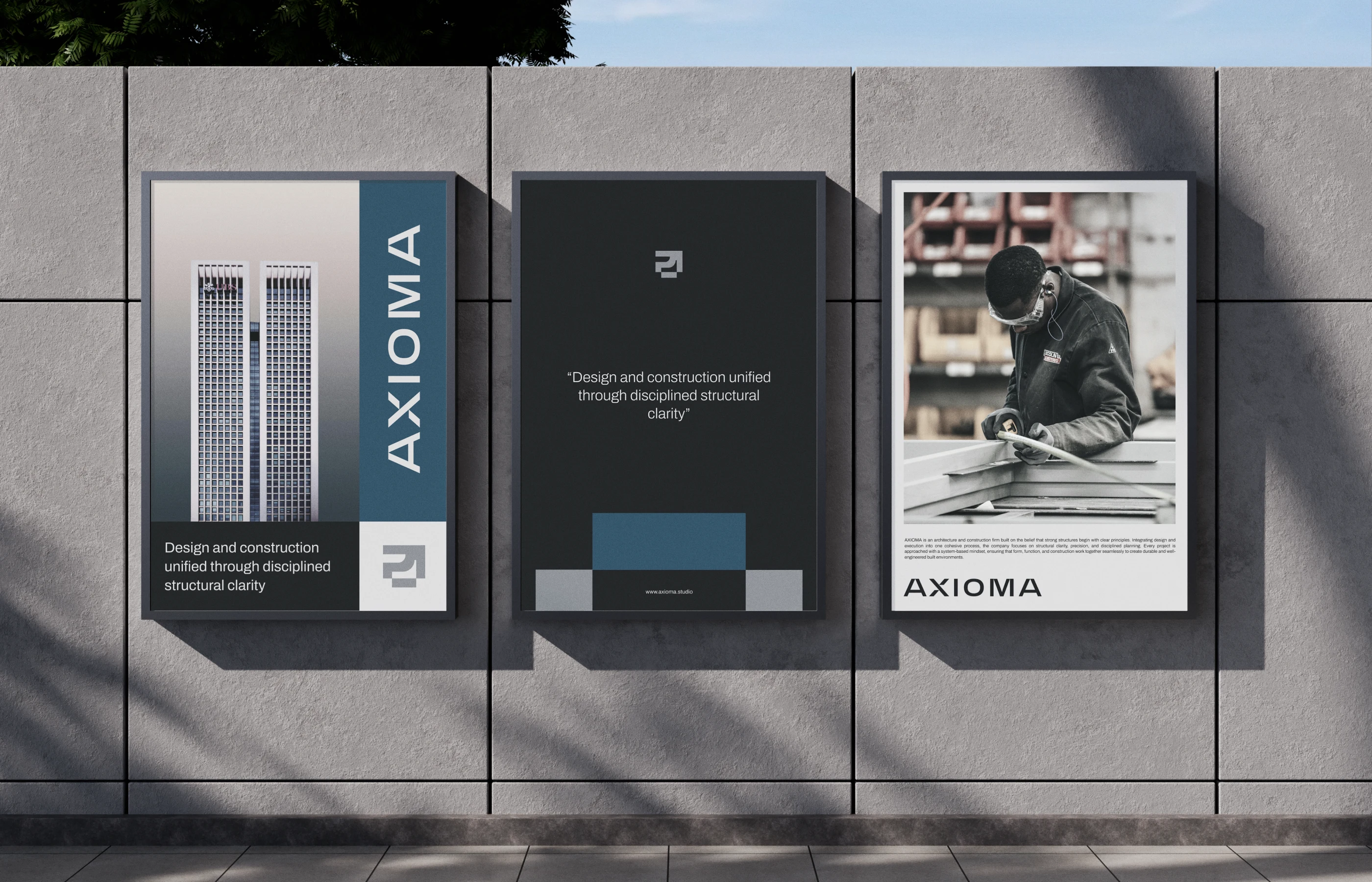
The identity was built on a system-based approach, reflecting the integration of design and construction into one coherent framework. A structured wordmark and grid-driven visual language were developed to express logic, stability, and measured execution. The restrained color palette and disciplined layout system reinforce clarity, durability, and professional confidence. The result is a brand that feels engineered rather than styled — grounded in principle, defined by structure.

RUKURU STUDIO
Axioma Brand Identity
Creative Director — Afifudin Zuhri
Graphic Designers — Lutfi Alwi, Zainul Khafidz
Motion Designer — Madebynoval
Mockup Assets — Vitora Mockup
Build Brands That Matter.
→ Collaborate with Us!
Like this project
Posted Jun 25, 2026
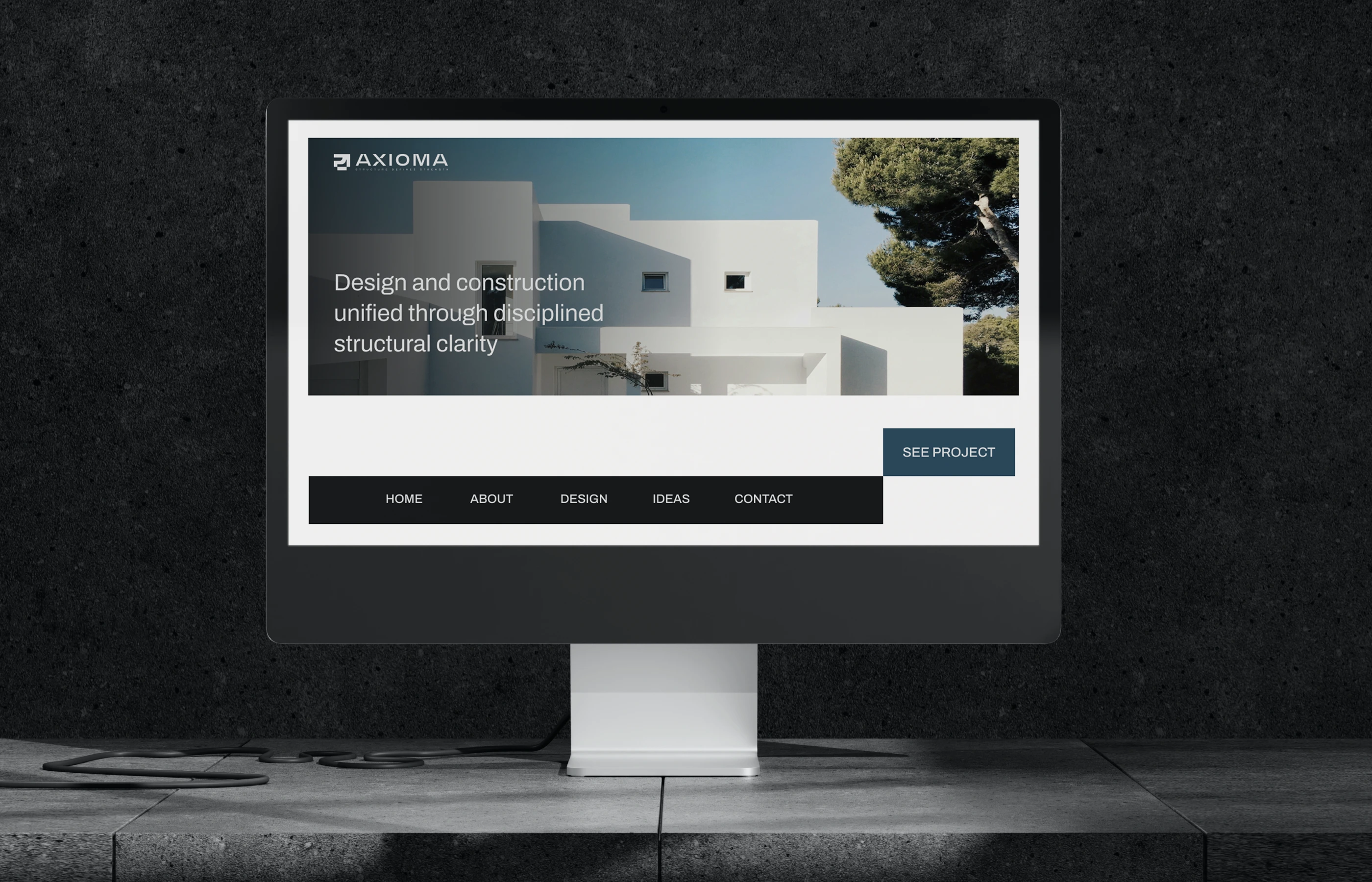
Created a modern brand identity for Axioma, highlighting precision, integration, and consistency through a distinctive visual system across every touchpoint.