The Saya School - Brand Identity Project
⭐️ The Brief
The Saya School brand identity project was aimed to craft a bold and compassionate identity that embodies the school's dedication to empowering future female leaders. The design integrated authenticity, compassion, and innovation, ensuring a nurturing and transparent educational environment.
👉🏽 Design Requirements
Authentic
Hummingbird or bumblebee
Elegant
Chic
Modern
☝🏽First Step
Yaya has selected our Brand Identity package which includes a Brand Strategy Workshop. Within this workshop, we clarified every corner of The Saya School's branding. Here are a few things we covered during our workshop that was signed off to be included in the Brand Strategy Summary:
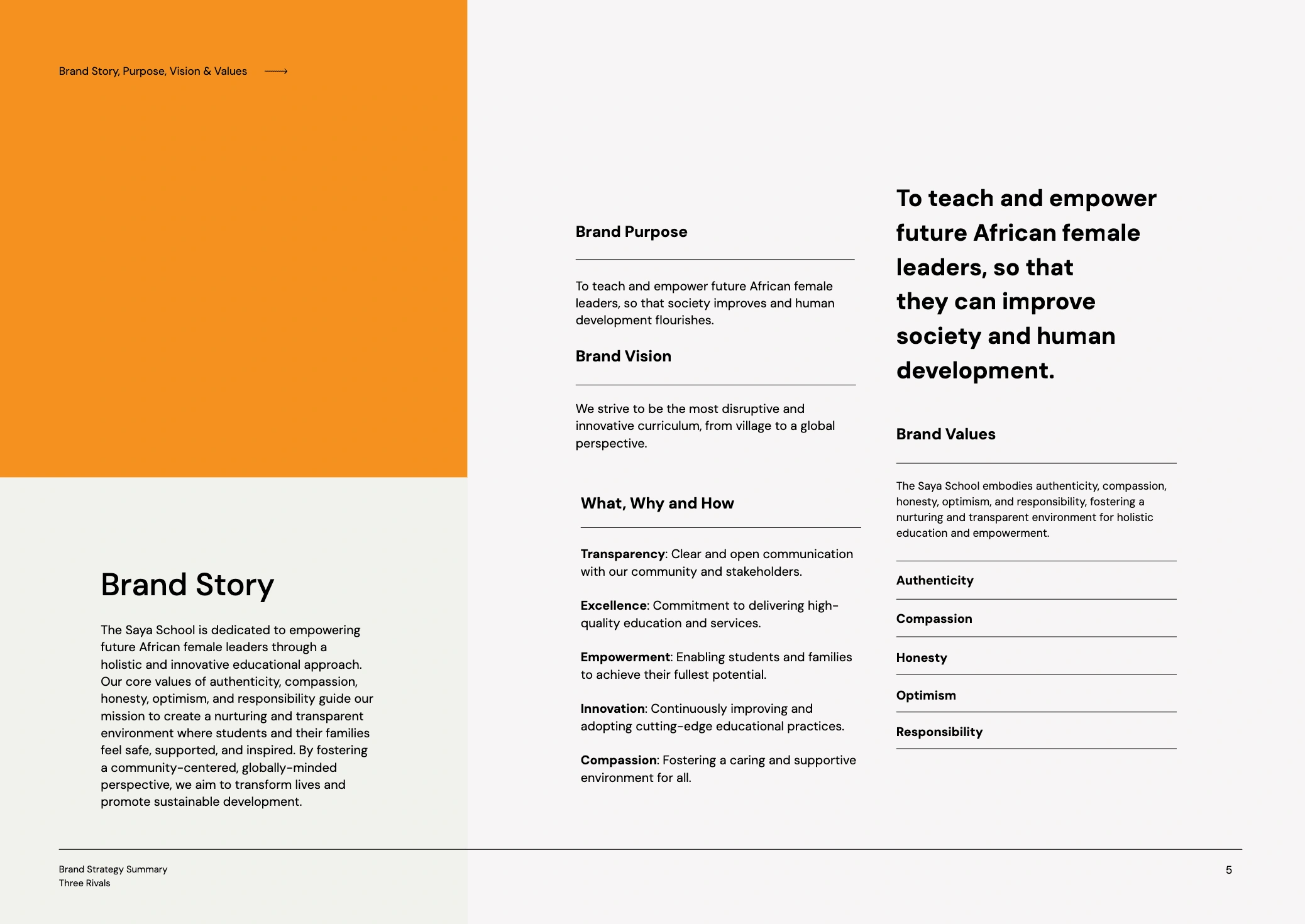
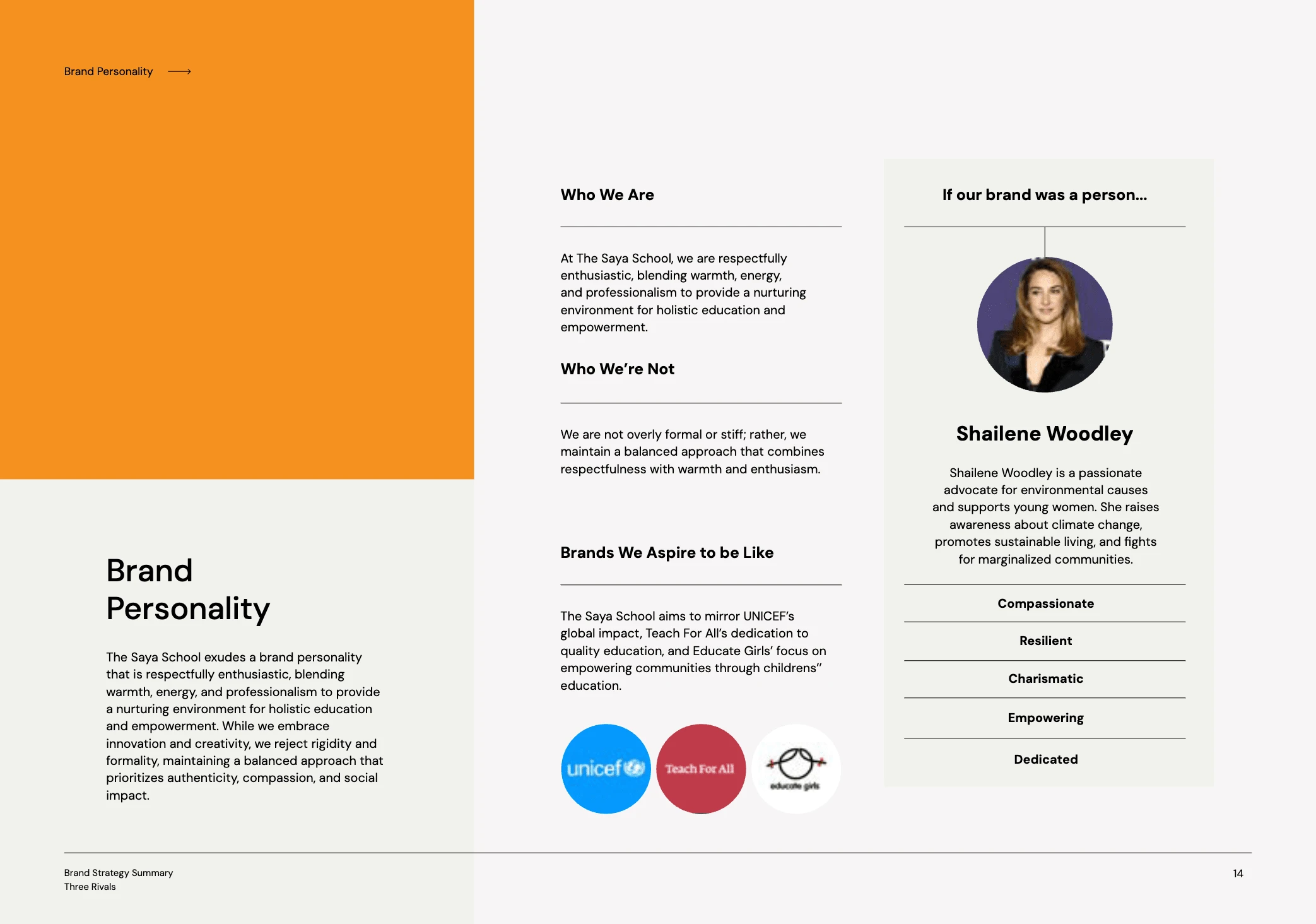
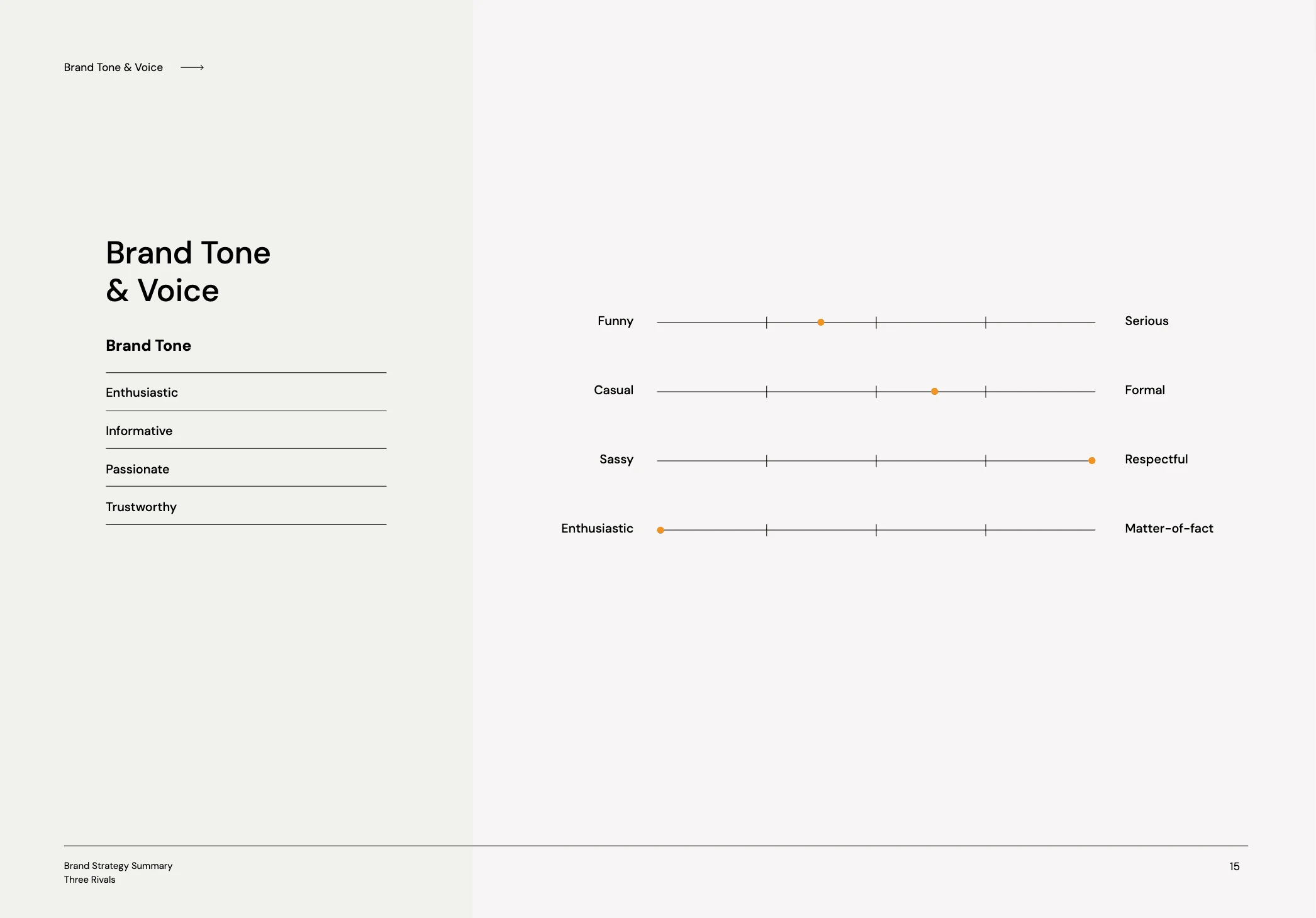
In conclusion, we were able to successfully clarify The Saya School's branding through our Workshop and Yaya was pleasantly surprised at how much value was given throughout this workshop. Now, time for the design fun!
✍🏽 Creative Directions
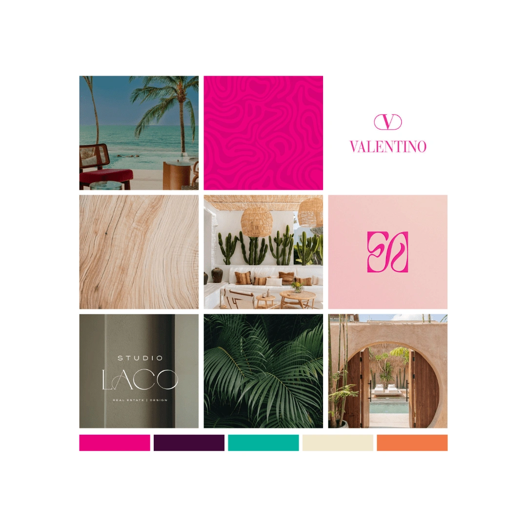
When it comes to creative direction, Yaya wanted the designs to lean more towards the feminine side since the school is primarily for girls. Within the color palette, she also wanted a beachy and natural overall feel which is why I've included two warmer colors (light beige and orange) and two cooler colors (dark purple and teal) for a balance and color options for the boys.
✍🏽 Iterations
Because Yaya had given me two approved nouns, the hummingbird and the bumblebee, for her logo, it was a matter of which one made the most sense with her strategy and creative direction. With that said, the clear winner of the two is the hummingbird. Here are some initial sketches of hummingbird with somehow incorporating the letter 'S', if possible:
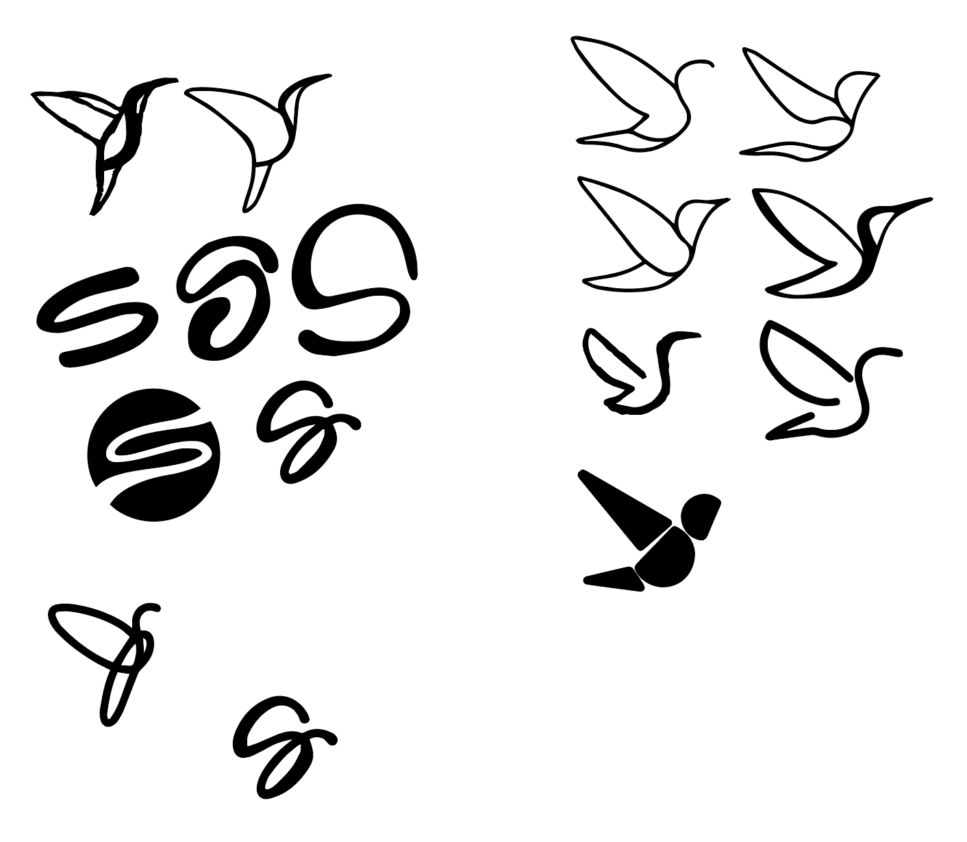
I noticed that when I was drawing the hummingbird, there were a few ways we could incorporate the letter 'S' for Saya. Here are more iterations with the focus more on the hummingbird.
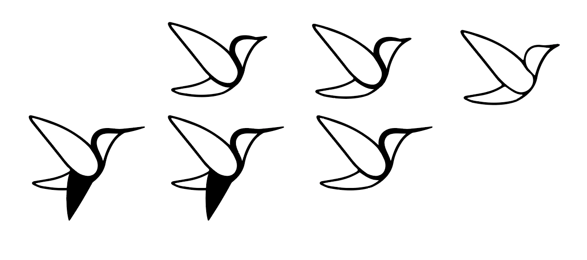
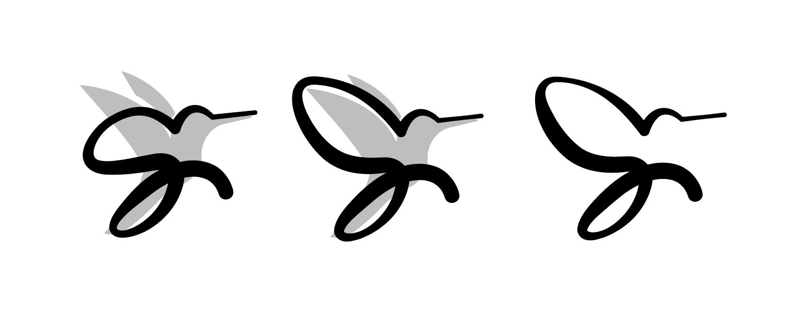
A lightbulb turned on when I was able to see the S more inside the hummingbird which is how the final designs came alive.
👏🏽 Supporting Graphics
Once the logos were signed off and approved, we were able to proceed with the rest of the brand identity including supporting graphics. There were so many options I wanted to go with, but I had to remember that this is a professional school setting, so I couldn't go more freehand than I usually like to go for.
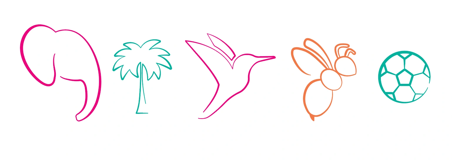
I thought the above illustrations would be adorable for a school but still put-together, professional-looking and minimal. We don't want to outshine the school itself with the designs, so I kept it simple with a light and airy vibe to keep it chic and beachy.
🎨 Patterns
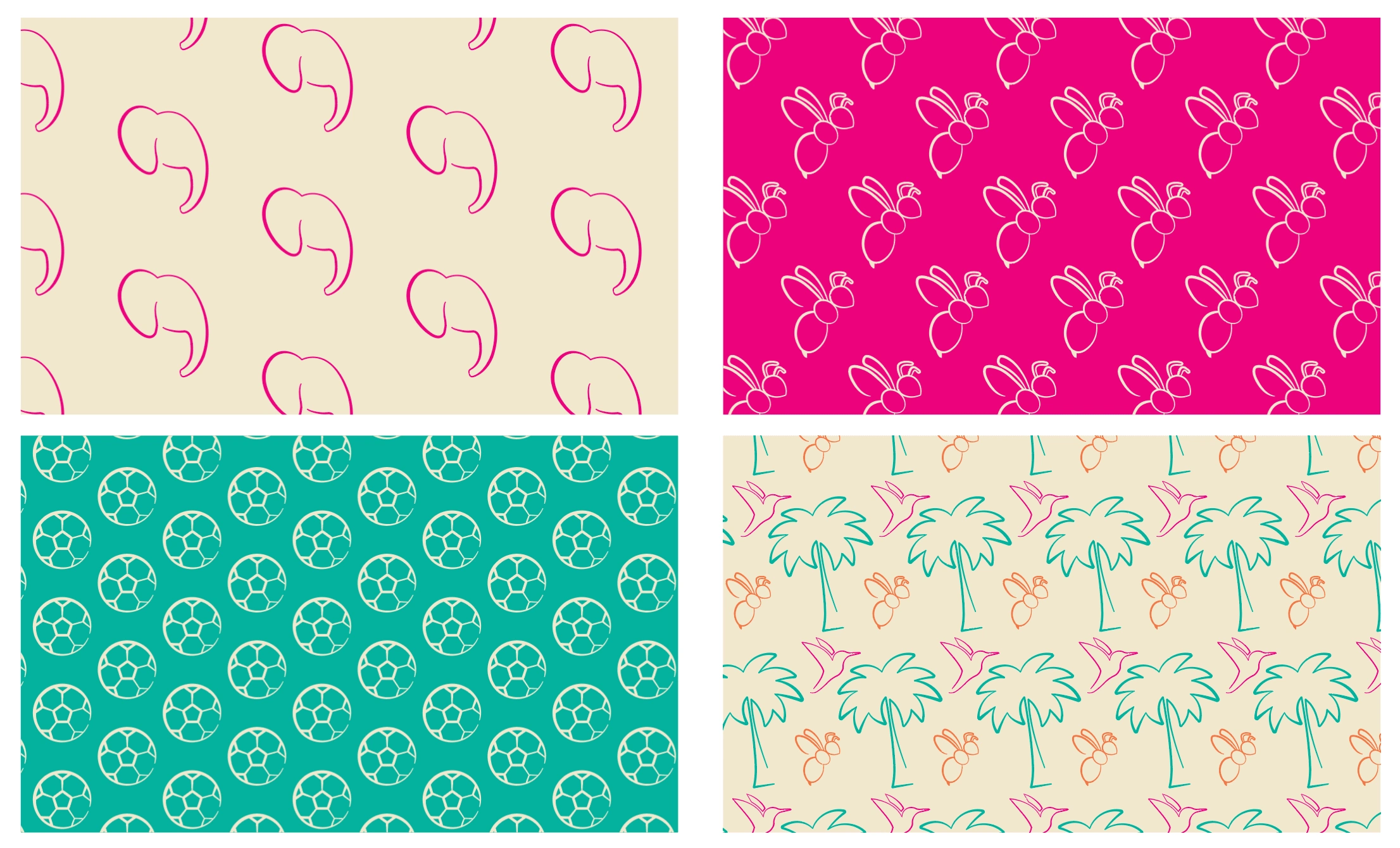
Lastly, I already knew the patterns were going to incorporate the illustrations from above. Yaya had a few changes with the the illustrations, and we were able to include the bumblebee even though it didn't make it as the logo.
📷 Mockups
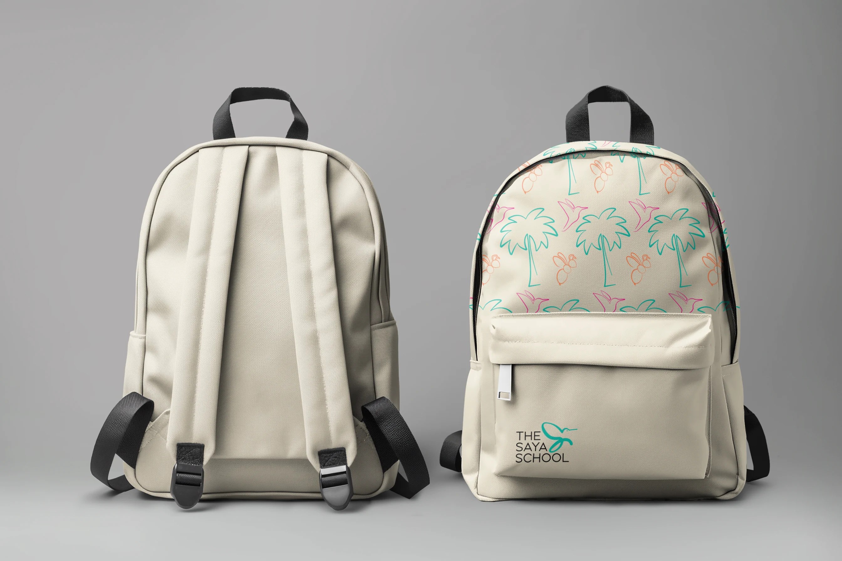
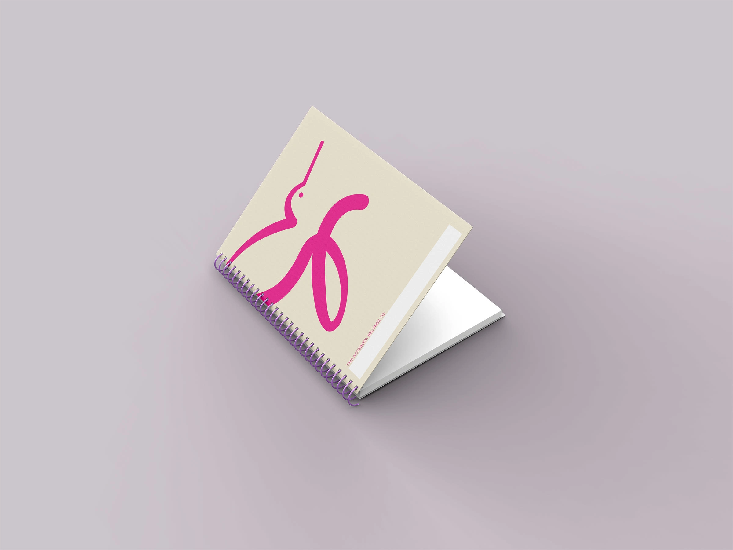
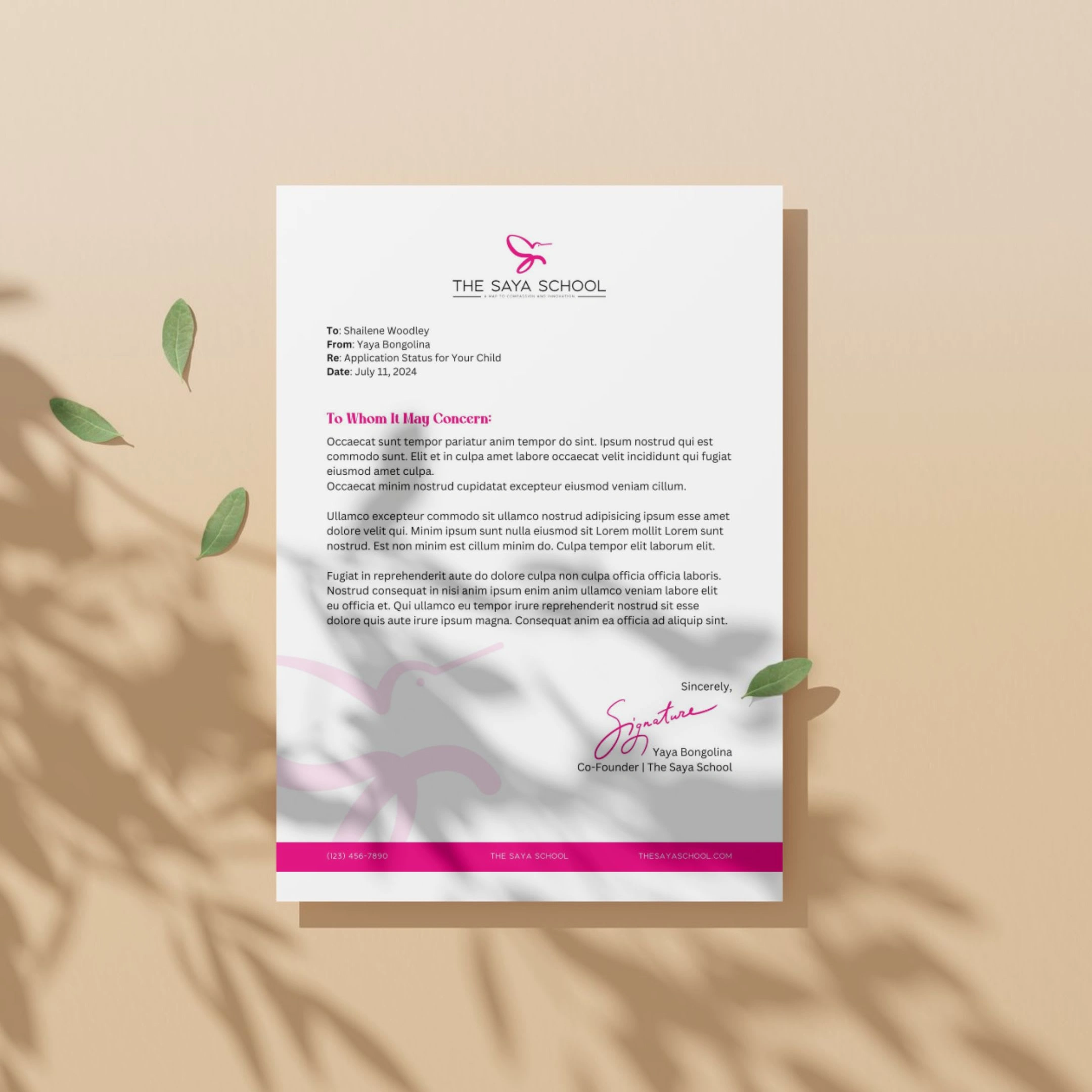
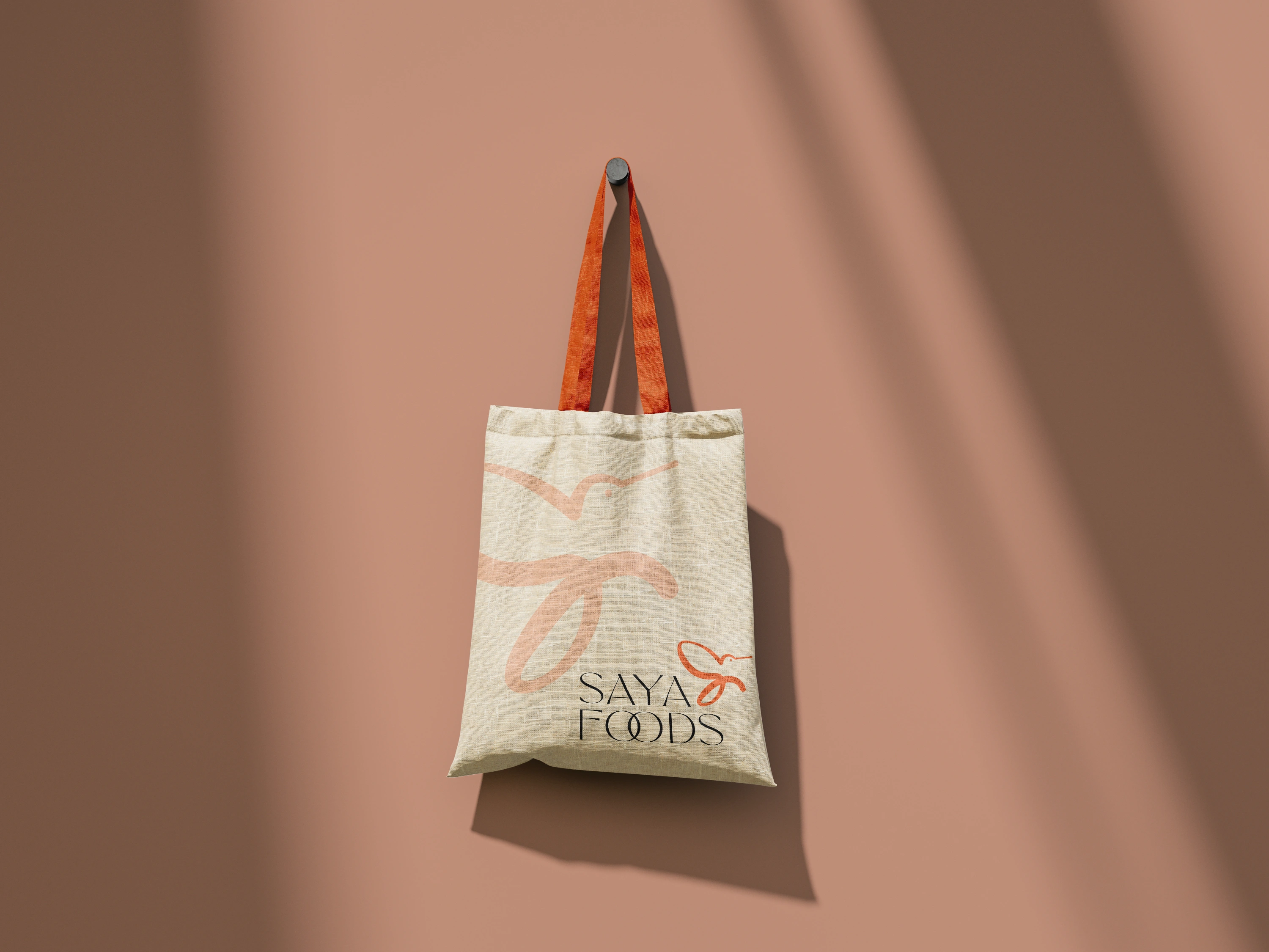
This last mockup is for a sub-brand of The Saya School which is Saya Foods and Saya Farms. Yaya's vision for The Saya School is that the students would learn about farming and growing their own foods. So, the Saya Foods will be a place where the community could come and purchase their foods knowing that it was taken care of and grown by the students in The Saya School.
✨ The Final Designs
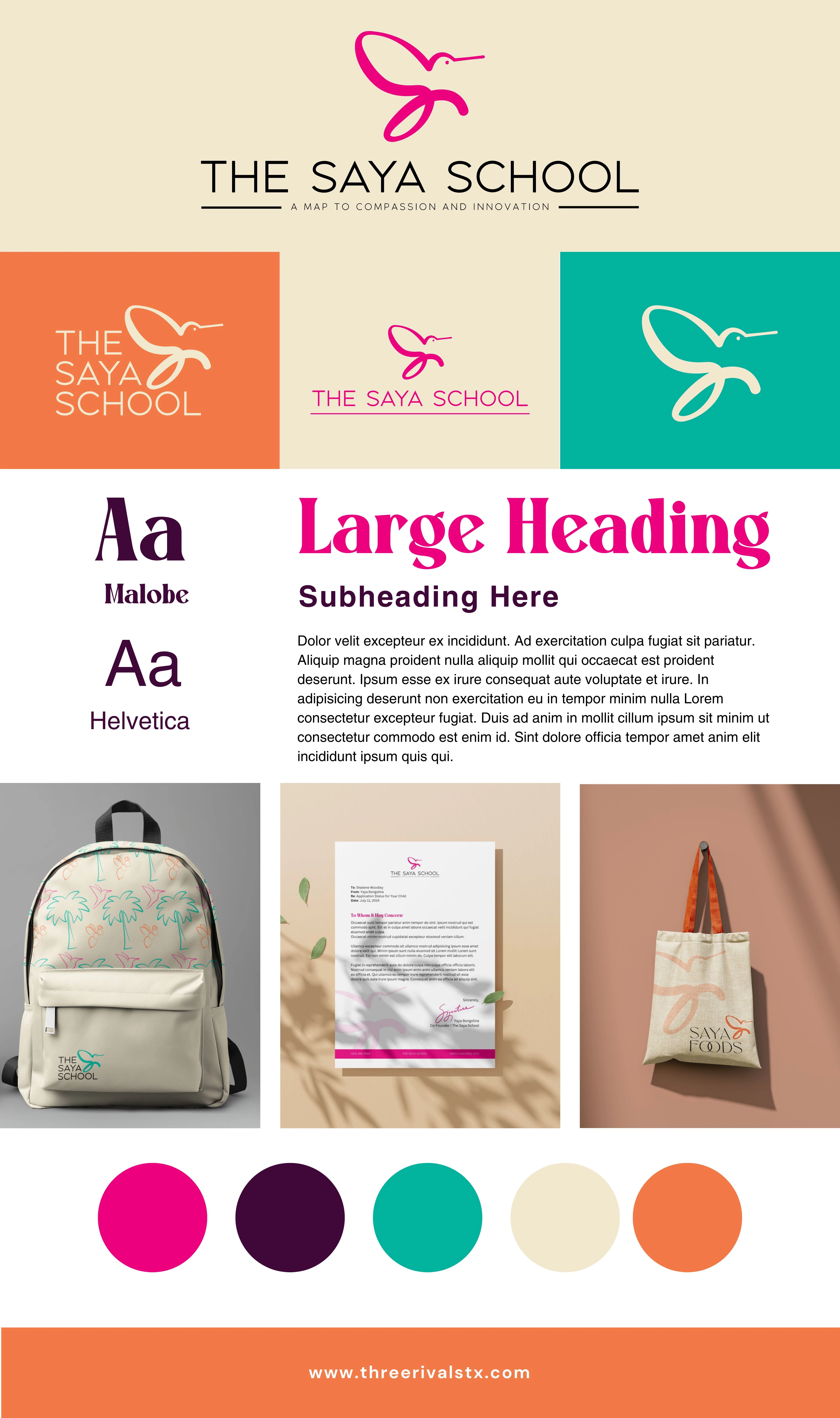
💬 Final Thoughts
This project was very close to my heart as a former teacher. When I left the classroom, I promised myself that I would continue to be involved in the education industry. I believe it's crucial to raise our children to become the future we can be proud of. That's why I couldn't turn down Yaya's project! The school is currently being built and in progress, and they've just finalized the location for it. So, within the next couple of years, you may see The Saya School and its designs come to life in person!
Like this project
Posted Aug 15, 2024
A Brand Identity project that includes our Brand Strategy Workshop and designs for The Saya School - a free school for primarily girls in Gabon, Africa.


