Zoë Arniotis - Visual Identity Project
⭐️ The Brief
The visual identity project for Zoë Arniotis aims to increase brand awareness for her video and photo business. Her business has grown over 17 years to include services such as Videography, Photography, Editing, Content Strategy, and Event Planning. The last time she had her logo made was 13 years ago, and this project will refresh her brand.
👉🏽 Design Requirements
Bold
Lots of colors - yellow, green, pink, orange, light blue, pink, red, and some purples can be included
Avoid dark blues and dark reds
Maximalism style
Wants a personal touch to her designs
Wants a mix of vintage and modern
☝🏽First Step
After Zoë's Brand Questionnaire completion, I was able to highlight a few things that she mentioned in the form. Here are a few things that I wanted to include in Zoë's visual identity designs:
Brand Values
Innovative
Adaptability
Creativity
Below, are the list of emotions Zoë wants her customers to feel when working with her:
Brand Emotions
Energized
Welcome
Empowered
Lastly, here are some nouns that Zoë is comfortable with to include in her designs:
Brand Nouns
Eye
Camera
Camera lens or shutter
Stars
Clouds
Dots
✍🏽 Creative Directions
On to the creative direction and creating mood board and color palette options for Zoë to select for her designs. Here were her options:
Creative Direction 01
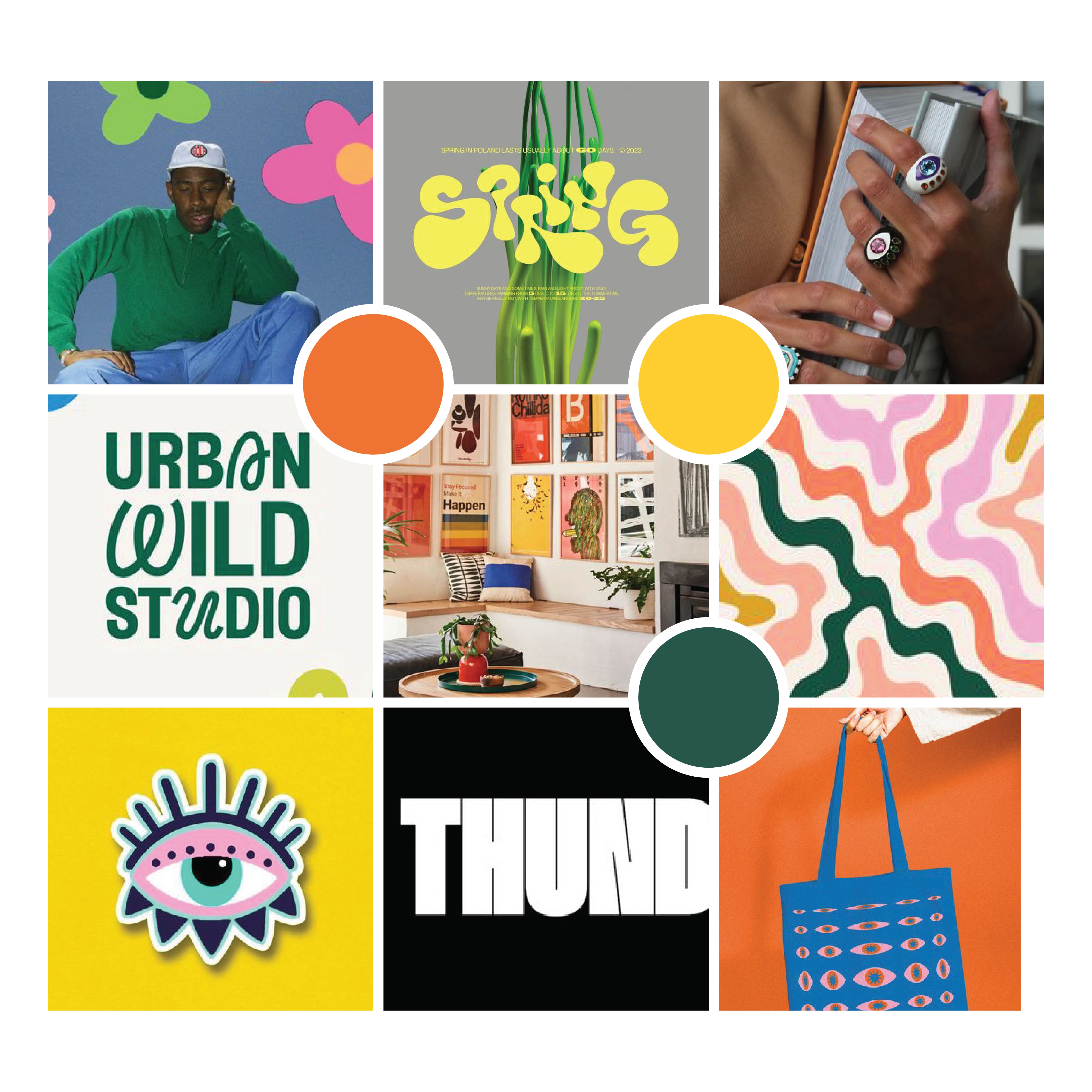
Creative Direction 01 has the maximalism feel that was asked and a lot of bold colors
In the first option, I included options to keep that maximalism feel in while keeping her 'eye' design in as well. Some funky lines and designs to appeal to her funky and fresh style. Lastly, the colors were the bright and bold colors she was looking for.
Creative Direction 02
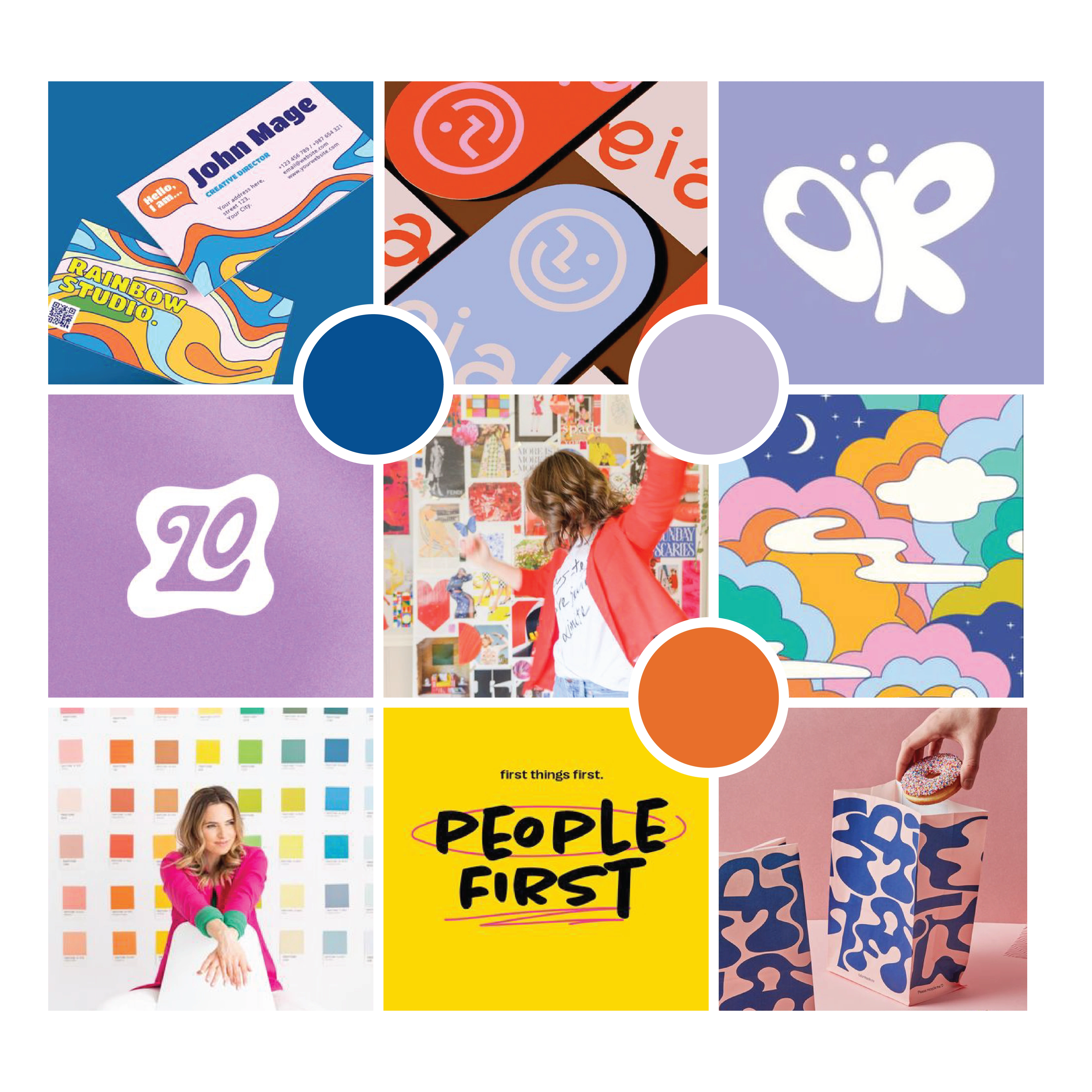
Zoë's second option was a little further than what she asked for, but she loved some elements here.
In the second option, I presented her something that's different than what she had asked for, but I knew there were elements here I could still potentially use in her final designs.
Creative Direction 03
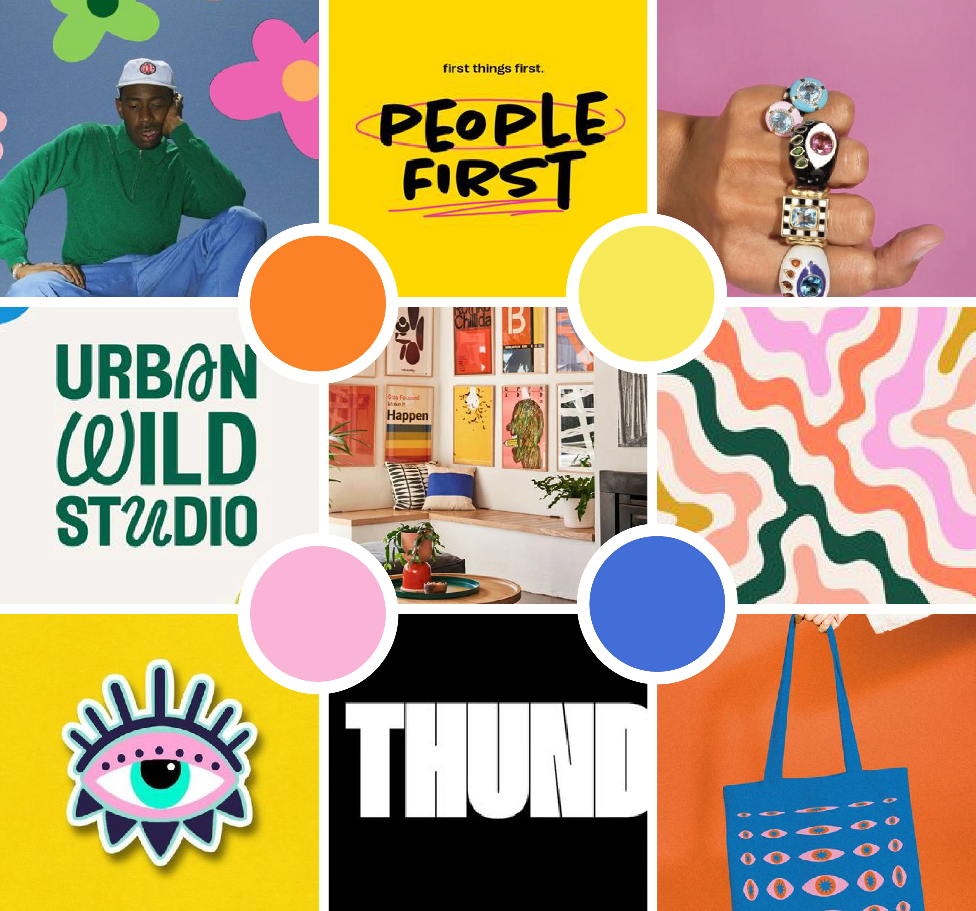
Zoë's creative direction 3 was a mixture of the first two mood boards.
Lastly, this third creative direction was a mixture of the first two mood boards. I still included the busy and maximalism feel while also keeping her 'eye' element and bright colors.
In the end, Zoë ended up loving the mixed option of the creative direction 3 which is what we moved forward with.
✍🏽 Iterations
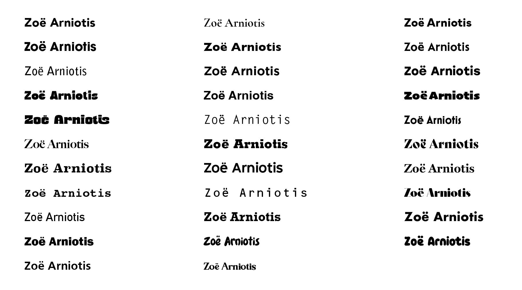
There were a lot of typeface options that I could use for Zoë' designs. However, with her uniqueness and want for a personal touch for her visual identity, I felt like none of these really hit the mark.
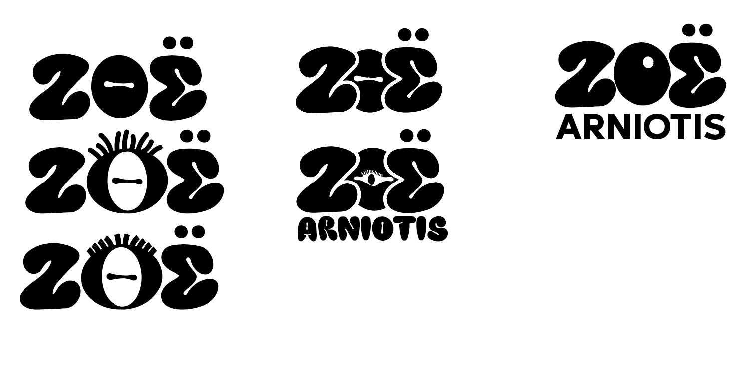
I tried one typeface, but it still didn't feel right and it felt too 'chunky' for her brand.
I came across this type face (top-right corner of the above image) and loved the free-flow handwriting feel it had, but it still didn't fully hit the mark.
Which then brought me to the idea of using my own handwriting to create it myself.
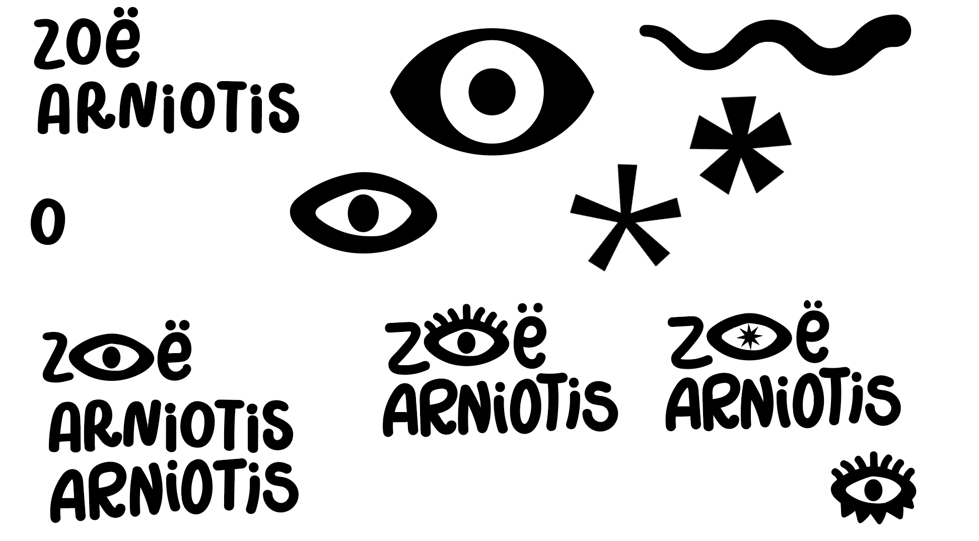
The below three designs are all mainly handwritten by my own writing. This truly felt more personal and had a hunch that Zoë would love this idea.
Once I sent over the brand presentation for Zoë, she absolutely LOVED the handwritten feel! She did ask if I would be creating a custom font for her - I offered the custom font addition to the project, however, she decided to go against it.
👏🏽 Supporting Graphics
Once the logos were set, I moved on to creating graphics that would support her visual identity. There were many doodles that started this rabbit hole, but something about simplicity yet funky really stood out to me. Here are a few 'funky' doodles I tested out:
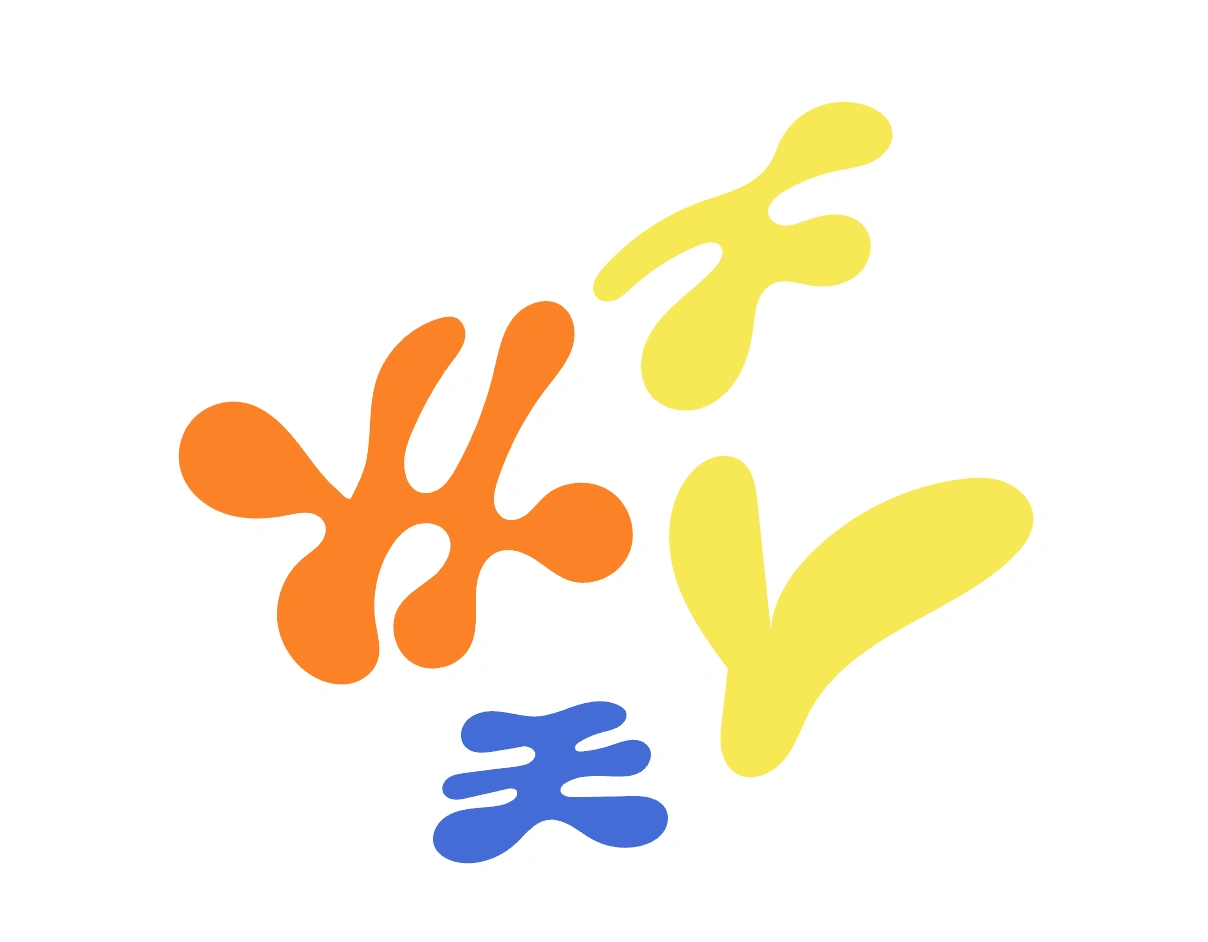
Zoë loved the idea of clouds and funky shapes but there was still something missing with this mixture. So, I went to add on more variety to the mix.
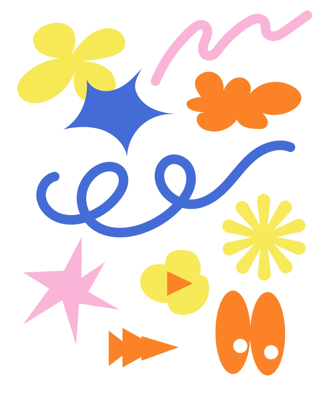
Here are the final supporting graphics that Zoë ended up loving and wanted to keep. I gave her a few extras as freebies since we agreed on 5 graphic elements. Wouldn't hurt her to have more, right?
🎨 Patterns
Lastly, patterns were to be created using the above graphics. I had a lot of fun playing around with her graphics. Here are the 4 pattern options I presented to her:
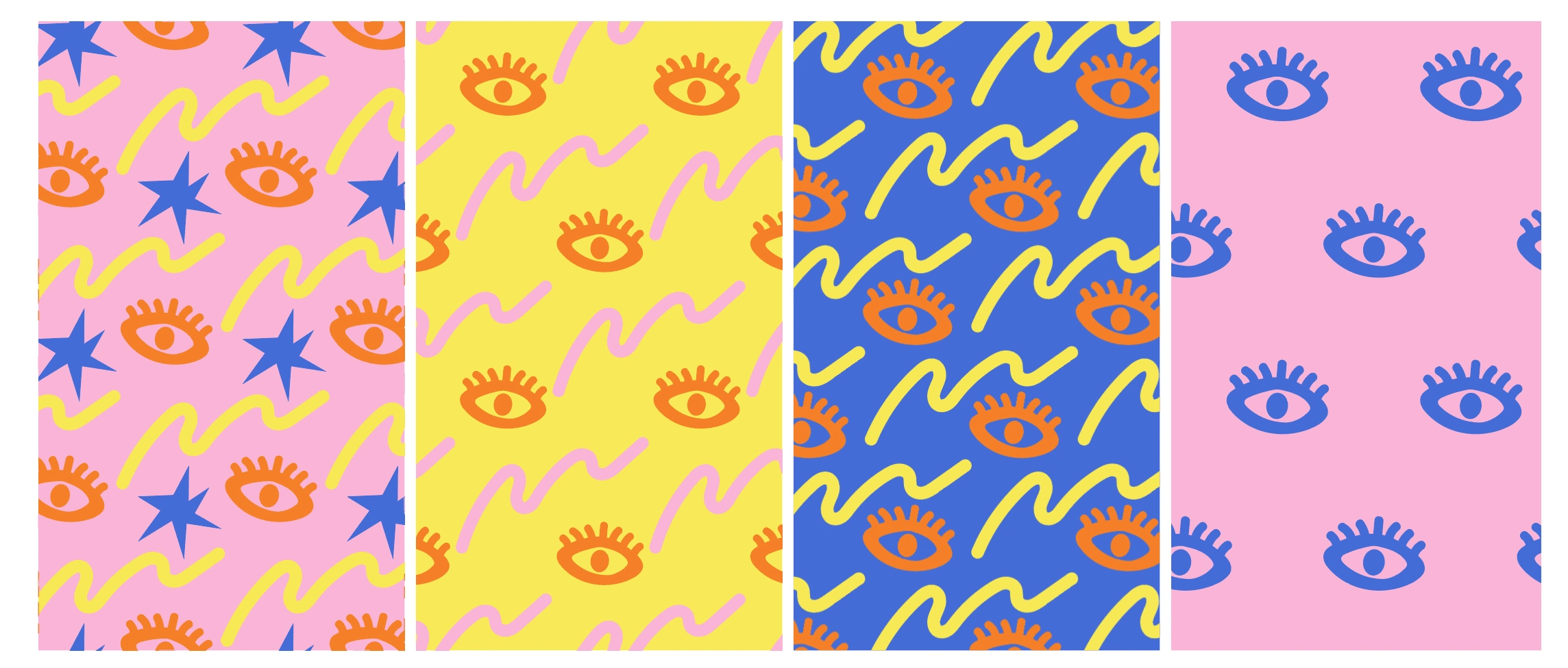
She ended up loving the first two only. So, let's hit up the mockups!
📷 Mockups
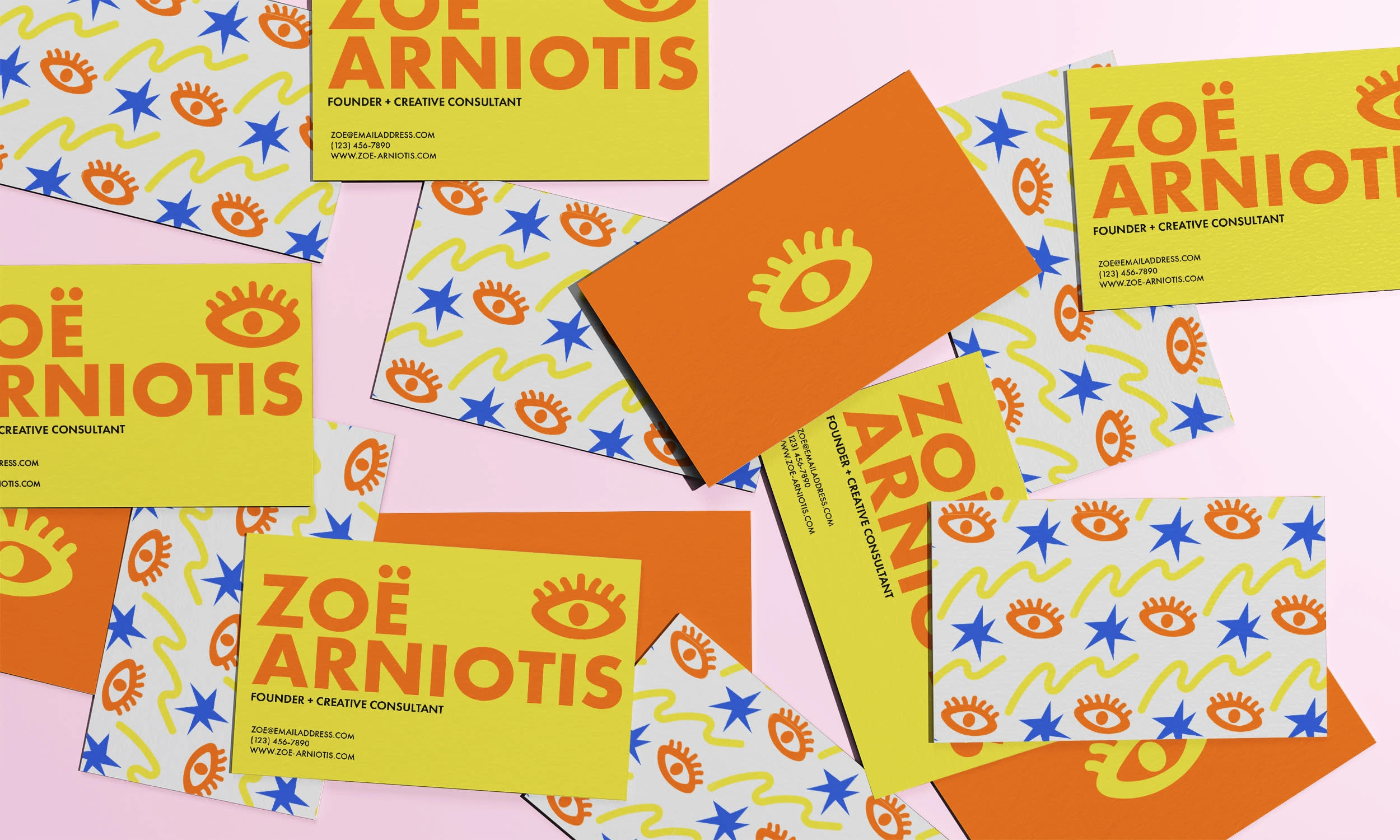
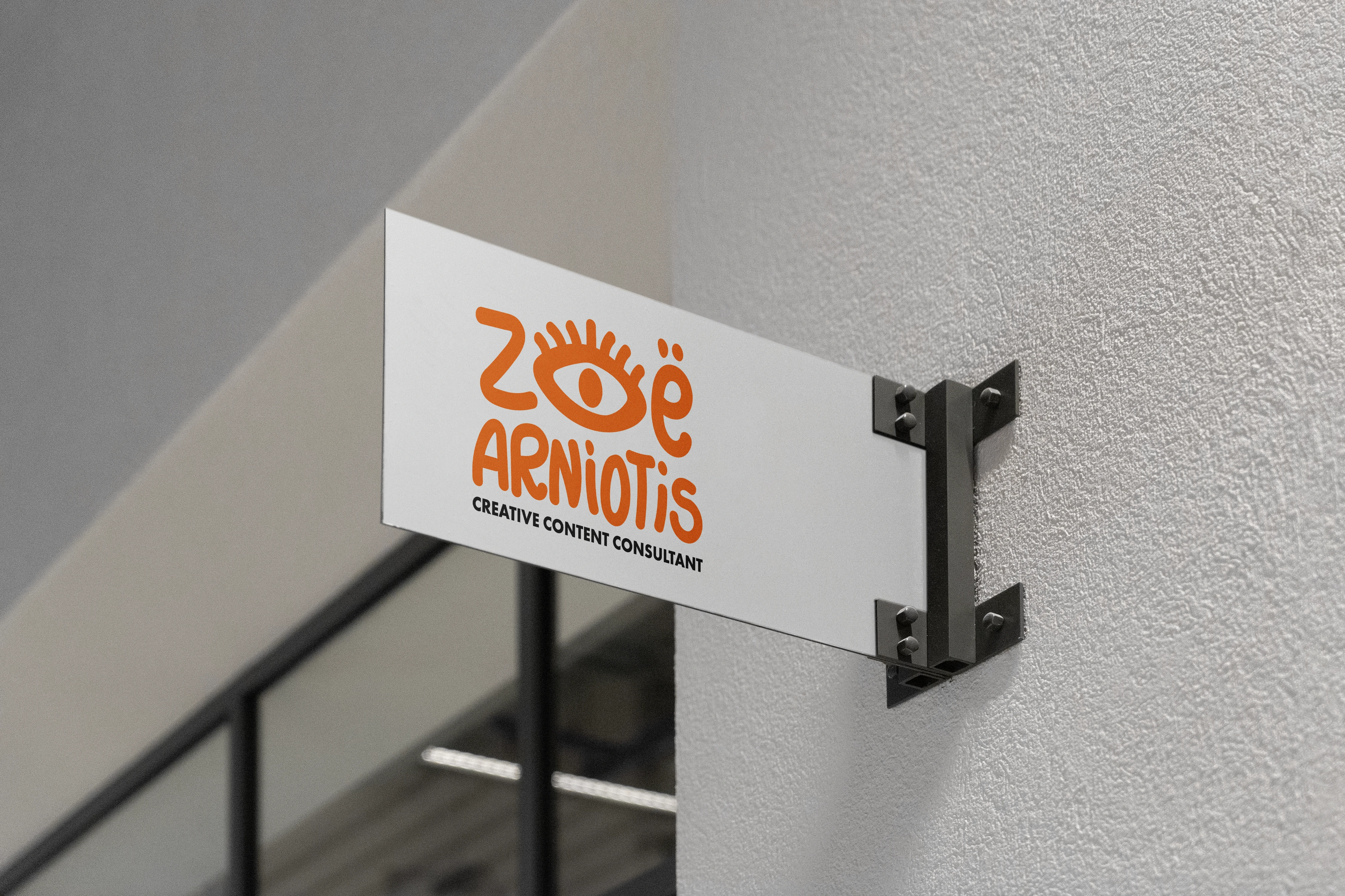
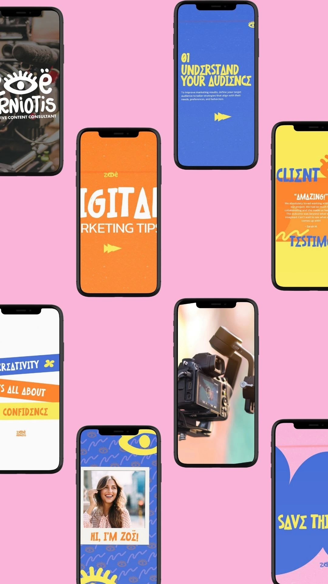
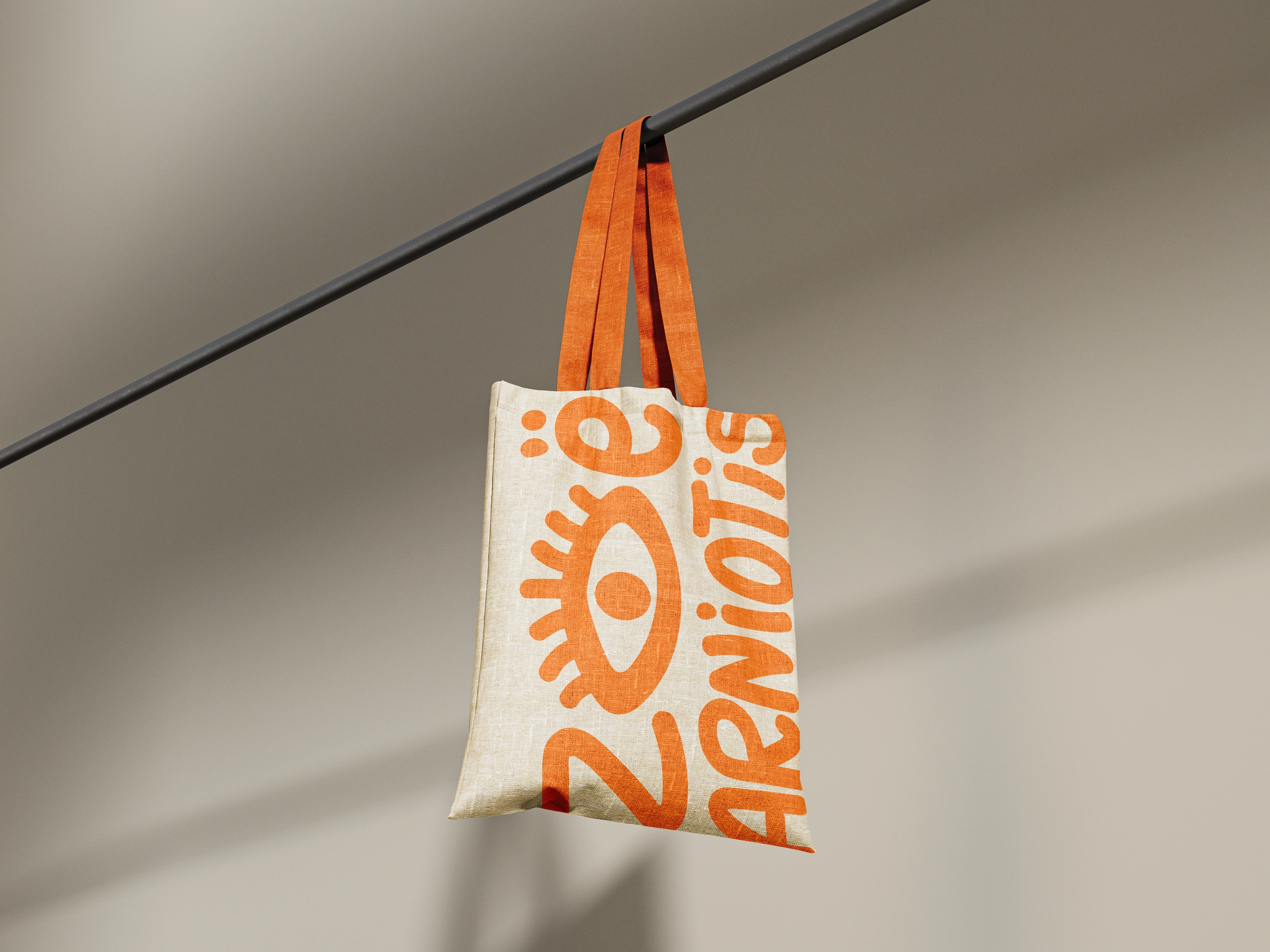
✨ The Final Designs

💬 Final Thoughts
Overall, Zoë's project was a LOT of fun creating! I've been wanting to design something fun, funky, and bold yet still professional and modern. I would absolutely LOVE to work with Zoë again in the future!
Like this project
Posted May 20, 2024
A vibrant and playful visual identity project for the innovative Creative Content Consultant, Zoë Arniotis, designed to capture attention and inspire creativity
Likes
4
Views
749
