☕💻 Trampo - Brand Design and Illustrations
Nanda Lopes
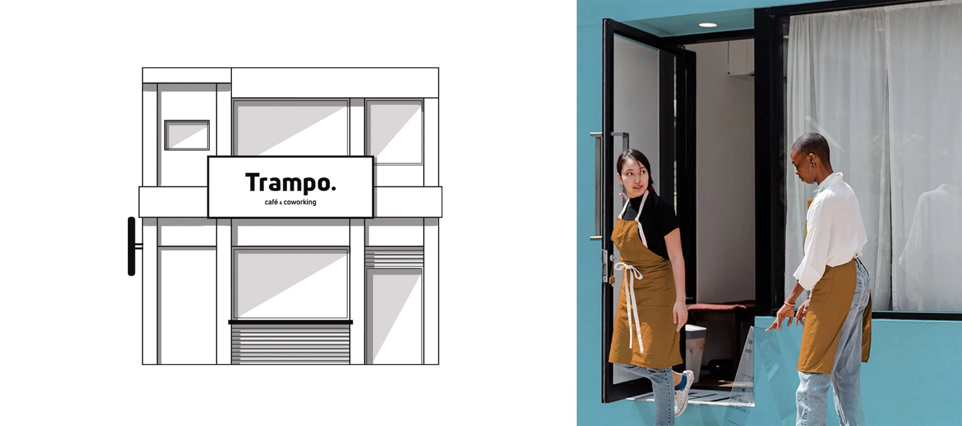
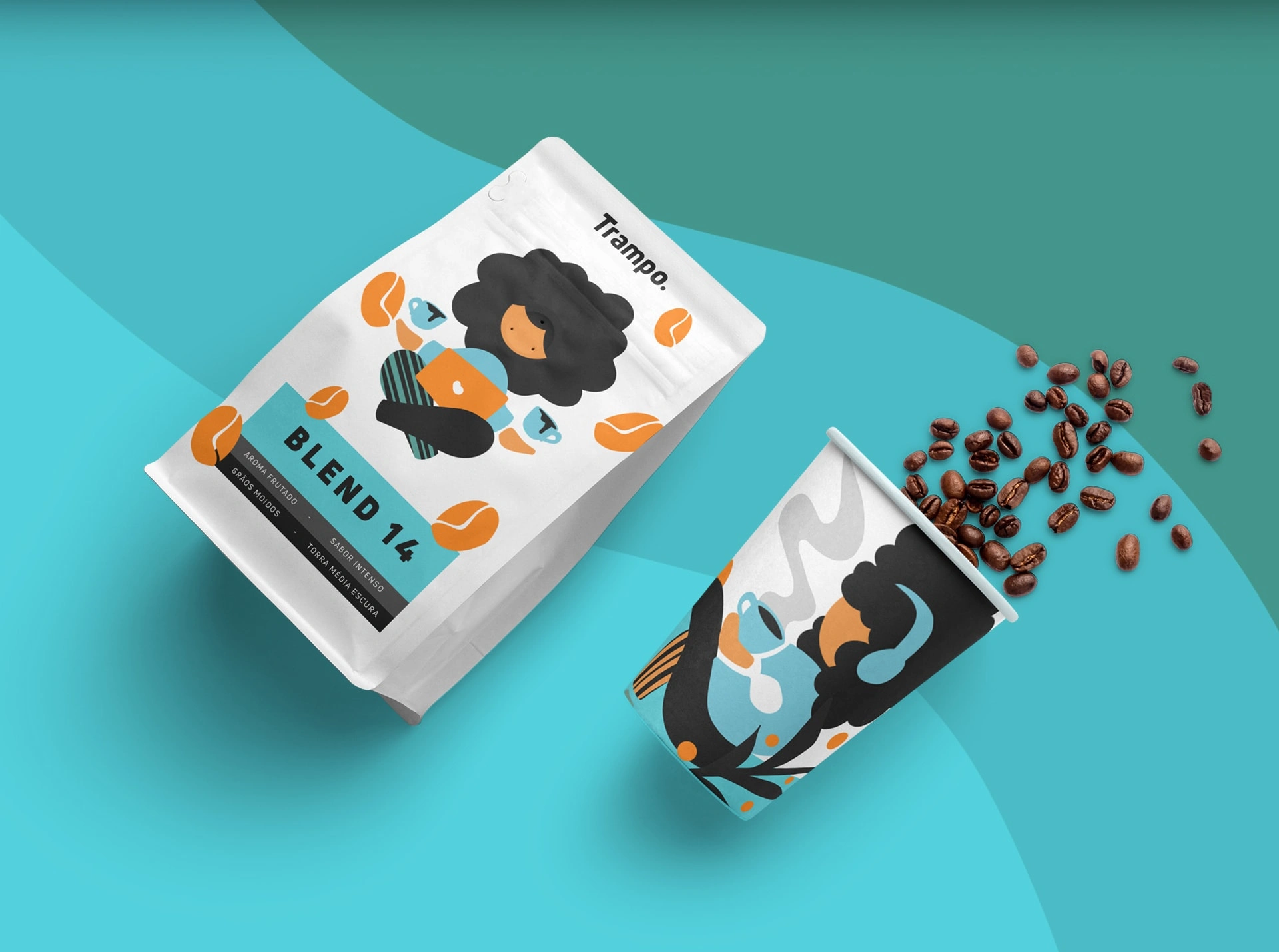
"Trampo" is Portuguese (BR) slang for "work".
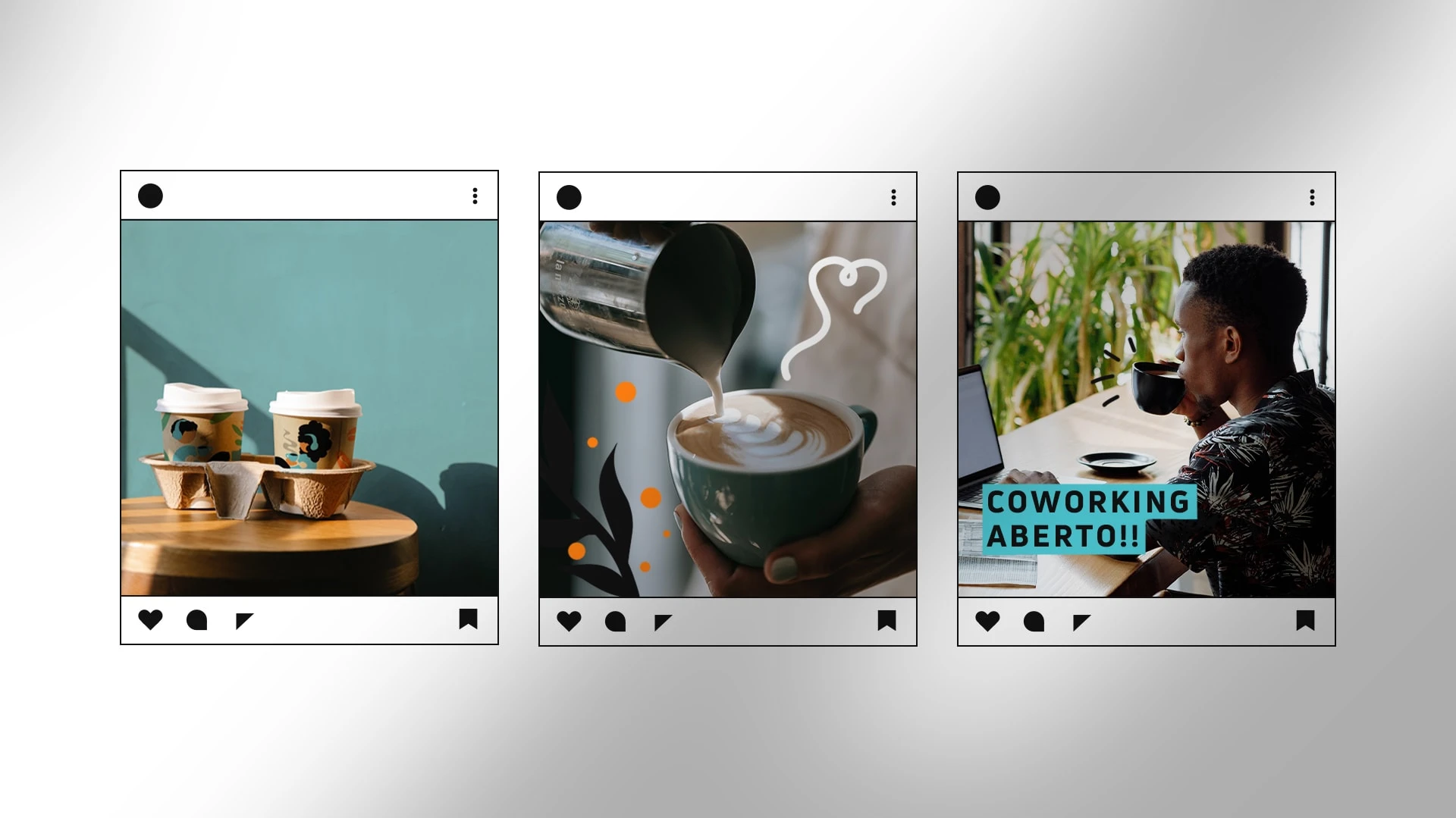
Trampo - Coffee and Coworking was designed to be a comfortable workspace for coffee lovers.
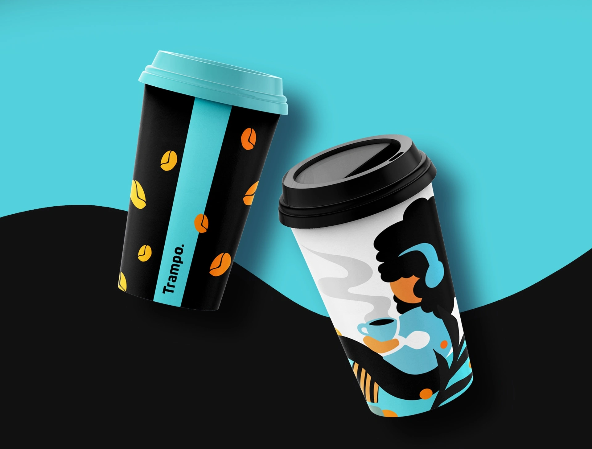
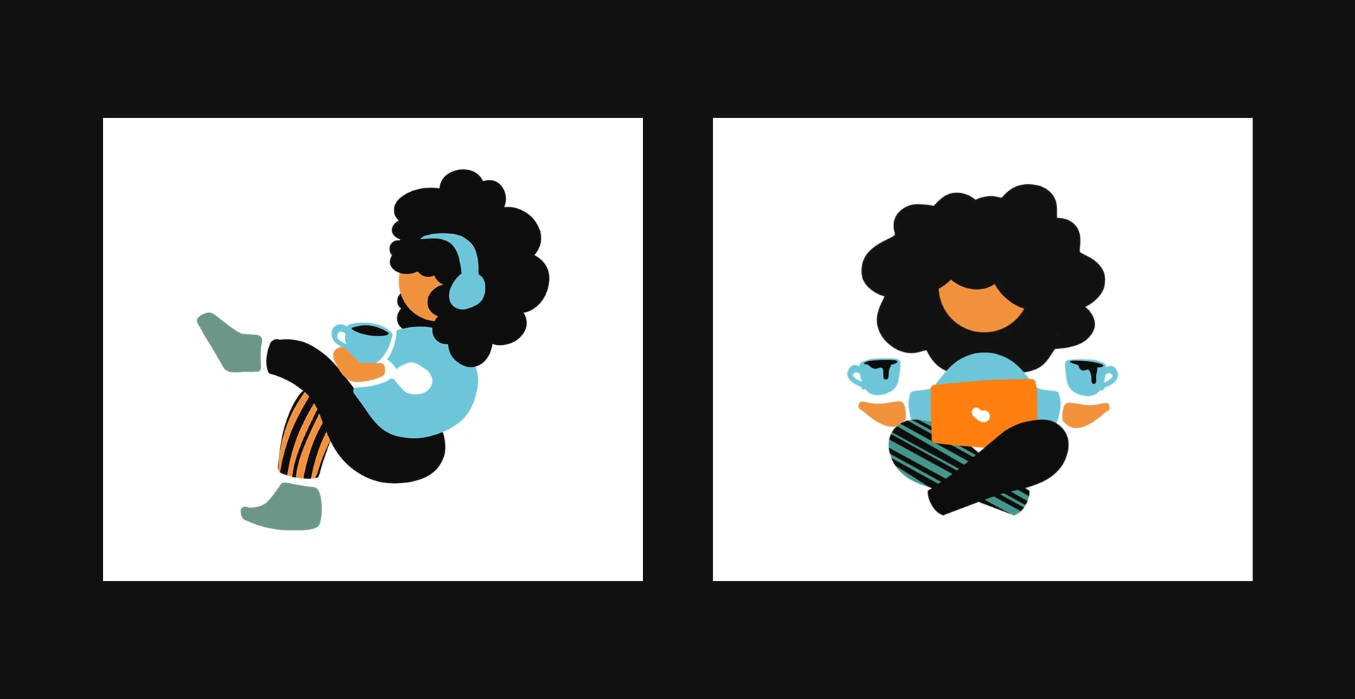
The color palette was created to be one of the most striking elements of the identity. The dynamics between light blue, black, and orange form a light and relaxed palette, making it also distinct from the common earthy tones coffee shop brands that exist in the market.
Like this project
Posted Mar 21, 2024
"Trampo" is Portuguese (BR) slang for "work". Trampo coffee and coworking was designed to be a comfortable workspace for coffee lovers.