
About the project
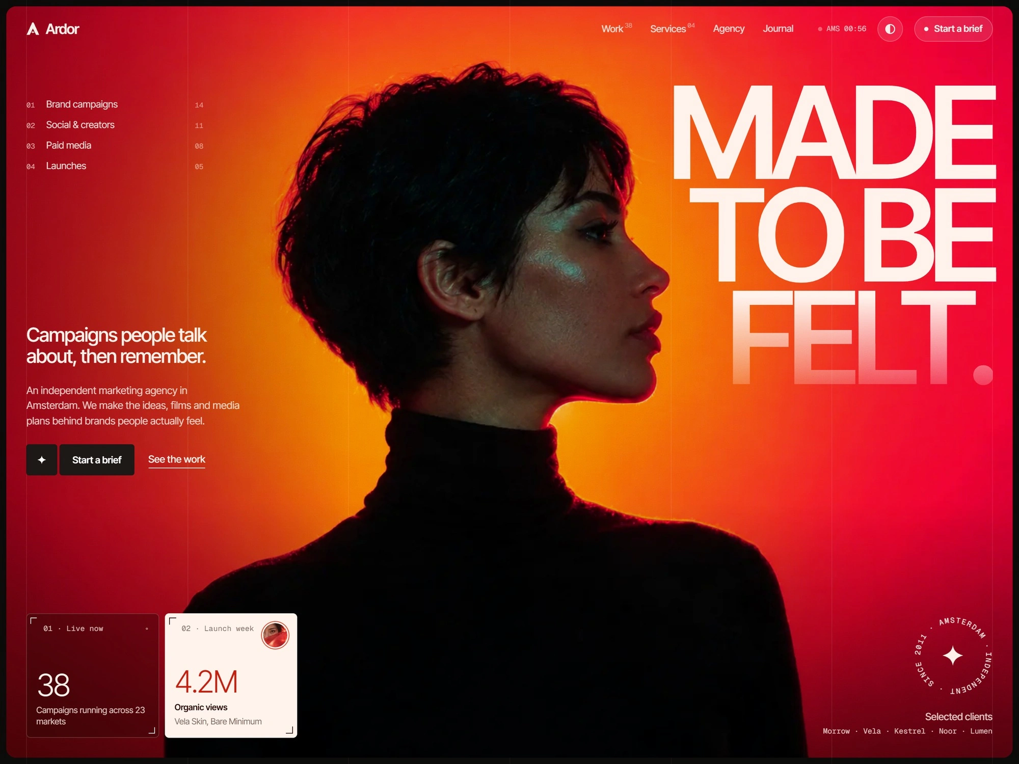
A website for an independent marketing agency in Amsterdam, built around one portrait, one headline and the number each case moved.
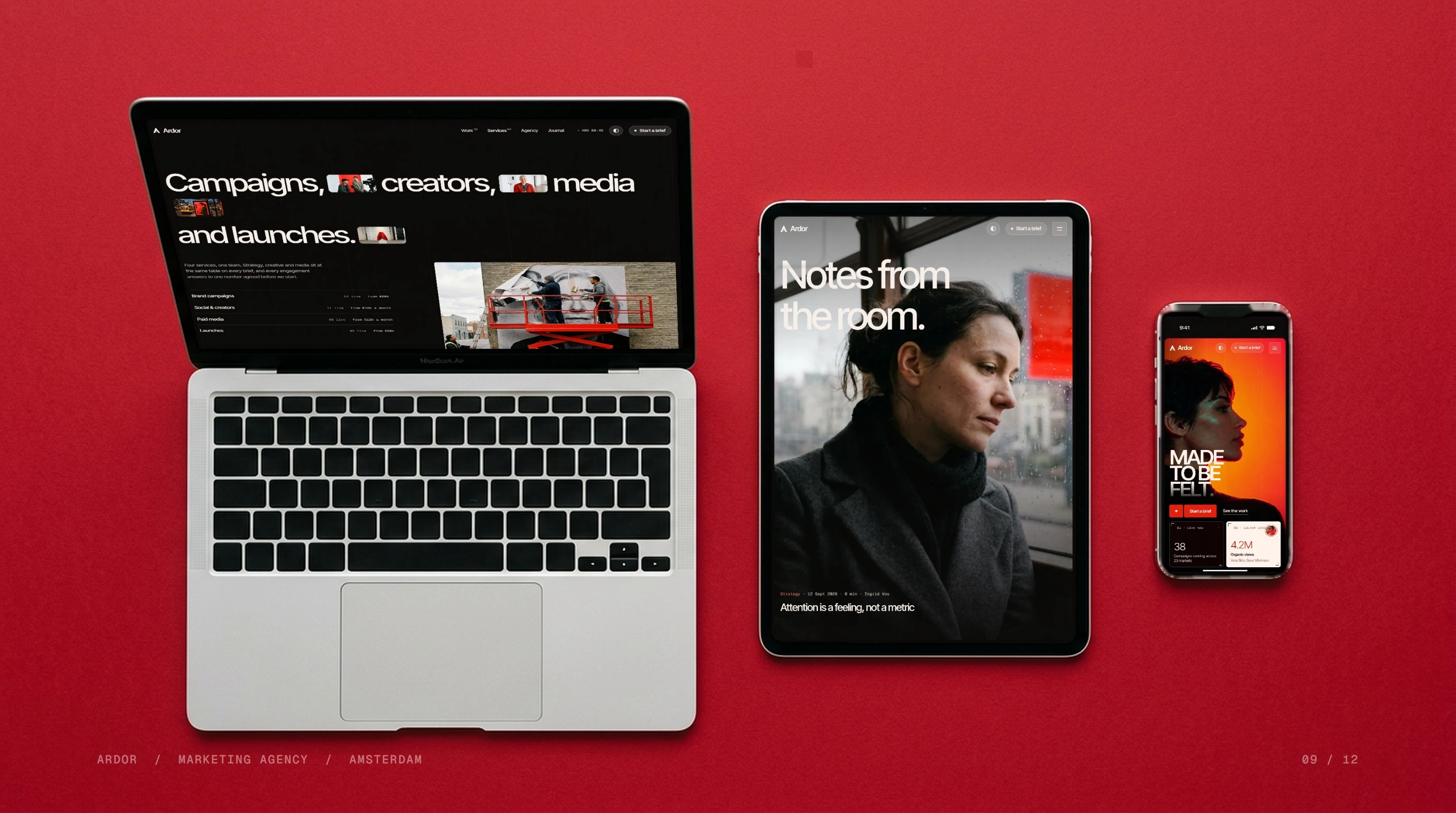
Ardor is a complete website for an independent marketing agency in Amsterdam. It is built around one idea: campaigns people talk about, then remember.
The brief
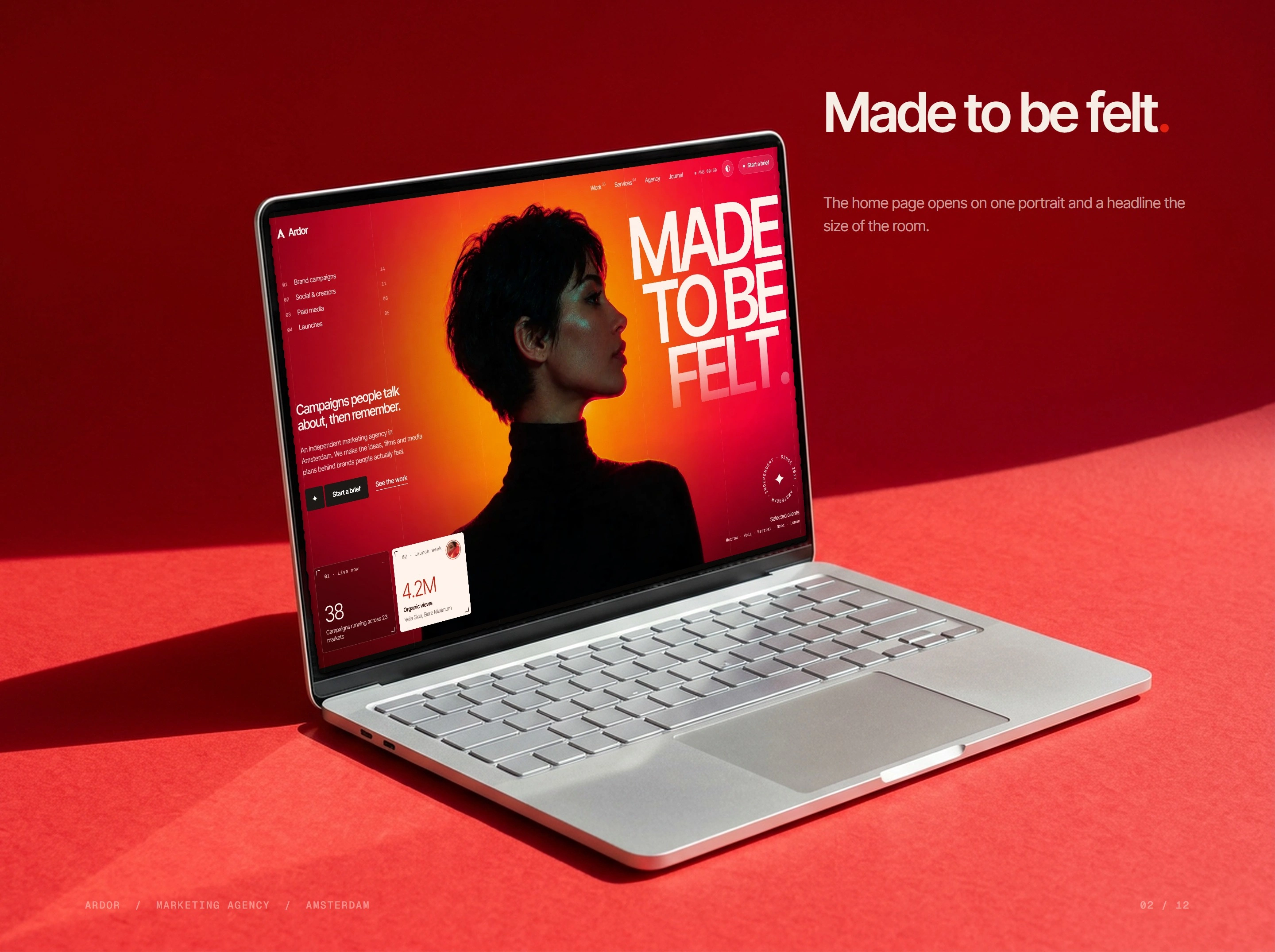
Make an agency site that feels like the work it sells: bold, photographic and quick to read, while keeping the four services, the cases and the brief form easy to find.
The approach
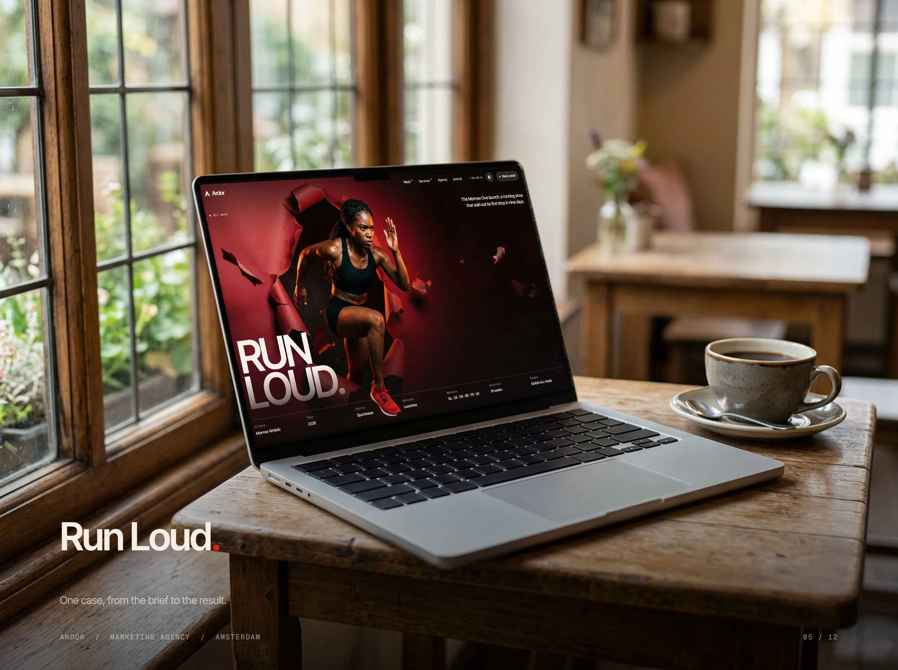
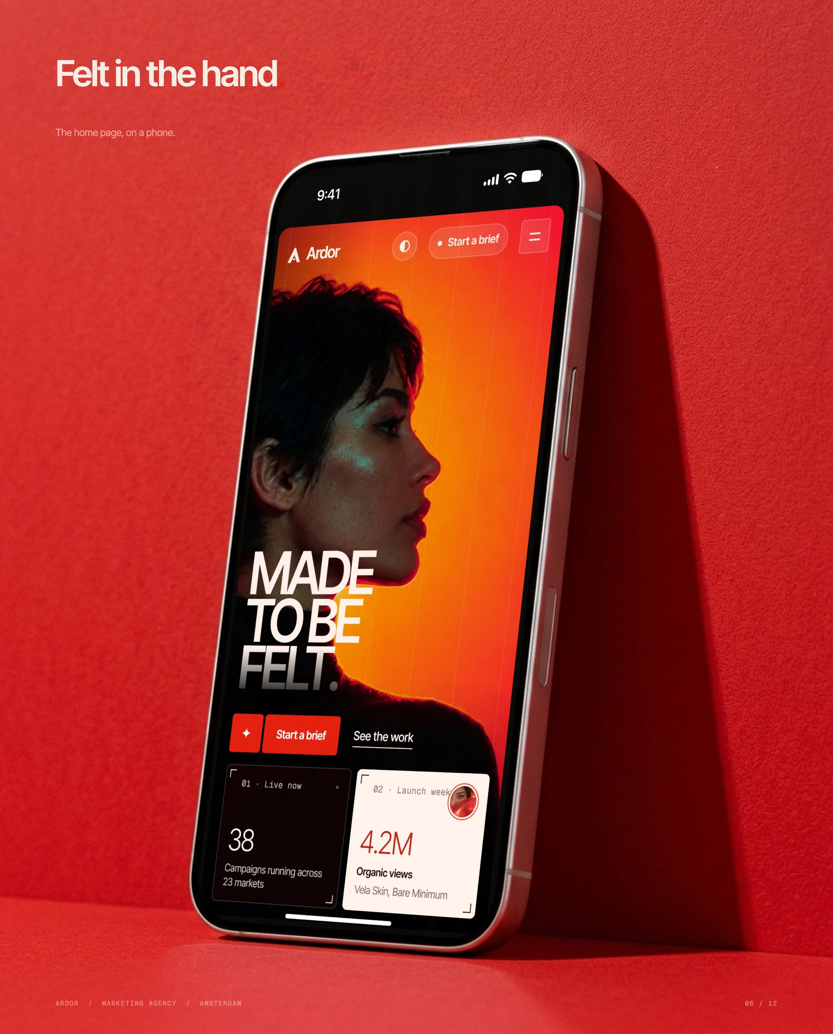
One red-lit portrait opens the site, set under a heavy grotesk and a mono meta layer, with dark and light themes and every case written as brief, idea, execution and result.
Homepage and pages
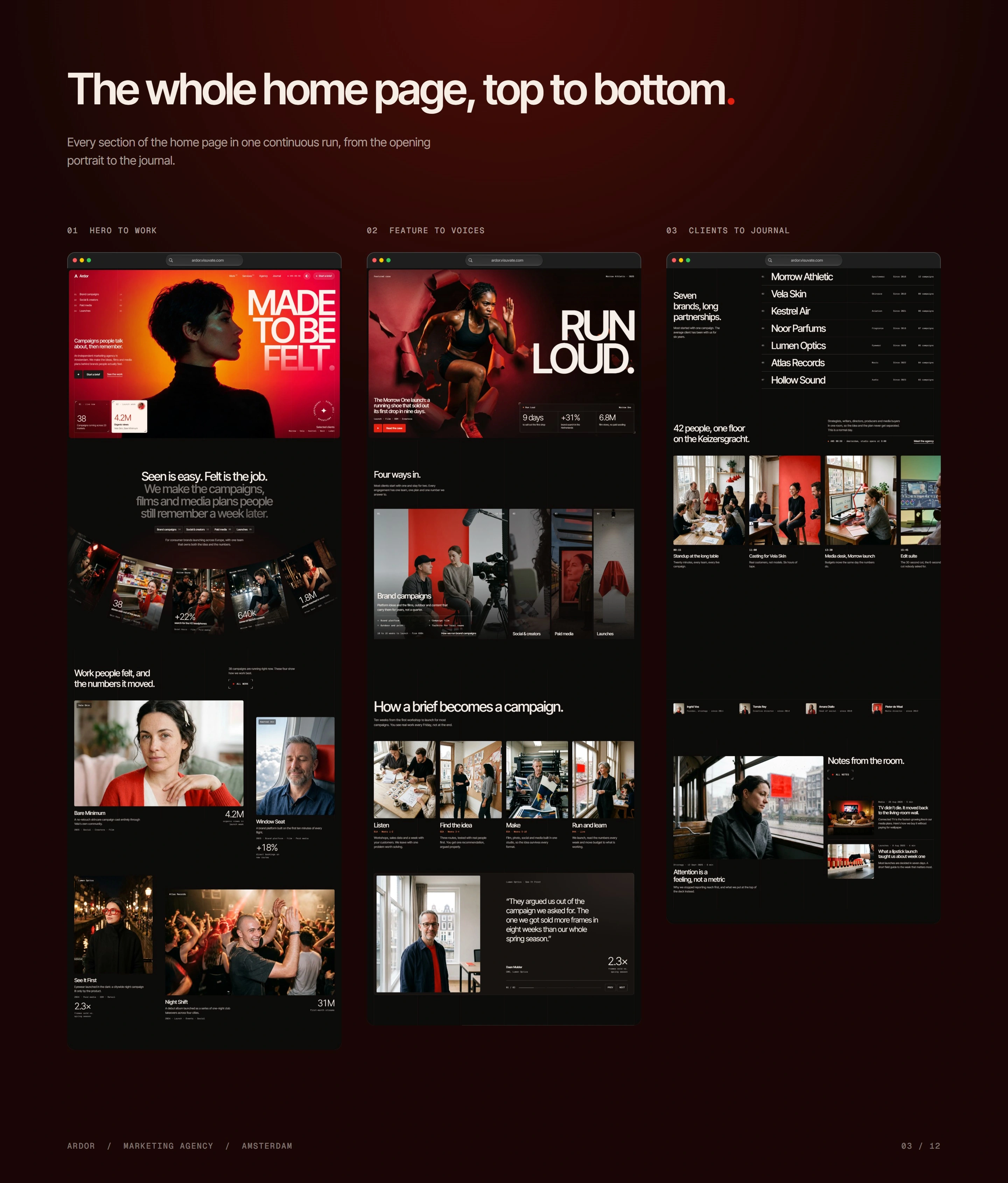
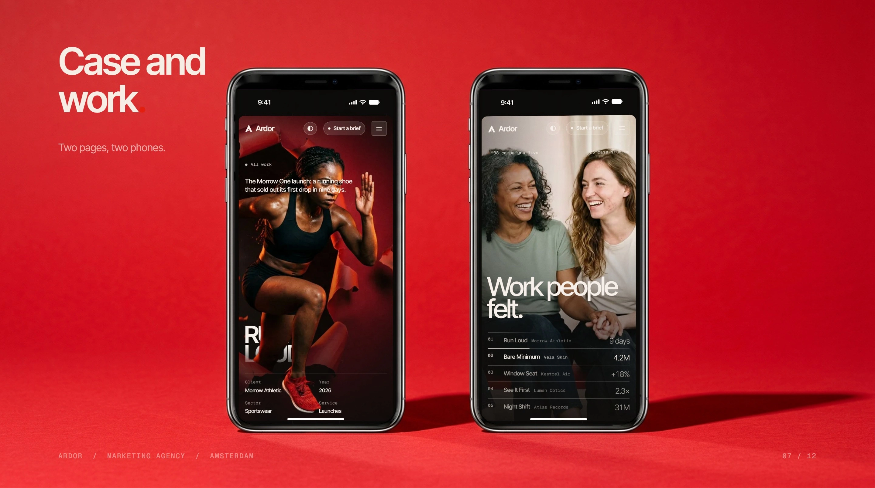
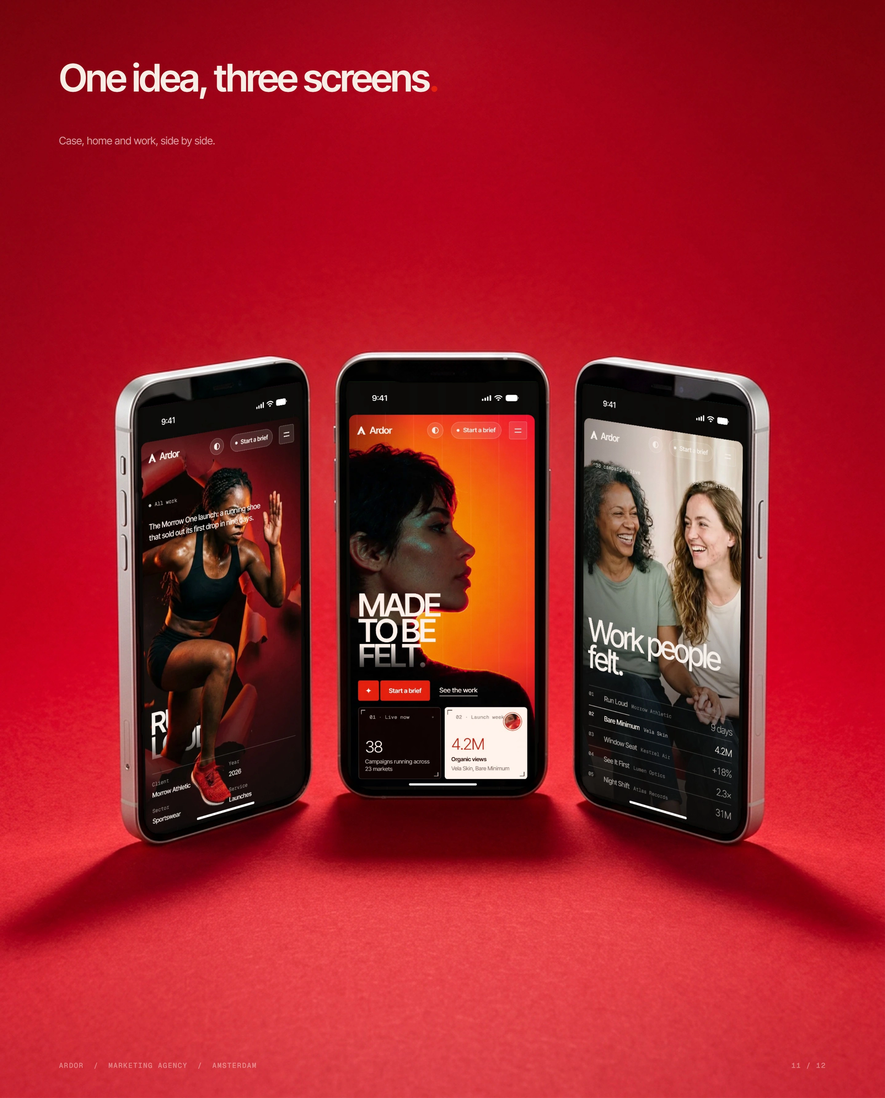
The home page opens on a red-lit portrait under the line Made to be felt, then shows the four ways in, a featured case that leads with the nine days it took to sell out, how a brief becomes a campaign in ten weeks, a client voice, seven long partnerships, the 42 people on the floor and the latest notes from the journal.
Inside the site
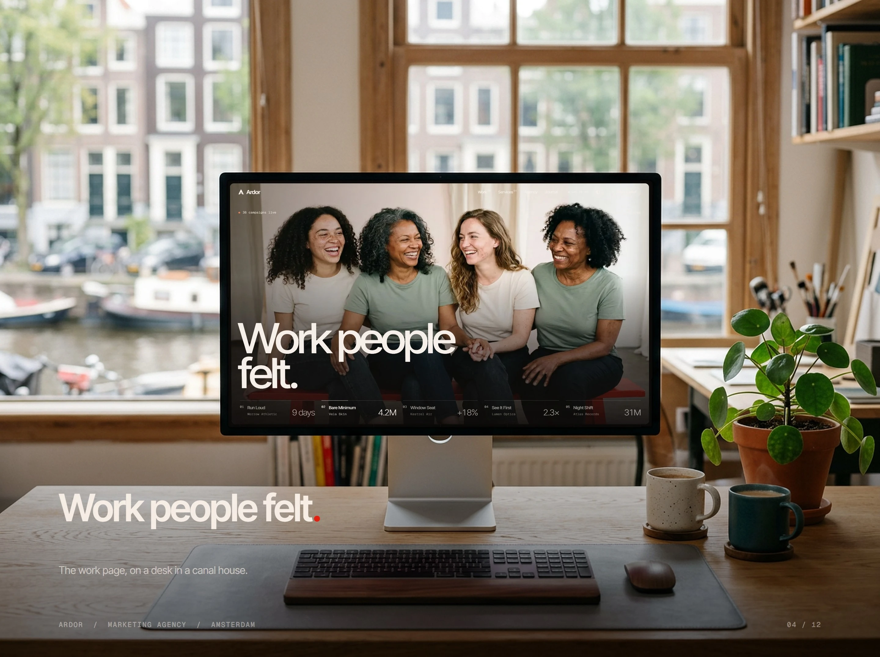
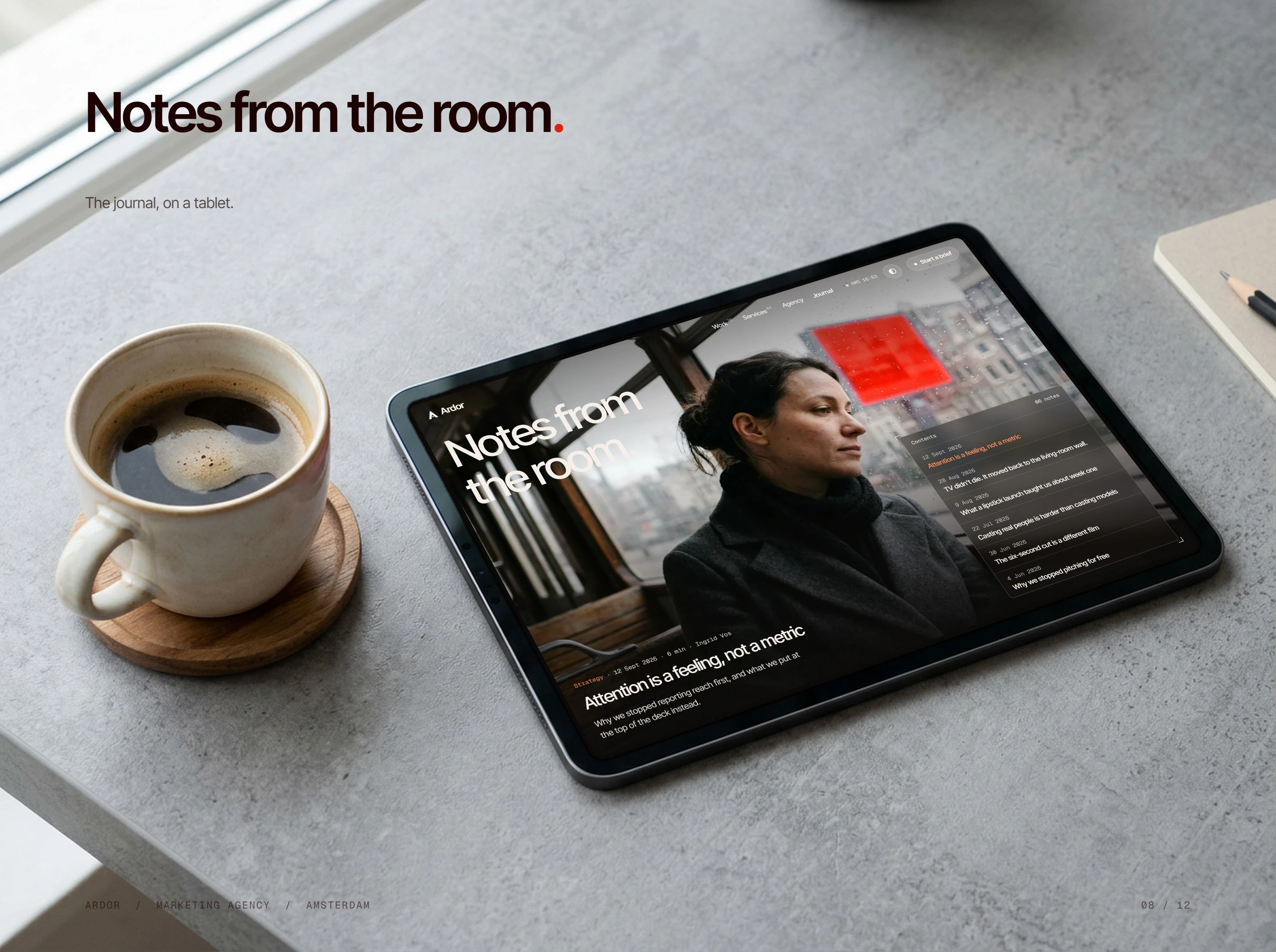
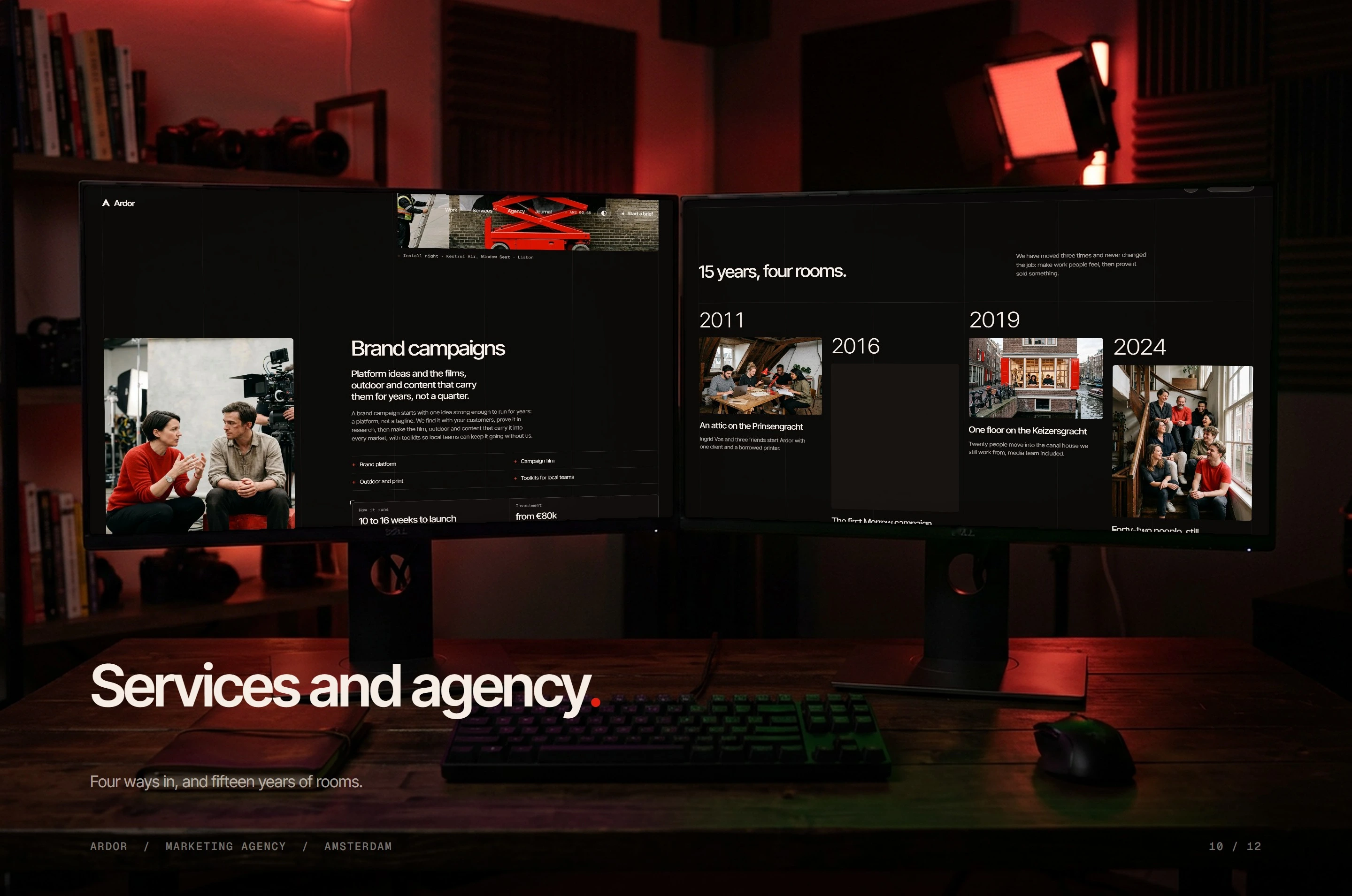
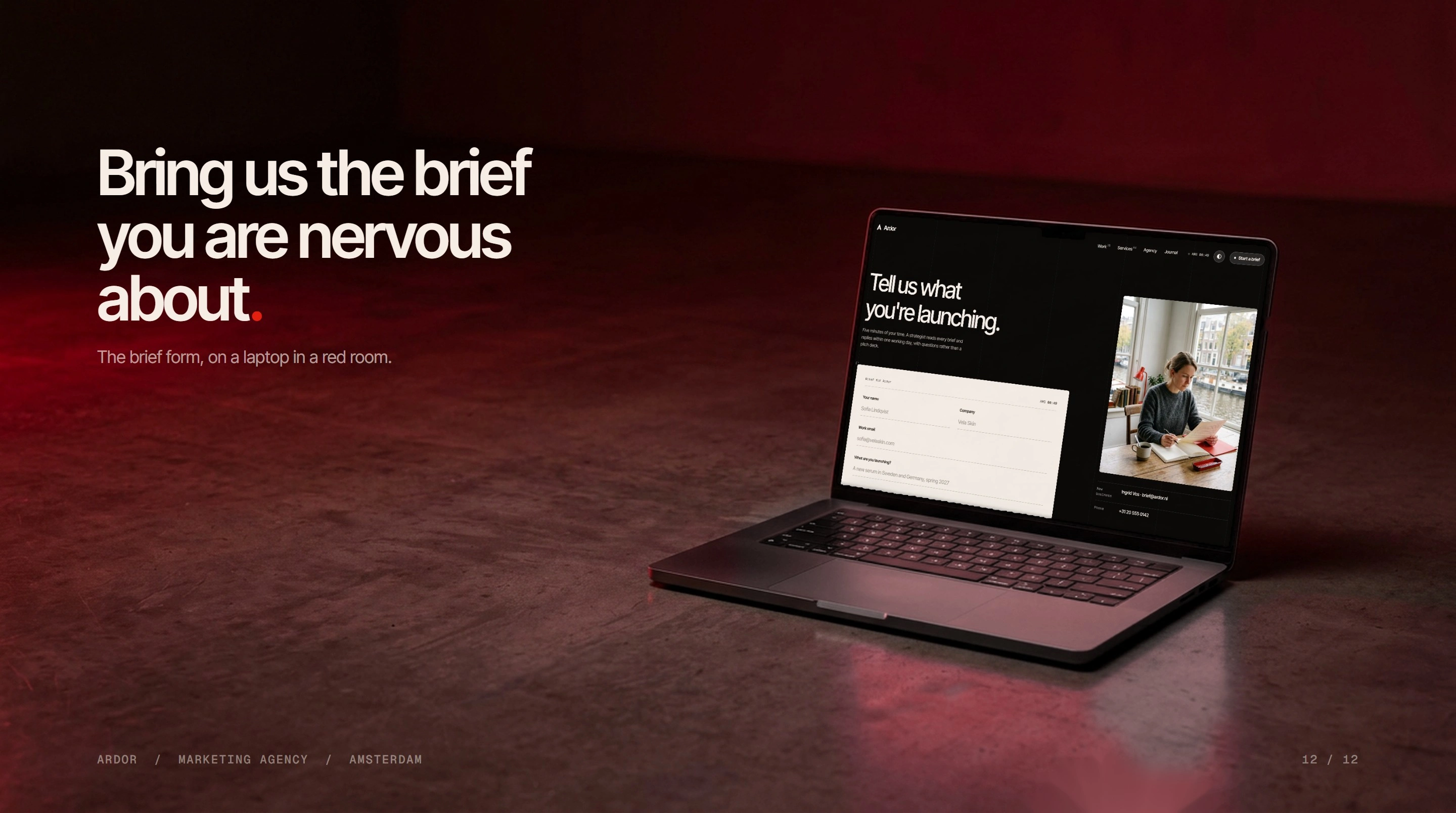
Behind it sit a work page with every case and its lead figure, a case study template that runs from the brief to the result, a services page with a price and a timeline for each service, an agency page that tells the story year by year, a journal with filters and a contents rail on every post, and a brief form that reads like a conversation.
The type is Inter Tight for headlines and text, with Geist Mono for the details. The palette is near black, red and ember, with a cream light theme on request, and the imagery is red-lit portrait photography. Built with Astro, GSAP and Lenis.
The outcome
A complete six-page agency site with a case study template, a journal with posts and a brief form, ready to start a conversation from the first screen.
1 like · 3 views · Oct 16, 2026
A website for an independent marketing agency in Amsterdam, built around one red-lit portrait and cases that lead with the number they moved.


