Development of TROK Membership Learning Platform
Guoshuai Zhang
TROK — Membership Learning Platform
Overview
TROK is a modern membership-based learning and resource platform designed to help users grow through structured content, community support, and premium digital resources.
The goal of this project was to design and build a bright, conversion-focused membership website that combines education, community, and digital product access into one seamless experience.
This project focuses on UX design, Webflow development, membership system structure, and scalable product architecture.
Project Goal
The main goal was to create a high-converting membership platform that feels premium, trustworthy, and easy to navigate.
Key objectives:
Design a clean and bright membership experience
Structure scalable content (courses, resources, tools, guides)
Build a conversion-focused pricing and onboarding flow
Create a dashboard-driven member experience
Improve retention through content discovery and community features
My Role
UX/UI Design
Webflow Development
Membership System Architecture
Information Architecture & User Flow Design
Visual Design & Art Direction
Responsive Design Optimization
Design Concept
The TROK design system is built around clarity, growth, and accessibility.
The visual direction focuses on:
Bright and minimal UI with soft gradients
Clean typography with strong hierarchy
Card-based modular layout system
Light shadows and soft depth effects
Friendly, modern, and approachable visual tone
The goal was to make the platform feel like a premium learning ecosystem rather than a traditional course website.
Core Experience
TROK is structured as a full membership ecosystem including:
Public marketing website (conversion-focused)
Pricing and membership tiers
Resource library preview
Member onboarding system
Personalized dashboard experience
Content library with filtering system
Community and engagement layer
Subscription and billing management
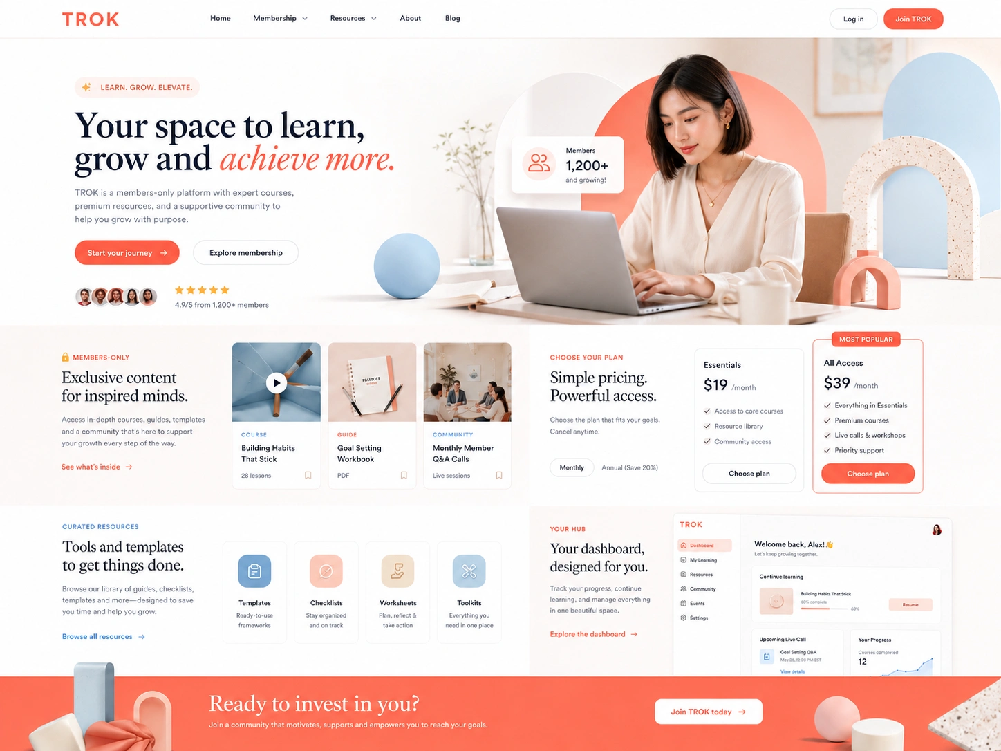
Homepage Experience
The homepage is designed to immediately communicate value and drive conversion.
Sections include:
Hero section with strong value proposition
Feature highlights and benefits
Preview of premium resources
Membership tiers overview
Testimonials and social proof
Final conversion-focused CTA
The goal is to build trust before asking for sign-up.
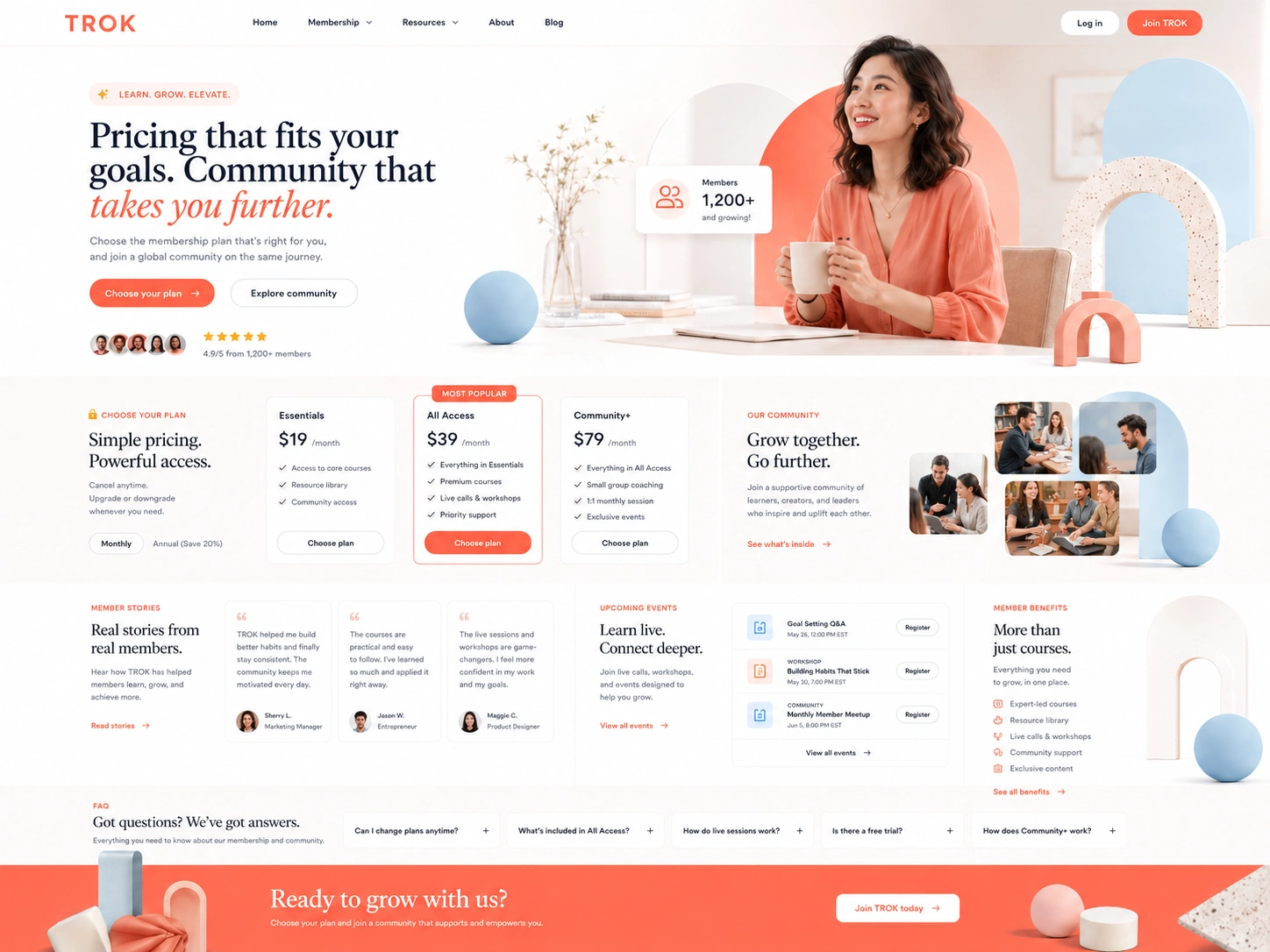
Membership & Pricing System
The pricing system is designed to maximize clarity and conversion.
Structure includes:
Tiered membership plans (Starter, Pro, Premium)
Feature comparison system
Monthly and yearly billing toggle
Clear upgrade path explanation
FAQ section for objection handling
Each tier clearly defines access level, content availability, and community benefits.
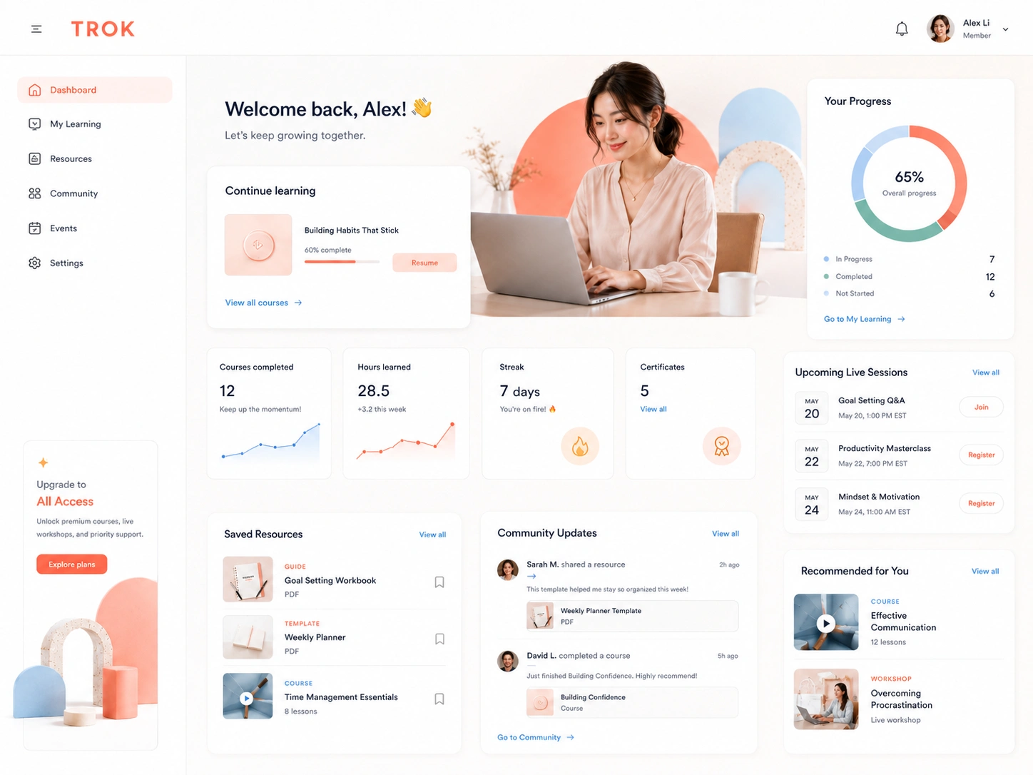
Member Dashboard
The dashboard is the core of the user experience.
It includes:
Personalized welcome section
Learning progress tracking
Recommended content feed
Saved resources and bookmarks
Upcoming events and sessions
Quick access to library and community
The dashboard is designed to keep users engaged and continuously returning.
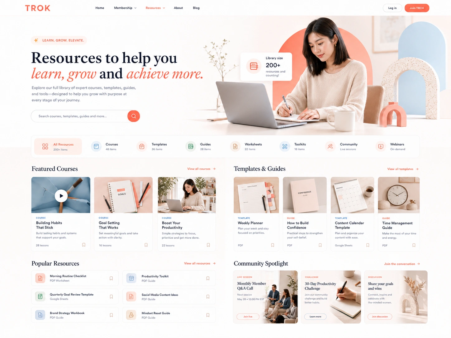
Content Library System
The library is structured for easy discovery and navigation.
Features include:
Category-based filtering system
Search functionality
Content tagging system
Resource cards (courses, templates, guides, tools)
Locked vs unlocked content states
Sorting and recommendation logic
This system ensures scalability as content grows.
Membership Flow
User journey:
User lands on homepage
Explores benefits and preview content
Visits pricing page
Selects membership plan
Creates account
Completes payment
Onboarding experience begins
Redirected to dashboard
The flow is optimized for low friction and high conversion.
Onboarding Experience
After signup, users are guided through:
Welcome introduction
Interest selection
Personalized content recommendations
First dashboard walkthrough
This increases engagement and retention in early usage.
UX Principles
Clarity over complexity
Fast navigation and content discovery
Strong visual hierarchy
Minimal cognitive load
Conversion-first design structure
Scalable system thinking
Tech Stack
Webflow — UI development and CMS structure
Memberstack / Outseta — membership authentication system
Stripe — payment processing
Finsweet Attributes — filtering and CMS enhancement
Zapier / Make (optional) — automation workflows
Outcome
TROK delivers a scalable membership platform experience that combines learning, resources, and community into a single ecosystem.
The final result is a modern, conversion-focused Webflow membership system that feels premium, structured, and highly usable.
It demonstrates strong capabilities in UX architecture, SaaS-like system design, and real-world product thinking.
Short Summary
TROK is a bright, modern membership platform built in Webflow, focused on learning, resources, and community — designed as a scalable digital product ecosystem with strong UX structure and conversion-focused design.
Like this project
Posted Jun 26, 2026
TROK needed a learning platform that keeps members coming back. I designed a membership experience built around progress, not just content.