Built with Jitter
Veta Café Carpintero Branding & Framer Development
Agustin Dell Aquila
Veta Café Carpintero — Framer Development
Project Type: University Fictional Branding & Web Development
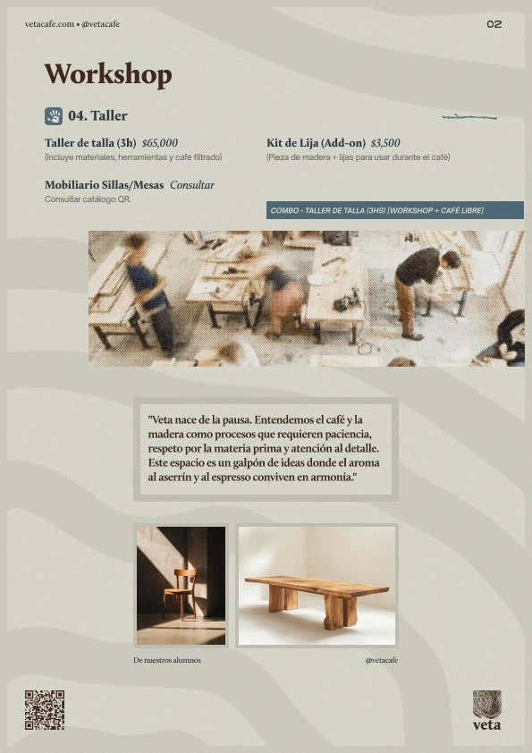
1. The "Identity Crisis" (Branding Critique)
The project attempts to merge two distinct worlds: Carpentry (Veta/Grain) and Specialty Coffee.
The Conflict: High-end carpentry produces sawdust, noise, and chemical finishes (varnish/stain). High-end coffee requires a sterile, aromatic environment.
The Problem: The website leans heavily into the "wood" aesthetic but fails to visually communicate how these two functions coexist without ruining the coffee experience. The branding risks feeling "dusty" rather than "fresh."
Contra View: In a real-world application, the branding might repel coffee purists who associate woodshops with industrial debris.
2. Navigation & User Friction (UX Critique)
Framer projects often prioritize "scroll-telling" over "utility."
Form over Function: The site uses high-engagement animations and scroll-triggered reveals. While visually impressive for a portfolio, it creates "interaction fatigue" for a user who just wants to see the menu or opening hours.
Hidden Information: If the primary goal of a café site is to drive foot traffic, the location and "Open/Closed" status are buried behind aesthetic layers.
The "Dead-End" Effect: As a fictional project, the "Shop" or "Booking" buttons often lead to nowhere or static sections. In a contra-study, this is seen as a failure of "Conversion Rate Optimization" (CRO). The site is a brochure, not a tool.
3. Visual Hierarchy & Accessibility
Contrast Issues: Many student projects using "organic" palettes (browns, beiges, creams) struggle with AA accessibility standards. Text-on-texture overlays (text over wood grain images) likely fail readability tests for visually impaired users.
Typography Overload: If the site uses more than three distinct typefaces (a common student pitfall), it loses its professional anchor. The "Carpintero" vibe might feel too "Pinterest-chic" rather than an established business.
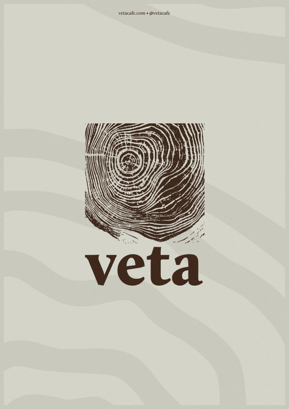
Front
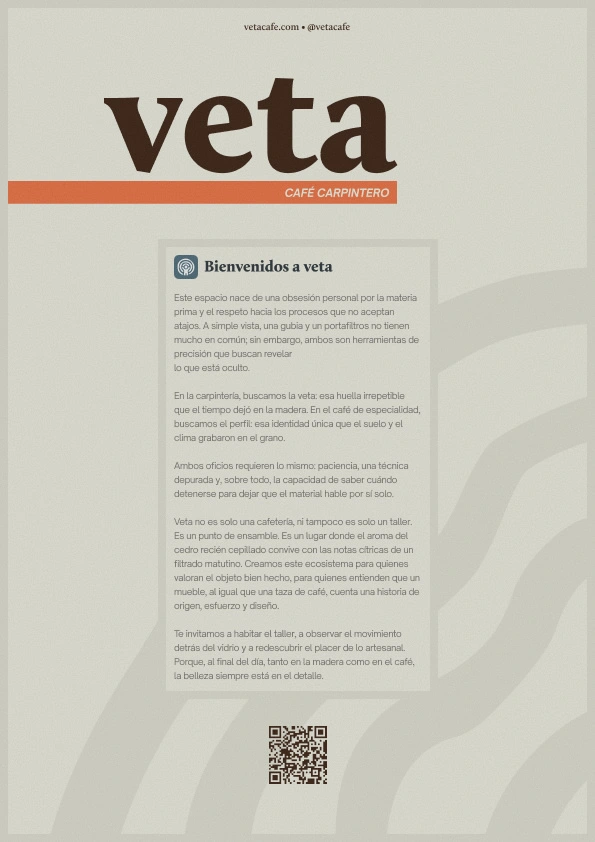
Back
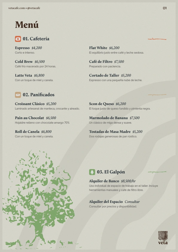
Menu L
Menu R
❖ Available for work ❖
Like this project
Posted Apr 30, 2026
Developed university project merging carpentry and coffee branding using Framer.
Likes
2
Views
57