Reducing Support Calls by 70% with a New Dashboard
Fábio Alencar

Reducing Support Calls by 70% with a New Dashboard
A complete UX redesign of Trinks B2B dashboard navigation, improving usability, scalability, and mobile responsiveness.
Product DesignUX ResearchInformation ArchitectureUsability Testing
Overview
Trinks is Brazil's largest beauty services marketplace with more than 1 million B2C users and 50,000 B2B users. Since 2019, it has been part of Stone Group, a payment processing services unicorn.
The Challenge
Redesign a 6-year-old B2B dashboard navigation that had usability and scalability issues, was not responsive, and was contributing to declining new user retention.
Timeline: 6 weeks | Role: Lead UX Designer
Key Problems Identified
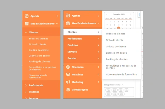
Old Dashboard
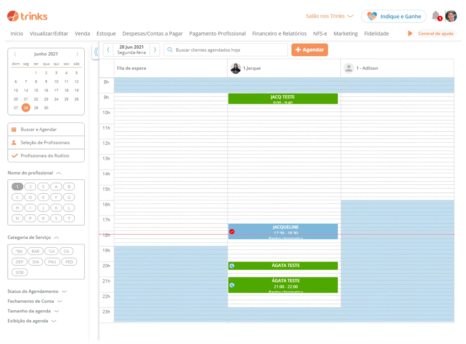
6.5%
Call Center Issues
Of all call center customer issues were related to dashboard navigation problems.
0%
Mobile Responsiveness
The dashboard was not responsive, despite mobile traffic growing faster than desktop.
6 yrs
Outdated UI/UX
Same navigation for 6 years with accumulated usability and scalability issues.
Design Process
I followed a complete design thinking process over 6 weeks, from discovery to post-launch research.
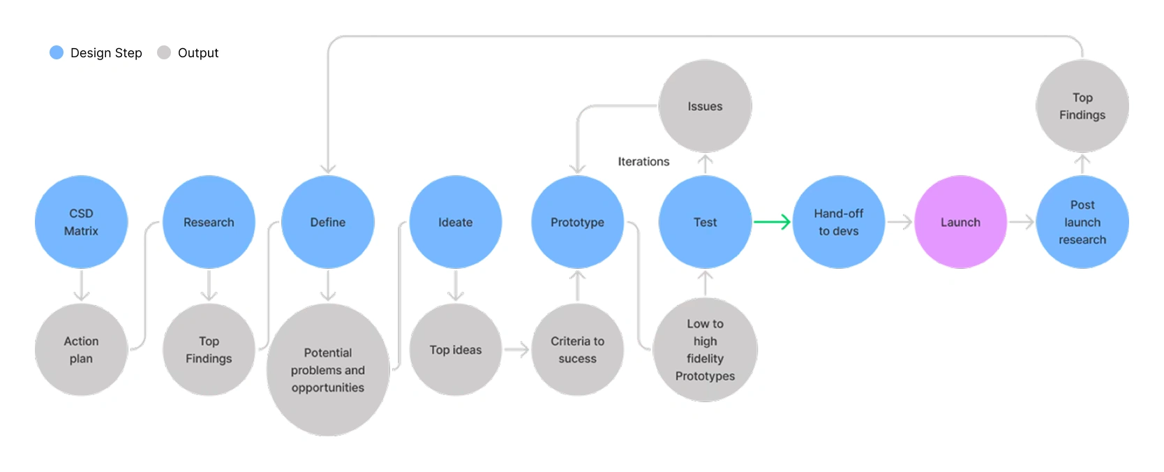
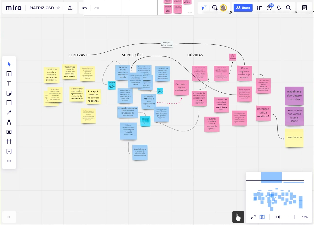
1. CSD Matrix
To expose all information the team had about the problem and question assumptions from the beginning, I facilitated a CSD Matrix session (Certainties, Suppositions, Doubts).
Output: Action plan for research phase
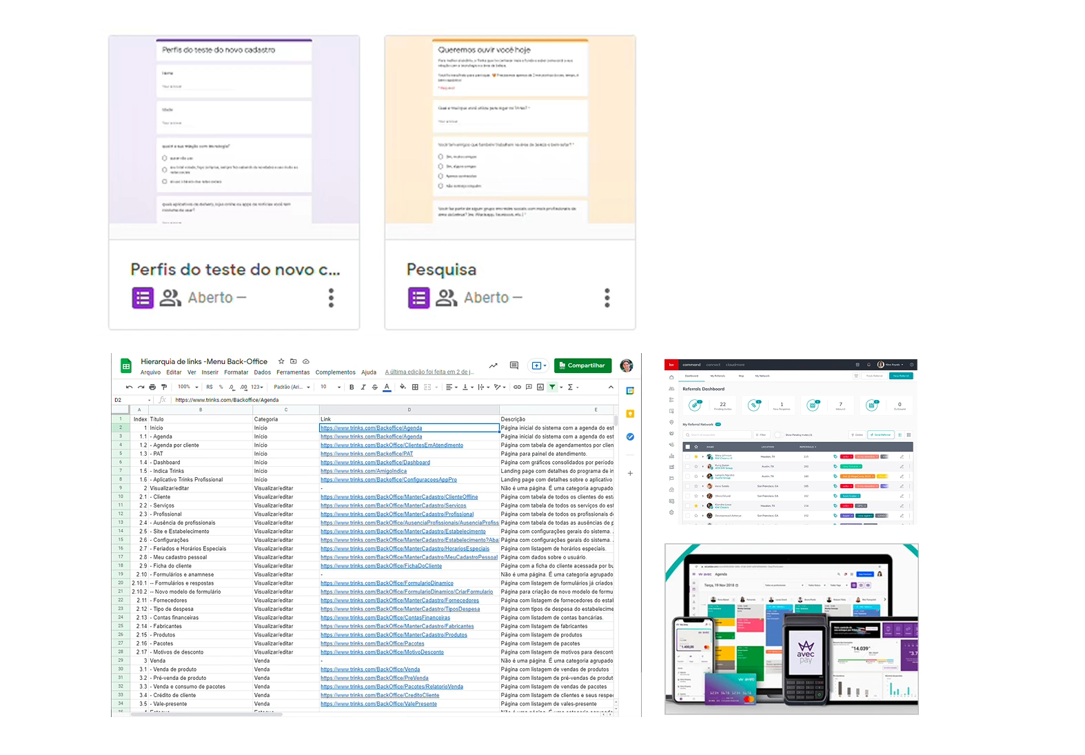
2. Research
Comprehensive research to understand the problem:
2 Surveys (95 responses)
15 User interviews (new, old, franchise users)
Inventory of 77 navigation items
Benchmarking with competitors
Heuristic analysis
Top Research Findings
User Behavior
New users don't explore all features they could
New users have more usability issues than old users
30% of users look for features on a search bar
Old users are very resistant to changes
Technical Issues
Some categories are ambiguous
Current navigation can't grow horizontally
Icons have different design styles
Mobile traffic growing faster than desktop
Competition Insights
Competition uses icons on navigation
Competition uses vertical menu on desktop
Some competitor dashboards are already responsive
User Concerns
New users miss a search bar
Users confuse video icon with help center
Franchise users worried about staff training
Ideate & Prototype
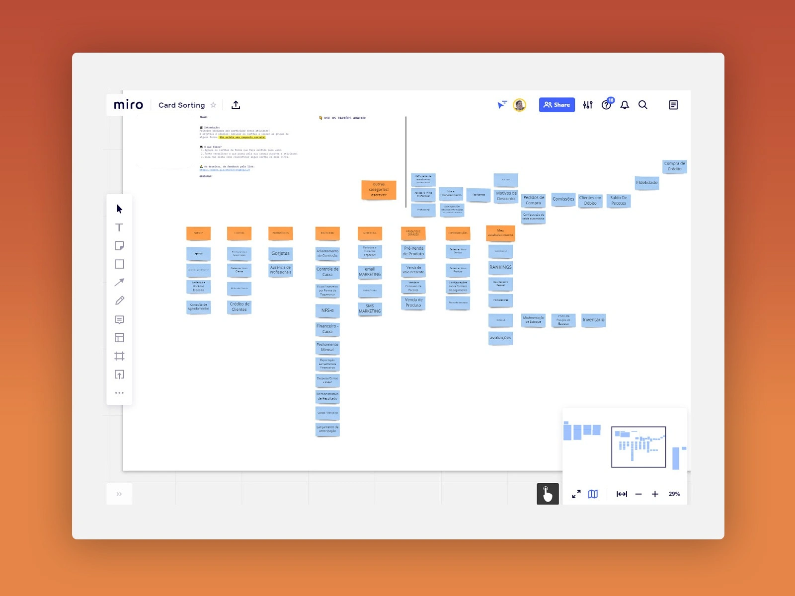
Card Sorting Activity
I conducted card sorting sessions with users to create a new information architecture for the 77 navigation items.
This helped create unique, unambiguous categories based on how users actually think about the features.
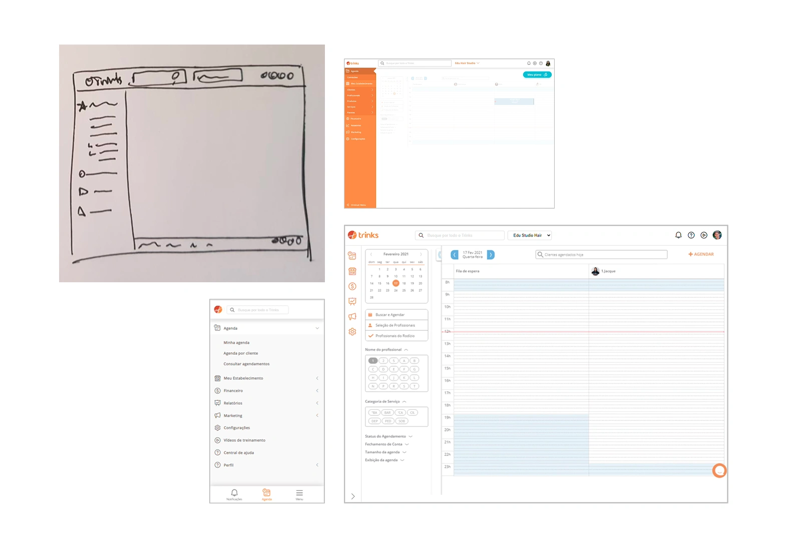
Low to High Fidelity
I created prototypes iterating from sketches to high-fidelity designs in Figma.
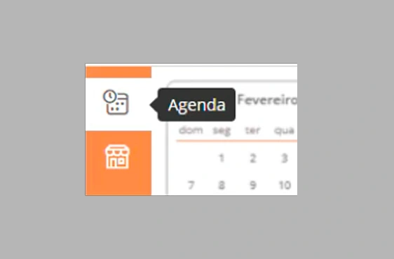
Vertical sidebar with icons and labels
Collapsible menu with tooltip support
Global search bar with autocomplete
Responsive mobile version with bottom navigation
Top Ideas Selected
Vertical Menu
Redesign as vertical menu for flexibility and scalability
Icons + Labels
Use icons with labels for faster recognition
Global Search
Add search bar with autocomplete and direct links
Optional Transition
Make new solution optional for old users
Testing & Iteration
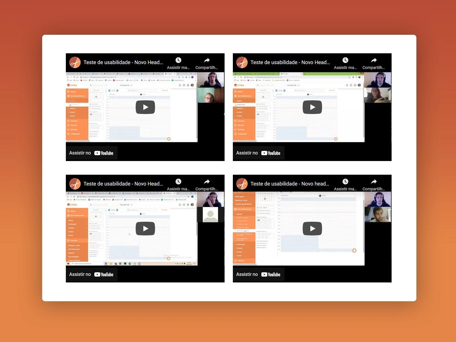
Usability Testing
I conducted usability tests with 19 participants:
15 users (5 from each user group)
4 internal stakeholders (2 partners, 2 CS)
Test areas: Third menu level, menu collapse, labels, cognitive paths, search usability, icon understanding, tooltip usability.
Adjustments After Testing
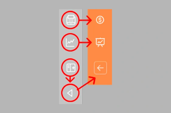
Icons Change
Some icons weren't recognized correctly and were replaced
Third Menu Level
Improved the interaction pattern for nested items
Mobile Issues
Refined the mobile navigation experience
Tooltip
Added tooltips for collapsed menu state
Launch & Results
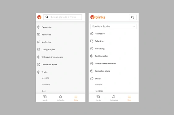
Final Design
The new navigation was launched with an optional transition for existing users.
Vertical sidebar with icon-based navigation
Expandable/collapsible menu with tooltips
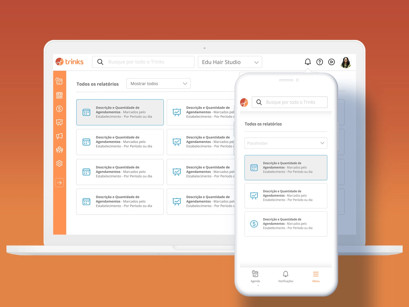
Global search with autocomplete suggestions
Responsive design with dedicated mobile experience
Notification center accessible from header
Impact & Results
70%
Reduction
In navigation-related call center issues (from 6.5% to 2%)
37%
Adoption
From existing users (new users have new solution by default)
0.55%
Negative Feedback
Only 0.55% of negative feedback from all users
100%
Responsive
Navigation now prepared for growing mobile traffic
Lessons Learned
Communication is key for major changes: Some users resist changes without understanding the purpose. I would have planned a more complete communication strategy with the PO.
Never underestimate performance issues: Some users were frustrated with cache bugs at launch and blamed the entire solution.
See the big picture: Major changes have bigger scope than you can imagine. Pay attention to edge cases from the user perspective.
Complete design review before launch: Never let developers launch a major UI change without reviewing all user cases.
What's Next
1.Theme selector (light/dark mode)
2.Franchise custom options
3.Responsive components across all pages
Like this project
Posted Mar 31, 2026
UX redesign of Trinks B2B dashboard improving usability, scalability, and mobile responsiveness, reducing navigation support calls by 70%.
Likes
0
Views
1