2 | Define
Paige Mariucci

INTRODUCTION
PRODUCT | A responsive web app which allows users to search, save, message, and book planners for their events.
PROJECT ROLE | My role was to develop the product design including preliminary research, problem definition, prototype development, usability testing, & refinement of the visual design.
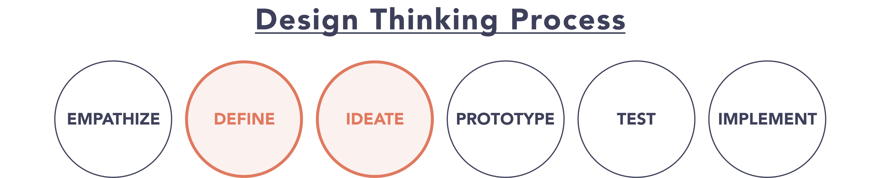
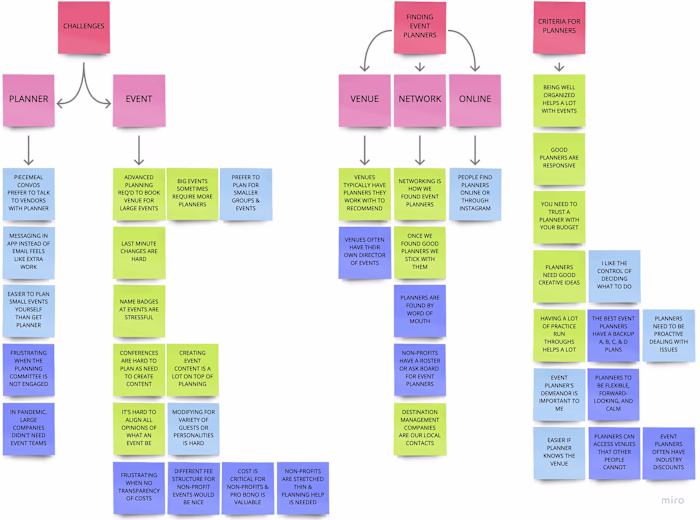
CASE STUDY | The below case study is focused on the process I used to define & ideate the user's problem by applying the interview data to develop user personas, journey maps, and flows followed by a card sorting exercise to create a site map.
Case Study Contents:
2.1 / 🙂 User Personas
2.2 / 🫤 User Journey Maps
2.3 / 😌 User Flows
2.4 / 🧑💻 Site Map
2.5 / 🙋 Card Sorting... and Revised Site Map
2.6 / 👍 Learnings
2.1 / 🙂 User Personas
To begin this process, design personas were created per my user interview data. I developed 3 personas for The Vision: Simone, Jesse, & Dara. The intent of having multiple personas was to design for users searching for personal, professional, or non-profit events planners.
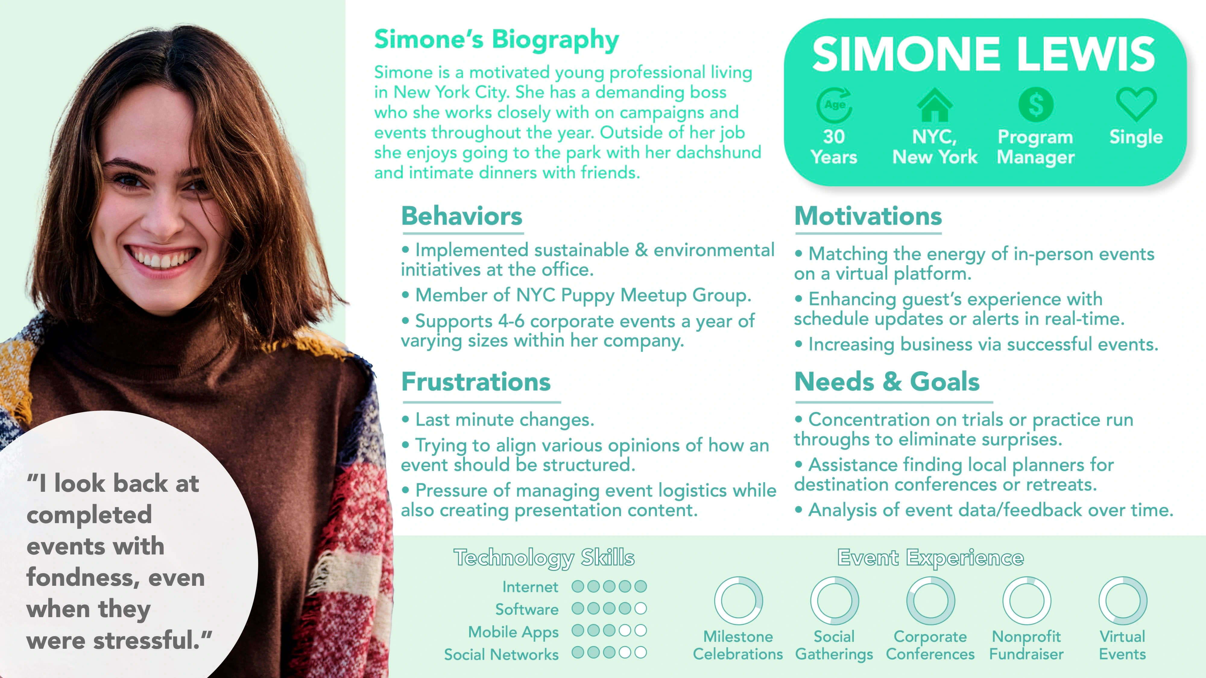
Simone's Persona
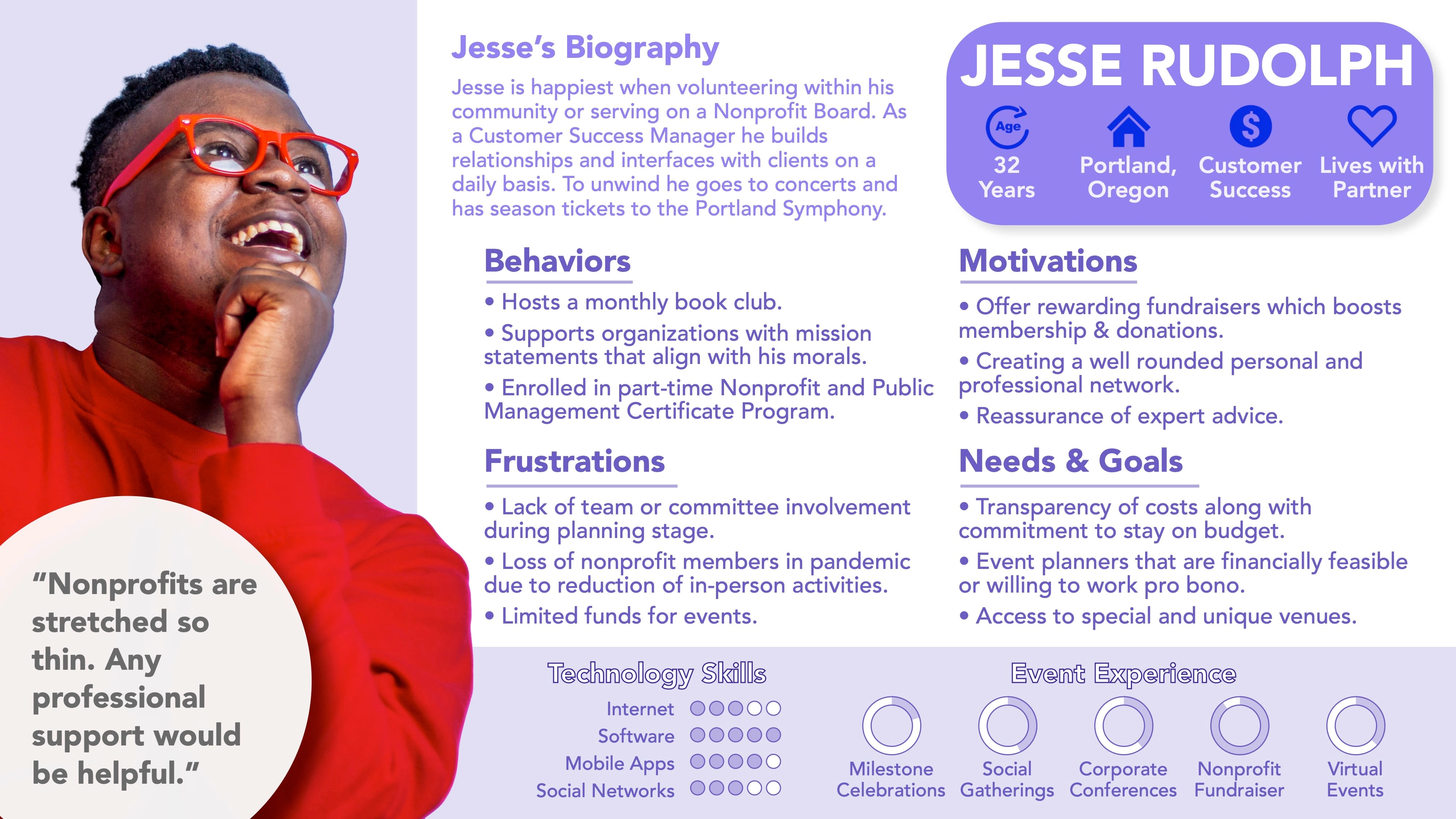
Jesse's Persona
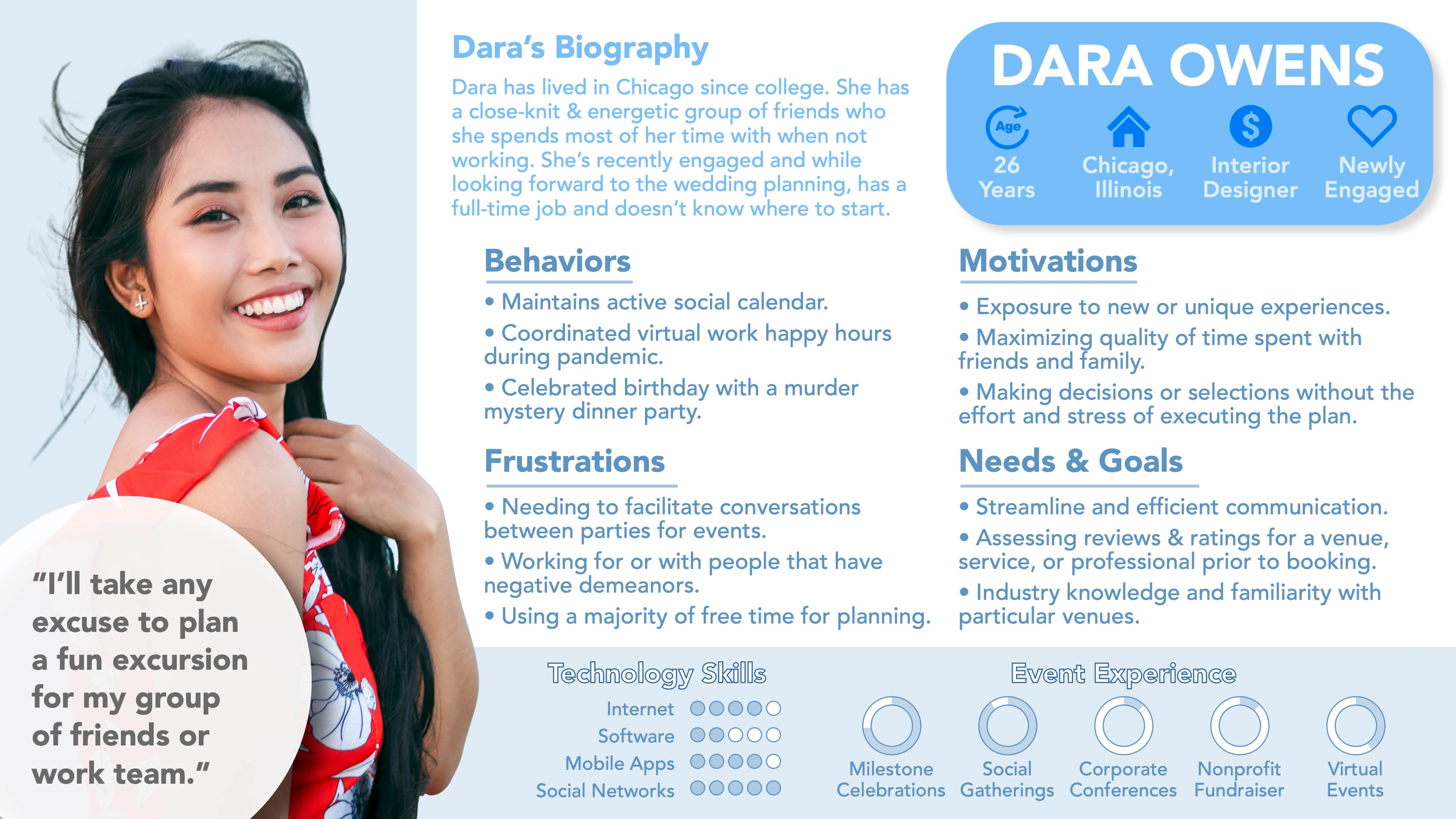
Dara's Persona
While additional information was included to make my personas memorable and relatable, the primary focus was on identifying user's motivations, needs, & goals and evaluating how those aligned with the preliminary problem statement.
2.2 / 🫤 User Journey Maps
With personas in hand, I started to visualize the tasks, thoughts, and emotions that my users would go through in order to accomplish a goal. This study was graphically represented in user journey maps.
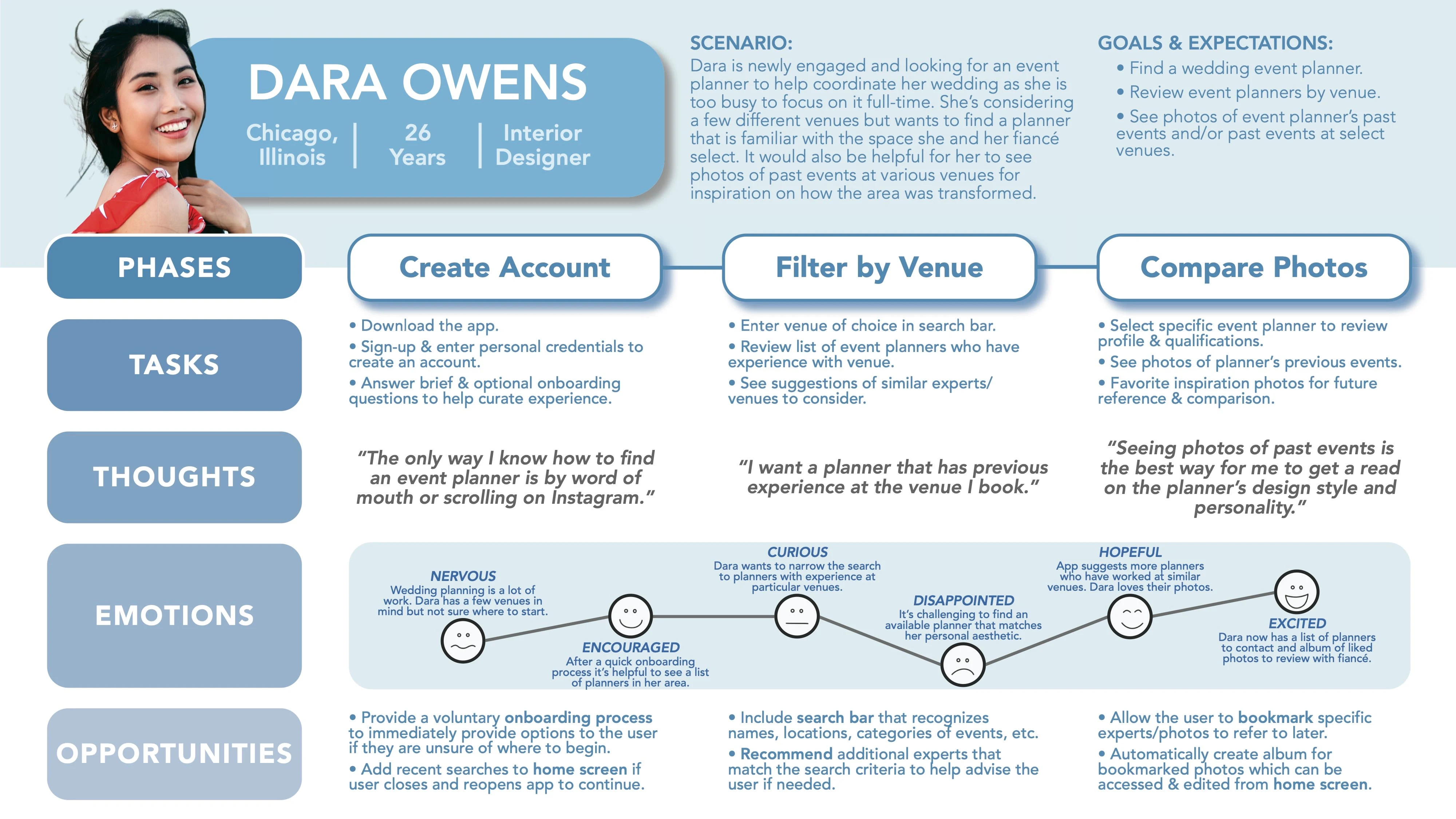
Dara's Journey Map
As seen in the Journey Map above, Dara would like to find an event planner for her wedding. It is important to her that she can review photos of particular planner's past events in order to determine if they will be an appropriate or aesthetic fit for her event.
A benefit of creating Dara's Journey Map was that I was able to recognize a few design opportunities for The Vision app to help Dara more easily accomplish her goal.
👇
Bookmark feature to help users remember planners while in the search flow.
Album feature for a user's bookmarked planners that can be referred to later.
2.3 / 😌 User Flows
The next part of the process required me to concentrate on specific actions the personas may be doing while using The Vision app. To create a user flow for Dara, I identified her objective, gathered information related to her task, and outlined an optimized list of tasks that I believed Dara would follow to accomplish her goal.
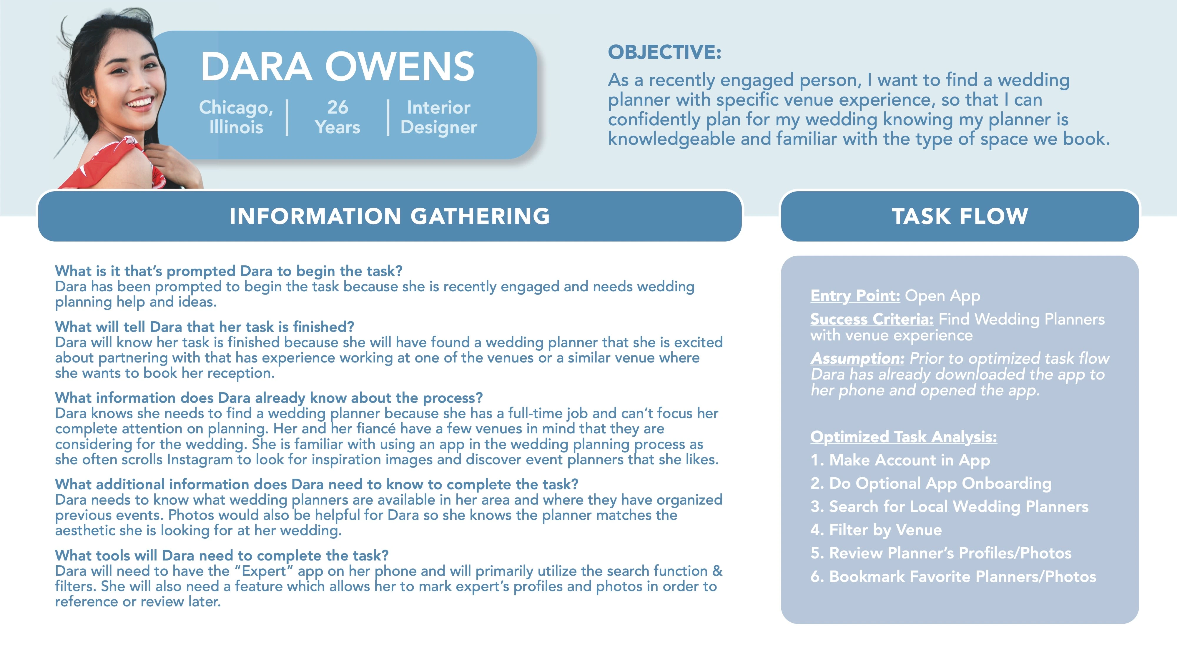
Dara's Context for User Flow
Preparing this context in advance helped me to visually represent the sequence of events Dara may follow when searching for a planner & bookmarking a favorite on The Vision app.
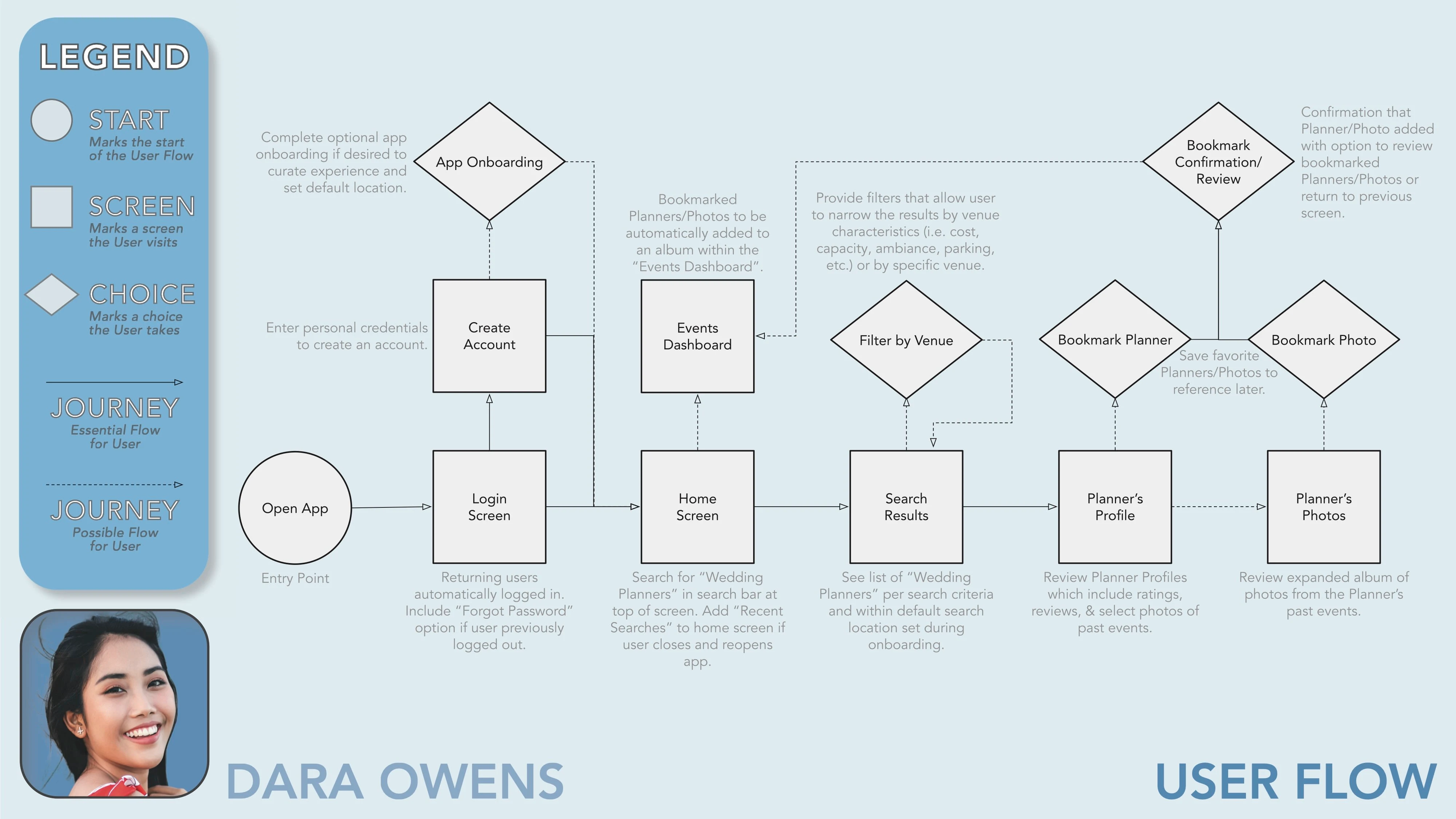
Dara's User Flow
As seen in Dara's User Flow diagram, users can sometimes follow non-linear paths. While I understand it is important as a designer to anticipate multiple routes a user may take, I tried to be mindful about presenting a straightforward series of tasks that Dara could execute in order to meet her objective efficiently.
2.4 / 🧑💻 Site Map
Defining my user personas, journeys, and flows as well as revisiting the problem statement helped me to get an idea of what product needs to be designed.
To start mapping out the organization and content of my product I created a preliminary site map. The hierarchy of The Vision app started with the home screen where the user could navigate to search, events, inbox, and account features.
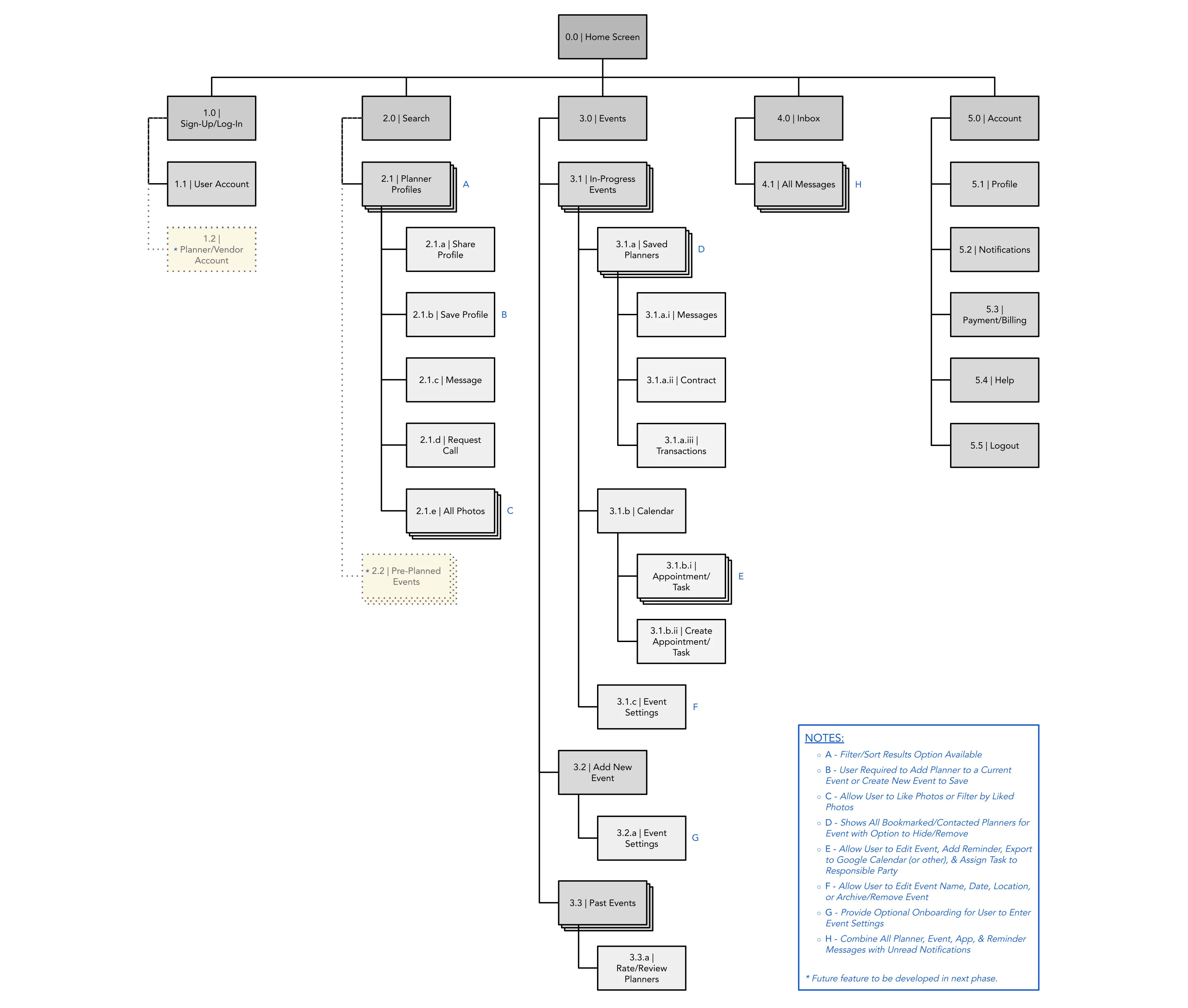
Preliminary Sitemap
A few subpages included in the sitemap (i.e. "Planner/Vendor Account" & "Pre-Planned Events") are features I believe could be incorporated into the product as a result of user interview feedback. However, since not necessary for the MVP design at this time I am simply showing a placeholder to anticipate their location within the overall sitemap.
2.5 / 🙋 Card Sorting... and Revised Site Map
Before starting to wireframe I conducted an open card sort to gain insight on my potential user's expectations for the organization of The Vision app. The following results are compiled from 10 participants sorting 20 cards via the website OptimalSort.
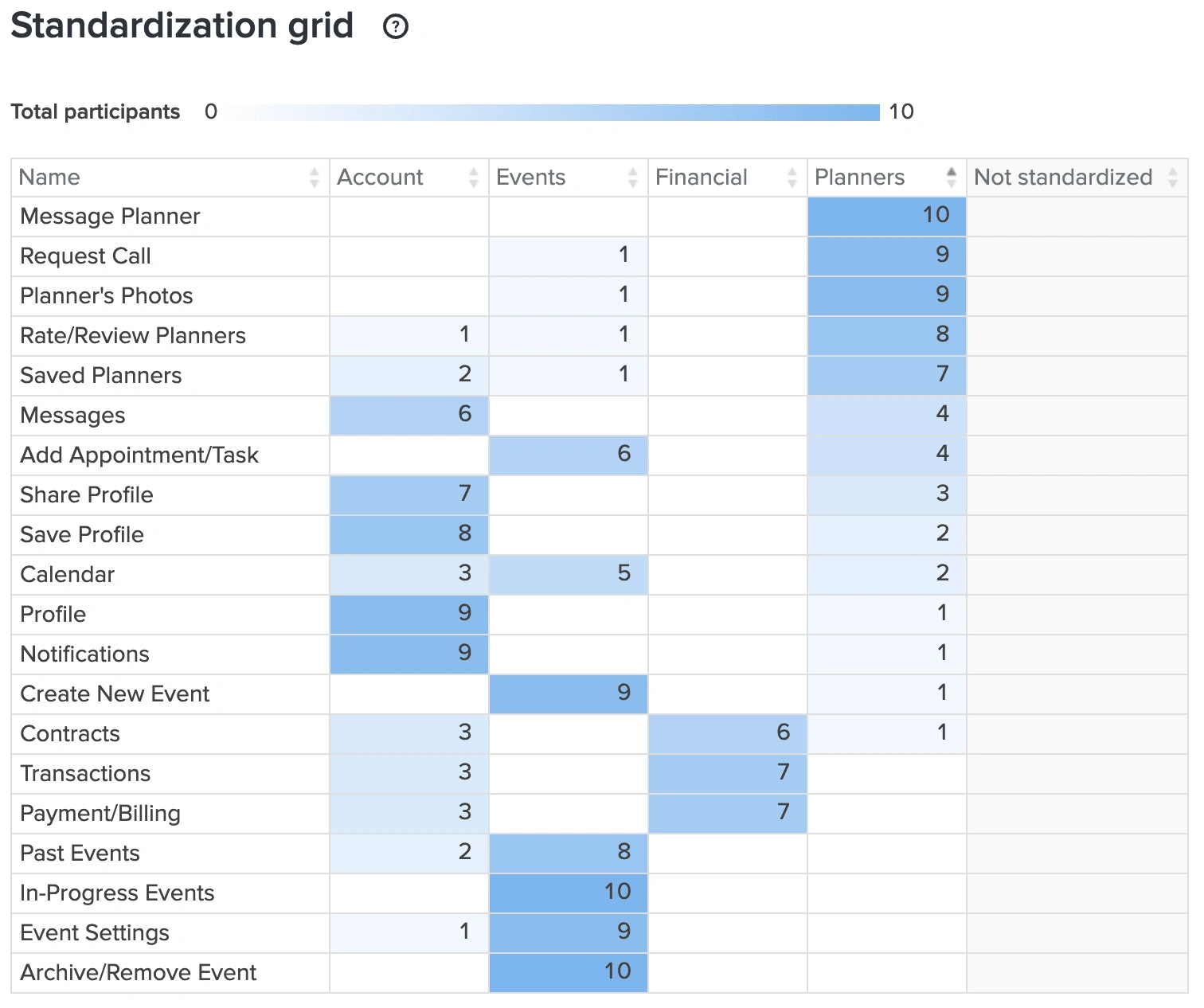
20 Cards Listed on Lefthand Side & Participants Proposed Categories Across Top
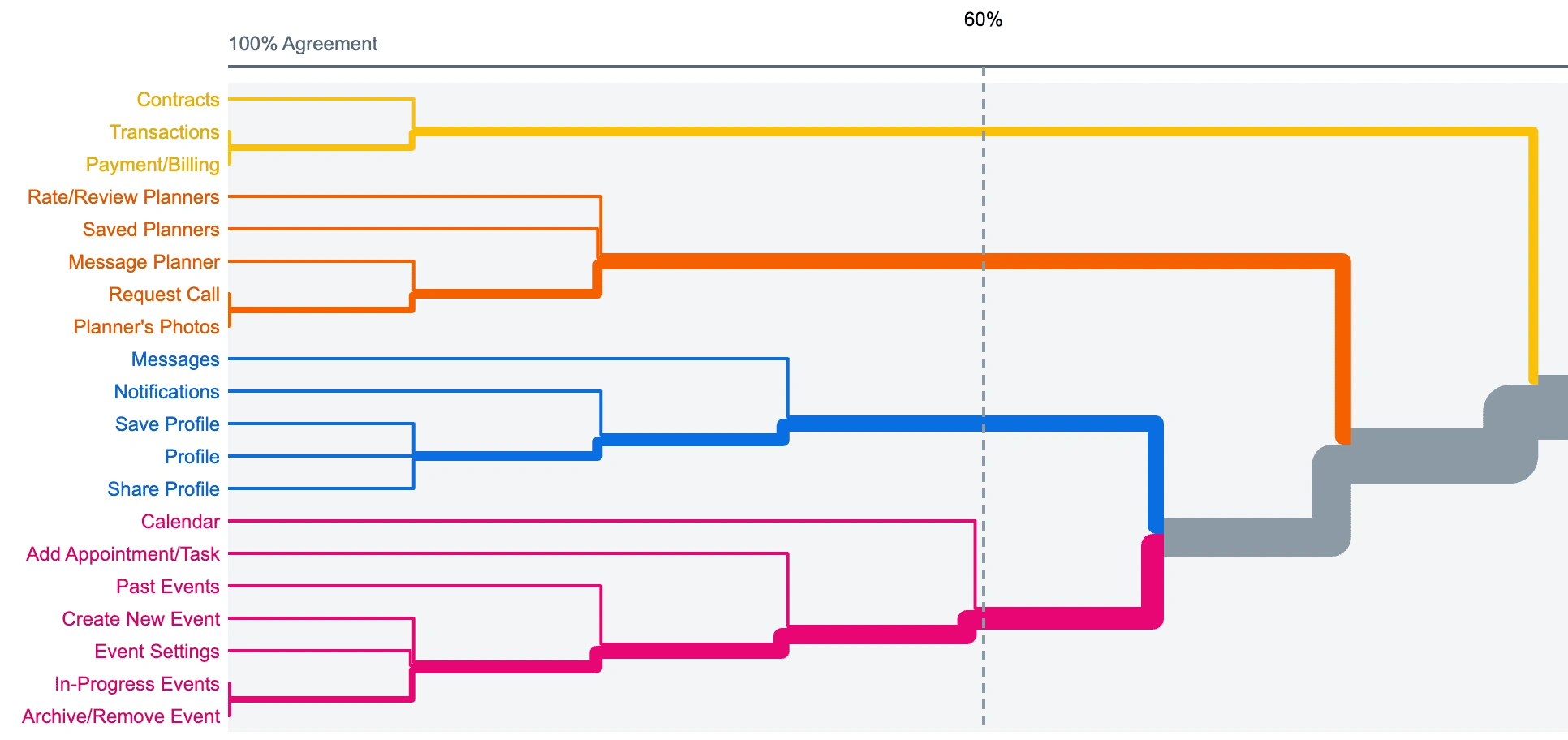
20 Cards Listed on Lefthand Side & Participants Expected Groupings of Cards
A few significant revisions to the preliminary sitemap came from the card sorting exercise with users.
👇
1. Many participants grouped "Profile", "Save Profile", & "Share Profile" together while "Profile" was intended for the user's personal account and "Save Profile" & "Share Profile" were meant for features on an event planner's profile. For clarity, "Save Profile" & "Share Profile" were revised to "Save Planner" & "Share Planner".
2. Participants typically differentiated the planner cards from event cards. Thus, a "Planners" category, separate from the "Events" category, was added under the "Home Screen" on the revised sitemap which allowed for a more simplified process when users are searching, saving, messaging, and booking planners.
3. With the addition of the new "Planners" category under "Home Screen" the user is no longer required to save planners to specific events when they wish to bookmark a planner. As a result, the "Add New Event" option was omitted as events will now only be created once a user has signed a contract with a planner.
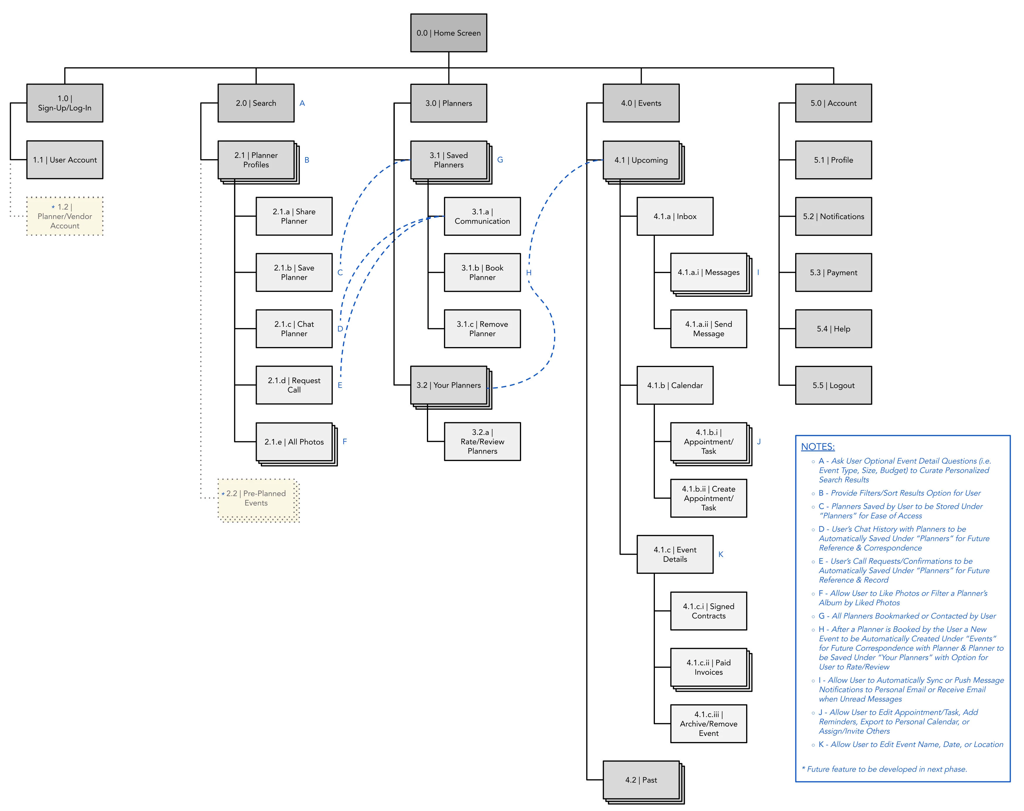
Revised Sitemap
2.6 / 👍 Learnings
Condense and strengthen personas.
Personal, corporate, and non-profit events differ in purpose, budget, or priorities. However, the people searching for planners of these various event types aren't drastically different from one another. I came to the realization that my personas have comparable end goals and could be synthesized into one primary persona given the project scope.
---
Temptation of feature creep.
In reflection, my user journeys may be ambitious for a product that will reach MVP development. While the user journeys/task analysis helped to identify potential features and grasp persona flows, I first focused on the features users needed to accomplish their goal before entertaining what else I could provide in order to maximize my design effort.
---
Card sorting helps reduce cognitive load.
Dedicating time to a participatory design exercise (i.e. card sorting) before prototyping not only saved me from redesigns later but also reinforced I was building an app that was aligned with the mental models of my users. A product that has intuitive navigation and doesn't require people to relearn patterns will make for a more enjoyable experience.
Like this project
Posted Sep 30, 2022
Defining the problem for The Vision.
Likes
0
Views
15