5 | Refine
Paige Mariucci

INTRODUCTION
PRODUCT | A responsive web app which allows users to search, save, message, and book planners for their events.
PROJECT ROLE | My role was to develop the product design including preliminary research, problem definition, prototype development, usability testing, & refinement of the visual design.
CASE STUDY | The below case study is focused on the process I used to refine the visual design through the study of gestalt principles, the creation of a style guide, and iterations after a design collaboration and accessibility evaluation.
Case Study Contents:
5.1 / 😅 Gestalt Principles
5.2 / 😊 Emotional Design Strategy
5.3 / 💁 Style Guide
5.4 / 🙏 Design Collaboration
5.5 / 🤩 Accessibility & Polished UI
5.6 / 👍 Learnings
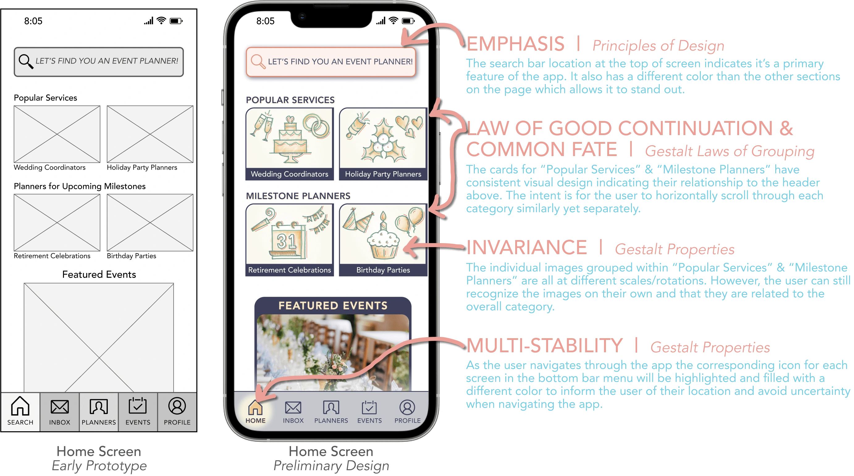
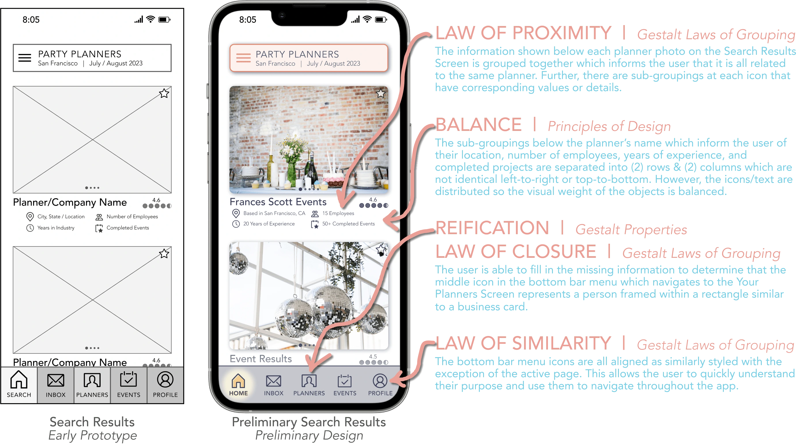
5.1 / 😅 Gestalt Principles
To improve both the visual design and user experience I studied the Gestalt Properties, Gestalt Laws of Grouping, & Principles of Design and aimed to apply them to the screens of the Vision app.
5.2 / 😊 Emotional Design Strategy
Once familiar with a range of visual design principles I further refined the screens of The Vision app by employing emotional design strategies to boost user engagement.
COLOR PALETTE
The first emotional design strategy I used was to thoughtfully select a color palette that was balanced and appealed to the user on a visceral level.
REASONING | Avoid light colors that could imply the app is exclusively for bridal or personal planners as well as exceedingly bright or high contrast colors which could be seen as more corporate or intimidating.
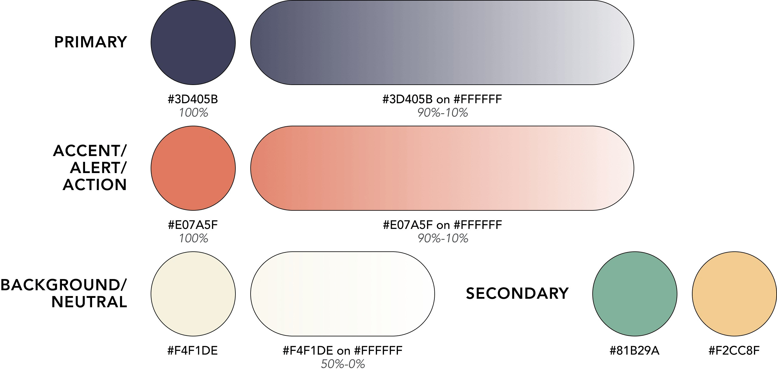
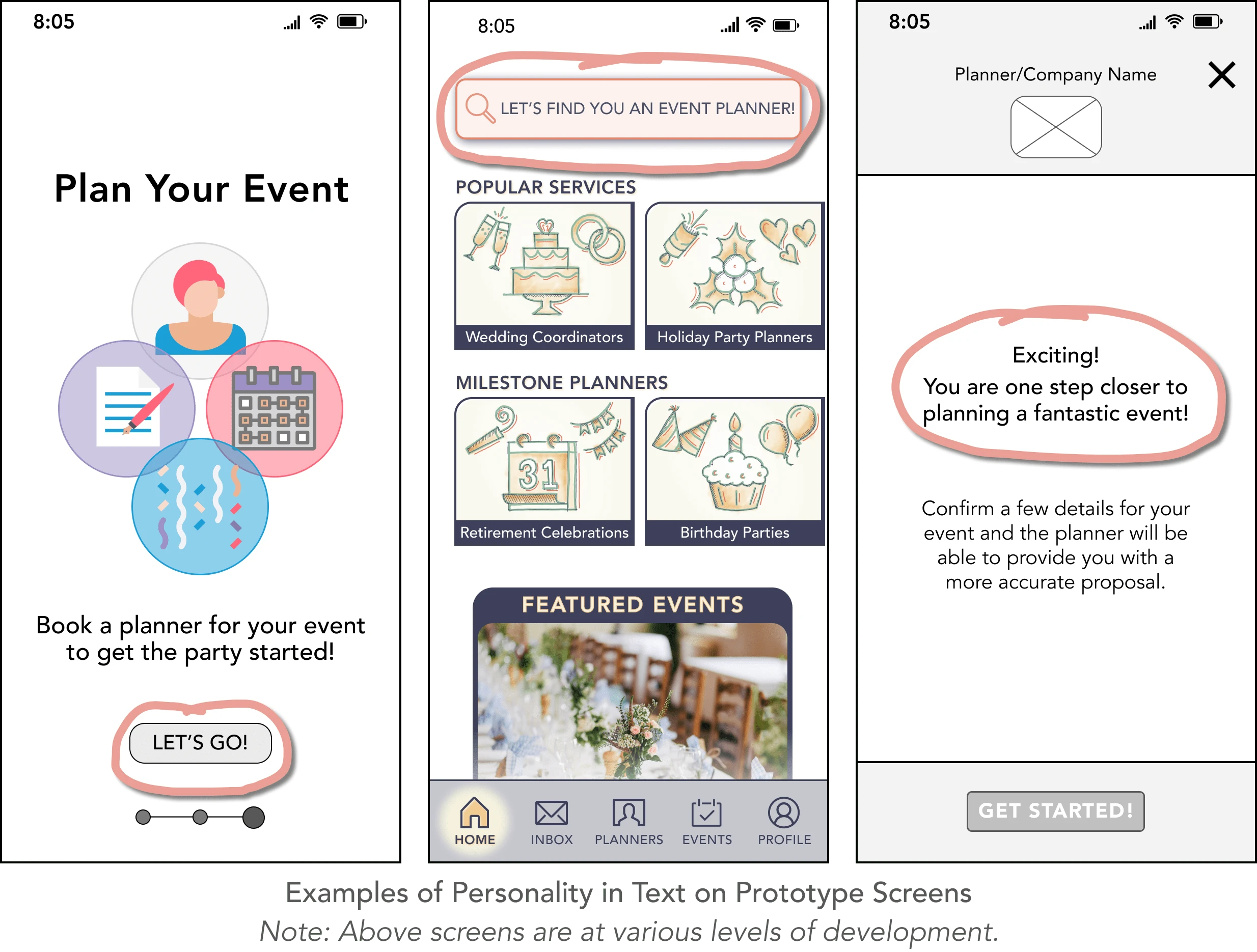
LANGUAGE & COPY
The second emotional design strategy I used was to develop a personality through casual language and friendly CTAs.
REASONING | As seen in my preference tests, a majority of participants were drawn to screens with a more conversational tone or relatable language as it made the experience more enjoyable and engaging.
5.3 / 💁 Style Guide
After narrowing in on a visual voice for The Vision app as well as developing a majority of screens to have a consistent visual language I compiled the information into a Style Guide.
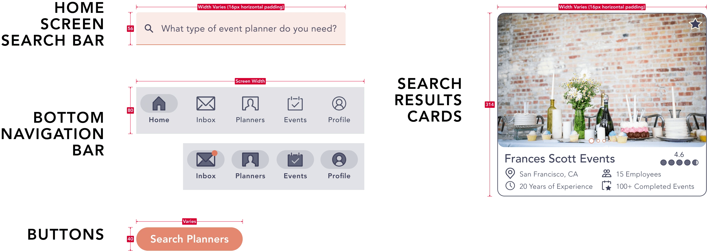
Example of Style Guide Information
The Style Guide includes information on the typography, colors, UI elements, imagery & illustrations, grids & layouts, as well as copy of The Vision app. When developing new screens or refining existing ones in the future the Style Guide can be used as a reference.
👇
5.4 / 🙏 Design Collaboration
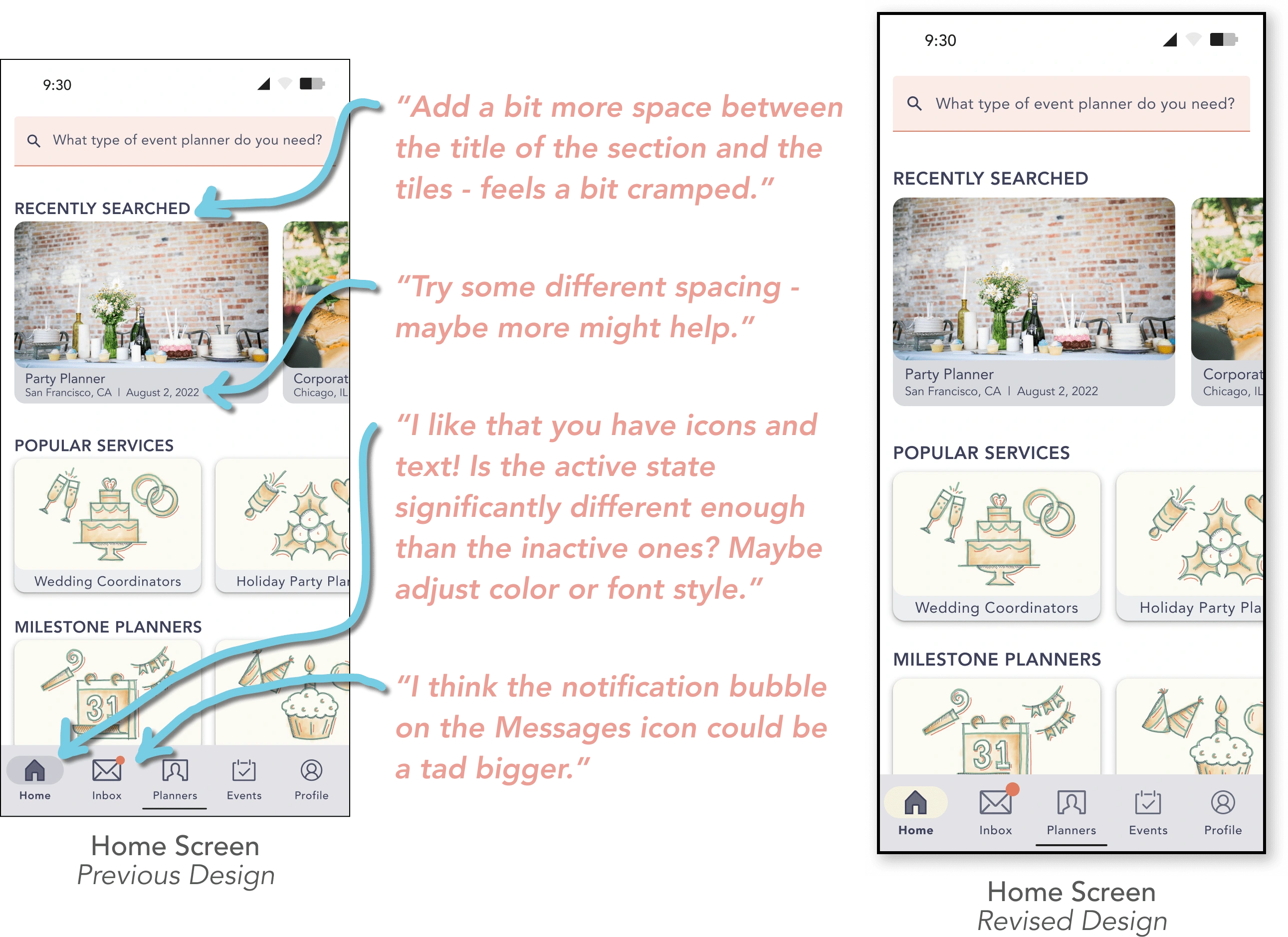
With visually updated screens it was time to share the latest prototype with fellow designers for feedback. The constructive comments received highlighted areas where I could strengthen the visual design of The Vision app for clarity and ease of use.
Updates to Home Screen
Recently Searched Cards:
Added more space between section headers (i.e. "Popular Services" & "Milestone Planners") and tiles below.
Increased the spacing between text lines as well as padding below the photo.
Bottom Bar Navigation:
Changed fill color of pill shape behind the icon to allow for more contrast, made inactive icons slightly softer/low-contrast, and increased boldness of active text.
Increased the size of the badge notification for the inbox icon.
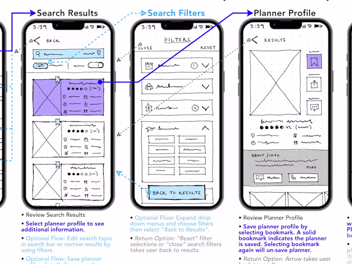
Updates to Search Prompt Screens
Where/When/What Cards:
Added arrows to indicate to the user that search prompts can be expanded or collapsed when editing.
Included descriptor on "When" card that the user can "select all that apply" for the event duration filter chips.
Updated "What" card to show both text and icons in (3) different categories to make info more readable.
Top of Screen:
Included description above the cards that search results can be narrowed by providing "optional" event info.
Omit three dot menu as not essential at this time.
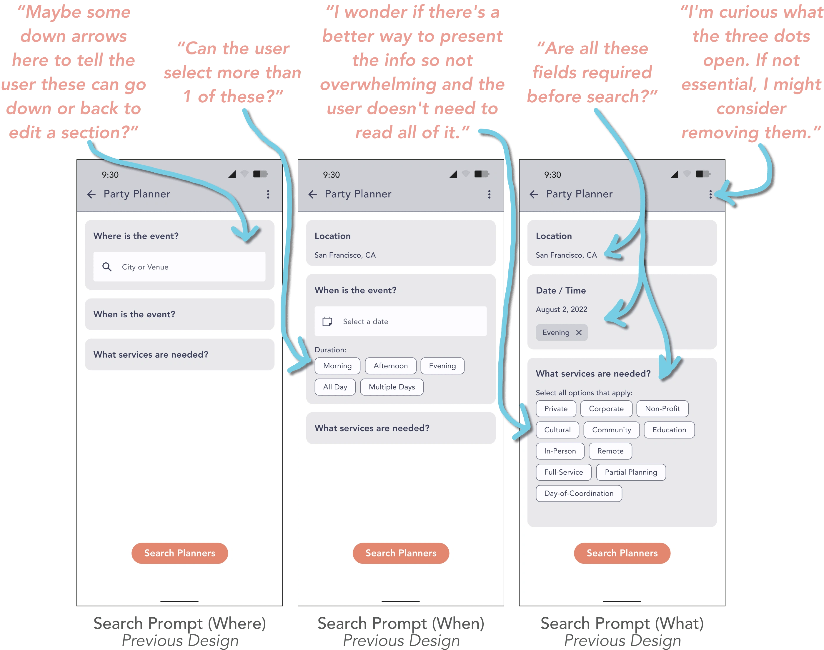
Search Prompt Flow
Previous Design vs. Revised Design
👇
5.5 / 🤩 Accessibility & Polished UI
The insight I received from designers ranged from minor visual recommendations to more significant pain points. While addressing these items I also took the opportunity to review each screen to identify improvements that could be made in terms of accessibility.
ONBOARDING:
CTA COPY | Additional description added to "Skip" CTA (i.e. "Skip to Sign-Up") to clarify where user will be taken when option selected.
CTA FONT WEIGHT | "Skip to Sign-Up" CTA strengthened from Avenir Light to Avenir Roman to help user find it during onboarding flow.
CTA LOCATION | "Skip to Sign-Up" CTA shifted to center & moved up from bottom to make it easer for user to select.
SIGN-UP / LOG-IN:
FONT SIZE | "or sign up with one of these services" increased for better readability.
LABELS | "Email" & "Password" labels added to input forms to help user remember what to enter after selecting field in flow.
HOME:
SEARCH BAR FONT SIZE | Search bar & icon increased for better readability.
SEARCH BAR LABELS/PLACEHOLDER | "Planner Search" label added to input form to help user remember what to enter after selecting field in flow. "Example 'Party Planner'" added as placeholder text to help guide user on what is expected to enter.
HEADERS FONT CASE | Headers (i.e. "Popular Services") changed from uppercase to title case to increase readability.
CARDS FONT SIZE/PADDING | Planner cards (i.e. "Wedding Coordinators") & "Recently Searched" cards increased for better readability. Padding around text increased to give visual breathing room.
CARDS BACKGROUND COLOR | "Recently Searched" cards lightened to increased contrast for better readability. "Featured Events" cards lightened as high contrast was drawing too much attention to that section and may distract user.
BADGE | Color of "Inbox" icon notification changed to achieve contrast ratio of 3:1.
SEARCH PROMPTS:
FONT WEIGHT/SIZE | "Narrow results by providing optional event info:" strengthened from Avenir Roman to Avenir Medium to help user find it during search flow. Headers (i.e. "Where is the event?") & filter selection (i.e. "Select all that apply:") increased for better readability.
INPUT FIELD FONT SIZE | "Where"/"When" input fields & icons as well as user inputted information (i.e. " San Francisco, CA") increased for better readability.
INPUT FIELD LABELS | "Location" & "Date" labels added to input forms to help user remember what to enter after selecting field in flow.
FILTER FONT SIZE | "What" filters (i.e. "Private") increased for better readability.
SEARCH RESULTS:
FONT WEIGHT | "Party Planner" at top app bar strengthened from Avenir Roman to Avenir Medium to help user find it during search flow.
CARD BORDER | Planner card borders increased to clarify extent of containers.
CARD FONT WEIGHT/SIZE/PADDING | "Planner Name" in cards strengthened from Avenir Medium to Avenir Heavy to help user find it during search flow. "Planner Info" below "Planner Name" in cards increased for better readability. Padding around text increased to give visual breathing room.
RATING COPY | Additional description added to rating (i.e. "4.6 rating" vs. "4.6") to clarify what this information means for the user.
ADDING PLANNER FONT CASE | Category titles (i.e. "Party Planners") when saving a planner changed from uppercase to title case to increase readability.
ADDING PLANNER FONT SIZE | Information below category titles (i.e. "San Francisco, CA | Aug. 2, 2022") increased for better readability.
The next step after addressing errors discovered in the usability tests, refining the visual design via principles & collaboration, and investing in the practice of designing accessible interfaces for diverse users is to modify the prototype for handoff or another round of testing.
👇
5.6 / 👍 Learnings
Design standards as inspiration.
Tools such as Google's Material Design were a handy reference when beginning the visual design. As I did not have an existing Style Guide it was beneficial to refer to it for best practices in the industry. However, I understand going forward they are purely guidelines and I have flexibility to evolve the product design as needed to best serve the users.
---
Start with clean style guide.
I learned that I can design more efficiently if I strive for visual consistency and simplicity from the start of a project. In fact, the Style Guide I created could be streamlined and consolidated further. When working on MVPs in the future I will aim to make deliberate design decisions at the beginning of the process to avoid over complication later.
---
Make accessibility a priority.
Designing products for all users with a range of accessibilities should be a priority for designers. The modifications I made to address accessibility concerns (i.e. enlarging text size, modifying colors, and including labels) not only resulted in a product that more people can navigate but also added to the visual balance of the interface in general.
Like this project
Posted Sep 30, 2022
Refining the visuals for The Vision.
Likes
0
Views
6
Tags