Brand Design, Web Design & Implementation
Jacob Rex
Revival Lane is a passion project that I run with my wife. We buy & sell mostly mid century furniture, clothes, decor, records and more. From the very beginning we wanted to stand out from the usual antique sellers with a visible and like-able brand.
Branding
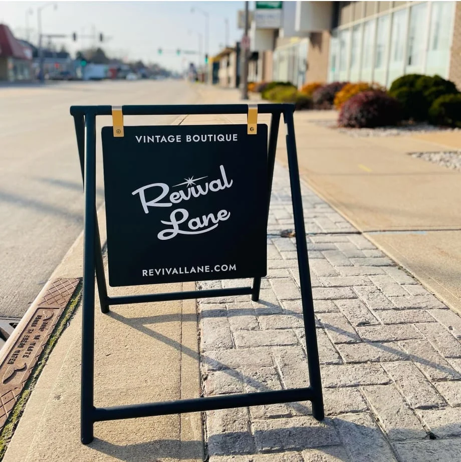
Branding is more than just a logo, its the way people interact and shop with us. From the moment they walk in our brand experience takes over with the music we play, to the branded tags on all our merchandise, to the type of items we curate, to the way we stage items, to how we decorate -- all of it stays true to our brand identity.
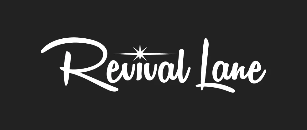
I wanted our brand to feel retro & young rather than retro & old because we are leveraging modern tools like Square, loyalty programs, and more to service our customers. I also wanted to avoid being too kitsch, which is a pitfall I think many mid century/retro brands make. For the logo, I modified some script fonts for visibility and character and added a starburst for flare. This font has served us well on everything from our web presence, to business cards, to signs and more.
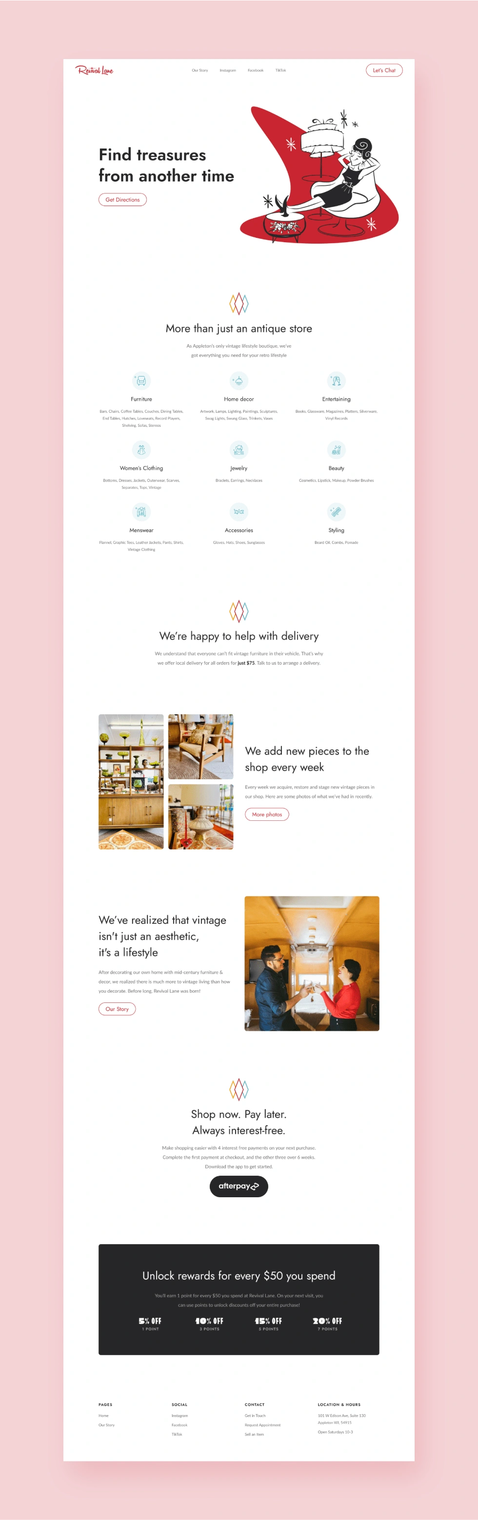
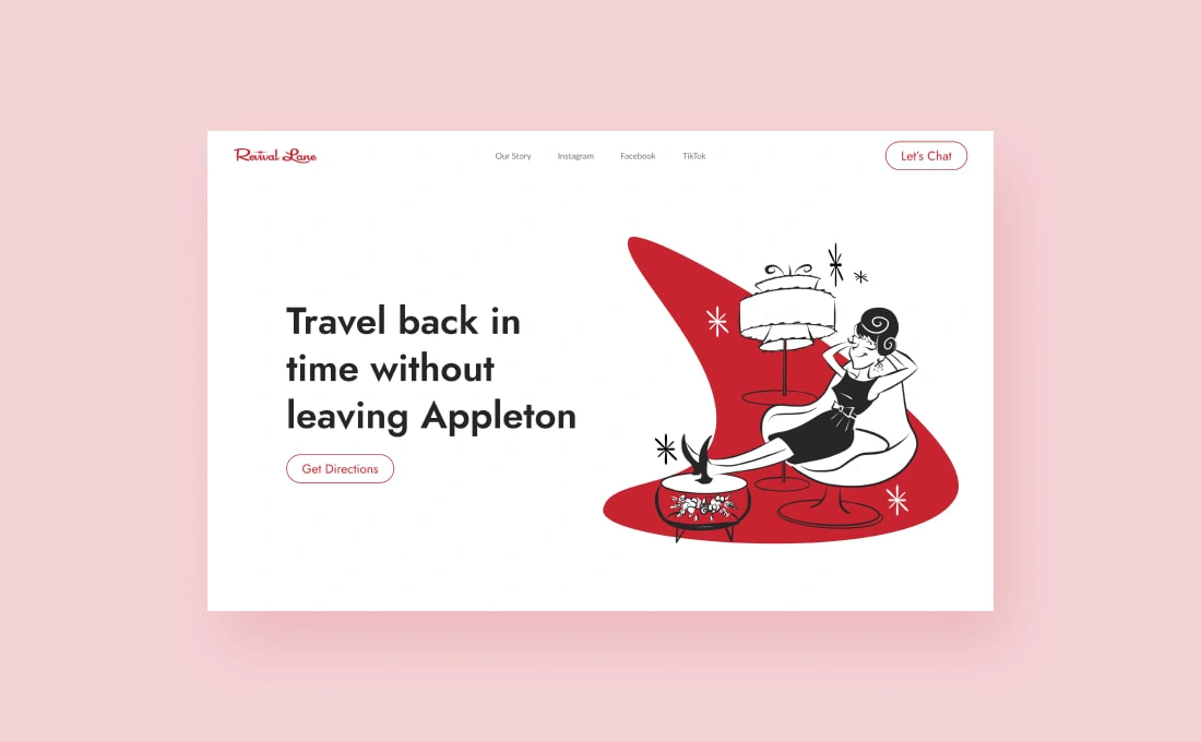
Website
When it came to the website, I wanted something that felt big so we had room to grow. I kept things light and fun with my wife’s illustrations and gave it a modern feel with plenty of white space and some iconography. The result is a website that makes people want to come in, and the brand gives people a good experience.
Like this project
Posted Jun 15, 2023
Over a period of 3 years I designed logos, business cards, hang tags, signs, ads, and our website and created a brand local customers love and are loyal to.
Likes
0
Views
10