Not Your Average — Building a Premium Superfood Coffee Brand
Sean Rainey
Project Overview
The Challenge:
Not Your Average needed a complete brand identity to launch their superfood coffee line in a crowded wellness market. They required a visual system that felt premium and distinctive while communicating transparency and functional benefits to health-conscious consumers.
Deliverables:
Complete brand identity system
Logo and mark variations
Custom typography selection
Packaging design
Botanical illustration library
Business collateral
Social media templates
Brand guidelines
The Approach
1. Strategic Positioning
Developed a bold, unconventional visual identity that breaks away from typical wellness aesthetics. The goal was to position Not Your Average as a premium player while maintaining authenticity.
2. Visual Identity Development
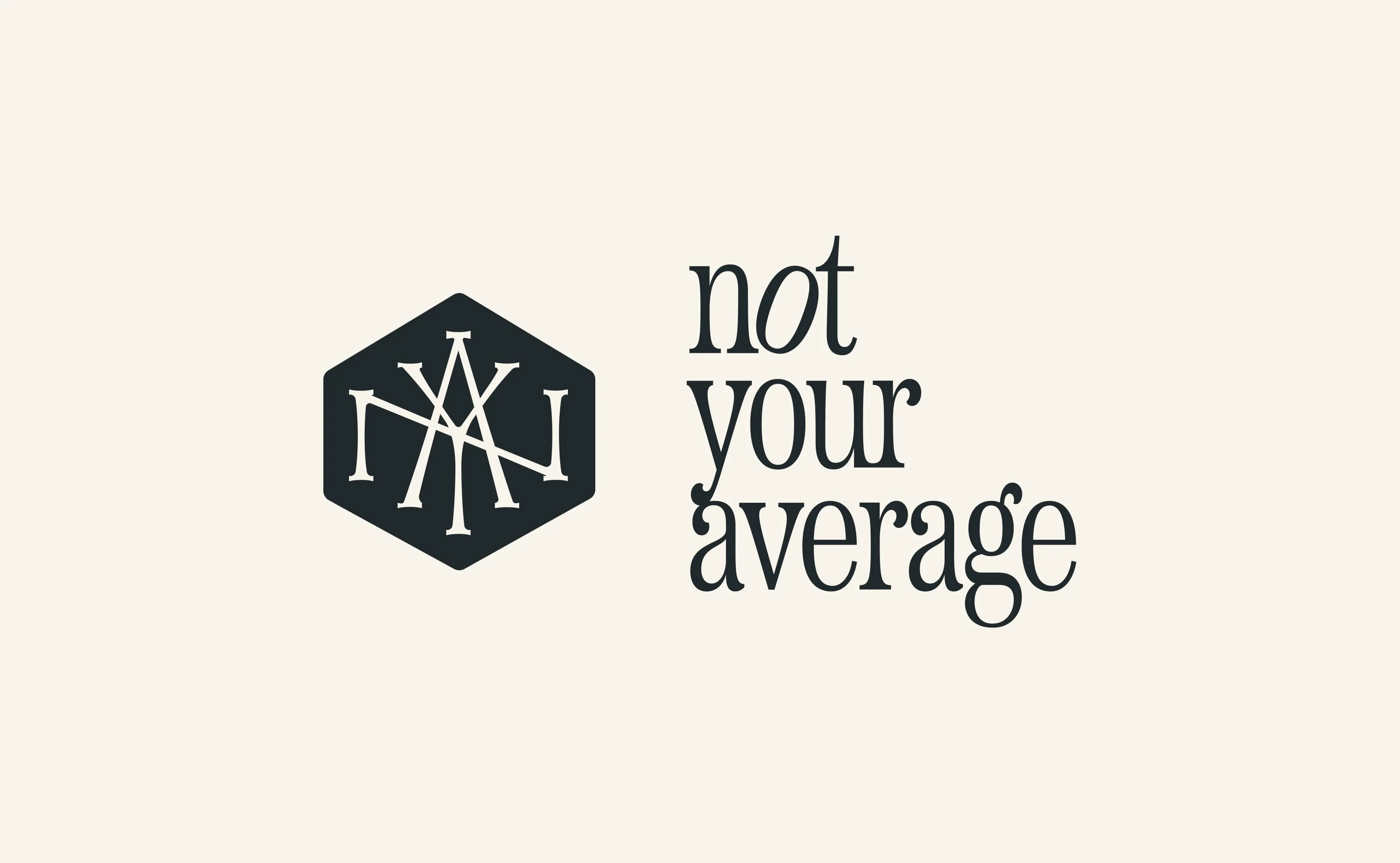
Created a flexible mark system featuring a distinctive hexagonal monogram that works across all applications. The custom typography balances sophistication with approachability.
3. Packaging as Communication
The packaging became a key differentiator—detailed ingredient callouts and transparent storytelling on every bag build trust with health-conscious consumers while educating them about each superfood component.
4. Illustration System
Developed a botanical illustration library representing each superfood ingredient, providing visual consistency and educational value across all brand touchpoints.
The Outcome
The comprehensive brand system successfully positions Not Your Average as a premium player in the functional coffee space. The distinctive visual identity stands out in a crowded market, while the transparent packaging approach builds trust with health-conscious consumers.
Key Results:
Cohesive brand experience across all touchpoints
Packaging design that educates and converts
Scalable illustration system for future product lines
Strong visual differentiation from competitors
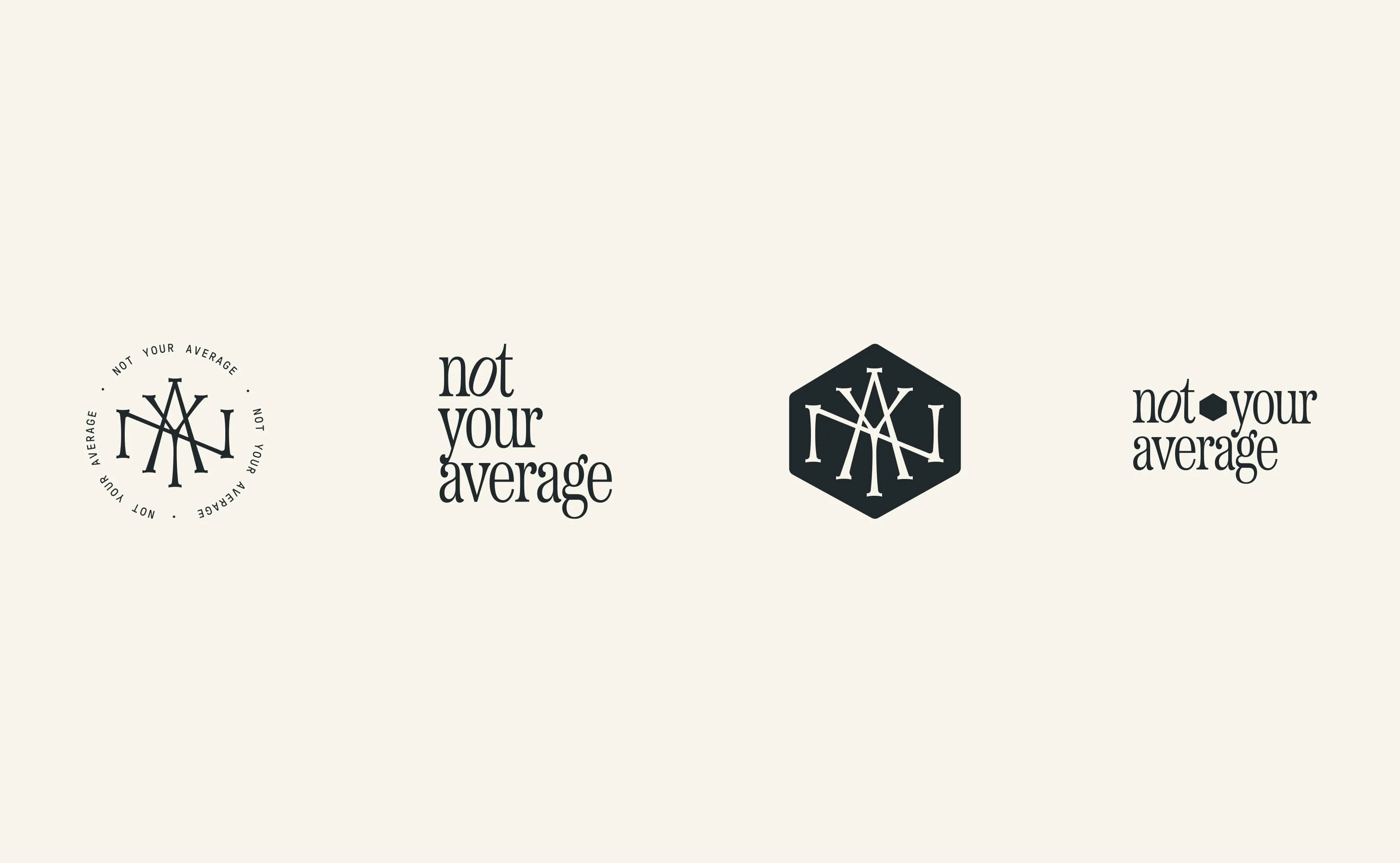
Flexible mark system designed for diverse applications—circular seal, standalone wordmark, and horizontal lockup variations.
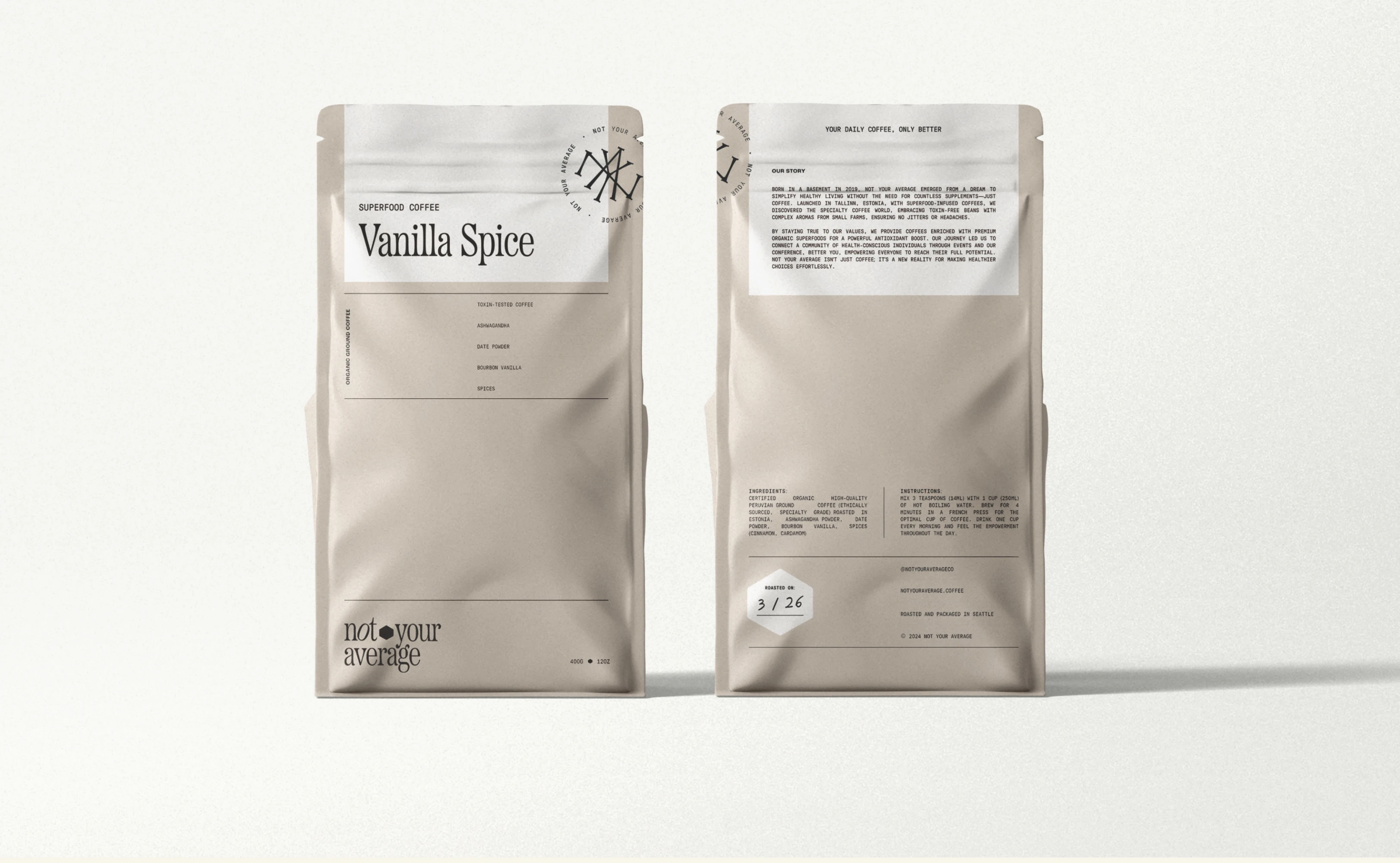
Packaging design with transparent product storytelling. Detailed ingredient callouts and brand narrative communicate quality and transparency.
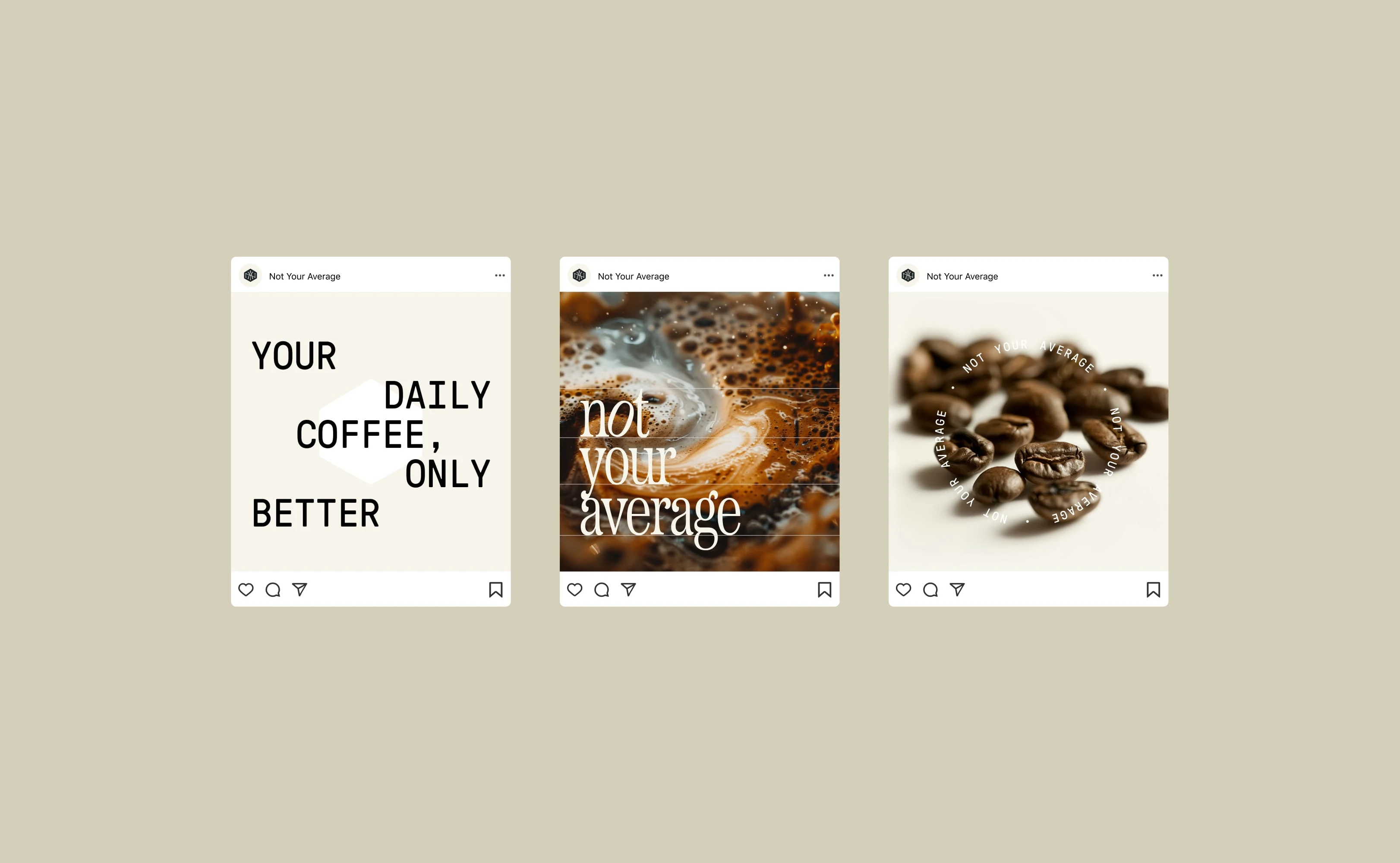
Social media templates maintaining brand consistency across digital touchpoints while allowing content flexibility.
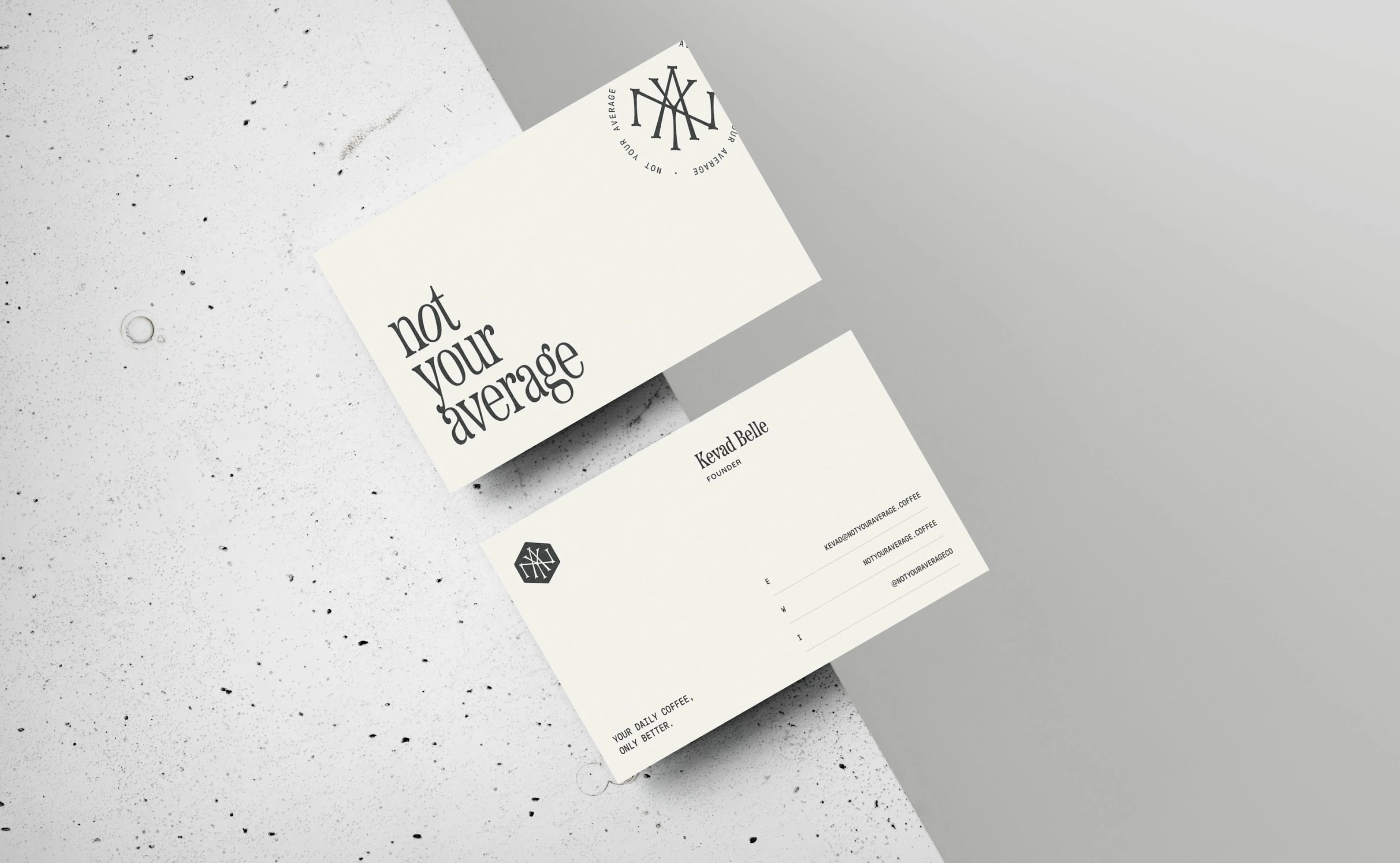
Business collateral system featuring minimalist design with strategic brand element placement and tactile material considerations.
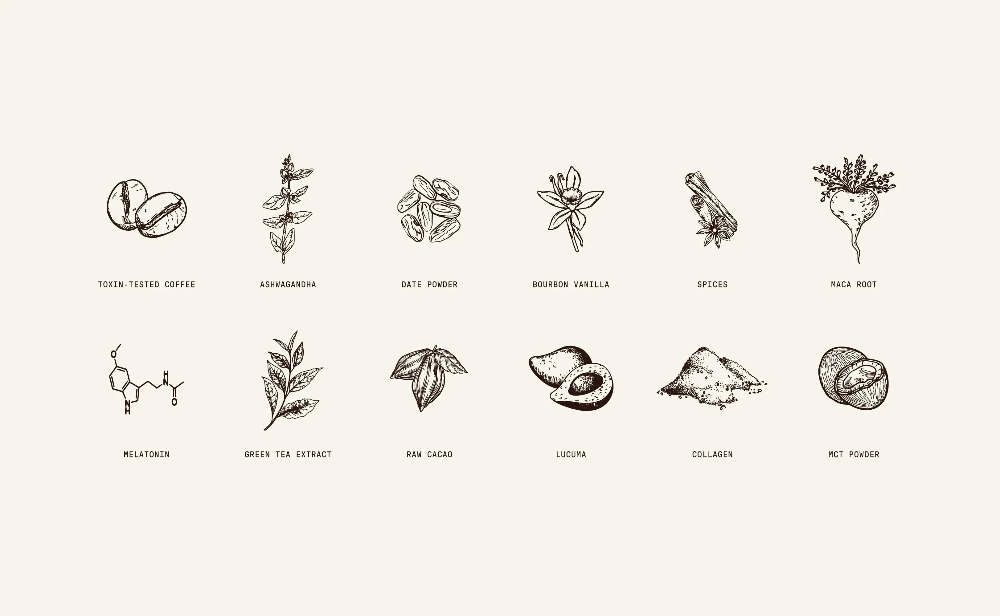
Custom botanical illustration library representing superfood ingredients—providing visual consistency across all brand applications.
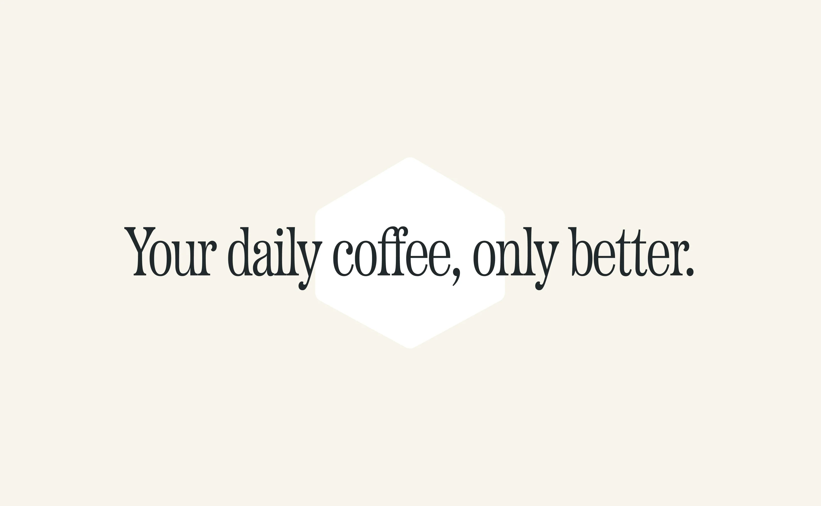
Core brand messaging establishing positioning: premium daily coffee enhanced with functional superfood ingredients.
Like this project
Posted Jan 29, 2026
Complete brand identity for Not Your Average superfood coffee—logo system, custom packaging, illustration library, business collateral, and social templates.