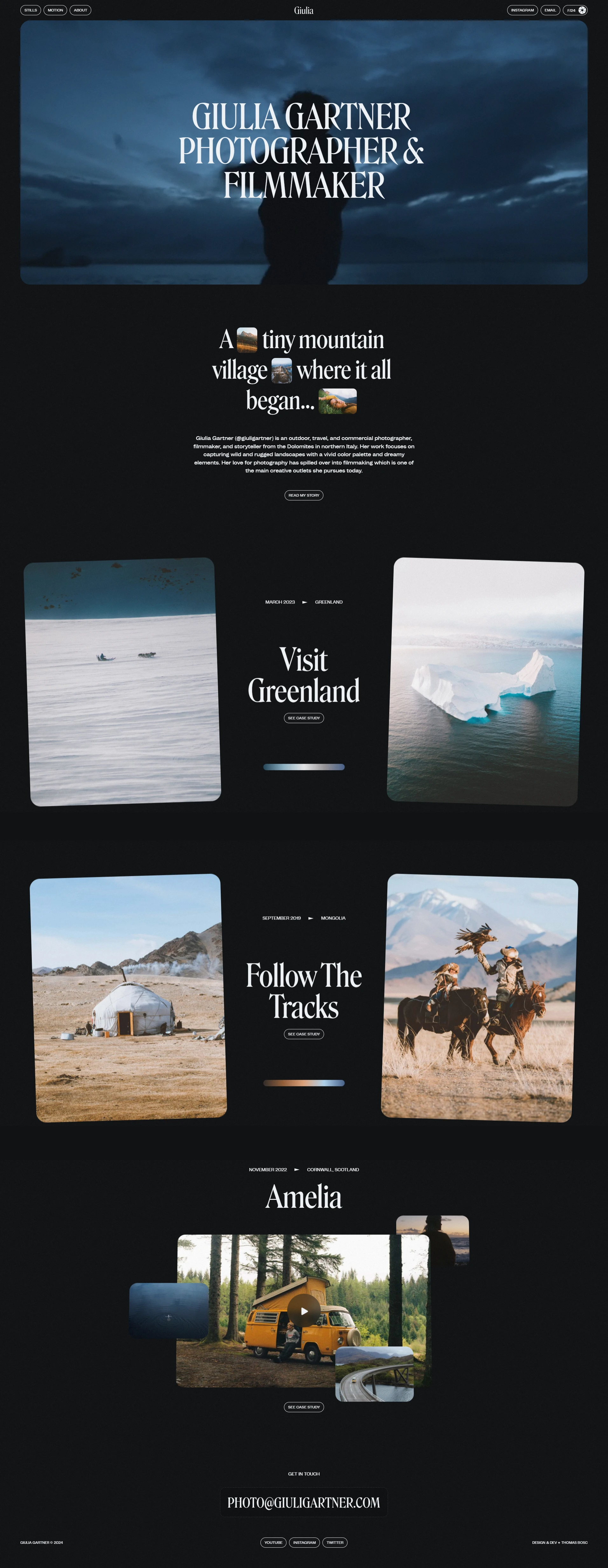
Framer Website development for Photographer & Filmmaker
Process:
1. Defining Purpose and Audience
My primary goal was to create a visually striking website that effectively showcases the work and design philosophy. I aimed to attract potential clients and collaborators by clearly communicating my skills and style.
2. Sketching the Layout
I started with wireframes to outline the structure of the site. I planned key sections: a captivating homepage, detailed project and case study pages, an about section, and a contact form. This layout allowed me to visualize the user journey and ensure easy navigation.
3. Setting Up Framer Account
I signed up for Framer, eager to use its design capabilities and intuitive interface. The platform's flexibility would allow me to bring the vision to life efficiently.
4. Choosing a Template
I chose a minimalist template that complemented my design aesthetic. This provided a solid foundation while giving me the freedom to customize elements to reflect my unique style.
5. Designing the Pages
I began constructing the homepage, focusing on a bold hero image and clear call-to-action buttons. I added sections for featured projects, making sure each element aligned with my branding.
6. Implementing Interactions and Animations
To enhance user engagement, I incorporated smooth animations and hover effects, particularly on project thumbnails. This added a layer of interactivity that made the browsing experience more enjoyable.
7. Ensuring Mobile Responsiveness
I prioritized mobile optimization by testing the site on various devices. Framer’s responsive design tools allowed me to fine-tune layouts, ensuring a seamless experience for mobile users.
8. Setting Up Content
I carefully crafted content for each project page, including high-quality images, descriptions, and my design process. I used Framer's CMS capabilities to manage project details efficiently, making updates easy.
9. Previewing the Site
Before going live, I utilized the preview function extensively to test aesthetics and functionality. This step was vital to catch any issues and refine the user experience.
10. Configuring SEO Settings
I optimized the website for search engines by adding essential metadata, such as titles and descriptions, to improve visibility. This would help potential clients find my work more easily.
11. Connecting a Domain
To establish a professional presence, I connected a custom domain. This step helped me create a cohesive brand identity online.
12. Publishing the Website
With everything in place, I published the website.
13. Monitoring and Updating
After launch, I set up analytics to monitor site performance and user interactions.

Like this project
Posted Nov 7, 2024
I created a Framer website for Giulia Gartner who is a outdoor, travel, and commercial photographer, filmmaker, and storyteller.

