Logo + Brand Identity for Lucid Neuro Health
Inflow Healthcare Designs
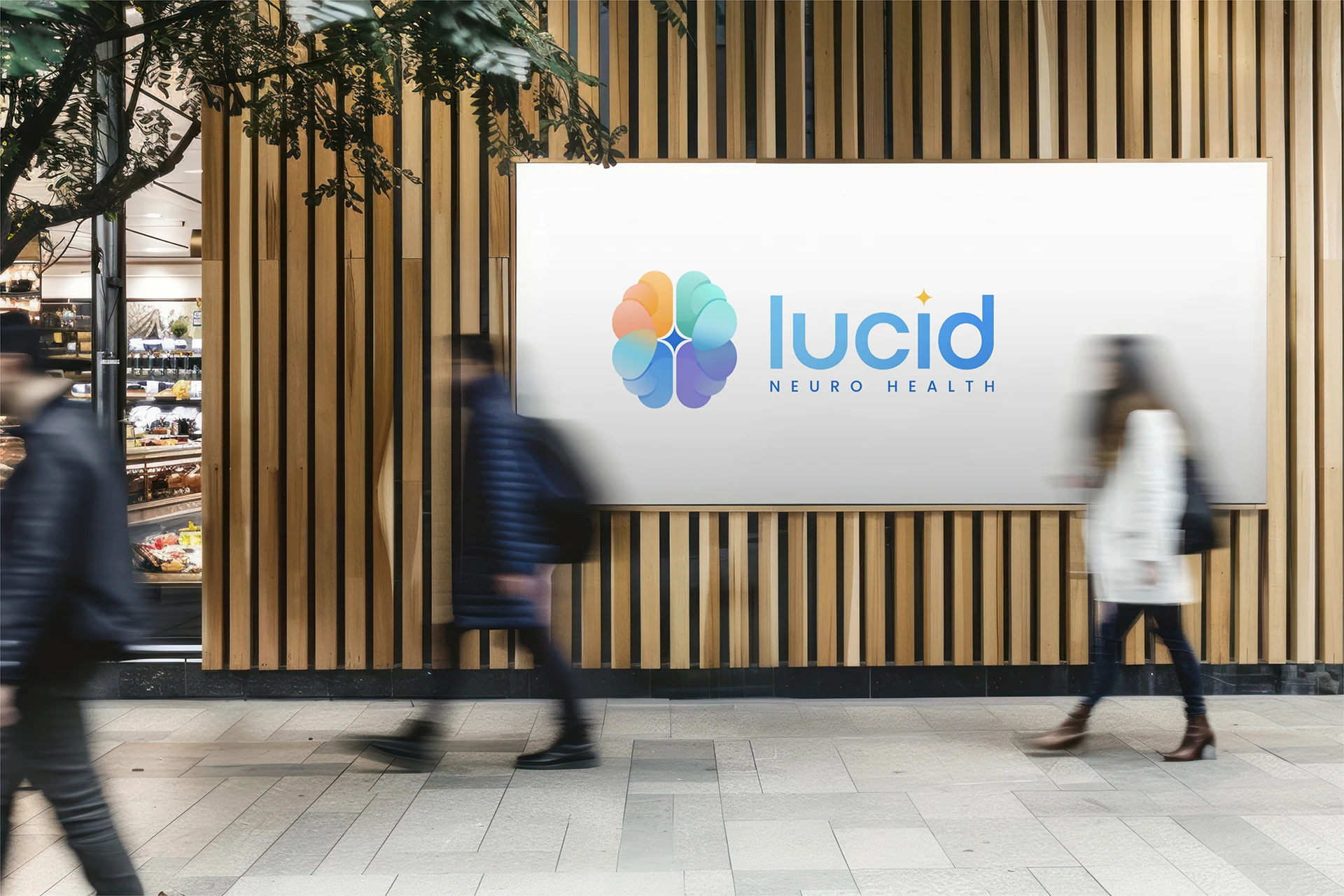
Logo + Brand Identity
Lucid Neuro Health
Lucid Neuro Health is reimagining preventative neurology — helping people think sharper, age healthier, and live with confidence through advanced diagnostics, TMS therapy, and continuous tracking. They needed a visual identity that would convey both clinical credibility and human warmth: a mark that felt premium, yet approachable, with depth and meaning behind it.
Challenge
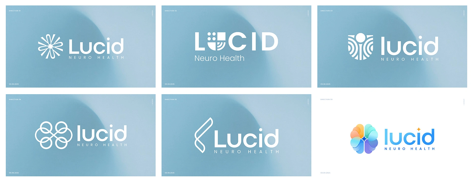
Lucid wanted to move away from sterile, overused medical symbols and toward something that truly reflected their philosophy. The logo needed to capture the complexity of the brain while still feeling calming, fluid, and inviting. Instead of leaning into rigid scientific imagery, we set out to design something that embodies the human side of neurology: fluid, layered, and centered on holistic wellness.
Approach
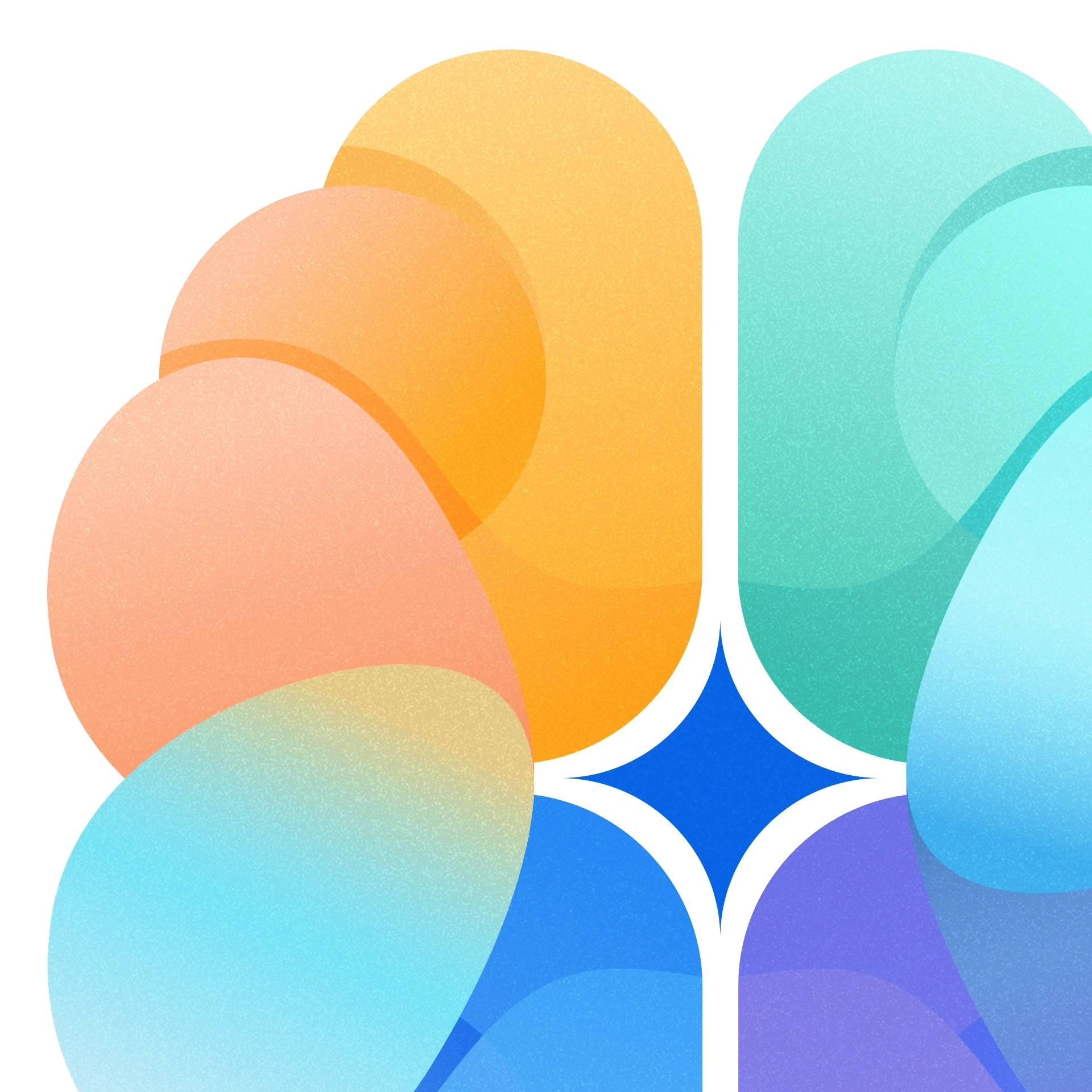
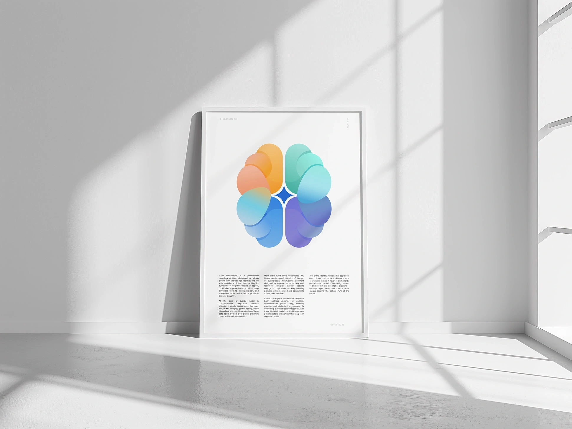
We focused on the idea of the brain not as a machine, but as a living, dynamic system. Four overlapping forms represent Lucid’s pillars of brain wellness — sleep, nutrition, exercise, and intellectual engagement — blending together in a soft, calming gradient. The transitions between colors symbolize the fluidity of the mind, while their intersection creates harmony and balance.
To give the mark more depth and authenticity, we introduced a tactile texture reminiscent of colored pencils on textured cardstock. This subtle detail prevents the logo from feeling overly digital, grounding it with a human, crafted touch.
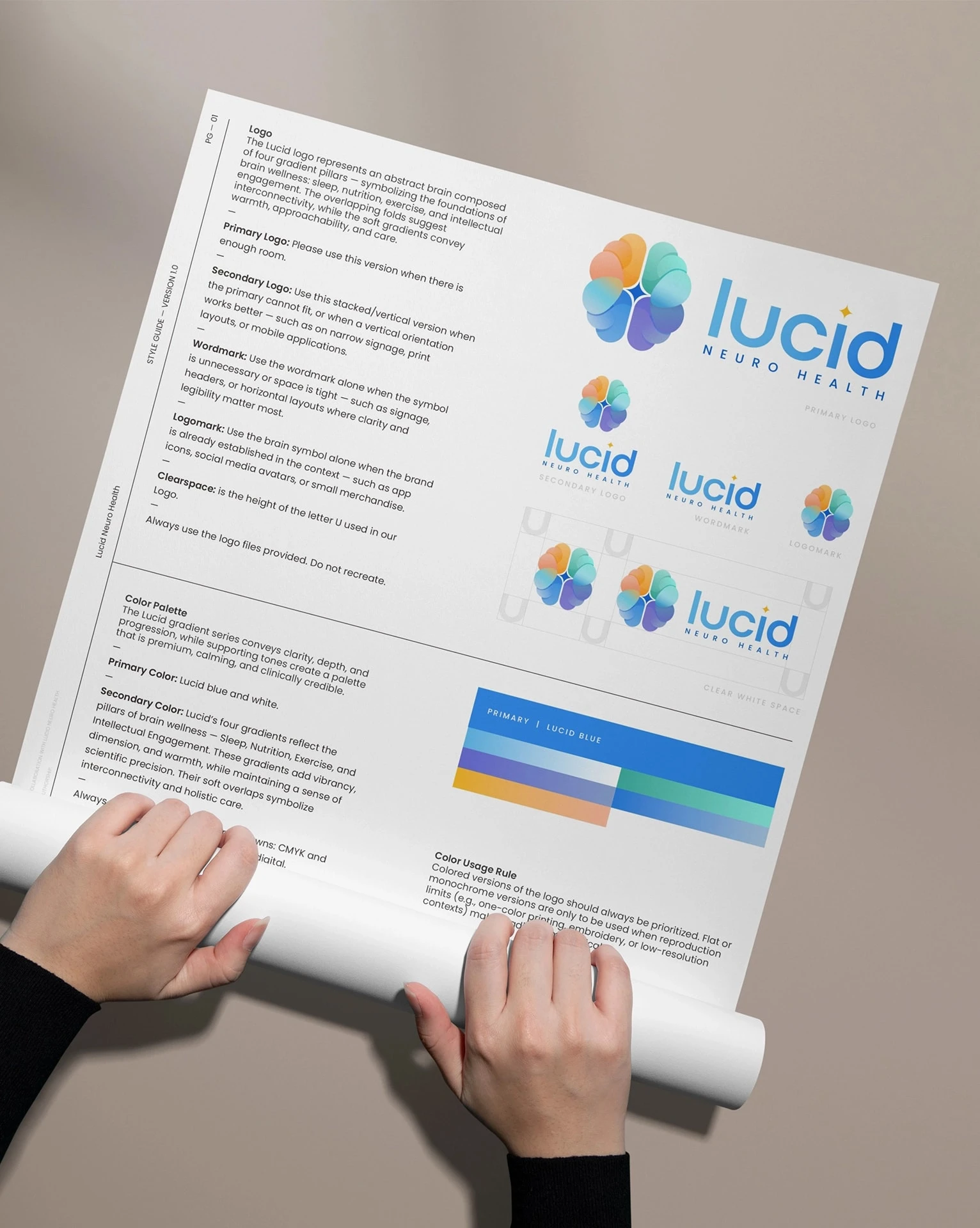
For typography, we paired Marble — a clean, geometric sans-serif with playful character — with Poppins, a versatile sans-serif family chosen for clarity and legibility in extended text. Together, they reinforce Lucid’s balance of modern authority and approachable authenticity.
Results
The final identity is calm, premium, and distinctly Lucid. The brain icon — with its softly blending gradients and tactile finish — feels alive, a symbol of clarity, vitality, and the fluidity of the mind. Paired with a versatile type system and a focused style guide, the logo adapts seamlessly across digital platforms, print materials, and clinical environments. More than just a mark, it captures both the science and the humanity of Lucid Neuro Health. By emphasizing warmth, texture, and flow, the design stands apart from generic medical branding, reflecting their patient-first promise and their mission to help people live sharper, healthier, and more confident lives.
Like this project
Posted Sep 16, 2025
Delivered a calm, premium brand identity with a layered brain logo, warm gradients, and a versatile system blending clinical credibility with compassion.
Likes
4
Views
76
Timeline
Sep 8, 2025 - Sep 12, 2025