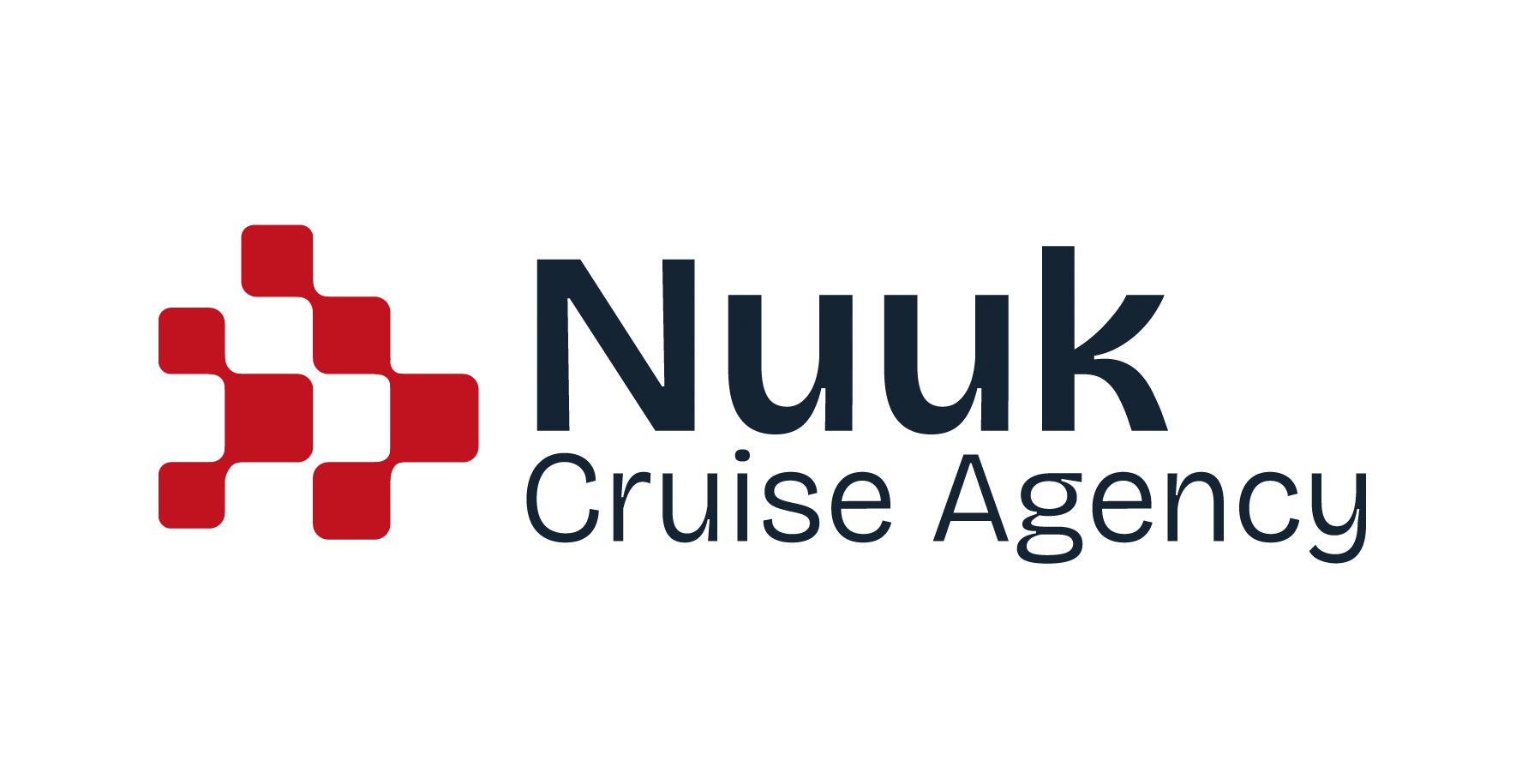
Nuuk Cruise Agency Brand Design
Approve request to show earnings
View
Jorge Gutiérrez Marco
Verified
Seven companies - one common goal: to be the best player in Greenland in the boat cruise business.
That's the brand proposition of Nuuk Cruise Agency. The force of seven, as one.
NCA was born as a way of aggregating the logistics involved in the management of cruises of tourist boats in the Nuuk region of Greenland.
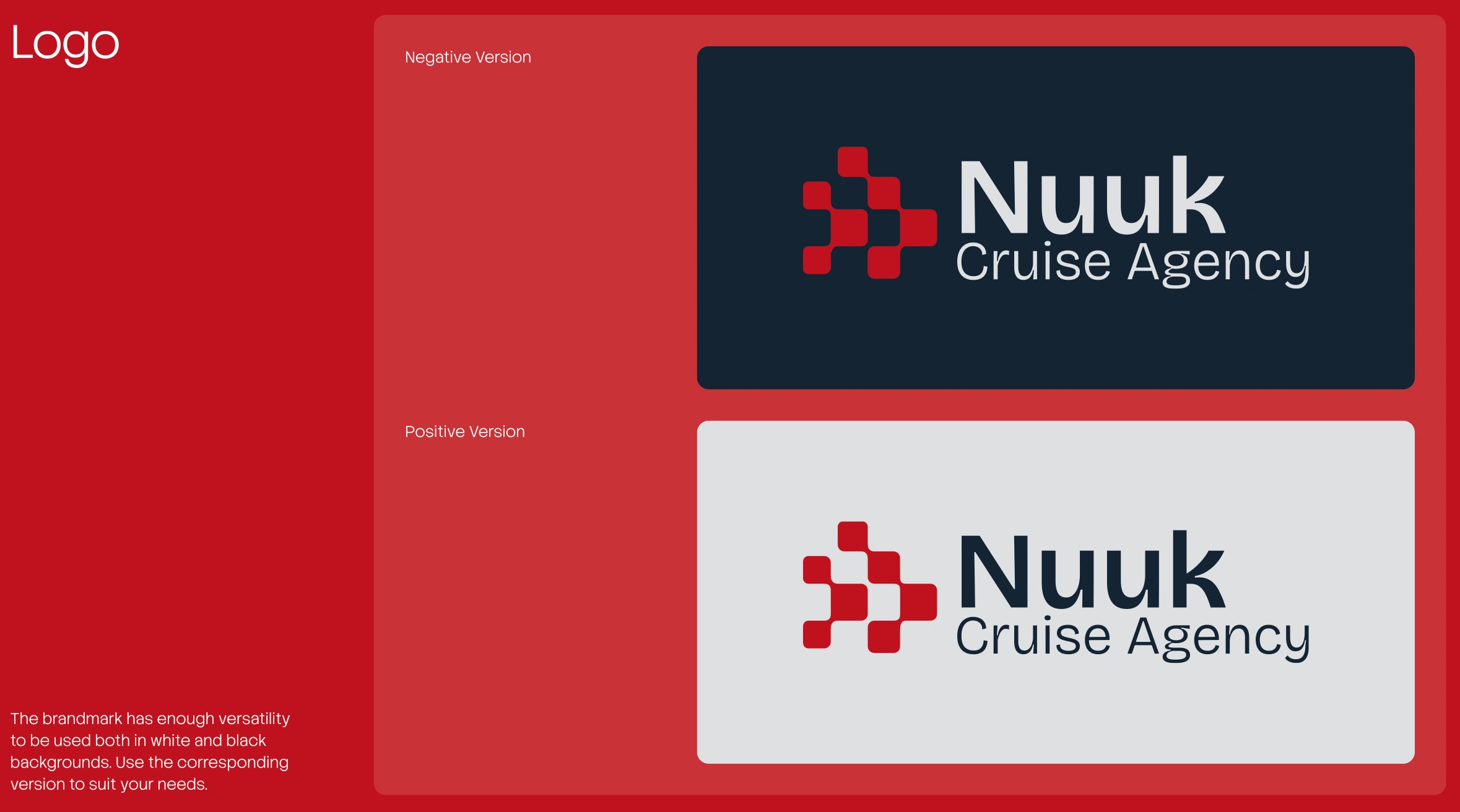
SNippet of the branding guide delivered to the client
The logo uses a tone similar to the color of the Greenland flag, in part to highlight the island itself and the tradition that characterizes the Greenlanders.
Overall, the layout is quite simple. It uses a series of "containers" that resemble those shapes from the logotype, but the client also wanted to add something different: a topographical map of the land.
This wasn't an easy talk. There aren't a lot of topographical maps available, so I had to dive deep into several sources. I finally came across one that could work, but I had to manually vectorize each map - way too time-consuming.
Luckily, I found a tool that could extract the topographical map info and convert it into a vector, easing the process.
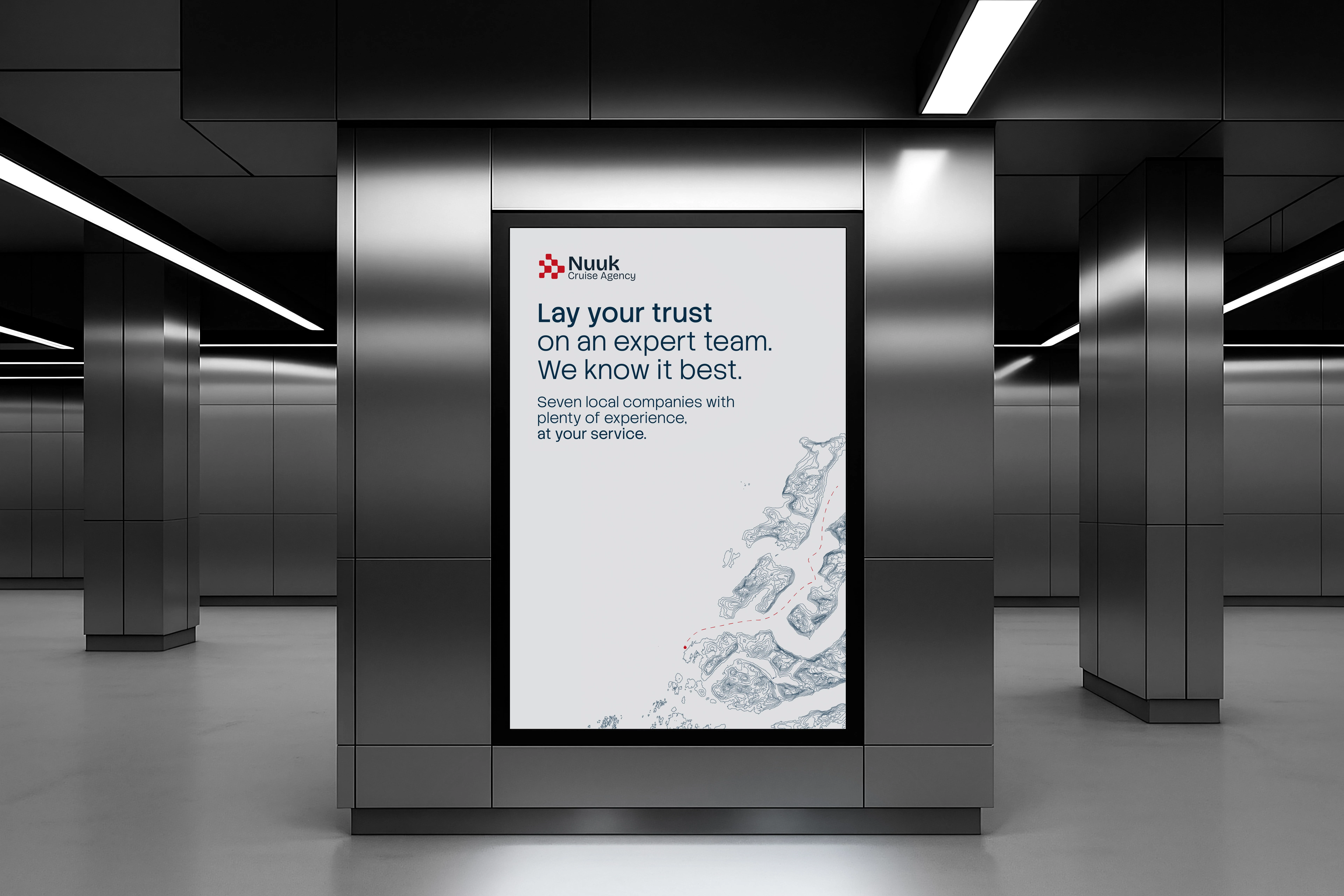
Example of the layout applied into a mockup
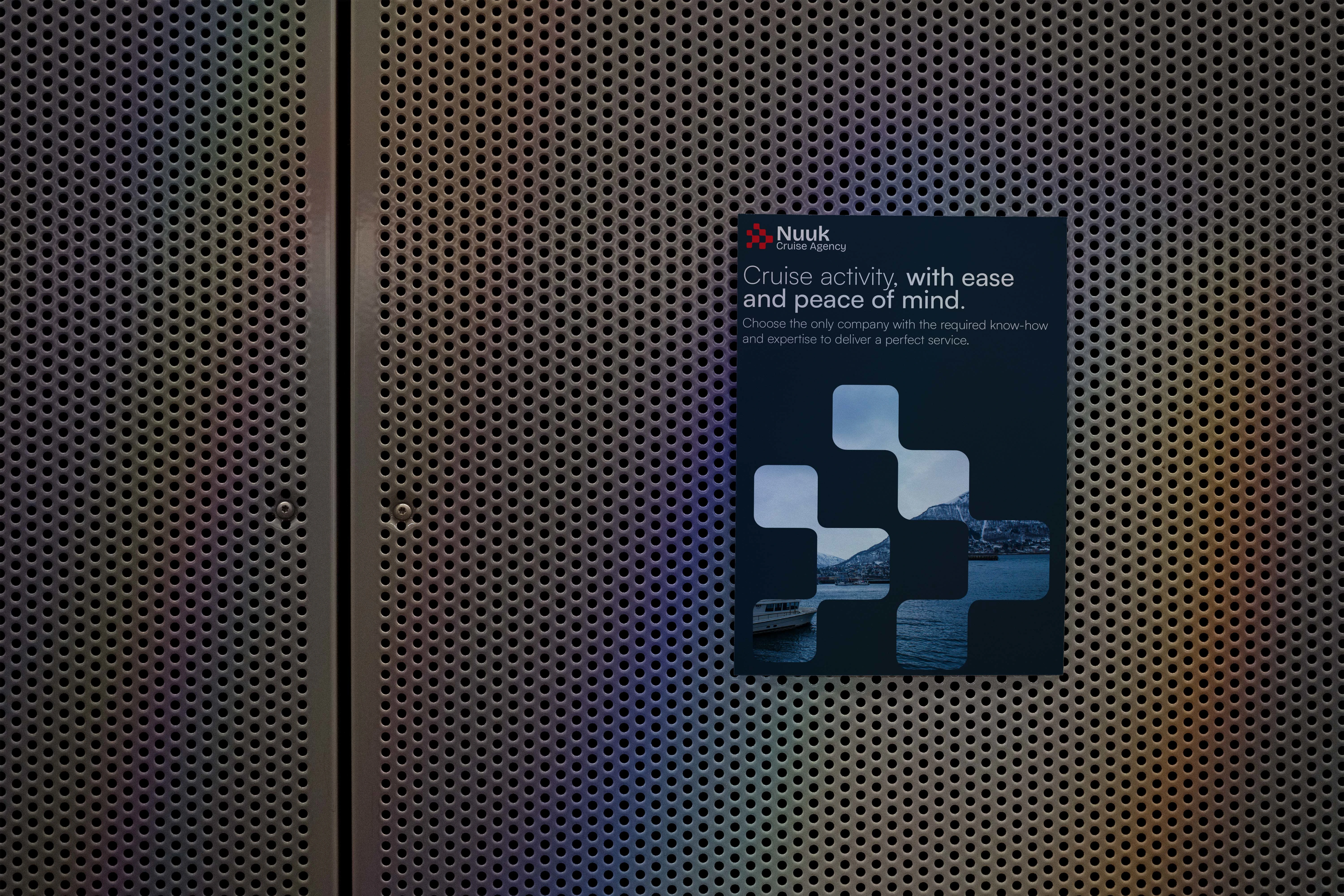
Other types of layouts have been designed that emphasize the expertise and know-how of all the companies involved.
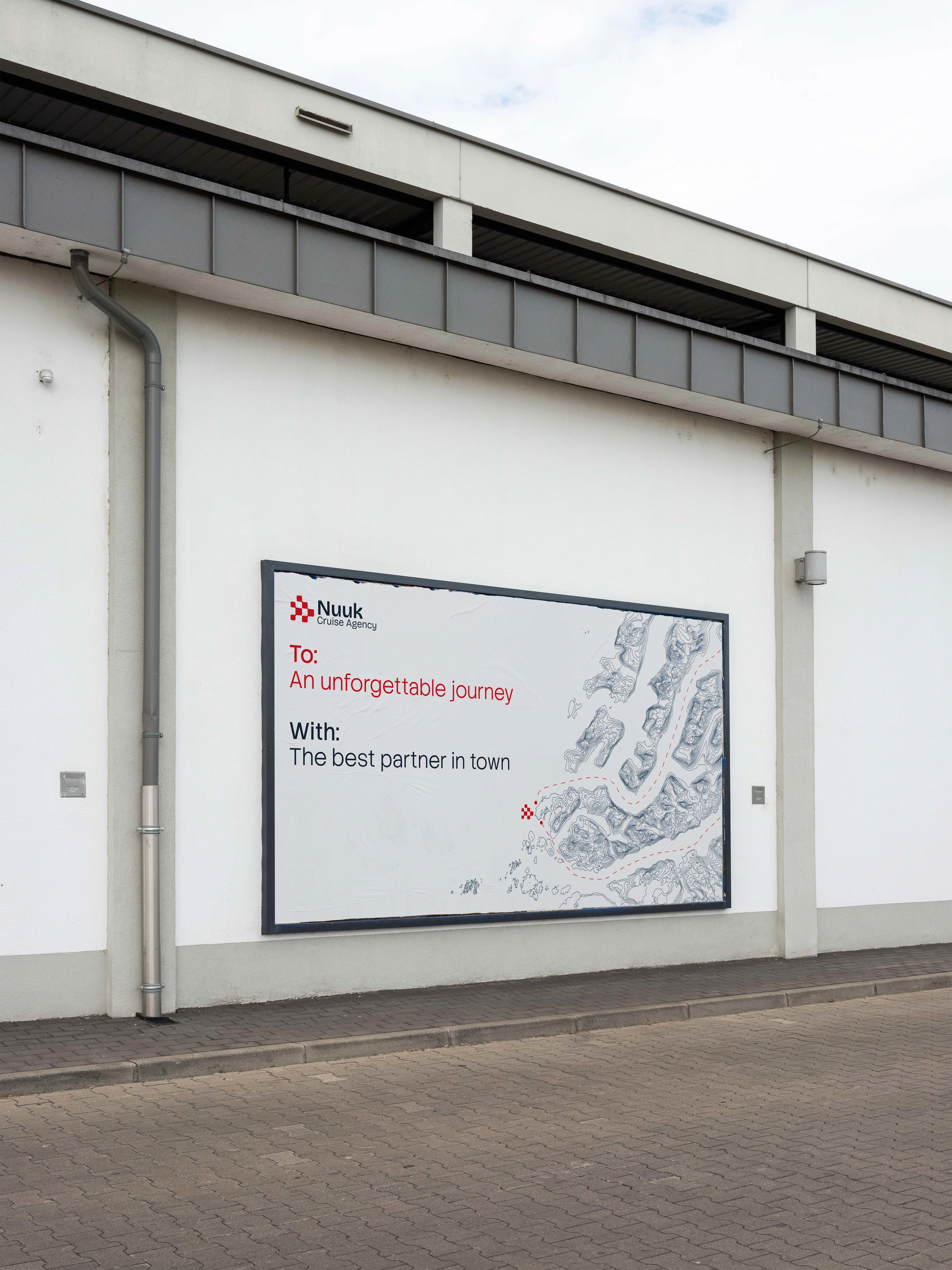
Another example of the different layouts applied to different formats
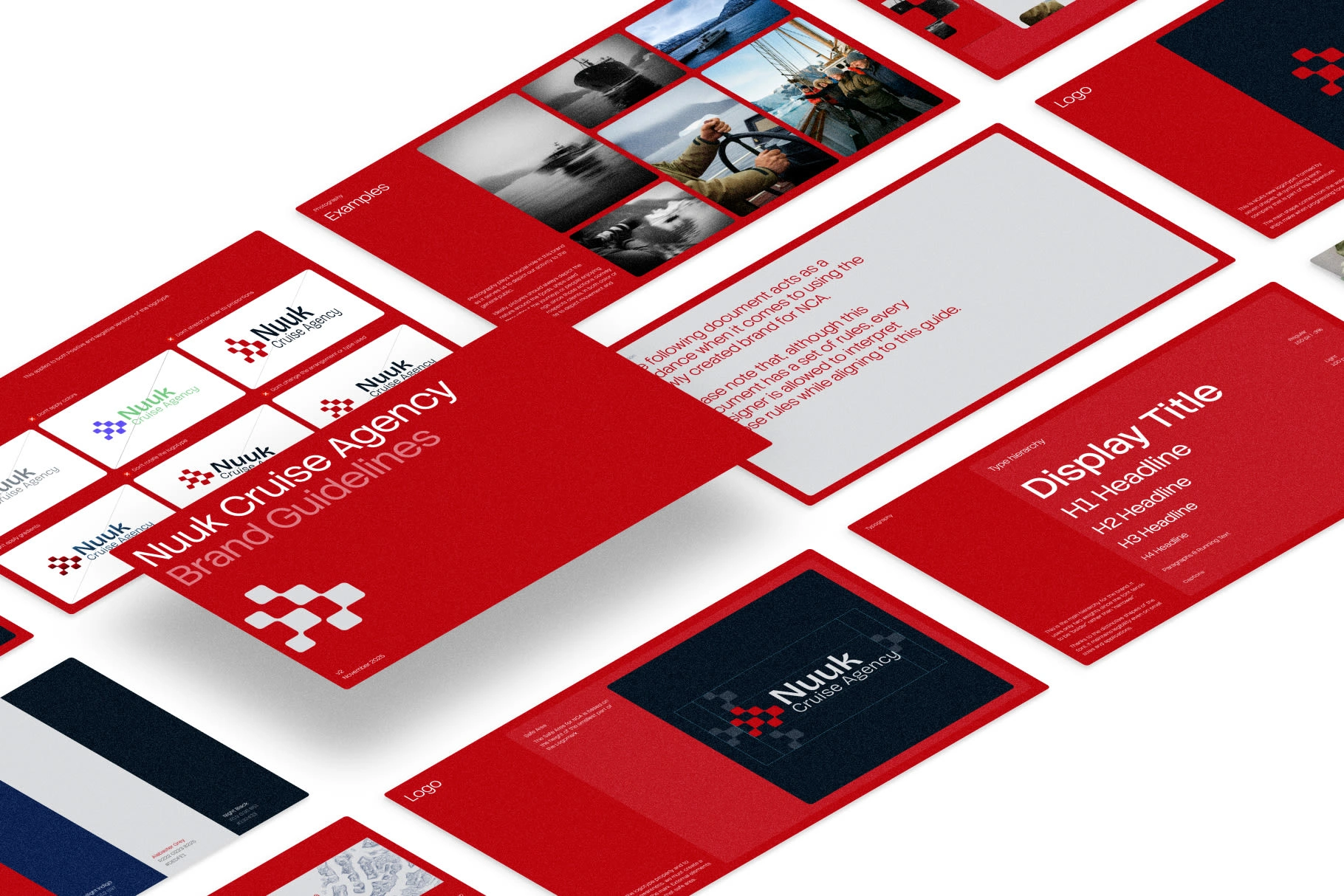
Part of the 30-page brand guidelines book PDF delivered to the client
Overall, I am quite happy to see this project come alive! Soon, you'll see a website for this company that Mathias Bang is working on.
Considering all the talk that has been regarding Greenland (not for sale, btw!), I feel quite proud that I got to do this project.
Like this project
Posted Jan 19, 2026
Brand identity for a Greenland cruise agency. Logo, variations, and full guidelines designed to position NCA as the premium choice in Arctic tourism.
Likes
1
Views
14
Timeline
Oct 28, 2025 - Nov 24, 2025