RC Geeks: Level Finder Quiz UX for E-Commerce

Amirul Hakim

RC Geeks Quiz Hero
Section 2

Section 3
The Problem
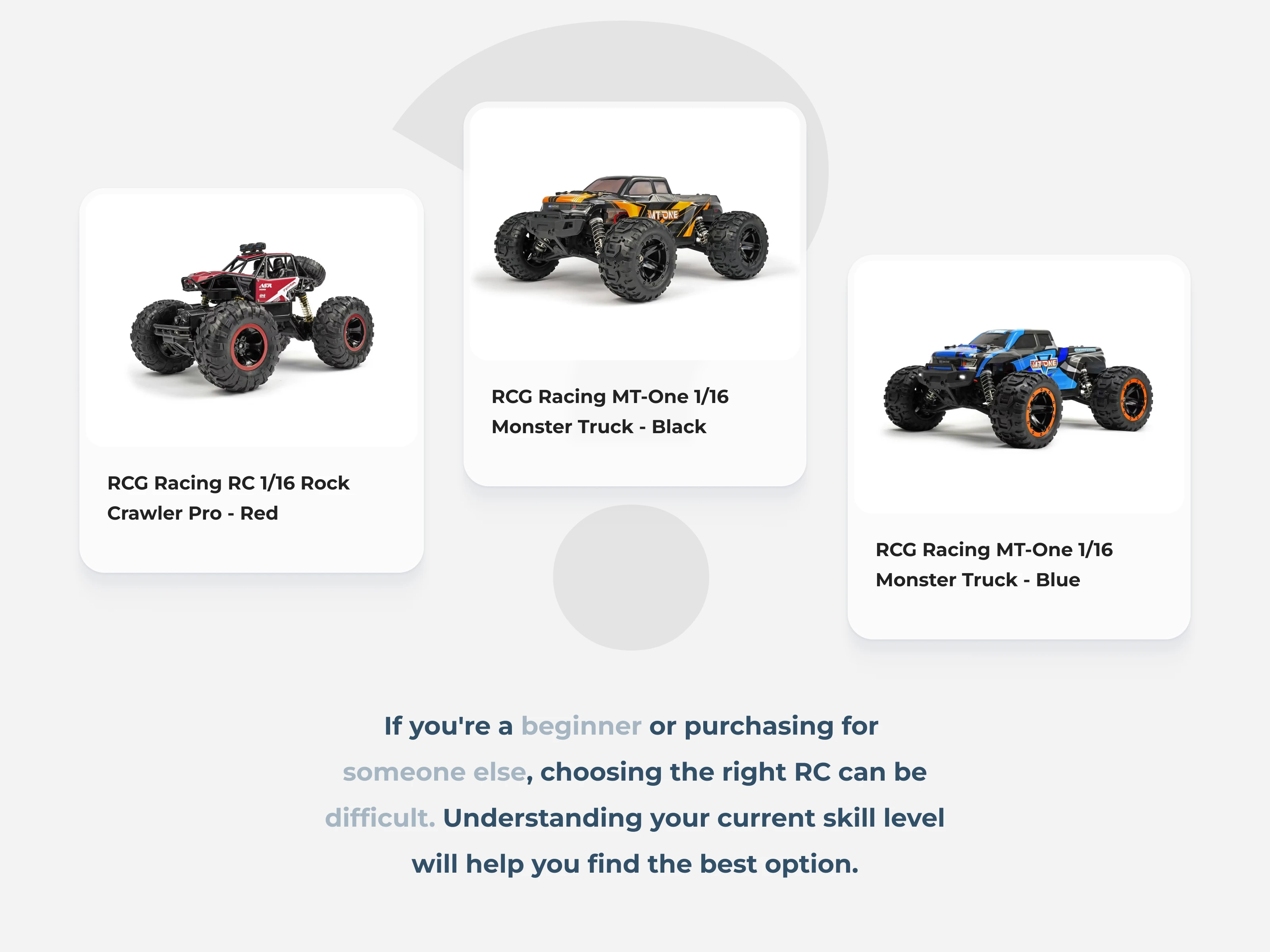
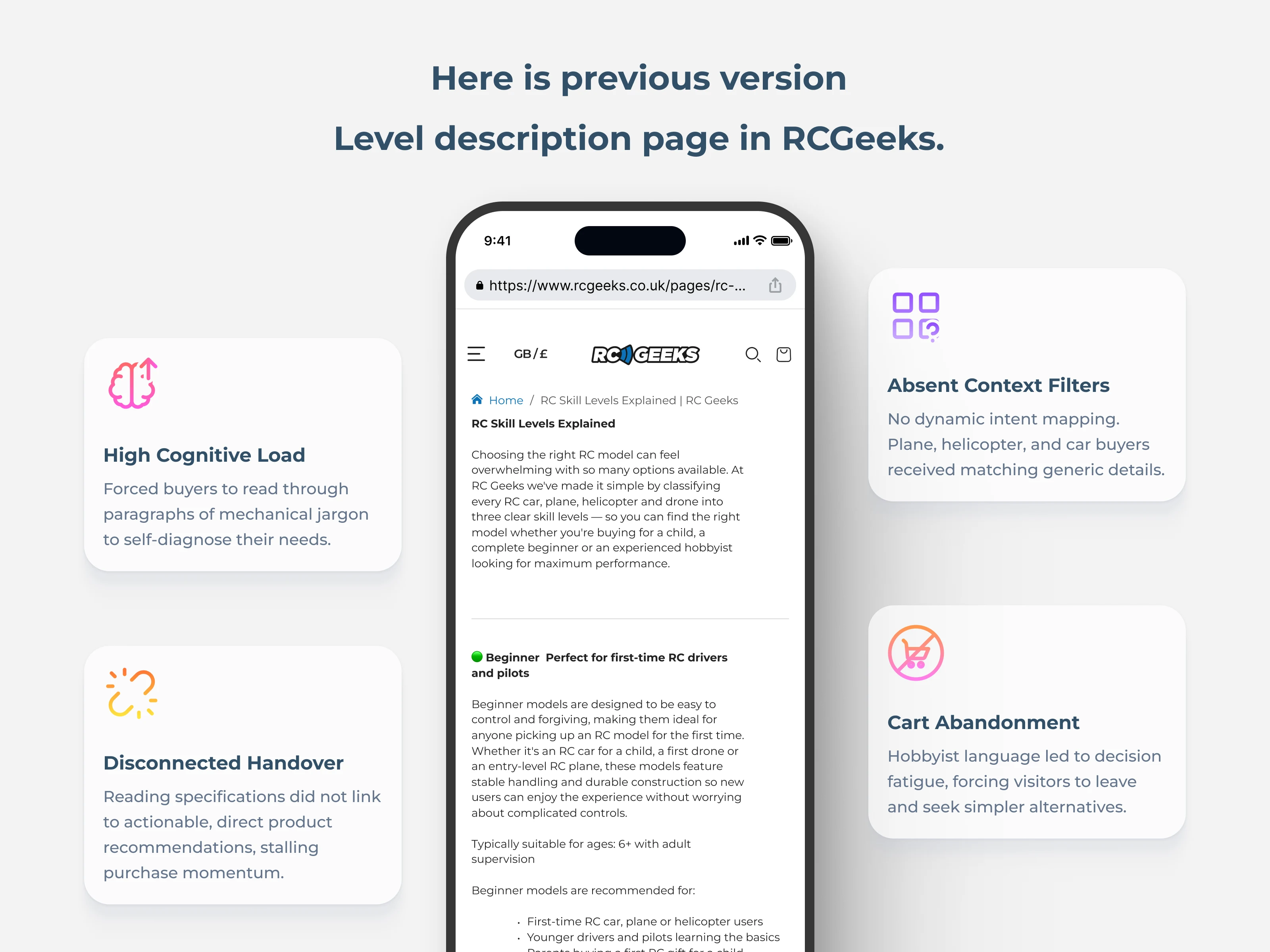
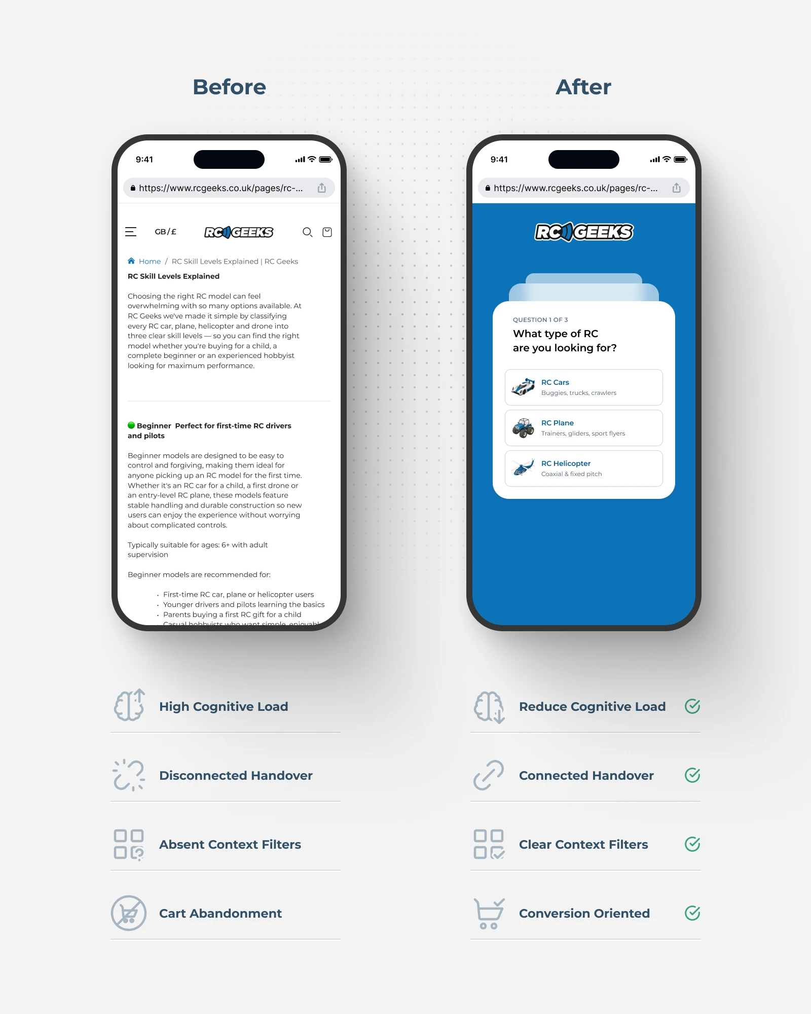
RC Geeks sells remote-controlled vehicles across multiple skill levels. Before the redesign, their level guide was a single page of dense text describing each level in detail. For hobbyists who already know what they want, this was fine. But for beginners, gift buyers, or anyone in a hurry, it was a wall of text standing between them and a purchase.
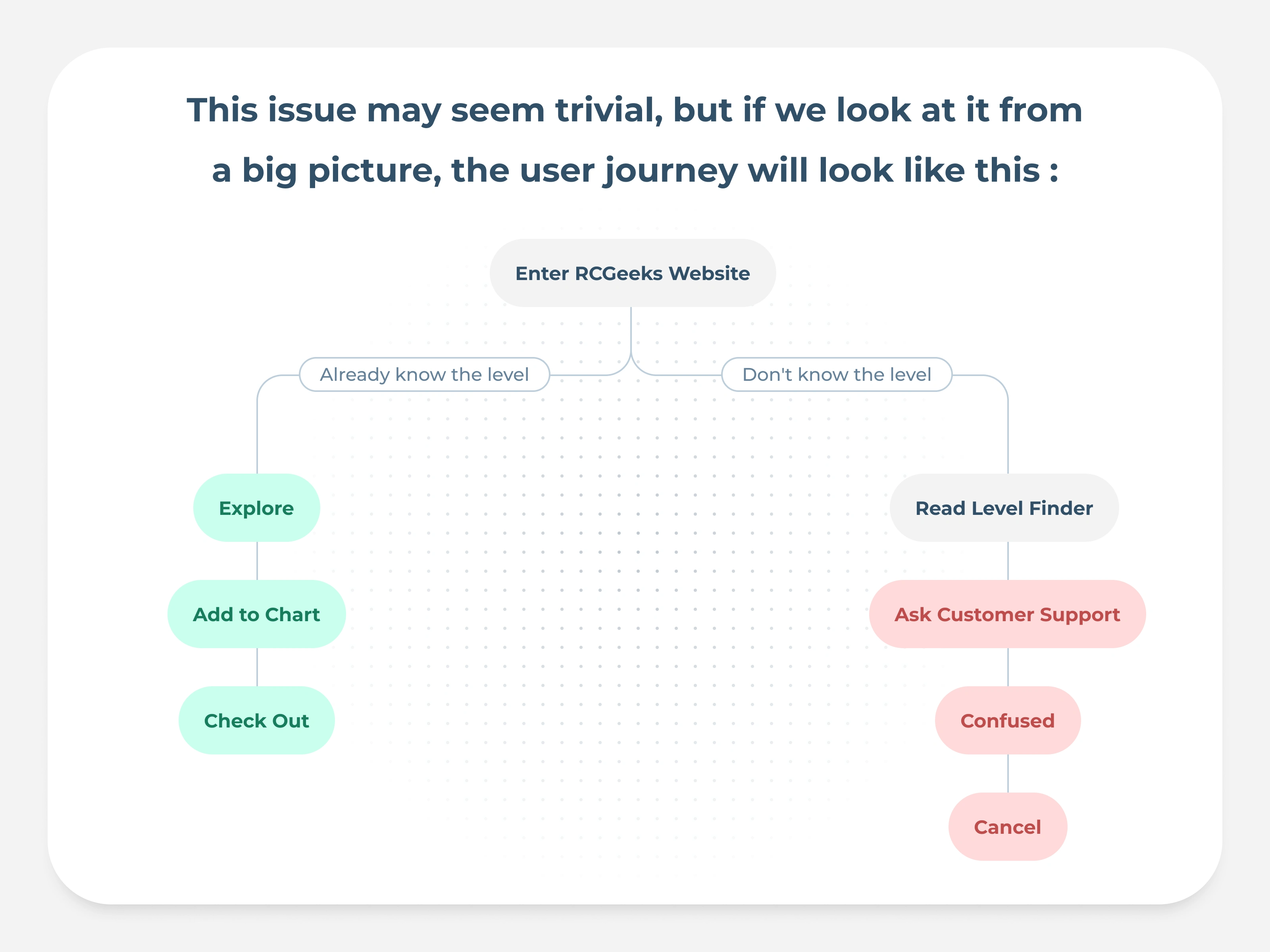
Users who couldn't quickly identify their level either bounced, bought the wrong product (leading to returns), or abandoned the decision entirely. The level guide was supposed to help, but it was creating friction instead.
Section 4
Section 5
The Users
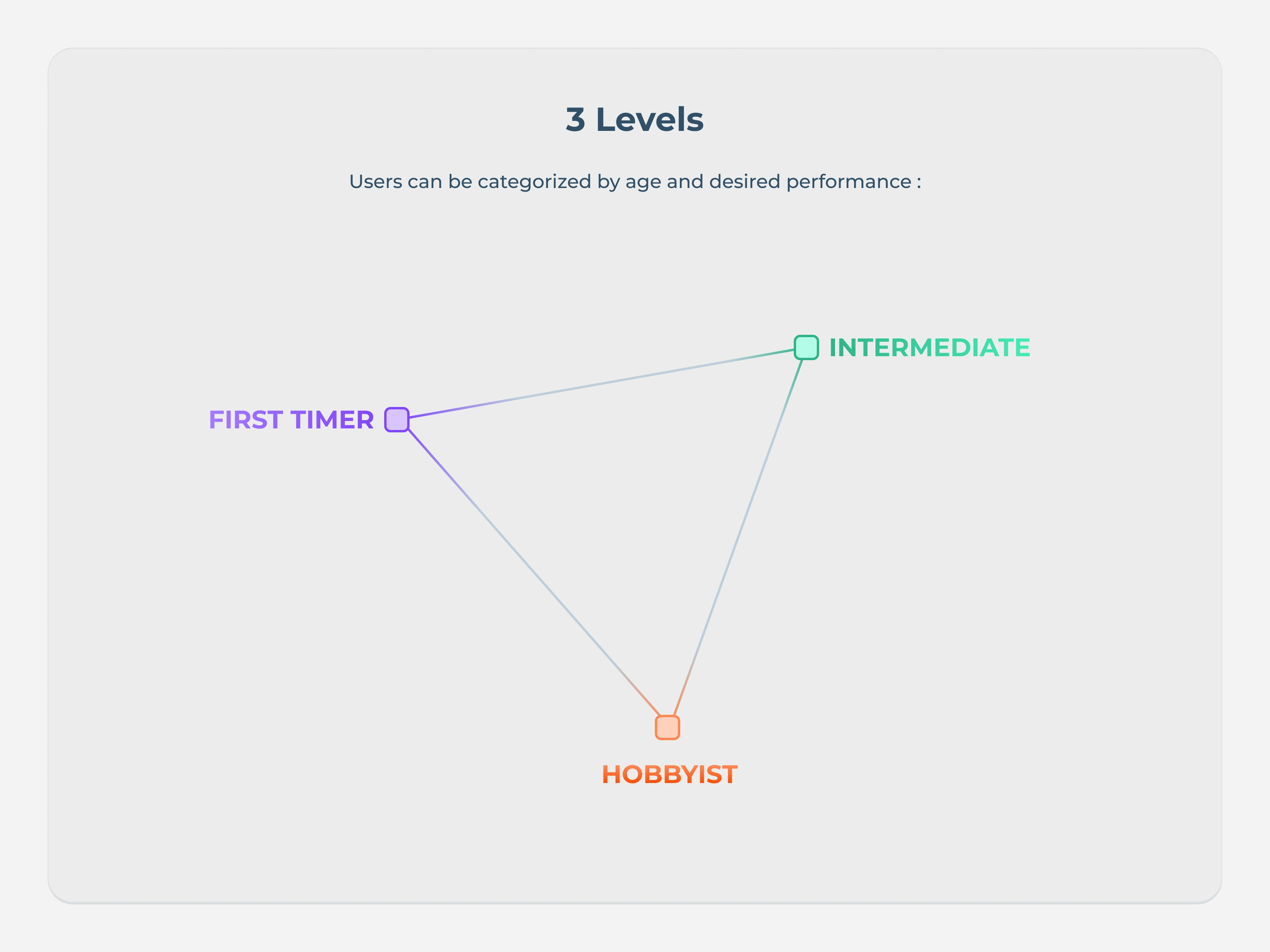
Three primary groups:
Hobbyists exploring a new category or upgrading their current vehicle
Beginners who have no idea what level they are and need guidance
Gift buyers purchasing for someone else, often with zero RC knowledge
All three share the same need: a fast, confident path to the right product without reading a manual first.
Section 6
Section 7
The Process
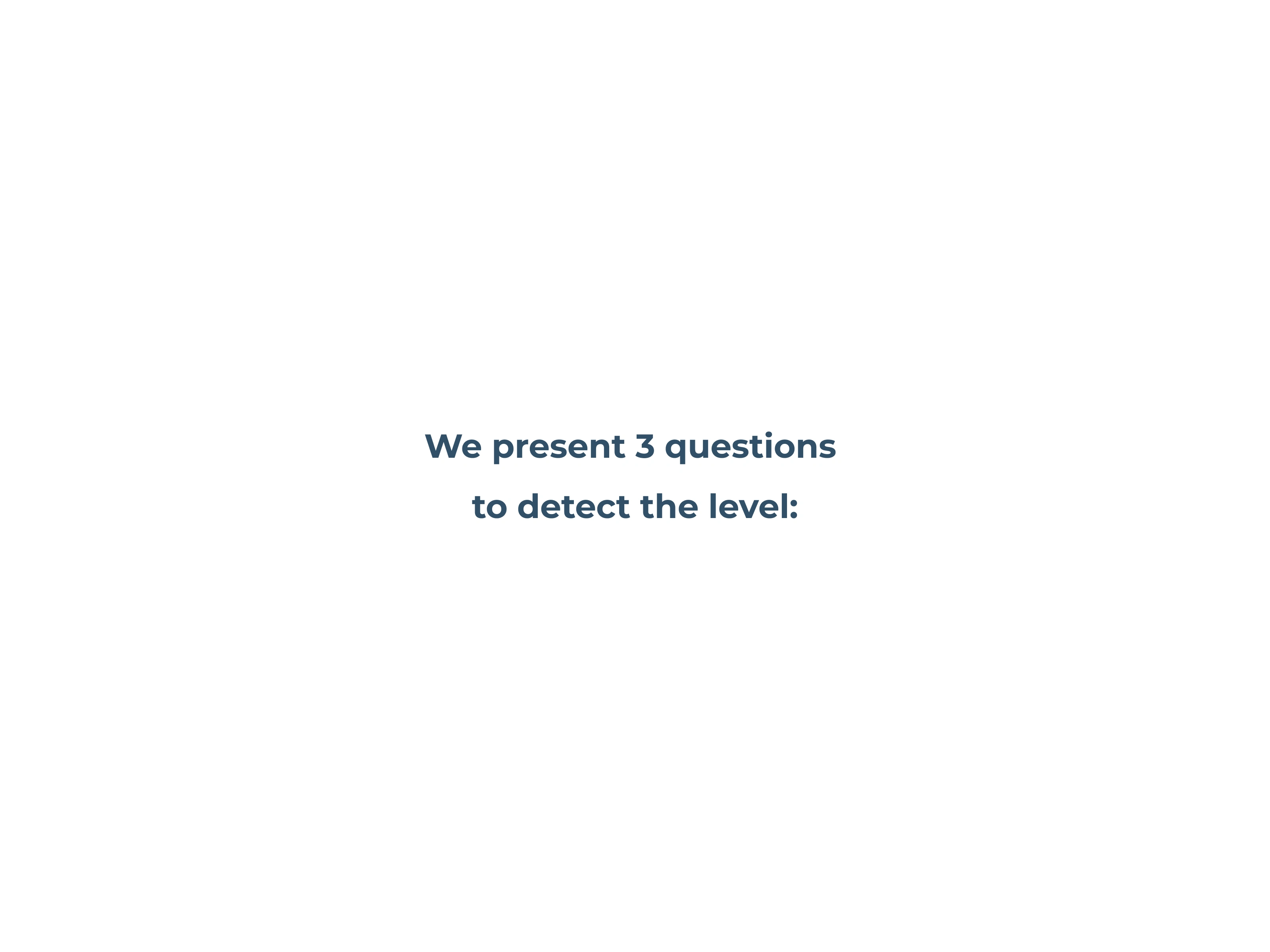
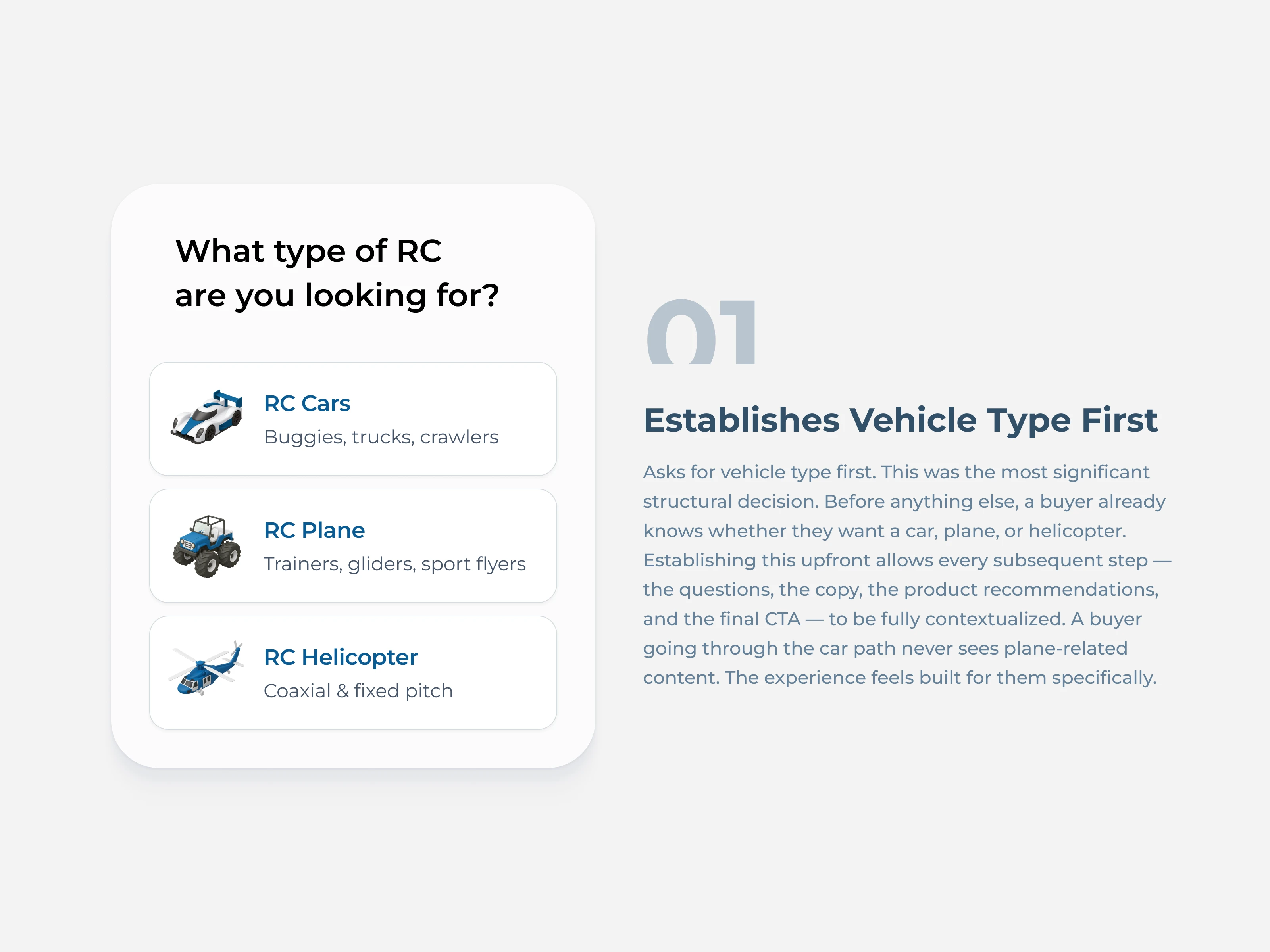
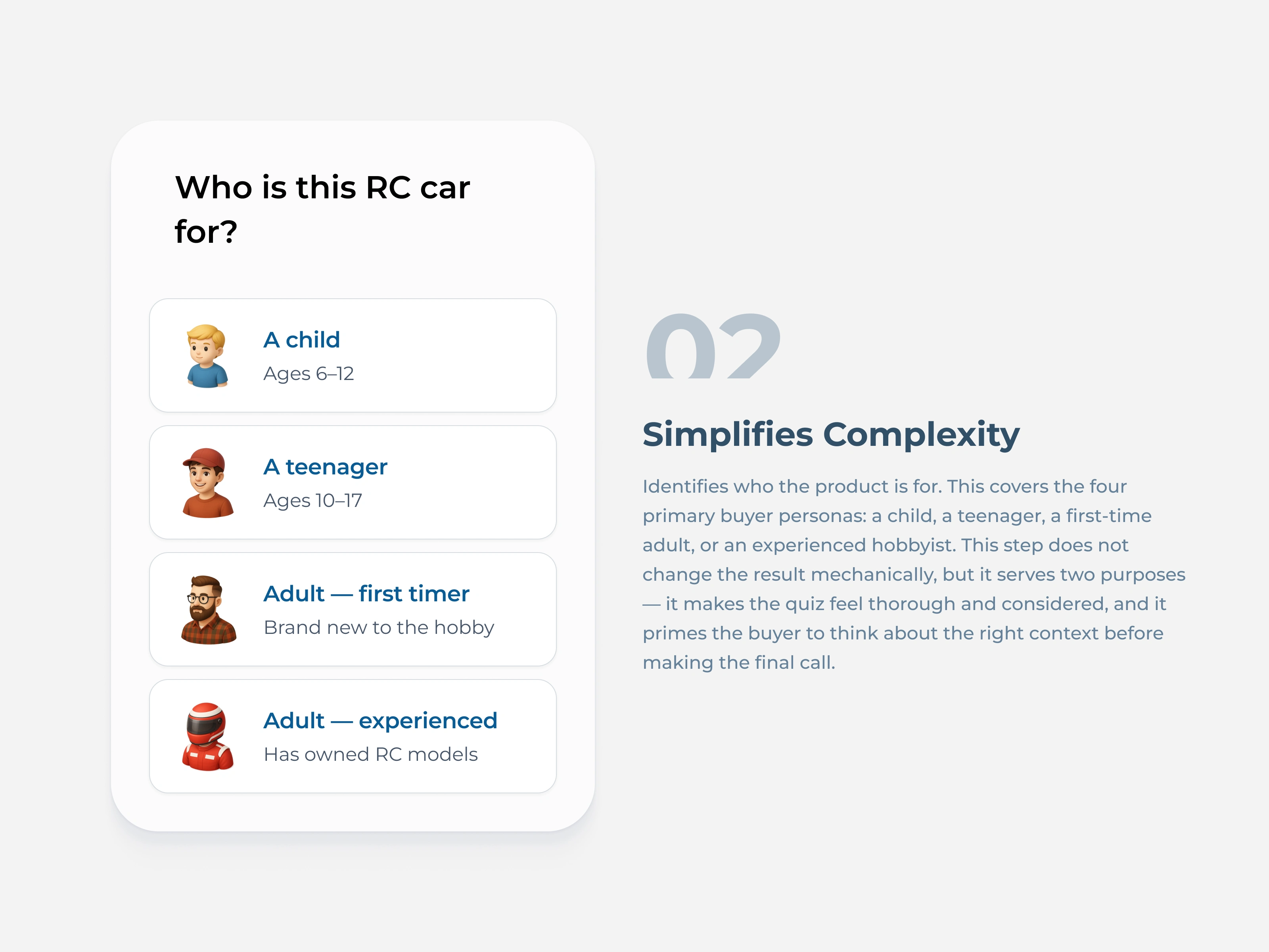
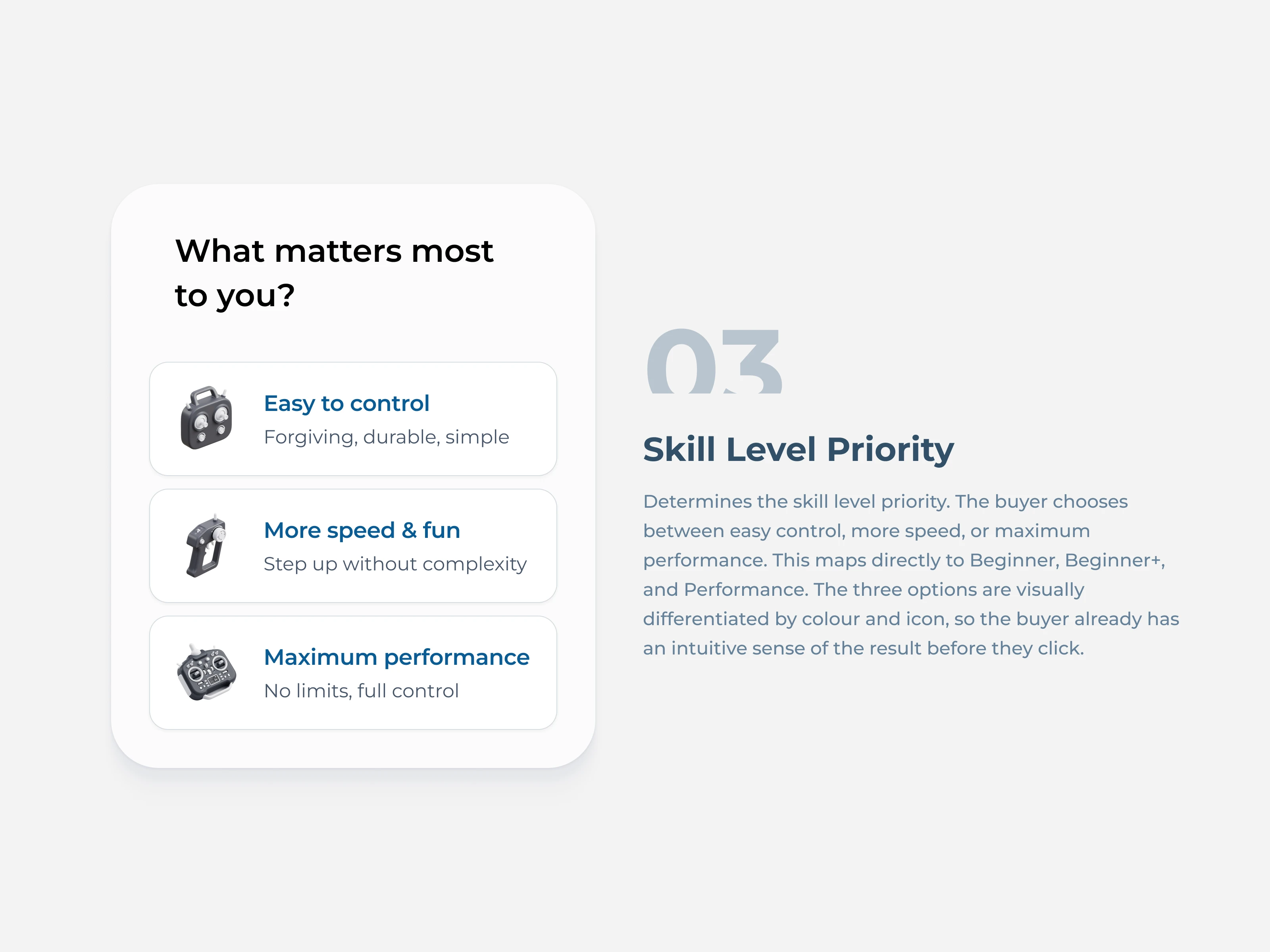
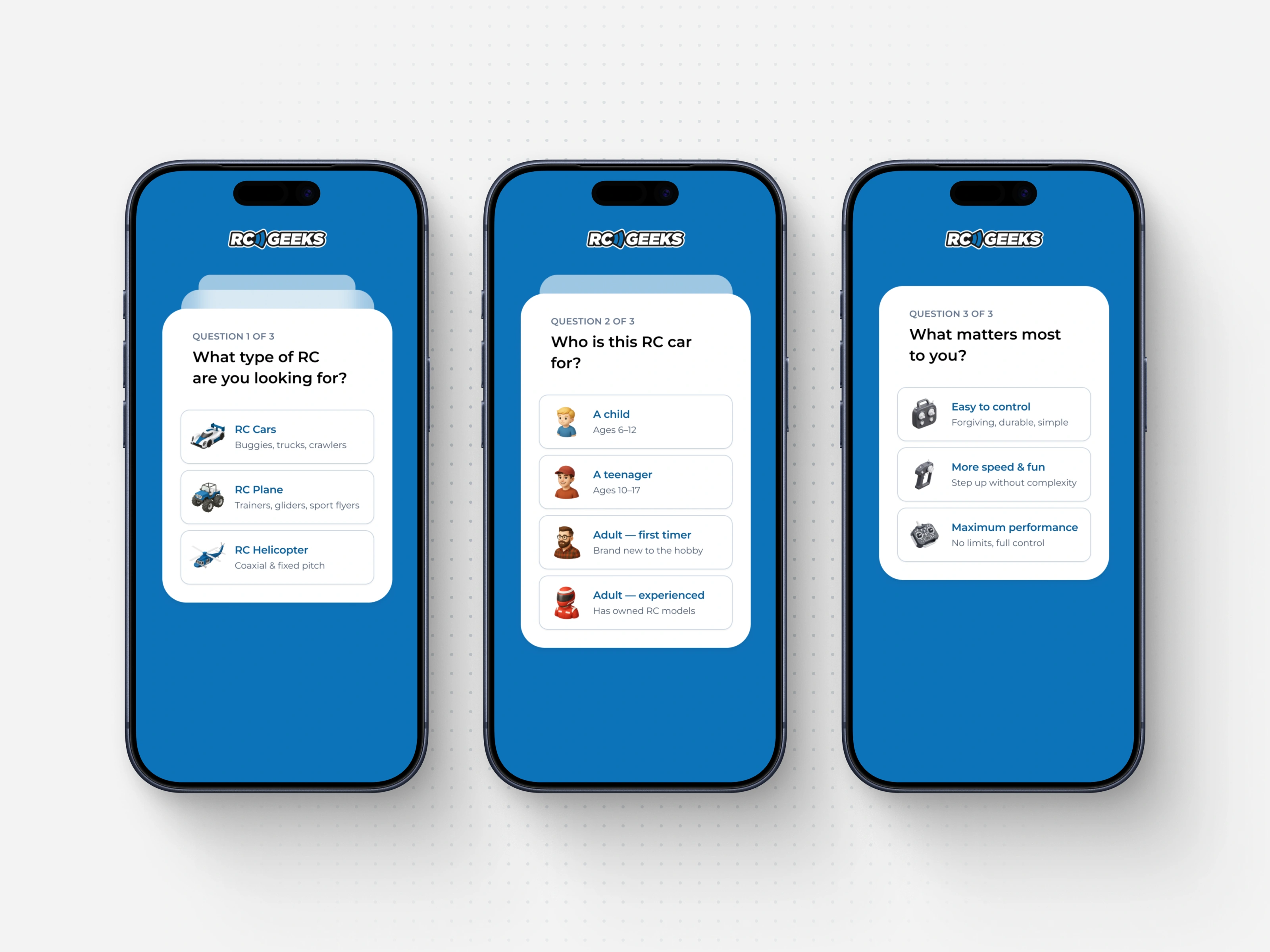
Step 1: Audit the content. I broke down each level's description and distilled the core differentiators. All the text boiled down to 3 key variables: What type of vehicle do you want? How old is the buyer? How fast do you want it to go?
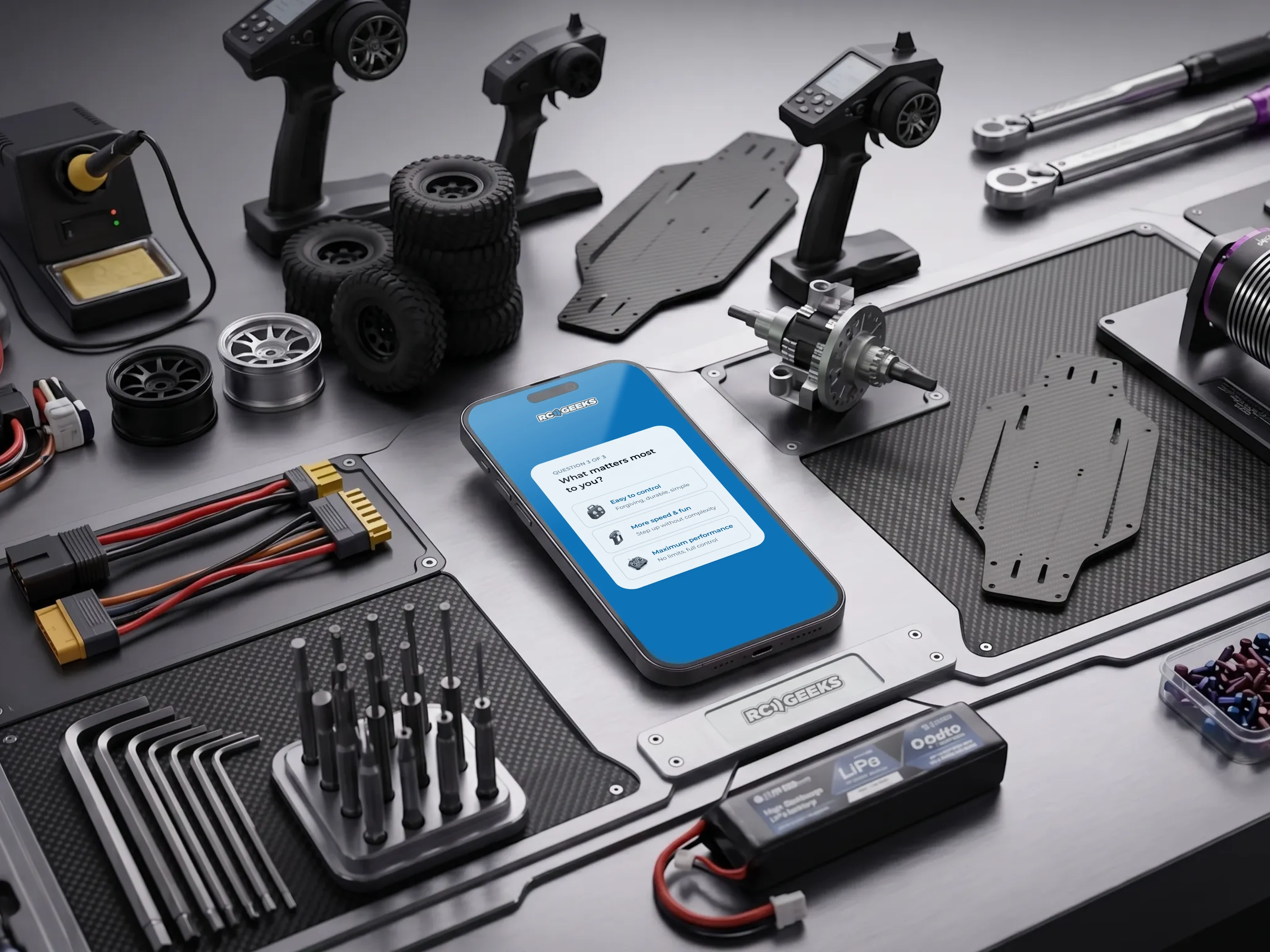
Step 2: Build the decision tree. From those 3 variables, I mapped the patterns that determine which level a user falls into. Instead of asking users to self-diagnose from a wall of text, the quiz asks 3 simple questions and does the matching for them.
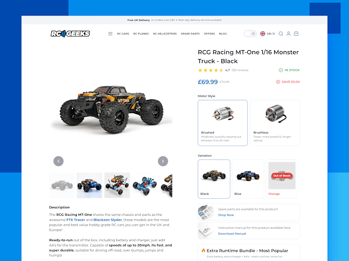
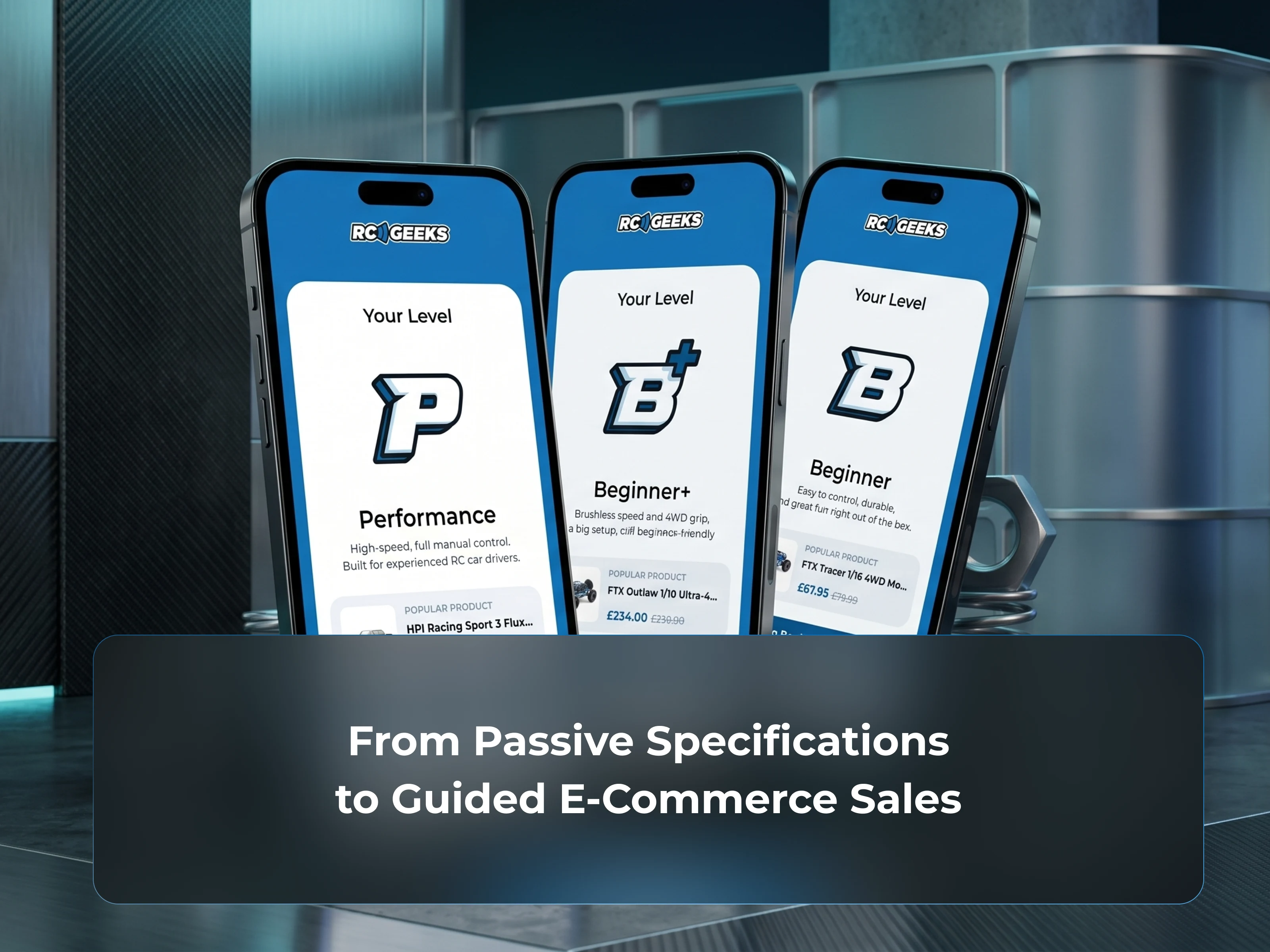
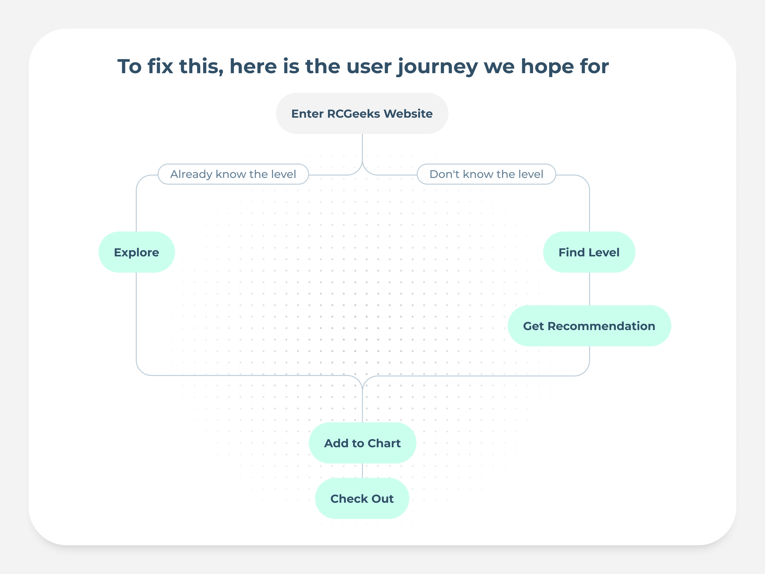
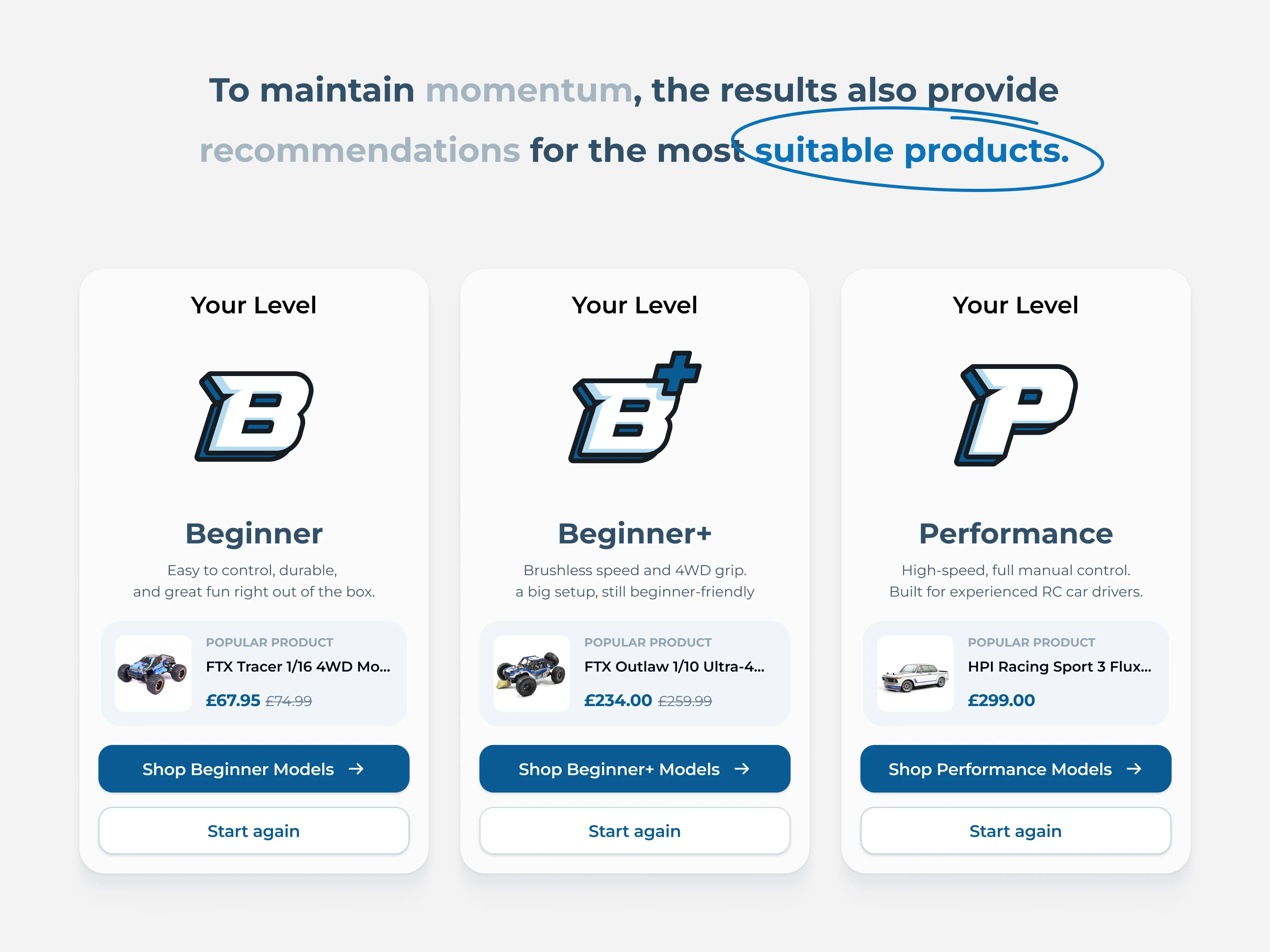
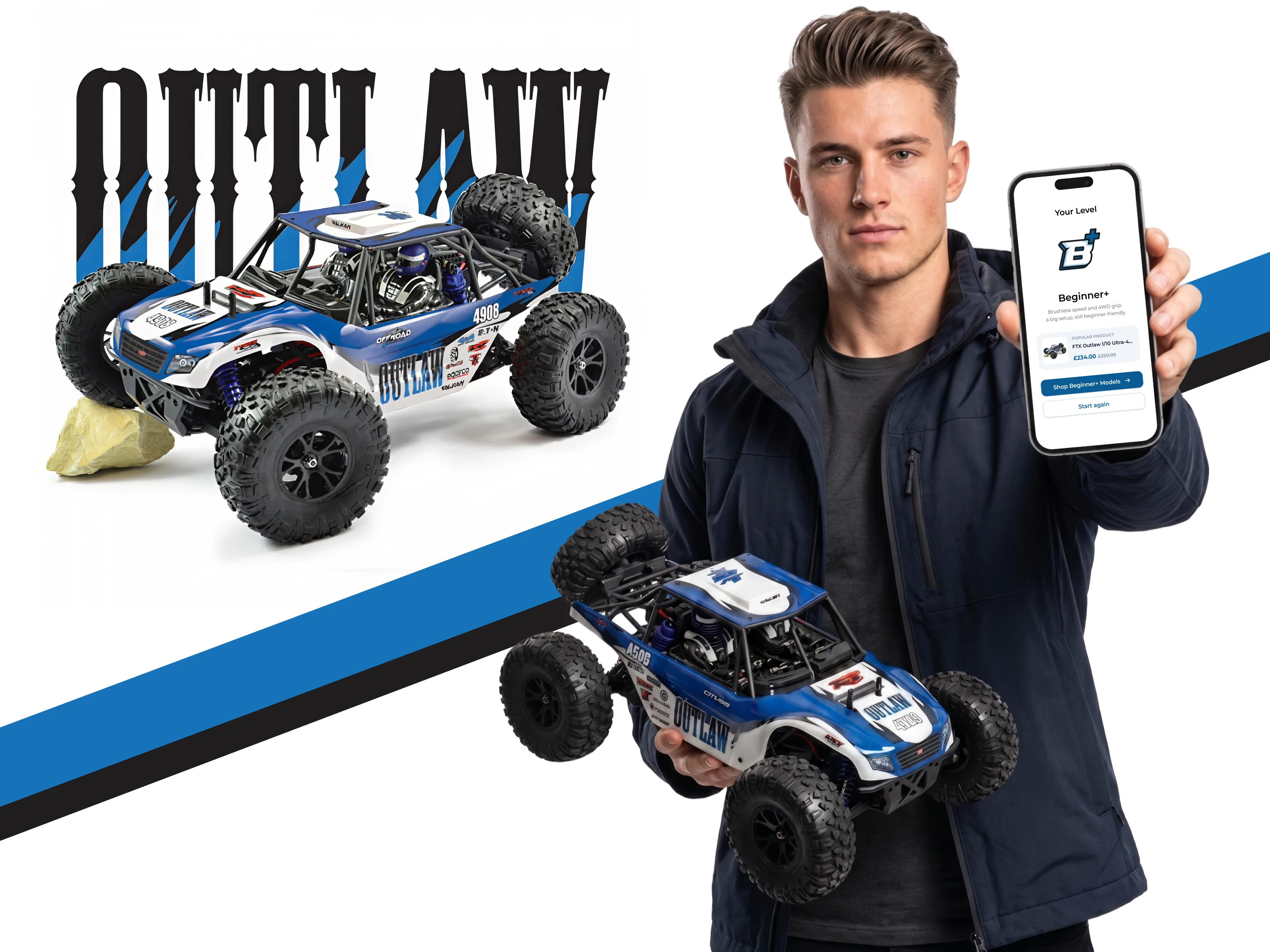
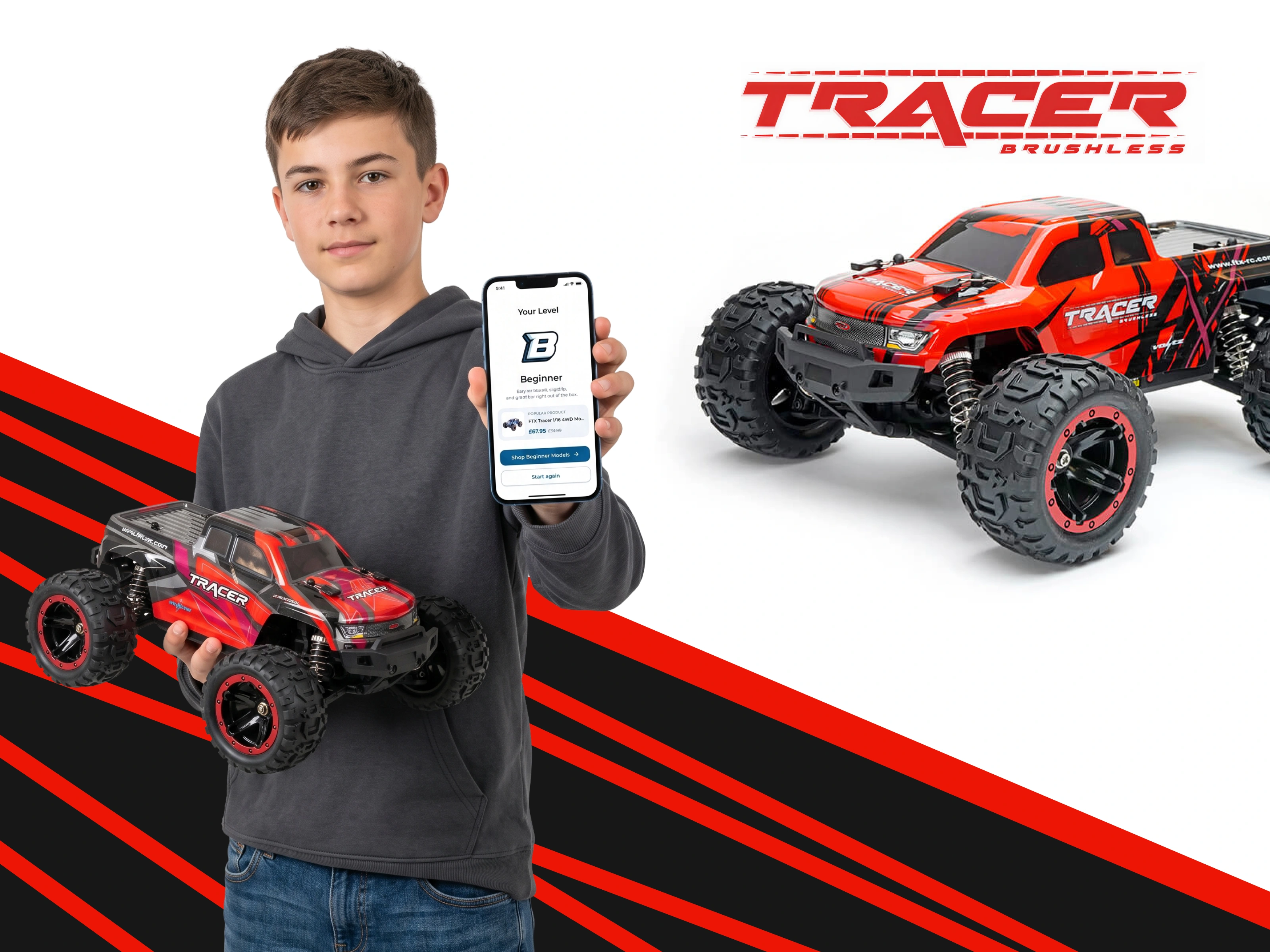
Step 3: Design the post-quiz conversion flow. Once the user's level is identified, the experience doesn't stop at a label. I designed what happens next: direct links to products, email templates, and ongoing engagement.
Section 8
Section 9
Section 10
Section 11
The Key Design Decisions
1. Non-hierarchical level icons
The level icons must not look like ranks. If levels appear as a ladder (beginner → intermediate → advanced → pro), buyers in lower categories feel inferior. A beginner spending $200 on their first RC car should feel just as valued as a performance buyer spending $800.
I borrowed the rating system from old DVD packaging (Everyone, Teen, Adult) and converted it into level icons. Each icon represents a category, not a tier. Every buyer feels like they belong, not like they're at the bottom of a ranking.
2. Instant post-quiz CTA
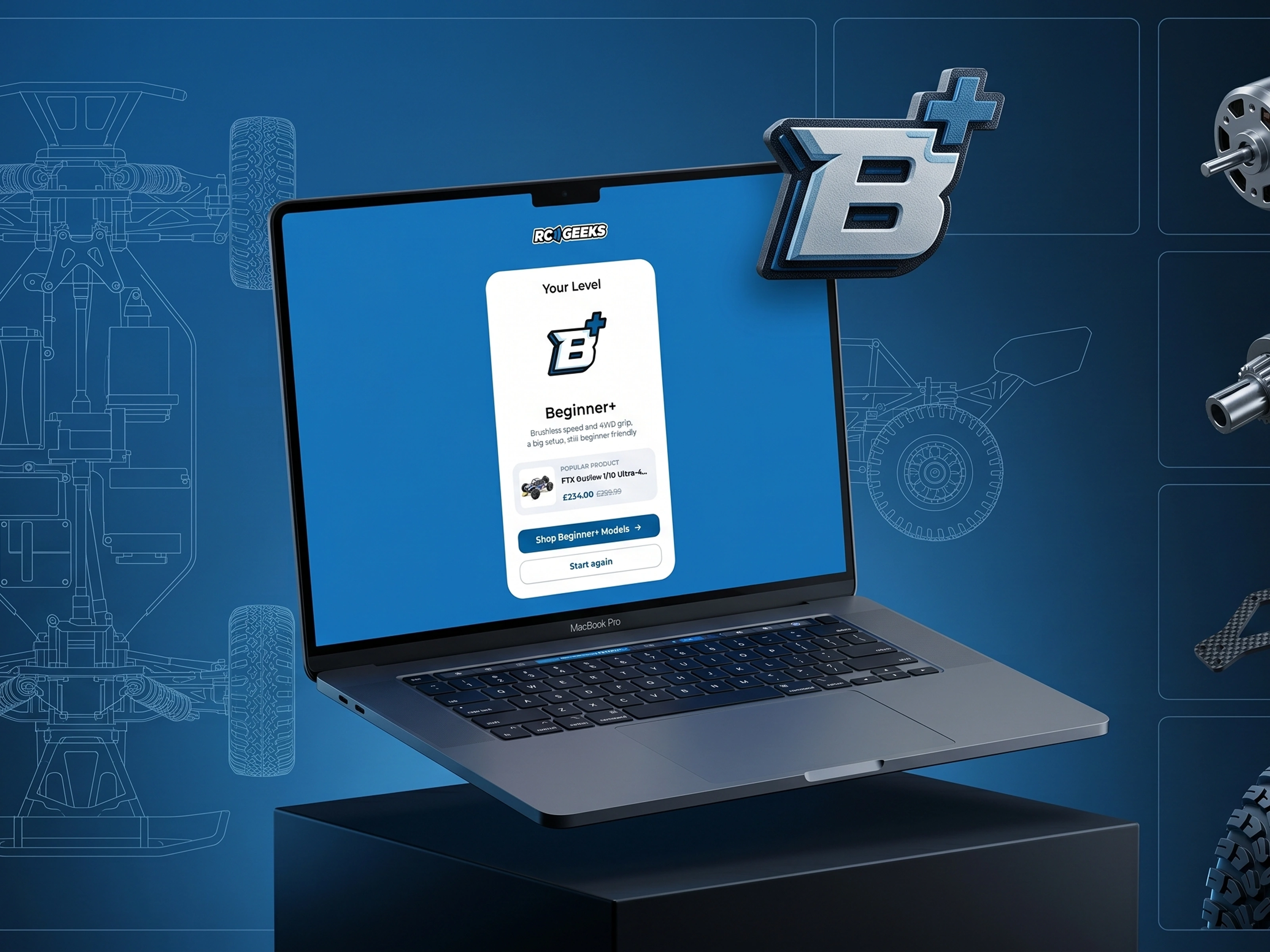
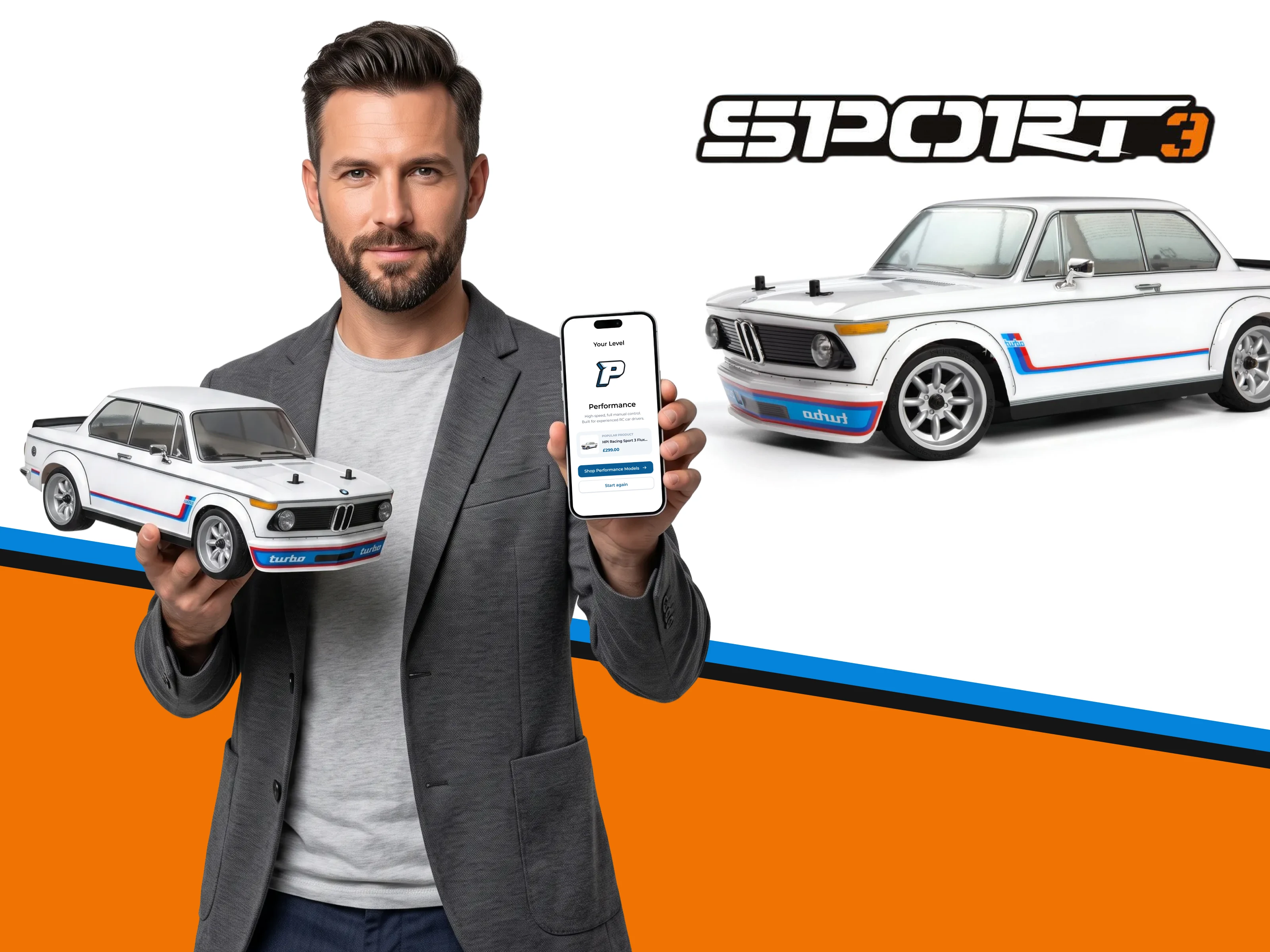
After the quiz identifies a user's level, I proposed a direct link to promoted or best-selling products within that level. The emotional momentum built by the quiz (curiosity → engagement → "that's me!") gets channeled straight into a purchase opportunity. No dead ends, no "now go browse our catalog." The chain from visitor to buyer stays unbroken.
3. After-sales email by level
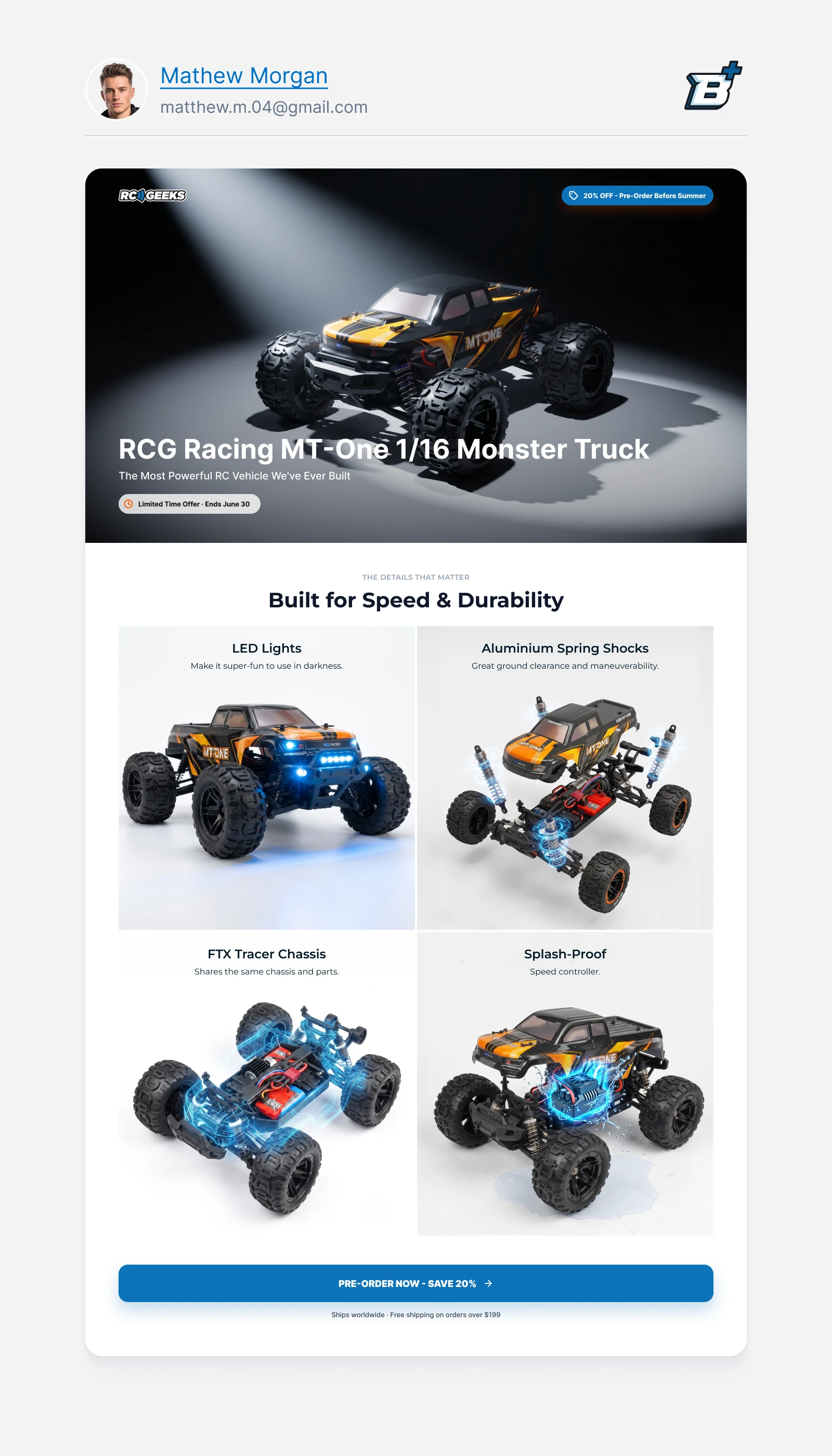
With user profiles now tagged by level, I designed email templates for post-purchase follow-up. New products matching the buyer's level get sent automatically. This extends the sales chain beyond the first purchase and turns a one-time quiz into a long-term retention tool.
Section 12
Section 13
Section 14
Section 15
Section 16
Section 17
Section 18
Section 19
Section 20
Section 21
Section 22
Section 23
Section 24
Section 25
The Outcome
The client reported strong results across all key metrics:
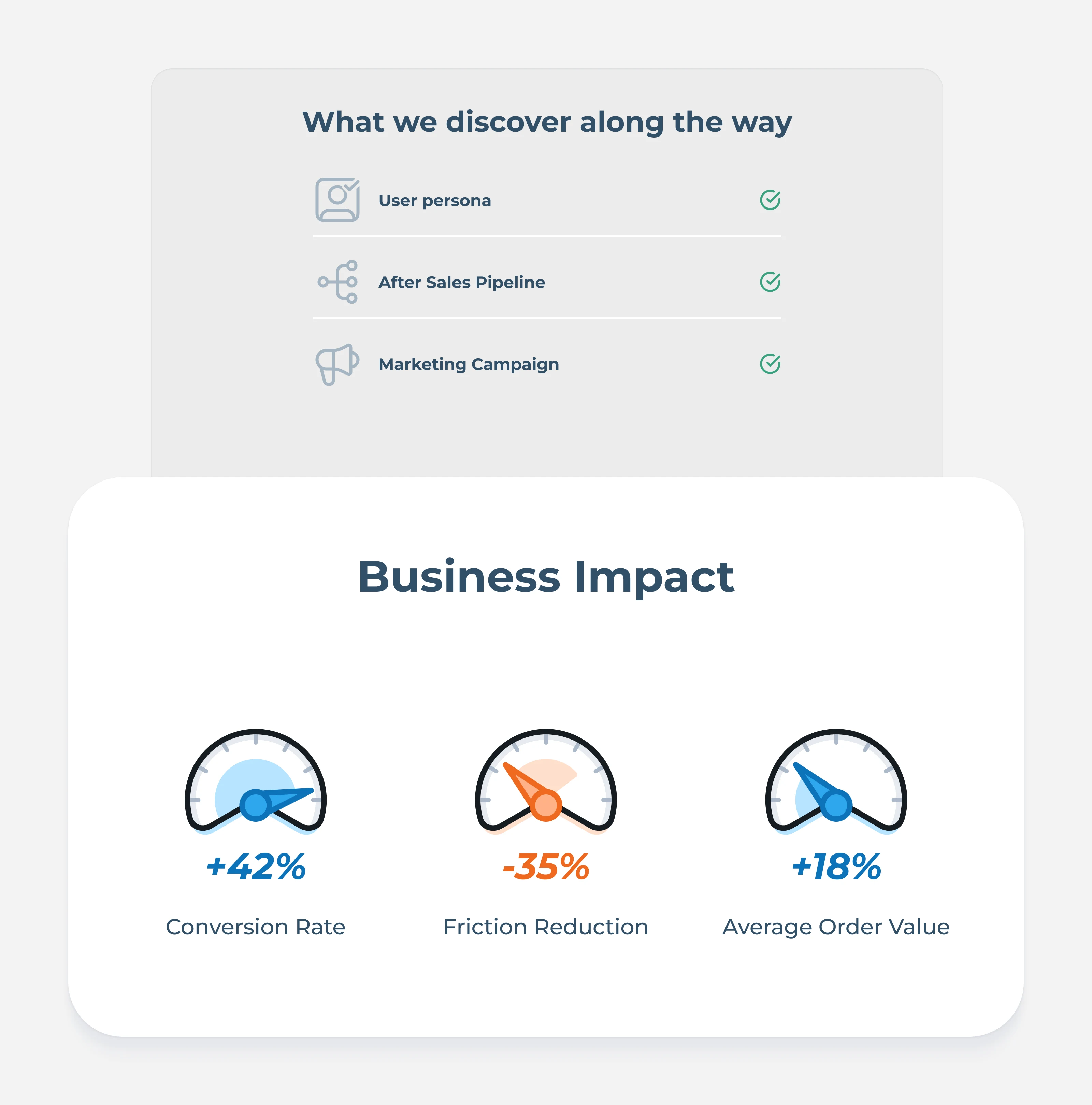
+42% conversion rate from the quiz flow compared to the old text-based level guide
-35% friction reduction in the product selection journey
+18% average order value growth this year
The quiz didn't just help users find the right product faster. The non-hierarchical framing made every buyer feel confident in their category, the instant CTA captured purchase intent at peak engagement, and the level-tagged email system turned first-time buyers into repeat customers.
Like this project
Posted Jul 2, 2026
Designed a 3-question Level Finder quiz for RC Geeks, replacing a dense product guide with personalized RC recommendations, product CTAs, and level-based follow-up. The new flow increased conversion by 42%.