Brand Identity for AirCon

Aavirash Mitra
Verified


Cooldown with Design - A Brand Identity for Modern Air Conditioning
A complete visual system built on calm, clarity, and cool blue confidence for a brand that keeps spaces comfortable.
This project set out to give an air conditioning service a brand identity as refreshing as the comfort it delivers. Every choice, from the color palette to the motion of the logo, was made to communicate coolness, trust, and effortless clarity. The result is a flexible system that works across print, product, and web, all rooted in a single feeling: fresh air, well designed.
Milestone 1 - The Logomark
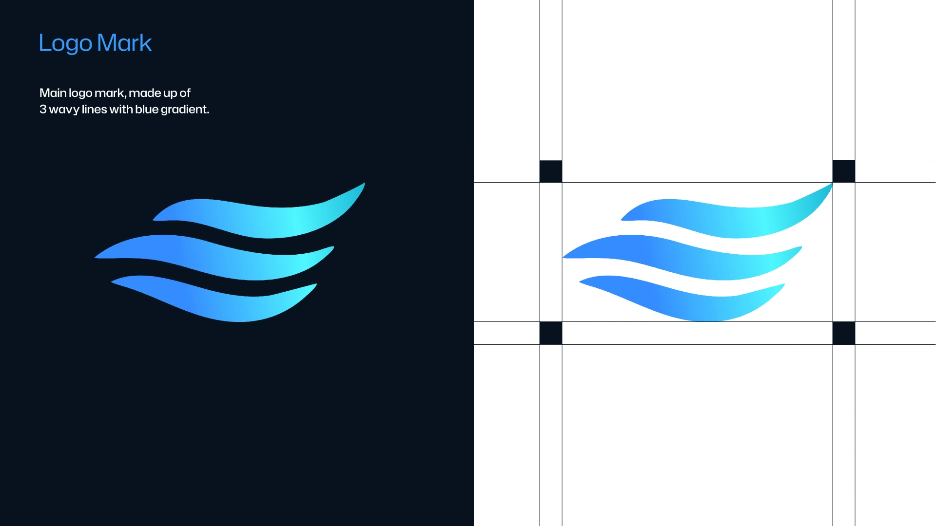
Three Waves, One Feeling
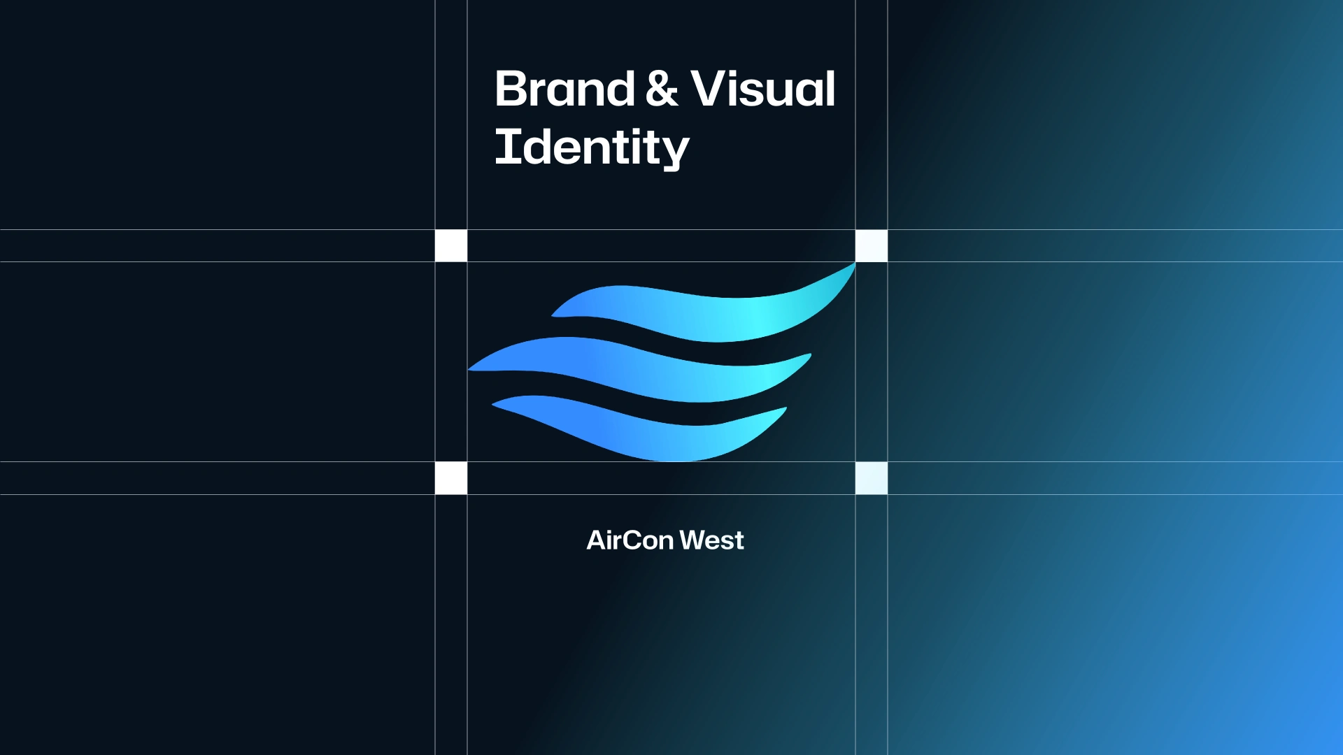
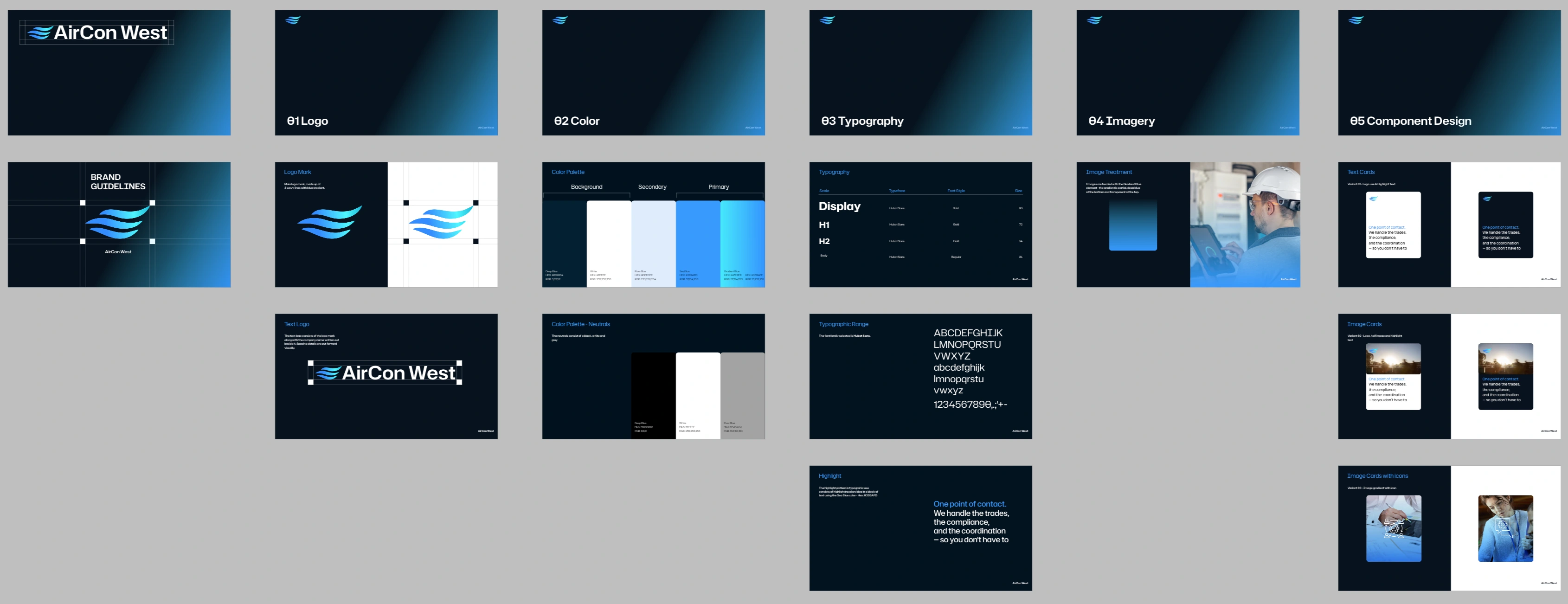
A mark that moves like cool air - The logomark is built from three flowing wave lines, carrying a gradient from light blue to deep blue. The waves suggest airflow, motion, and the calm rhythm of a well cooled space. The blue gradient anchors the entire system, setting the tone for a brand that feels clean, modern, and dependable.
Milestone 2 - Logo & Wordmark
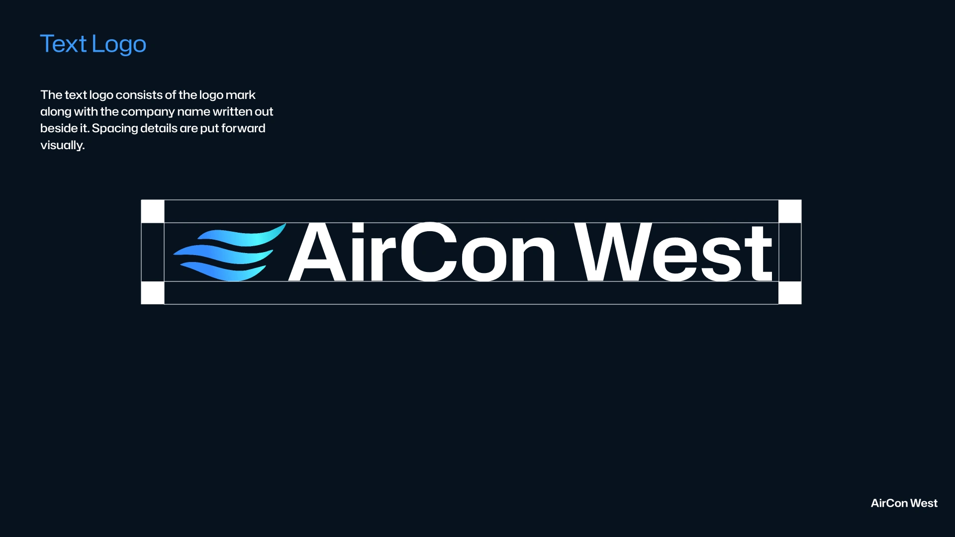
Structured for balance
The full lockup pairs the wavemark with the wordmark, aligned on a precise 40 by 40 pixel grid. This spacing framework keeps the identity balanced and reproducible at any scale, so the brand always reads clean and considered, whether on a business card or a building sign.
Milestone 3 — Color System
Built on Blue
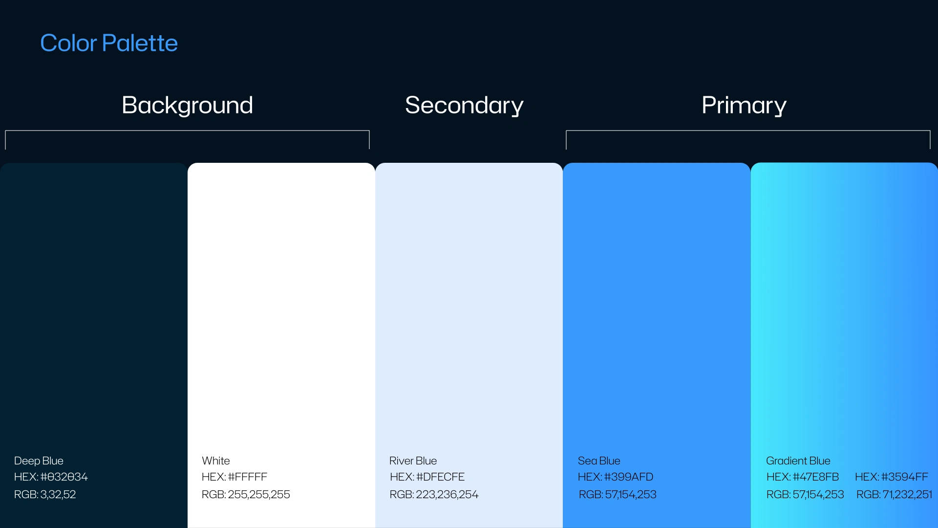
A palette as cool as the product.
The color system is grounded entirely in blue, reflecting the calm and freshness of the service itself. It includes two primary colors, one of them the signature gradient, plus a secondary blue and a set of background tones. A neutral foundation of black, grey, and white keeps everything grounded and legible. Together, they form a palette that feels crisp, calm, and unmistakably cool.
Milestone 4 — Typography
Hubot Sans: Clear, Cool, Confident
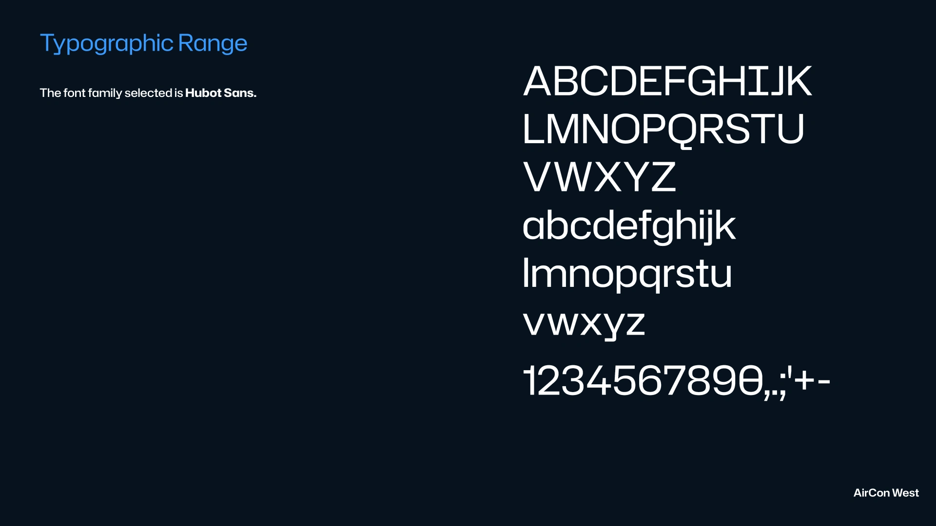
A typeface that speaks plainly and reads beautifully.
Hubot Sans was chosen for its clean geometry and modern warmth. It carries the brand’s voice across headlines and body copy with clarity and confidence, striking the balance between technical precision and approachable comfort that defines the brand.
Milestone 5 — Highlight Pattern
Guiding the Eye
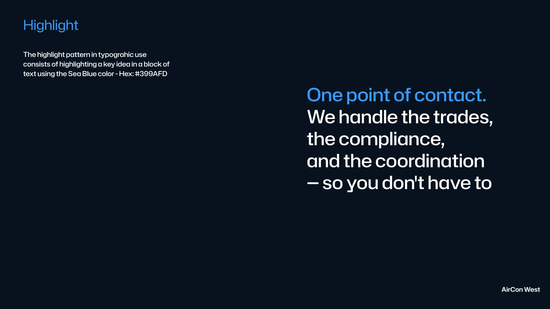
When explaining ideas and concepts, clarity is everything. The highlight pattern uses a single line of blue within a body of copy to draw attention to what matters most. It’s a simple, repeatable device that helps readers absorb key ideas quickly, turning dense information into something easy to follow.
Milestone 6 — Image Treatment
Every image, unified by a signature gradient.
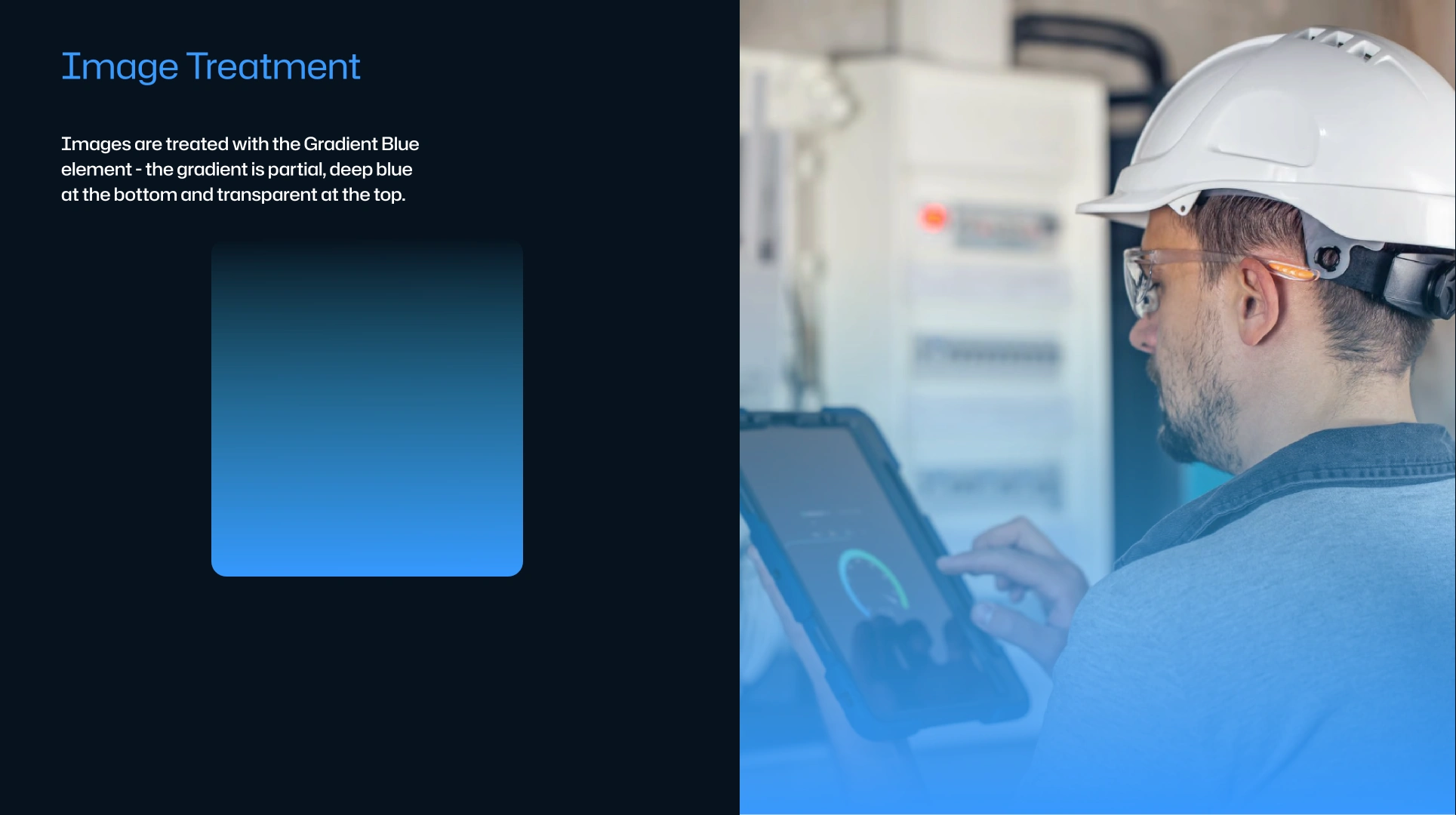
A Cool Wash Over Everything
To keep visuals cohesive, all photography and stock imagery carries a signature gradient: transparent at the top, fading into light blue at the bottom. This treatment ties every image back to the brand’s cool palette, creating a consistent, atmospheric look that feels unmistakably on brand.
Milestone 7 — Component Design: Cards
Three card components, dark and light, ready to build.
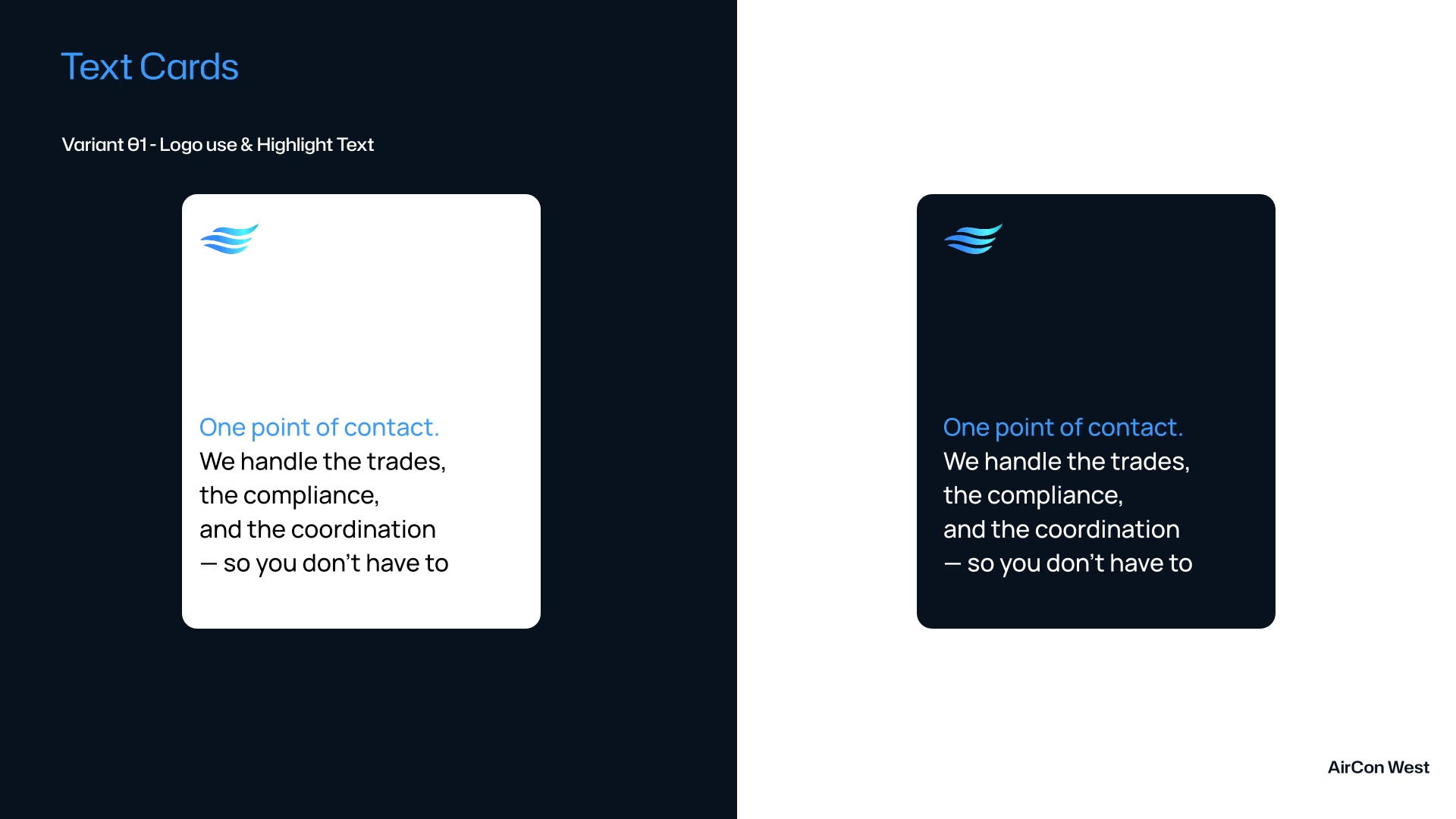
Card Components with Text Only + Highlight
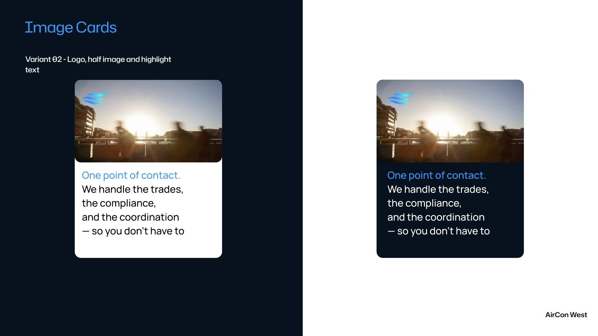
Card Components with Image & Text (Image frames with 20px rounding)
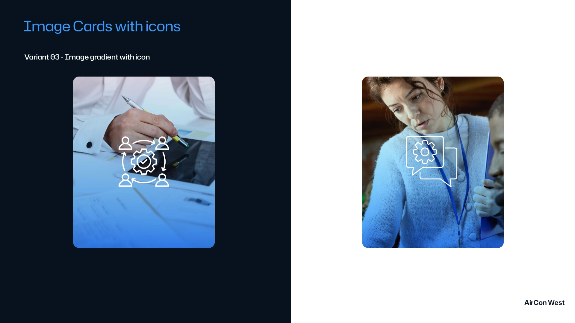
Card Components with Image & Icons
Description: To show the system in action, the identity was applied to a set of card components, each designed in both dark and light versions from the start. The first is a text card, with the logo anchored in the top left corner above clean, readable copy. The second is an image card, splitting the frame with imagery on top and text below. The third is a full image card, where the signature gradient wraps the photo and a logo icon sits at the center, using the mark as a visual cue to describe the concept behind the image. This use of logo icons over imagery became one of the most versatile patterns in the system.
Closing
From System to Screen
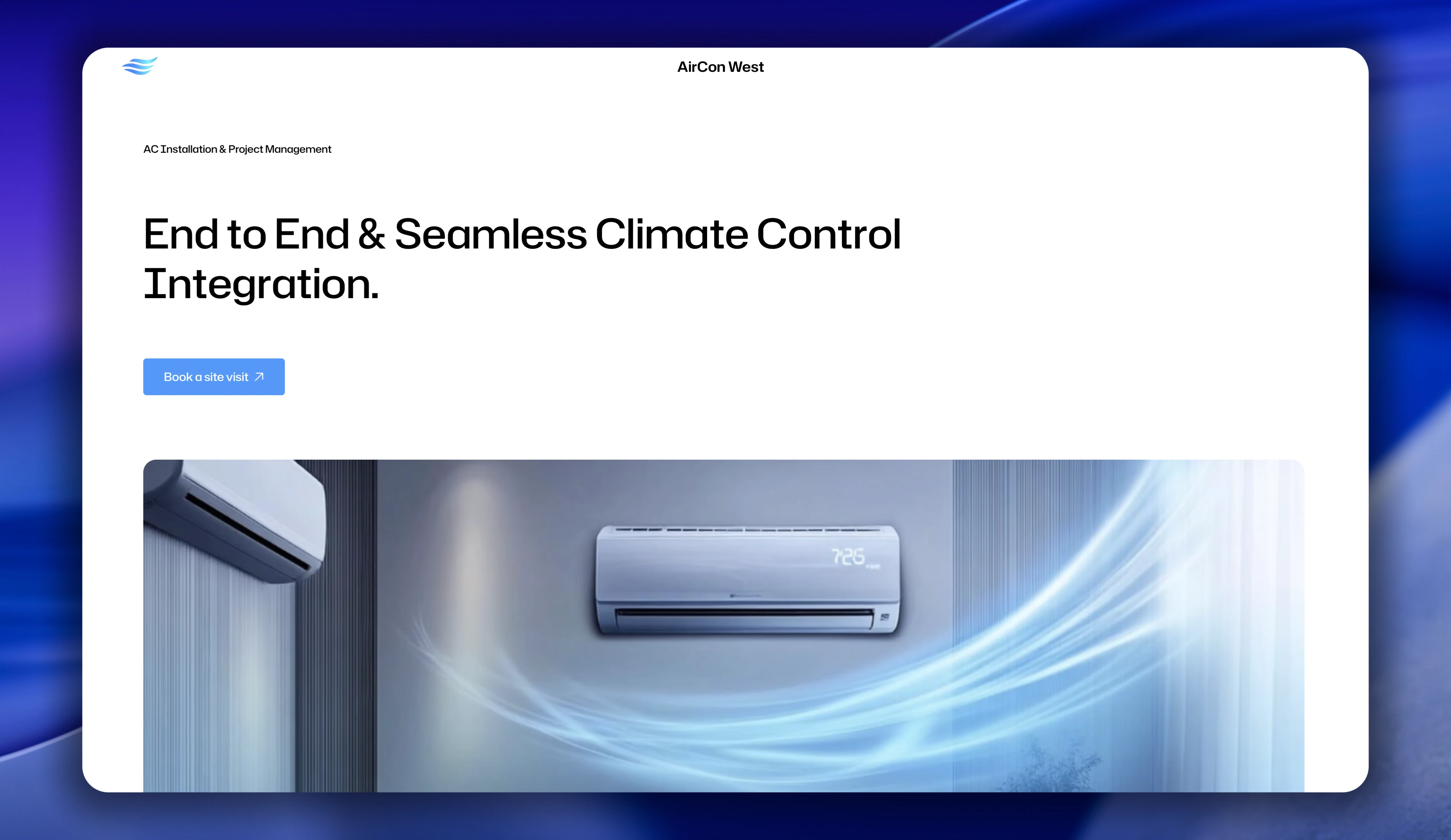
Website built with Framer
The brand, brought to life on the web.
Every principle in this guideline, the waves, the gradient, the grid, the card system, was fully implemented in a live Framer website that brought the identity to life.
See the full Framer Website Case Study here ->
Like this project
What the client had to say
Aavirash is an excellent designer, he breathes and lives this stuff. He is a true professional and master at all things to do with design, branding, web design in framer. Collaboration is seamless and he's extremely responsive.


Meetpal Singh, Prime Property
Jul 21, 2026, Client
Posted Jul 21, 2026
Brand identity for AirCon, a West London air conditioning service. Designed the logo and core visual system to give the brand a clean, modern, trustworthy look.
Likes
0
Views
27
Timeline
Jun 29, 2026 - Jul 21, 2026
Clients
Prime Property