Mitigrate — responsive website design
Mitigrate landing page
Mitigrate is a ClimateTech SaaS startup generating fully automated analyses leading to prioritized preventive measures for reducing climate damages on real estate, starting with flooding, to be extended to other risks
Thanks to high-resolution satellite images, our map-based AI models, and optimization algorithms predict how 50+ climate-positive prevention measures can be implemented to reduce risk. Business value stems from reducing risks on individual assets and prioritizing preventive measures within large portfolios of commercial & residential real estate. Since 01/01/23, the EU Taxonomy has made prevention mandatory for insurers throughout Europe
.
Principal tasks
Objectives
To create a better introduction of the company and online experience for visitors while also increasing awareness between social media.
Project Includes
Design Ideation
Design Direction
User Interviews
Final Design
Web Development
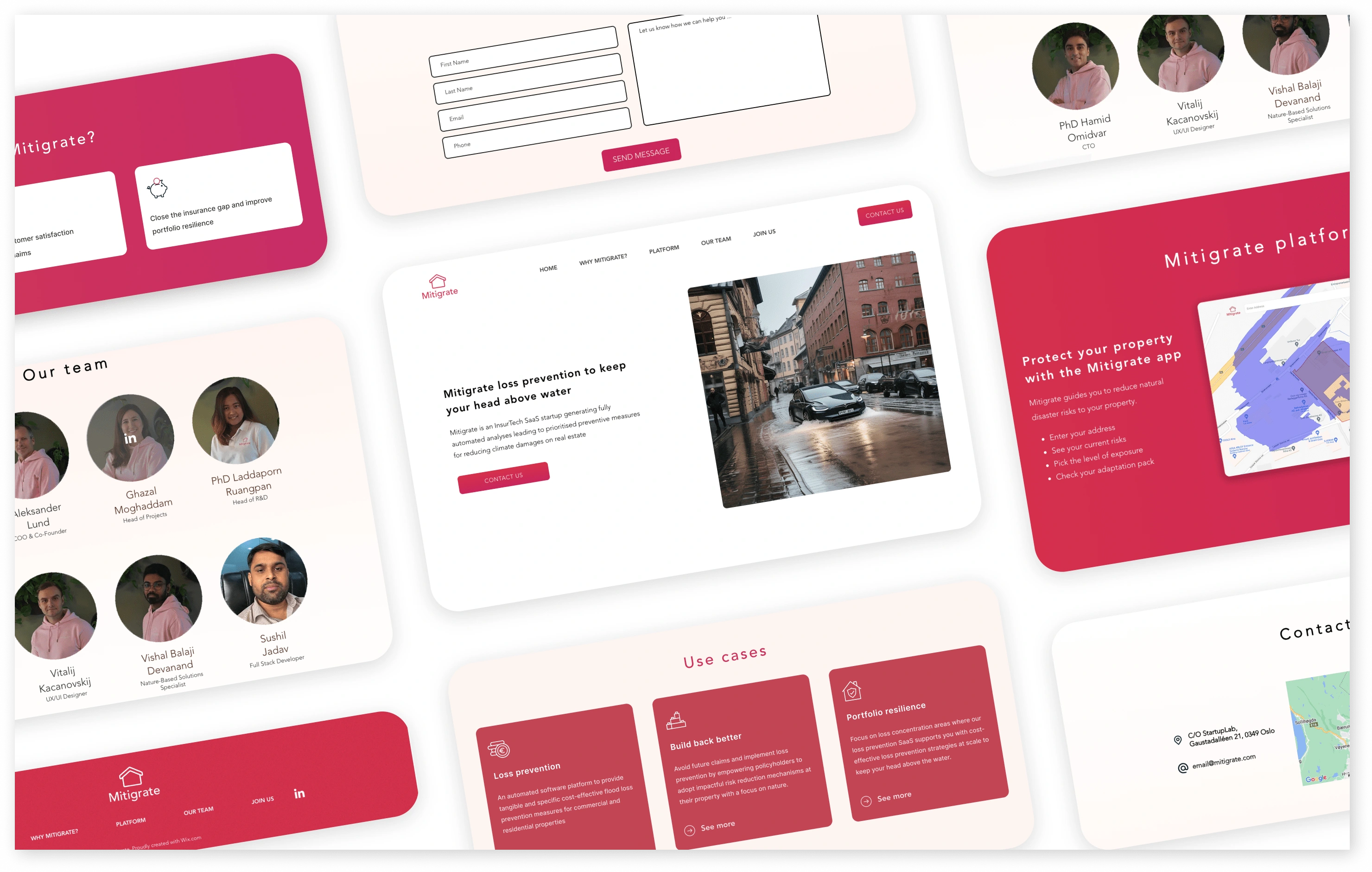
Re-designing the whole website
Given the existing website from a year prior, I dedicated time to strategize the optimal approach for rebuilding the product. This involved conducting interviews with stakeholders, defining personas, and engaging in team brainstorming sessions. Beginning with low-fidelity prototypes, I iteratively tested and adapted them based on user feedback. The transition to high fidelity was a meticulous process, involving the creation of interactions, high-quality UI, and the development of a robust framework. The final phase encompassed user testing, interviews, and the implementation of minor adjustments based on feedback.
Timeframe

User Personas
At Mitigrate, we meticulously crafted the website to cater to three distinct user personas. Primary focus was to enhance user experience and ensure clarity for each demographic, providing a seamless and tailored online environment.

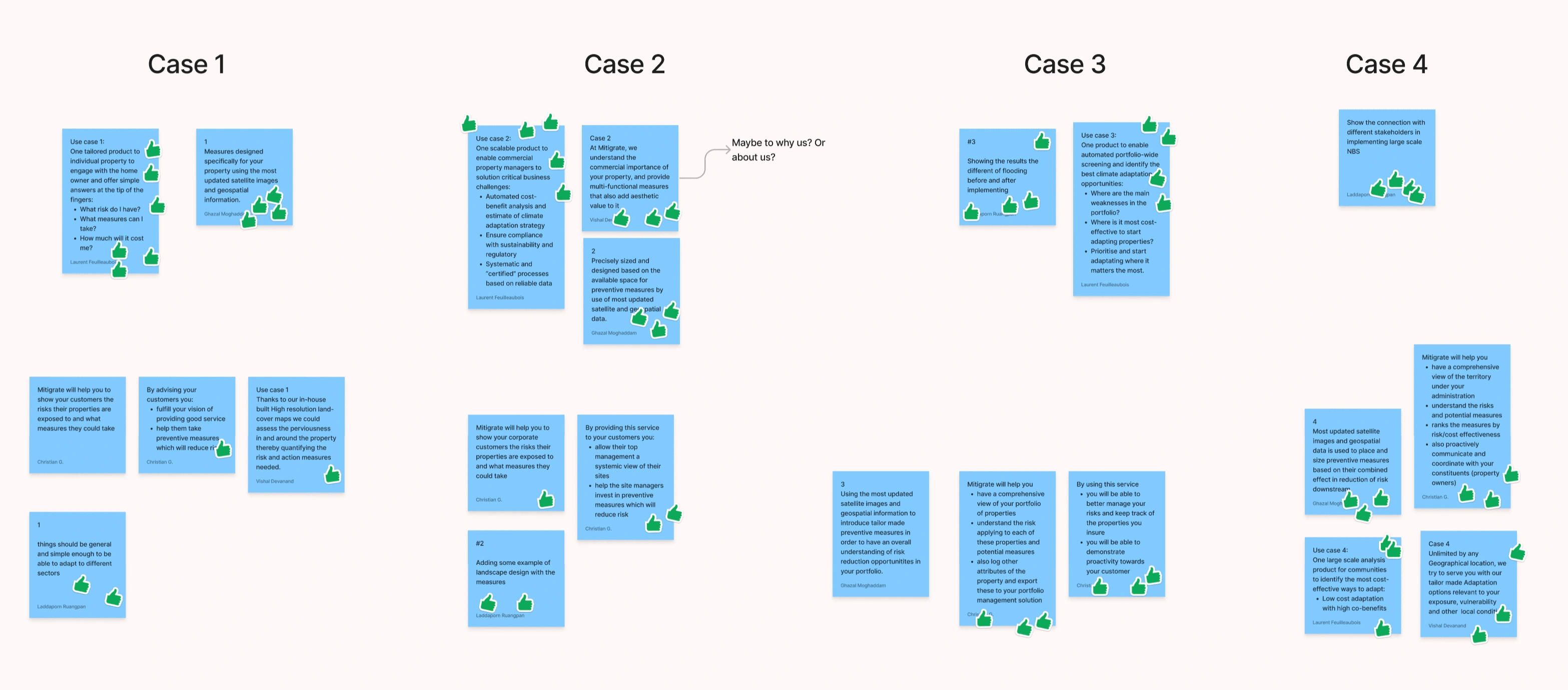
Brainstorming
During brainstorming session, we went beyond design and personas. Our main goal was to ensure universal understanding of our mission and the purpose driving our efforts. Our aim was to craft a landing page that is not only visually appealing but also user-friendly, catering to the diverse needs and preferences of all individuals.
Low fidelity
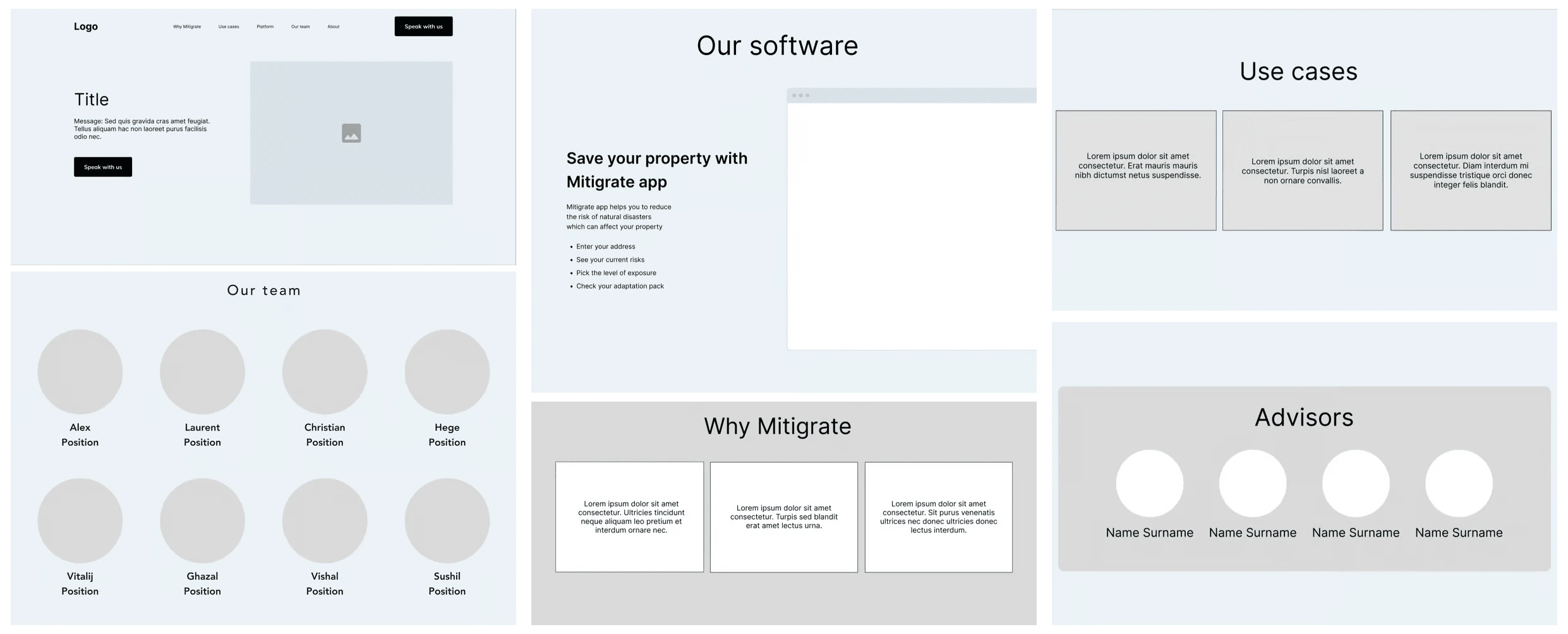
Prior to crafting high-fidelity wireframes for a detailed website design, preliminary low-fidelity wireframes were developed. These low-fidelity representations served the purpose of gauging feedback on the overall website structure and layout.
Styleguide
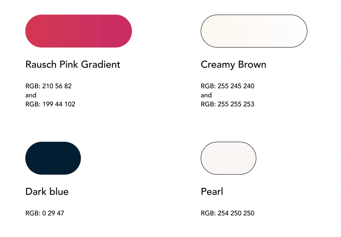
Rausch Pink Gradient - Vibrant and bold, the Rausch Pink Gradient demands attention and stimulates engagement. Ideal for call-to-action buttons or backgrounds, it effectively captures users' focus.
Trust and Comfort - Soft, creamy hues foster a cozy and inviting atmosphere, imparting a sense of comfort to visitors. This palette aims to convey empathy and relaxation, emphasizing a welcoming and soothing ambiance.
Typography
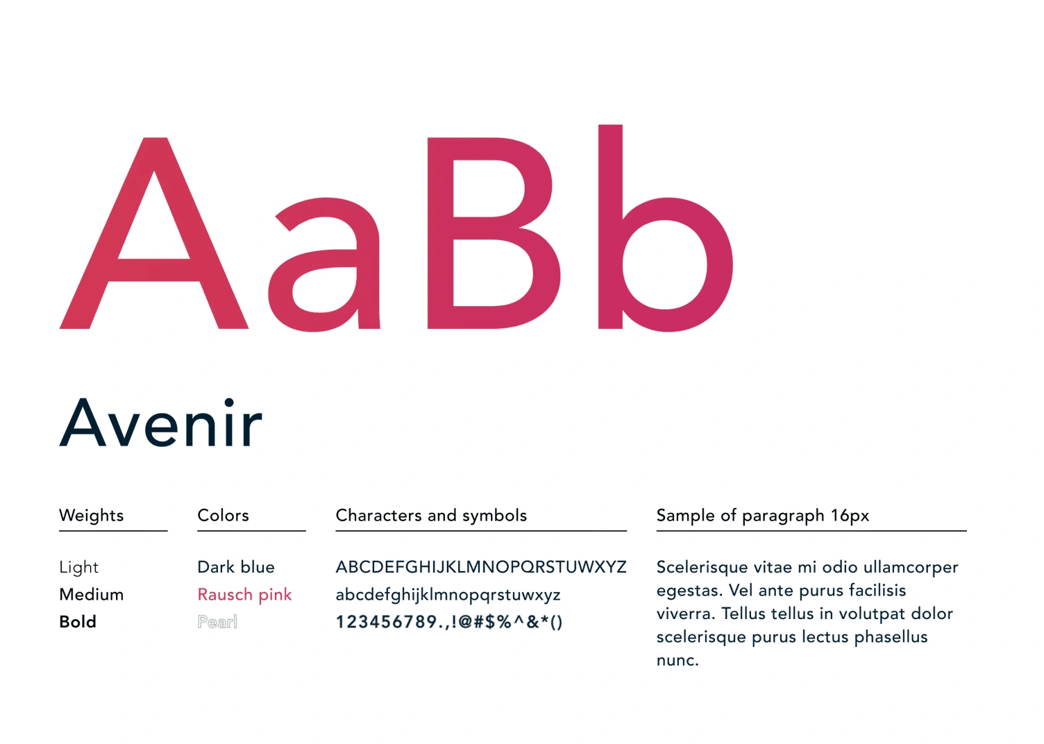
Avenir font signifies modernity. Its sleek and contemporary appearance conveys a sense of trust and credibility, while its clarity enhances readability. The font's minimalist style ensures a clean and uncluttered look, allowing your visitors to focus on essential content.
Logo re-design
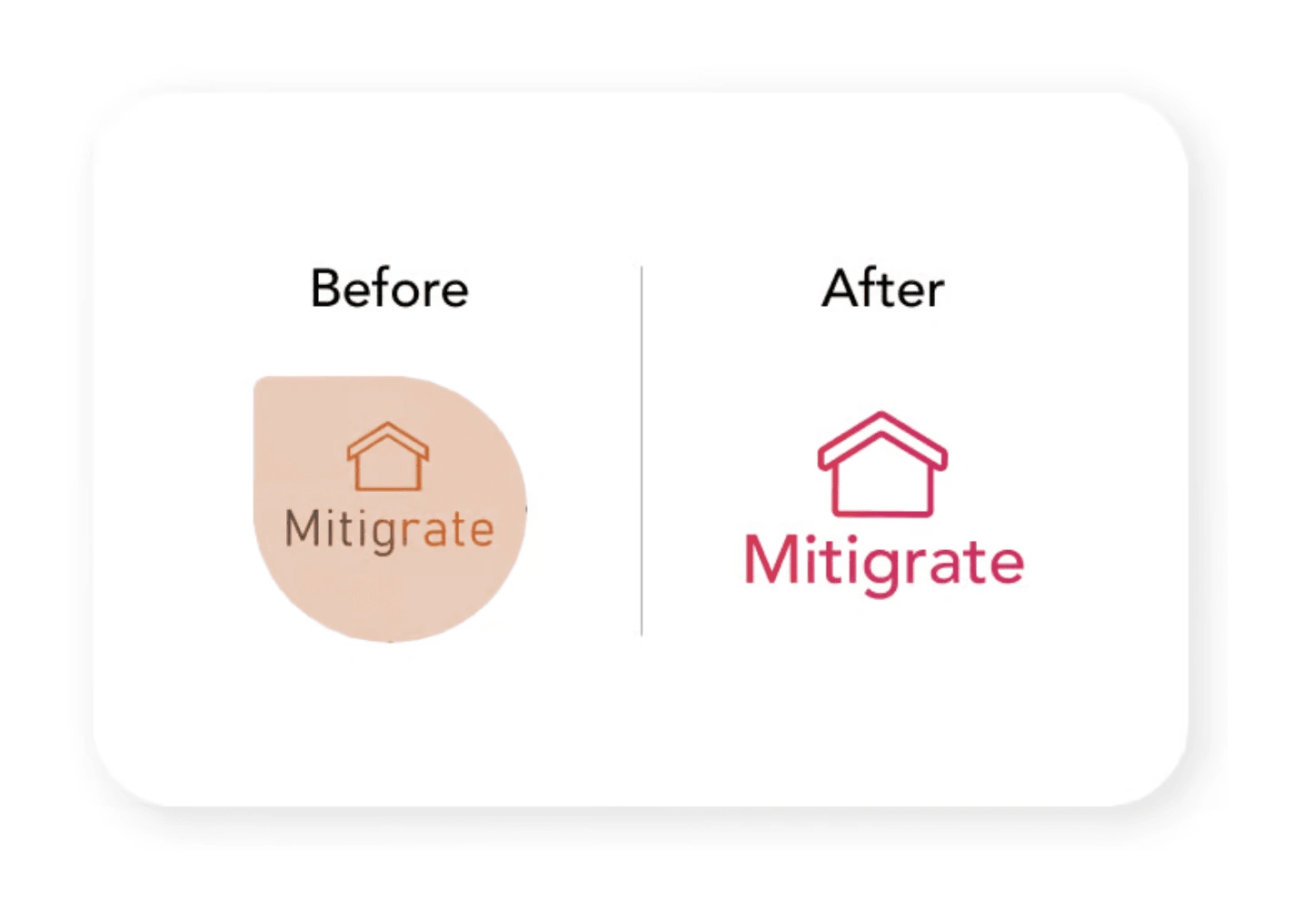
The previous logo featured heavier colors that often overlapped, diminishing readability. Additionally, the logo shape didn't align with the font style.
In contrast, the new logo boasts a minimalistic design. The bold pink hues effortlessly capture attention, while the house with smooth corners evokes feelings of coziness and safety.
High fidelity
Final website development comprised:
UI Designed delivery
Feedback collection
Based on feedback fixes and updates were done
In phase two interactions were added
Website is still in development
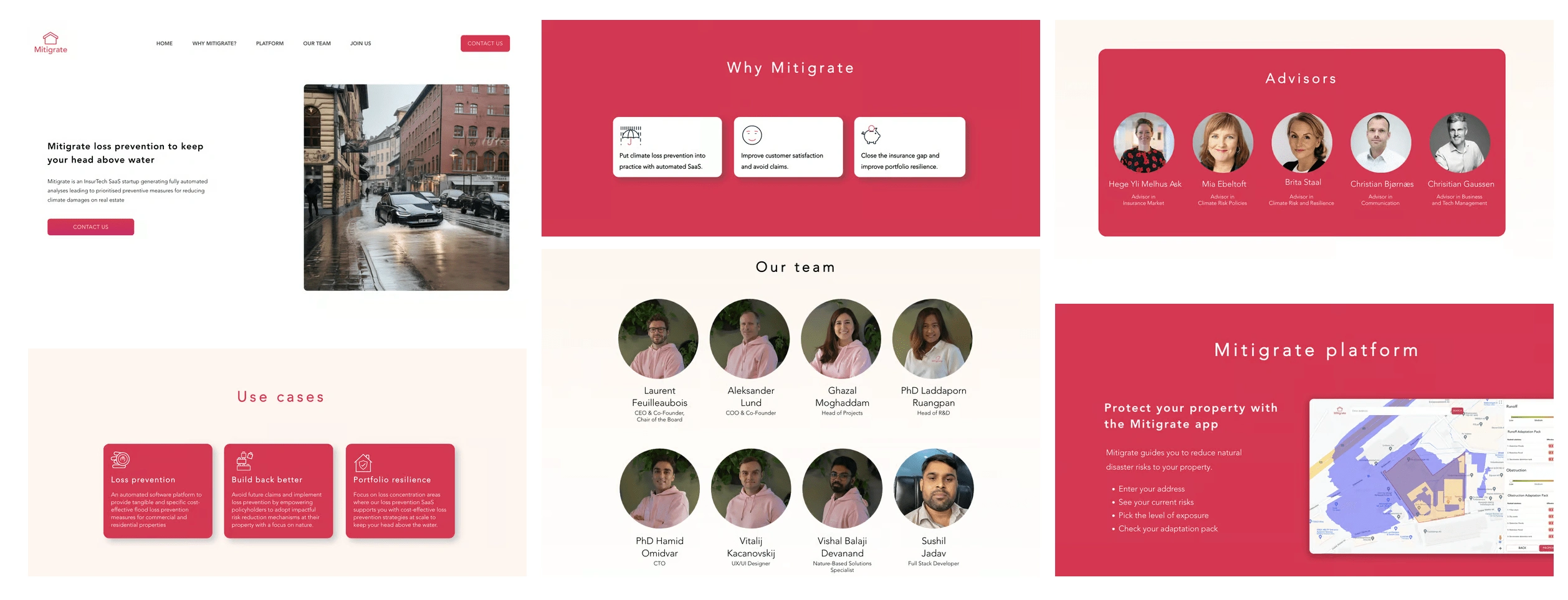
Interactions
To enhance the visual appeal of the landing page, I've incorporated subtle and playful user interactions throughout. These small, engaging elements create a more dynamic user experience, making the page feel less formal and more inviting. By adding these fun interactions, the landing page becomes more enjoyable and engaging for visitors, encouraging them to explore further and interact with the content in a lighthearted manner. This approach not only captures attention but also provides a memorable and pleasant user experience, setting a positive tone for the entire website.
Responsive Design
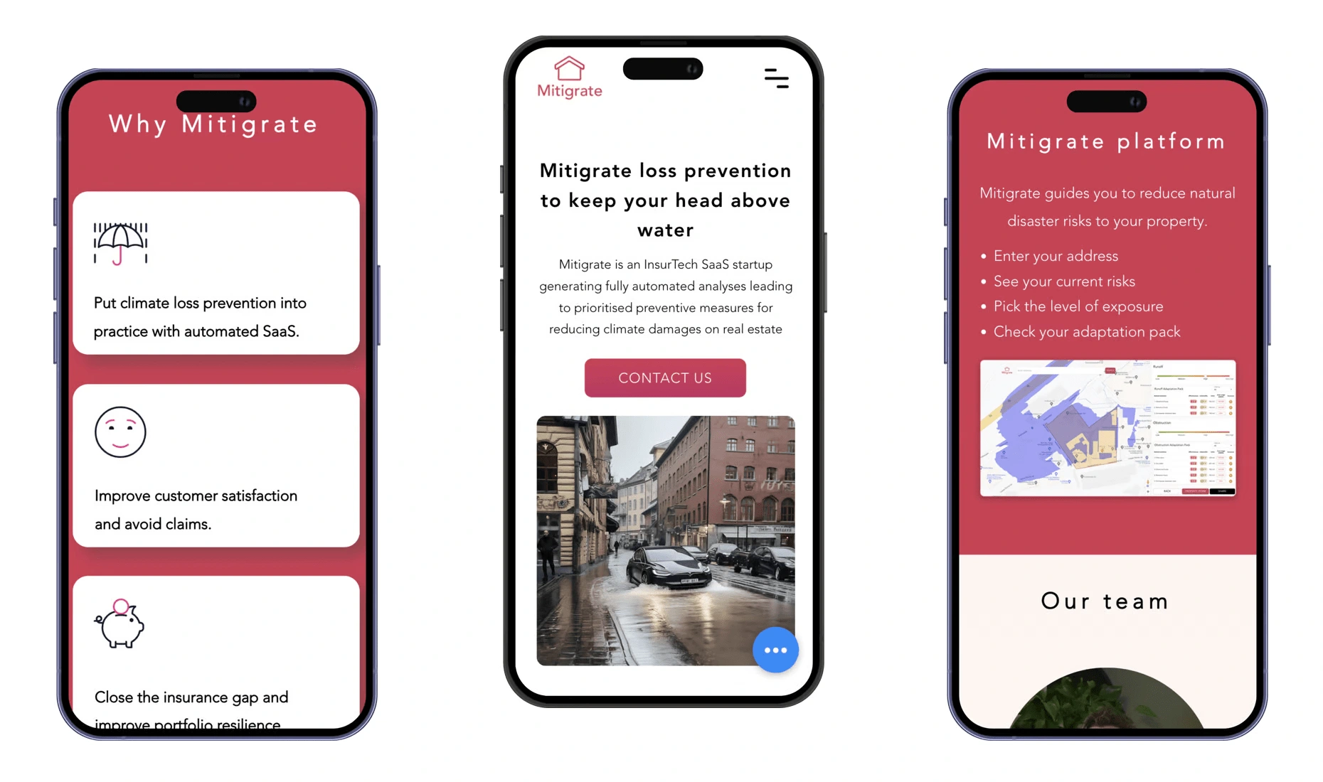
Mitigrate website was meticulously crafted to be responsive. Despite data indicating that the majority of users primarily accessed our site from desktop devices, we recognized the significant presence of mobile users. As a result, our design ensures a seamless experience across all devices, catering to both desktop and mobile users alike.
Thank you for attention!
Like this project
Posted May 9, 2024
Main goal was revamping outdated site completely. Refine purpose, enhance user experience, and design. Identify key users, gather feedback.

