Custom Generated Infographics
A. Barkett
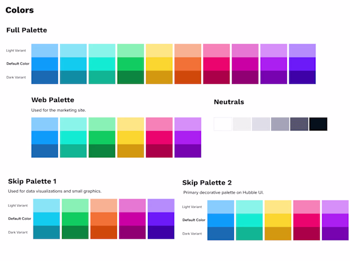
While Illustrator offers some dynamic charts, they are very basic and did not offer us the ability to create the rich data visualizations that we wanted. We found a tool that integrated with Illustrator called Datylon, that gave us the ability to create accurate and beautiful visualizations we were after.
With Datylon in the toolkit, we worked on a visual design and layout. Through experimentation with different styles, we found a bright, fun, and clean style that worked well for infographics and matched our brand.
Like this project
Posted Aug 29, 2023
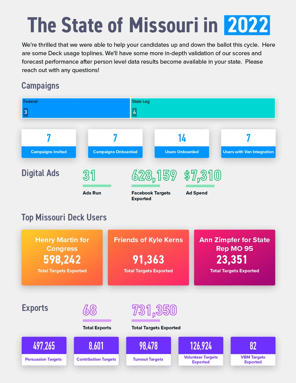
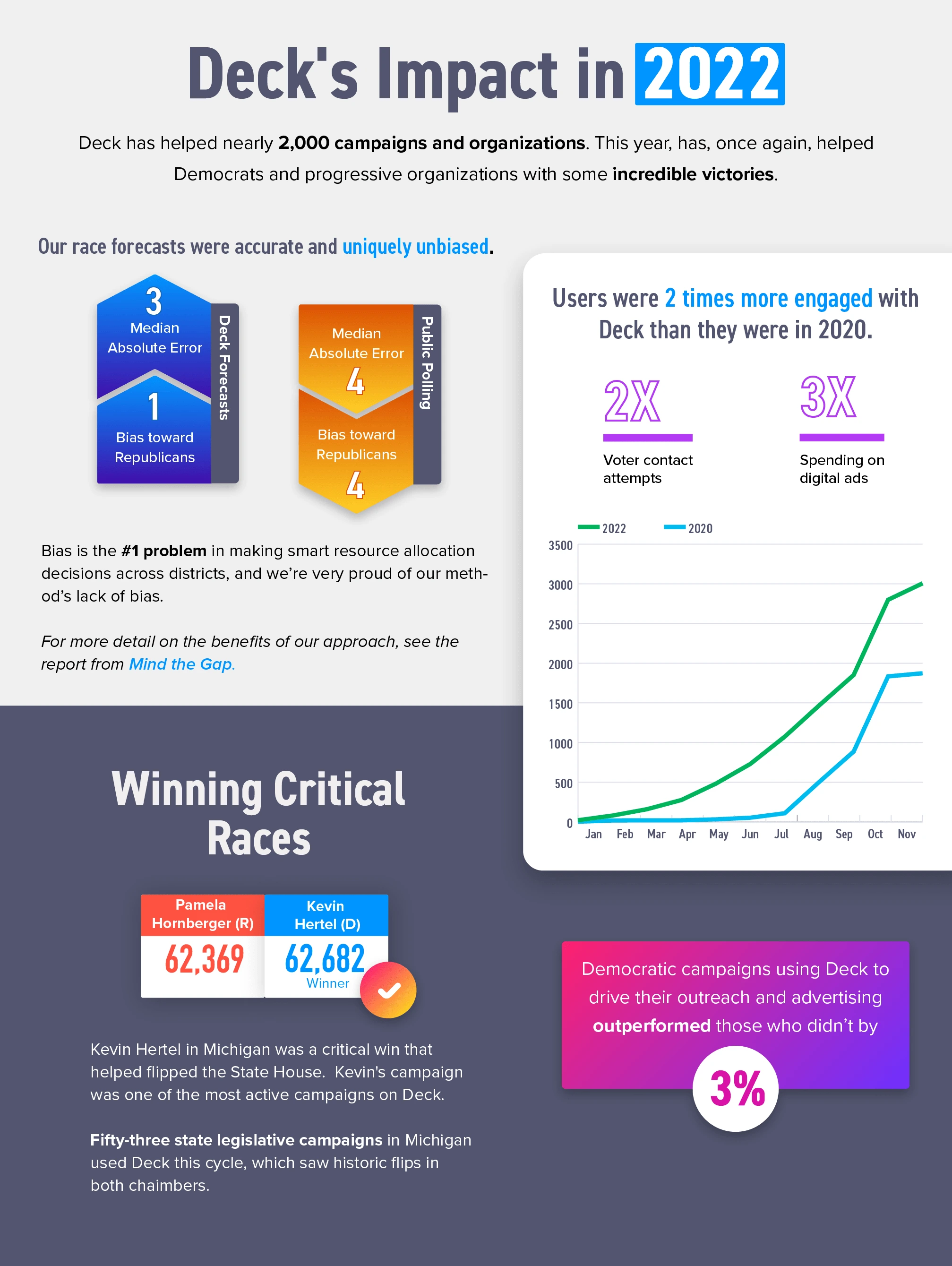
These infographics were created with information from Data Science. The data is parsed by Illustrator and rendered in the visualizations with Datylon.
Likes
0
Views
2
Clients
Deck