US Census Demographic Data
Youssef Maher
Table Of Contents
Main Goal
The ultimate goal is to make a dashboard that contains a filter for states so you can use this filter to look at a specific State -or multiple- and see the variety of informative visuals that gives you information like total population, average income per cap, unemployment and much more for the states of concern.
Insights
The project consists of 5 sheets are then combined into main dashboard along with the filter. The cleaning phase on data was done on Excel and the main work was all done using Tableau Software to make all the visuals and even the last dashboard.
US Population Heat Map
This is a geographic heat map that shows how dense every state is. You can drag the cursor on any state and see where it is and how many people are living there. As seen below the cursor shows that the population of Utah State is 2,903,379. It is also clear that California is most congested state.
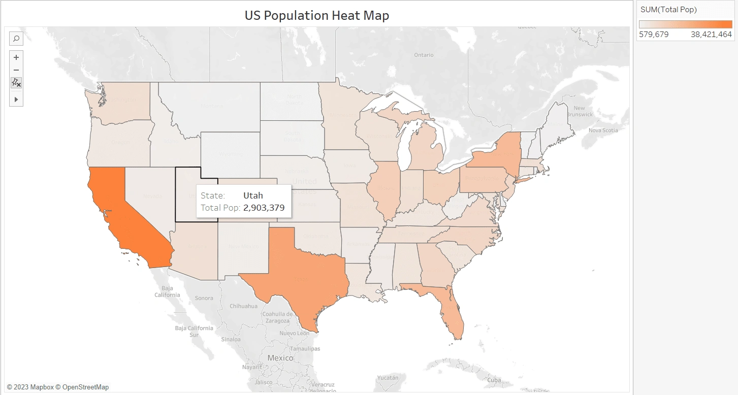
A heat map of the US population.
People's Gender
This is a very basic visual yet it is the very important one. This Bar Chart compares the number of men and women in every State in the US. It seems a bit noisy but the filter shows only the states of concern and in this case, the visual becomes a crucial piece in the dashboard.
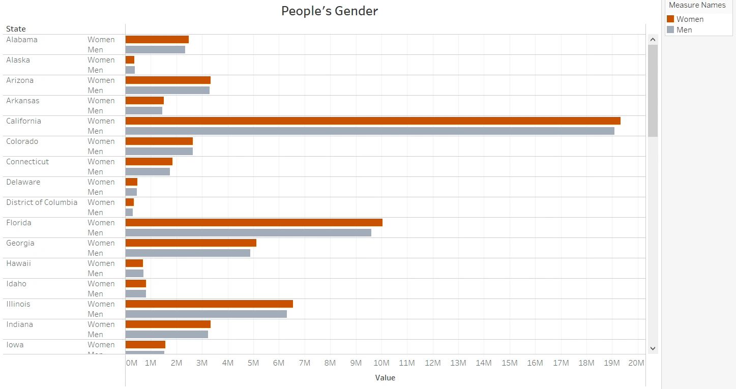
People's Gender in every state in the US
People's Ethnicity
In this visual, we can see the percentage of White, Black, Asian, Hispanic, Pacific, and Native for each state. We can use multiple charts, but I preferred the Side-by-Side Circle chart to see a different visual and also a visually appealing one.
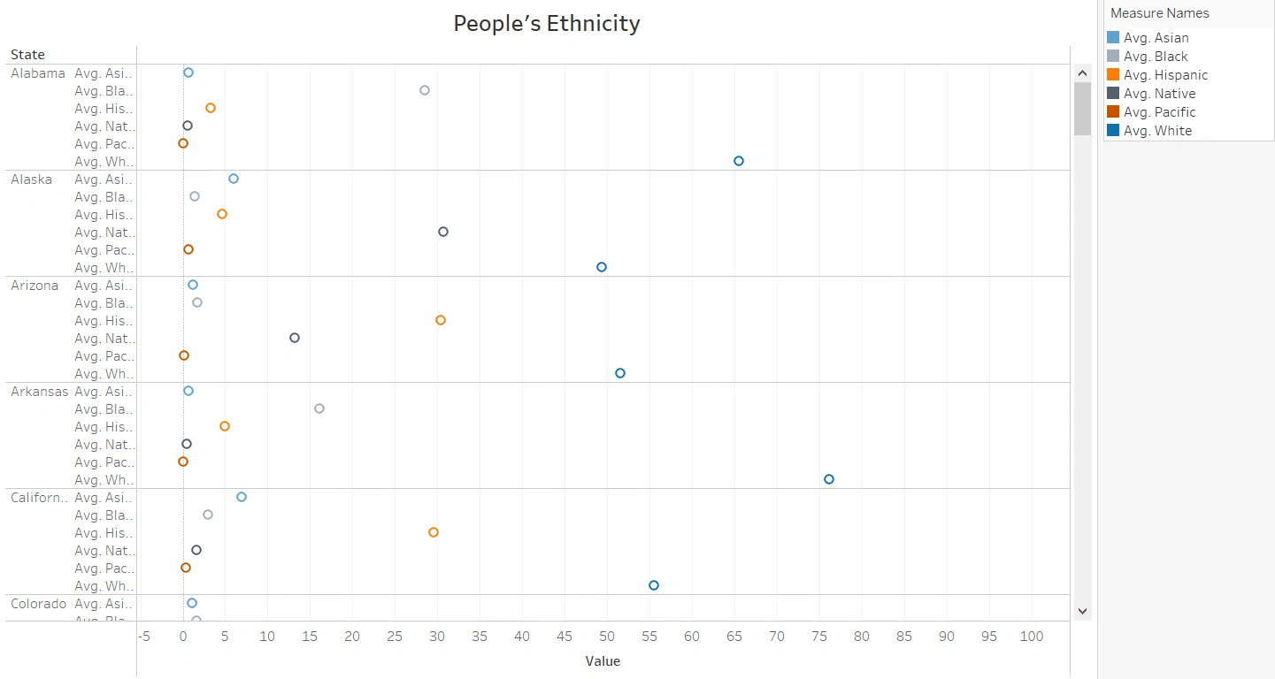
People's Ethnicity in every state in the US
Income Per Cap
In this Treemap, we are looking at the average income per cap for each state to see the richest and poorest states in the US and using a filter in case we need to look at a specific state. It is obvious that the District of Columbia has the highest Income Per Cap in the US of 47,675$ and that Puerto Rico is the lowest With 9618$.
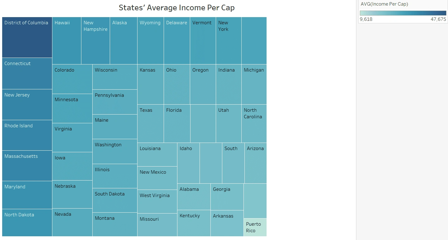
Average income per Cap for each state in the US
Average Unemployment and Poverty
A different approach was used here. In this one, I used two Measure values to see whether there is any correlation between them or not. The values that I used is the average unemployment and the average poverty for each state.
It is clear how unemployment strongly affects poverty. A scatter plot was definitely the way to go in in this case to see how the are correlated just with a glimpse.
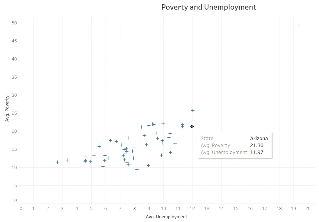
Umeployment vs. Poverty
The Final Dashboard
This Dashboard is the great goal of the project and it is collecting all of the visuals we saw from insights 1 to 5 and combining the all in one brief visual that gives so much information and uses filters to make it more interactive. In this Dashboard just by choosing one or more states you can get information about the total population (sheet 1), The total number of men and women (sheet 2), the percentage of the classification (sheet 3), the average income per cap (sheet 4) and the average unemployment and poverty (sheet 5). I will attach a link to the dashboard in the resources below so you can try it and see how it behaves according to changes.
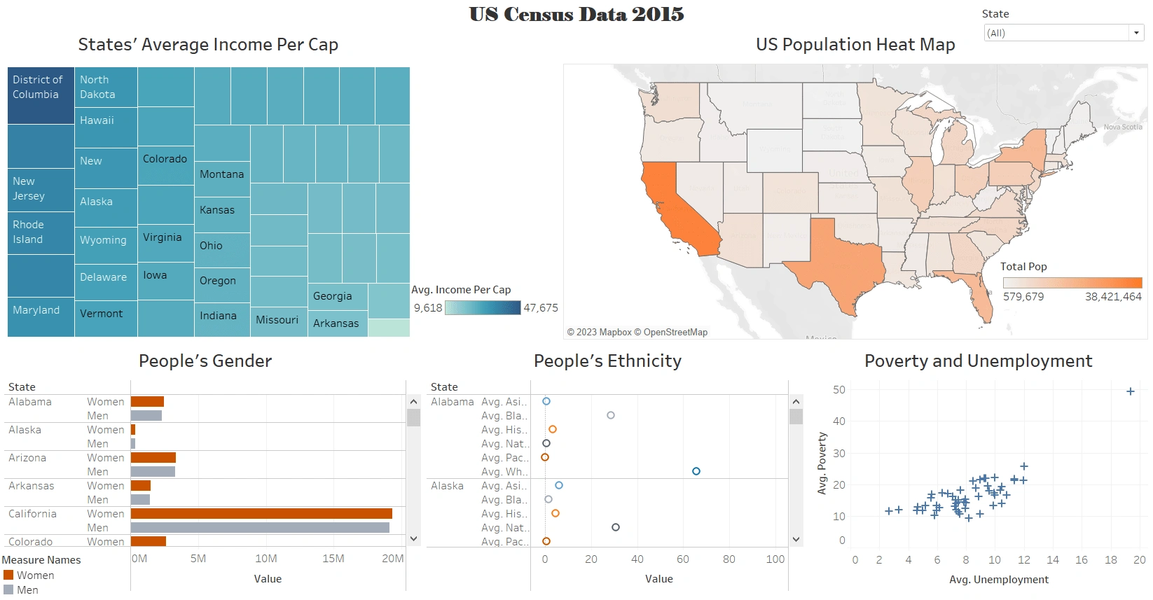
final dashboard showing all insights for all the states
Now let's see how powerful the dashboard is using the filter. in the image below we will choose only California and Florida to compare them.
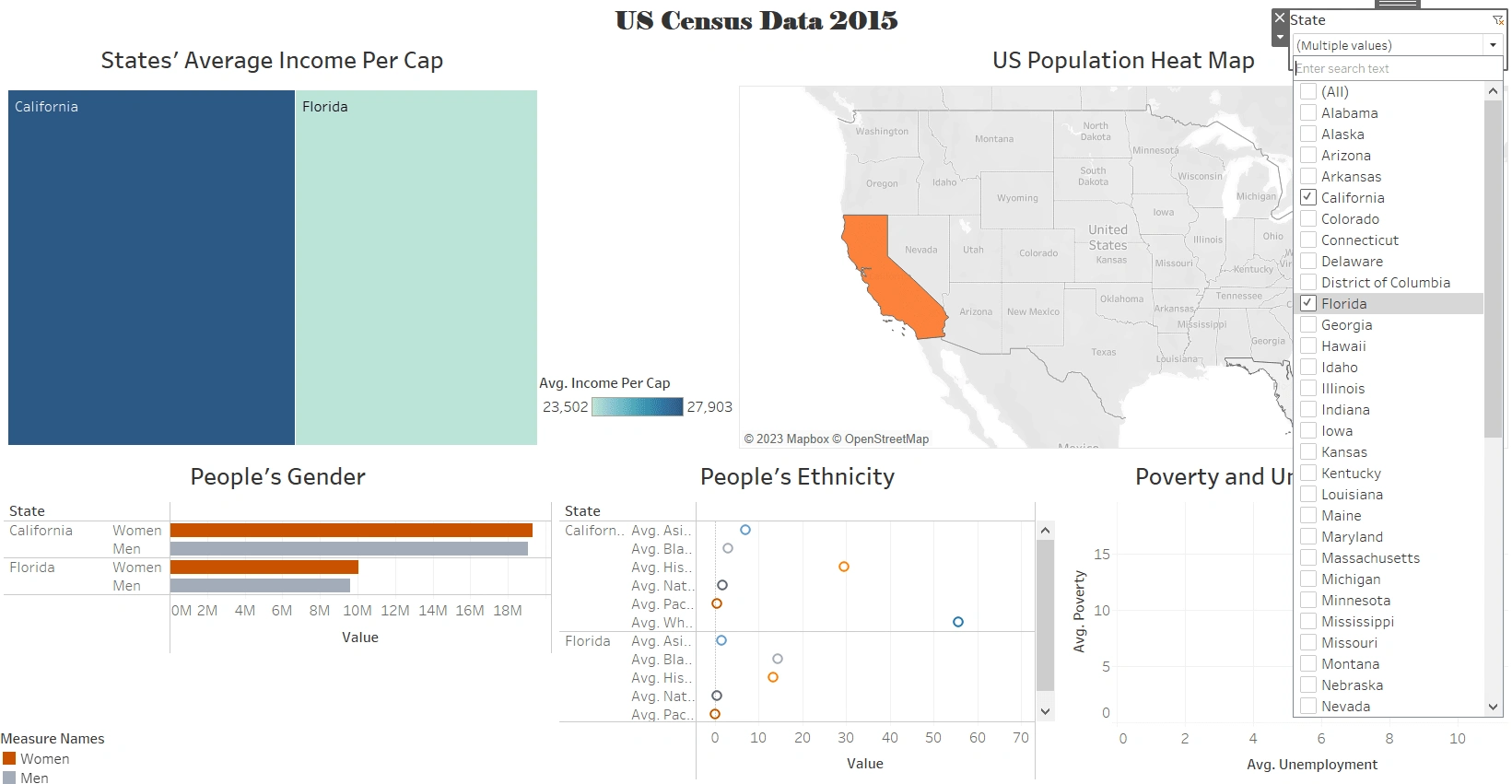
Choosing California and Florida so that we can see them clearly.
Now, We can clearly see the filter in action and how the 5 visuals adapted to the change to show only the two states that we have chosen. And we can notice the following:
California and Florida are both coastal States and California are much larger.
California has a much higher population than Florida.
The average income per cap is higher in California.
The number of women is higher in both states.
Ethnicity is shown and it can be noticed that Black people are in Florida than in California
Florida has lower avg unemployment but higher poverty, While California has higher unemployment but lower poverty.
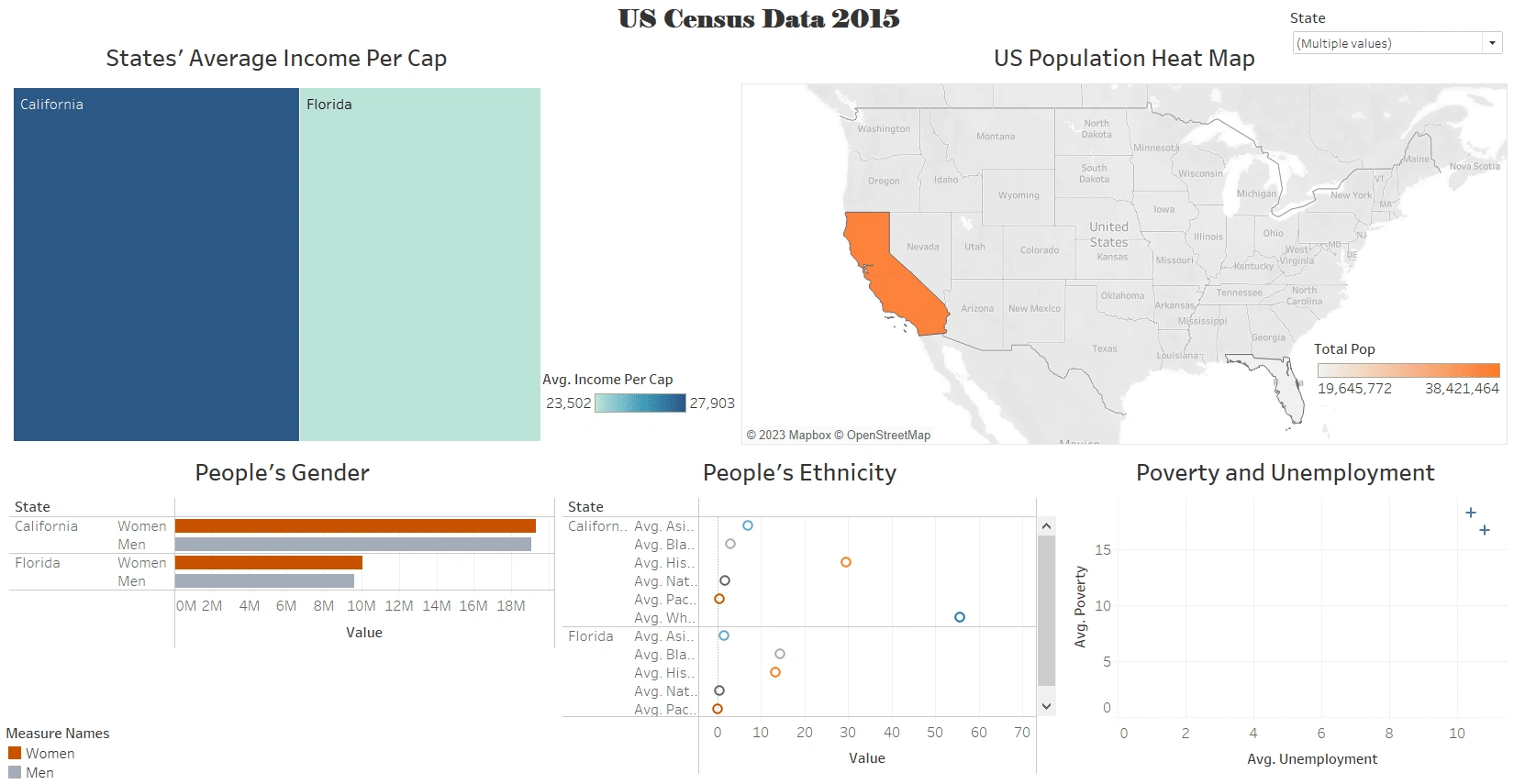
Comparing California and Florida.
Resources
Like this project
Posted Jan 27, 2023
A visual analysis of US Population using US Census Data from 2015. The dashboard summarizes a ton of information just with few clicks.
Likes
0
Views
40