LOGOFOLIO Vol.1 – A Visual Journey by Selin Çınar
Selin Çınar | Logofolio Vol.1
Revaunt — Premium Cosmetic Identity
Revaunt — Premium Cosmetic Identity
Revaunt is a fictional luxury cosmetics brand designed to evoke a sense of confidence, elegance, and sophistication. The logo reflects the brand's emotional core: the quiet strength of a woman who values both softness and power.
The visual identity merges a bold serif structure with soft curves, symbolizing harmony between refinement and resilience. Revaunt’s design language is built on minimalism, intentional typography, and subtle contrast — tailored for a market that values understated prestige.
The final logo animation focuses on clarity and poise, representing a brand that doesn’t shout — it resonates.




Lunea — Timeless Elegance in a Name
Lunea is a conceptual brand inspired by the calm strength of the night and the soft glow of the moon. The name blends femininity with clarity, making it suitable for luxury wellness, skincare, or slow fashion brands.
The logo features delicate curves and restrained geometry — balancing emotion with structure. Designed with a focus on graceful minimalism, Lunea reflects a brand that whispers, not shouts.
Every detail, from letter spacing to stroke contrast, was shaped to express a quiet confidence and poetic depth.
Monvella — Timeless Form, Functional Elegance
Monvella is a fictional furniture brand that blends modern minimalism with classic design principles. The name was chosen to convey a sense of elegance, permanence, and lifestyle refinement.
The logo reflects the brand’s attention to craftsmanship and spatial harmony — drawing from architectural geometry, soft contrasts, and a subtle serif structure.
Monvella designs aren't just furniture — they are statements of living well, designed for those who appreciate the details.
Mellow Bakery — Nostalgia Baked Fresh
Mellow Bakery is a conceptual brand inspired by comfort, warmth, and the simple pleasure of fresh-baked memories. Designed to feel both familiar and refined, the logo blends vintage cues with modern minimalism.
Soft typography, gentle textures, and a calming pastel palette define the identity — evoking the scent of warm bread and the feeling of Sunday mornings.
The result is a bakery brand that feels personal, artistic, and quietly delightful.
Doğadan Süt — Naturally Trusted
Doğadan Süt is a conceptual dairy brand rooted in simplicity, freshness, and trust. Its identity draws from soft countryside imagery, minimal visual language, and a calming palette of lavender, cream, and ice blue.
The logo design is clean yet organic — suggesting purity without feeling sterile.
Doğadan Süt was built to evoke the comfort of nature, the reliability of tradition, and the elegance of modern branding.
Winer – A Symbolic Identity Inspired by Vineyards
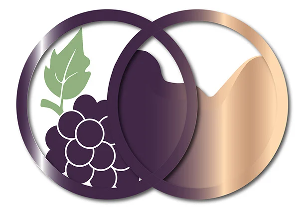
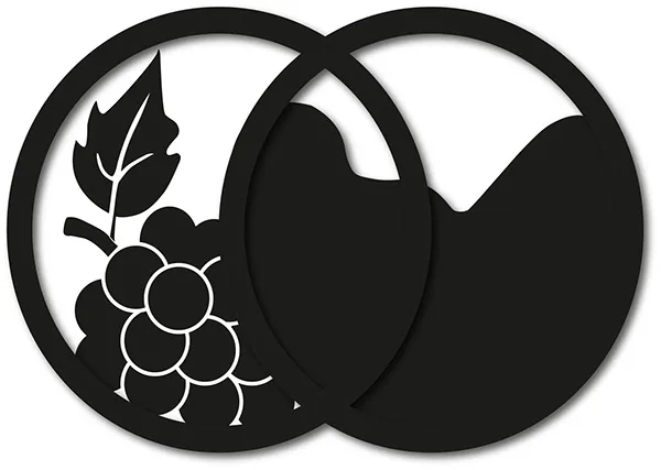
Winer is a fictional wine brand designed with a focus on elegance, simplicity, and organic symbolism.
Inspired by vineyard imagery, the logo integrates grape and leaf forms into a versatile and scalable mark — suitable for wine labels, packaging, and digital presence.
Presented in full color, black, and inverted white versions, the design maintains visual clarity across multiple applications.
Winer represents a refined brand identity built for a subtle yet memorable impact.
Savia – Botanical Branding for a Skincare Line
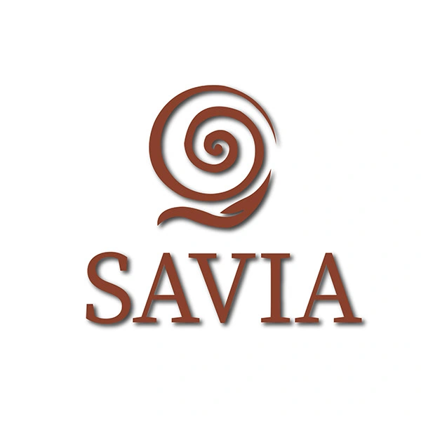
Savia is a conceptual skincare brand inspired by natural extracts, botanical purity, and wellness.
The logo reflects its essence through organic forms, gentle curves, and a calming color palette.
Savia is designed as a mindful, soft-spoken identity with a grounded visual presence.
Trueb – Symbolic Branding for a Calm & Elegant Personal Care Line
Trueb is a conceptual skincare brand centered on themes of elegance, purification, and inner calm.
The swan symbolizes grace and serenity, while the lotus represents renewal and spiritual purity.
The visual identity balances organic curves with clean typography to express quiet beauty and clarity.
Trueb offers a personal care identity that speaks softly — but deeply.
Mireya – Feminine Branding
for a Boutique Fashion Label
Mireya is a conceptual fashion brand that blends modern simplicity with feminine sophistication.
The logo is built on elegant typography and precise balance — quietly confident, yet memorable.
With its minimalist aesthetic, Mireya reflects a brand that doesn’t shout, but speaks style fluently.
Designed for boutique apparel and contemporary elegance.
SLN Design – A Logo Rooted in Family and Vision
SLN Design is my personal design identity — a logo that represents both my creative journey and my roots.
The maple leaf element is a tribute to my surname, symbolizing my family, origin, and the values I carry forward.
Combining minimal typography with an organic symbol, the logo speaks of creative independence anchored in deep emotional meaning.
It’s not just a mark — it’s who I am, where I come from, and where I’m going.
Like this project
Posted May 10, 2025
A curated collection of my logo designs, showcasing diverse styles and branding approaches—crafted to reflect each client’s unique identity and vision.
Likes
1
Views
8


