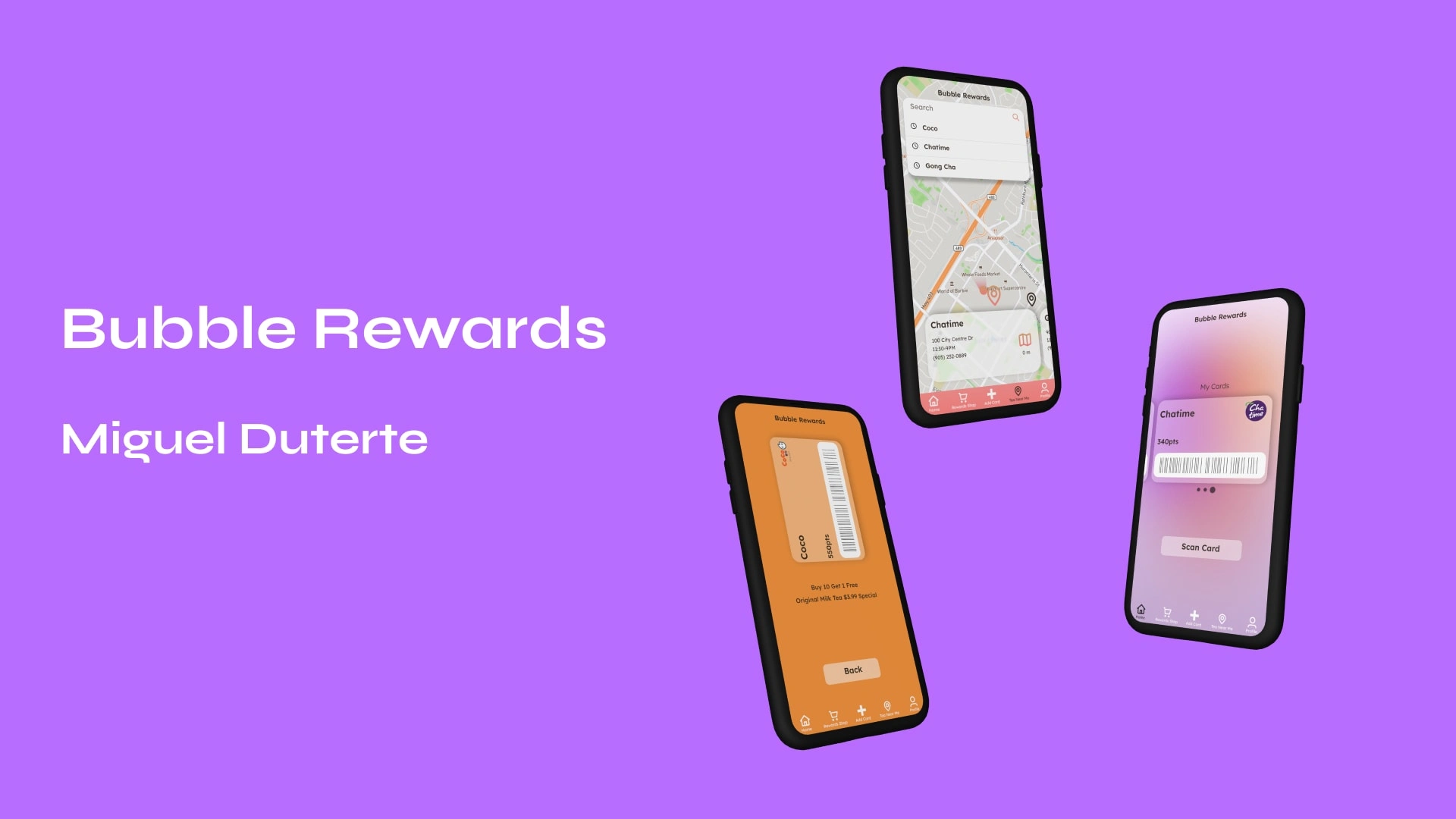
Bubble Rewards - App for Bubble Tea Enthusiasts
Project Overview
THE PROBLEM: Bubble tea chains each have their own app and reward system that can be confusing to make use of as each shop's app is different and each rewards system is unique.
THE GOAL: To create an app that streamlines the use of loyalty rewards across multiple bubble tea chains to make collecting points and redeeming rewards easier.
RESPONSIBILITIES: Conducting interviews and research, facilitating usability test sessions, creating wireframes, low and high fidelity prototyping, design iteration.
UNDERSTANDING THE USER
USER RESEARCH: SUMMARY
Firstly, I conducted user interviews to get a better understanding of users' perspectives and experience with current bubble tea apps. A user group that I discovered to be an important target market for the Bubble Rewards App is low-income earning students who would benefit from any opportunity to make their bubble tea purchases cheaper.
I also conducted a competitive audit and was surprised by how few Bubble Tea chains have apps. This demonstrated a market gap/opportunity for the Bubble Rewards App to potentially partner with Bubble tea chains that do not have a rewards app.
USER RESEARCH: PAIN POINTS
Time
Money
Ease of Use
STARTING THE DESIGN
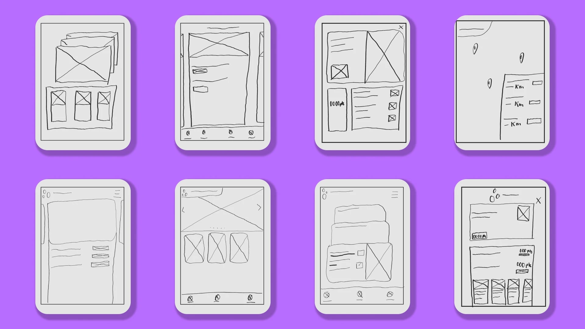
PAPER WIREFRAMES
The iterative process started with creating multiple versions of each key screen with paper sketches to determine how to best address user pain points in the most efficient way. For the home screen, I was focused on how to make the task of scanning a card accomplishable with 1 step. Another facet I was focused on is how to make redeeming and applying a card highly distinguishable to remove confusion.
DIGITAL WIREFRAMES
I continued to reflect on the best features of the sketches, the initial feedback, and user research when creating the digital wireframes.
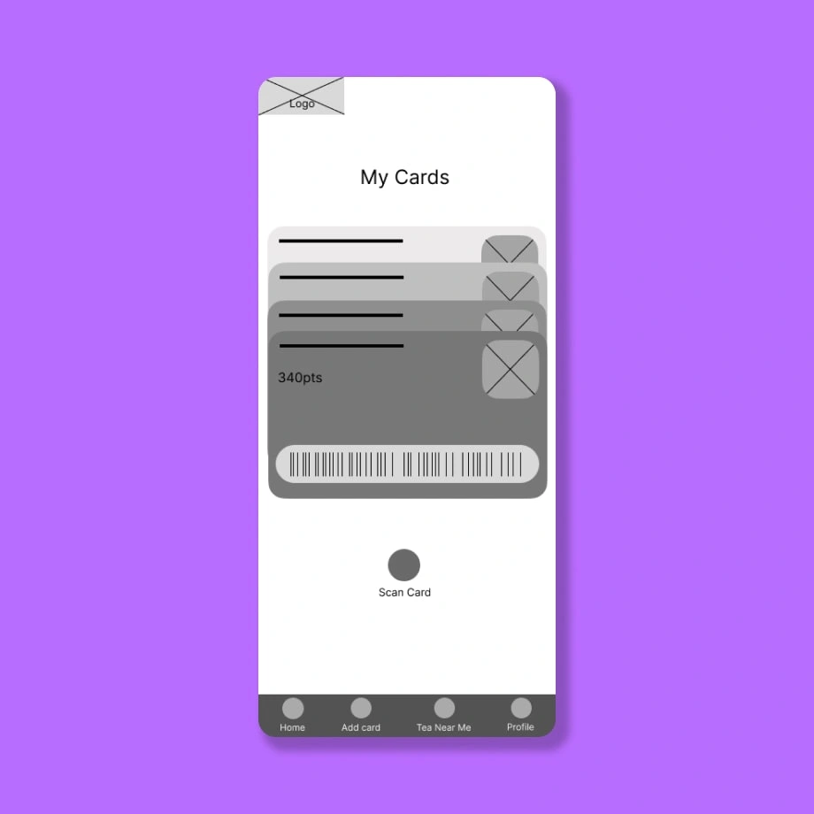
Home screen
Rewards cards are seen in the home screen for easy access
"Scan Card" Button makes scanning for points at the time of purchase quick and easy
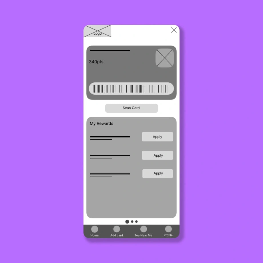
Card Screen
Multiple points of access for scanning a card
Redeemable rewards can be applied before scanning
LOW-FIDELITY PROTOTYPE
The lo-fi prototype features important user flows such as scanning a card, adding a card, applying rewards, and searching for a nearby bubble tea shop.
USABILITY STUDY
I conducted a moderated usability study to evaluate the effectiveness of the prototype and identify major pain points a user encounters when completing key tasks.
The Key Performance Indicators for this study was:
1. How much time does a user spend opening and scanning a card
2. How often do user get stuck trying to complete a task
USER TASKS
1. Create a profile
2. Select a card to scan
3. Locate a nearby bubble tea shop to navigate to
4. From the home screen, apply a coupon to your card to scan
USABILITY FINDINGS
Round 1 Findings
1. Users want to make points redemption quick
2. Users want to know what bubble tea shops are in the area
3. Users want effective ways to make Bubble Tea purchases cheaper
Round 2 Findings
1. Completion of scanning a card is not defined
2. Users often lose track of task path
3. Not all buttons are functional
STARTING THE DESIGN
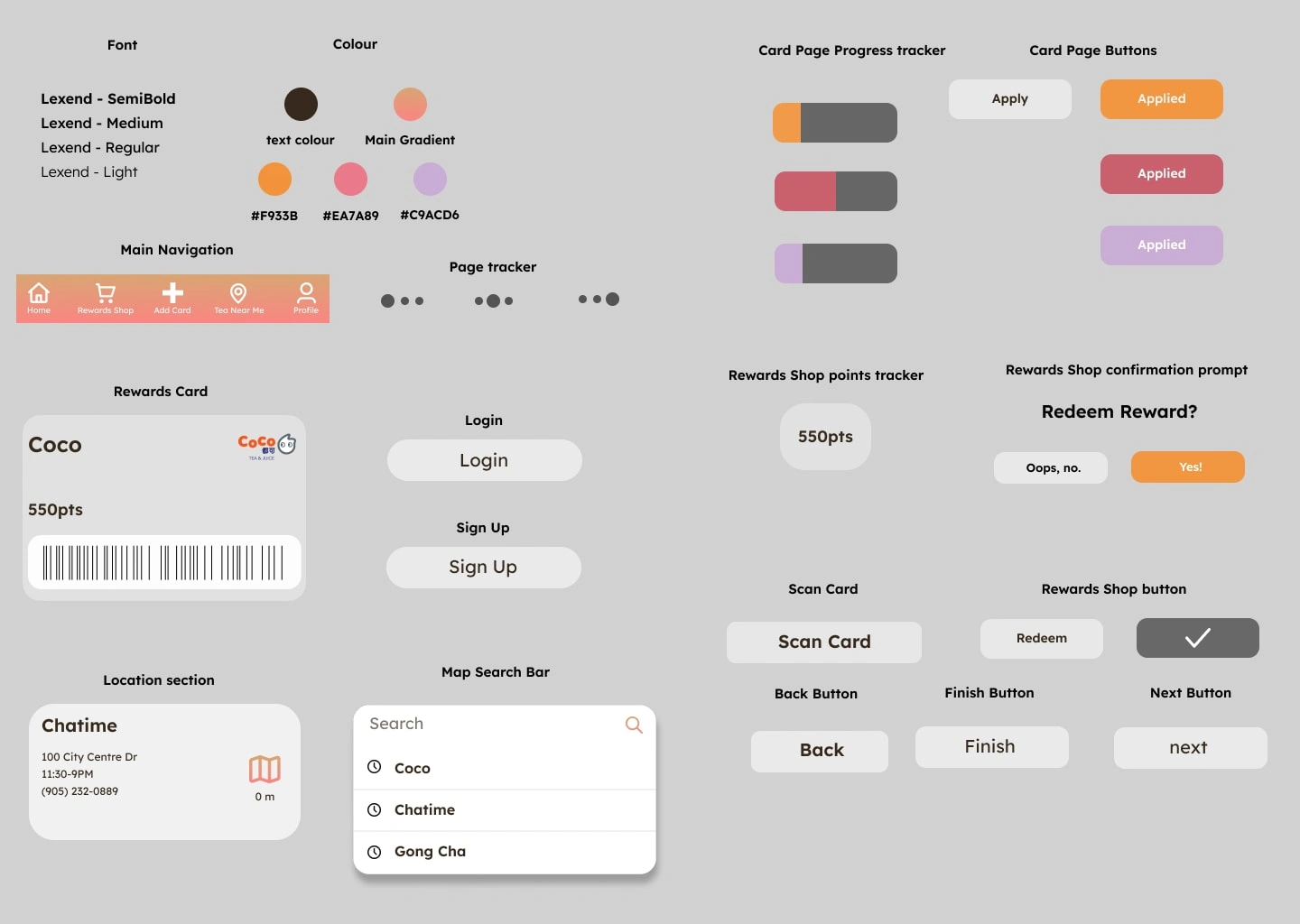
BRAND & DESIGN GUIDELINES
I created the sticker sheet so that the look and feel of the mockup is consistent
MOCKUPS
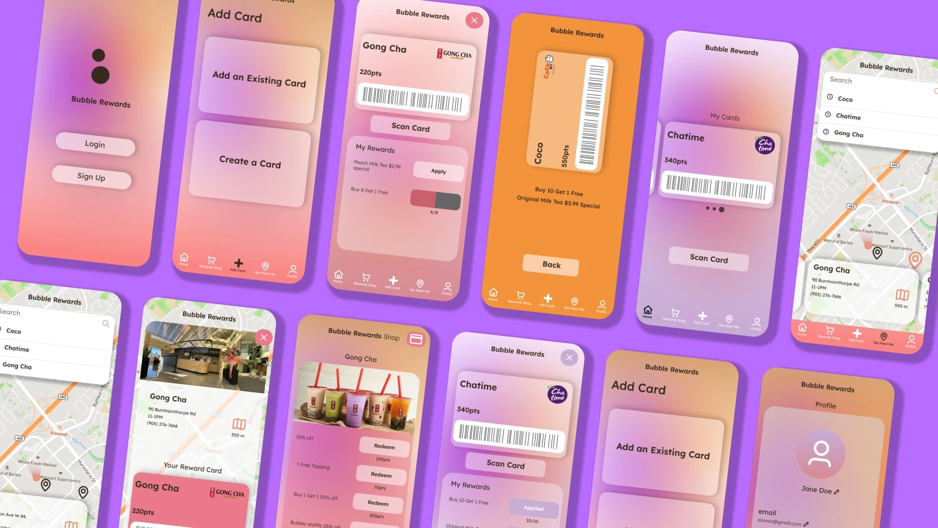
High-fidelity mockups were developed after multiple rough iterations. The mockup features animations for scrolling between cards, finding bubble tea locations, and scanning a card. This eliminates the static-look felt from the lower fidelity prototypes. The mockups especially addresses the feedback raised by the users.
HIGH-FIDELITY PROTOYPE
The second iteration of the high-fidelity prototype presents better ease of use in Bubble tea shop search customization and allows more points of access to one’s reward card throughout the app.
Like this project
Posted Feb 1, 2024
A comprehensive application designed to centralize and manage your entire collection of bubble tea rewards cards and perks seamlessly in one convenient platform
Likes
0
Views
10

