UI/UX | Desktop App Features Design
Tetiana Myleiko
Parametric Design App design | UI/UX
Case Study 1: AI Intake Feature
Objective: Automate project data extraction to bridge the gap between dense client documents and actionable engineering requirements.
The Problem: Manual project onboarding is a bottleneck. Clients struggle with data entry from technical documents, while engineers face inconsistent data and manual questionnaire setup.
The Solution: A dual-flow AI ecosystem that extracts, maps, and validates project information.
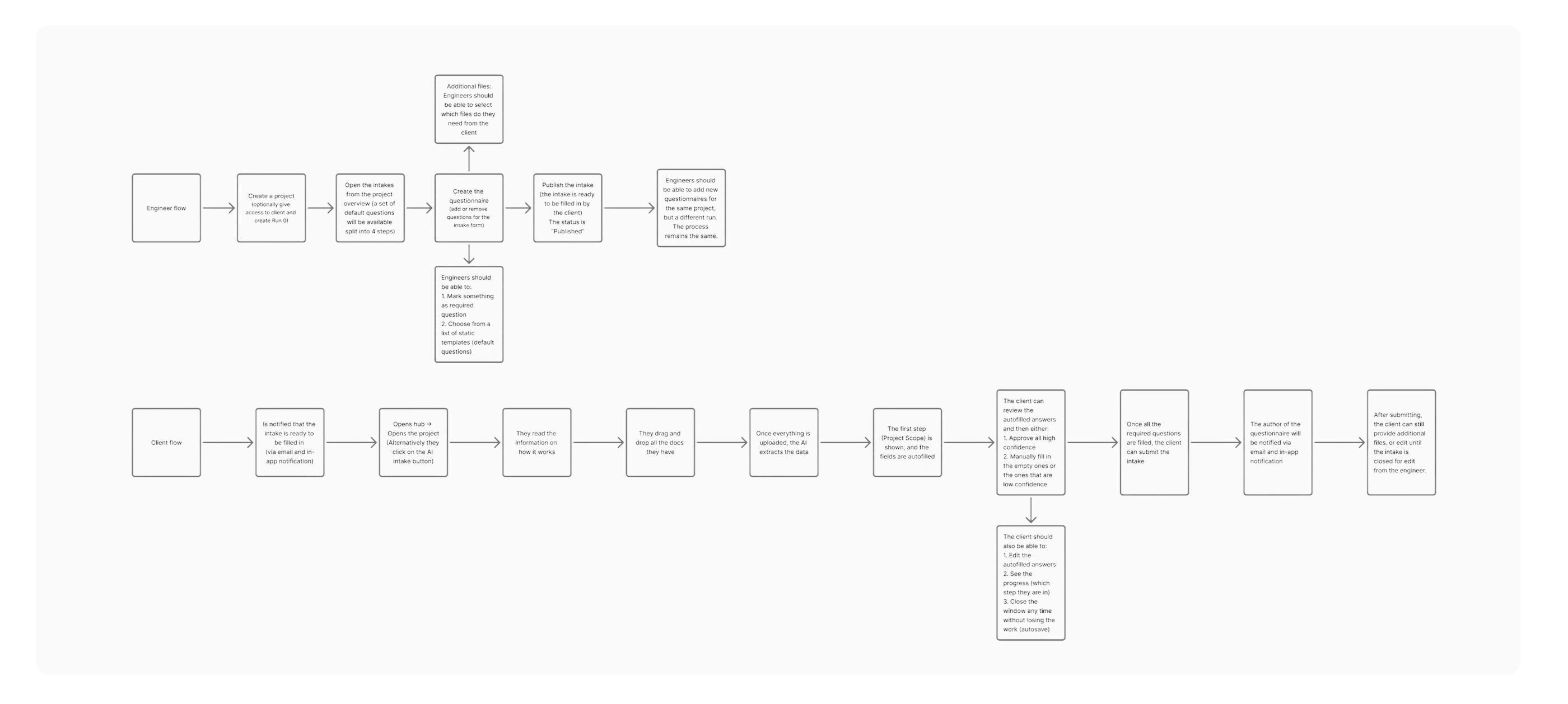
Client & Engineer User flows
Flow 1: The Client (Data Verification)
AI Extraction: Upload documents; AI maps extracted data to engineer-defined questions.
Confidence Scoring: Each field displays an AI certainty score (e.g., 82%) to highlight areas needing manual review.
Review & Edit: Clients verify, edit, and approve AI-suggested values before submission.
Management Hub: A centralized "Project Intake" page to track "Pending" vs. "Submitted" tasks.
Client Flow
Flow 2: The Engineer (Oversight & Setup)
Custom Templates: Create and deploy questionnaires using pre-filled, modular templates.
Review Dashboard: Monitor all client progress and access submitted data in one view.
Finalization: Edit submitted data for precision and "Close" the intake once finalized to lock the project scope.
Engineer Flow
Key Results
Efficiency: 80% reduction in manual data entry for clients.
Communication: Elimination of back-and-forth communication between engineers and clients regarding data clarification.
Accuracy: High-transparency "human-in-the-loop" validation via Confidence Scores.
Centralization: All project data and status tracking moved from fragmented email threads to a single source of truth.
Case Study 2: Sidebar & Navigation Overhaul
Objective: Evolve the navigation from a basic list into a scalable, "SaaS-native" hub that prioritizes feature discovery and technical depth.
The Problem
The original sidebar was too generic, offering limited "Quick Access" and no clear hierarchy. It lacked the visual prominence needed to launch high-value features (like AI Intake) and didn't provide enough professional context for enterprise users.
The Solution
A restructured navigation system using card-based grouping and expanded technical entry points.
Feature Promotion: Integrated a high-contrast AI Intake button with a "New" badge to drive immediate adoption.
Information Architecture: Grouped "Quick Access" into 6+ specialized categories (Floorplans, Cores, Materials) to reduce clicks to core project data.
Identity & Context: Replaced the simple user label with a Professional Profile Card containing the user’s full name and company (e.g., "Pheonix Germany").
Visual Evolution: Adopted the "OMRT / hub" branding to position the platform as a centralized ecosystem.
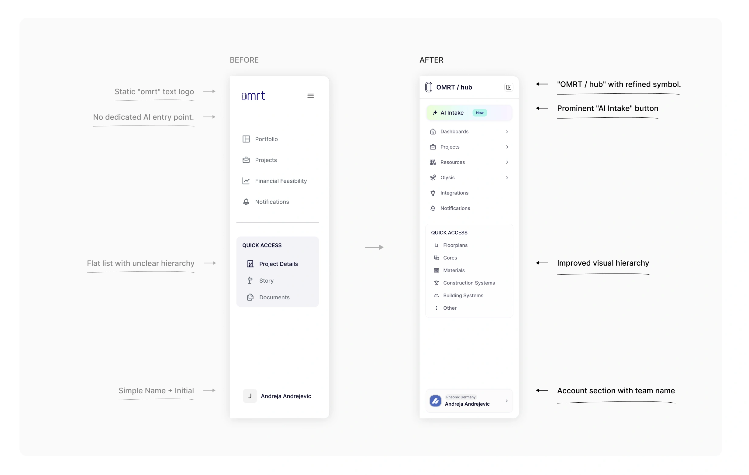
Sidebar redesign
Key Results
Accessibility: 50% faster navigation to deep technical assets via expanded Quick Access.
Engagement: Increased visibility for AI features, leading to higher trial rates.
Scalability: A modular container system that allows for new menu items without cluttering the UI.
Professionalism: Shifted the product's "feel" from a utility tool to an enterprise-grade platform.
Case Study 3: Run Overview Redesign
Case Study: Run Overview & Template Integration
Objective: Transition the project summary from a fragmented data dashboard into a story-driven, template-based narrative that prioritizes process transparency and scalability.
The Problem
The original layout focused on raw, disconnected data points (status, dates, variant counts) in large cards. This created two major issues: a fragmented understanding of the project's "why" and a lack of standardization, as every run had to be built from scratch without a reusable framework.
The Solution
A restructured vertical hierarchy centered on a narrative flow and a modular template system.
Template Library Integration: Introduced a Run Template Library, allowing users to select from pre-defined project structures (e.g., Urban Performance, Sunlight Analysis) instead of starting from zero.
Process Visualization: Added "Run Steps," a visual timeline with iconography that automatically populates based on the chosen template, showing the exact methodology used.
Layout Consolidation: Shifted to a streamlined vertical flow, compacting secondary stats into a tight grid to prioritize the project's objectives and sequence.
Narrative Focus: Elevated Objectives and Conclusions into readable text blocks, ensuring the project's goals and results are the focal points of the report.
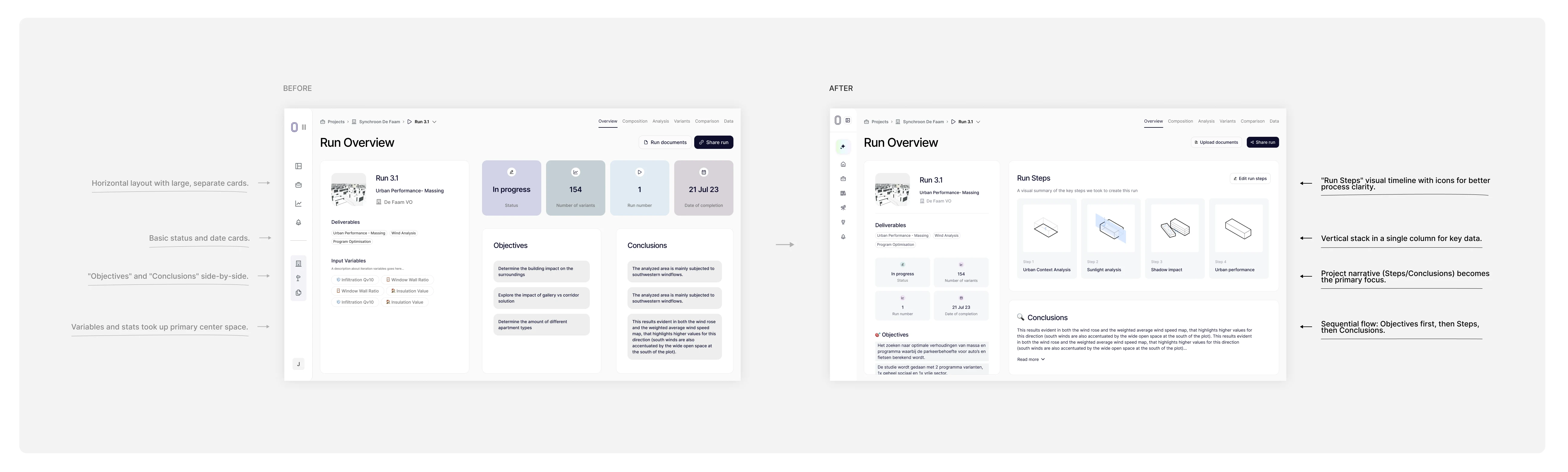
Run Overview Redesign
Run Steps Redesign & Run Library design
Key Results
Faster Setup: 70% reduction in configuration time by allowing users to launch runs from the new Template Library.
Standardization: Established a consistent visual language for project steps across the entire organization.
Improved Clarity: Run Steps provides instant context on project complexity, eliminating the need to dive into sub-menus.
Enhanced Reporting: Transformed the screen into a presentation-ready asset that logically guides stakeholders from goals to methodology to results.
Like this project
Posted Mar 30, 2026
I've been a UI/UX designer for a parametric design desktop app. Here I am featuring 3 case studies form it: AI Intake feature, Sidebar, Run Overview.
Likes
0
Views
9