Brand Identity & Communication System
Tetiana Myleiko
About the project
For OMRT, a parametric design firm shaping the future of building design, this project defines a focused and intentional color foundation. Clear, energetic, and forward-thinking, the palette supports a consistent visual presence across LinkedIn, reports, documents, and presentations — built to communicate with confidence and precision.
Colour Guide
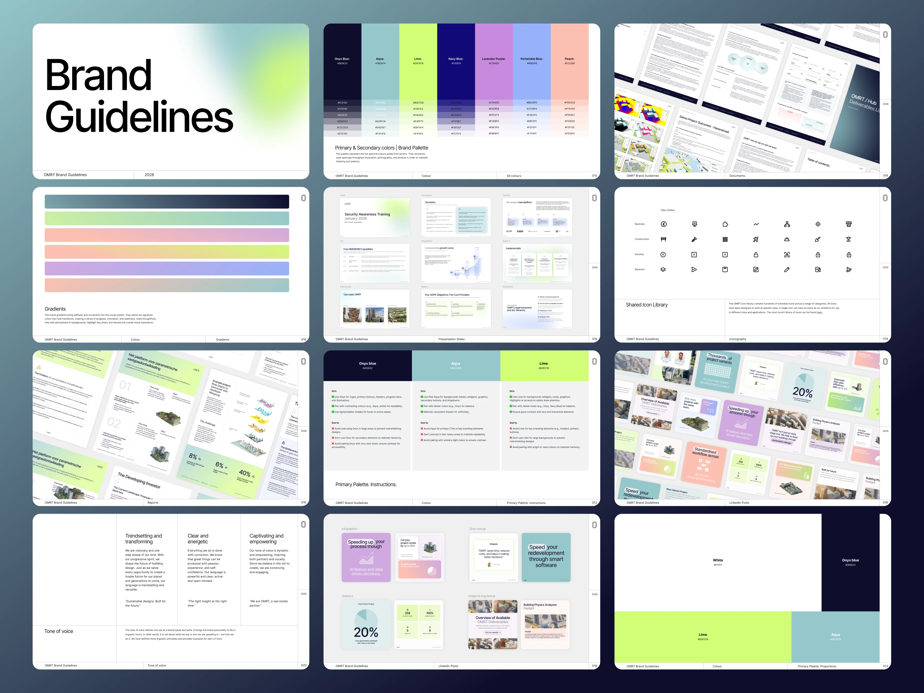
Colour Guide
Color forms the foundation of OMRT’s visual identity. The palette is designed as a structured system that ensures clarity, consistency, and flexibility across all brand communications. A strong primary color establishes the core visual anchor, while secondary colors introduce contrast and versatility. A range of defined shades allows for hierarchy and depth, supporting different layouts and visual contexts.
Gradients extend the palette by creating dynamic transitions that add energy and a contemporary character to the brand. The guidelines also define recommended color proportions to maintain visual balance, along with clear dos and don’ts to ensure consistent and effective application across presentations, reports, social media, and other materials.
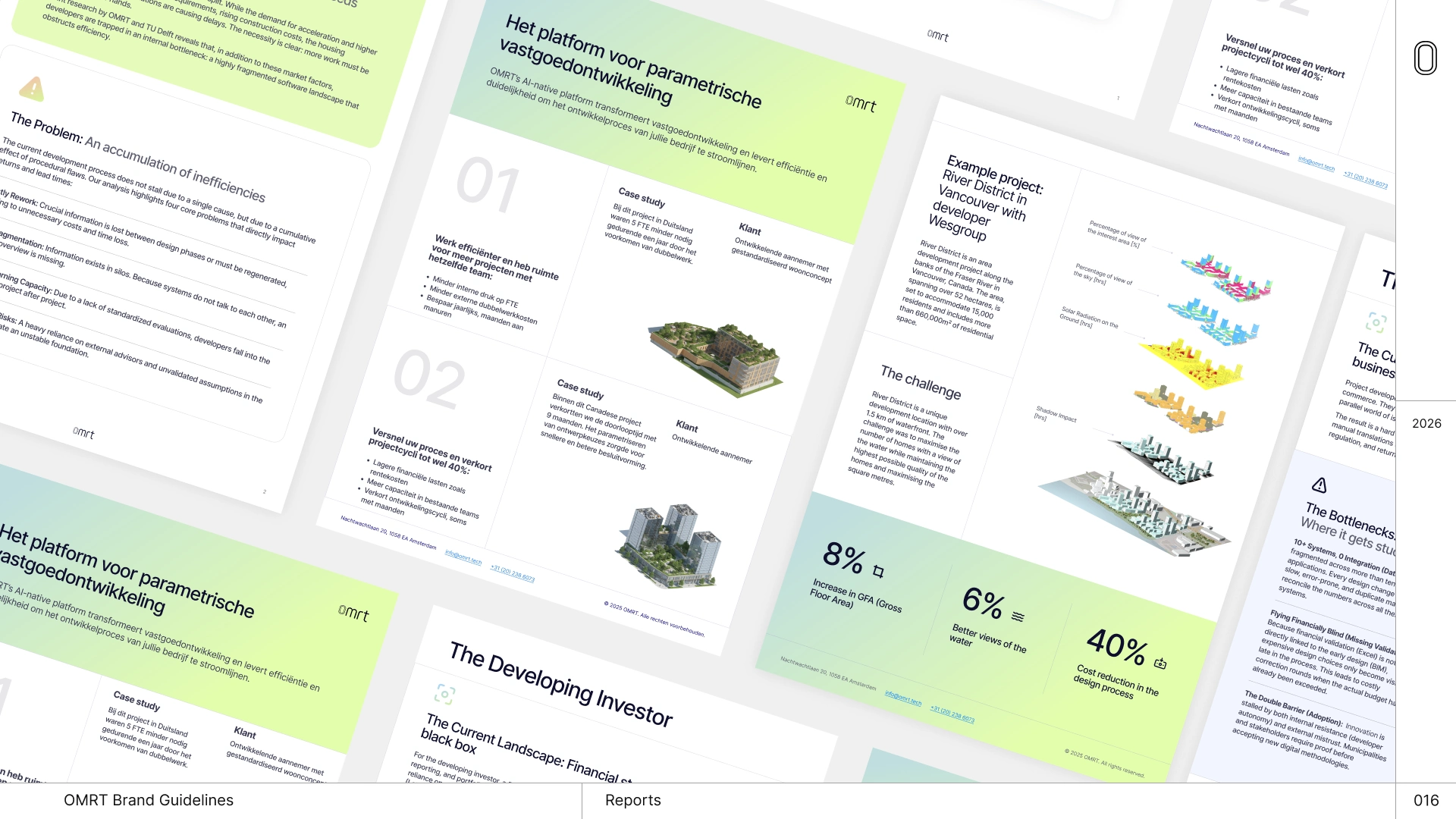
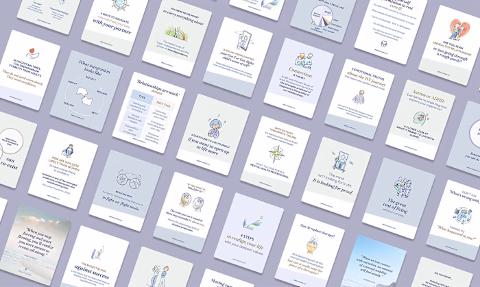
Applications | Mockups of reports
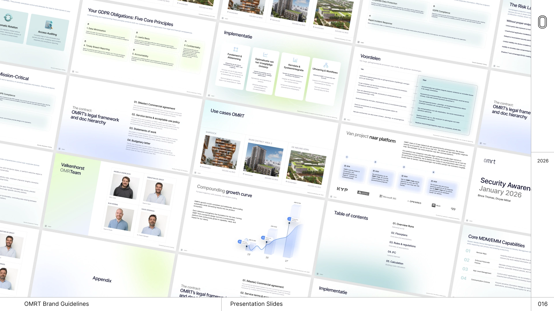
Applications | Mockups of Slides
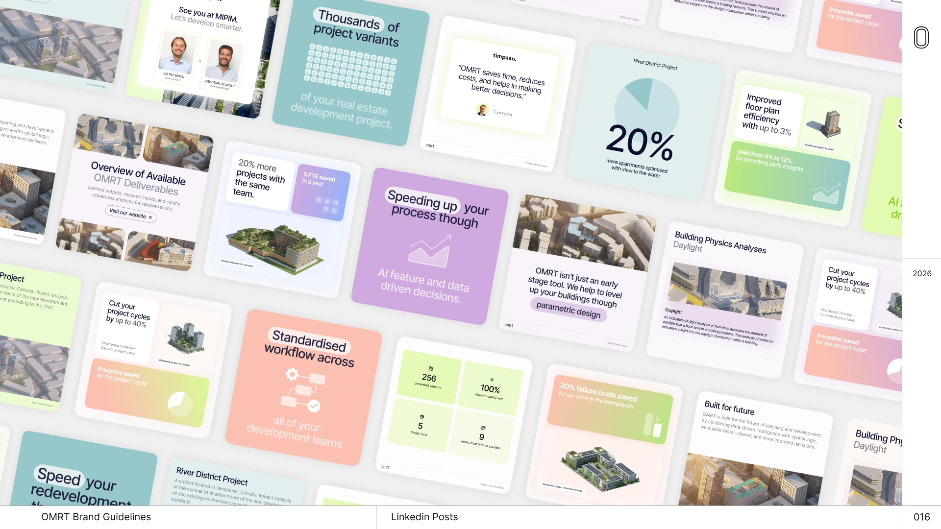
Applications | Linkedin posts
Applications
To demonstrate the versatility of the color system, a series of brand applications and mockups were created using the defined palette. These examples translate the guidelines into real communication materials, including LinkedIn posts, presentations, reports, and corporate documents. Subtle bright colors and thin graphic lines are used to create a clean, precise visual structure that reflects the analytical nature of parametric design.
Standout 3D render imagery of buildings plays a central role in the compositions, highlighting OMRT’s architectural work and innovation. Combined with the controlled use of color proportions, shades, and gradients, these elements create a balanced visual hierarchy while staying closely aligned with the brand’s forward-thinking strategy and identity.
Brand Guidelines
Conclusions
The resulting color system provides a clear and practical framework for OMRT’s visual communication. By defining primary and secondary colors, gradients, shades, usage proportions, and application rules, the guidelines establish a consistent foundation that can be applied across a wide range of materials. The system ensures that the brand maintains a recognizable and coherent presence across digital and corporate communications.
More importantly, the approach is strategy-based and designed for real use. Through practical applications and mockups, the guidelines demonstrate how the palette works in everyday contexts such as presentations, reports, and social media. This makes the system not only visually cohesive, but also scalable and adaptable, supporting OMRT’s forward-looking and innovative brand identity.
Like this project
Posted Mar 5, 2026
A scalable brand system with clear guidelines and cohesive mockups across LinkedIn, reports, documents, and presentation slides.
Likes
1
Views
3