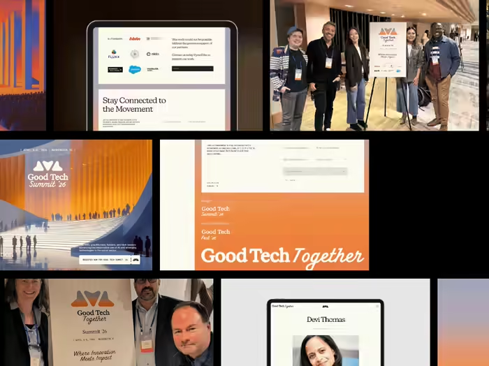
Good Tech Together Brand Identity & Event Design Case Study
Pinar Bahar
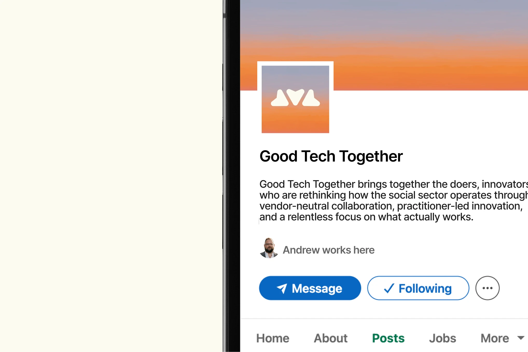
Good Tech Together: Brand Identity, Website & Event Design for the Vendor-neutral nonprofit Tech community
Good Tech Together: Brand Identity & Event Design Case Study
How we built a unified brand identity, website, and event design system for Good Tech Together, a vendor-neutral nonprofit AI community. 500+ attendees. 11K visitors in 90 days.
Focus Keyword: nonprofit AI community brand identity
Secondary Keywords: social sector branding, nonprofit event design, responsible AI conference, tech for good branding, event visual identity
The Brief: One Brand, Two Events, Three Audiences
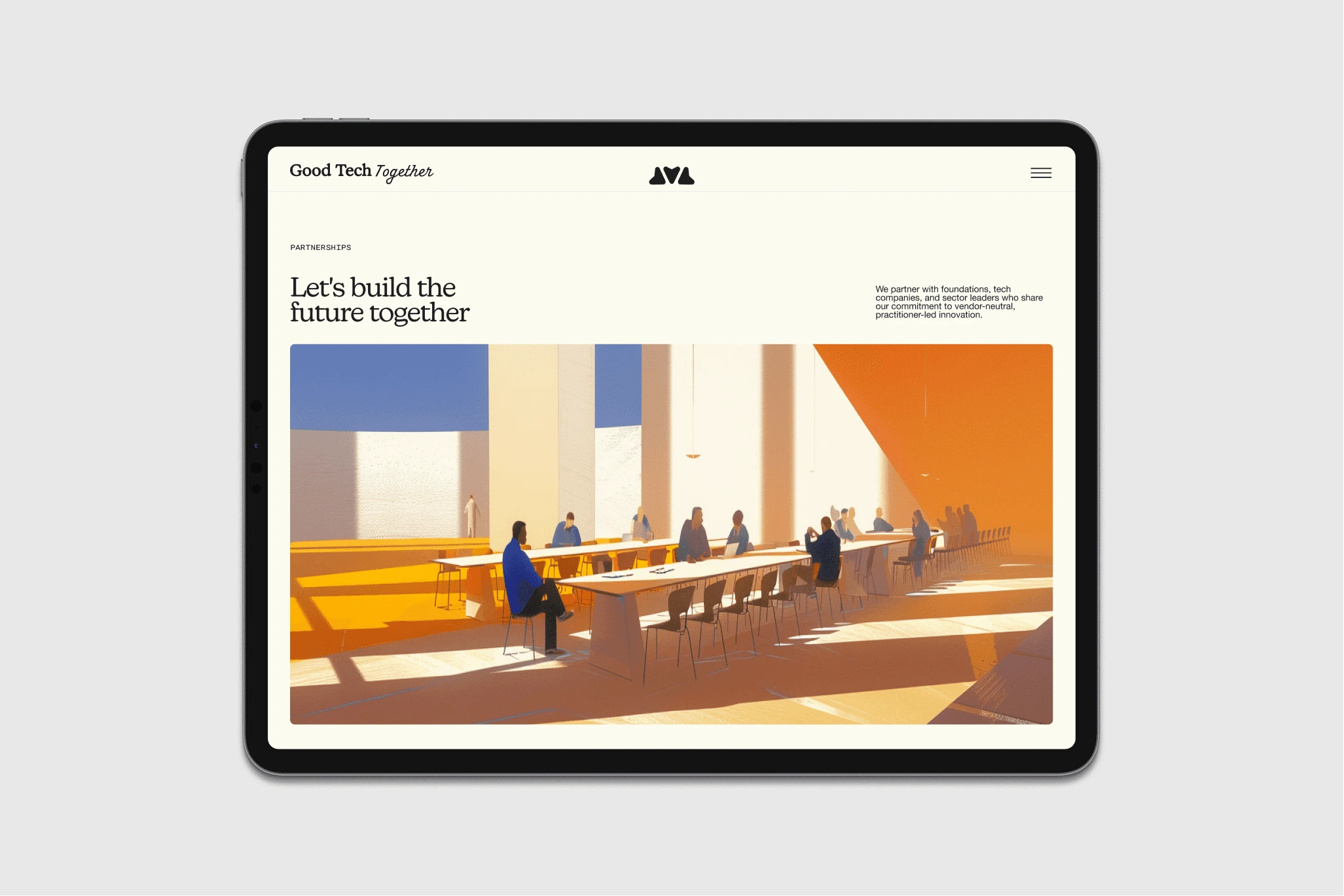
Good Tech Together is a vendor-neutral community uniting nonprofit practitioners, funders, and technologists around responsible AI use in the social sector. They run two flagship events with completely different scales : a 500-person open summit in Washington DC and an 80-person invite-only retreat in Utah and needed a unified brand identity, website, and event design system that could hold both.
The constraint that shaped everything: this audience is exhausted by tech branding. Corporate blue, geometric abstractions, sterile white if the brand showed up with that same language, it would be invisible. The identity also had to bridge two groups that rarely share a visual vocabulary: senior technologists who expect polish, and nonprofit leaders who associate that aesthetic with vendors trying to sell them something. Too polished loses trust. Too scrappy loses credibility.
Strategy First: The Structural Idea Behind the Mark
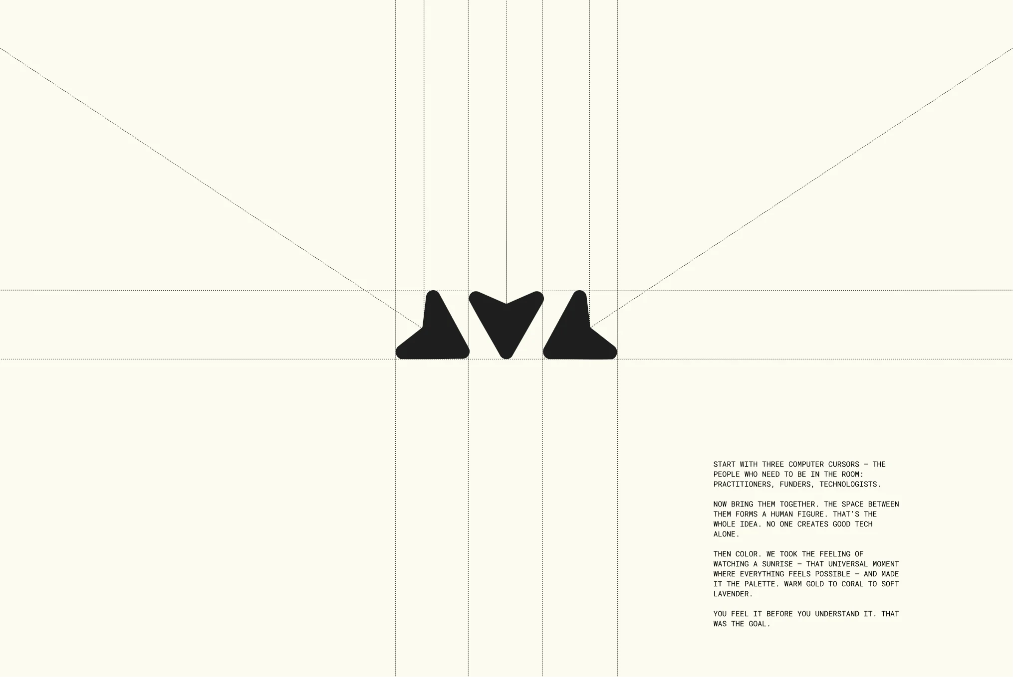
We started with strategy, not style. Three stakeholder groups kept surfacing: practitioners doing the fieldwork, funders controlling the capital, and technologists building the tools. Remove any one and nothing works.
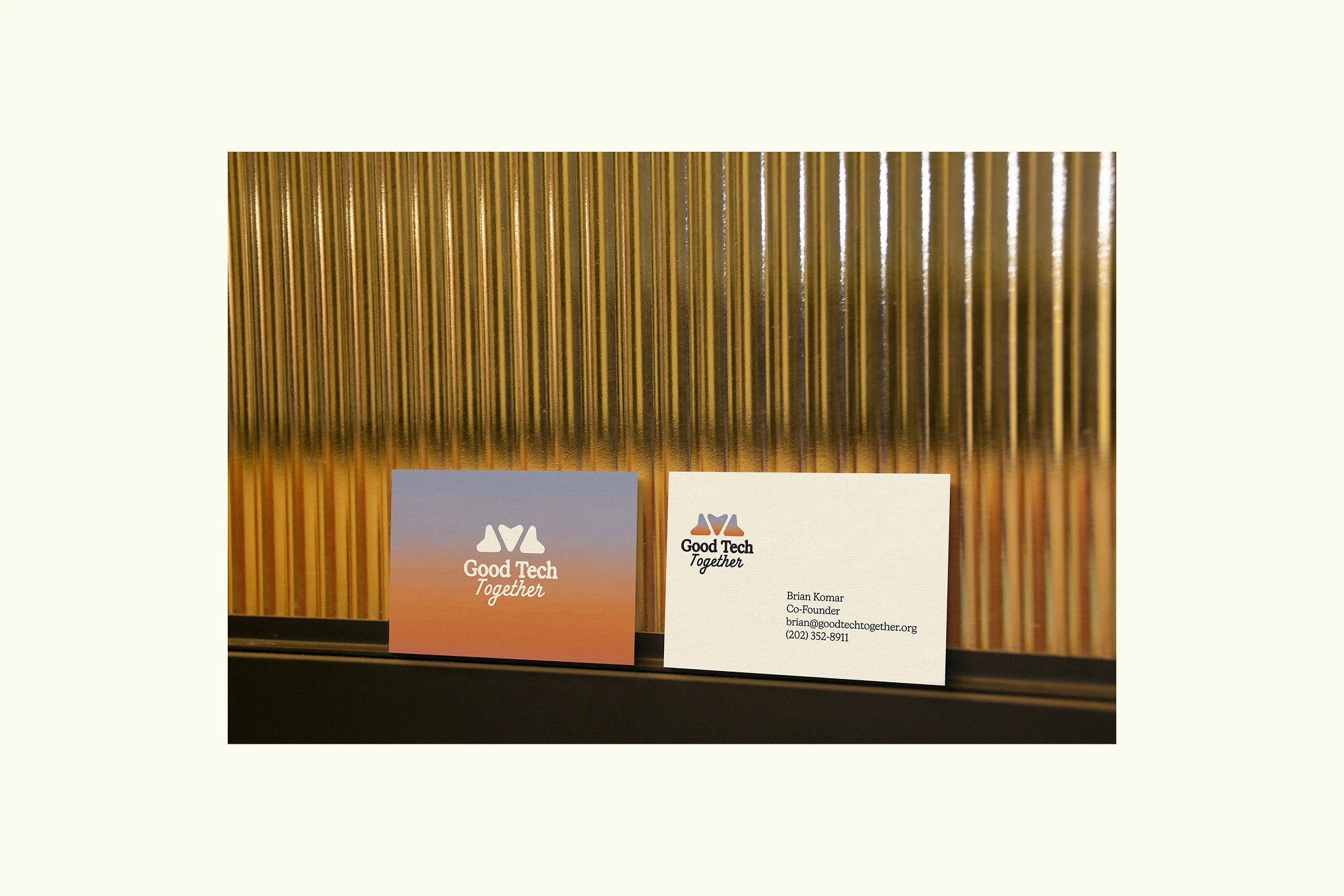
That insight became the logo: three computer cursors each representing a stakeholder group pointing inward. When the three converge, a human figure appears in the negative space. Remove one cursor and the person disappears. The mark is a structural argument: good tech isn't what any single group creates, it's what emerges in the space between all three.
When the gradient fills the mark, it reads as a sun rising over a horizon so a single shape carries three meanings: convergence, humanity, sunrise. That density allows a young brand to work across every touchpoint without losing coherence.
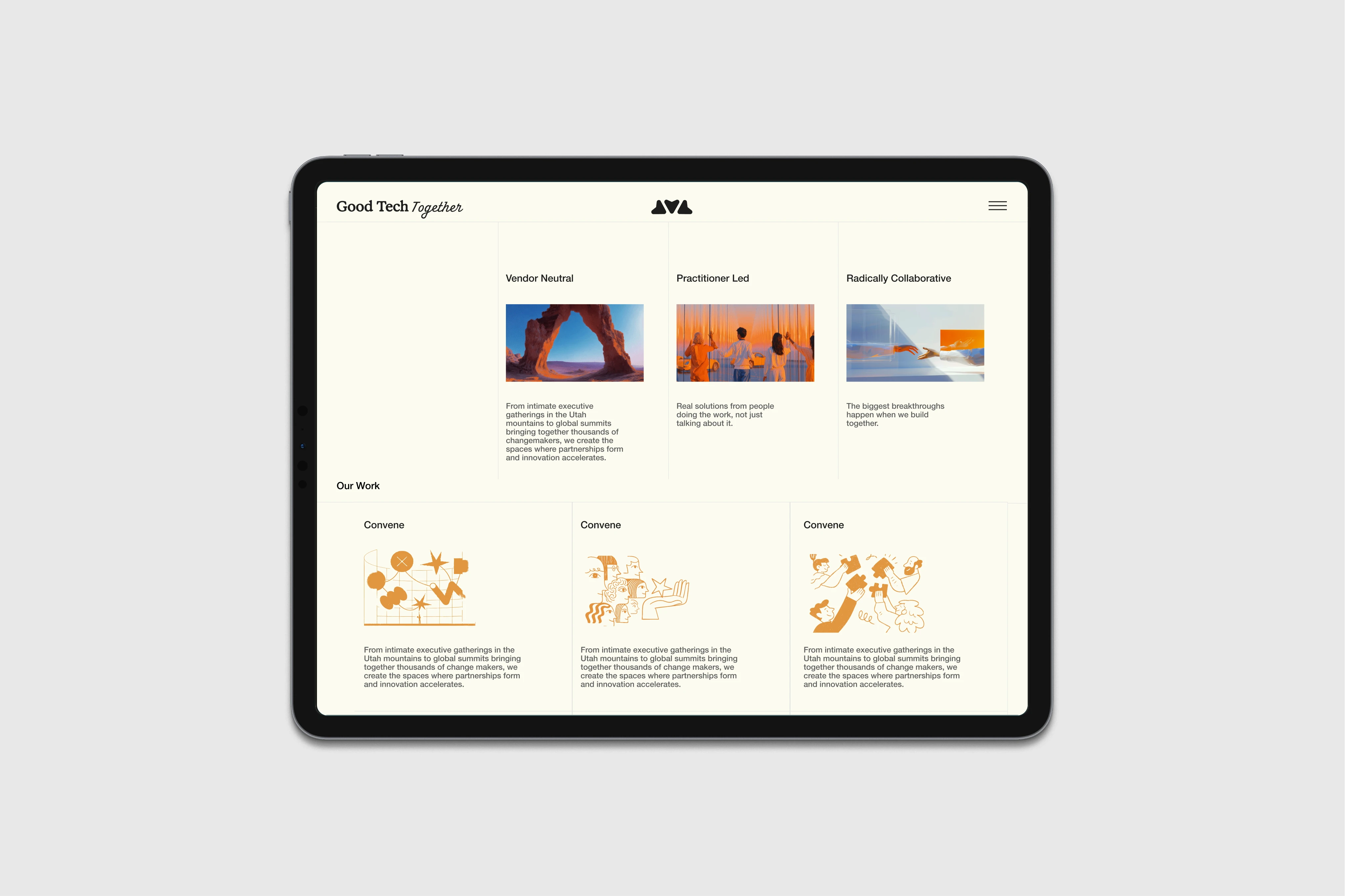
Visual System: Category Separation by Design
The gradient was a strategic choice. We studied what every other brand in this space was doing and chose the opposite. A sunrise palette warm gold through coral into soft lavender creates instant category separation. Before reading a word, you know this isn't another vendor.
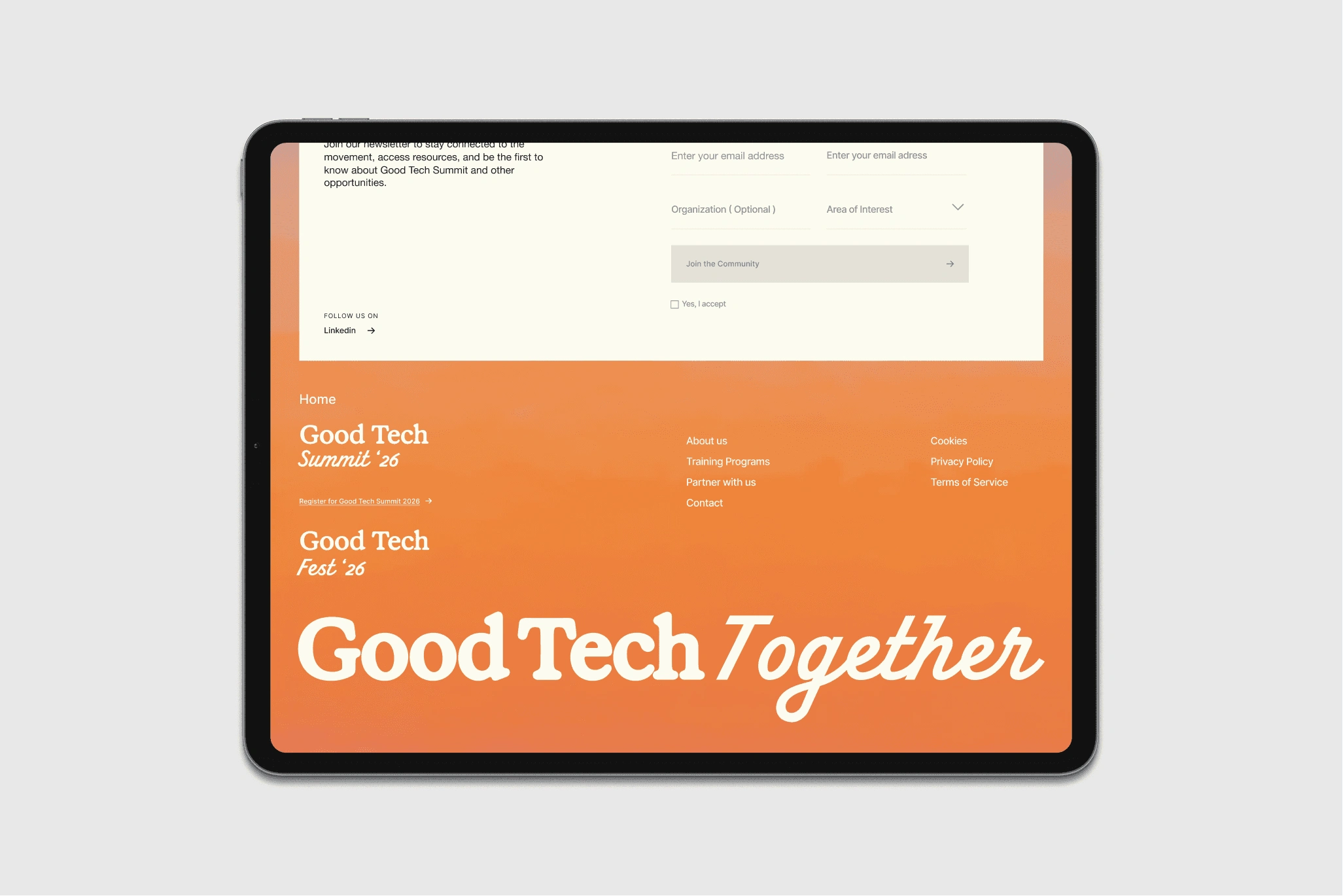
The type system carries the same tension the brand navigates daily: a heavy slab serif for "Good Tech" (grounded, institutional), a flowing script for "Together" (warm, human), and a monospaced face for dates and CTAs (a quiet nod to the tech context). Three typographic voices, one clear hierarchy.
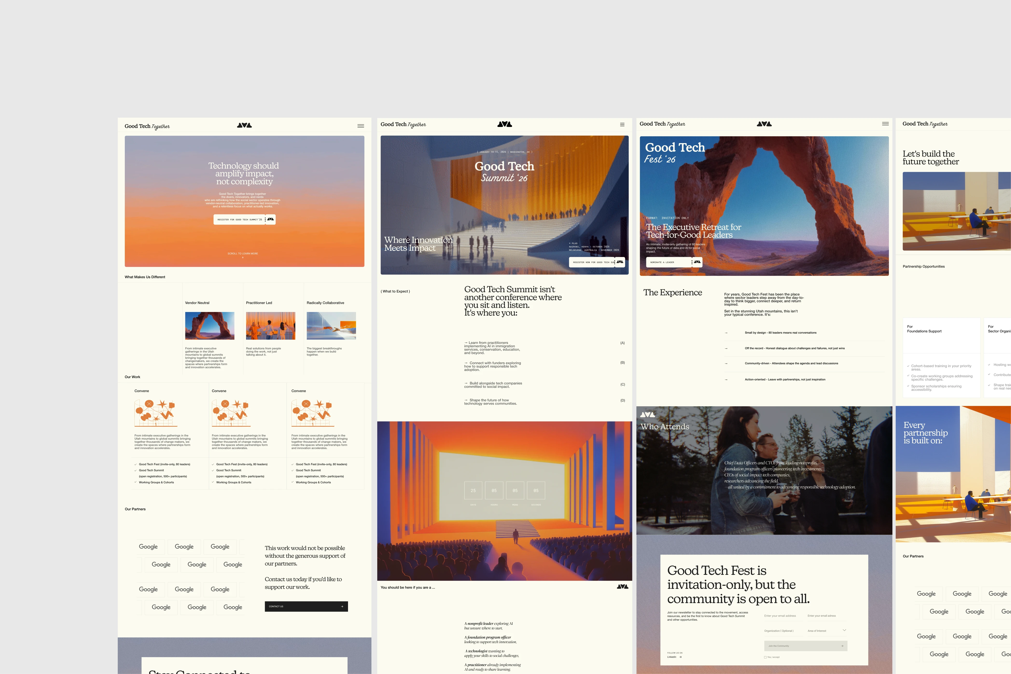
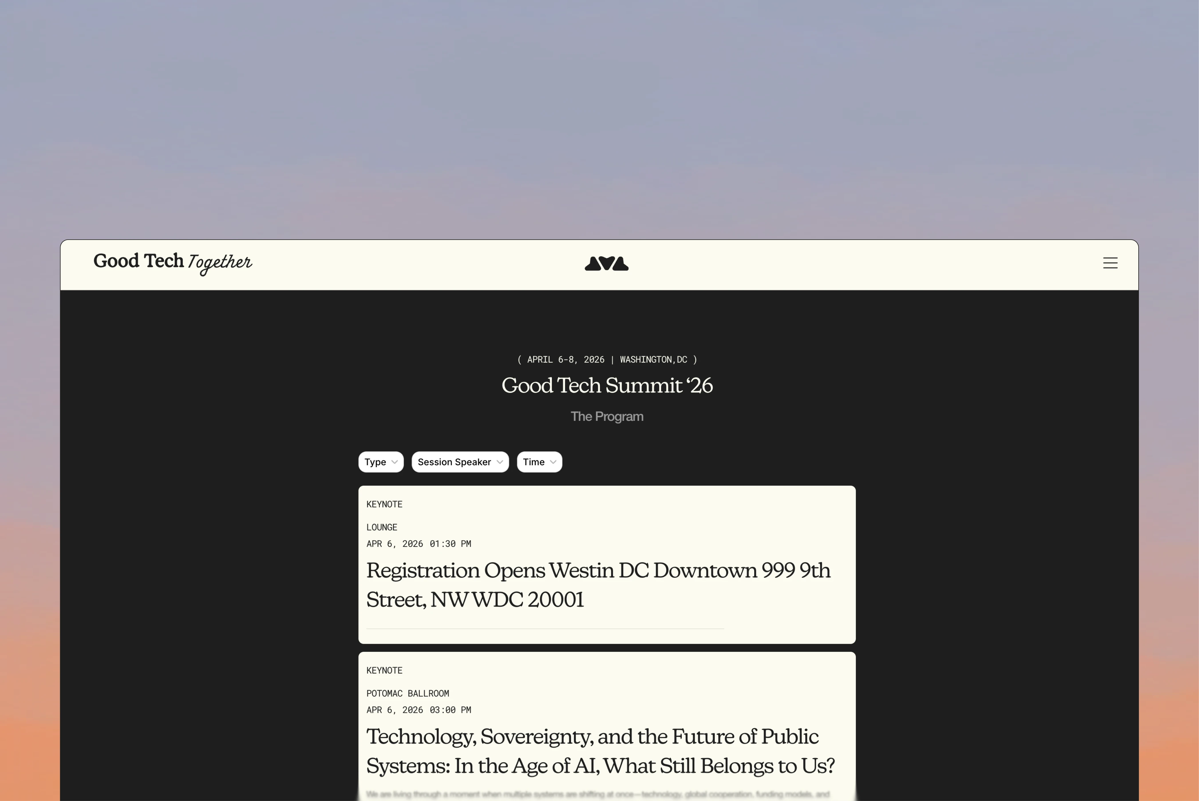
Two Events, One Flexible System
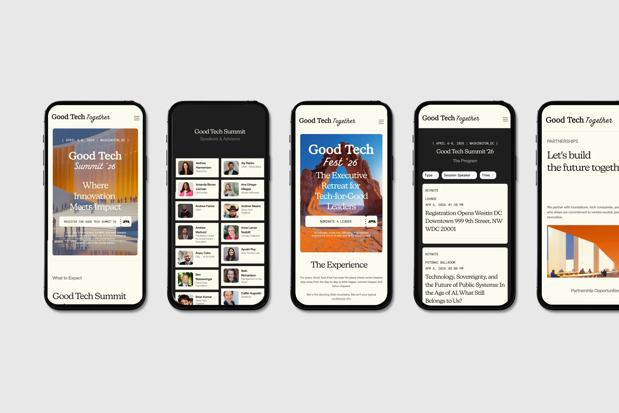
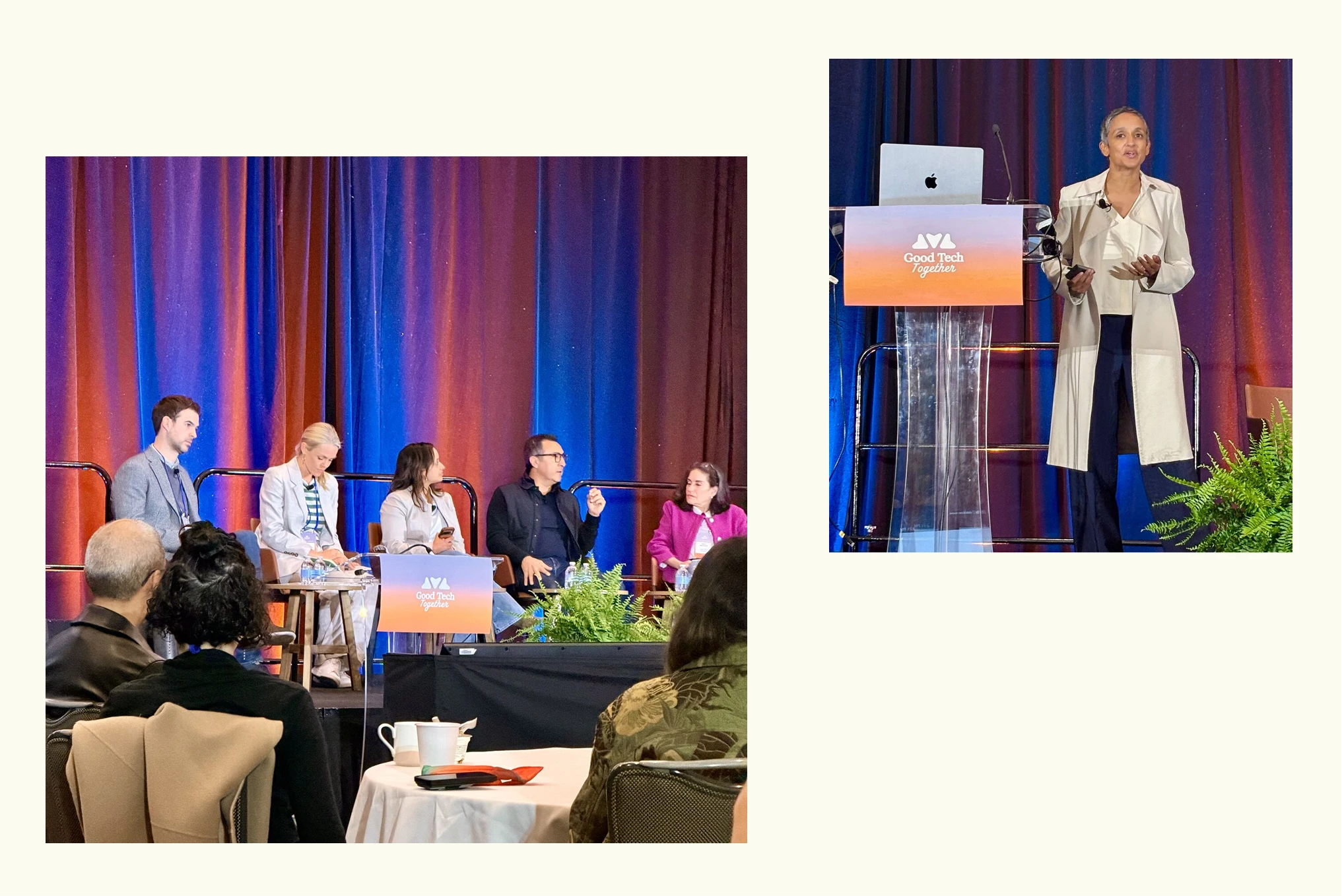
For Good Tech Summit in DC — 500 attendees, open registration, keynotes we built an aspirational visual world: a futuristic convention hall rendered in Midjourney, warm orange lighting, human silhouettes on grand stairs. Urban. Ambitious. Come build with us.
For Good Tech Fest in Utah 80 leaders, invite-only, off the record — we built the opposite: a desert rock arch with sunlight pouring through stone. A natural portal. Intimate. Reflective. Come think with us.
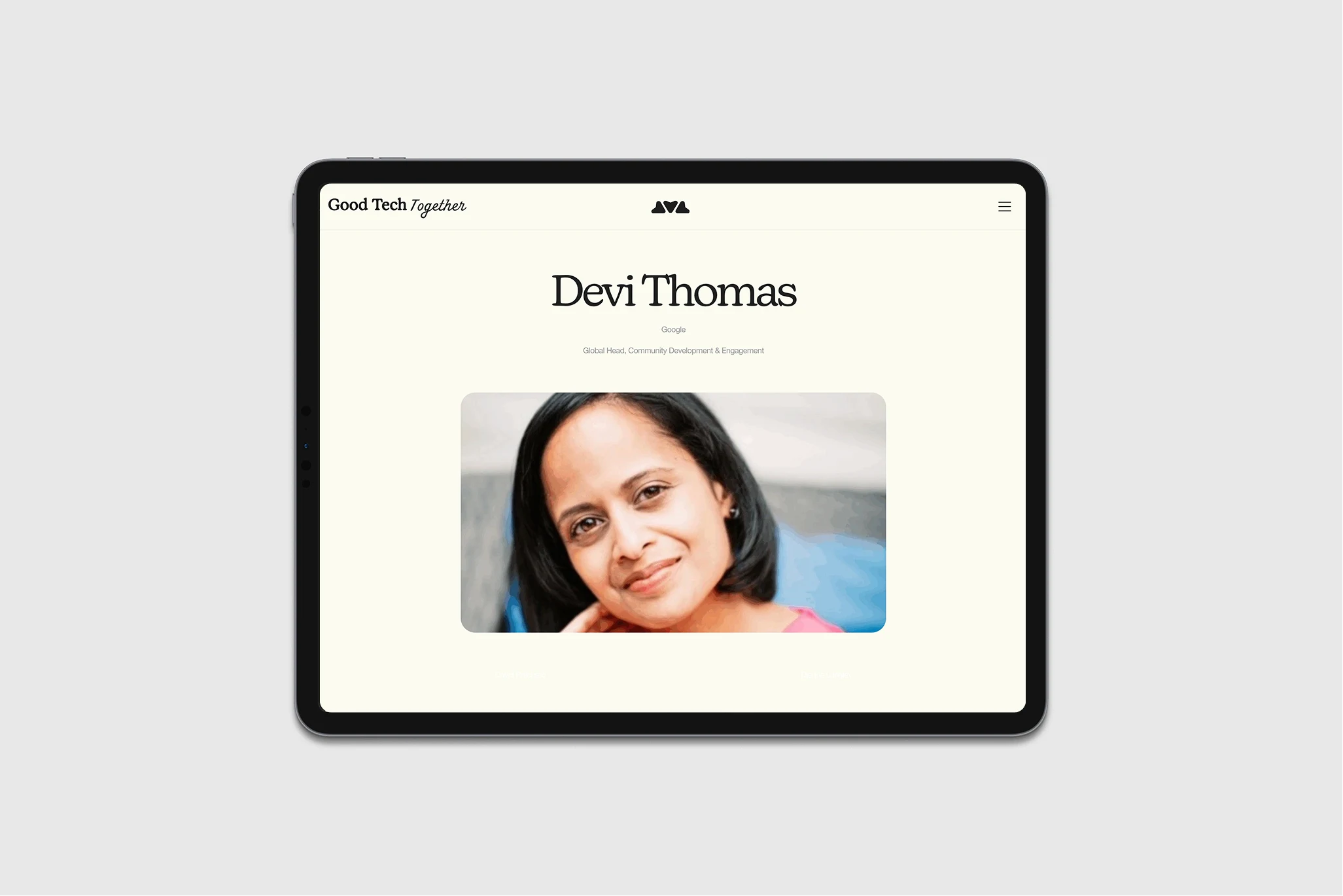
The website holds both events with the same navigation, mark, and type hierarchy. Only the hero image shifts the emotional register. The system flexes because the flexibility was designed in — not patched on afterward.
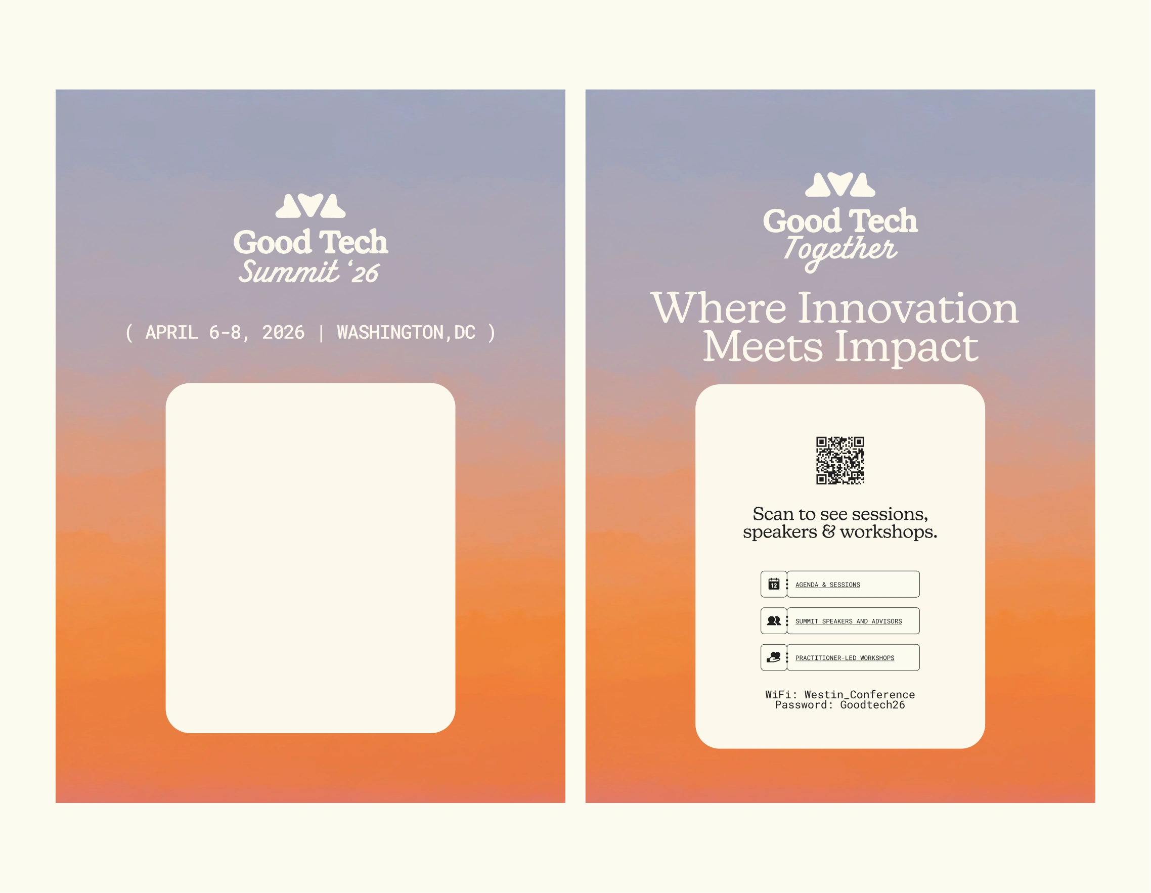
Physical Touchpoints: Designed to Keep, Not Discard
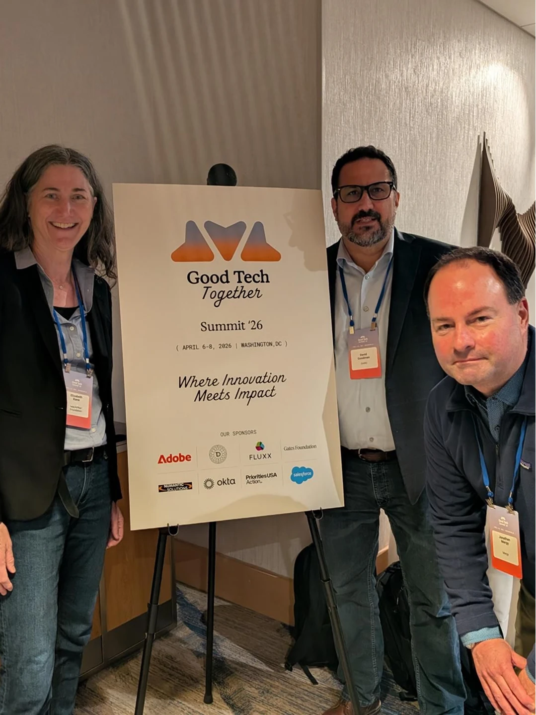
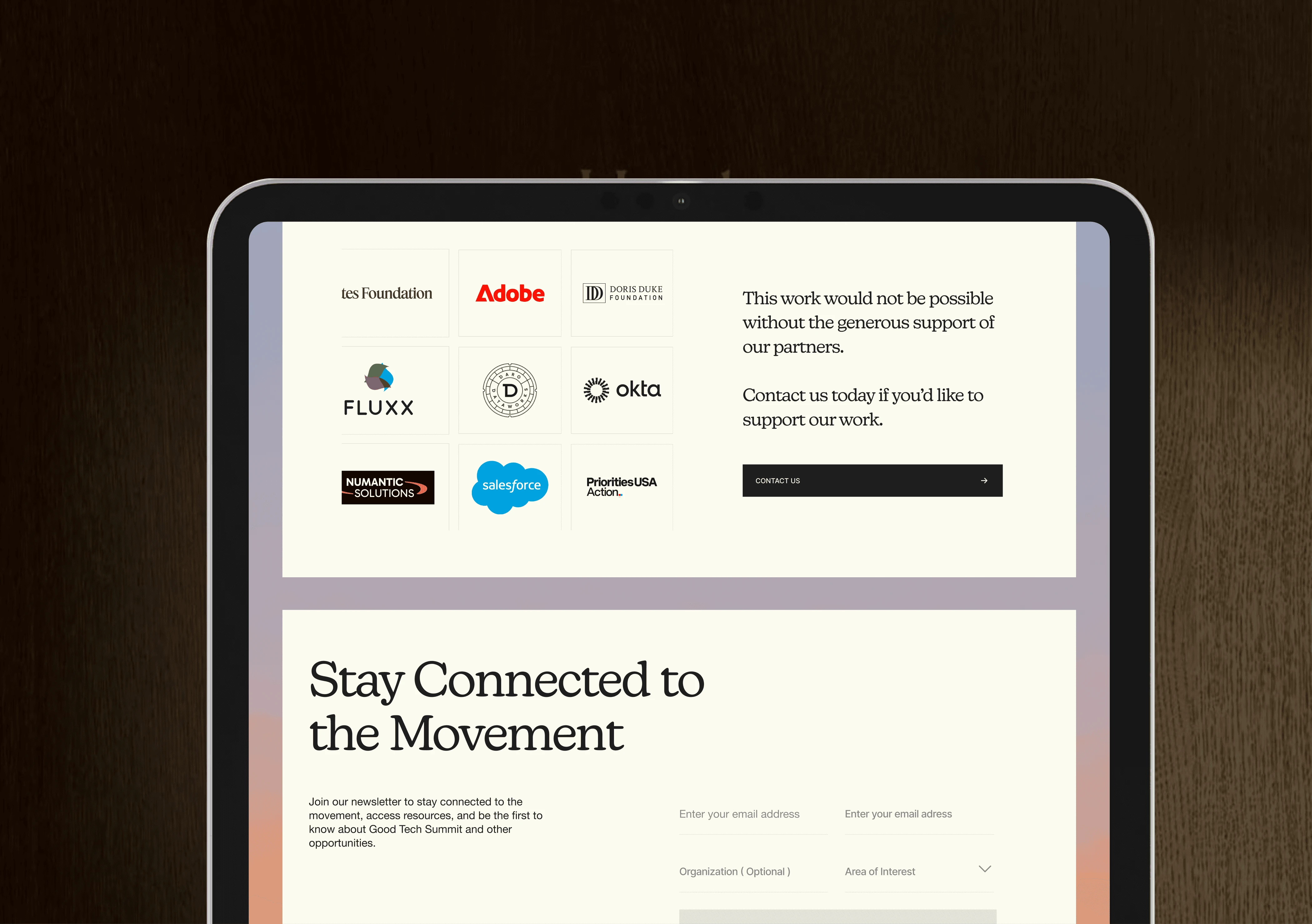
The lockups — logo mark, logotype, and event-specific variants — were designed with physical behavior in mind: sticker die-cuts, badges, event signage. Every piece had to pass one test: would someone take this home.
The event signage became the most-photographed element of the summit. Attendees posed with it unprompted — turning personal photos into organic brand distribution. When people want to be seen next to your brand, the identity is doing its job.
Results
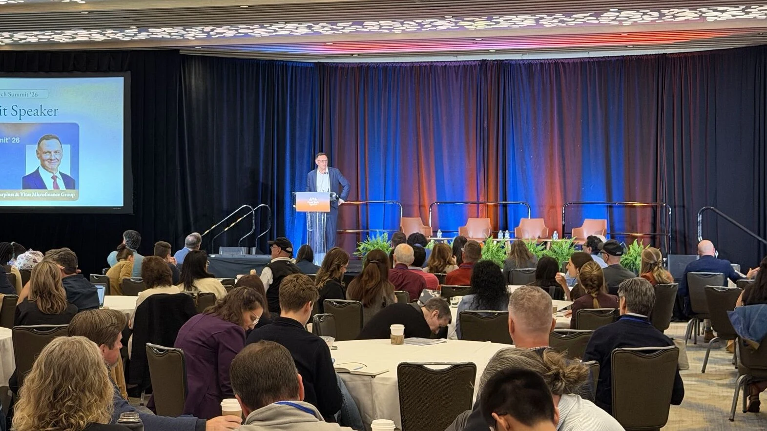
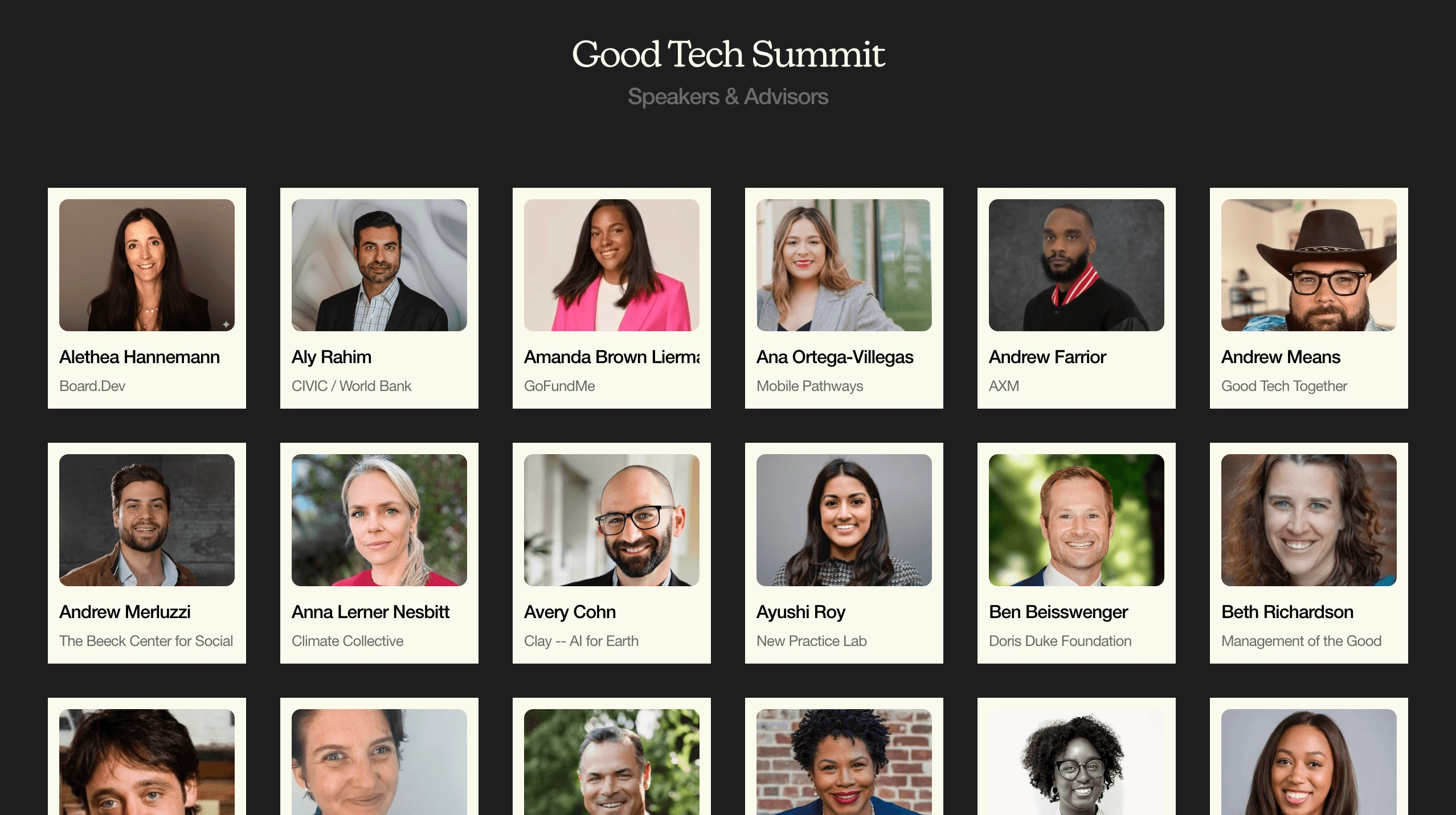
Good Tech Summit '26: 500+ attendees, 5 keynotes, 12 workshops over three days
Website (first 90 days): 11,000 unique visitors, 23,000 pageviews, ~5 min average session duration (2–3× industry benchmark for event sites)
Summit page: 8,800 views; Google organic search as the top traffic source, followed by LinkedIn — no paid advertising
Expansion: Planned summits in Nairobi (October 2026) and Melbourne (November 2026)
Biggest website I have managed reach so far.
Like this project
Posted May 18, 2026
How I built the brand identity, website + event design for Good Tech Together, a vendor-neutral nonprofit community. 500+ attendees. 11K visitors in 90 days.
Likes
0
Views
3
Timeline
Dec 1, 2025 - Dec 30, 2025