Built with Framer
Wilson's Framer Website Redesign
Ansh Jamdagni
Verified
Wilson's - Framer website Design & Dev
// Overview
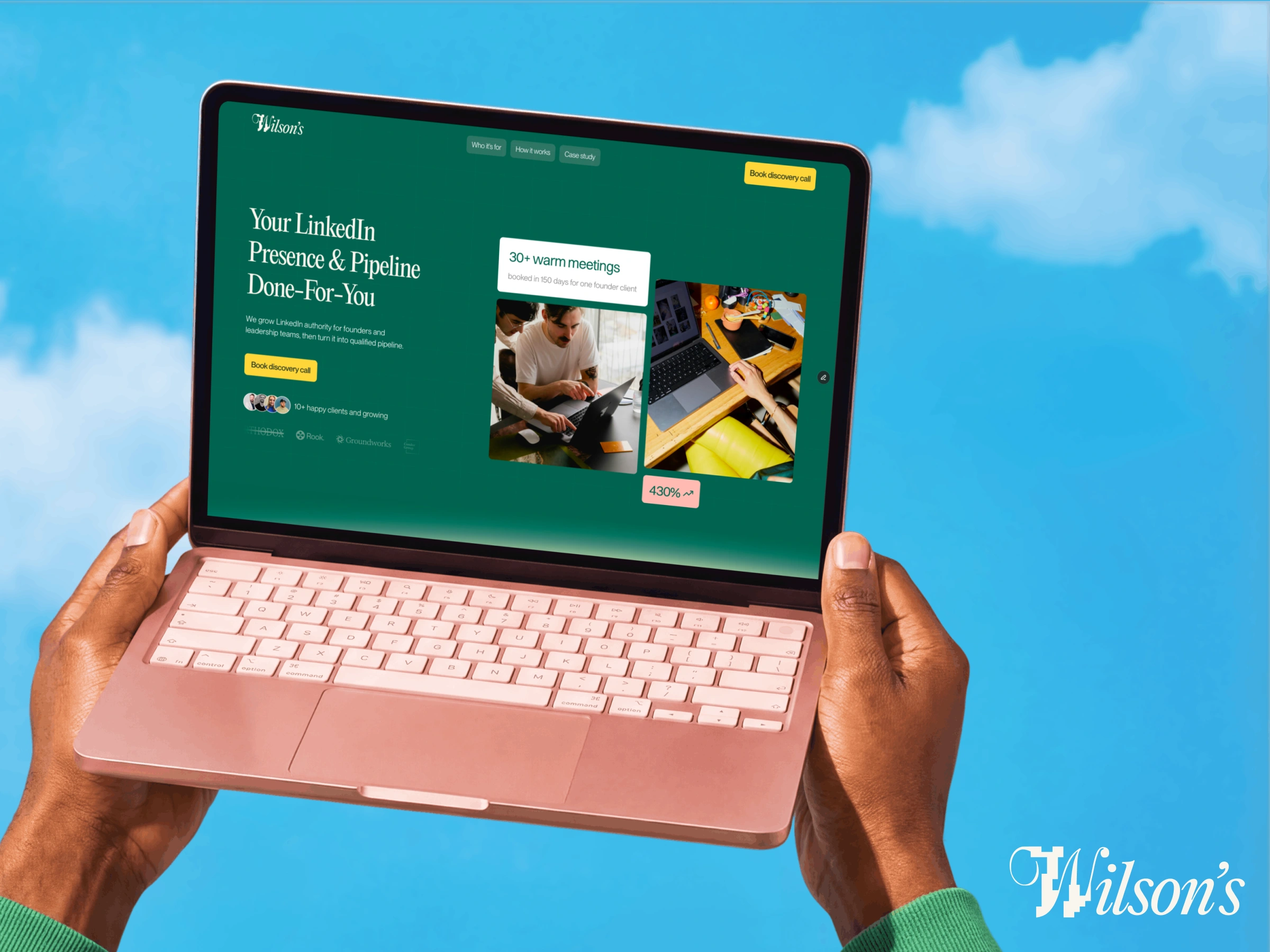
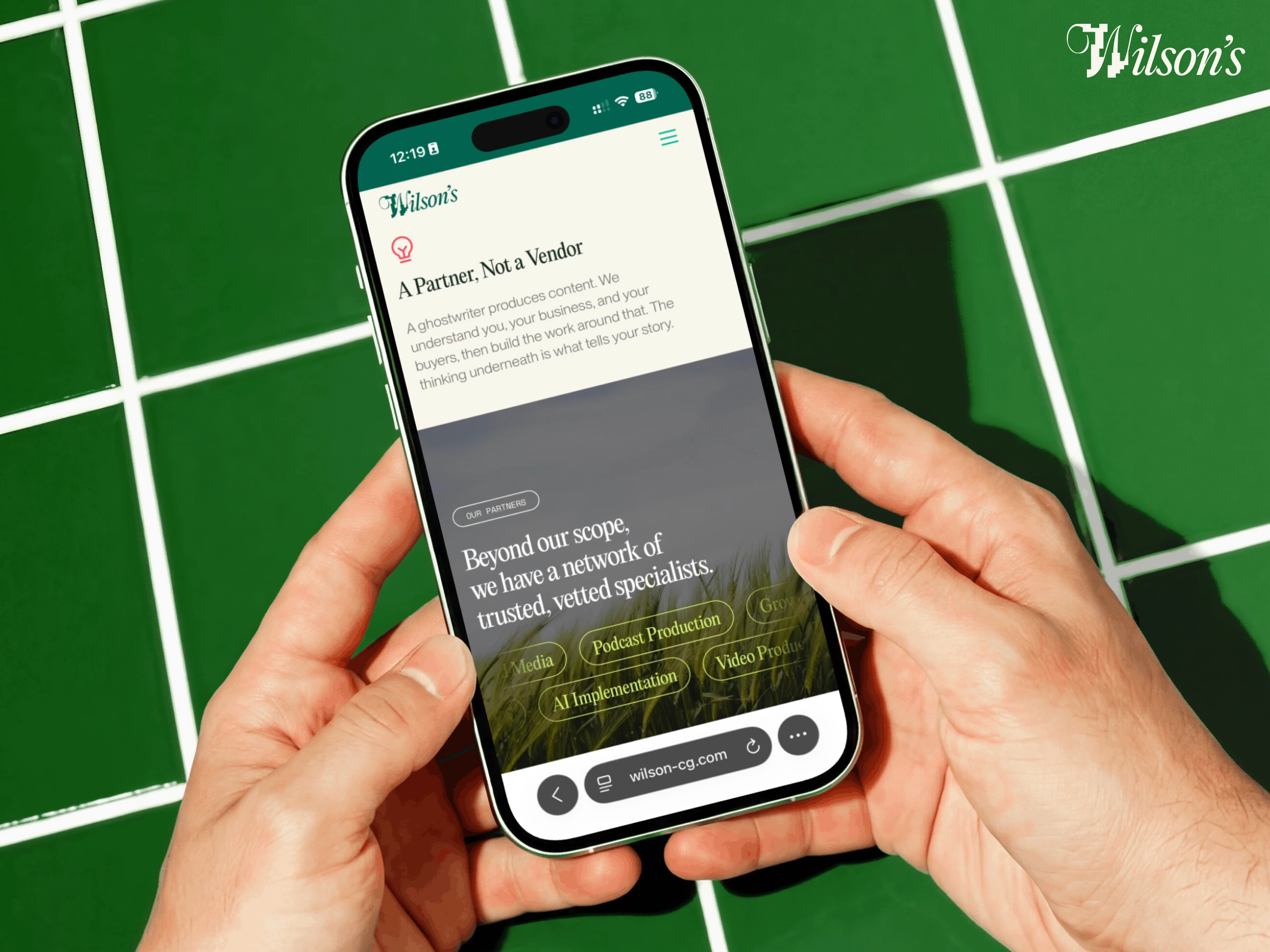
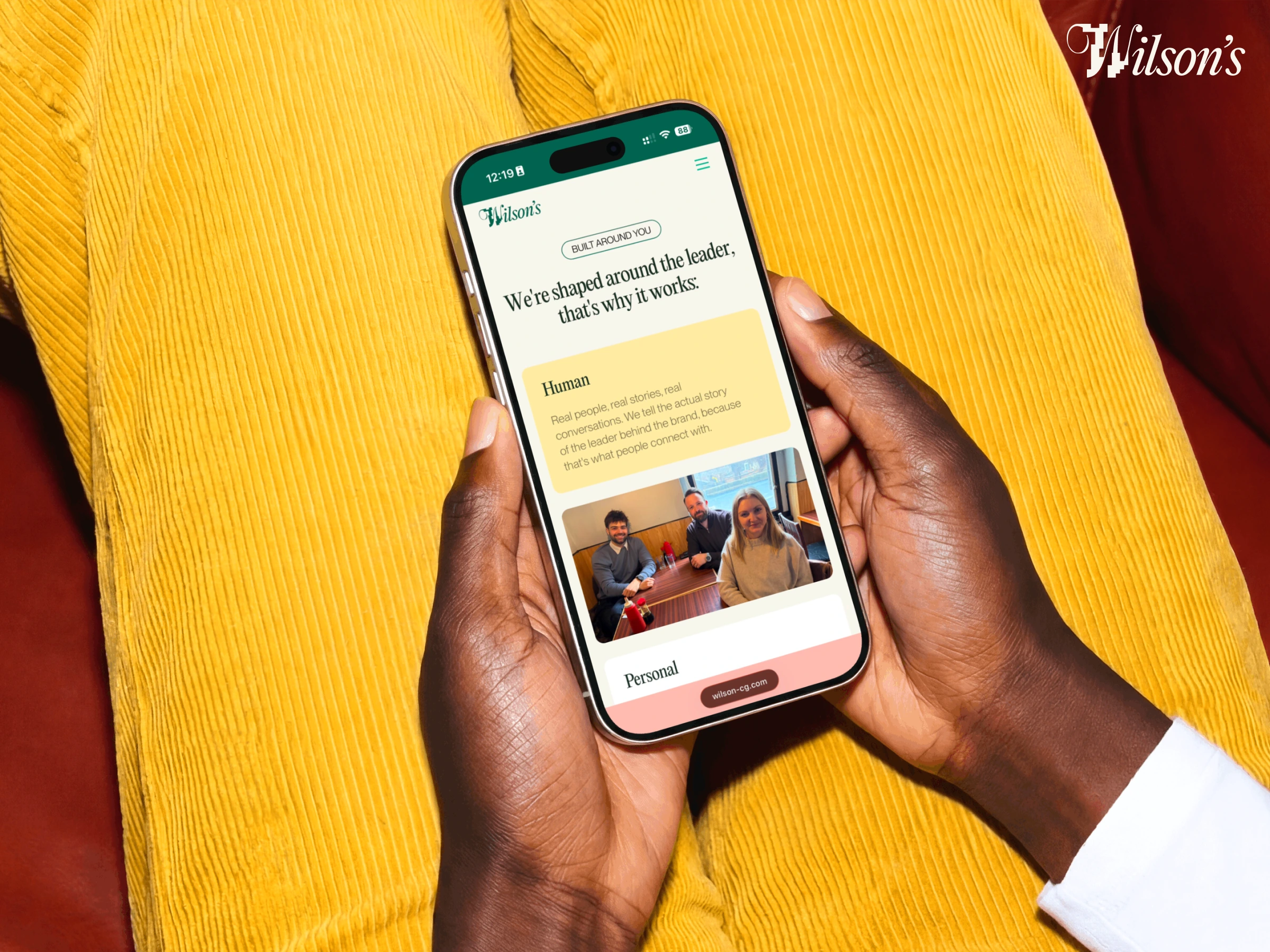
Wilson's helps founders and leadership teams build LinkedIn authority, then turns that authority into qualified pipeline. Stan came in with a Framer template, a sharp brand, and a clear sense of what he was building. The brief was to make the website match the thinking behind the business.
// The Challenge
The template was built for an investment fund. The bones were good but the logic was wrong. The section order told the wrong story, the graphics were generic finance widgets that had nothing to do with LinkedIn growth, and the copy read like a VC pitch deck. The brand and the website were living in two different worlds.
// What we built
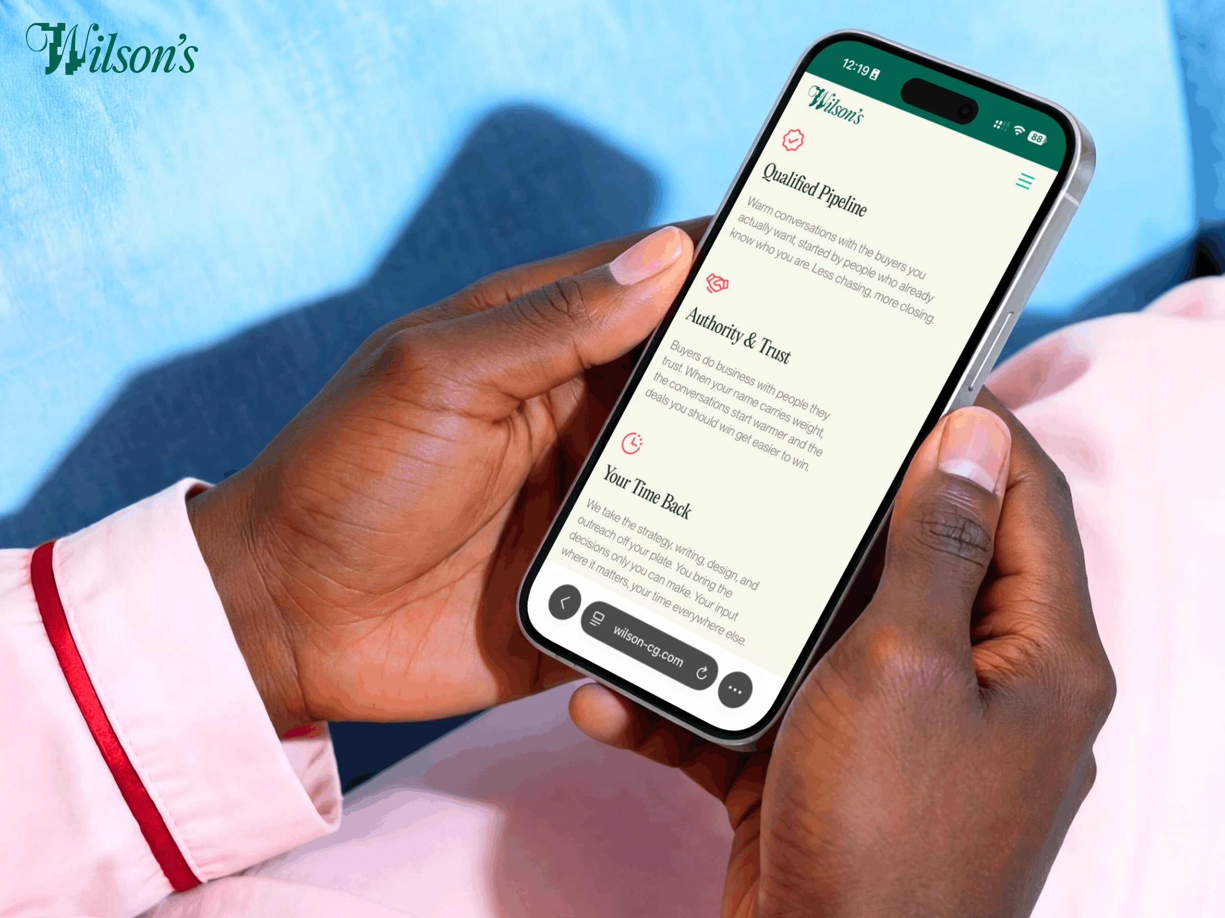
A fully redesigned single-page Framer site across ten sections, rewired from the ground up to fit Wilson's positioning, voice, and ICP.
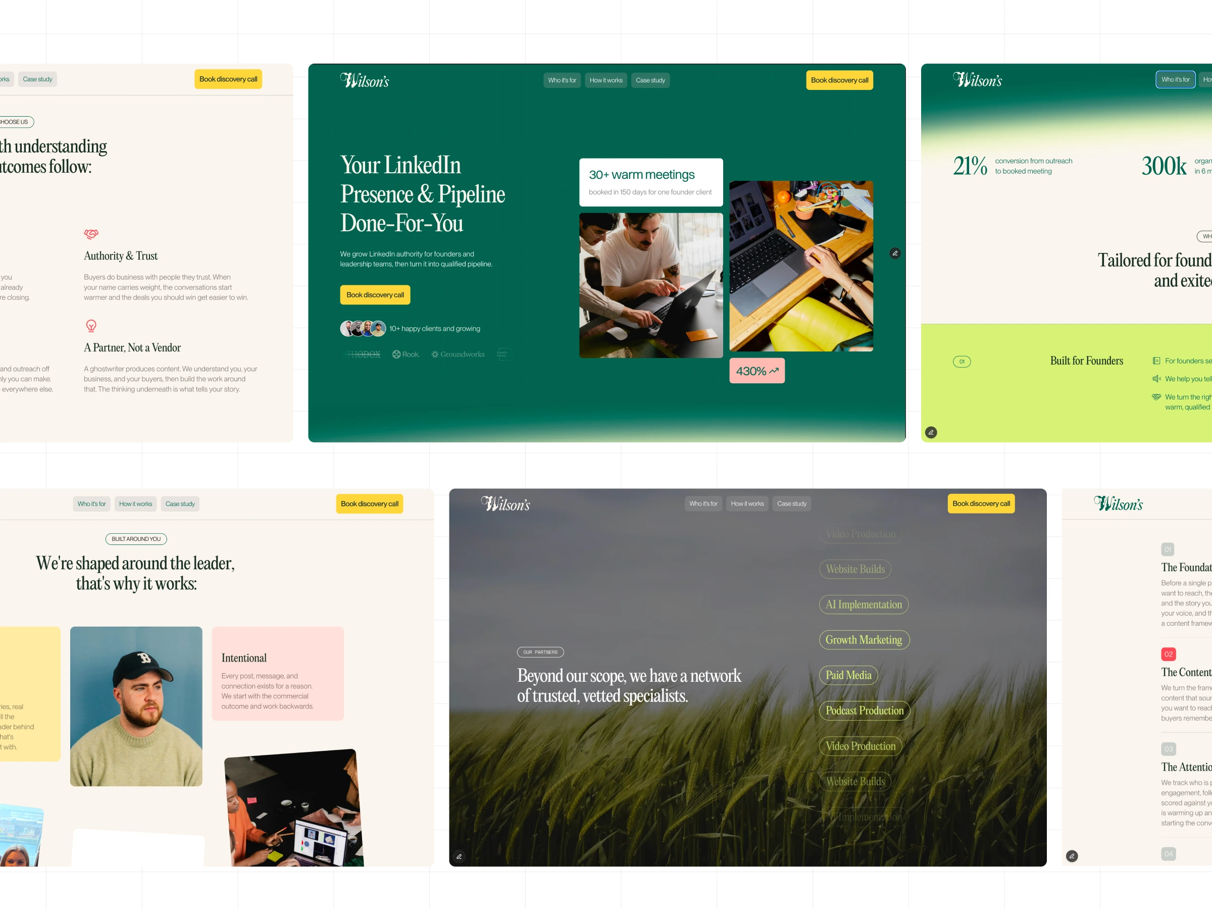
We rebuilt the section flow based on visitor psychology, moving from hero to services to social proof to process before asking for anything. Every section was reordered with a reason. The who-it's-for logic comes before the how-it-works logic. Trust is earned before the CTA fires.
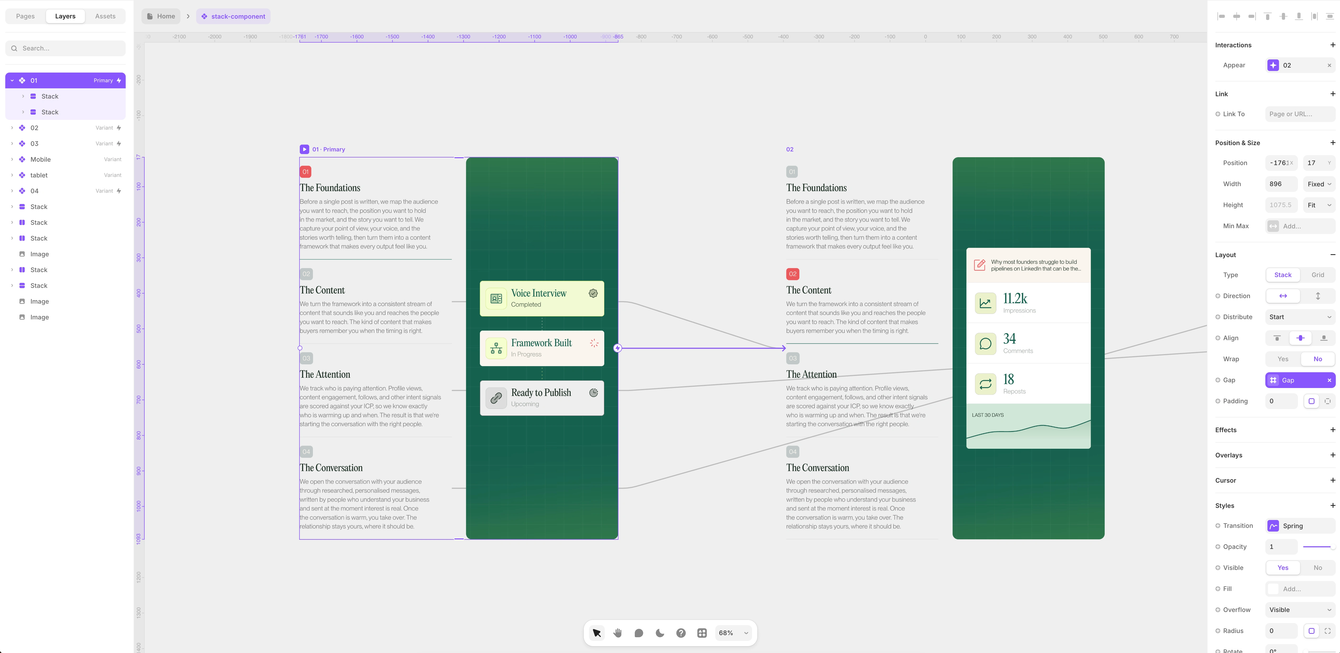
The how it works section got a full visual overhaul. We scrapped the stock dashboard widgets and built four custom animated graphics from scratch inside Framer, each one showing a real moment in the Wilson's process: the voice interview and framework build, post engagement metrics, intent signals warming up, and a personalised outreach conversation. Every graphic was designed to make the invisible work visible.
Each graphic was built and animated entirely inside Framer, no external tools, no imported assets. The process card uses live state logic to show progression from Voice Interview to Framework Built to Ready to Publish. The engagement card pulls a realistic post preview with impression and comment metrics and a 30-day sparkline. The intent tracker shows three warming contacts with company names, titles, and intent tags. The outreach card closes the loop with a personalised message preview, a reply timestamp, and a sent at peak intent label. Four graphics, four moments in the process, all built to communicate the service without a single word of explanation needed.
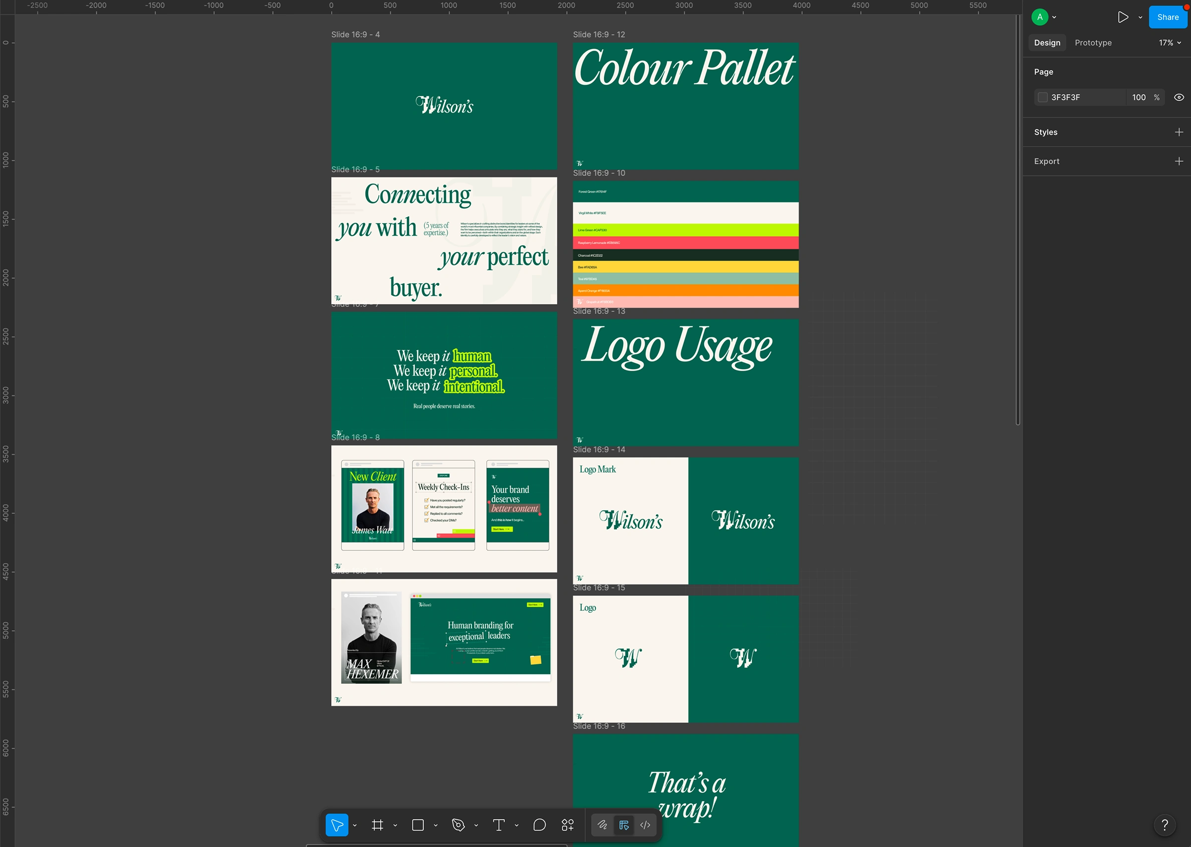
// The Detail
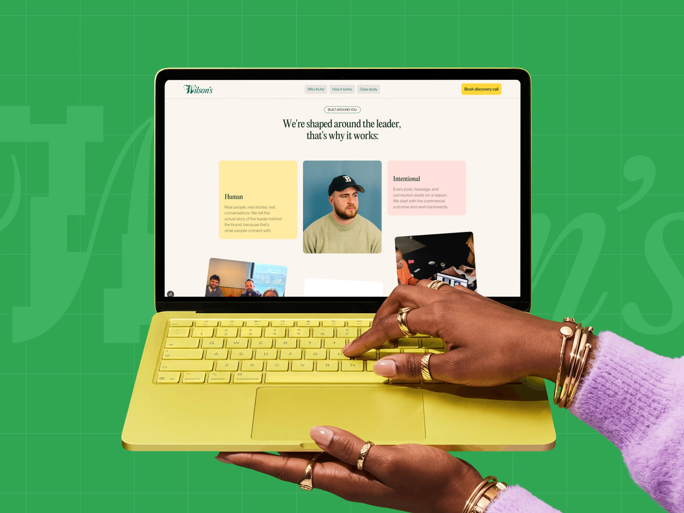
The typography is set in a high-contrast serif that carries Wilson's handcrafted feel across every screen size. The deep forest green and lime yellow hold at both desktop and mobile without adjustment. The site passes the screenshot test: you know what Wilson's does and who it's for before you read a single word of body copy.
The site is integrated with Cal.com for discovery call booking and connects directly to Stan's LinkedIn and email for warm inbound. Metadata was set up clean from day one.
Like this project
What the client had to say
Delivered on time, pleasure to work with, high quality and great communicator. Wld recommend
Stan Whyte
May 18, 2026, Client
Posted Jun 1, 2026
Redesigned a Framer site for Wilson's to fit its brand and positioning. Custom graphics, Cal integration, strategy-led section flow.
Likes
2
Views
33
Timeline
Apr 23, 2026 - May 18, 2026