Gymhall APP
GYMHALL is a premier chain of gyms aiming to enhance the fitness experience.
The gyms cater to cardio enthusiasts and bodybuilders, providing high-quality exercise machines and equipment. With professional instructors and personal trainers, GYMHALL offers a variety of classes. Tailored for individuals with medium to high purchasing power, GYMHALL prides itself on a luxurious environment for achieving fitness goals with style and comfort.
The gym’s overarching goal is to promote a healthy lifestyle and foster a sense of community among its members.

Why Gymhall launches an app?
Gymhall launches this app to have deeper engagement with its clientele. The app has several key features, including the ability to effortlessly book classes and access personalized performance tracking tools. Through intuitive graphical representations, clients can monitor their weekly gym attendance, empowering them to stay committed to their fitness goals.
Moreover, the application serves as a comprehensive resource hub, providing invaluable insights into dietary recommendations and details on the diverse range of classes available at the gym. By seamlessly integrating membership management functionalities, users can conveniently explore and adjust various membership packages to suit their preferences and needs.
Designed with user convenience in mind, the app streamlines interactions with the gym, ensuring a more comfortable and enriching experience for every client. With its array of features aimed at promoting healthy lifestyles and facilitating seamless gym interactions, the application stands as a testament to the gym’s commitment to empowering its members on their fitness journey.
Welcome Sections
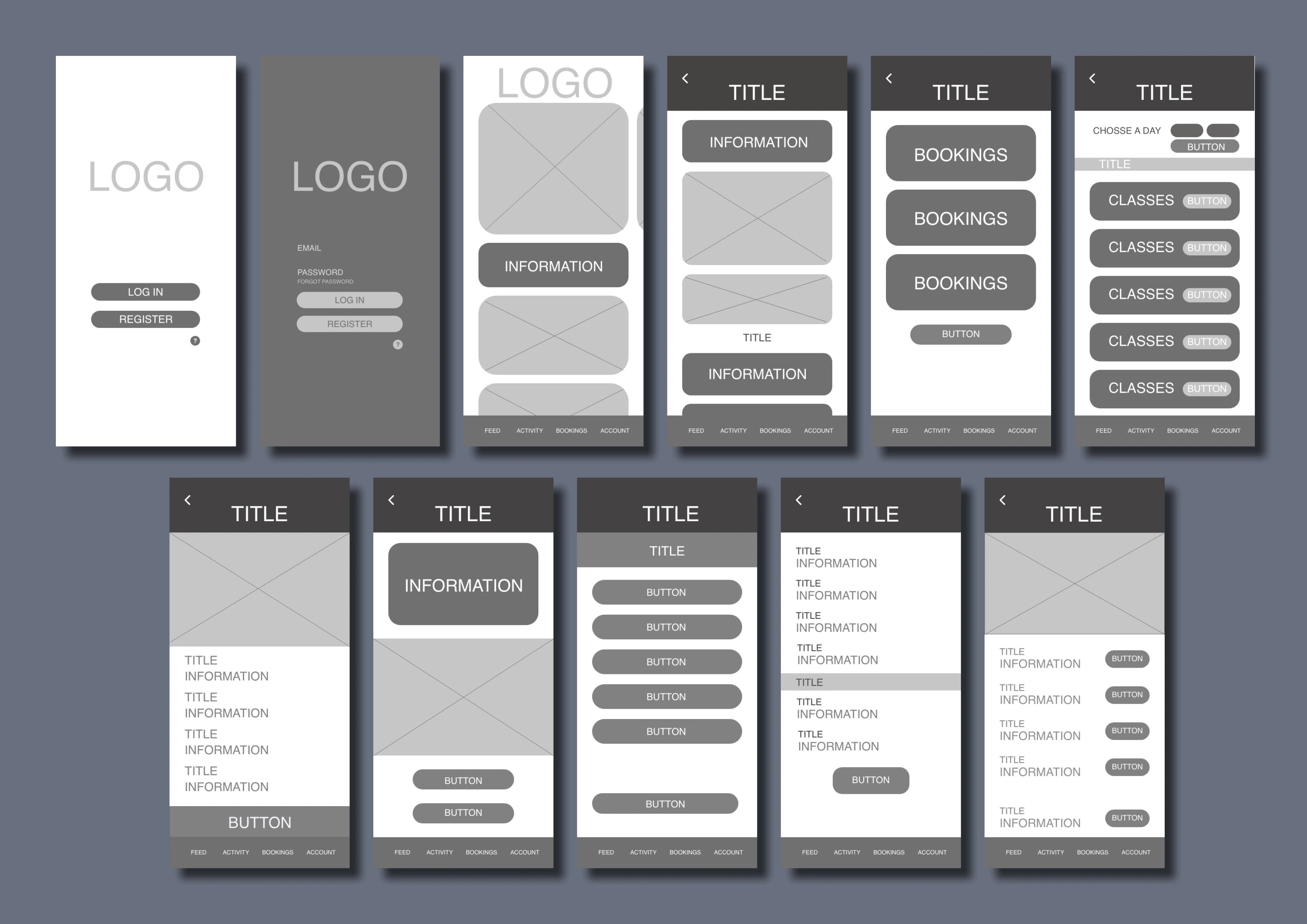
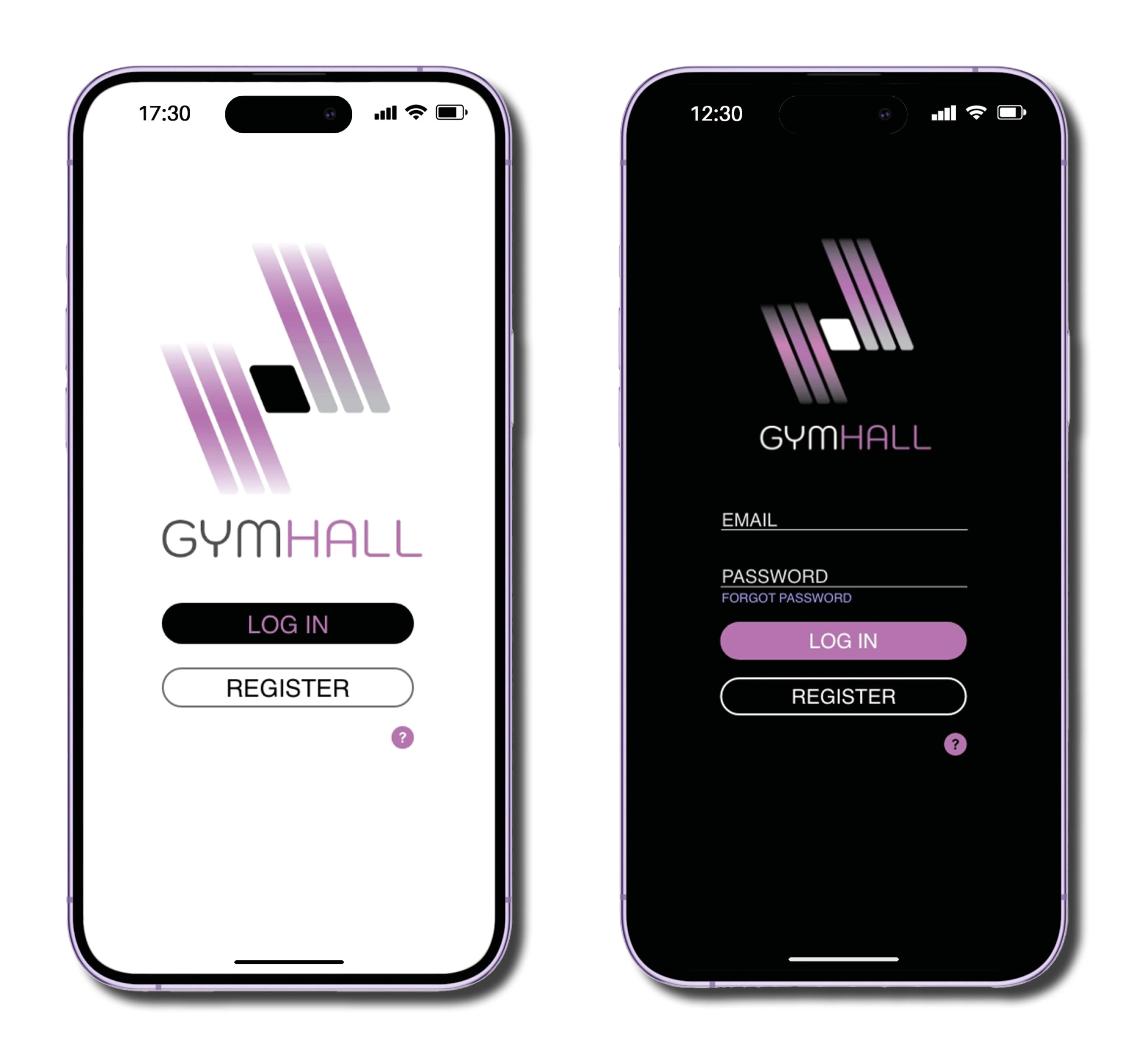
I feature two distinct welcome sections within the app interface. The initial section presents a clean, white background, serving as the users’ first point of contact with the app. Here, they encounter a minimalist UI adorned with the gym logo and three prominent buttons: one directing them to the login section, another guiding them to the registration area, and a third providing access to assistance.
Transitioning to the second welcome section, I introduce a sleek black background, elevating the user experience to one of sophistication. Here, users are prompted to input their email followed by their password, with a login button situated below. Notably, we include the registration button once more, strategically addressing any inadvertent clicks on the login button in the initial section. This deliberate redundancy ensures users can seamlessly proceed without the need to backtrack. Moreover, the black background of this section exudes an air of intrigue, compelling potential users to explore further and register for an account.
Feed & Activity Sections
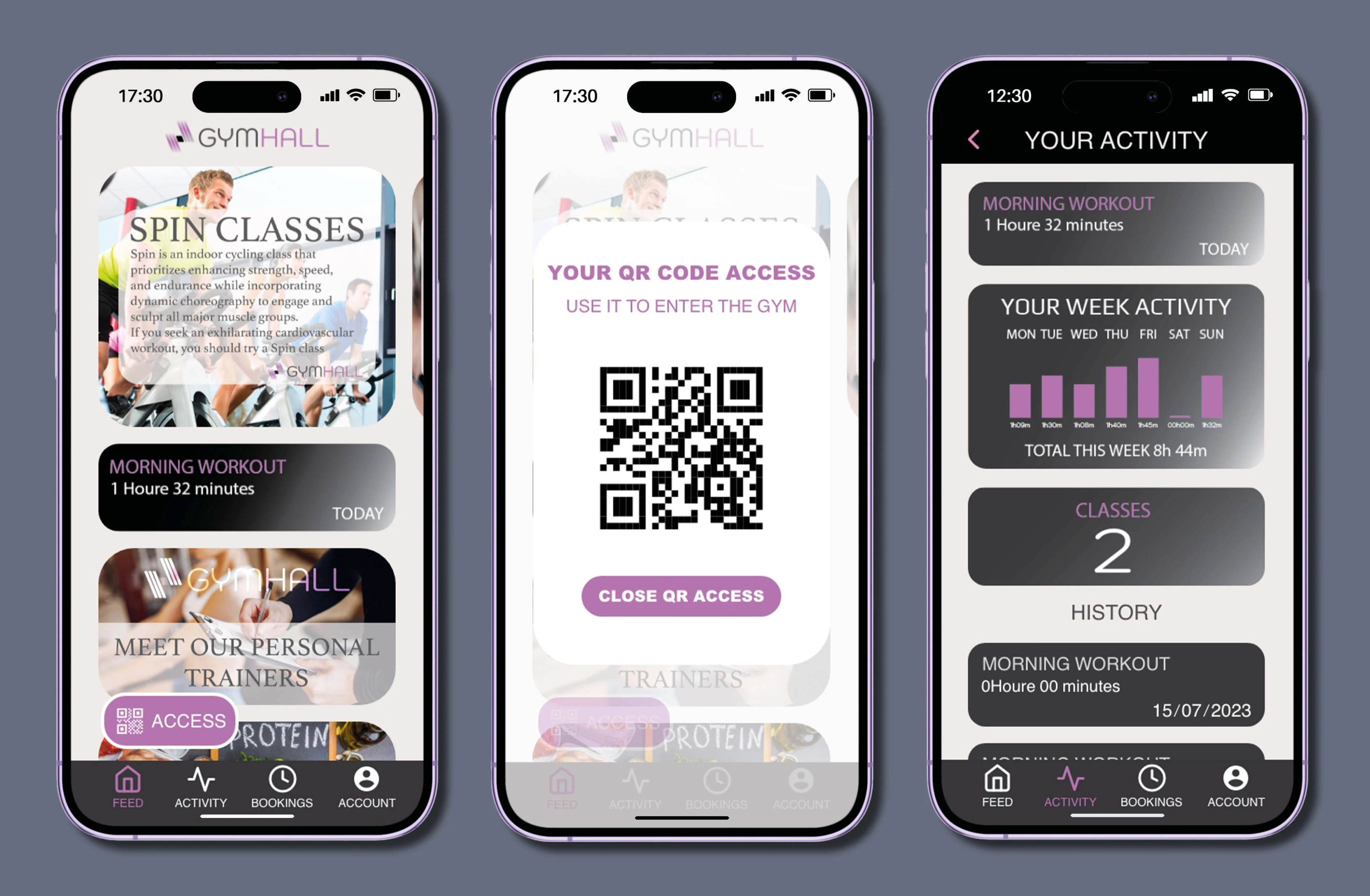
In the feed section, a user-friendly interface awaits with carefully curated features to enhance the gym experience. At the forefront is a sleek horizontal carousel, elegantly presenting buttons packed with valuable insights on the diverse array of classes offered at the gym.
Directly below, a vertical section beckons with rich information on diets and personal trainers, empowering users to make informed choices regarding their fitness journey. A conveniently placed button facilitates swift entry to the gym via QR code, ensuring seamless access for patrons.
Navigational ease is prioritized with a prominent bar housing the four primary sections, enabling users to effortlessly explore the entirety of the application’s offerings.
Further along, the Activity section stands ready to unveil the user’s comprehensive interaction history with the gym. Through meticulous tracking services, every engagement, from houres to classes attended, is meticulously documented, providing users with invaluable insights into their fitness journey.
Class Booking Sections
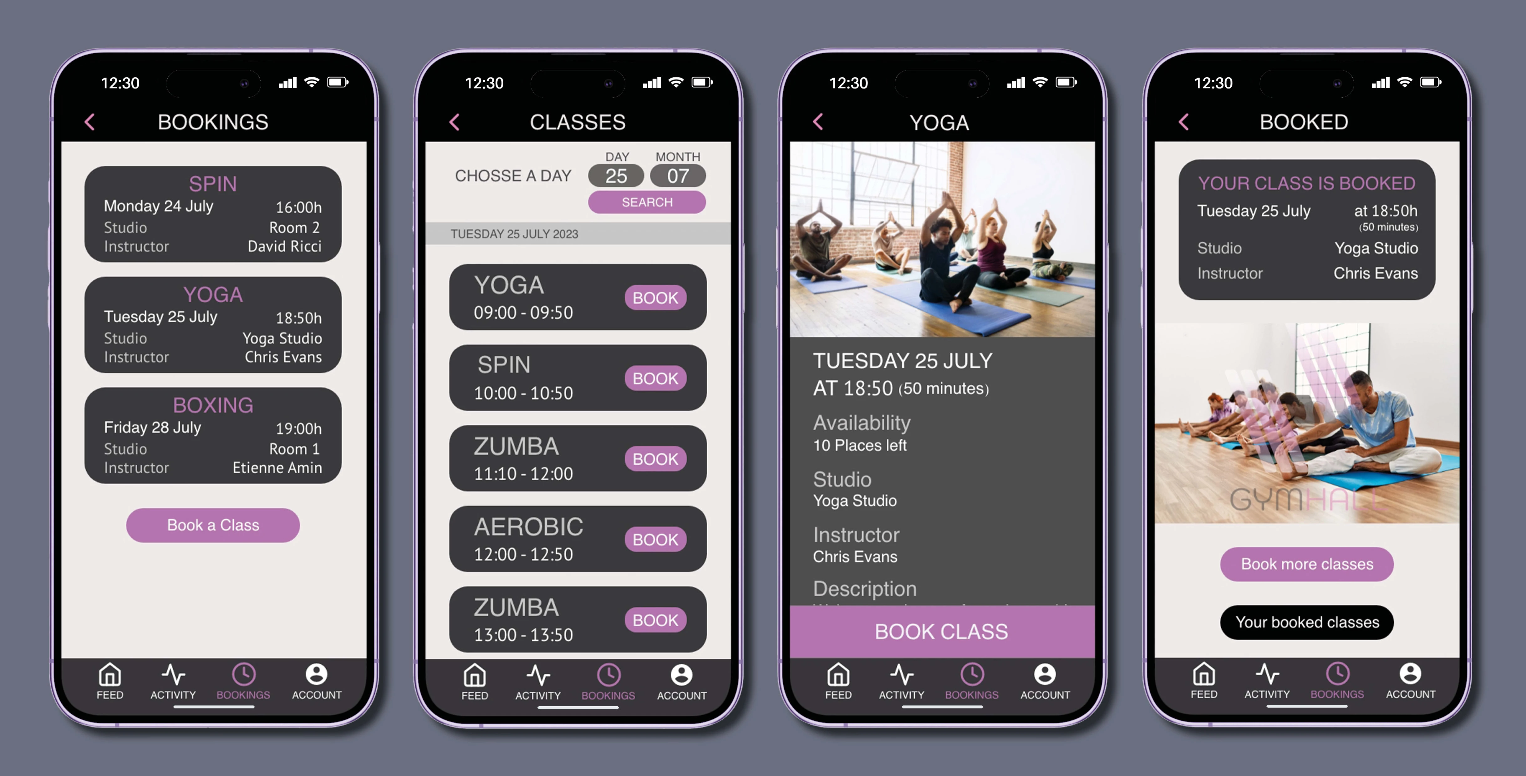
In the reservation section, users can view previously booked classes and access a button to reserve new classes. Upon selecting the “Book a Class” button, all available classes are displayed, accompanied by tools to select the desired date conveniently located in the upper right corner.
Each class listing features a “Book” button, allowing users to secure their spot in the class of their choice. Upon selection, detailed information about the class is presented, including the schedule, instructor details, available slots, and more. Following this, users are prompted with a “Book Class” button to confirm their reservation.
Once the reservation is confirmed, users are provided with information regarding their reserved class, along with two options: to book additional classes or to return to the menu of booked classes. Throughout these sections, a back arrow is consistently available in the upper left corner to facilitate easy navigation.
Account Sections
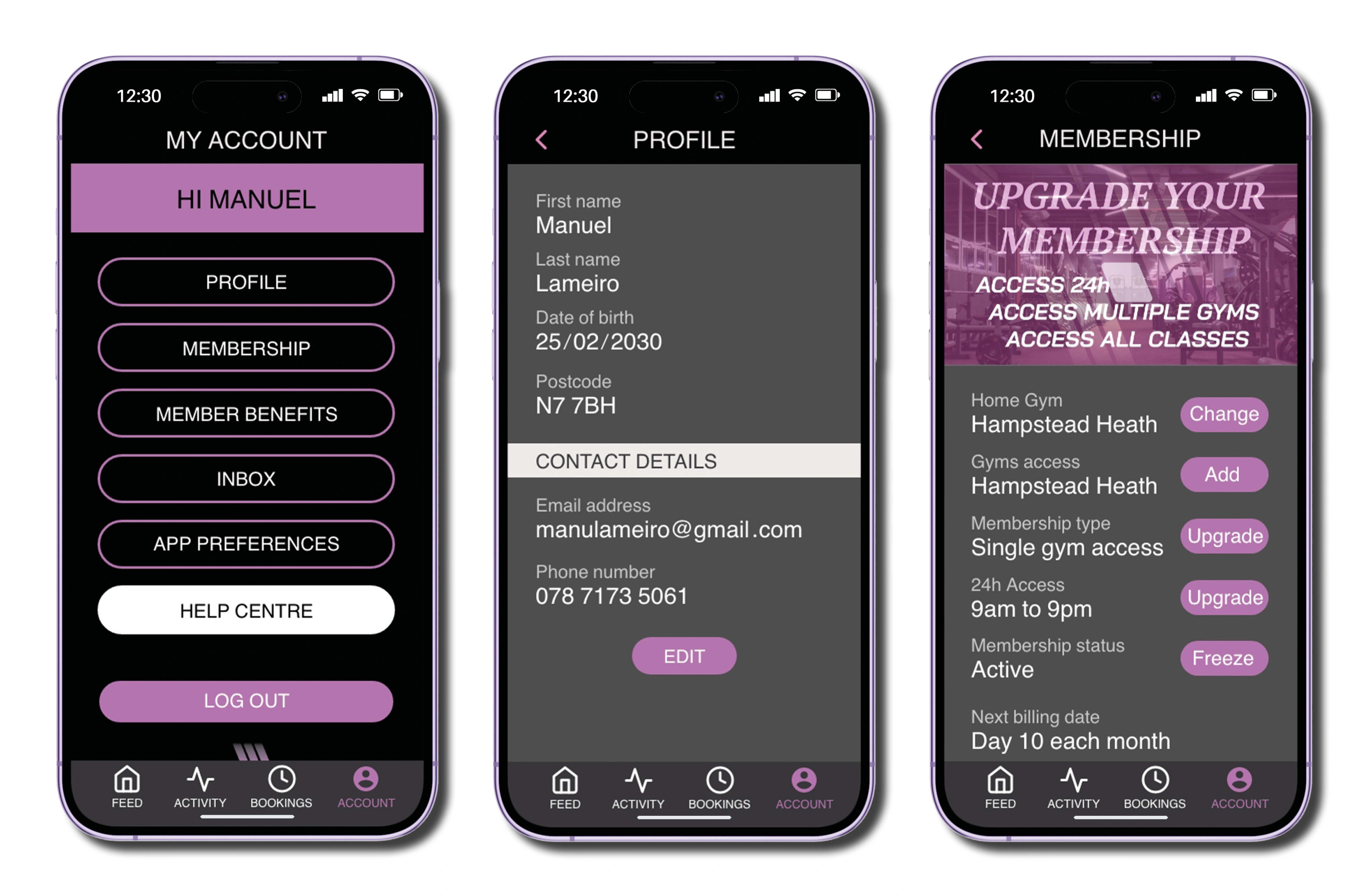
Within the account section, users access a comprehensive range of features tailored to their needs. This includes details about the user’s profile, tools for modifying membership settings, insights into membership benefits, and a dedicated inbox for messages.
Additionally, users can fine-tune their app experience through the app preferences section, where they have the flexibility to adjust system settings such as notifications. Should users require assistance, a help button is readily available to guide them through the application’s features.
Lastly, for seamless exit from the application, users can easily log out from their account. This multifaceted account section ensures users can manage their profile, preferences, and interactions within the application with ease and efficiency.
Logo
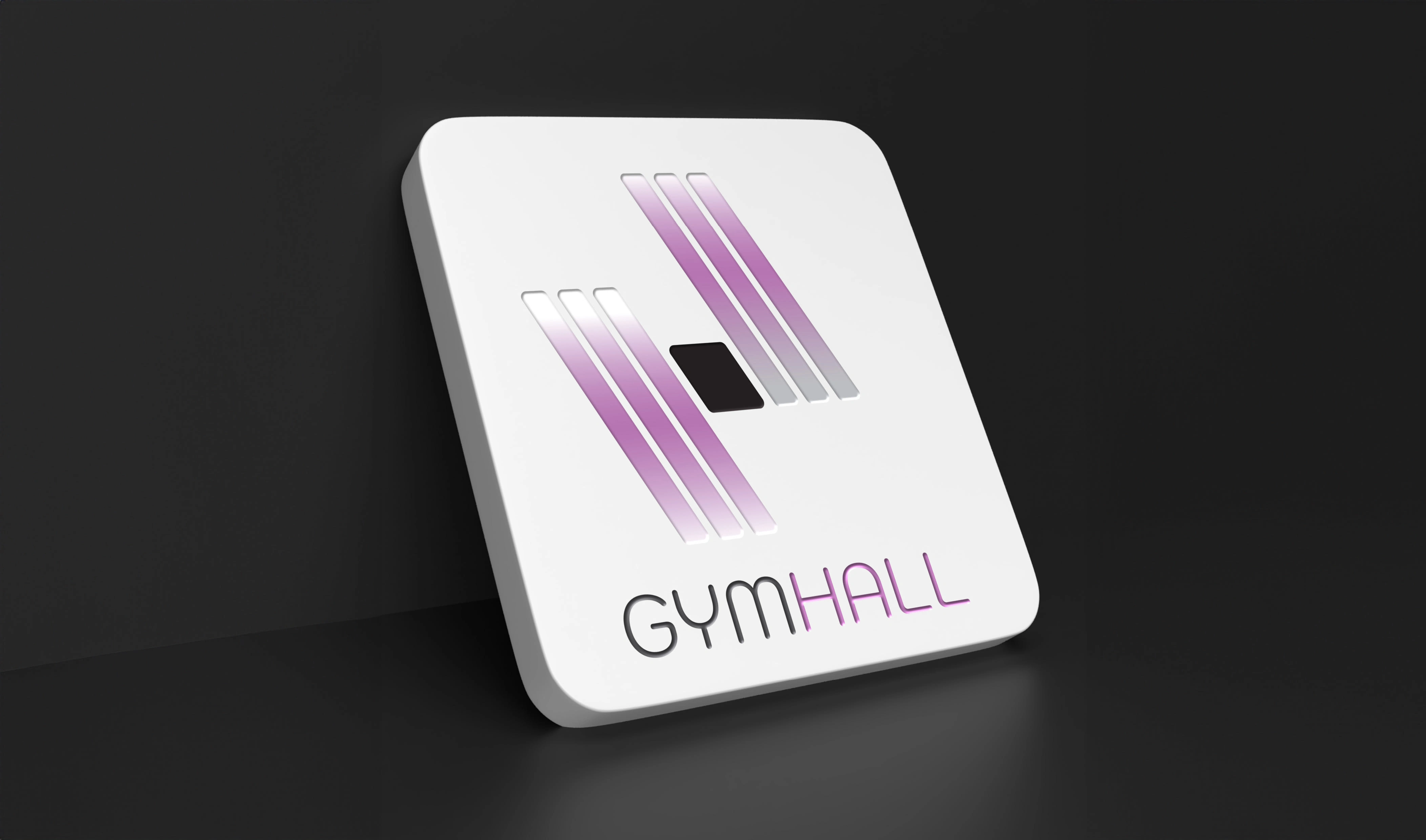
The GYMHALL logo is inspired by the design of a dumbbell, with three vertical lines on either side of the central axis that bend elegantly to the left, creating a unique and personalized touch.
To provide stability and balance, an elegant rhomboid represents the central axis, distinguishing the logo from a conventional dumbbell representation. The strategic position of the three-line dumbbell on the right side, starting from the rhomboid upwards, enhances the originality and ensures a distinctive identity of the Gymhall emblem.

Like this project
Posted Feb 28, 2024
GYMHALL is a premier chain of gyms aiming to enhance the fitness experience.
Likes
0
Views
0


