TL REAL ESTATE
TL Real Estate stands as a prominent real estate agency located in Madrid. Our project began with a clear directive: create a logo that represented the letters LT on a background infused with architectural elements, harmonized with two unique colors: a hot pink (#ed177b) and a black or grayscale tone. Presented with a choice of four different logos, the owner found resonance with two designs in particular. After careful consideration, the client sought a perfect fusion: merging the LT emblem from the first logo with the design of the second without the sun. In response to this directive, I meticulously incorporated the LT motif from the initial design into the second, culminating in the creation of the official logo shown in the image below.
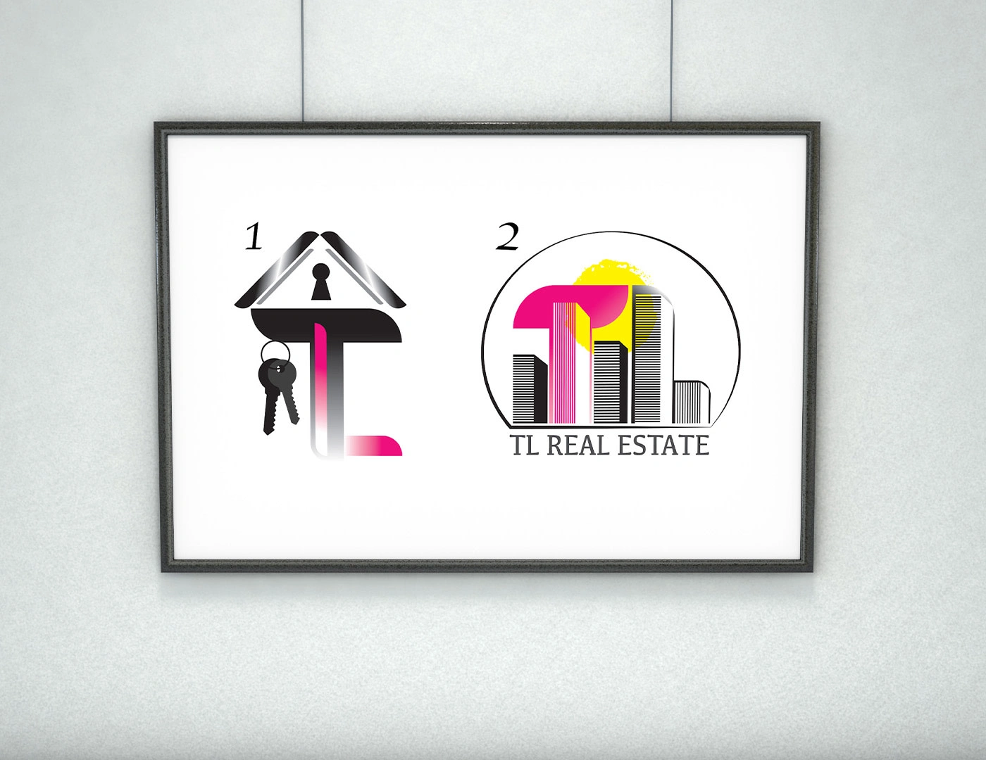
Inicial logos

Official Logo

Sign

Office 3D
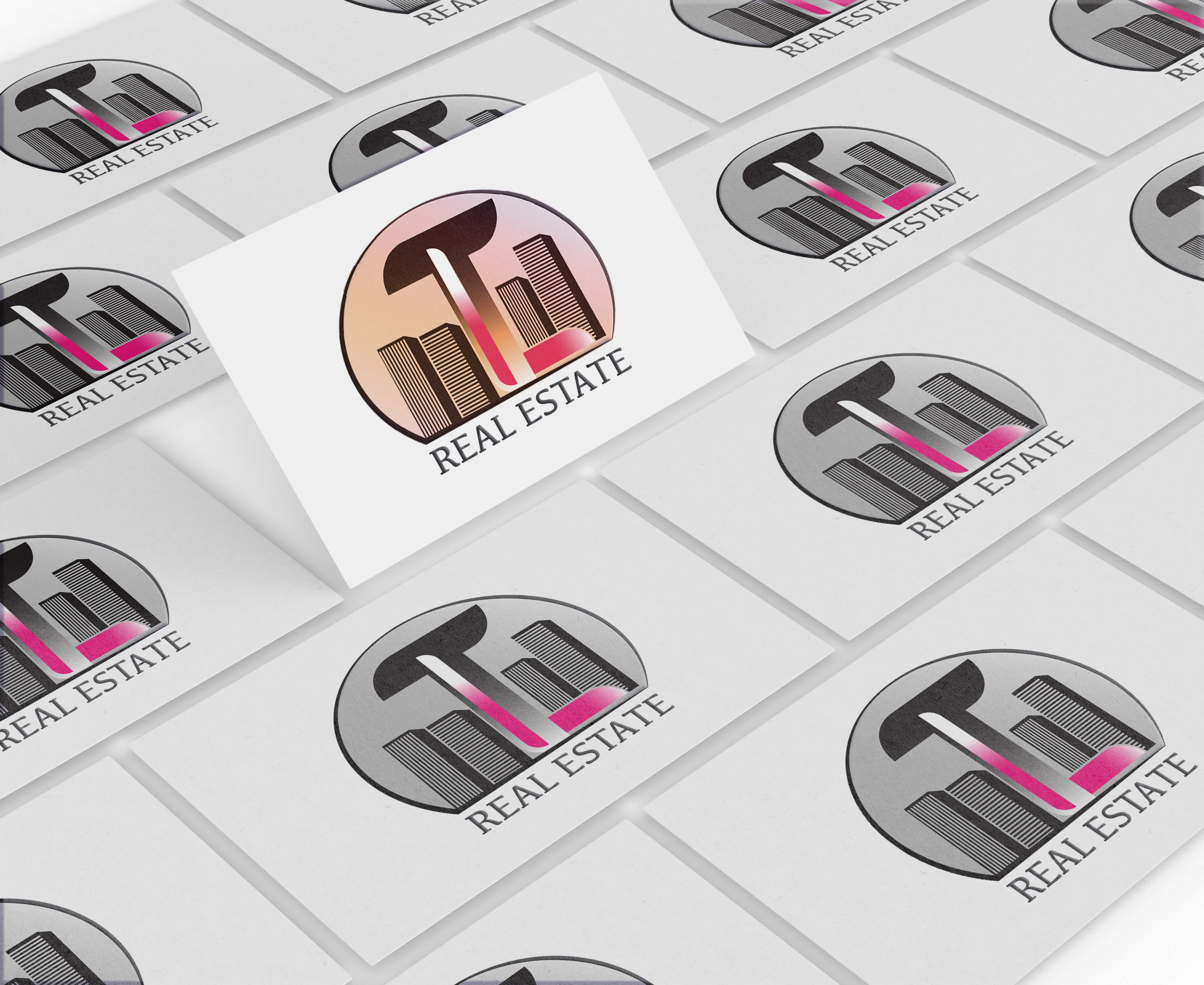
Background color alternative
Like this project
Posted Feb 29, 2024
TL Real Estate stands as a prominent real estate agency located in Madrid. Our project began with a clear directive: create a logo that represented the letters
Likes
0
Views
0


