Built with Framer
Boutique Event Brand and Website Design
MONO BO
Boutique events organizer Branding and Website design and development
Project Requirements & Background
When the client approached me, her ambition was clear: to create a luxury event brand that welcomes everyone. She wanted every client to feel special, regardless of their background or budget, embodying the belief: “Luxury is for everybody, and everyone is my client.” Something had to e done for this big idea.
The Transformation Story
We started by diving into the client’s aspirations. With no clear direction and only a spark of an idea, I guided the process—exploring their values, visual inspiration, and the emotions they wanted their brand to evoke. Through research, interviews, and moodboards, I mapped a narrative that would shape every design decision.
Logo Evolution
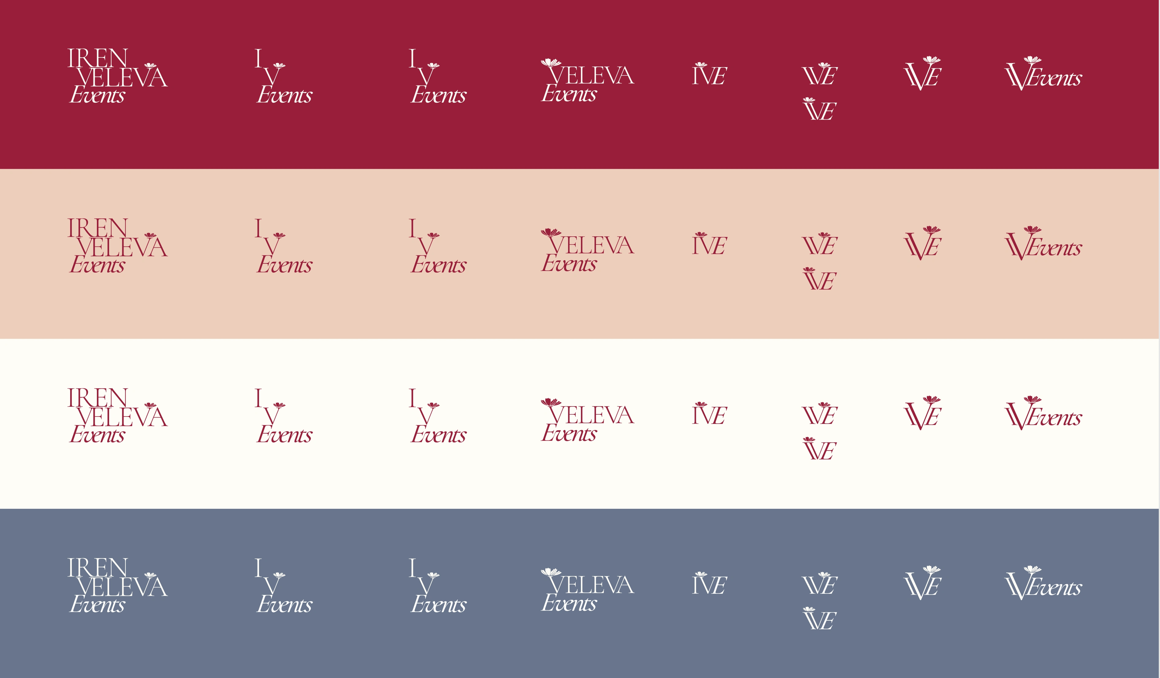
The brand’s journey began with an initial logo—a simple, gold design chosen to symbolize luxury and exclusivity. While the gold color aimed to convey a sense of refinement and aspiration, the mark itself lacked distinctiveness and didn’t fully capture the inclusive spirit at the heart of the client’s vision.
Another issue was for an English logo the letters IV I.V. might have bad connotations like IV moments in the medical usage.
initial logo
It was clear that the logo needed to go beyond conventional luxury tropes—transforming from a generic symbol into a bespoke, memorable emblem that would invite all clients to feel welcome and valued, while still projecting sophistication and premium quality.
Brand Identity Development
_client did not choose this representation
cover and back cover with the introduction rpesentation of the brand image
Detail of the initial brand strategy with the different logo usages and a typography set with a color palette that fits the big idea, think saint tropez events with champagne and yacht clubs
From color palettes to typography, every element was selected to foster emotional connection and visual harmony. The new identity expresses sophistication, inviting curiosity and trust. I created a suite of graphics and guidelines to ensure consistency across all touchpoints.
Second logo attempt
_was a complete 180 from the initial approach but it was the chosen one for it s feminine and intimate style,
variants of the second attempt
setteled on this at first
few inspired applications
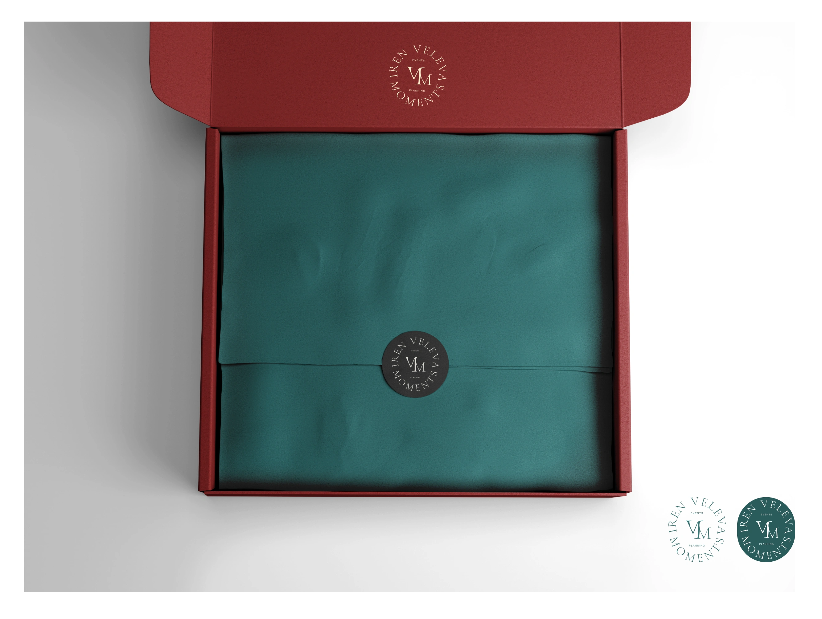
a pre wedding bridal package design
Third logo attempt
-was yet another palette change and the final image is starting to be set
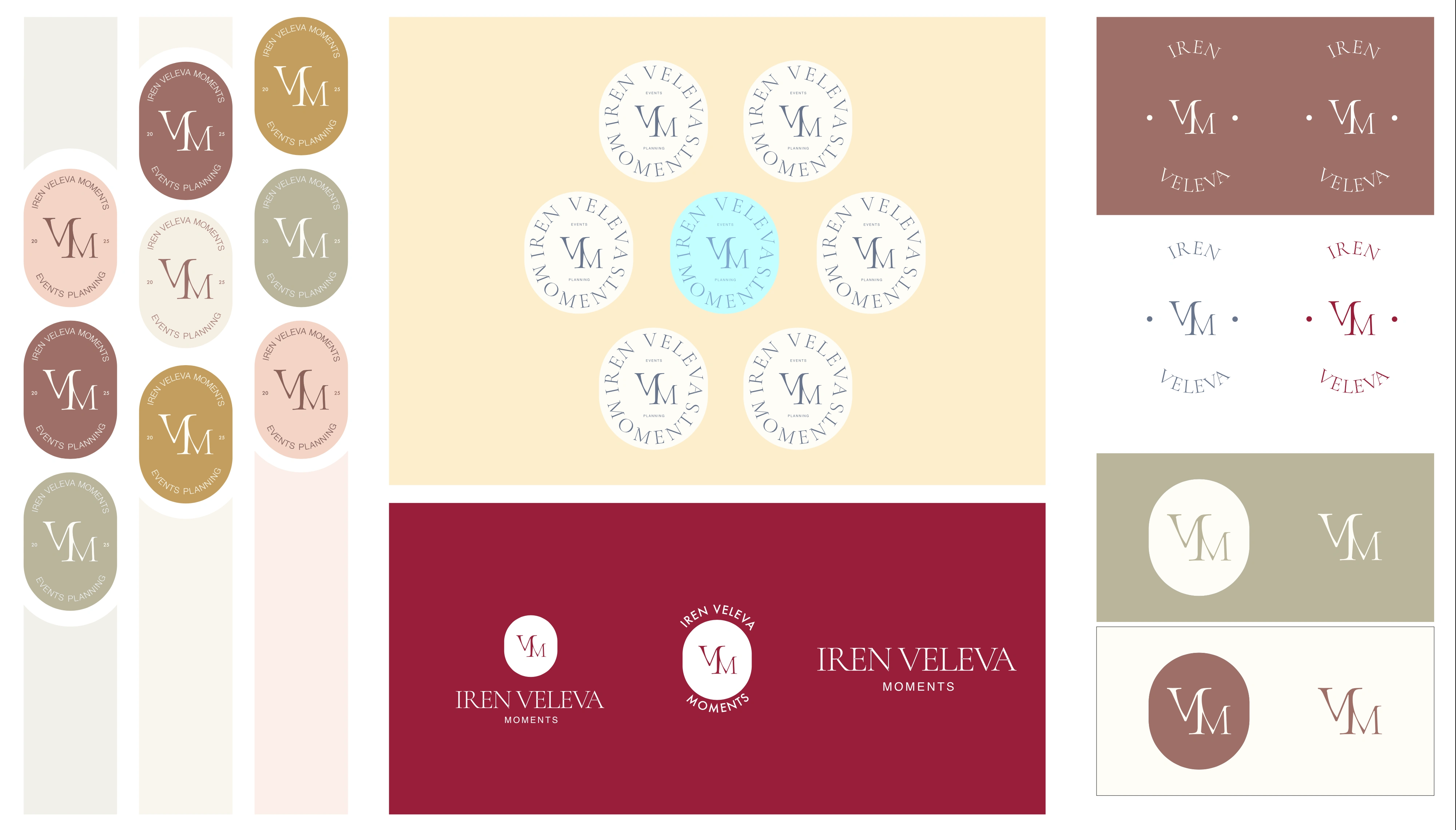
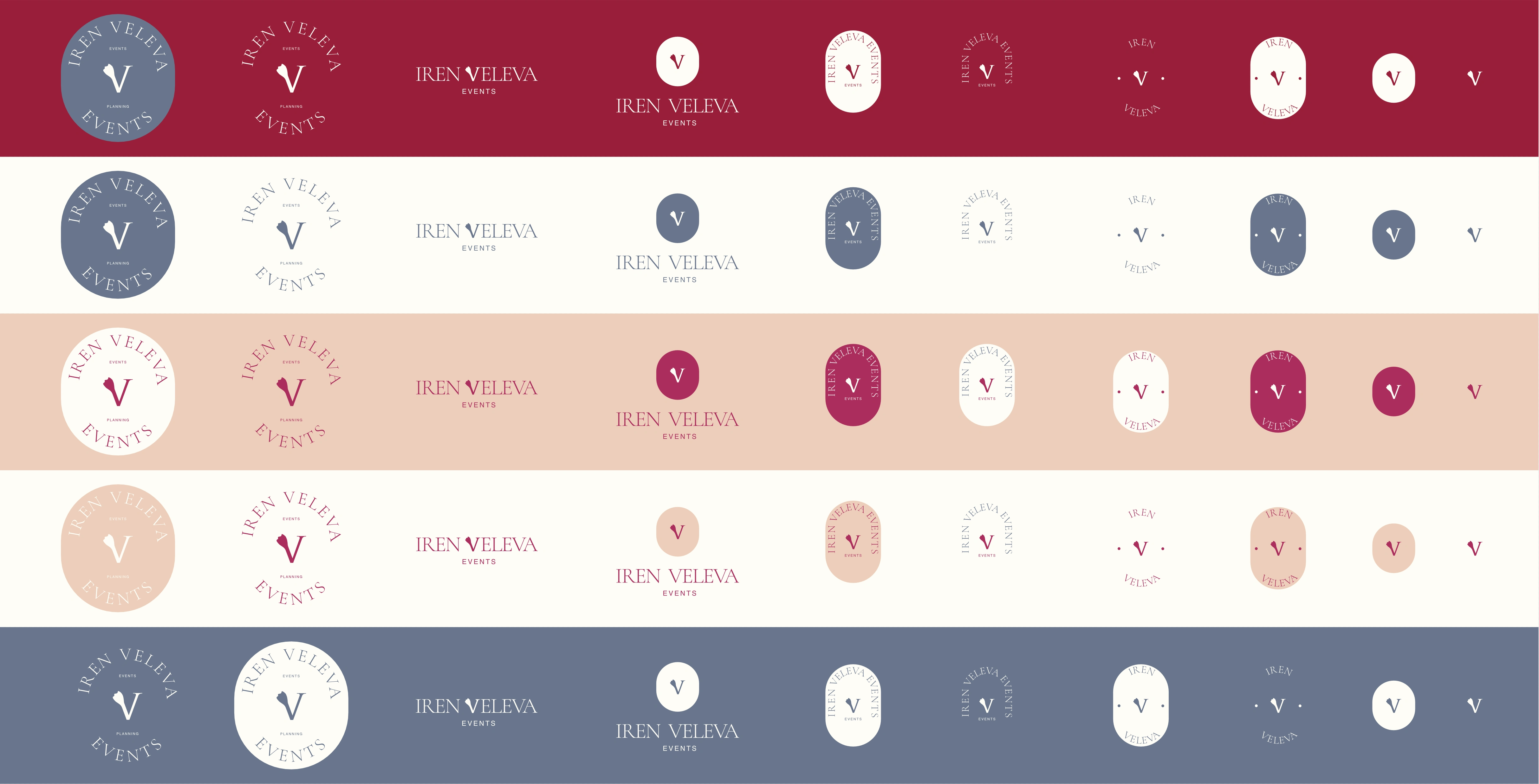
Fourth attempt and final logo
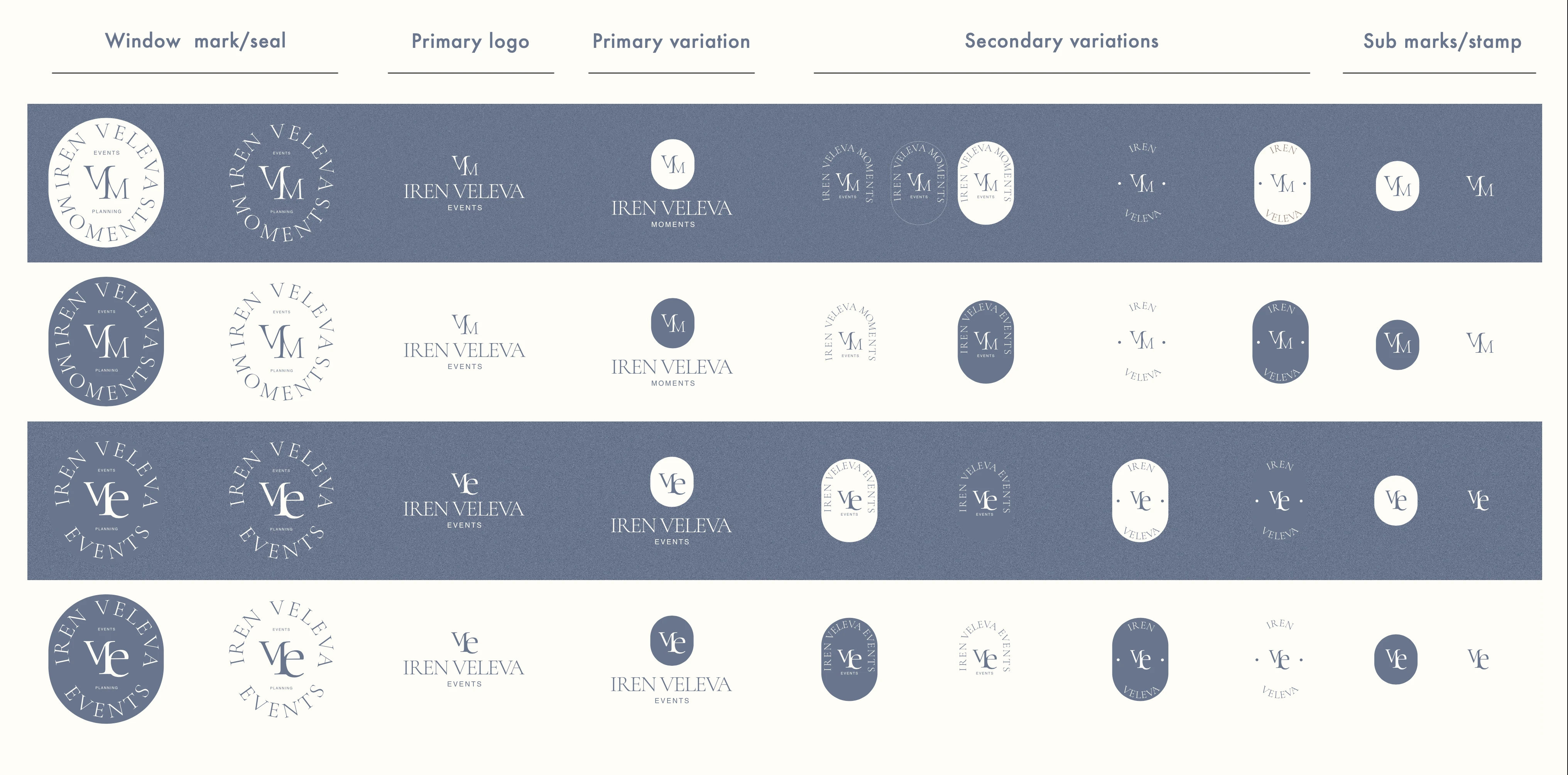
-went back to the previous model with slight changes to the icons and the subtle V beautifucation This is not a regular Logo implementation but the reason for the multitude of variants in the logo is for choice and especially the choice for print and embossing as the business would lean heavily on decorations and signage and card and packaging and all of these wedding or small events invitaitons and accessories that make the event thematic we took the decision to have the logo have the ability to be presented in many conditions and many materials and themes.
The different background colors are for the best suited color match of backgrounds for photos and graphcis so the business can have a coherent social media and other presence and have a littel guideline to stay in line with it s colors and charts.
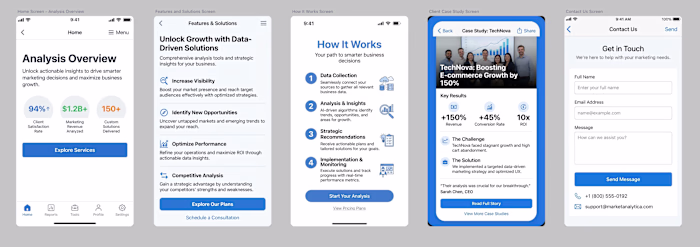
Website Design & Implementation

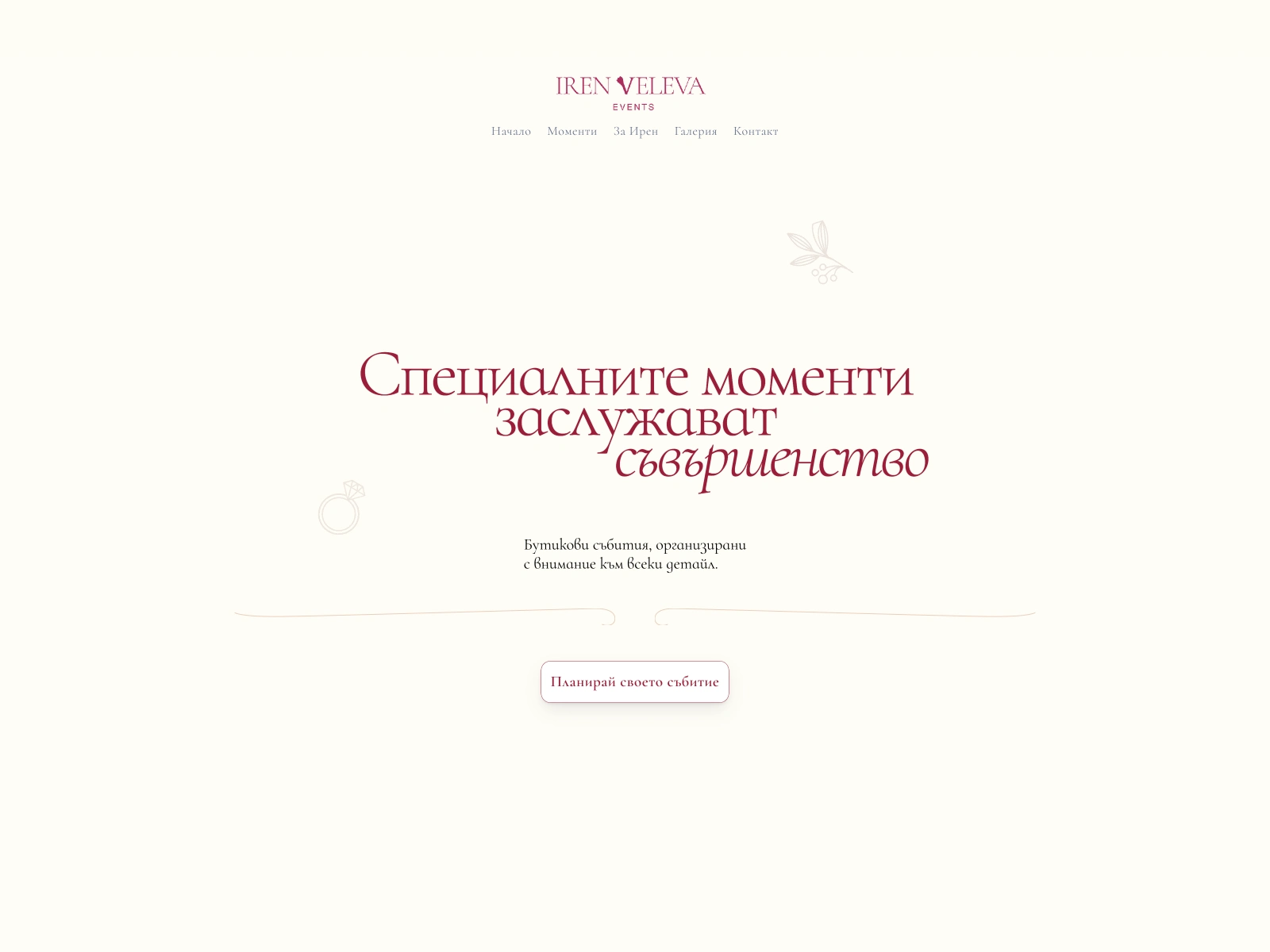
Chosen main logo
With the identity in place, I crafted a tailored website—balancing elegant visuals with a seamless user experience. Each section was purpose-built to communicate the brand’s story, showcase services, and convert visitors into booked clients. Responsive layouts and thoughtful animations bring the brand to life on any device.
The site is pretty simple as a landing page to start the business with a recall after several months work for restructure to include the current work and adjust the layout to fit more pages and more services after proof of concept let's say.
The background is a soft powder rose or pink, with the deep rose red aas the main character, it keeps it unique elegant and intimate, three features of what is called boutique luxury.
Animations were kept subtle, notably in the main header text the welcome message, the services and the form is the actual feature that brings it together, i chose to have a text on circle shape ritating 260 continuously but the choice of typeface is the key to the result, the unbalanced handwriting style version of cormorant made the arc have the feel of an evergreen wreath, representing life, renewal, and the hope. Neet around a contact formm might remind customers of xmas when they re about to send a letter...
Results & Client Success.
Within days of launch, the brand secured its first real world client—proving the impact of a focused, narrative-driven approach. Client feedback has been overwhelmingly positive, with the new identity sparking genuine excitement and opening doors to new opportunities.
Like this project
Posted Oct 1, 2025
Created a luxury event brand and website, securing first client quickly.
Likes
1
Views
8
Timeline
Aug 8, 2025 - Sep 19, 2025