Built with Framer
Boutique Luxury Website Design for Iv moments
MONO BO
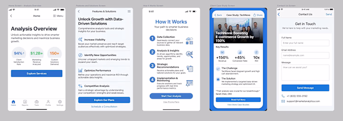
With the identity in place, I crafted a tailored website, balancing elegant visuals with a seamless user experience. Each section was purpose-built to communicate the brand’s story, showcase services, and convert visitors into booked clients. Responsive layouts and thoughtful animations bring the brand to life on any device.
The site is pretty simple as a landing page to start the business with a recall after several months work for restructure to include the current work and adjust the layout to fit more pages and more services after proof of concept let's say.
The background is a soft powder rose or pink, with the deep rose red aas the main character, it keeps it unique elegant and intimate, three features of what is called boutique luxury.
Animations were kept subtle, notably in the main header text the welcome message, the services and the form is the actual feature that brings it together, i chose to have a text on circle shape rotating 360 continuously but the choice of typeface is the key to the result, the unbalanced handwriting style version of cormorant made the arc have the feel of an evergreen wreath, representing life, renewal, and the hope.
Around a contact form might remind customers of xmas when they're about to send a letter...Results & Client Success.
Within days of launch, the brand secured its first real world client, proving the impact of a focused, narrative-driven approach.
Client feedback has been overwhelmingly positive, with the new identity sparking genuine excitement and opening doors to new opportunities.
If you like to have an experience like Iren building your personal brand in the most boutique way and personal outcome, this is what i do!
Like this project
Posted Oct 28, 2025
Crafted a tailored website for Iren, enhancing brand identity and user experience.
Likes
0
Views
2