Built with Webflow
#1 Webflow & Design Agency for B2B & B2C Brands
Overview
The Vector Box is a design agency specializing in creating remarkable user experiences through innovative web design and development, primarily using Webflow. As a growing agency looking to set itself apart in a competitive market, The Vector Box decided to embark on a full branding and website redesign to better reflect its creative expertise, values, and core offerings. The main goals were to elevate brand perception, optimize the user experience, and communicate the agency's services effectively to both B2B and B2C clients.
Objectives
Reinforce the brand identity: Establish a strong, consistent visual identity that reflects the agency's creative and modern approach.
Improve user experience: Simplify navigation, enhance accessibility, and streamline the browsing experience to ensure visitors can easily understand the services offered.
Showcase expertise: Highlight The Vector Box's capabilities in Webflow development, no-code/low-code solutions, and custom design.
Drive engagement: Encourage prospective clients to connect and initiate projects, improving conversion rates.
Approach
1. Branding & Visual Identity
We started by reimagining the brand's visual identity, focusing on a bold, strong, and modern aesthetic. The new branding needed to convey creativity while maintaining a sense of reliability for clients across different industries. We revamped the logo, color palette, typography, and imagery to better align with the agency's vision.
Logo Update: We refined The Vector Box logo, giving it a more sleek and contemporary look while ensuring it remained recognizable.
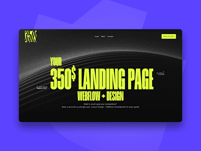
Color Palette: The chosen color scheme included dark tones with vibrant, contrasting accents to attract and engage new users, particularly SaaS startups and B2B businesses. The colors were selected to convey energy, creativity, and boldness while evoking trust and professionalism.
Typography: We used bold, strong, block-style typefaces to give a powerful, new-generation vibe. This typography choice was designed to be visually engaging and create a consistent, confident look across all devices.
2. Website Re-Design
With the branding refreshed, the next step was redesigning the website to be more user-friendly, visually appealing, and conversion-focused. The Webflow platform was used to its full potential, allowing us to create a fully responsive, high-performance website.
Homepage Experience: The homepage was designed to immediately capture attention, showcasing The Vector Box's services and portfolio with bold visuals and impactful messaging. We created sections that clearly communicate what sets the agency apart, focusing on its no-code/low-code capabilities.
Contact & Conversion Focus: A prominent call-to-action was included across the site, encouraging users to get in touch. Forms were streamlined to reduce friction in the conversion process.
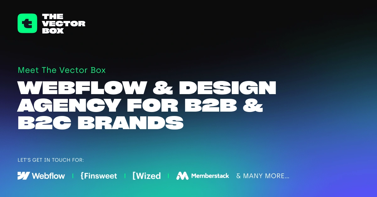
OG Image Banner
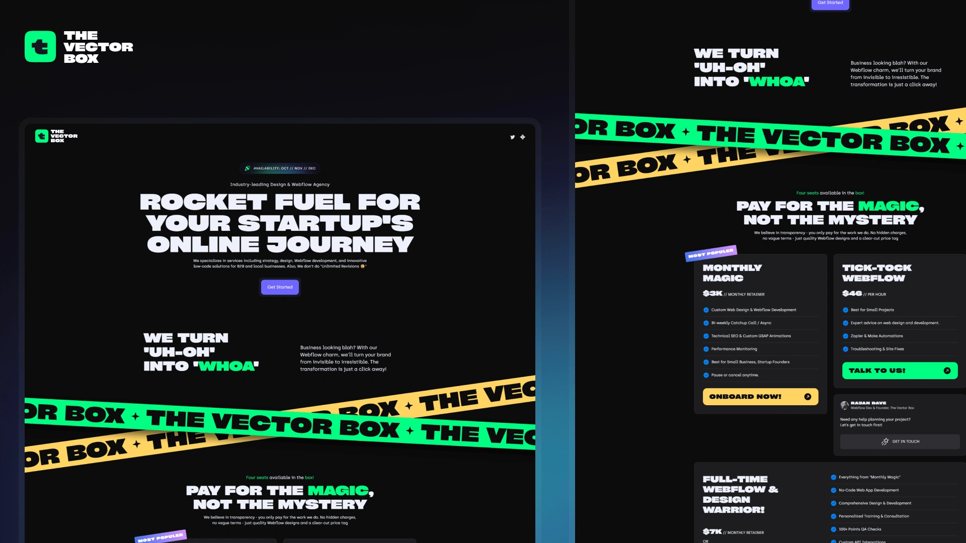
Landing Page
3. Webflow Development
Using Webflow, we developed a custom, fully responsive site that was optimized for speed and performance. The website was designed with scalability in mind, ensuring that future additions and modifications could be made easily without compromising on quality.
Animations & Interactions: Subtle animations and interactions were incorporated to create a dynamic browsing experience that highlights the agency's capabilities.
SEO Optimization: On-page SEO was prioritized to help improve search engine rankings and drive organic traffic, targeting keywords relevant to the no-code and Webflow development community.
Marketing & Socials
Contra Covers
Contra Covers

Social Media Posts
Results
Enhanced Brand Perception: The rebranding and redesign helped establish The Vector Box as a cutting-edge agency capable of delivering high-quality design and development solutions.
Improved User Engagement: Website analytics showed a significant decrease in bounce rate and an increase in time spent on pages, indicating improved user engagement.
Higher Conversion Rate: The optimized calls-to-action and intuitive navigation led to a noticeable increase in inquiries from prospective clients.
Recognition in the Industry: The revamped website has not only helped attract new clients but also gained recognition among peers in the Webflow and design community.
Conclusion
The branding and re-design project for The Vector Box successfully met its objectives by creating a bold, visually compelling, and functional website that truly represents the agency's expertise. By aligning the brand’s visual identity with its core values and optimizing the online experience, The Vector Box now stands out in the competitive world of creative design and Webflow development.
Visit the redesigned site:
Like this project
Posted Oct 8, 2024
At The Vector Box, we empower B2B and B2C clients with tailored no-code and low-code solutions to drive business growth.
Likes
0
Views
87
