Doughy Delicacies Visual Identity and Packaging Design Project
The Brief: Welcome to Doughy delicacies, where our artisanal donuts are lovingly crafted to bring joy to your taste buds and a smile to your face. From classic glazed rings to imaginative flavor fusions, each creation is a testament to our passion for perfection. Step into a world of irresistible treats at Doughy Delicacies and experience the joy of donuts done right.
The Creative Process: This was by far one of my favourite project to work on as the primary logo design inspired creative possibilities for the other areas within the visual identity. The primary logo consisted of a dougnut illustration, along with the brand name, founding year and slogan. I utilised the swirls from the donut illustration to integrate them into the letter D in Doughy Delicacies, allowing the brand to have a more creative and custom type design.
While playing around with the rotation of the customised type of the letter D, I noticed that as a filled object, it’s works as a valuable asset when combined with other visual elements. As a result, I combined the donut illustration with the filled object behind the design, making it a recogniseable and eye catching logomark on it’s own. This logomark also inspired me to experiment utilising it as a repeating pattern on the brand’s packaging design.
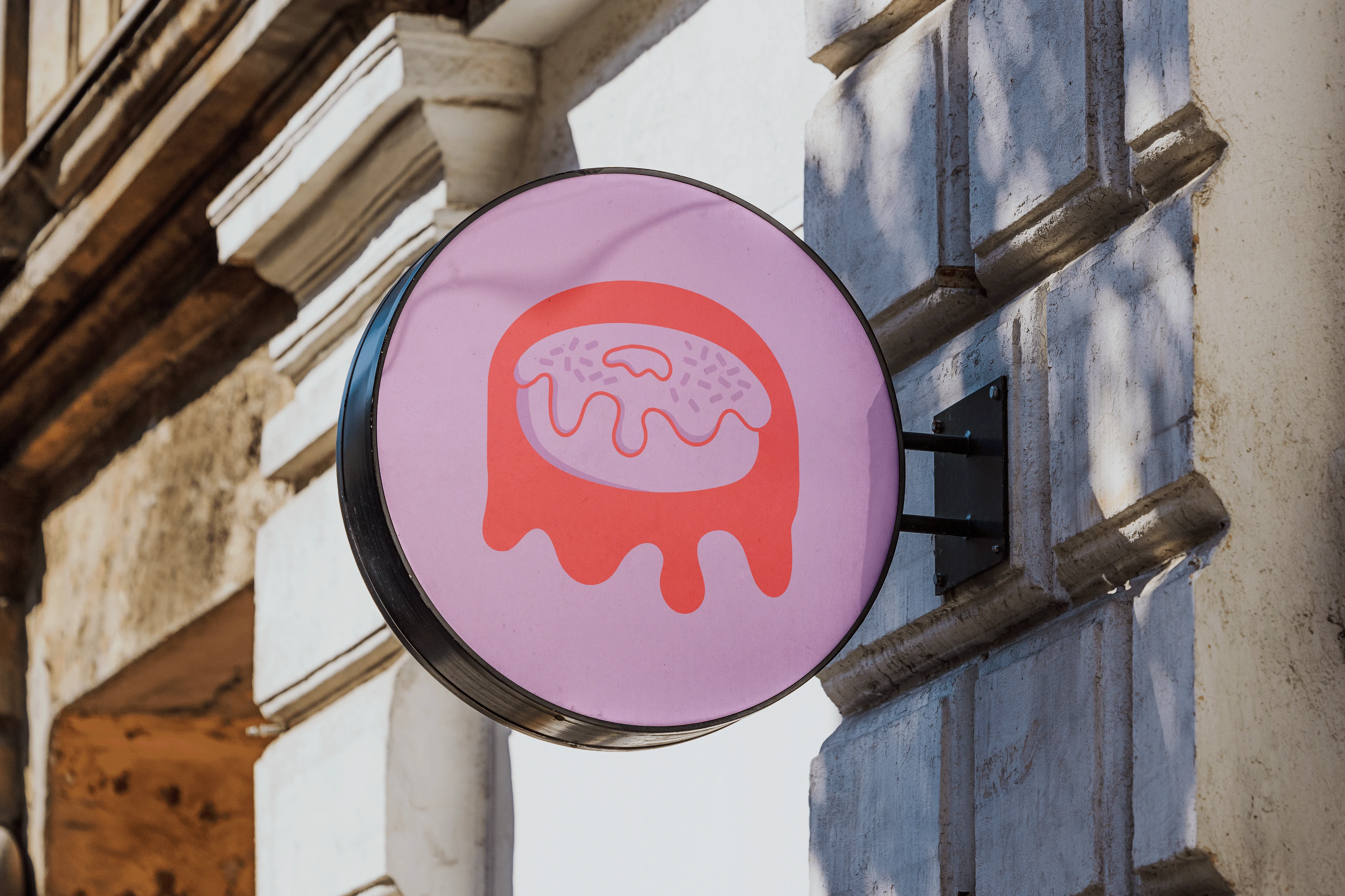
Signboard Design
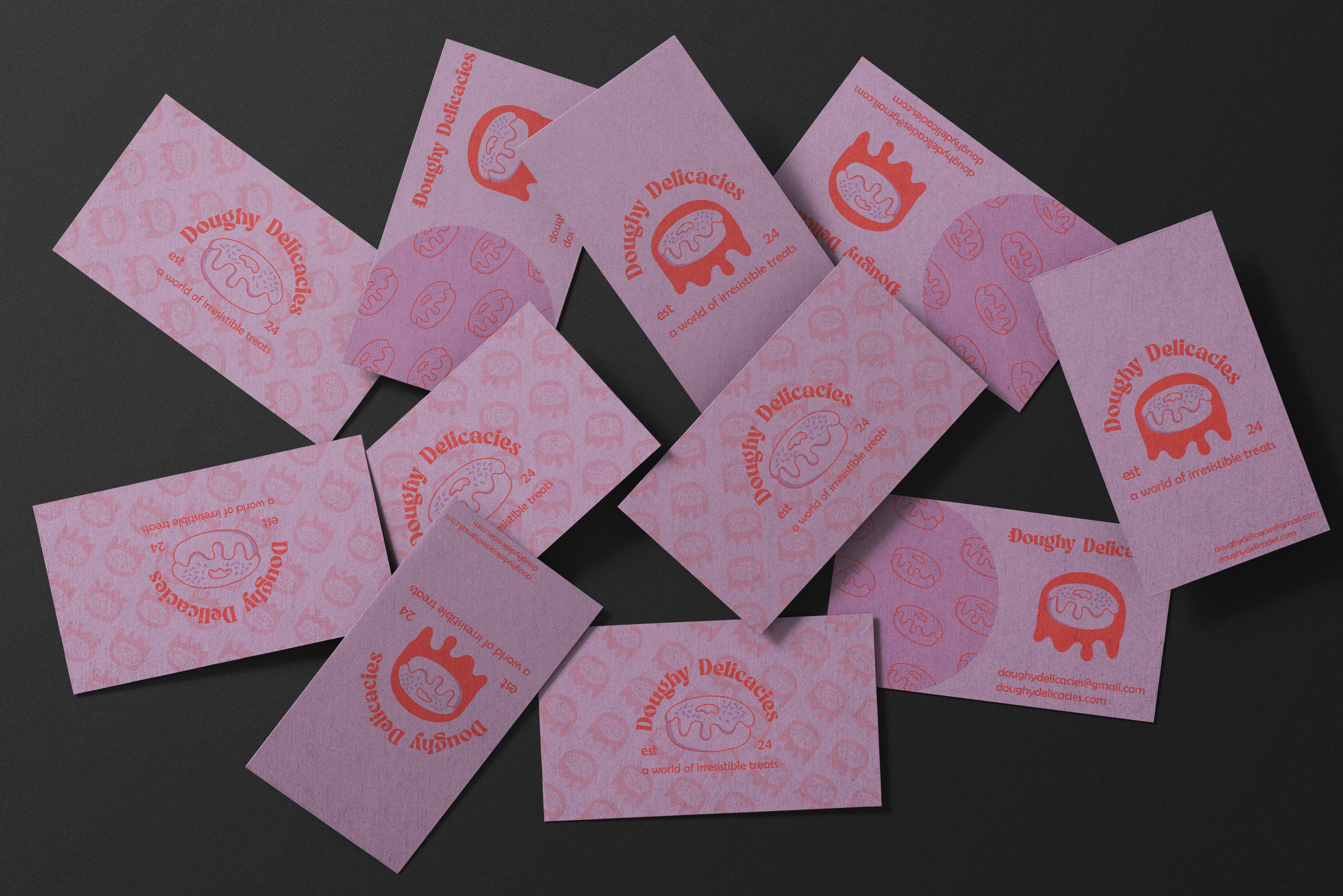
Scattered Business Card Design
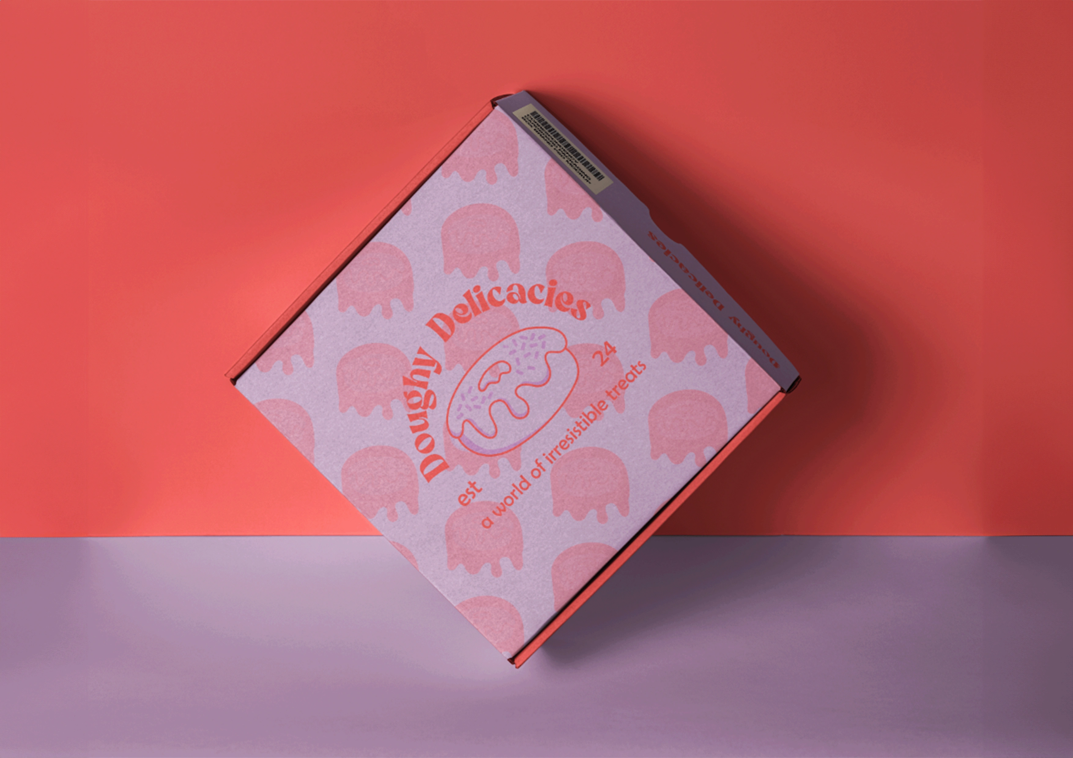
Packaging Design
Like this project
Posted Jul 21, 2024
Doughy Delicacies crafts artisanal donuts, blending classic and creative flavors to delight your taste buds and bring joy.

