MapLab Brand guidelines
PROJECT DETAILS
My role
Branding Designer, UI Designer
Team
MapLab
Tools
Figma, Affinity Designer, Google Suite, Miro and Notion
OVERVIEW
The MapLab brand guidelines include the following elements:
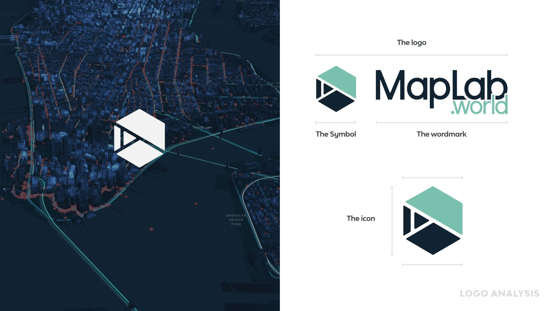
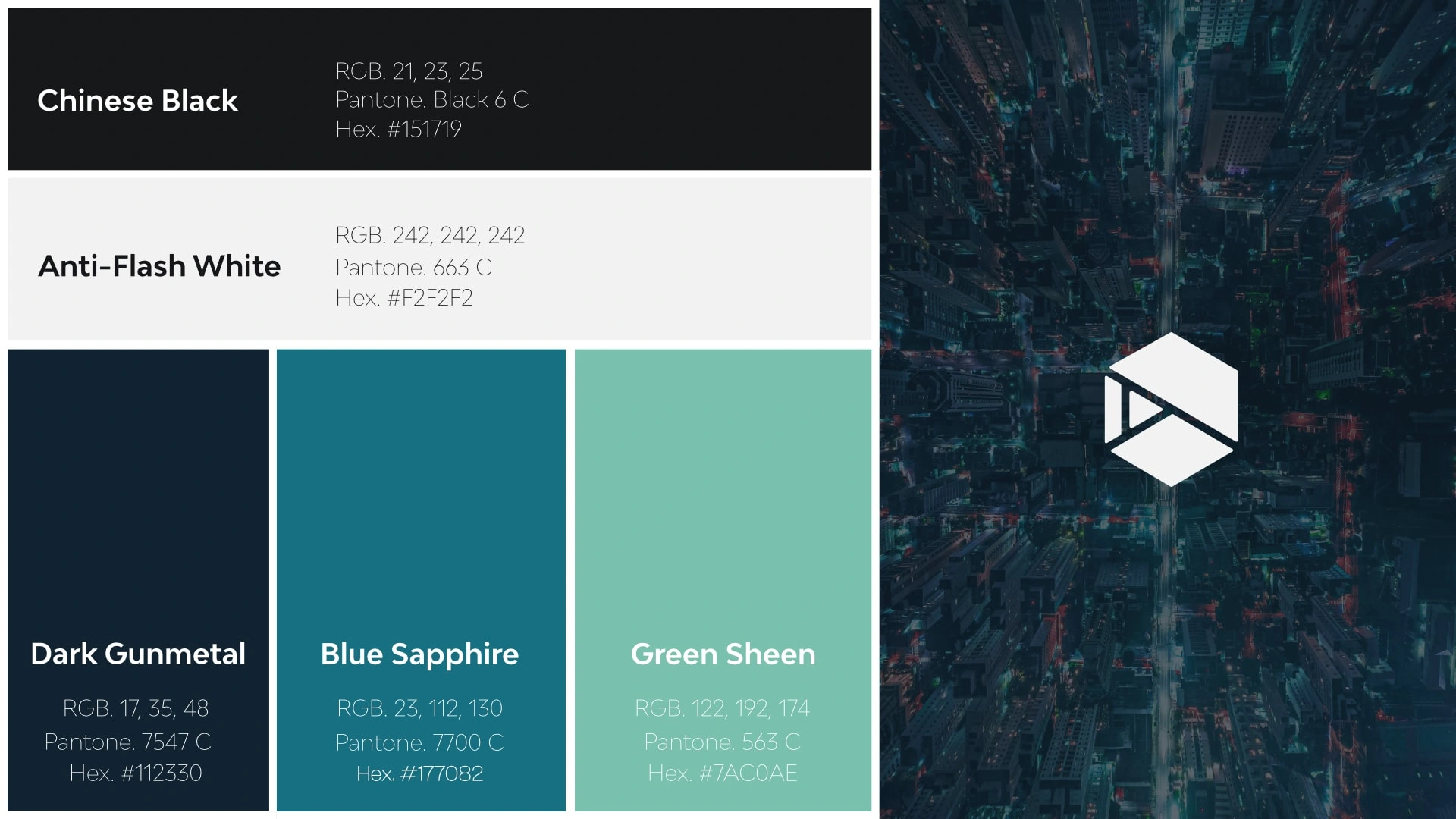
Brand identity: The brand identity for MapLab is based on the previous logo. The primary colour palette includes shades of blue and green, which are associated with maps and technology.
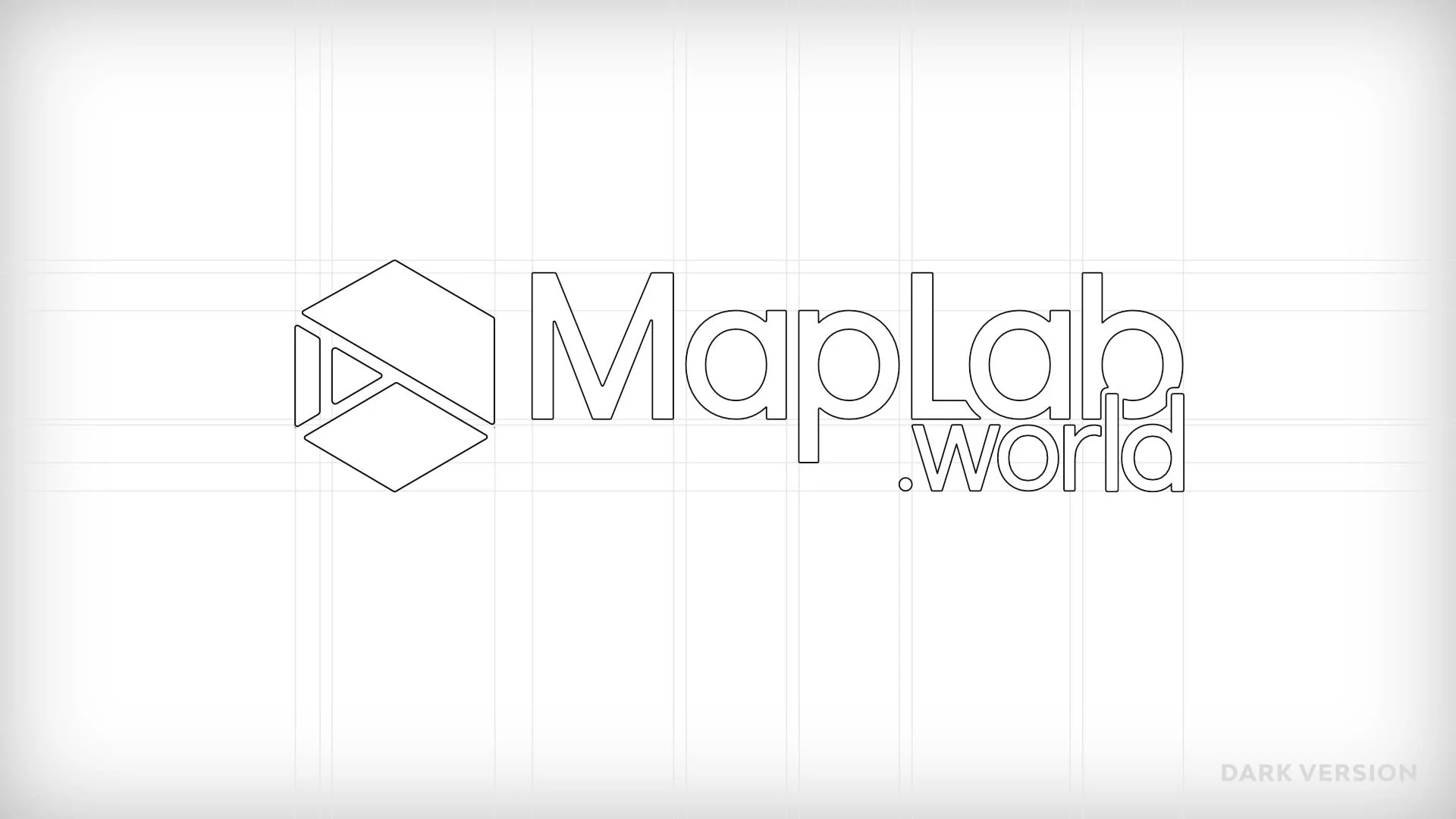
Logo guidelines: The MapLab logo should be used consistently across all media channels. The logo should not be modified or distorted in any way. The logo can be used in both horizontal and vertical formats, depending on the application.
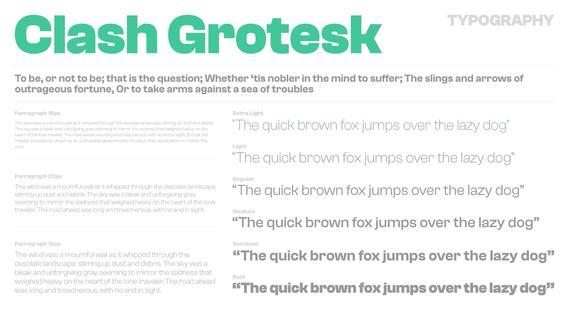
Typography: The primary typeface for MapLab is Clash Grotesk. This typeface should be used for all headings and subheadings. The secondary typeface is Open Sans, which should be used for body copy and other text elements.
Colour palette: The primary colour palette for MapLab includes shades of blue and green, which are associated with maps and technology. These colours should be used consistently across all media channels. The colour palette also includes secondary colours, which can be used for accents and highlights.
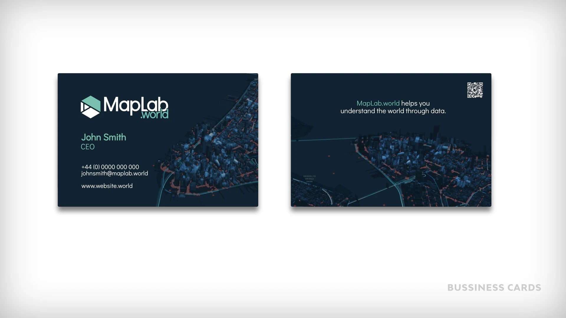
Usage guidelines: The MapLab brand guidelines include specific guidelines for how the brand should be used in different contexts. This includes guidelines for social media, website design, and print materials. The guidelines specify how the logo, typography, color palette, and imagery should be used in each context.
OVERVIEW
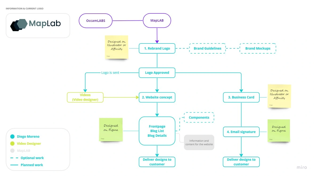
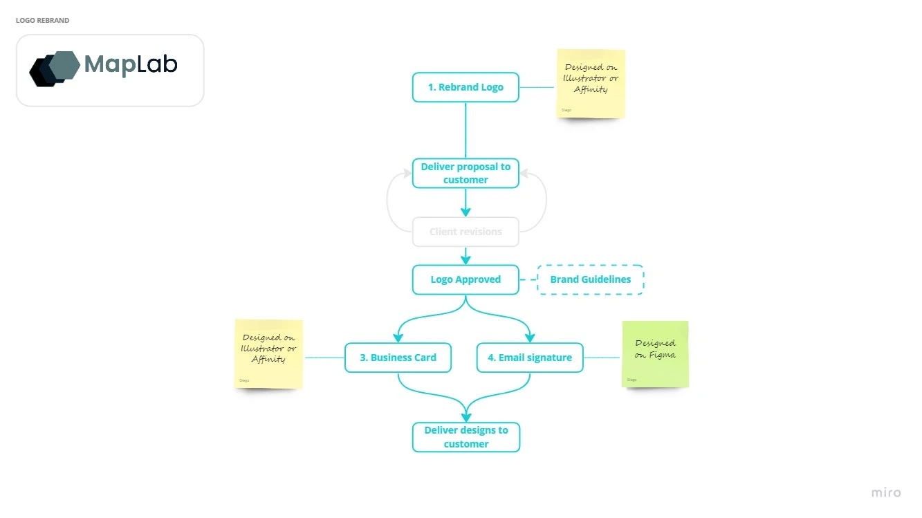
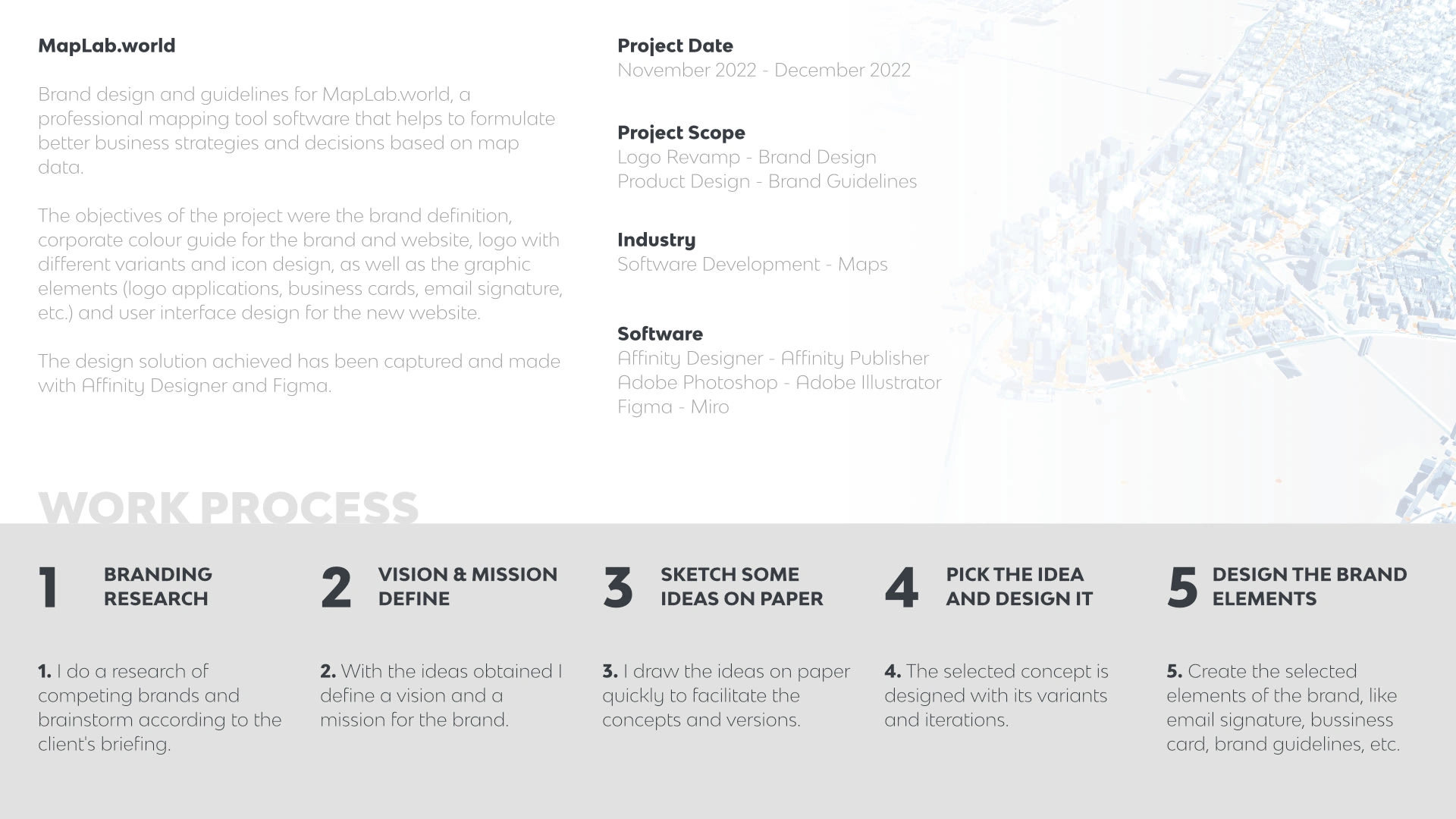
Development, planning and updating of the MapLab brand on a visual level, with logo, typography and colours. In addition, renewing its image, tone and brand identity by updating the colours related to the technology and the measurement of data on maps.



Like this project
Posted May 13, 2023
Development, planning and updating of the MapLab brand on a visual level, with logo, typography and colours.


