Heti Brand Identity & Packaging
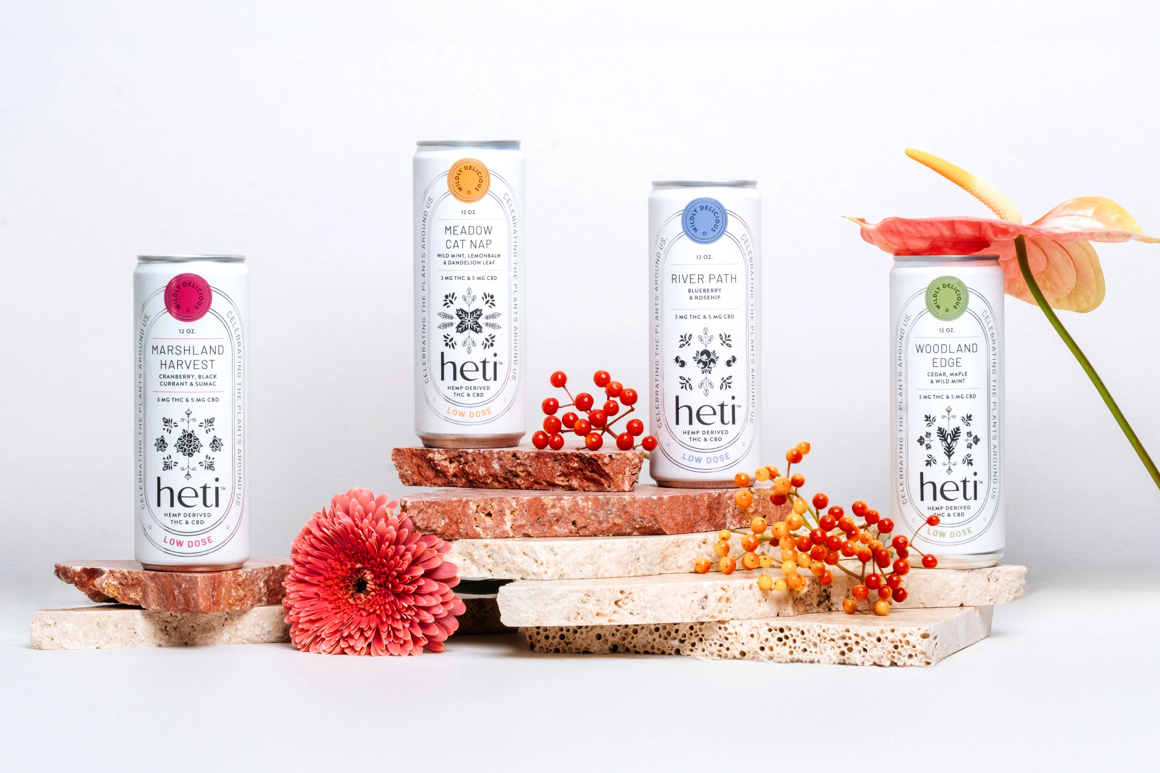
Celebrating the plants around us
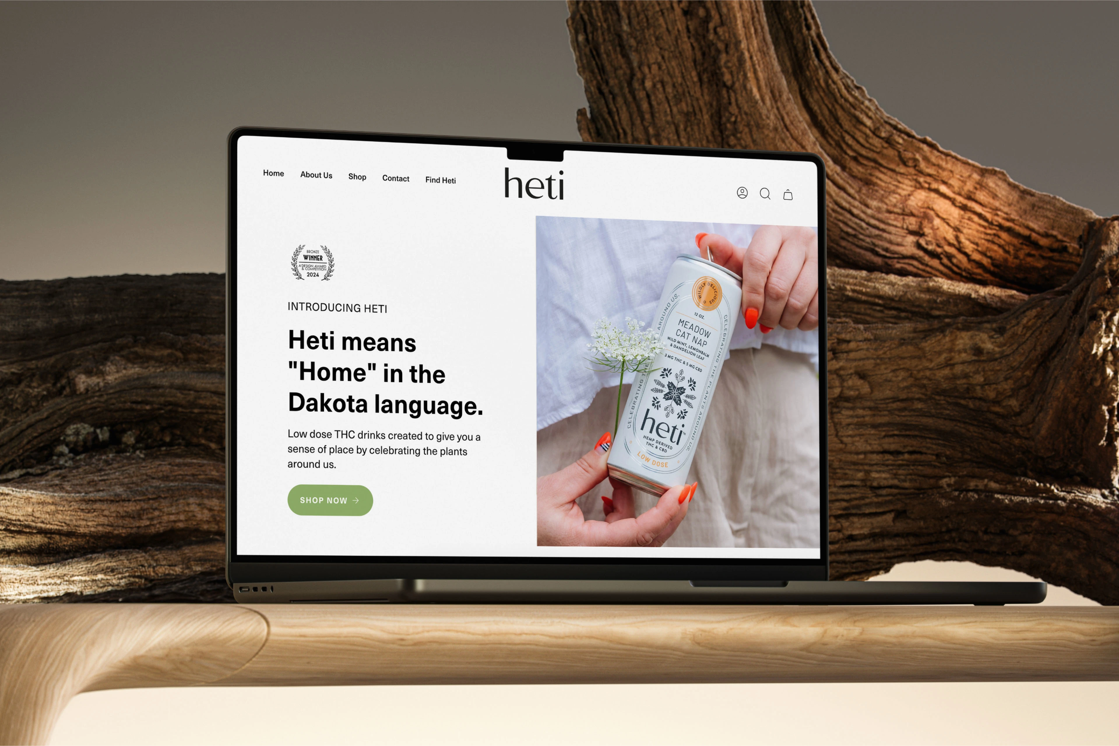
Heti means "Home" in the Dakota language and these beverages are lovingly designed to taste like the flavors of home. Introducing our Brand Identity and Packaging work for Heti, where we weaved the indigenous art spirit into a cohesive identity by seamlessly blending the traditional wisdom with contemporary design.
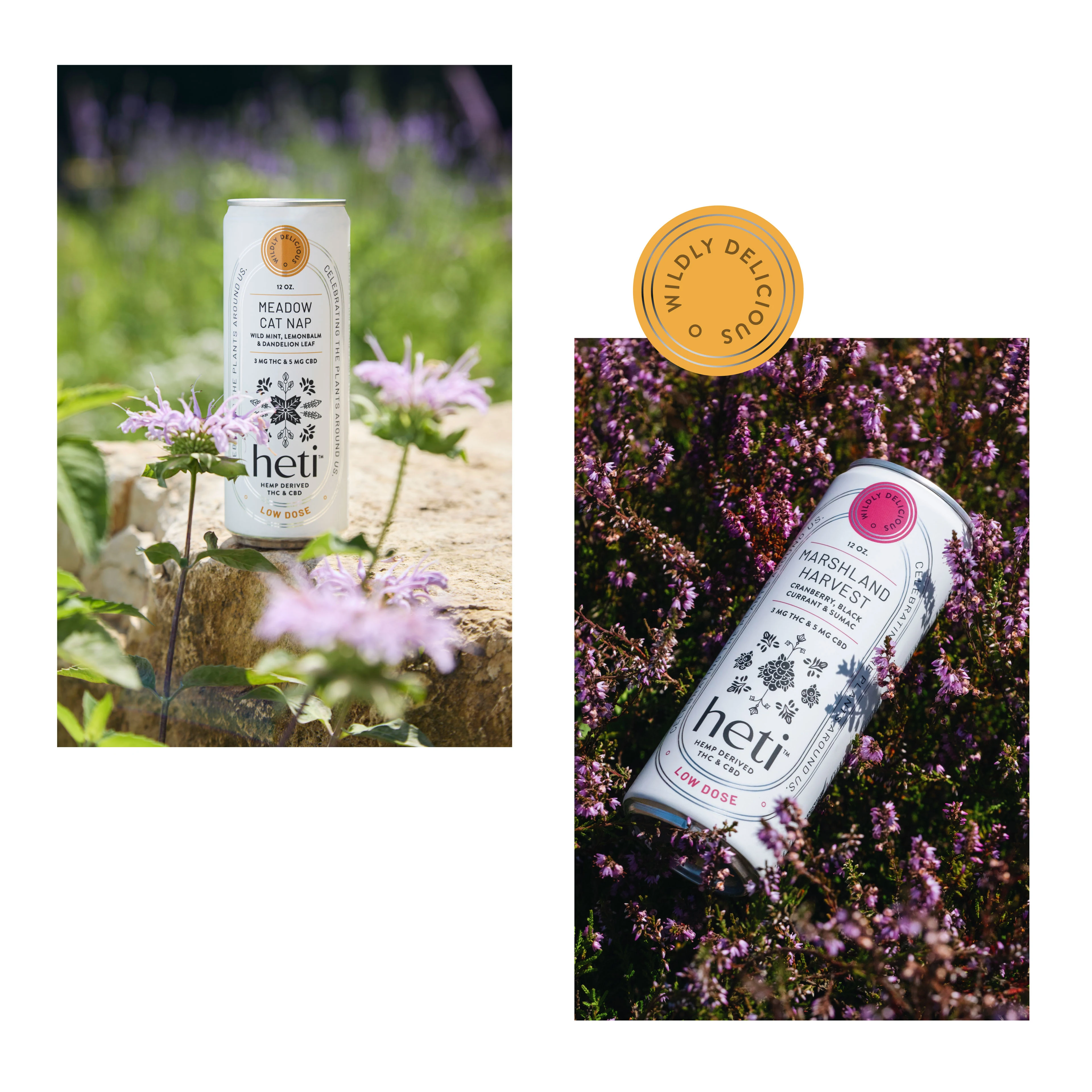
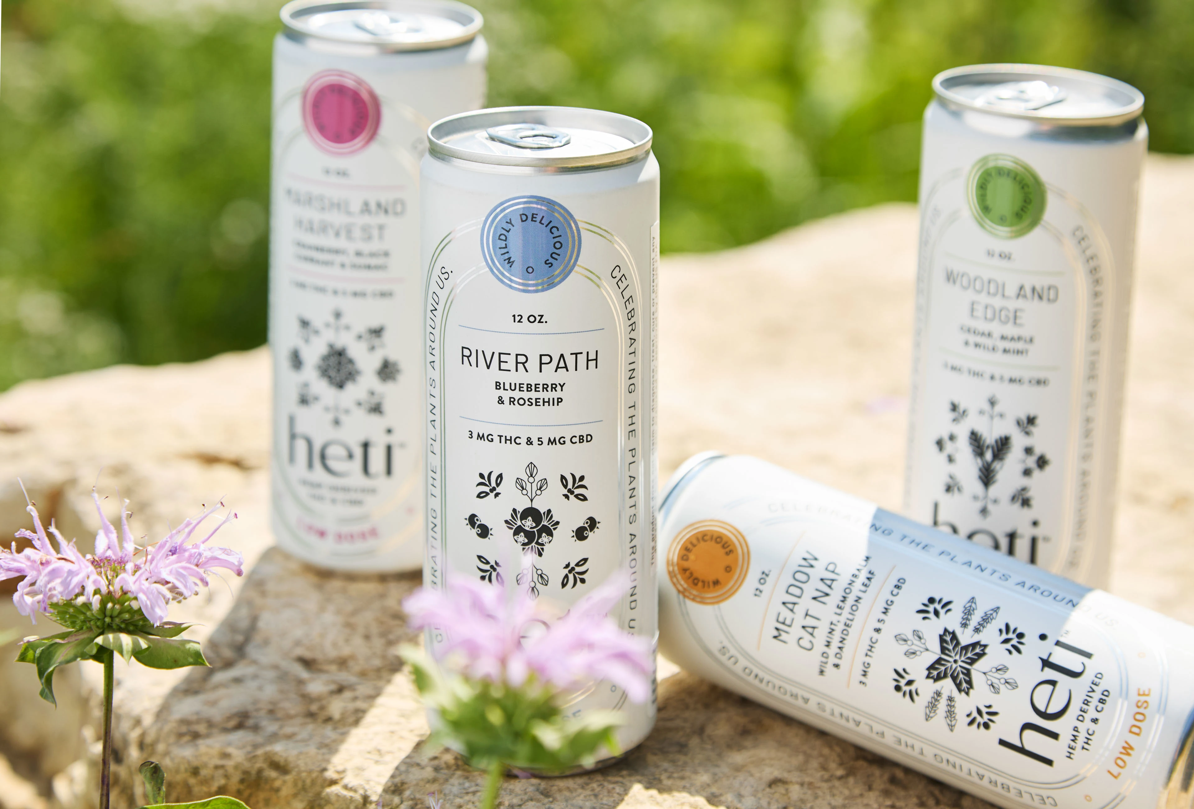
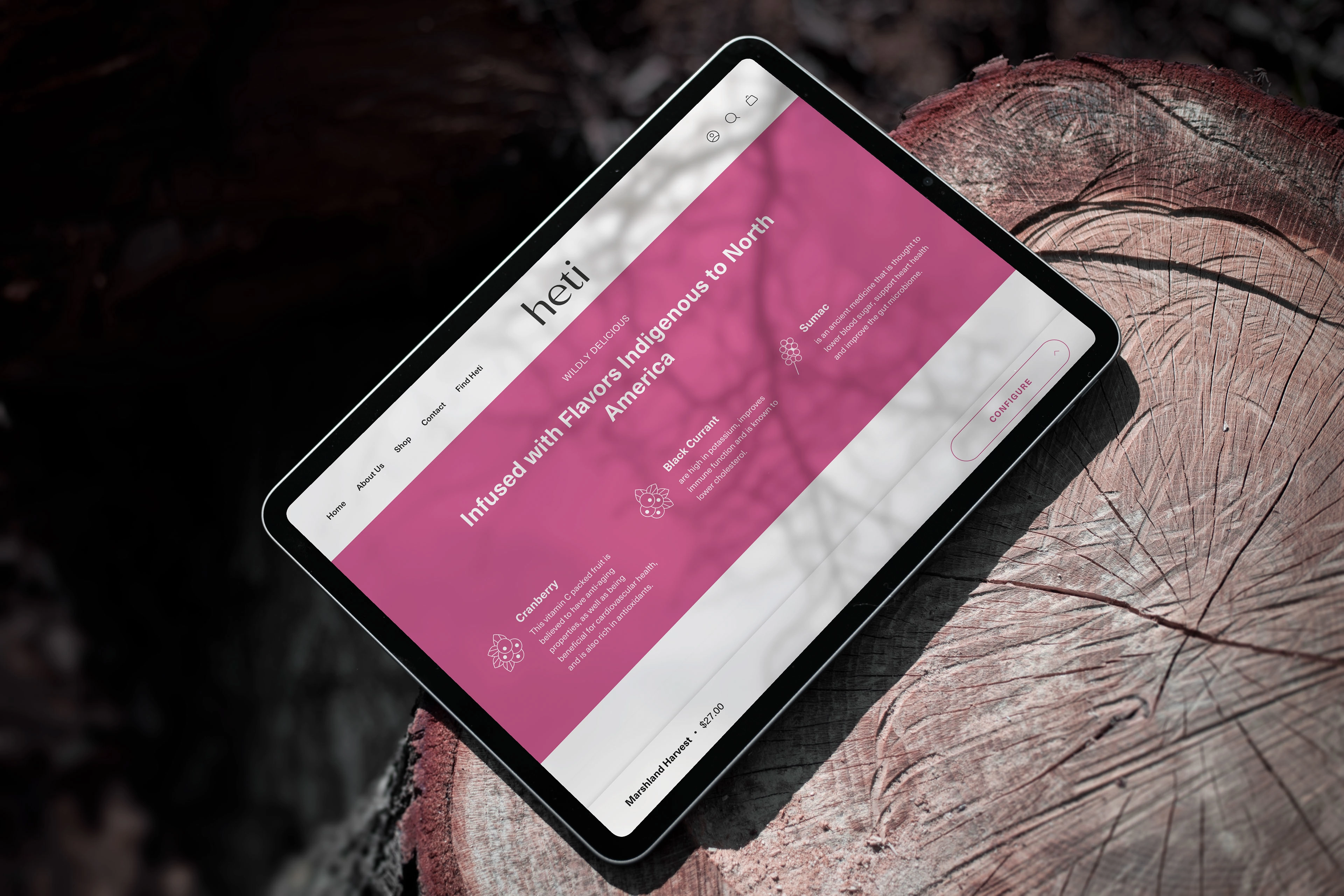
Low dose THC and CBD drinks created to give a sense of place by celebrating the plants around us. It's also a social impact brand, with a percentage of revenues going to drive wealth, security and health into tribal communities. Infused with flavors indigenous to North America, Heti aims to remind that indigenous culture is rich, wise and healing.
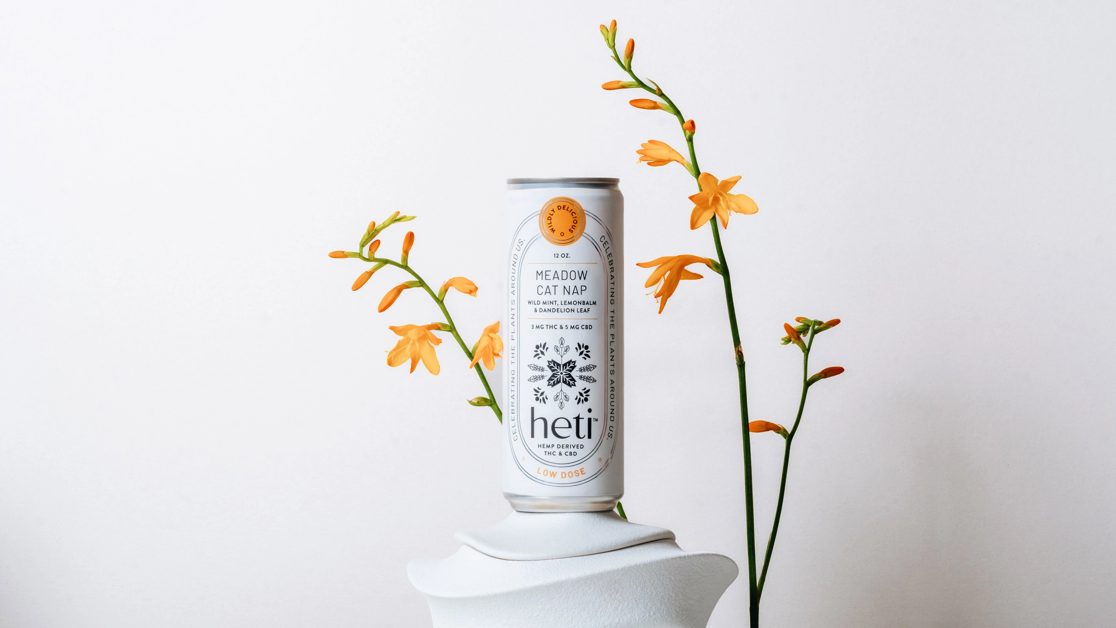
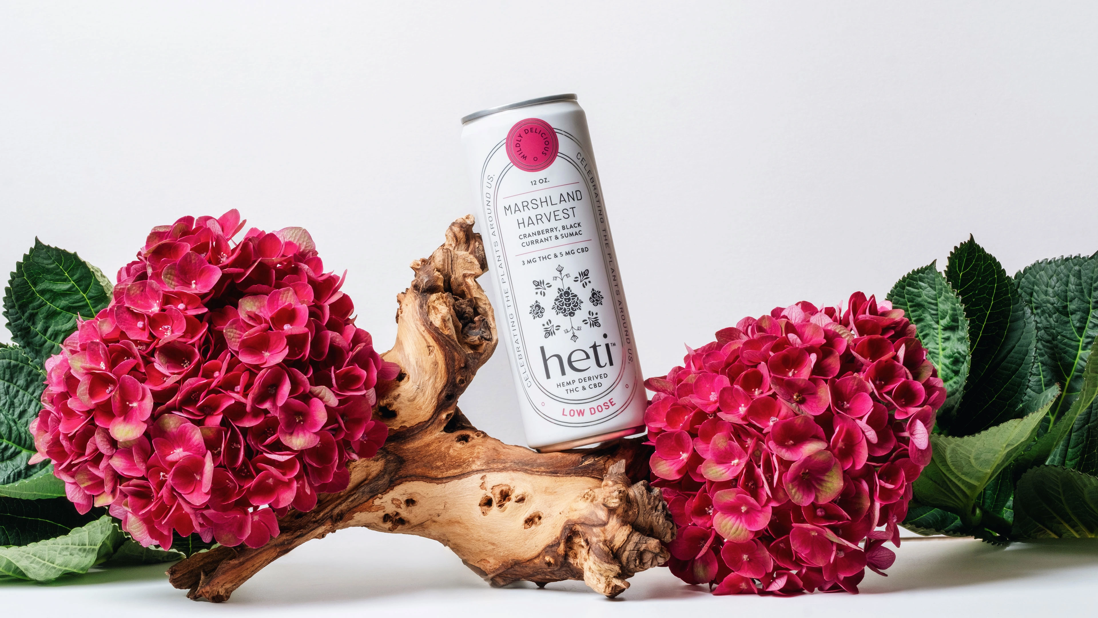
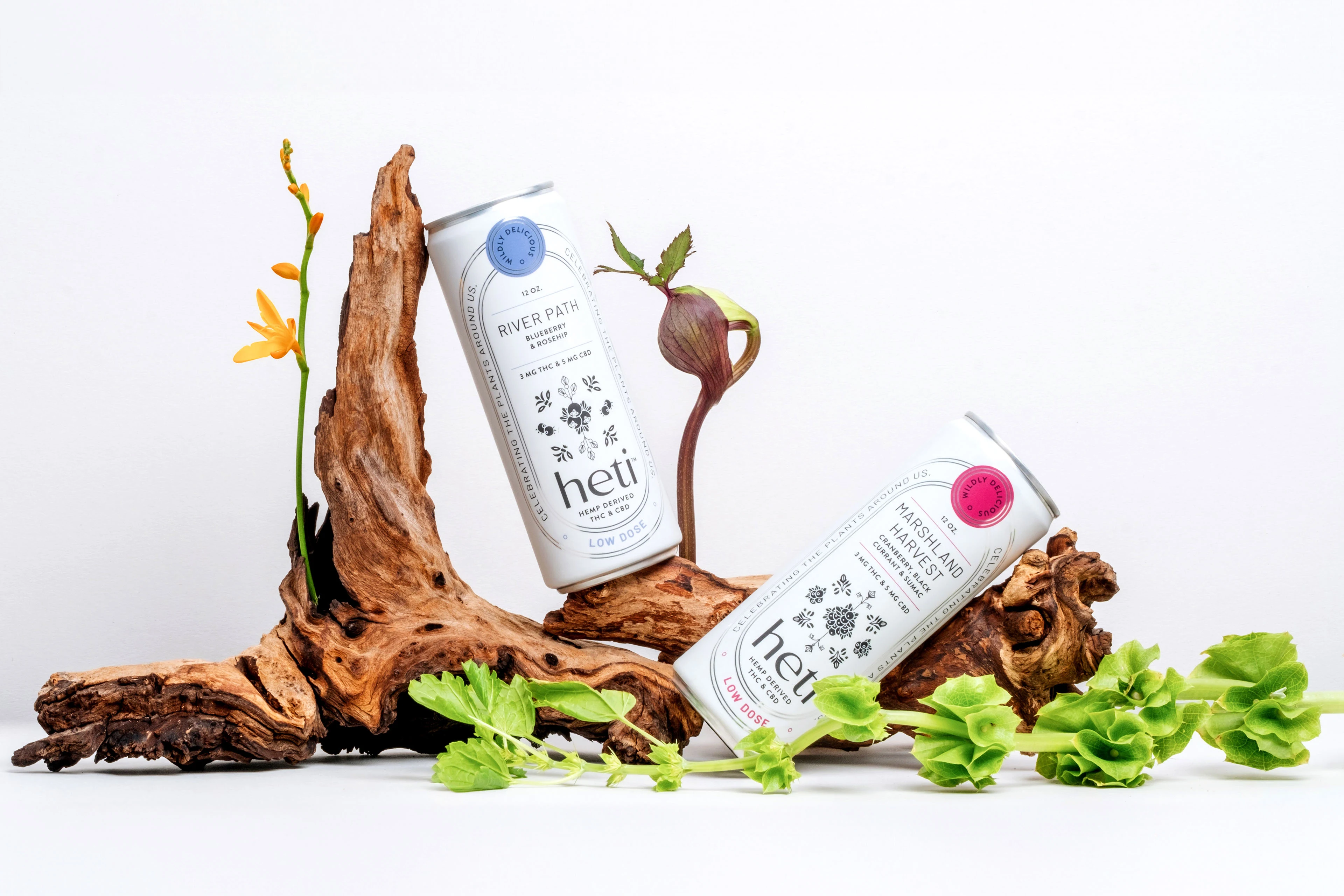
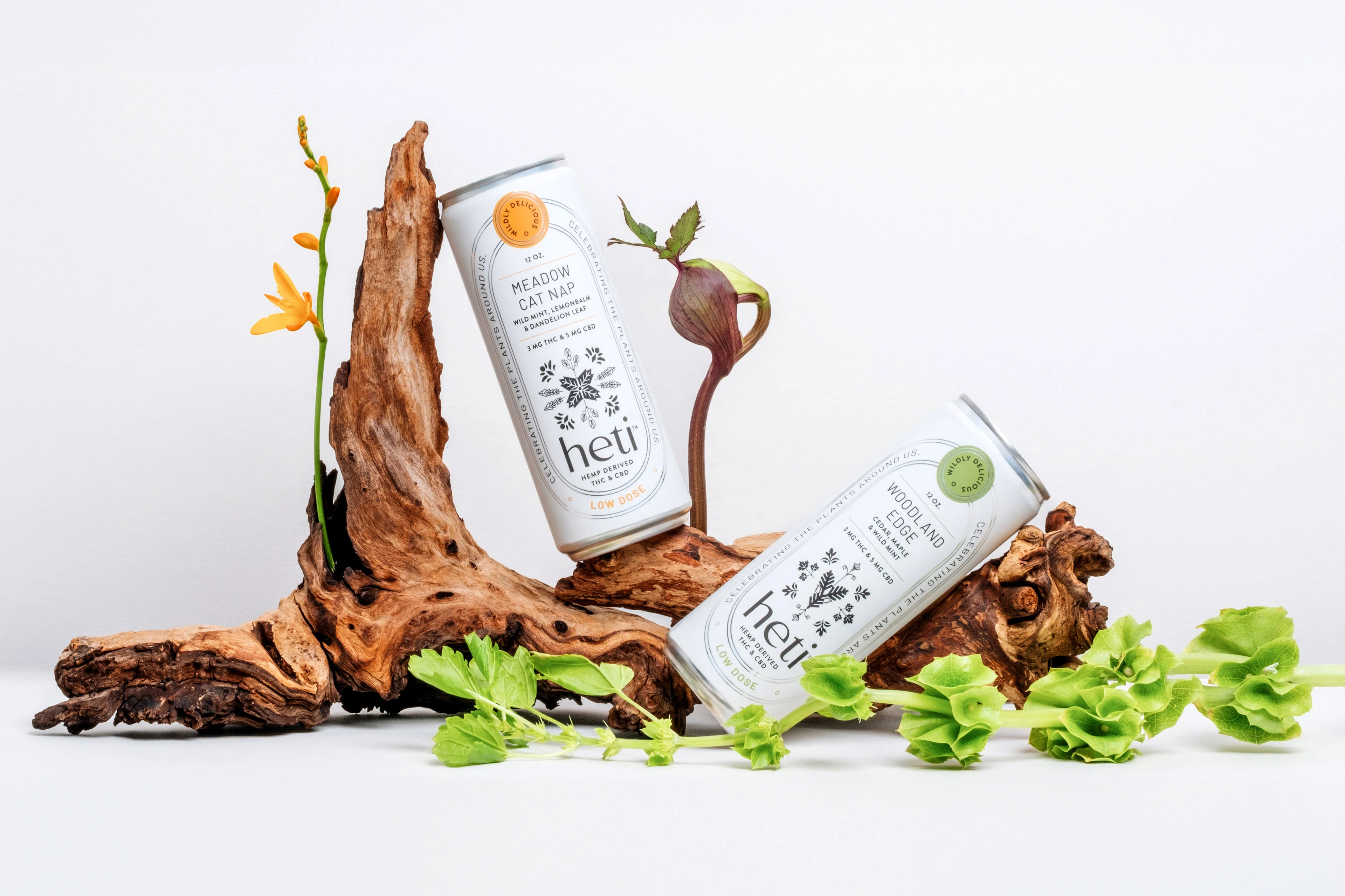
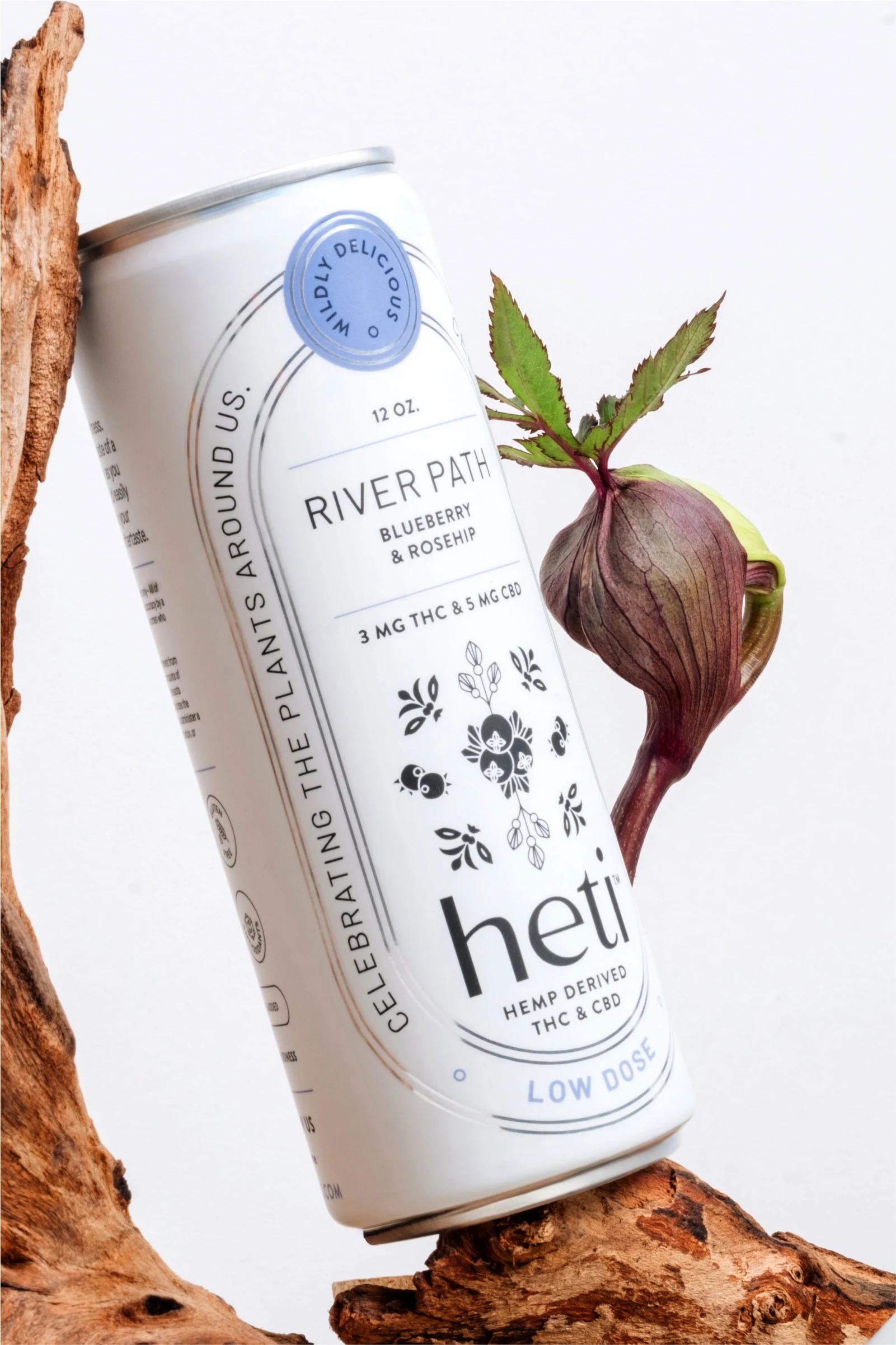
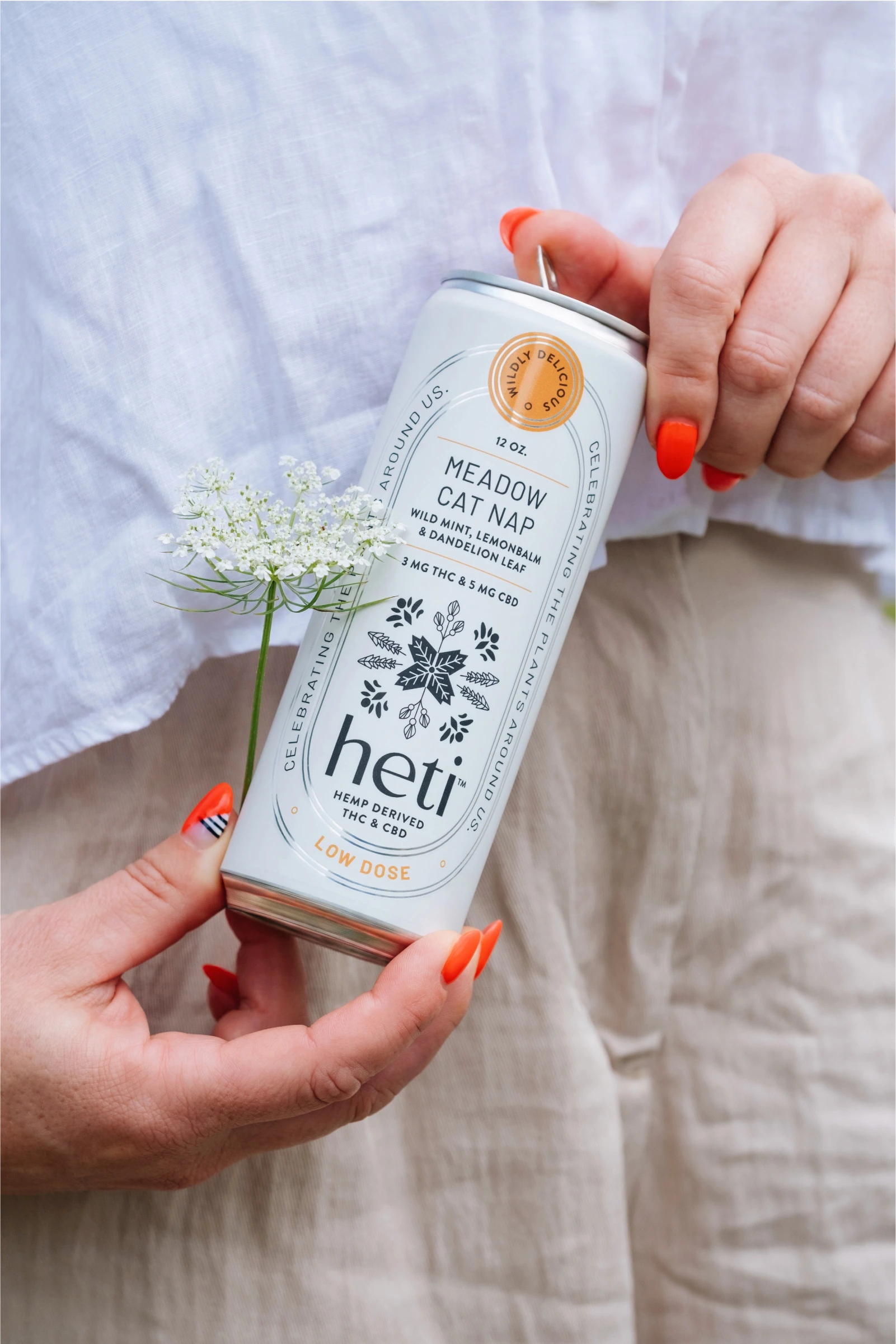
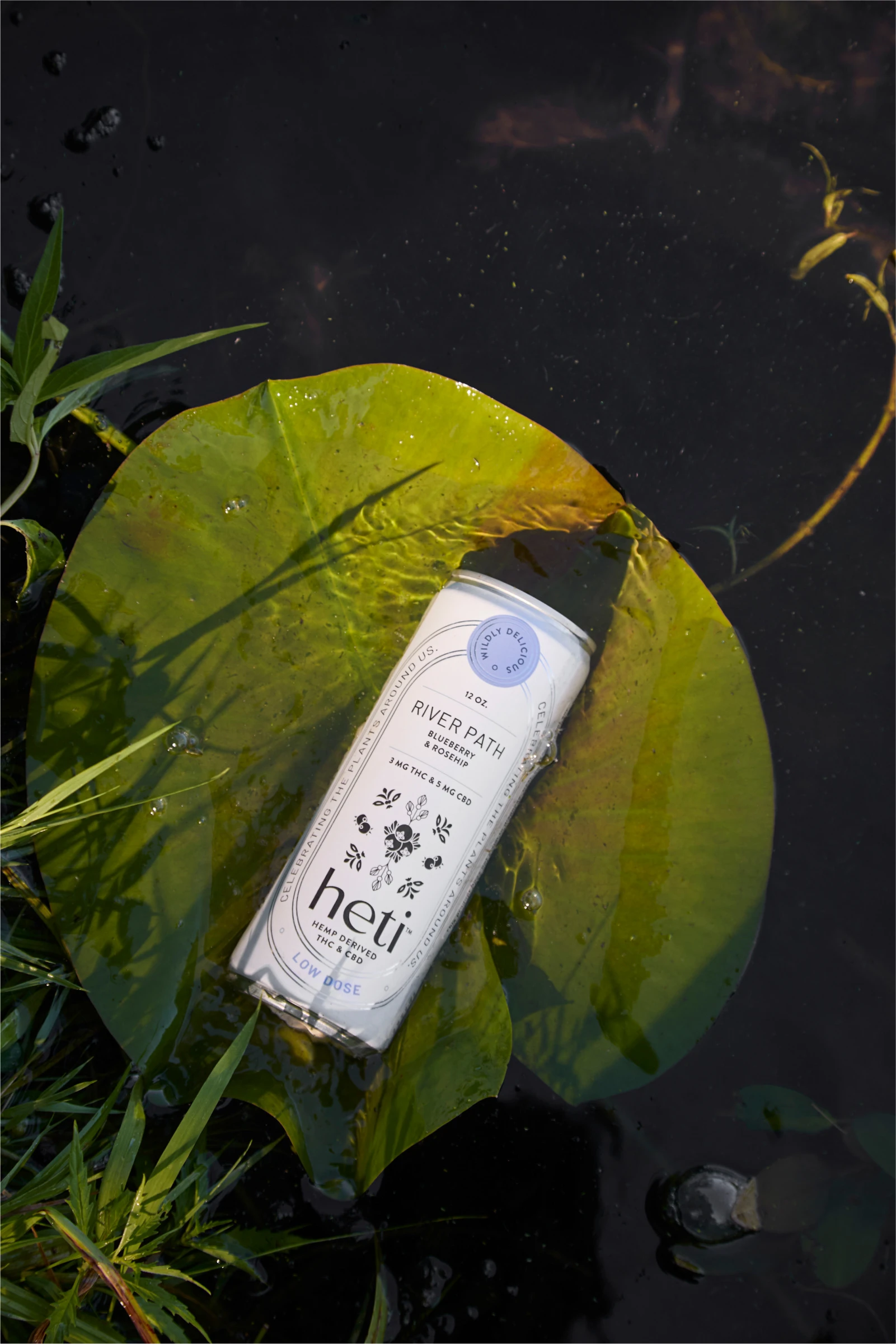
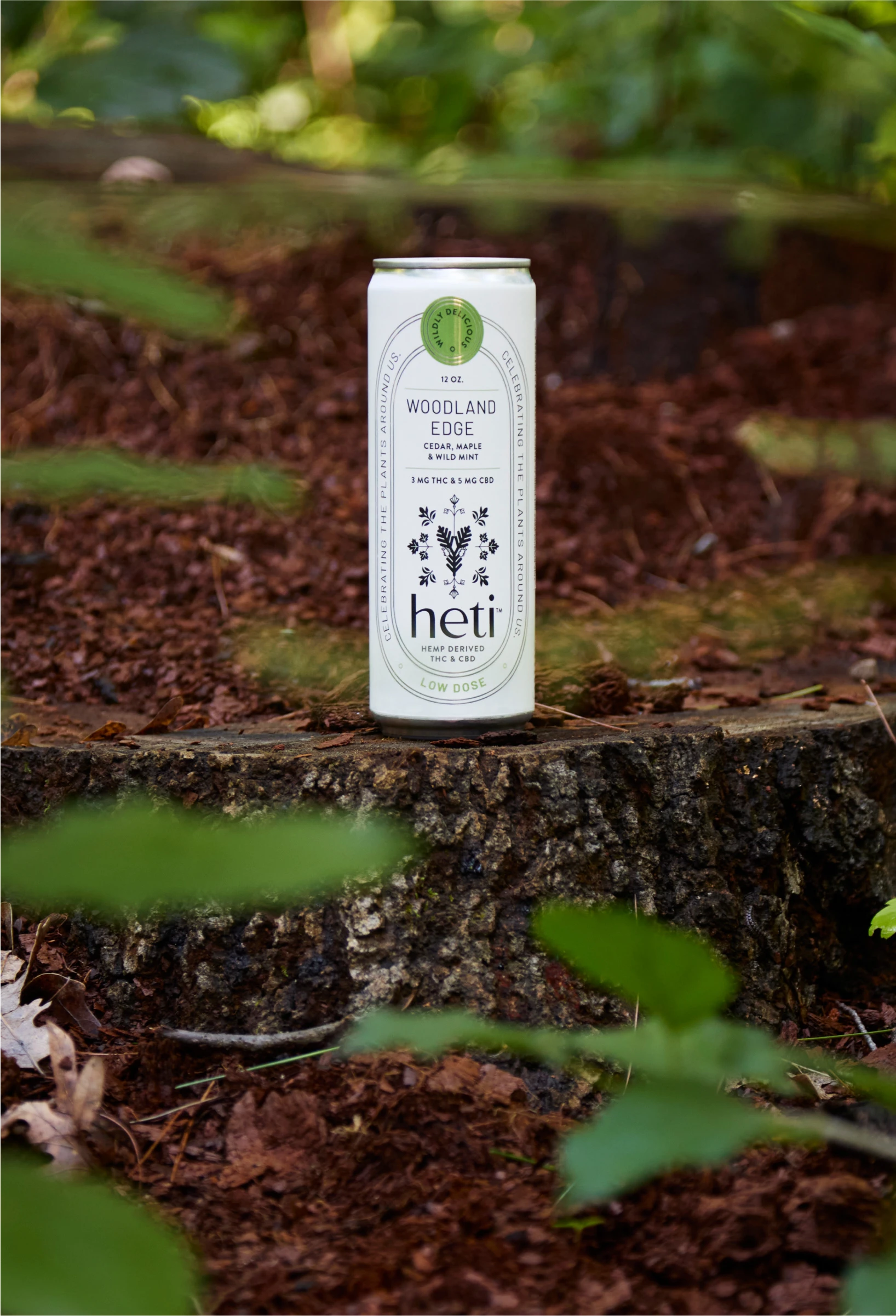
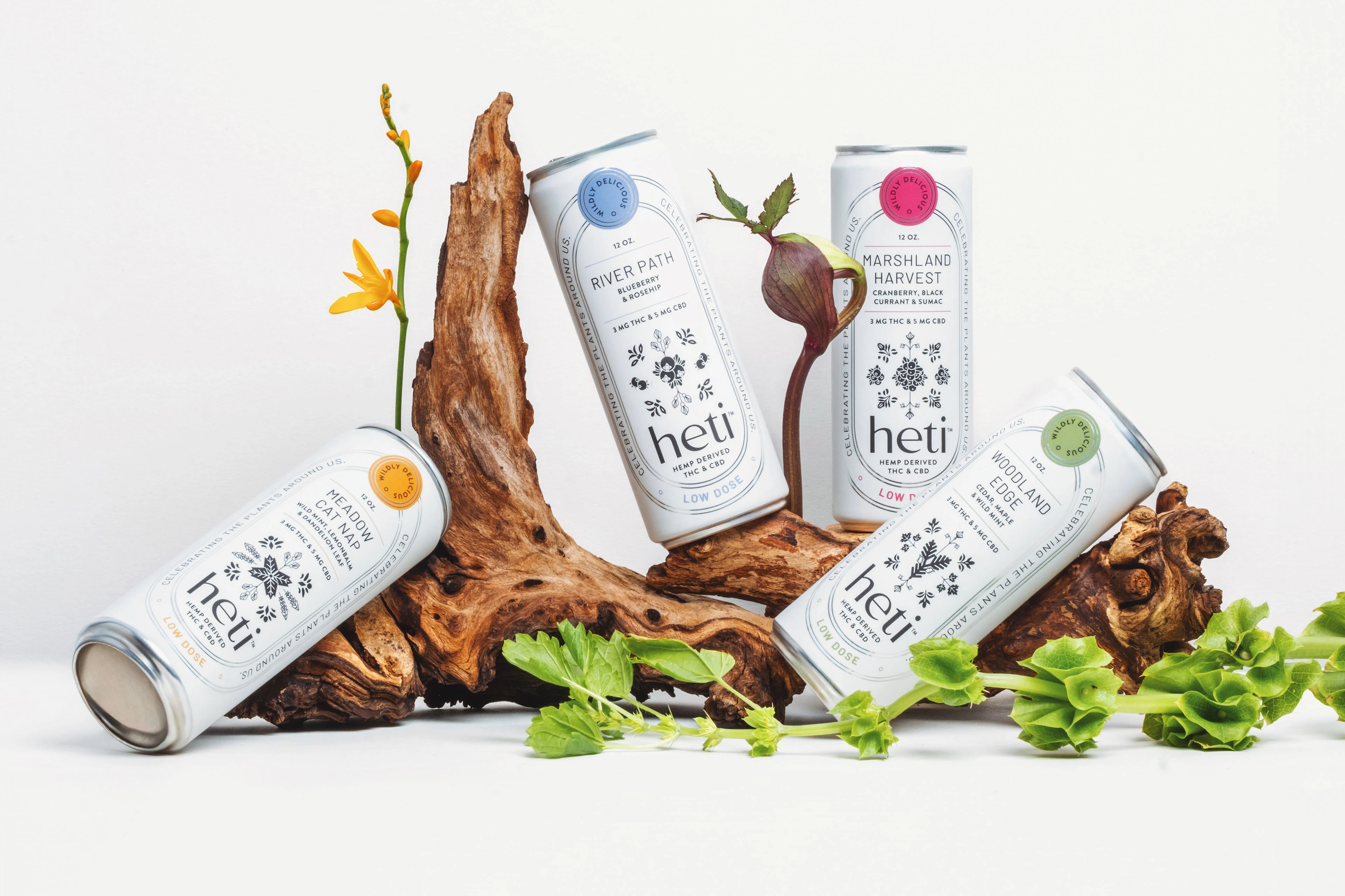
Connecting with plants is proven to give us the feeling of calming connection. Aiming to raise awareness to the richness of the native plants used in the drinks, we named the branding concept as "Effortless Wisdom" and designed custom native style illustrations, celebrating the plants.
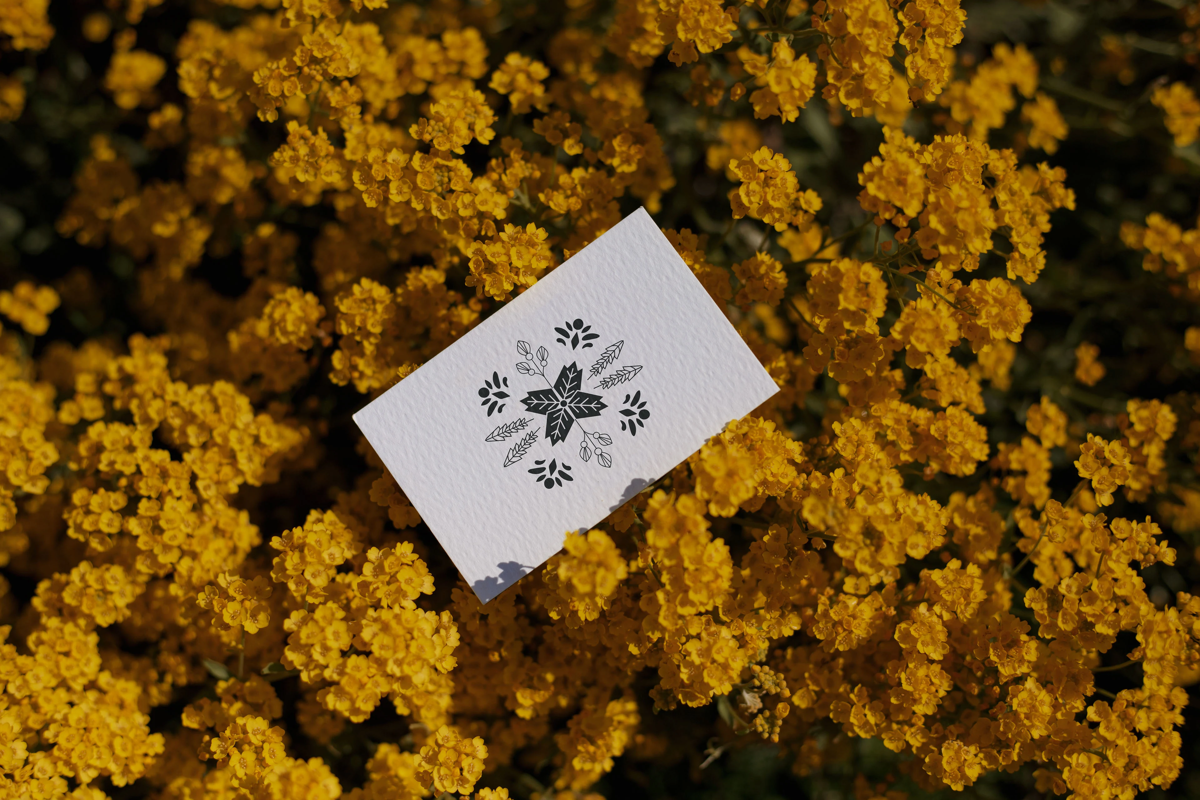
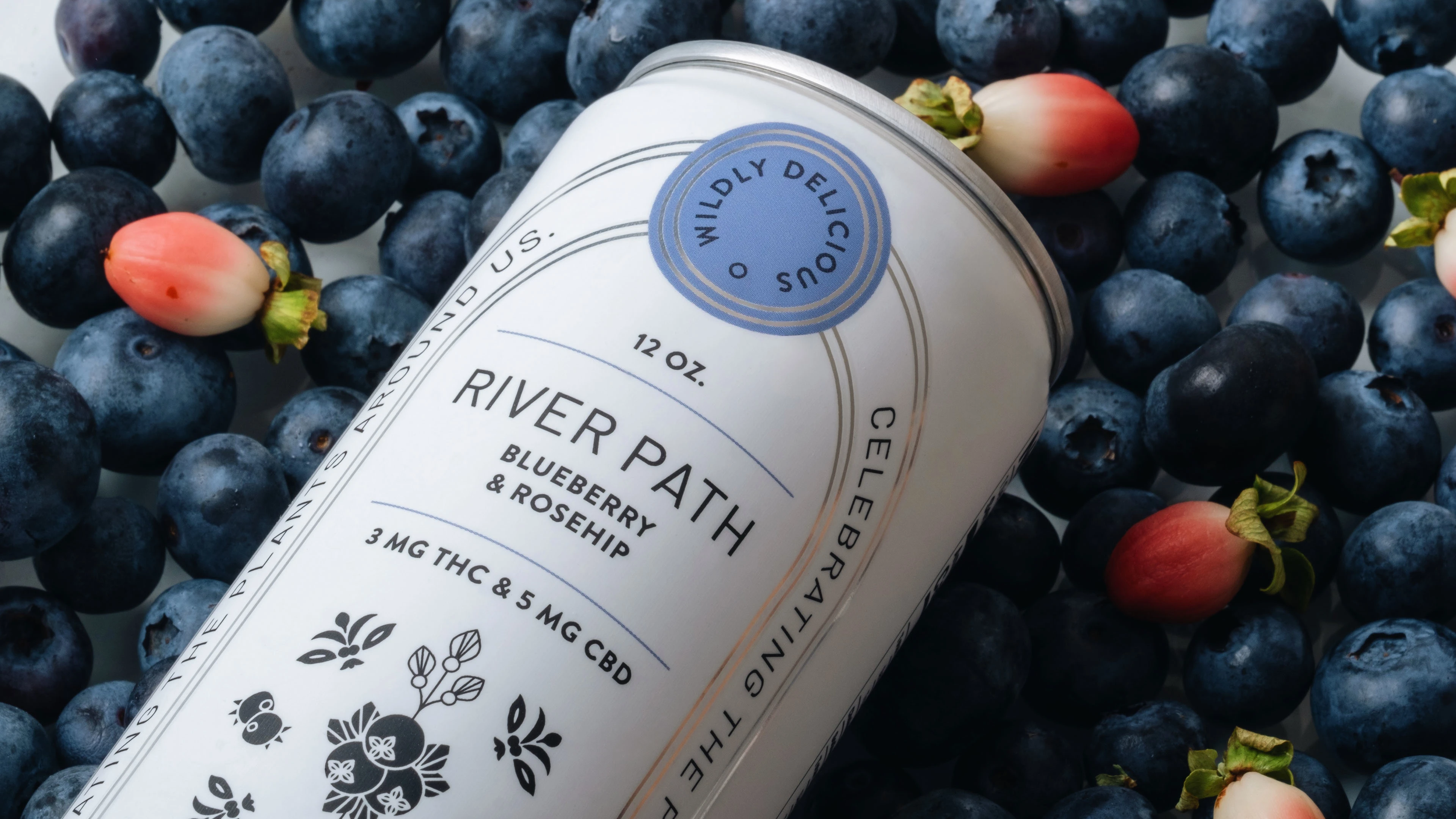
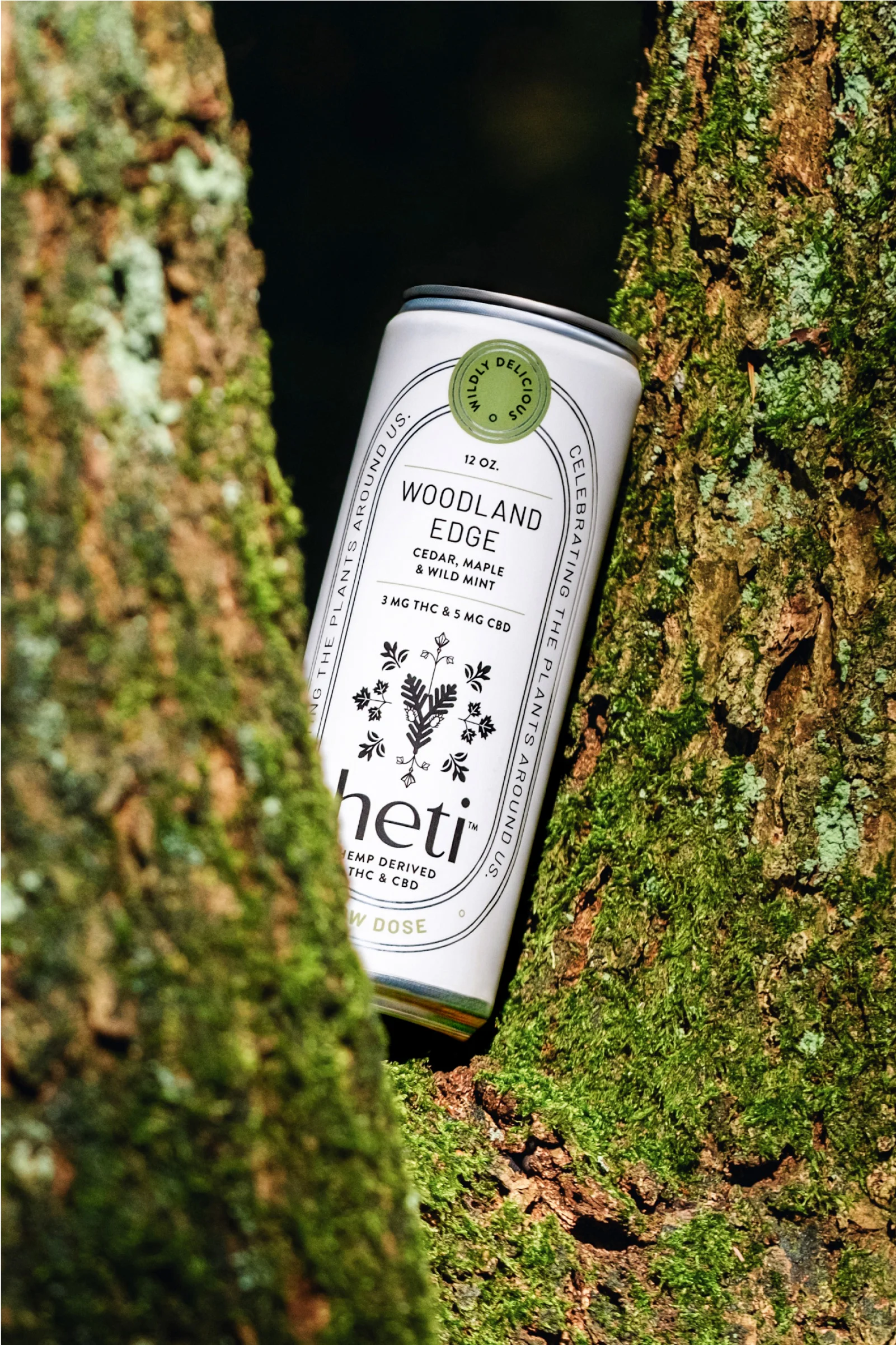
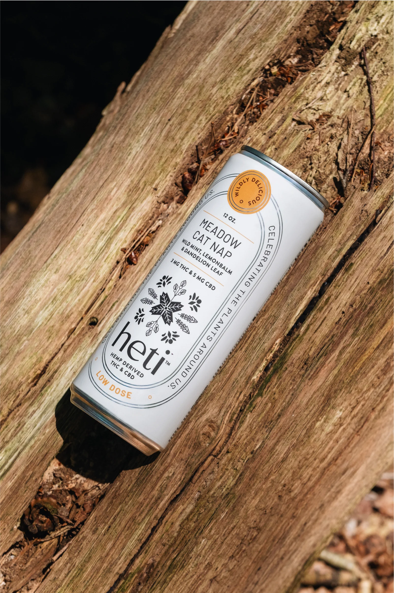
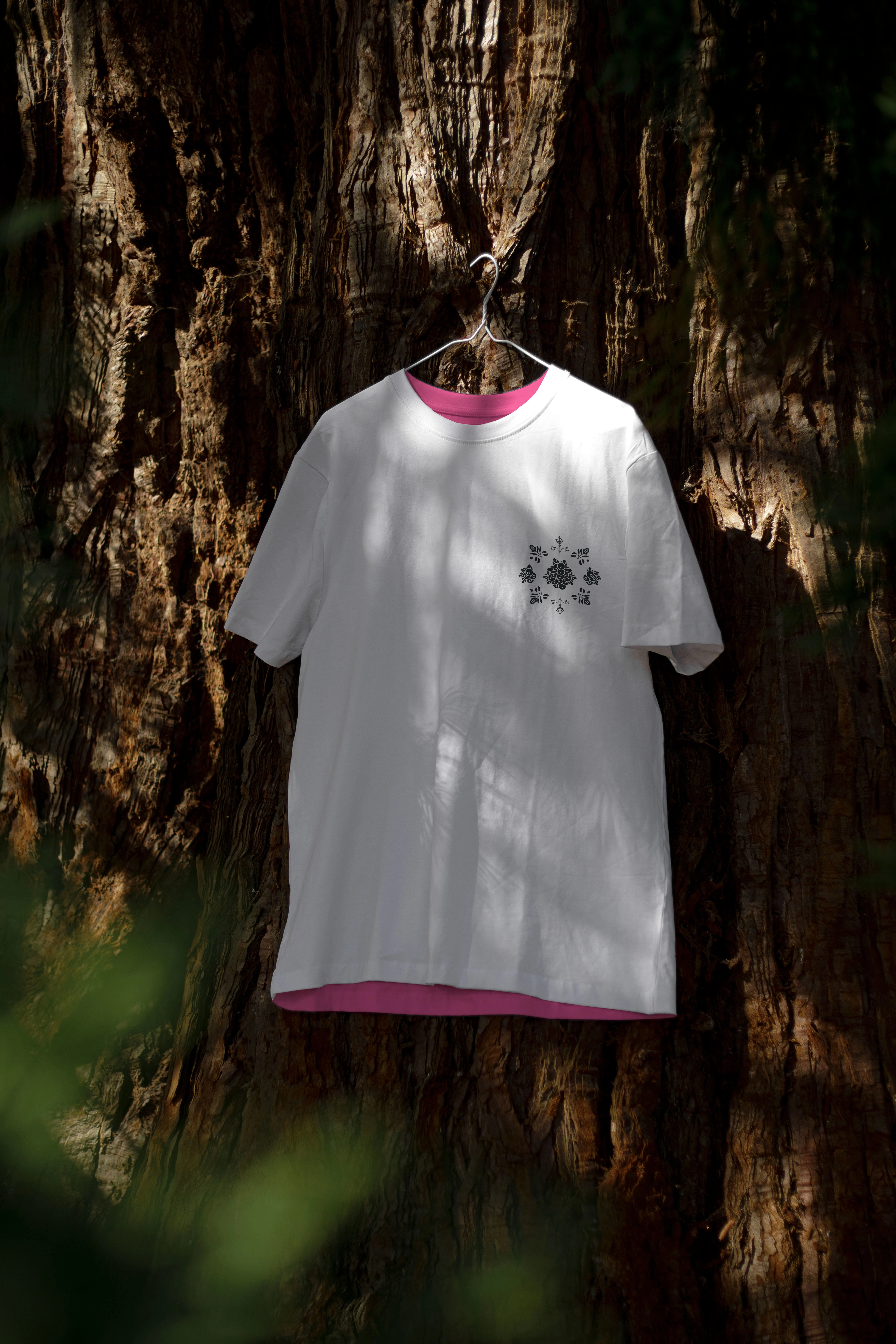
The flavor illustrations are inspired by Indigenous Dakota art which always incorporates geometric and symmetric shapes. They are placed at the heart of packaging prominently, to convey the “celebration” and “wisdom” that comes from ancient wild plants. The symmetry in the illustrations symbolizes harmony and balance, core values in many indigenous cultures. The oval frame creates a strong establishment and draws the eye to the center of the packaging. The choice of a monochrome palette with a touch of color is deliberate, aiming to capture the depth and nuance of indigenous art forms in a manner that is both contemporary and timeless.
Client: hetiproducts.com
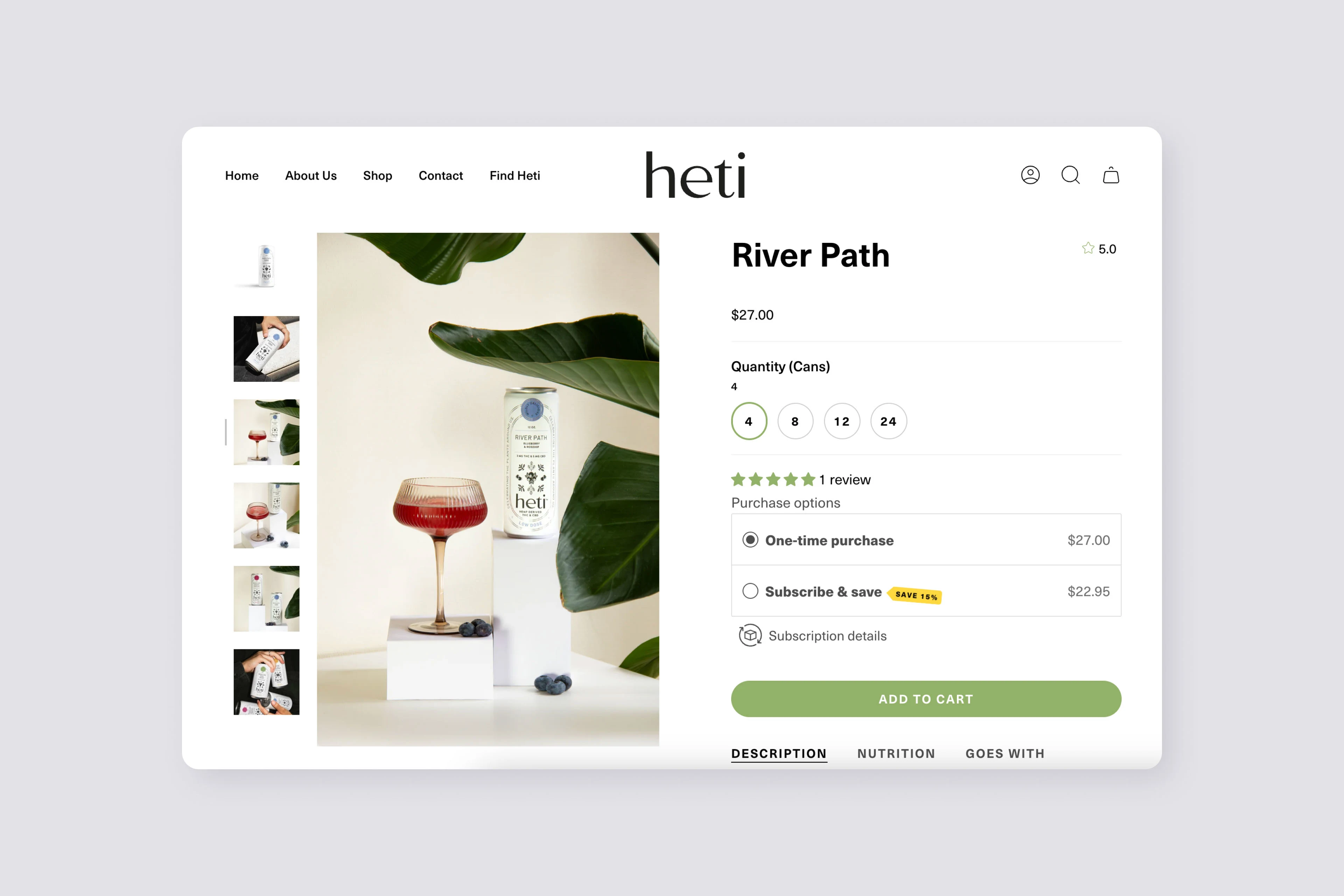
Services: Creative Direction, Branding, Packaging & Web Design

Like this project
Posted Nov 3, 2024
Introducing our Brand Identity and Packaging work for Heti, where we weaved the indigenous art spirit into a cohesive identity by seamlessly blending the tradi…

