Al Khayr Association (Donation flow for charity)
Project Overview
Product:
Al Khayr Association (ALK) is a charity website that will allow everyone to make a donation wherever they are in the world.
Project duration:
1 May to 31 May.
My role:
UX designer leading the app and responsive website design from conception to delivery.
Responsibilities:
Conducting interviews, paper and digital wireframing, low and high-fidelity prototyping, conducting usability studies, accounting for accessibility, and iterating on designs.
The problem:
After all the disasters (natural, wars, etc.) we watched several times this year behind our screens, we noticed that several countries could not send aid, including Morocco.
The goal:
Allow everyone to make a donation and support different charities that are reliable without having to search every time
Understanding the user
User research: summary
To better understand user needs and behaviors, I interviewed 5 people to confirm the idea for the charity’s website. Each interview lasted about 20 minutes and included topics to get to the heart of the user’s objectives and hot spots.
Most interview participants reported that there is no platform for donations in Morocco. Most donations are done locally or by going to an association or a group of people who collect money to help.
Personas:
Persona 1 : Lina.
Problem statement: Lina is a caring person and marketing manager who needs a platform that wants to make donations abroad because the majority of associations in Morocco are local.
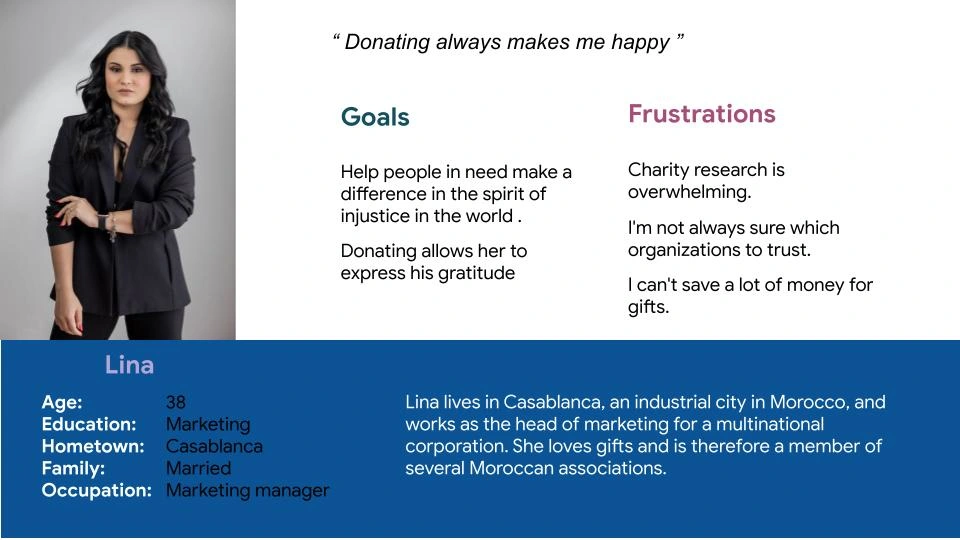
User Persona 1
Problem statements:
Persona 2: Mustapha.
Problem statement:
Mustapha is a lawyer and a caring person who needs a platform that allows him to find local cases for donation and follow the online donation process because it’s difficult to know if the donation was received.
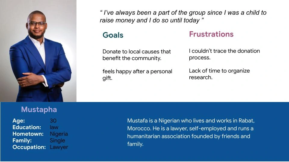
User Persona 2
User journey maps:
Lina's user journey map provides an idea of how to meet user needs and goals.
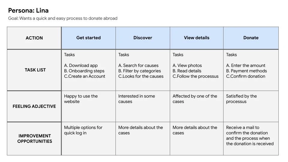
User Journey map
Starting the design
Paper wireframes:
Four versions of wireframes (A, B, C, D), and the fifth one is the final version.
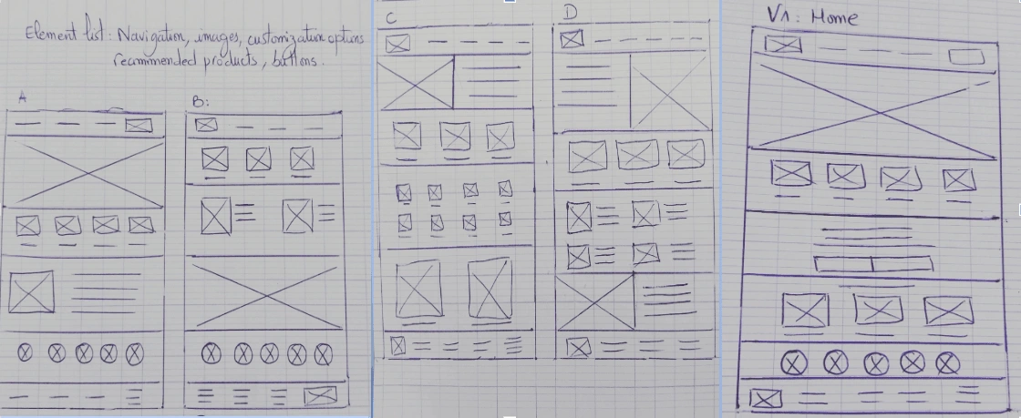
Paper wireframes
Digital wireframes:
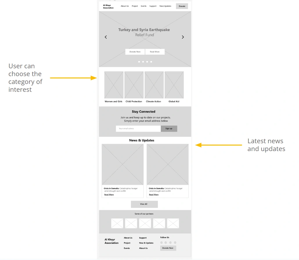
I simplified the homepage to make it more pleasant at first sight.
I have chosen a recent article for the user to discover on the second page.
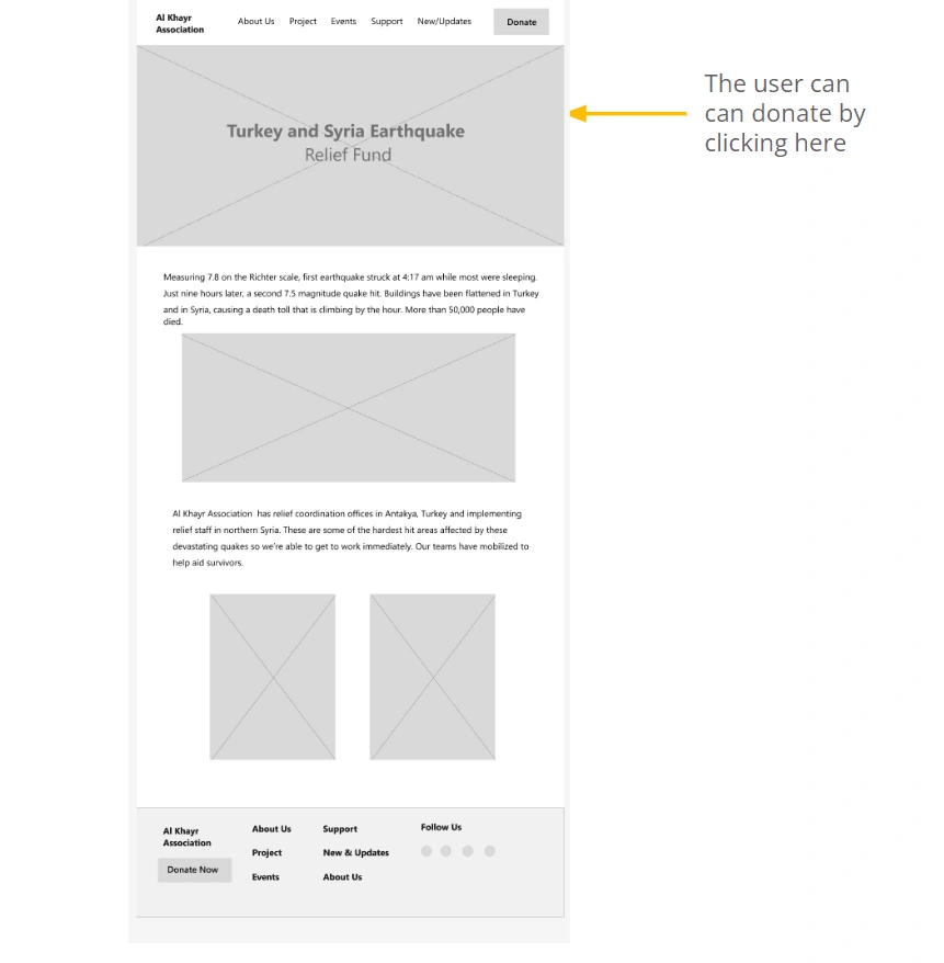
Low-fidelity prototype:
This visual guide presents the basics of the website. He helped me organize the interface elements while focusing on functionality rather than appearance.
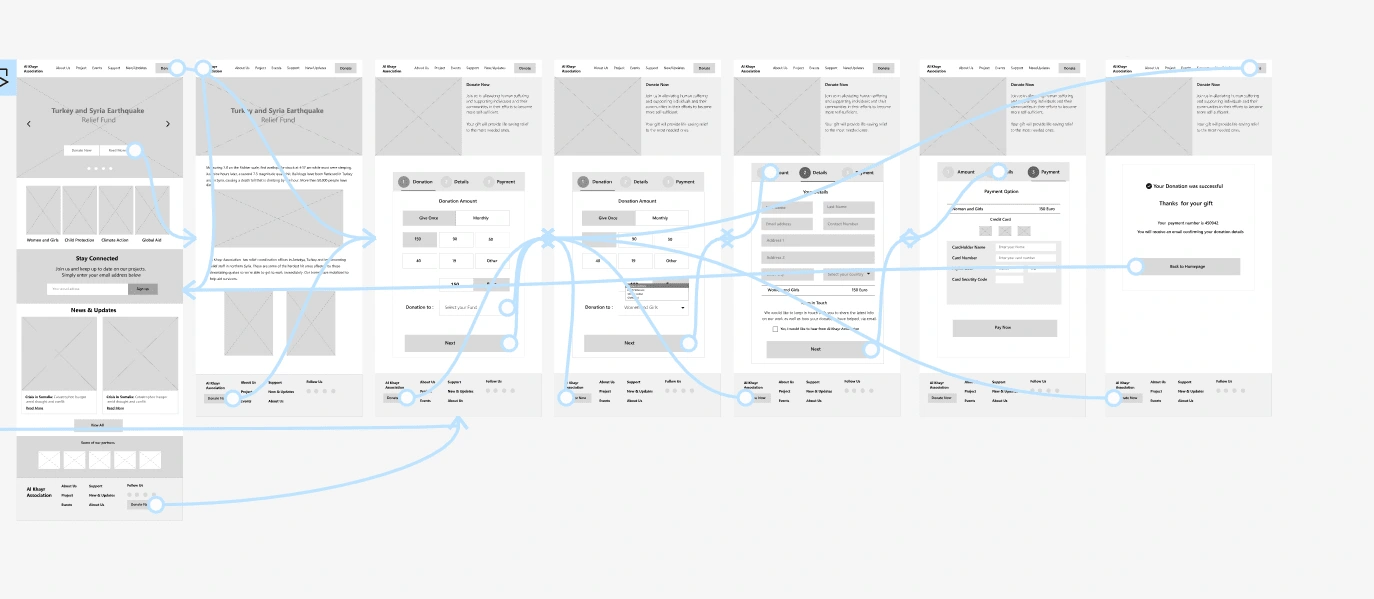
Low-fidelity prototype
Usability study: parameters:
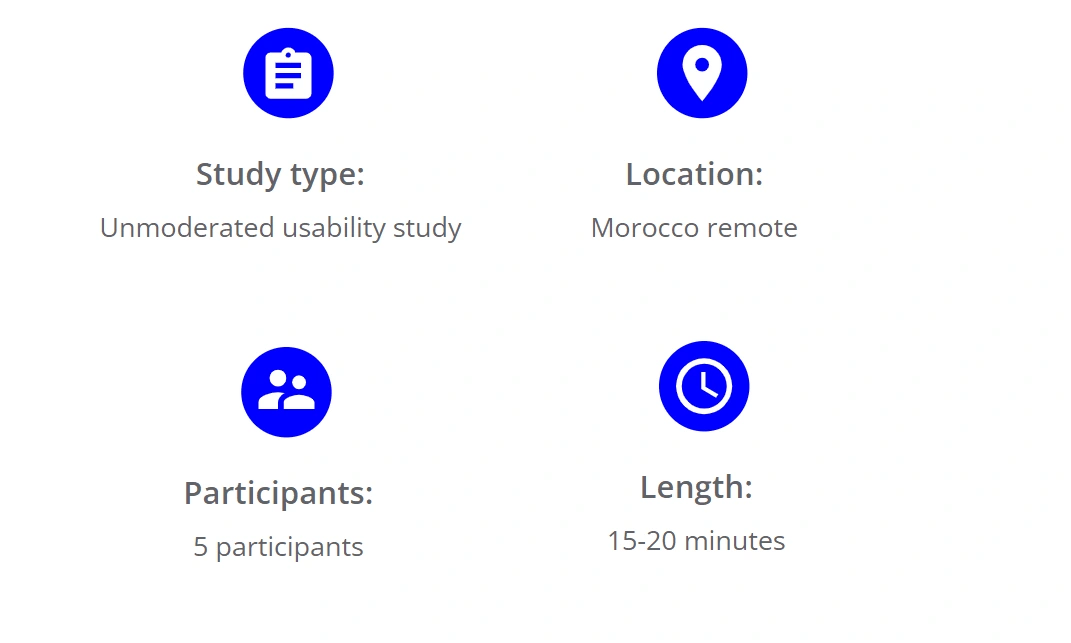
Usability study: findings
I conducted two rounds of usability studies. Findings from the first study helped guide the designs from wireframes to mockups. The second study used a high-fidelity prototype and revealed what aspects of the mockups needed refining.

Refining the design
Mockups:
Donate button added to all pages.
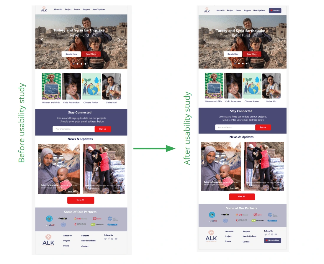
Before and after the usability study
A section “Stay connected” has been added where the user can put his email to be informed of current causes.

Before and after the usability study
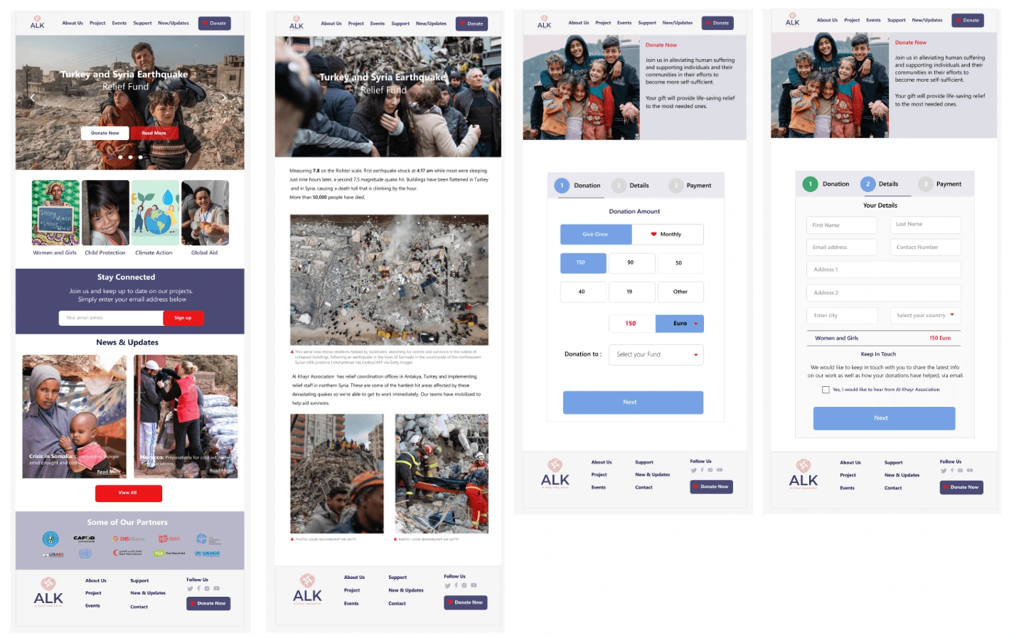
Mockups of the Al Khayr Association Website
High-fidelity prototype:
The high-fidelity prototype followed the same user flow as the low-fidelity prototype, including design changes made after the usability study.
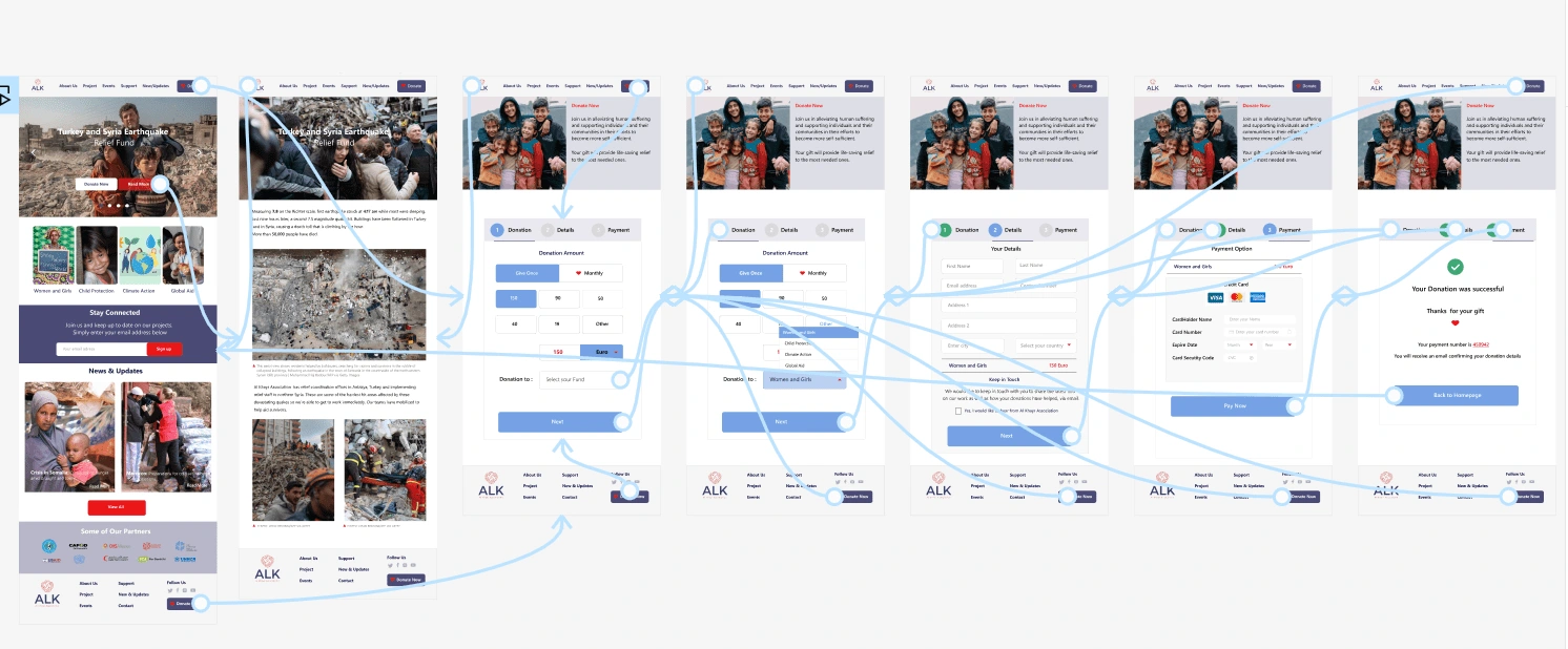
High-fidelity prototype of the Al Khayr Association Website
Accessibility considerations:
Going forward
Takeaways:
Next Steps:
Like this project
Posted Jul 17, 2023
Al Khayr Association (ALK) is a charity website that will allow everyone to make a donation wherever they are in the world.
Likes
1
Views
13


