A Loan Servicing Web-app
Michelle Grishchenko
R3P brings workflow clarity and operational efficiency to loan servicing agents through a streamlined internal web application, replacing manual Excel tracking with a centralized, automated system for managing tasks and loans.
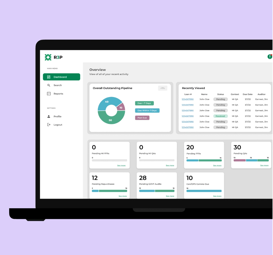
R3P is a redesigned internal platform that replaces a cluttered Excel-based workflow for loan servicing agents. Built to surface outstanding tasks, streamline navigation, and improve efficiency, R3P gives agents a clear view of their loan pipeline while enabling access to all loans in the system.
Problem
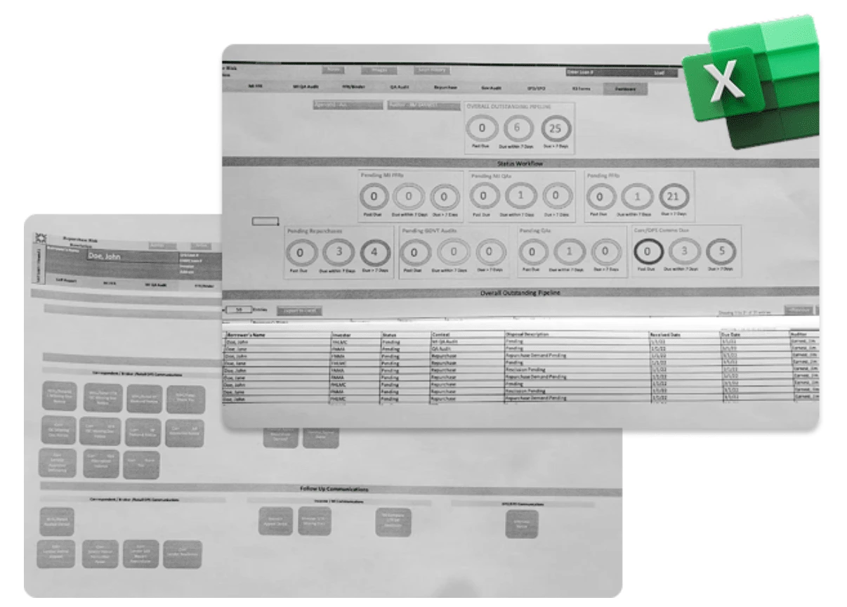
Agents were using a complicated Excel sheet to track communication with borrowers, leading to constant errors, duplicated effort, and a complete lack of visibility into progress. It was time-consuming, frustrating, and risky for compliance.
Solution
I designed a centralized internal web app that allowed agents to create, edit, and track borrower outreach attempts across different departments. It reduced manual entry, aligned everyone around a consistent process, and improved information architecture , all while being easy to use and quick to adopt.
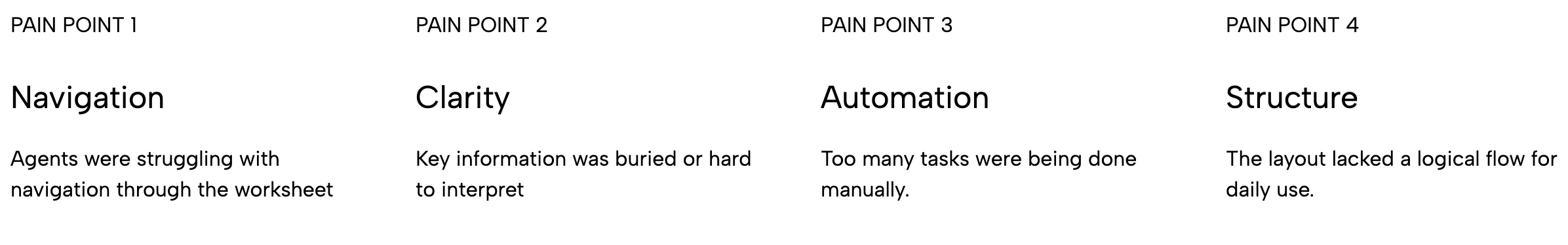
Pain Points
After gathering insights from the agent interviews, I mapped out the key pain points like lack of visibility, manual tracking, and poor navigation. From there, I brainstormed feature ideas that could directly address those issues. This included things like a searchable loan list, status filters, and automated progress tracking. The goal was to design a system that felt intuitive, reduced manual work, and helped agents stay focused on what mattered most.
Navigation
Clarity
Automation
Structure
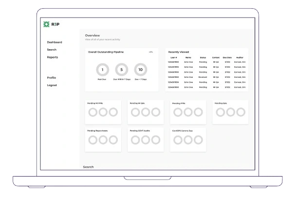
Wireframes
Using the insights from brainstorming, I created low-fidelity wireframes to explore layout and functionality. I tried to keep as much of the original workflow as I could at first, to give me a foundation to work from. I wanted to keep the structure of the web-app as close to the original as I could to avoid confusion. These early sketches helped me visualize improvements to navigation and structure, while also serving as a tool for quick feedback and iteration.
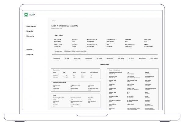
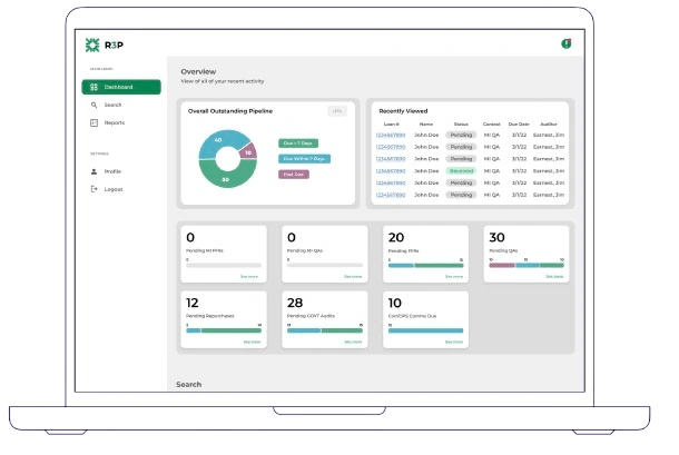
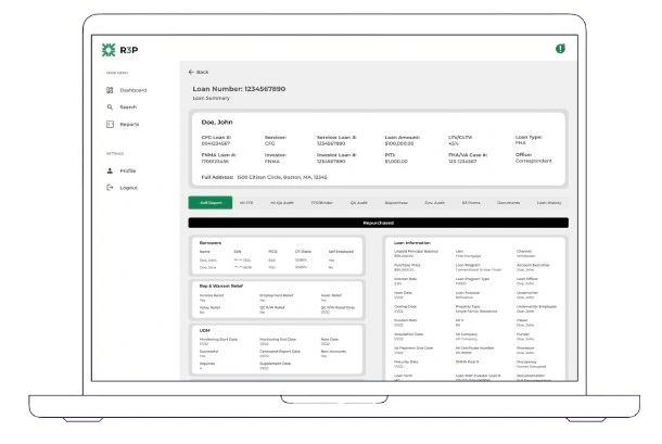
High-Fidelity Prototypes
My main focus during the redesign was to create a cleaner, more accessible experience. I started by adjusting the color palette to improve contrast and ensure better accessibility for all users. Alongside visual refinement, I continuously looked for ways to condense and reorganize the information, removing unnecessary elements, grouping related content, and prioritizing what users needed most. The goal was to reduce cognitive load while maintaining clarity and function.
Dev Standups
Throughout the development process, I worked closely with our engineering team, meeting daily to review progress, clarify interactions, and ensure alignment between the design and implementation. These check-ins helped us catch edge cases early, stay on the same page, and adapt the design when needed based on technical feasibility or feedback from the devs.
Testing
Once development reached a stable stage, we handed the tool over to agents for real-world testing. We observed how they interacted with the interface, noted areas of confusion or inefficiency, and continued to make iterative improvements. This ongoing loop of feedback and refinement helped ensure the final product truly supported their workflow.
Looking Back
Looking back, there are definitely things I would approach differently. While the final solution achieved our goals, I now see opportunities to simplify the interface even more and establish a stronger visual hierarchy from the start. I’d also love to conduct more structured usability testing earlier in the process to validate decisions sooner. Still, I’m proud of how much this project evolved and how much I grew through it. It’s a reminder that every iteration, even in hindsight, is a step toward better design.
Like this project
Posted Apr 27, 2025
A web app built to simplify loan servicing and replace clunky spreadsheets with clarity and speed