A CRM For Personalized Shopping Experiences
Michelle Grishchenko
shopex brings enhanced engagement tools and in-store insights to retailers through a comprehensive web-based application, enabling a more personalized shopping experience for their customers.
Designed to improve the in-store experience, shopex empowers retailers to monitor live customer check-ins, manage product catalogs, send real-time offers, and provide live assistance.
shopex targets retailers of all sizes, enabling them to deliver a seamless, interactive experience to their customers. With its intuitive design and real-time capabilities, shopex redefines how retailers and customers interact within the store environment.
Problem
While the initial mockup for shopex created by our developers provided a starting point, the overall design of the retailer web app was still in its very early stages. After picking up the project, the main challenge I faced was the visual inconsistency within the design, notably the color contrast and the spacing. This made it difficult to read, which could lead to eye strain and some pretty frustrated users.
Solution
I spruced up the design with some visual upgrades, making it much easier on the eyes and more inviting overall. I primarily focused on making the elements contrast properly with the white background and were more readable. I made sure to fix up the spacing and grouping of the pages throughout the flow, to make the user experience look more seamless.
Heuristic Evaluation
I decided that my first step should be to get some hands-on experience using the app
A few insights into the heuristics were
Visibility of Page Components: The color choices for certain elements reduced their prominence and made them less noticeable.
Aesthetic: The color palette and minimalistic design made the page visually unappealing and difficult to look at.
Business Requirements Document
The next step was diving into the project's Business Requirements Document (BRD). Since I joined the project after the initial design and requirements were already in place, I needed to get a solid understanding of the product's main goal and how users were expected to interact with it. This gave me a clear foundation to build on as I worked to refine the user journey and make the visual improvements it needed.
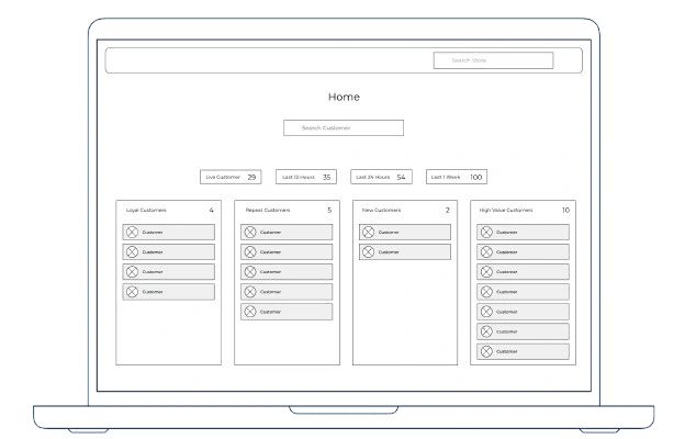
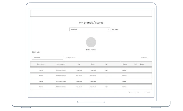
Wireframes
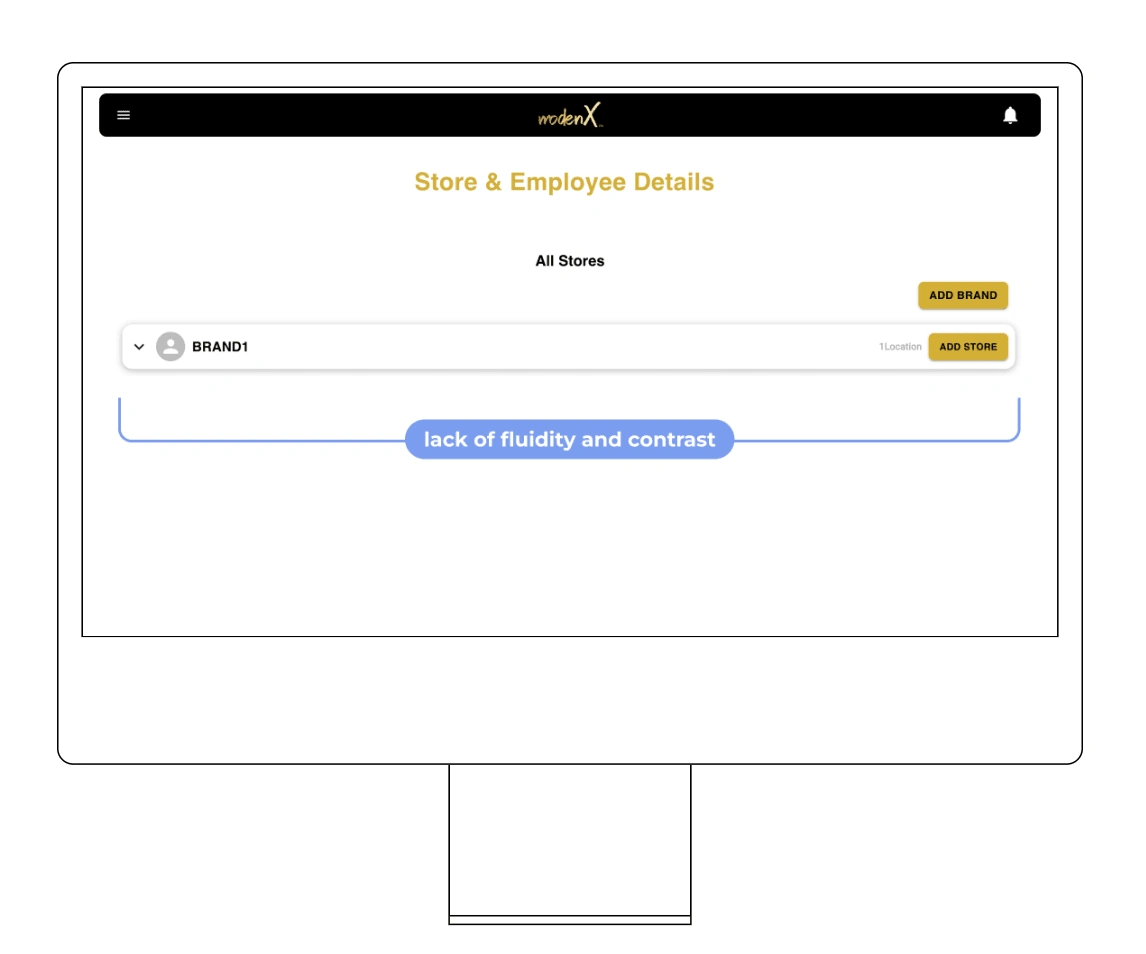
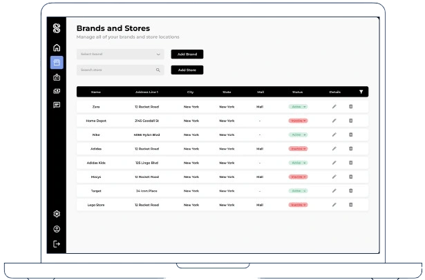
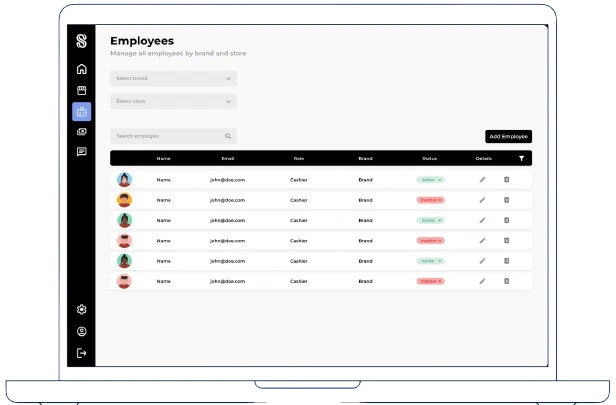
Looking at the original design, I felt the flow could be improved. The stores and employees were combined on one page, which made things feel a bit cluttered and harder to navigate. I decided to split them into two separate pages to make each one more focused and easier to use. I also reworked the layouts to make everything more structured and visually clear, with key actions and information easier to find. The wireframe shows how I started building a cleaner, more polished foundation compared to the original design
Iteration
While I started with a basic wireframe to map out the elements, I was still uncertain about the overall design direction. To explore my ideas further without locking into a specific color scheme or structure, I created a mid-fidelity design somewhere between wireframe and hi-fi. This process gave me a clearer sense of the style I was aiming for. However, it also helped me recognize that my initial wireframes weren’t quite hitting the mark. While a few elements worked well, the overall design lacked the fluidity and cohesion I was hoping to achieve.
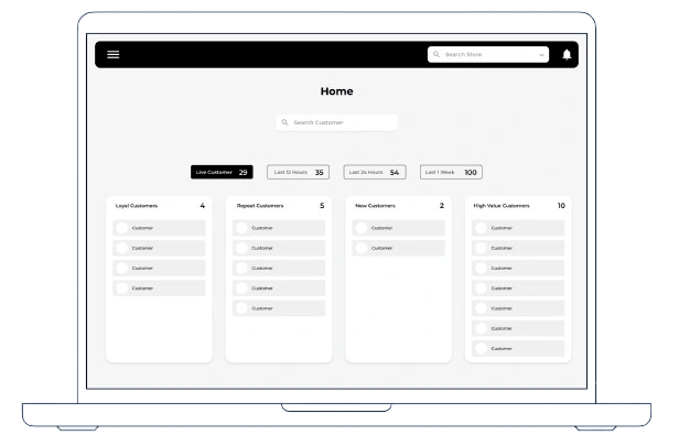
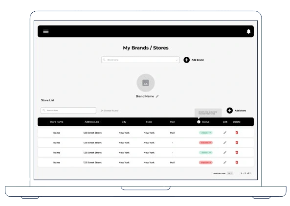
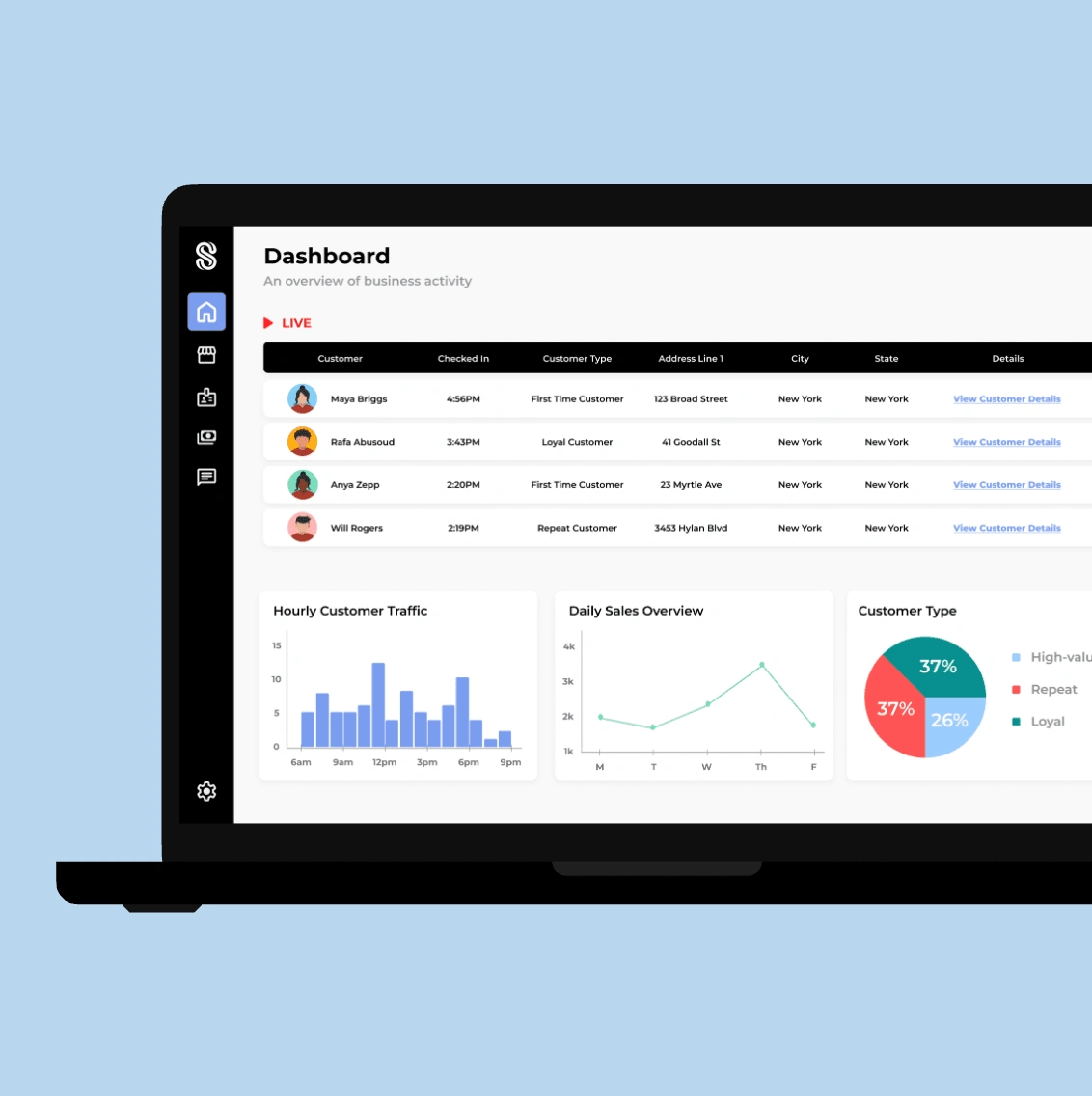
The Redesign
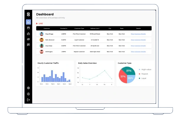
I decided to take a fresh approach to the design by rethinking the layout and navigation. Instead of using a top header bar and hamburger menu, I opted for a full side menu. This shift allowed me to consolidate all essential functions in one place, creating a more intuitive and cohesive navigation experience. The side menu also helped establish a sense of structure and flow across the pages. Additionally, I aligned the elements to the left to create a more organized and anchored layout, rather than leaving them centered and disconnected. I also standardized the tables to ensure consistency and improve readability, making the information easier to scan and interact with.
Reflection
Working with a Team
Being the sole designer on this project was both a challenge and a valuable learning experience. While it pushed me to take ownership of every design decision, I believe working with a larger design team would have been incredibly beneficial. Collaboration could have sparked more creative ideas and made iteration more efficient, while also providing an opportunity to learn from others’ expertise.
A Structured Approach
Without a larger team or a clear process in place, the project lacked the structure typically seen in a standard UX workflow. Although the project was completed successfully, I can’t help but wonder how much stronger the final outcome could have been with a more structured and collaborative approach. I would love to revisit this case study in the future with a clear mind and see what additions I could come up with.
Like this project
Posted Apr 27, 2025
A SaaS solution to make in-person shopping a more personalized experience
Likes
0
Views
6