zPay - Buy Now, Pay Later
Michelle Grishchenko
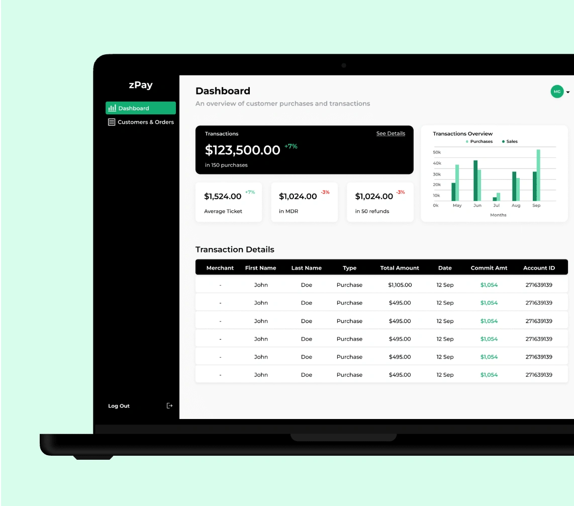
zPay streamlines the financing experience by providing merchants with seamless onboarding, and a robust dashboard to manage transactions, empowering businesses to drive growth with ease.
zPay revolutionizes how merchants manage their financing and transactions, offering an intuitive platform that simplifies merchant onboarding processes.
Through a user-friendly interface, merchants can seamlessly sign up for financing options and access powerful tools to track their financial activities. zPay reduces operational friction and empowers businesses to focus on growth and customer satisfaction.
Problem
This product was simply a concept when I was first put on the project as a UX design consultant. It had been in the works logistically for a few years, but no one ever sat down to create or design any of the user flow. This large financial institution needed a user experience, and fast, as deliverables were expected in the coming month.
Solution
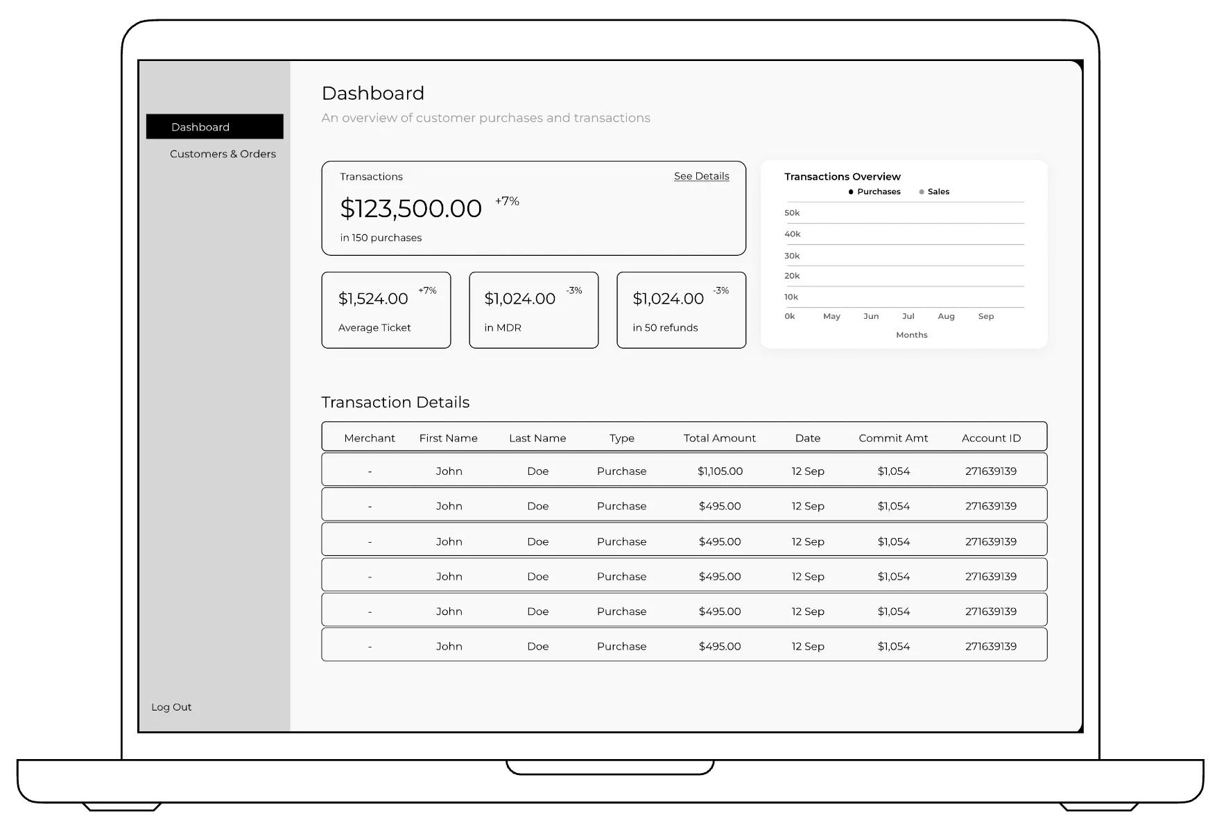
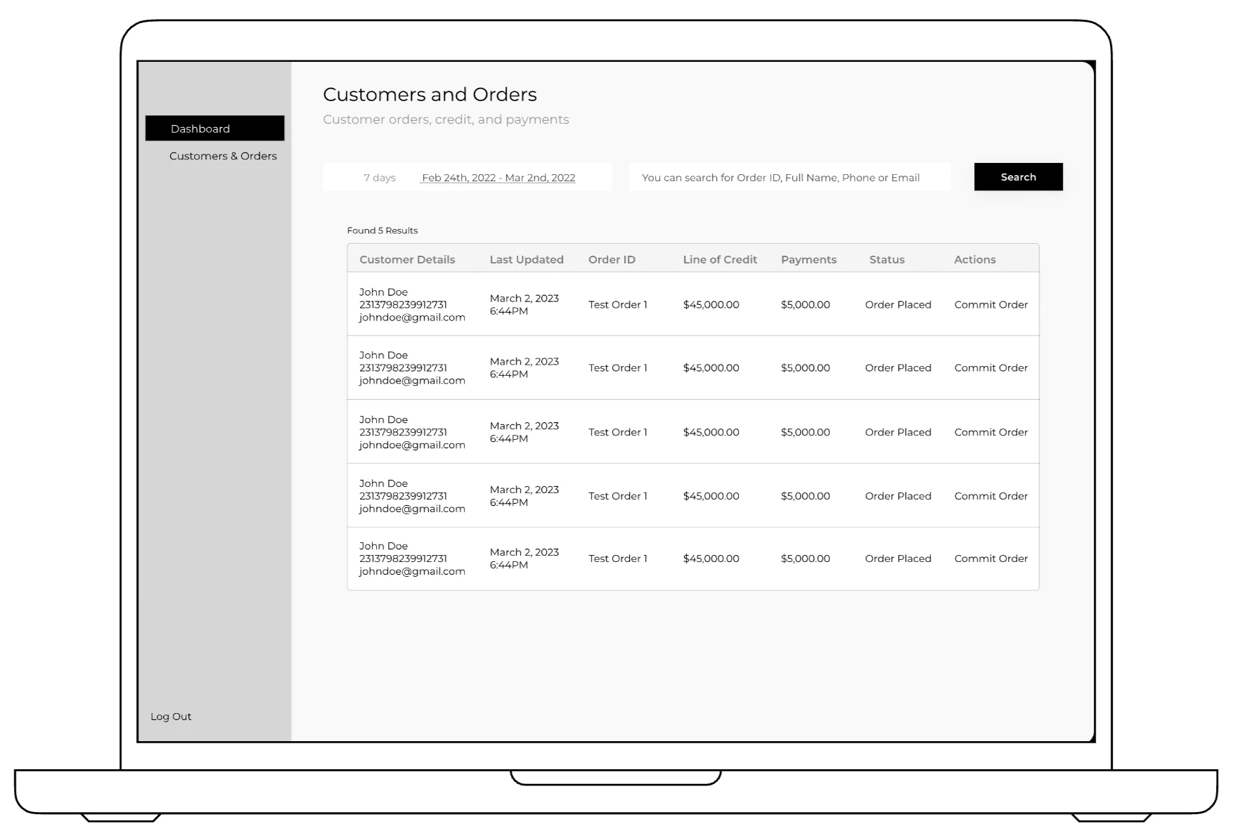
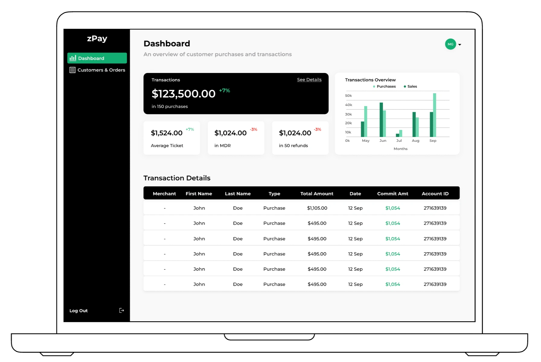
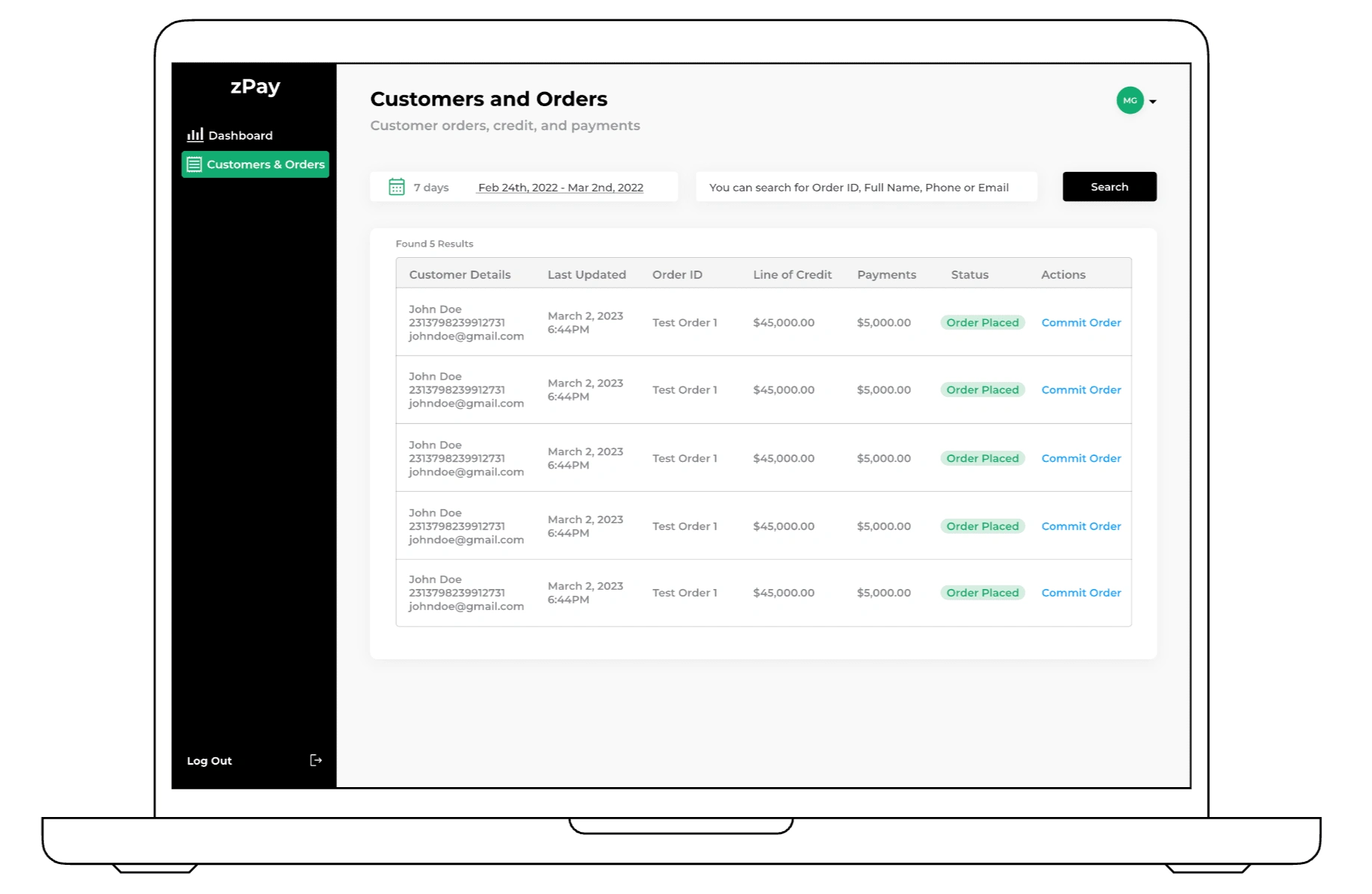
My challenge was to bring this company’s concept to life, with a very straightforward financing onboarding process, and an easy-to-use interface for the desired merchant dashboard. I focused on the spacing and overall layout to keep things organized, and made sure that the presentation of information wasn’t overwhelming for the user.
Research
Requirements
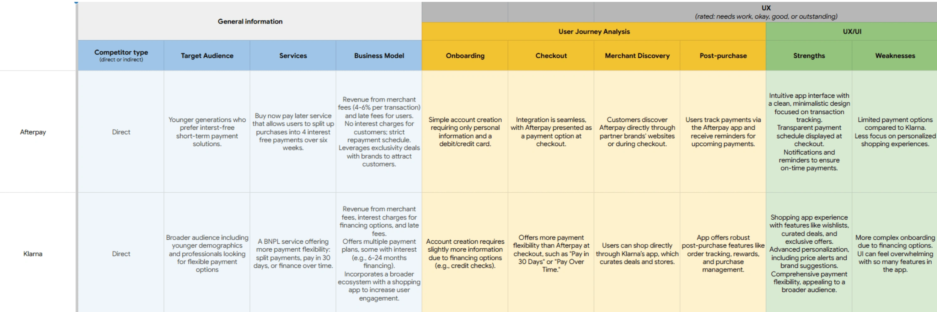
For this project, my first goal was to really understand the services the financial institution wanted to offer its target audience. Since the concept had been in development for a while, the team had put together detailed requirements on Confluence, which helped me quickly get up to speed. As the services felt quite similar to Afterpay and Klarna, I took a closer look at their user journeys. This deep dive gave me valuable insights into what works well in the industry and what we could improve on to create a more tailored and user-friendly experience.
Competitive Audit
Since the user journeys for Afterpay and Klarna closely aligned with the desired experience for this project, I decided to conduct a competitive audit. This approach allowed me to analyze the strengths and weaknesses of each service in detail, providing valuable insights into what works well and what could be improved. By identifying key features and design strategies, I gained a clearer understanding of which elements to incorporate into the project to create a compelling and user-friendly experience.
Wireframes
While designing the initial wireframes, I ensured that all key points from the requirements thread were thoroughly addressed. Drawing insights from my competitive audit, I observed that one of the main weaknesses in similar services was a complicated onboarding process, largely due to the variety of financing options and required credit checks. To address this, I prioritized creating a streamlined and minimal sign-up process that focuses on getting users started quickly. Advanced features could then be introduced gradually, ensuring a smoother and less overwhelming user experience.
High Fidelity
After completing my first round of high-fidelity designs, I realized the pop-ups I had designed for the onboarding process weren’t working as well as I’d hoped. I had incorporated colorful background blobs to make the screens more visually engaging, but based on my team’s feedback, they came across as overwhelming and distracting. To address this, I decided to simplify the design by focusing on readability and improving contrast, ensuring the content was clear and easy to navigate while maintaining a clean, polished look.
Design Improvements
In this project, I believe I successfully created a simple and straightforward onboarding process. The pop-ups guide users step-by-step through a minimalistic UI, ensuring ease of use and clarity. If I were to continue developing this project, my focus would be on refining the onboarding experience further, both in terms of design and functionality, while also expanding the content and features of the merchant dashboard. While this project establishes a solid foundation, there is plenty of opportunity to enhance the details and provide an even more robust user experience.
Like this project
Posted Apr 27, 2025
A dynamic platform dedicated to simplifying financial access and management for users
Likes
0
Views
13