Driving mobile app adoption with conversion copywriting
Goal
Increase the number of mobile app downloads by compelling new and existing users to switch to the mobile app.
Background
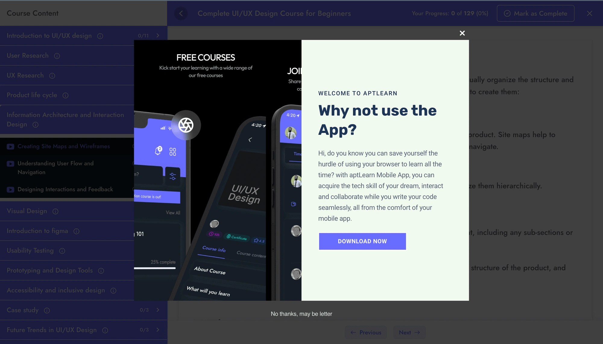
Having built and launched a mobile app for its browser-based learning platform, aptLearn currently uses a popup to persuade learners to switch to the mobile app.
The Problem
I identified key issues that may be causing this popup not to turn in the numbers. They are:
The heading
Why not use the app?
Fails the “what’s in it for me” test as it does not immediately communicate value
The body
“Hi, do you know you can save yourself the hurdle of using your browser to learn all the time? with aptLearn mobile app, you can acquire the tech skills of your dreams, interact and collaborate while you write your code seamlessly all from the comfort of your mobile app.”
At 7 lines, the copy takes up too much space on the UI and instantly feels like it’ll be a lot of read.
The sentences are lengthy and may be hard to understand.
Words like “acquire”, “interact”, “collaborate”, and “seamlessly” may increase cognitive load and complicate the message
The copy fails to effectively agitate the learner pain points as it relates to browser-based learning
By explicitly mentioning “code seamlessly”, it may fee like the mobile app was built for people who need to code
The Call-to-Actions (CTAs)
Asides containing errors, the language of the secondary CTA “No thanks, may be letter” feels more like a way out of the popup, rather than a desirable alternative course of action
By not using a thoughtful, prominent secondary CTA, the popup misses the opportunity to preserve the learner’s interest
How might we compel aptLearn users to happily download the mobile app?
Constraints
Having worked with off-the-shelf CMS tools like Wordpress and HubSpot CMS, I can tell that this popup comes ready-made and therefore may not lend itself to significant editing. So I’ll just keep my design changes as minimal as possible and focus more on the copy.
First Iteration
When I first imagined how this popup could be optimized, the image that came to my mind was of something similar from LinkedIn:
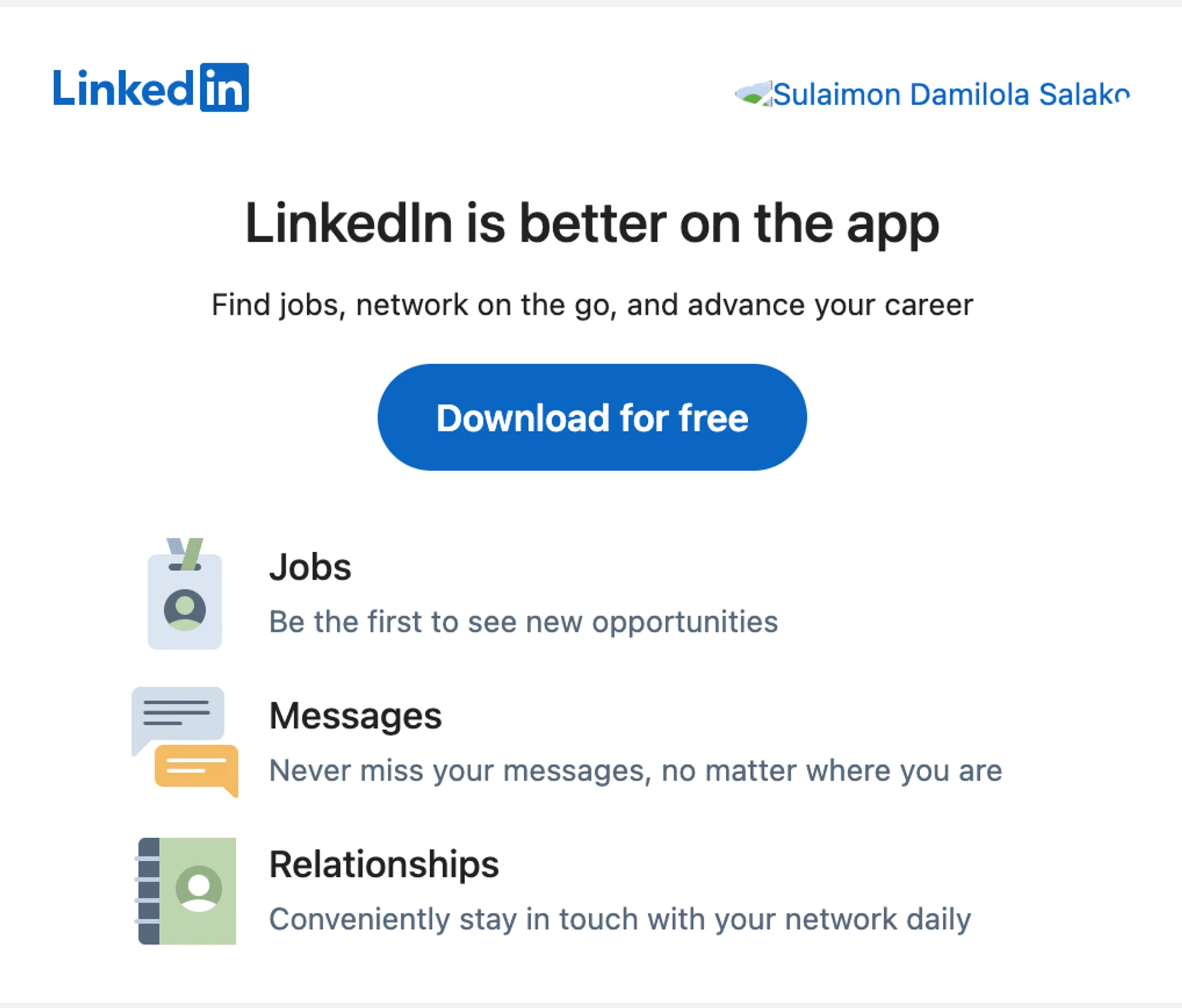
So I decided to adapt this solution – if this worked for LinkedIn, then it should work for us too, or shouldn’t it? We’ll see.
So here’s what my implementation looked like:
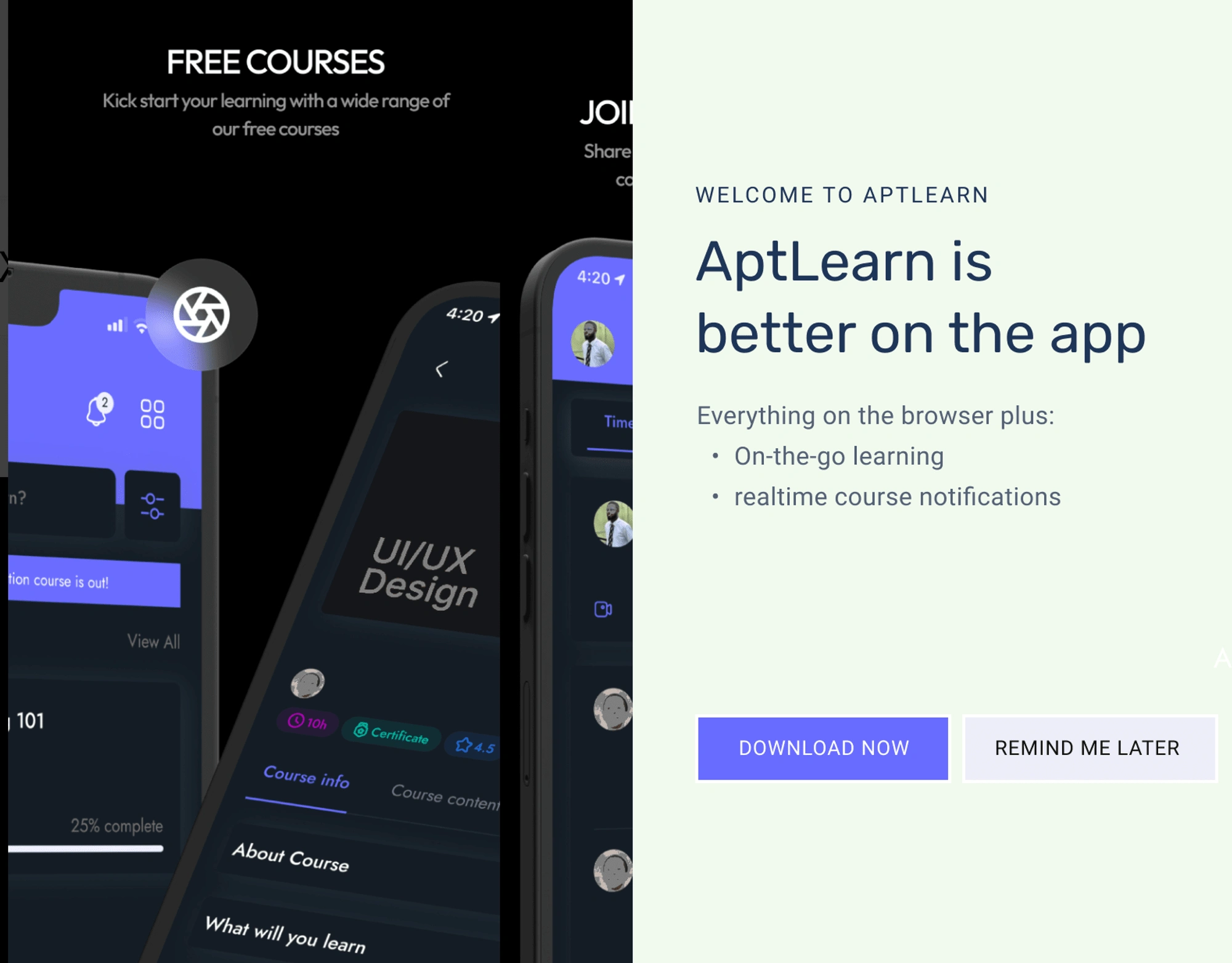
In addition to the copy changes, I added a prominent CTA that subtly nudges the learner to view the popup at a later time. So when next time the learner sees the popup, they’ll be:
unlikely to find it annoying
more likely to give it more attention, given they ask that it be brought back later
As for the overall copy, when I zoomed out and analyzed this new popup, a few issues still lingered:
The header, which is the first thing that jumps at the reader, does still not communicate tangible value. It fails the “what’s in it for me” test.
The first bullet point, “on-the-go learning”, seems already apparent — isn’t that why it’s on a “mobile” device? Plus it wouldn’t make much difference for people who already use aptLearn on mobile browsers.
The “realtime notifications” may also come off vague. Learners may have questions regarding the exact kind of notifications and worry that they might turn out buggy that they’ll have to eventually turn them off.
Finally, I picked up a lesson on the importance of considering your product’s unique context and goal when adopting an existing solution — whether from Apple or Google.
So, I return to the drawing table to improve on this first iteration.
Second iteration
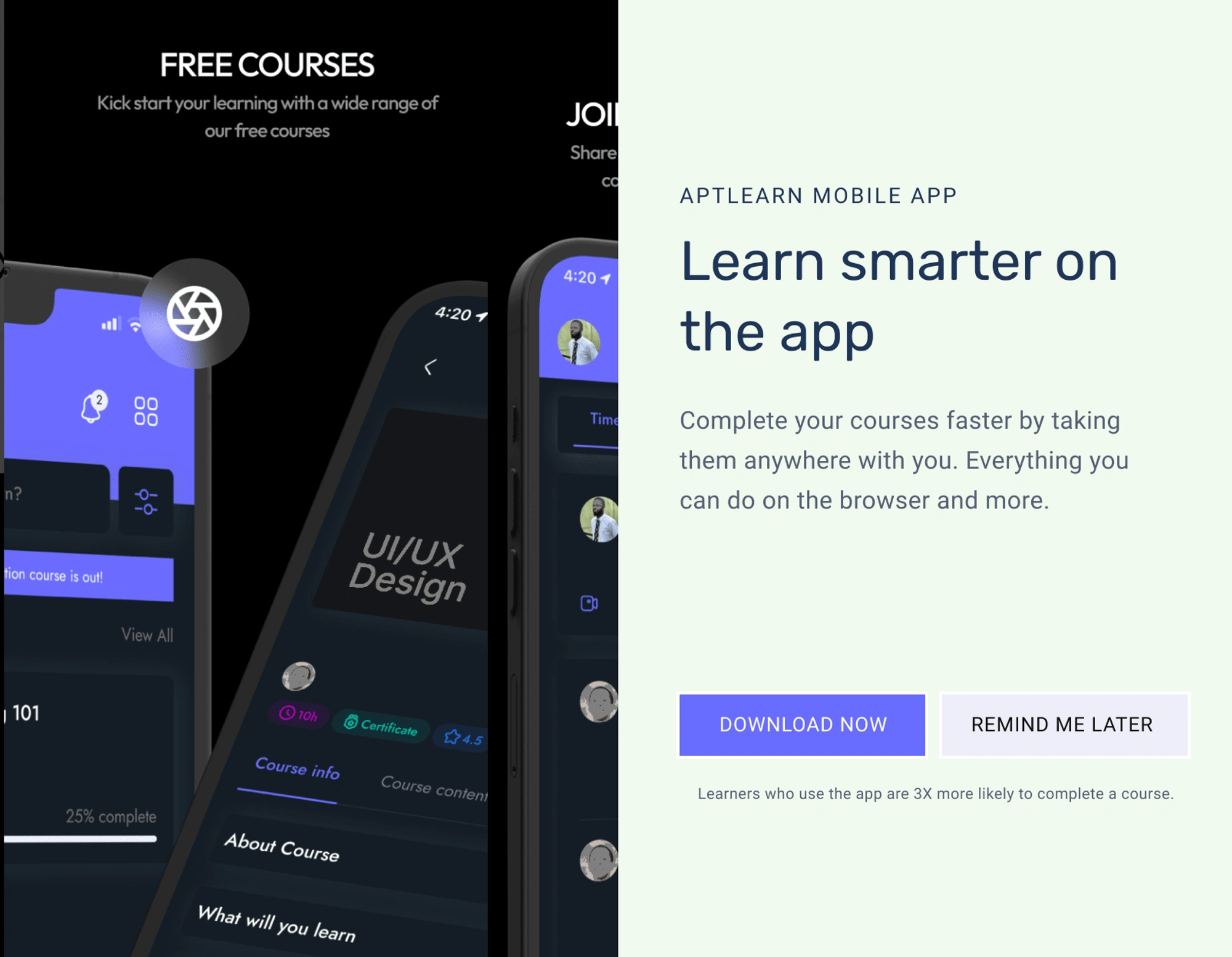
I have now revised the copy so that the header focuses on the user, instead of the app. In the body, I focus on a very important goal for every learner — completing a course, and I finish off by letting them know they won’t be losing any of the features they already enjoy on the website.
As a final, subtle nudge, right below the CTAs, I highlight that the likelihood of completing a course increases when learners use the app.
Improved copy? Certainly, but… There’s still room for improvement, such as:
The “smarter” in the header could be more specific. How exactly will they learn smarter by moving to the mobile app? And in the body, “…by taking them anywhere with you” still feels like “yeah I already do that with my Chrome mobile browser”.
The header could be more specific – how exactly will they learn smarter by moving to the mobile app?
The “…by taking them anywhere with you” part of the body copy also feels bland given learners can already do that when they learn with their mobile device browsers
Also, the text below the CTA would also have been more powerful if I could point at the data behind the claim. Right now, it comes off as bogus.
So, once again, I return to my desk.
One reason I enjoy iterating on solutions is that each time, I’m armed with feedback on what’s working, what’s not, and how I could improve it. So, subsequent iterations will typically require more thought and tact.
Third iteration
The adrenaline rush that prompted me to take a quick stab at improving the popup has now worn out. So it’s time for a bit more thorough content design work.
<aside> 💡 To position the aptLearn mobile app as a solution to real learner pain points, I’ll need to do some digging.
</aside>
Some quick-fire customer research
How can we find the actual pain points of aptLearn’s audience (people who are looking to learn a tech skill)? Or better yet, where can we find them voicing out these pain points?
A number of options come to mind, but for this case study, I decide to stick to a low-hanging fruit: the Nigerian Twitter tech community.
I have chosen this source because a lot of time, I see tweets from influencers asking their followers what their “challenges” with learning have been — a goldmine for pain point harvesting if you ask me.
I went on to manually go through the responses to these “pain point tweets”, and the most common challenges were:
Internet data subscription
Laptop computer
Power supply
Mentorship and motivation
Now, which of these pain points does the aptLearn mobile app address — directly or otherwise? And how can we make learners see the aptLearn mobile app as a solution to some of these problems?
Data saving
Learners may be able to download course materials for offline learning. This could be useful in a number of ways:
Learners who use time-bound data plans or Wi-Fi networks can download courses so that they’re available to watch later — when they no longer have internet access.
When the internet connection is poor or slow, learners can download the course and watch offline, avoiding the frustration of waiting for videos to load.
Also, learners may be able to save data costs since the interface elements and other resources are already available offline in the app and don’t need to be loaded each time. But this is not a given, and ultimately depends on whether the app has been built in a way that supports this hypothesis.
Power saving
Learning on a mobile phone can help learners save power costs in two ways:
Learners can simply continue on their mobile phone when their laptop’s battery run down
For non-technical courses like digital marketing and technical writing which may not require computer-based hands-on, learners can completely switch to using their smartphones which, when fully charged, typically last longer than laptops.
Other pain points
What other features of the aptLearn mobile app can help our audience achieve their learning goals?
I’d say one feature that may tick that box would be real-time notifications for things like graded assessments, scheduled learning reminders, and course updates.
Putting all of this together, here’s what the third iteration looks like:
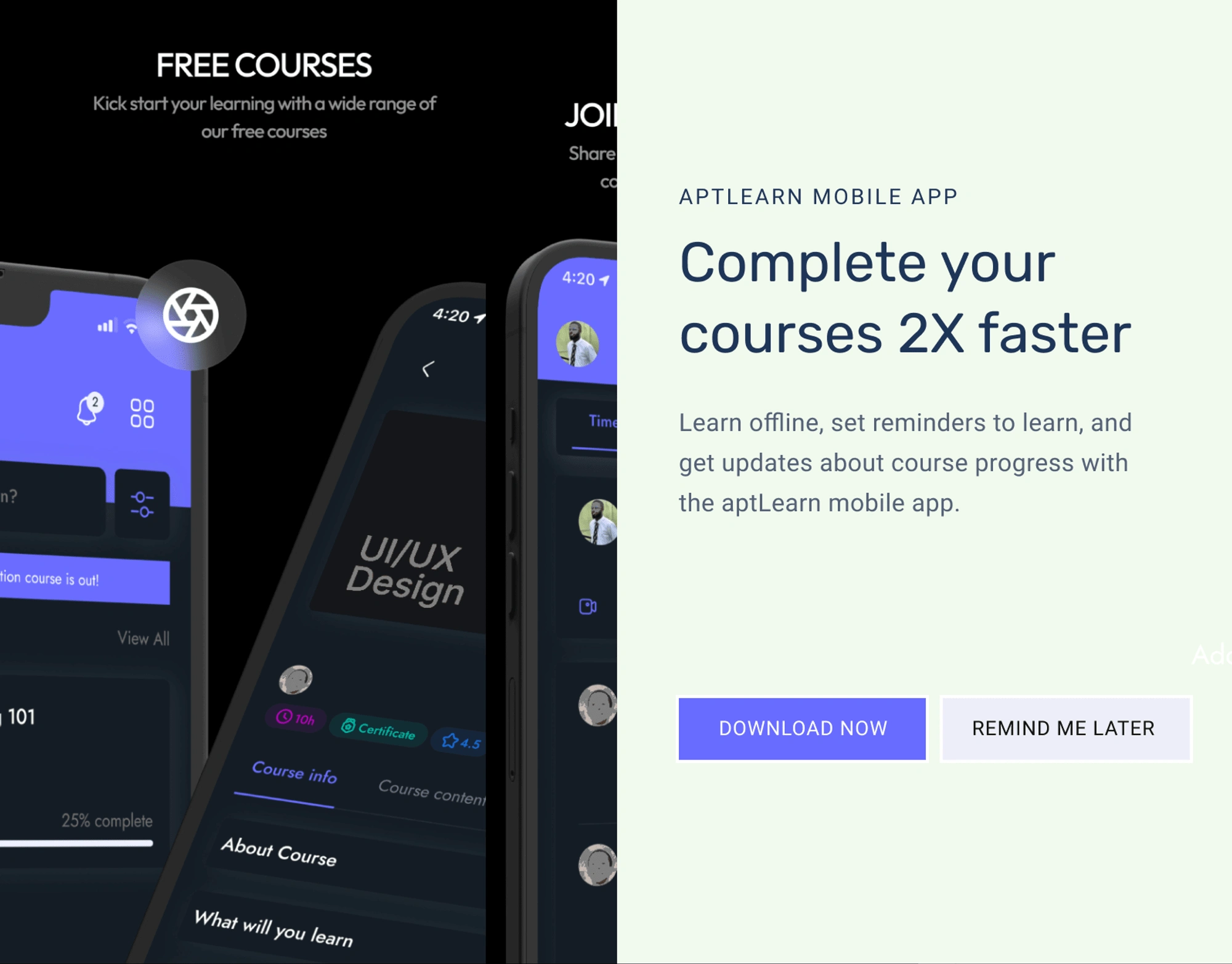
In this iteration I have made the header as specific as possible — stating exactly what’s in it for the learner and communicating value at first sight.
And as for the body copy, here’s how it addresses relevant learner pain points:
Learn offline: This instantly tells the learner the app can help them learn when they’re out of internet data, and possibly even help them save data costs. They may also be able to learn for longer since their phone typically lasts longer when it’s not connected to the internet.
Set reminders to learn: This feature nudges the learner, like an actual mentor would, that it’s time to crush some of their learning goals.
Get updates about course progress: This is an attempt to be specific about the kind of notifications learners will get, like graded assignments, newly available modules, etc. So when the app requests permission to show notifications, learners will be more likely to grant it.
If this was an actual project, I’d be ready to take this version into the team design/content crit session and get some feedback from the team — or maybe even do some highlighter tests to collect user feedback.
So what comes next?
Keeping the experience coherent
It’s important to keep in mind that this interaction is part of a user journey — not isolated.
Therefore to keep the overall experience coherent, the next steps (when a user chooses to download the app) must involve providing the learner with more information on how exactly the features we sold to them work. That is, how to learn offline, set learning reminders, etc with the aptLearn mobile app.
We could do this with strategic user education via app store content, onboarding content, and product release notes.
Like this project
Posted Oct 4, 2023
Helping an online learning platform persuade its new and existing users to download its shiny new mobile app.

