🗓️ Scheduling Messages (UX Mobile Design - New Feature)
The story:
Actionaly specializes in streamlining the communication flow between schools and parents through "Actionable Messaging." Examples of actionable messaging are field trip forms, surveys, request for parent signature, and daily health screenings.
Overview
The goal of this redesign was to help users feel empowered & confident to send an actionable message through a guided and focused experience.
Challenges:
- Understanding the use cases for why people needed to schedule an actionable message
-Helping user feel confident and informed while keeping the creation flow lightweight
Solution:
-Launched a natural entry point following the actionable message creation
-Designed a scalable framework for the technical team to implement in a timely manner
Wireframes/Story Board
During this process, our full team discussed how the scheduling part was going to flow with our current user process. We discussed the limitations of the project as well as how we were going to store this data.
User Testing
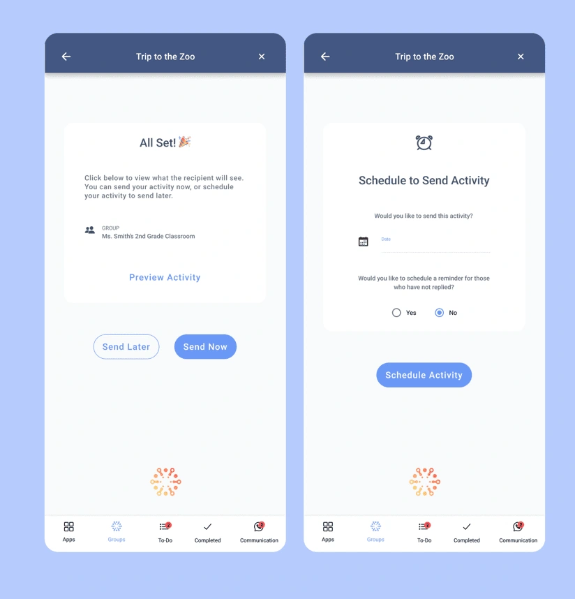
Before launching the product, I did a testing round in order to reveal possible usability problems. We wanted to find out if the early designs we created solved all of the users pain points. From these interviews we learned that the users were able to fully adapt to the new flow. One issue we uncovered was that the button language was confusing to some users. We originally used "Send Now." This impacted the version 2 where we updated the language to say "Schedule Now."
Natural Entry Point
I redesigned the point at which the use will decide to send their actionable message now, or schedule to send at a future time. The new design was more actionable and prominent leading to a significant increase in user satisfaction and consumer trust in our product.

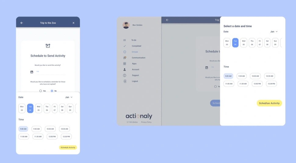
Scalable framework on both platforms
During the design it was important to consider the scheduling activities from both app and web app. I designed a framework that allowed the date and time picker to scale.

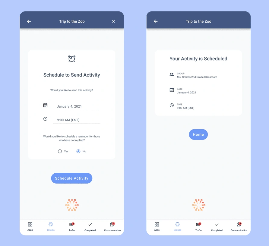
2 Step Creation
I designed a 2 step creation flow for scheduling an activity. This would give users more security and confidence with scheduling/sending their activities.

Like this project
Posted Mar 6, 2023
Actionaly is a Ed-Tech company that helps bridge the gap between the educators and family communication with a scheduling tool to send messages to parents.


