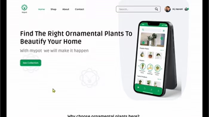
Mypot — SaaS Admin Dashboard UX/UI

hendri yadi


📖 Context
Mypot is a web-based admin dashboard for managing users, products, sales, marketing, and content from one centralized workspace.
Many online stores overwhelm users with crowded layouts and unclear navigation. The challenge was to create a shopping experience that helps users find products quickly while maintaining a clean and engaging interface.
🧠 Approach
I simplified the information architecture, prioritized key metrics, created clear navigation, and established a consistent UI system across the dashboard.
🎨 Output
Login experience, admin dashboard, navigation system, KPI cards, sales visualization, product management, marketing, and blog sections.
✨ Outcome
A cleaner and more structured dashboard experience that makes key information easier to scan and administrative functions easier to navigate.
👨💻 My Role
Product Design
UX Design
UI Design
Responsive Design
Design System
🛠️ Tools
Figma
Webflow
HTML & CSS
💭 Why I Designed It
I wanted to demonstrate how complex business information can be transformed into a simple, organized, and scalable product experience.
Like this project
Posted Aug 16, 2026
SaaS admin dashboard designed to simplify business data, streamline navigation, and create a clear, scalable experience for administrators.
Likes
0
Views
0