
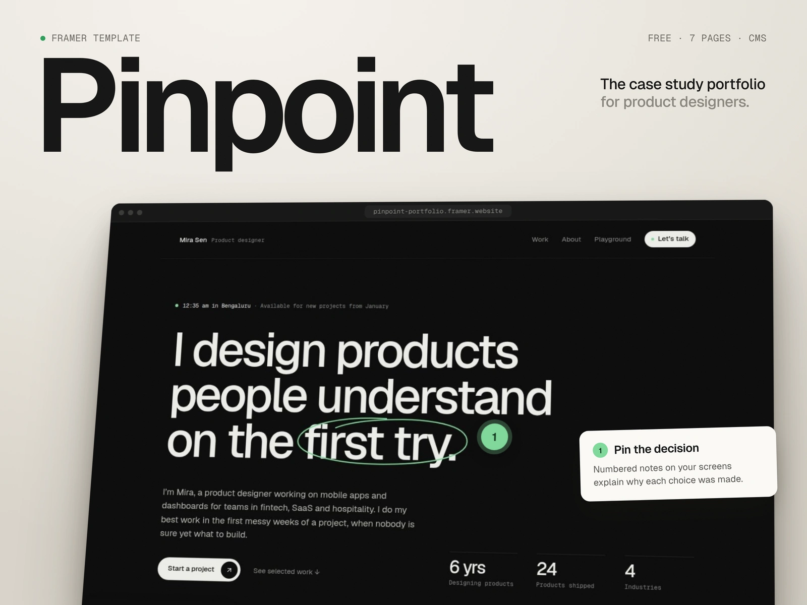
Role: Product design, UX/UI, Framer development
Type: Self-initiated template, free on the Framer Marketplace
Timeline: November 2026
The problem
Designer portfolios show finished screens. Hiring managers and clients want to know why those screens look the way they do.
Most portfolio templates answer with big images and a long scroll. A reviewer skims the shots, can't tell what the designer decided versus what the team handed them, and moves on to the next link.
Pinpoint is a Framer template built to put the reasoning on the work itself.
The approach
Pinpoint started as a rebuild of First Impression, my most-remixed portfolio template. People kept remixing it, but when I opened it myself I could see why it wasn't working after the remix. Case studies were hard-coded pages, the copy was instructions like "Summarize what the data showed", and the home page had twelve sections of cards. Remixing took a minute; making it yours took a weekend.
So I stopped polishing the old layout and started from one idea: the case study is the product. Then I set three rules:
Show the reasoning on the work, not three sections below it.
Keep the facts in view: client, role, team, duration and outcomes shouldn't scroll away.
Let short case studies look finished, so nobody pads a project to fill a layout.
Four decisions that shaped it
1. Pins on the screen.
Numbered pins sit directly on a design screenshot. Hover or tap one and a short note opens: what changed and why. A reviewer gets the reasoning exactly where it applies, and the designer writes three sharp notes instead of three paragraphs.
Trade-off: it's a code component. To keep it editable, the screenshot and pins come from two CMS fields, one line per pin, and the colours are linked to the site's colour styles.
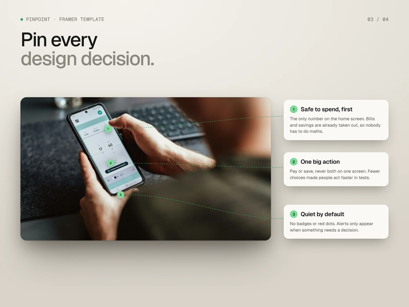
Three pins, three decisions
2. Before and after, side by side.
A drag slider compares the first concept with what shipped. It works with touch and the arrow keys, so it isn't a desktop-only trick. Seeing the change does more than describing it.
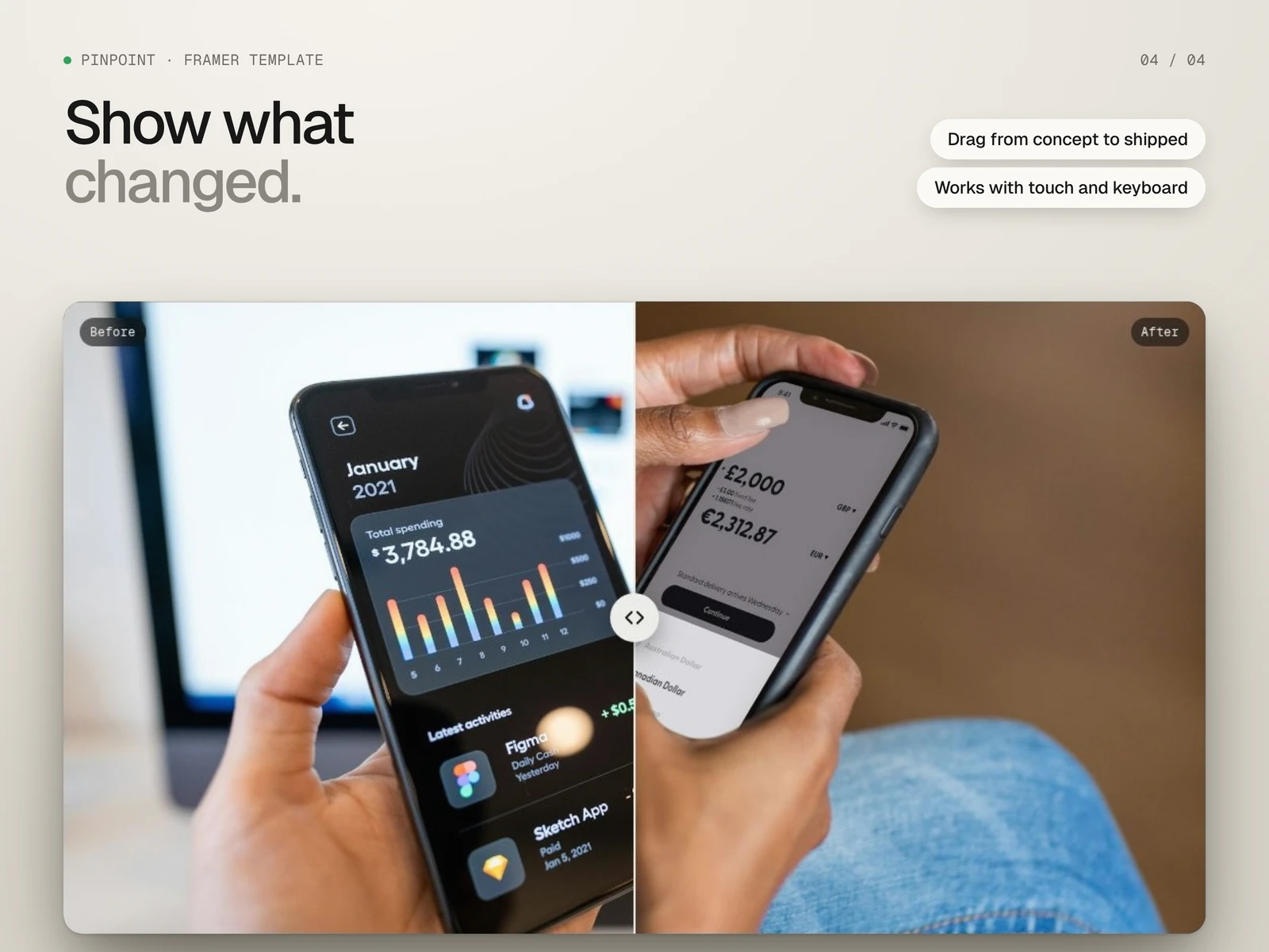
Concept to shipped, in one drag
3. Facts that stay put.
A sticky fact rail holds client, role, year, duration, team and outcomes beside the story. Outcome numbers count up when they come into view and show their final value when reduced motion is on.
4. A process story, not a wall of images.
The process image pins on the left while four steps scroll on the right, swapping the image and counter as you go.
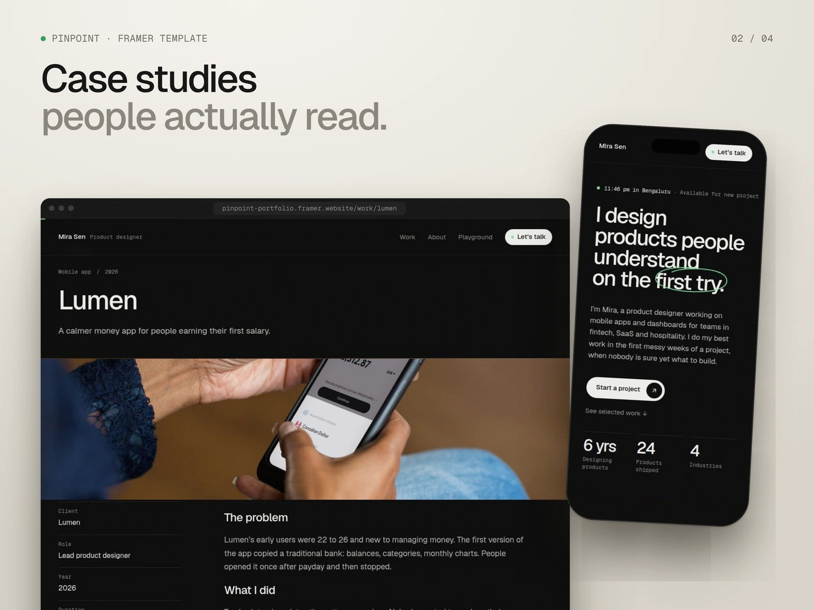
The case study page on desktop and the portfolio on phone
Built for the next person
A template gets judged twice: by the visitor, and by whoever has to fill it in.
Every case study section is a CMS field, and empty sections hide themselves. A case study can be three paragraphs or ten sections and still look finished.
The demo case studies are written as real examples, not instructions to delete.
7 pages: Home, Work, Case study, About, Contact, Playground and 404, with desktop, tablet and phone layouts.
A "Start here" guide inside the project.
Honest limits: pins are placed by typing their position as a percentage, which takes a little trial and error. The contact form needs connecting to an email or webhook before launch.
Outcome
Pinpoint is live on the Framer Marketplace as a free template, released as the successor to First Impression. It's self-initiated, so there are no client metrics yet. The number I'm watching is how many remixes turn into published portfolios.
What it shows is how I like to work: find what the visitor actually needs to decide, put it where they're already looking, and make sure the next person can edit what I made.
Live demo: Pinpoint Portfolio
Template: Framer Marketplace
Need a Framer site that explains your work instead of just showing it? Message me here on Contra.
0 likes · 0 views · Nov 9, 2026
Framer portfolio template for product designers. Case studies explain decision with numbered pins screen, a before/after slider , a step-by-step process story.
Timeline
Nov 2, 2026 - Nov 7, 2026
