Quorum: A Framer Template for Professional Communities

Shreyansh Shrivastava

Role: Product design, UX/UI, Framer development
Type: Self-initiated template, free on the Framer Marketplace
Timeline: October 2026
The problem
Paid communities sell something visitors can't see before they join: the people and the conversations.
Most community websites fall back on a list of benefits and a pricing table. That explains the offer, but it doesn't answer the question a founder or operator actually has before paying: who will I meet, and what will I do each month?
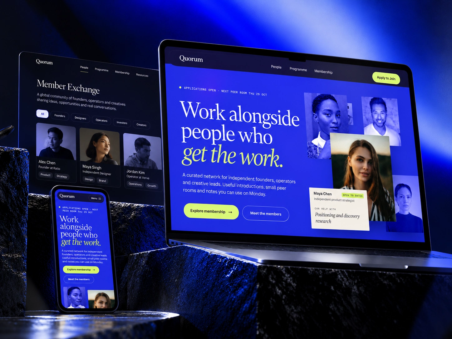
Quorum is a Framer template built to answer that question before asking anyone to apply.
The approach
I set myself three rules:
Lead with people, not features.
Show an ordinary month instead of listing benefits.
Make applying feel low-risk: two clear options, and exactly what happens after you submit.
Every section on the site had to serve one of them.
Four decisions that shaped it
1. A hero you walk into.
The first impression should be "a room of people worth meeting", not a headline over a stock photo. Member portraits sit at different depths, the scene tilts with the cursor, and scrolling moves you into the room.
Trade-off: a 3D scene is too heavy for small screens, so below 1024px, and for anyone who prefers reduced motion, it becomes a composed static layout.
2. Members as an index, not a card grid.
Card grids make everyone look the same and hide the useful part. Each name shows what that person can help with and what they're exploring right now, the two things that actually start an introduction. Filters by expertise make it easy to find the right person.
3. One ordinary month instead of a benefits list.
"Six members, one real decision each" is more convincing than "exclusive networking". The section pins as you scroll through four weeks, and each one ends on what you leave with.
4. Two tiers, not three.
The only difference between them is a standing peer group, so the choice takes seconds. The application page then removes the last bit of doubt: a call within five days, and two introductions in your first week.
Built for the next person
A template gets judged twice: by the visitor, and by whoever has to edit it. So I designed the editing experience too.
Every section, including the custom code, is linked to the same colour styles. Change the brand colour once and the whole site follows.
Sessions live in the CMS. The programme page, session pages and homepage list all update together.
Code sections can use any font from Framer's font picker.
A "Start here" page inside the project explains what to edit where.
Honest limits: member lists are edited in the properties panel rather than the CMS, and billing or sign-in would need an external platform.
Outcome
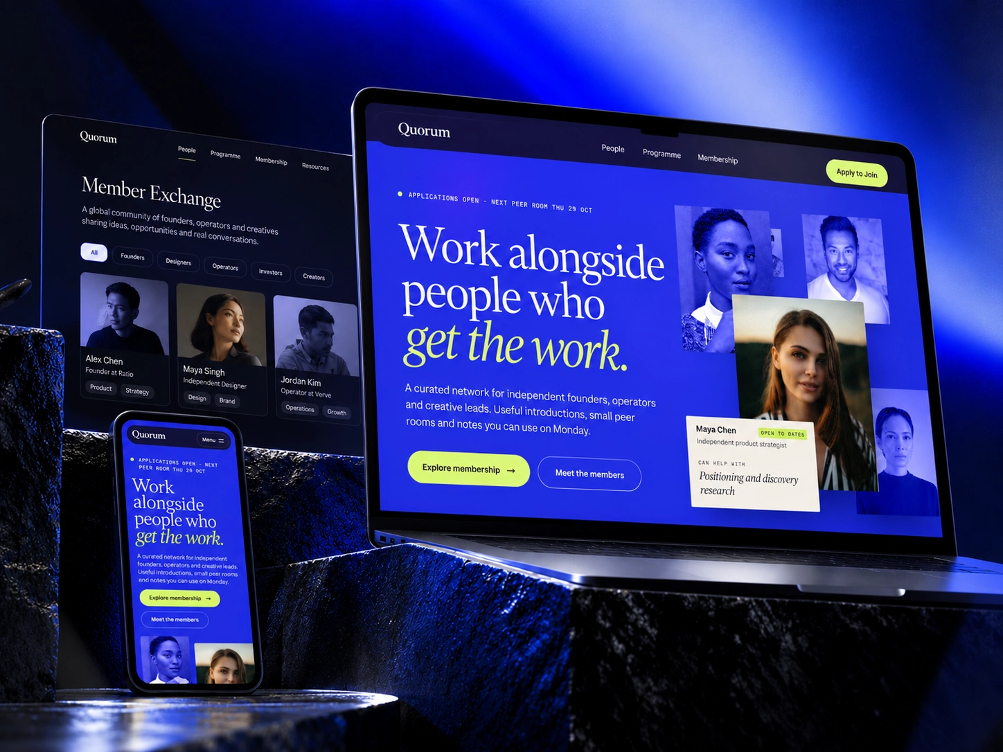
Quorum is live on the Framer Marketplace as a free template. It's self-initiated, so there are no client metrics yet. Next, I'd like to see how community operators adapt it and where they get stuck when editing.
What it shows is how I like to work: start from the question a visitor really has, make a few clear decisions, and ship something another person can actually use.
Live demo: Quorum Network
Template: Marketplace Link
Need a Framer site that explains your offer as clearly as it looks? Message me here on Contra.
Like this project
Posted Oct 26, 2026
A self-initiated Framer template for paid communities. The brief I set myself show visitors the people and an ordinary month inside before asking them to apply.
Likes
0
Views
2