Advisory — A Consulting Site That Starts With the Problem

Shreyansh Shrivastava

Advisory
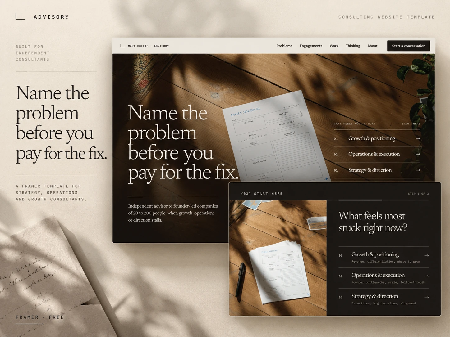
A consulting website that helps visitors name their problem before it sells them a solution.
Type: Free Framer template · Consulting
Scope: Product design, UX, visual design, Framer build
Timeline: 1 week, October 2026
Live preview: Advisory
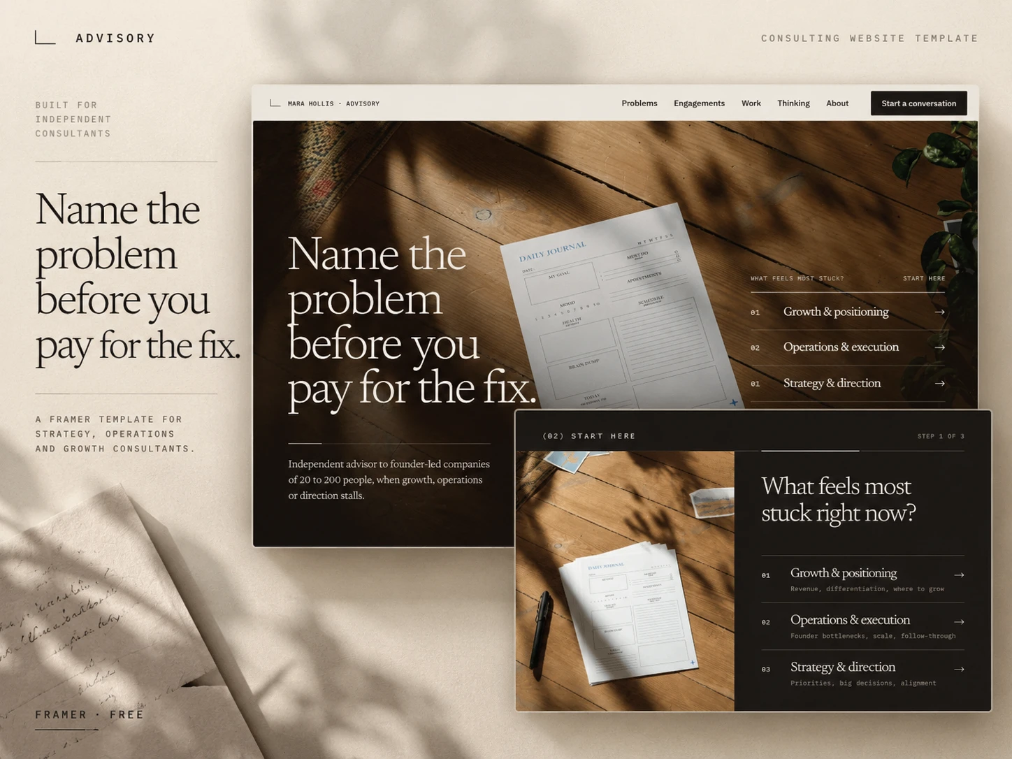
*The Advisory homepage. Three ways in, before a single service is mentioned.*
Revenue has been flat for three quarters
The founder knows something is wrong. The team is busy, the pipeline looks fine, and the numbers still won't move. What they can't say is whether it's a positioning problem, an operations problem or a strategy problem.
Most consulting websites assume they already know. They lead with a list of services and ask the visitor to pick one, which is the exact decision the visitor can't make yet.
Advisory is a free Framer template for independent consultants and small advisory firms, built around that moment of not knowing.
Most consulting websites follow the same script
Before designing anything, I went through the top consulting templates on the Framer Marketplace. Nearly all of them run the same sequence: a bold claim, service cards, a three-step "Discover, Strategize, Execute" process, case studies with percentage uplifts, stat counters and a testimonial carousel.
Two things stood out. None of them started with the visitor's problem; services were organised around the firm's own categories. And credibility was built on numbers a real independent consultant can't honestly fill in. "+42% efficiency" works in a demo. It becomes a liability the day a real consultant publishes it.
That became the brief: prove expertise through how the consultant thinks, not through invented results.
Consultants don't sell a service so much as a better-framed problem. So the site should do a small version of that work before the first call.
Let the visitor name the problem first
The centre of the site is a three-step diagnostic.
What feels most stuck? Growth, operations or strategy.
Which sounds most like you? Three symptoms per area, written the way a founder would say them: "Everything still runs through the founders." "Prospects can't tell us apart from competitors." "A big decision is coming and we want a second opinion."
A short memo, not a score. What the symptom usually points to, what the consultant would look at first, which engagement fits, and what the visitor would leave with.
The hero offers the same three areas as a starting point, so a visitor can jump straight into the diagnostic with their area already selected.
It's deliberately not a quiz or an "AI assessment". The result says plainly that it's a starting point for a conversation, not a diagnosis.
*Three steps from "something's wrong" to a named problem and a matching engagement.*
Make the first email already useful
"Discuss this" on the result opens the contact page with the chosen problem already filled in. The consultant's first message isn't "hi, interested in your services". It already says what the conversation is about.
Of everything in the template, this is the small detail I'd keep if I had to cut the rest. It's where the interaction turns into an actual lead.
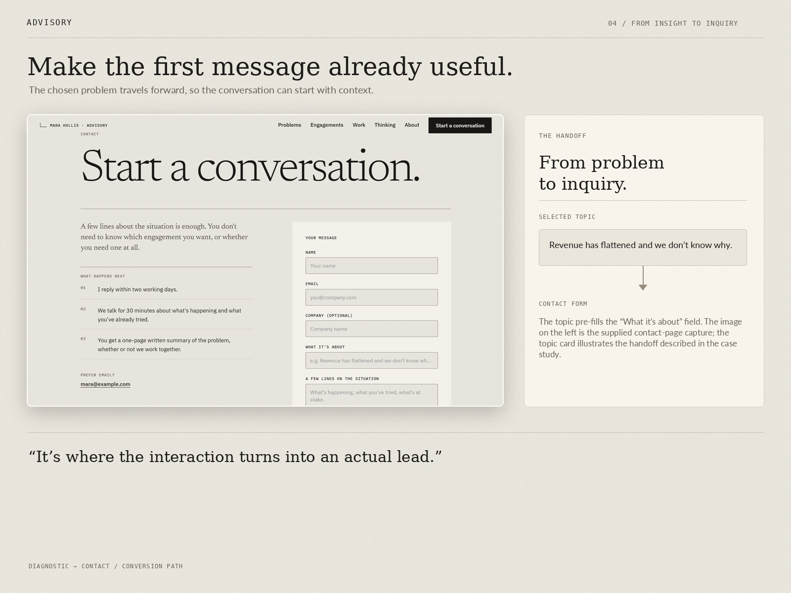
*The selected problem carries through to the inquiry.*
Show the engagement, not a process diagram
Instead of an abstract Discover → Strategize → Execute graphic, the process section follows one six-week engagement through the four documents it produces: interview notes, a findings memo, a decision paper and a 90-day plan. Each is a sticky card that the next one slides over.
Engagements come in three fixed shapes: a two-week Diagnostic Sprint, a six-to-eight-week Strategy Engagement and a monthly Advisory Retainer. Each shows its length and what you leave with, with an optional price that can be switched off. Time-poor buyers want to know what they're actually getting.
Proof without invented numbers
Past work is written as decision records: the situation, what was found, the decision, and what changed. Outcomes are described in words, not percentages. The demo records are clearly labelled as illustrative, so a consultant replaces them with their own work rather than inheriting made-up metrics.
There's also a "good fit / not a fit" section. Good consultants turn work down, and saying so up front builds more trust than a logo wall. No stat counters, no fake client logos, no testimonial carousel.
*Case studies structured around the decision, not the uplift.*
A visual system borrowed from the work itself
Warm stone and graphite, Newsreader for display, IBM Plex for the interface and labels. It feels closer to a well-made report than a SaaS landing page.
The photography follows one rule: show evidence of the work. Paper in afternoon light, hands and pens around a table, the inside of the client's business. The only face is the advisor's, so a buyer can keep the imagery or swap in their own without the site falling apart.
One revision worth mentioning: the first version of the new hero put the three starting points in a light card floating over the photo. It looked cheap and duplicated the main button. The final version sets them as ruled serif rows directly on the image, in the same visual language as the diagnostic further down. The hero now introduces the signature feature instead of competing with it.
Built to be handed over
Designed and built end to end in Framer. Motion is native wherever Framer can do it, and code is used only where it can't.
What's included
Homepage: hero with problem entry points, statement, diagnostic, engagement process, engagements, selected work, the advisor, fit, notes and closing CTA
Engagements listing and detail pages
Work listing and decision-record detail pages
Thinking (articles) listing and article pages
About, Contact and 404
Three CMS collections: Engagements, Work and Thinking
Diagnostic code component, with all nine results editable from the property panel, keyboard and reduced-motion support
Row Preview component and small overrides for the hero entry points and the contact pre-fill
Fully responsive across desktop, tablet and mobile
The demo is a fictional independent strategy advisor, but the structure works just as well for a two-to-five-person boutique firm.
Names, engagements, prices, case records and contact details are examples. They must be reviewed and replaced before a real business publishes the site. The inquiry form must also be connected to and tested with the owner's chosen destination.
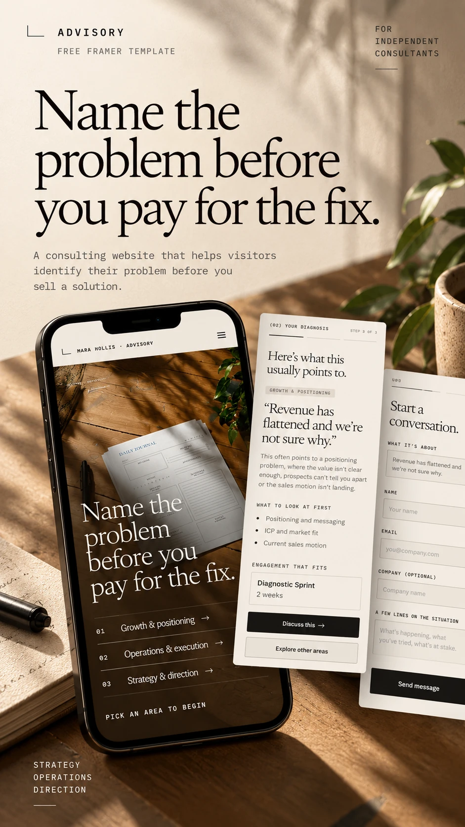
*The diagnostic and the contact path, intact on a phone.
Where it stands
Advisory is a template, not a client project, so there are no conversion numbers to report yet. The next step is to see how consultants adapt the diagnostic to their own practice, and whether the pre-filled inquiry changes the quality of first conversations.
It's the second of five free niche templates I'm releasing in October 2026, after RelayHome for home-service businesses.
The lesson from this one: an interactive feature earns its place only when it carries through to the business outcome. The diagnostic would be a nice widget on its own. The pre-filled inquiry is what makes it a sales tool.
Need a site like this for your practice?
If you're an independent consultant or run a small advisory firm, I can adapt Advisory to your services and voice, or design and build a site around how you actually win clients.
Message me on Contra to discuss your project.
Like this project
Posted Oct 17, 2026
Framer template for independent consultants, built around a three-step diagnostic that helps founders name their problem before they book a call.
Likes
0
Views
3
Timeline
Oct 10, 2026 - Oct 17, 2026